Showing posts with label Maple Leaf architecture. Show all posts

Saturday, September 7, 2024

Rooflines of Maple Leaf


8/30/24 Maple Leaf neighborhood (The Dutch Colonial at upper right was especially challenging to draw! The owners have uprgraded with solar panels.)

9/5/24 What's up with the skinny windows on the upper floor?
As an urban sketcher, I’m not necessarily attracted to drawing buildings, but every now and then I get in the mood to take my walks with an eye to the ever-changing neighborhood landscape. One of many things I love and appreciate about Maple Leaf is all the traditional architecture of homes that have been standing for a century (like our house, built in 1925). Some newer homes and additions have at least attempted to fit into the neighborhood; others have not.

Saturday, October 7, 2023

New SFR, ADU and DADU in the ‘Hood


10/4/23 Maple Leaf neighborhood

For the past year, I’ve been watching several residential construction projects on my walking routes. A few months ago I sketched an enormous SFR with AADU (architectural jargon for single-family residence and its attached accessory dwelling unit). Around the corner from those are the ones shown here, which confused me for much of their progress.

The original 750-square-foot house on the left, which is about a hundred years old, had been completely gutted and redesigned. Then the 3,500 square foot SFR on the right, which is set back slightly from the smaller house, was built and attached to it, making the small house an ADU (accessory dwelling unit). What confused me was the dark connecting bit (literally painted black) between them. Was it a hallway with doors between the two houses? A primary house with a mother-in-law unit? An Airbnb type of thing?

I continued to ponder the possibilities as I sketched, when the developer/builder happened to come by. Delighted to see me sketching the houses, he offered to take me inside all three (a detached accessory dwelling unit behind the other two is hidden from the street view) and answer my questions that way.

It turns out that the connecting bit does not include access to either dwelling; the “hallway” is actually a walk-in closet for one of the homes. Structurally, the two buildings are connected that way so that they could be built so close together. With four bedrooms plus three “bonus” rooms, the big house has three full stories. One of the top floor bonus rooms, which is set up to be a “media room” with a wet bar, opens to a deck with a magnificent west view of the Olympics. The price will be about $2 million (in case you were wondering).

Although I’m still not a fan of this type of modern architecture (for one thing, there’s no space for large trees, which I have only recently become more aware of in terms of benefits to residences), the floor plans seem well designed for the types of families that might live there. Learning about anything always increases my appreciation for the planning and details involved, even if I don’t necessarily care for the results.

Monday, August 21, 2023

Yellow House

8/17/23 Maple Leaf neighborhood

On Day 4 of our heat wave, I went out extra early for my walk-sketch. Typically I encounter only a few other walkers in my neighborhood. On this day, I must have said “good morning” a dozen times – lots of people, especially dog walkers, were out early trying to get ahead of the heat. Although not nearly as bad as the “heat dome” we had a couple of years ago when temps soared into record-breaking triple digits, last week was still brutal for the many in Seattle without AC (which we thankfully have in a few rooms).

Color and mixed media notes: The Caran d’Ache Mixed Media Botanical Set is challenging me from both the color and media angles. In this sketch, the palette worked out well: The house was pale yellow, so the Golden Ochre (033) Fibralo Brush marker was a good shadow color. I wanted to spritz the dark reddish-colored bushes (Supracolor Dark Carmine 089), but unfortunately, I had already applied the water-soluble marker on the house behind them. I was afraid the marker would have dispersed into a muddy mess along with the Supracolor, so I left the pencil dry.


In the past when I’ve mixed markers with water-soluble colored pencils, I’ve most often used non-soluble Faber-Castell Pitt Artist Pens that stay solid when I activate pencils applied next to them. I’m going to have to plan my sequence of material use more consciously with this combo.

On the upside, I’m enjoying Supracolors, and I’m not missing Museum Aquarelles as much as I had expected. I’ve said before that if I ever had to choose only one colored pencil (heaven forfend!), it would be Supracolor for its versatility, and my answer still stands. When people new to watercolor pencils ask me to recommend my “favorite,” even though my honest answer would be Museum Aquarelles, I don’t recommend them to the uninitiated, mainly because of their high cost. They also aren’t necessarily versatile – they just meet my needs best. Instead, I always recommend Supracolor. I’m happy that this Caran d’Ache set gave me a reason to put Supracolors in my bag. 

Sunday, June 4, 2023

SFR with AADU


5/31/23 Maple Leaf neighborhood

Within a couple of blocks, several new houses are under various stages of construction in Maple Leaf. All are behemoths compared to the traditional homes around them – the kind that the behemoths have replaced, often two or even three at a time. This one is typical: A large single-family residence with a smaller “attached accessory dwelling unit” in back. (I learned this term by seeing the convenient label AADU on the dwelling.) Even the smaller one has three stories and probably more square footage than our house.

Saturday, June 18, 2022

Summer Palette Refresh, Triad 2


6/14/22 Maple Leaf neighborhood (new primary triad 2)

Caran d'Ache Museum Aquarelle primary triad 2

Yesterday I showed one of two primary triads I am trying out for summer. Here’s the second one. The only difference between this one and yesterday’s is the blue, which is a warmer Caran d’Ache Turquoise Blue (171).

The sketch above posed several interesting color challenges. First, I am still getting to know this triad, which is noticeably warmer than the other one I’m trying (and much warmer than my favorite CMYK triad). Second, the day was overcast again, and from the angle I chose, the subdued light  illuminated both sides of the house nearly equally with very little difference in value in the roof angles. Finally, the two yellow caution diamonds were also nearly equally illuminated, but I wanted to show one at a right angle to the other.

As I pondered the roof, I suddenly remembered color temperature! I haven’t been focusing on color temperature since I started the composition challenge, but things I learned from Sarah Bixler’s workshops and Ian Roberts’ videos popped into my head: If I make a hue warmer, it appears closer to the light, even if the value differences are slight. With colored pencils, it’s easy enough to add a bit more yellow to warm up the slightly more illuminated side.

Much warmer primary triad 2

As for the two caution diamonds, I applied the same principle, but probably went overboard. I made one diamond cooler and therefore slightly less illuminated, but it got darker than I had intended.  

One additional challenge was the ultra-tiny spritzer that I keep in my small walking bag (it’s the perfume atomizer shown in this post). It’s much harder to target the water output compared to my favorite spritzer (also shown in that post), but I like its small size, so I tolerate it. I over-spritzed the page in a couple of places, and I also had to use a thumb or a hand as a mask to keep from over-spraying areas that I wanted to keep dry. But as all watercolor painters know, it’s best to embrace the out-of-controlness of water media instead of trying to manage it!

Rare bird observed in the wild! (Photo by Mariah)

As I was happily sketching, a woman walking by was surprised to realize what I was doing. She was familiar with plein air painting (“with the easel and palette and all that”), but urban sketching was new to her. She was so delighted that she asked to take my photo (and I asked her to take one with my phone, too). I know so many urban sketchers that I always feel like we are everywhere all the time, but I guess we are still a rare bird that average pedestrians are surprised to encounter in the wild.

Monday, May 2, 2022

Color Temperature Studies: Black and White Test


4/23/22 overcast morning

I apologize if you’re tired of this house. Although it’s awkward for me to sketch (looking through a window at an odd angle), it turns out to be a good color temperature and value study subject because I can easily see the sun traveling around it.

On two consecutive mornings – the first under an overcast sky; the second in sunshine – I gave color temperature two more tries. To test my values, I went out on the deck to take a photo (the angle is slightly different from my drawings) each day and converted the photos to black and white. I also converted the sketches to black and white. Whoa – it’s an excellent test because it’s easy to see when I’m off!

First is a primary triad on the overcast morning (top of page). Based on my previous studies, I chose a cooler magenta as well as a cooler blue than those in my previous CMYK triad, thinking that they would indicate the cooler, overcast light better. When I finished, I thought I got the rooftops too dark, but the black-and-white conversion compared to the photo indicates that I didn’t get them dark enough. I have a habit of making the windows the darkest value, but they are actually about the same value as the rooftops.

Black-and-white conversion of 4/23 sketch


The next day on the sunny morning, I tried a secondary triad with a cooler green so that its temperature wouldn’t be as close to the orange as it was in my previous try. But I chose a warmer violet to better indicate the sunnier day. Based on the black-and-white conversion compared to the photo, I think my relative values are better this time. The cool green worked out well as a relatively warm, sunlit roof that is, in reality, dark gray.

4/24/22 sunny morning

Black-and-white conversion of 4/24 sketch


Of course, I can’t just slavishly copy the values I see in the photos – or even on the actual house. In this video by Ian Roberts, he explains how it’s not about “accuracy of value in service of the photograph” or how something really looks in life. “The only thing that’s important is that we are using the accuracy of our values in service of our painting.” And then he goes on to demonstrate this by painting from a photo reference but manipulating the values for the sake of his painting – not just to copy what the photo shows. More thinking required!

Trying to think about color temperature at the same time as values is a solid brain buster! I need a nap.

Thursday, April 28, 2022

Color Temperature Studies, Morning and Afternoon


4/21/22 Maple Leaf neighborhood, morning

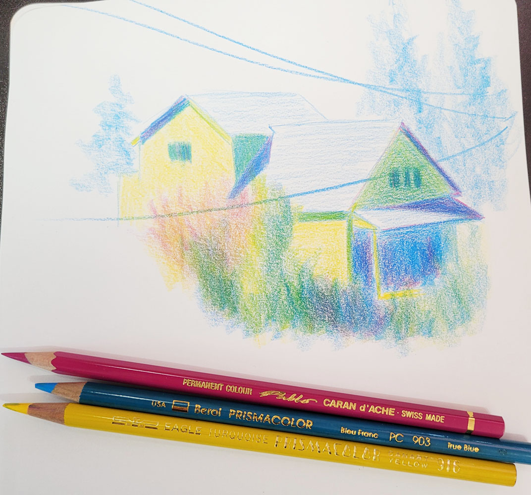
My fascination with color temperature continues. Although this house across the street is more awkward for me to sketch from my studio than the back view I sketch more often, it’s a better subject for studying values as well as color temperature. One sunny morning, I sketched it using my favorite CMYK primary triad (above). The side of the house being hit with full sunlight was an easy place to start with straight-up yellow, the warmest hue. I stayed with that local color (the house is actually a pale yellow) on the shady front of the house, and brought in blue to cool it down. I also used blue in the darkest areas under the porch and cast shadows on the roof. Then I started to add magenta to those areas, thinking the resulting violet would make them darkest, but it warmed up the blue even as it made it darker. As a pure temperature study, the magenta was probably wrong here, but I like the sparkle it added to the shadows. To check the values, I converted the sketch to black and white, below.

Black and white version of sketch above

Several hours later, the sun was almost directly overhead, and some clouds had come in, so there was less contrast between the front and side of the house. This time I thought I’d try a secondary triad, which I knew would be more challenging (below). In retrospect, I think I chose an orange and a green that were too similar in temperature – a cooler green probably would have been better. The rooftops were still in full sun, but their actual hue is a cool gray. I was afraid if I used violet there, they would end up being too dark in value, so I waffled and used green. The only easy part was making the darkest shaded areas and silhouetted trees dark violet, which was clearly the coolest hue.

4/21/22 Same house, early afternoon

Again, to check the values, I converted it to black and white.


When I look at the black and white versions, I think I got the relative values mostly right (at least they “read” correctly). And according to Ian Roberts (and most instructors and books that discuss values), if the values are correct, then the actual hues don’t matter (the oft-quoted “Value does the work. Color gets the attention”). All of this reinforces the basic principles that I learned in Sarah Bixler’s color temperature class months ago: Areas facing the light will be warmer; areas moving away from the light will be cooler. And yet, while I’m applying color, it’s never as straightforward as monochrome values. Maybe it’s just that I’m always simultaneously fighting the urge to use “real” colors.

(Seeing the sketch at the top of the page, a Facebook follower asked if the house really is painted yellow and green! I wish it were . . . then I could just sketch it with “real” colors and be done with it.)


Tuesday, March 8, 2022

Carrots on Sticks

2/10/22
Except on invitingly sunny days (which have been way too few and far between), I haven’t been getting out much lately to sketch, even in my car. But I still catch sketches now and then on my daily walks. As the carrot on my stick, a potential sketch is often the only thing that shoves me out the door on these cold, drizzly, dreary days (you can see raindrops on a couple of pages).


Every now and then we’ve been rewarded with unexpected afternoon clearings. That’s when we take our walk around Maple Leaf Park to see if Mt. Rainier is out. Paying homage to Her Majesty is almost worth the chilly dreariness of February.

2/25/22 Mt. Rainier from Maple Leaf Park

3/1/22


3/4/22

2/20/22
3/3/22


Monday, February 21, 2022

Ten Minutes: My Choice

2/16/22 Maple Leaf neighborhood

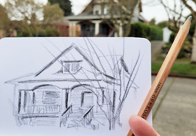
 A recent morning walk took us down a street we sometimes drive but rarely walk. On foot instead of speeding by in a car, I noticed several houses with charming details, like this one with the arched portico (I hope that’s the right architectural term). I started to make a mental note to return when it was sunny and warm so that I could take my time to make a proper color “portrait” in my larger sketchbook. But I realized that by then, the tree would be leafed out, obscuring much of the house. I decided to stop on the spot. I might come back to do a color portrait someday anyway, but at least I had captured the 10-minute version.

I didn’t think about it while I sketched, but when I had finished, I found myself feeling strangely emotional. There was a time when I would have been so intimidated by drawing Architecture (with a capital A), which involves scary stuff like perspective, angles and parallel lines, that I would have either avoided it or waited until I had lots of time – an hour or more – before attempting a house like this.

It wasn’t even very long ago. In 2018 when I had just begun my series of Maple Leaf architectural styles, I was past the intimidation stage, but I still allowed plenty of time because I wanted to measure the angles and proportions, block in the main shapes carefully and measure again. I couldn’t draw a house in 10 minutes, even if I wasn’t intending to make a portrait. Although by then I enjoyed the challenge, drawing houses was never easy.

In fact, it still isn’t; this quick pencil sketch was still challenging. But somewhere along the way in my 10-year drawing journey, I left behind the feeling that architecture was somehow special or different from any other subject. There’s nothing special about houses. It won’t be as accurate, but I can draw one without measuring just as I can draw people in public without gauging their proportions. An amaryllis can be sketched gesturally in a short time or as a carefully observed botanical study. A building, a human body, a potted plant, a tree, a car, a trash can – everything requires close observation to draw accurately, but any subject matter can also be drawn quickly and gesturally. It’s a different intention and approach.

Walking home after the sketch, I felt joy in the liberation: Houses or house plants; 10 minutes or 60: It was my choice. The more I draw, the more choices open to me.

Saturday, September 26, 2020

Inverted

9/22/20 Maple Leaf neighborhood

Here’s a type of architecture uncommon in Maple Leaf (this may be the only example I’ve seen on my daily walks). I wonder what keeps rain from collecting in the “valley” and eventually leaking through the roof? The style doesn’t appeal to me much esthetically, especially in this neighborhood of traditional Tudors and Craftsman homes, but it’s fun to draw from this angle.

I mentioned last month that I was disappointed not to be able to easily continue the Maple Leaf architecture series that I had started a couple of summers ago. Although I don’t feel comfortable now making leisurely portraits of houses from the sidewalk as I used to, this small 10-minute sketch was easy to do and almost as fun. In some ways, it’s a better challenge: How much can I capture with one pencil and a few lines? 

Monday, August 31, 2020

Kitty Corner

8/22/20 Maple Leaf neighborhood

This summer, I had wanted to continue my Maple Leaf architecture series more regularly, especially since I’ve been walking through the ‘hood so often. But it hasn’t been as easy as I had hoped. To see a house well, I like to stand directly across the street, but that means that if a pedestrian came by, I’d have to pull up my mask and quickly move out of the way. As infrequently as that happens in my quiet neighborhood, it still requires keeping one eye on the sidewalk instead of my sketch subject. (Ah, how simple the Before Times were!)

Second Avenue Northeast is the widest of the streets on my route, so it offered this opportunity: a house on a corner, and kitty-corner from it was a parked car that I could stand in front of, safe from both traffic and pedestrians. It’s a nice house, too – I think of it as a quintessential Maple Leaf Craftsman, probably from around the same era as our own.

Perhaps I looked strange sketching from that marginal area, but a couple of friendly nods and smiles came my way, so maybe strangeness is OK, especially in these strange times.

Friday, August 21, 2020

Twin Houses

8/14/20 new houses in Maple Leaf

Toward the end of June, I made a couple of quick sketches of some new houses going up in the ‘hood. Huge compared to most houses in Maple Leaf, they’re also extremely close together. I’ve been wanting to sketch more of their progress, but the street and sidewalk in front of them are narrow, so I haven’t felt comfortable taking too much time there.

I recently discovered that a short alley runs behind the properties, giving me an undisturbed view from the back. The two houses are identical, so I didn’t bother finishing the second one.

Wednesday, August 5, 2020

The Quickly Moving Sun

7/25/20 Maple Leaf neighborhood

Although I’m generally a morning person, it has not been my routine to go out sketching early in the day – until this summer. My neighborhood streets are sparsely populated most of the time, but especially early, so it’s easier to stay out of other pedestrians’ way the earlier I go out.

It has been fascinating to learn how quickly the sun’s angle changes in the early morning compared to the hours on either side of noon. It’s a no-brainer if I were to think about it, but sketching is what brings the matter to a head. For example, if I find a nice shady spot to stand in, that shade might disappear in a matter of minutes. Cast shadows on a house will be entirely different after only five or 10 minutes. The brilliant light around a tree that I was so attracted to might be gone if I spend too much time on a car. I’ve learned that if the light is what I’m interested in, I must capture that first.

One morning, the light on a row of slender bushes caught my eye (above). Other parts of the landscaping and the house interested me too, but I spent most of my time on those bushes before I lost them.

Another day, I had to walk only to the end of our block to see that the low sun was casting both intriguing shadows on the corner house and bright halos on the trees around it. As you might know by now, I tend to be more interested in landscaping than architecture, so after quickly blocking in the house, I started focusing on all the different layers of trees and other foliage. When I went back to finish the house, I got confused by my unclear marks for the shadows and the roof structure, and by then, the shadows had entirely changed. The first sketch below is the result.
 
7/27/20 Maple Leaf neighborhood (original)

After I got home, I looked again at the roof because something was wrong – and I realized I had forgotten to attach the front section to the rear. I tried to fix it (below), but now the shadow is wrong!
 
Roof corrected -- sort of.

The moral of the story: Understand important shadows and mark them clearly before moving on!

Friday, July 31, 2020

The House on the Corner

7/24/20 Maple Leaf neighborhood
More attitude in the 'hood.

I admire this pretty little Tudor house each time I walk by – the turret-shaped roof detail (I’m sure architects have a proper name for it); the weathervane at its peak; the lush, multi-layered landscaping that all but obscures the entryway. Two details I didn’t notice until I started sketching: That the turret is asymmetrical because of the complicated roofline (most of which I conveniently omitted); and that the flag is upside-down.

If I had a flag to put up, I would be flying it upside-down, too.

Thursday, July 16, 2020

Right Before My Eyes

7/10/20 Maple Leaf neighborhood

It was 4:30 p.m. The temperature was 69 degrees. Dragging a kitchen chair out to our front porch, I had about a half-hour before the sun would dip below the edge of the porch roof and hit me in the face. Across the street, our neighbors’ trees were beautifully backlit.

I have seen this view countless times. I don’t know why I had never appreciated it enough to sketch it before this day. My world had to become very small for me to see what has always been right before my eyes.

Friday, July 3, 2020

More Big Ones

6/29/20 Maple Leaf neighborhood

In March when we first began our daily walking routine, we noticed that a new house was going up in the ‘hood. It turned out that two houses are being built on a property that used to hold only one. We could tell early on that they were going to be humongous – and yet extremely close together. (I quipped that the two neighbors could easily use tin cans tied together with string to talk to each other through the windows. Heck, they could hold hands.) The framing of the first one is nearly done; the second is just beginning.

On this morning, I made two small sketches of the first one – once from directly across the street (at left) and once from a side street (below). It’s three full stories in a neighborhood where most second floors are not much more than a dormer.

6/29/20

Thursday, June 18, 2020

Houses of Maple Leaf

6/13/20 Maple Leaf neighborhood

A couple of years ago I began a series of sketches to document the architectural styles of my Maple Leaf neighborhood. Most were “portraits” of individual houses I found especially charming or that exemplified the various styles I see around here. I usually stood directly across the street, and on warm, sunny mornings, it was sheer delight (and extremely challenging, I might add) to spend close to an hour trying to capture these homes.

I continued the series last year, and my intention was to keep going this summer. But now I don’t feel I should stand on the sidewalk for an hour while pedestrians may be trying to get past me safely. Stepping 6 feet away each time I see someone coming is difficult to do while sketching.

I’m undeterred, however. I am taking notes on houses that face in directions that I can find safe spots to stand for a while. And I have also changed my approach to this series. The sketches do not all have to be color portraits as I have made in the past. Quick, small sketches also tell a story, especially when shown together.

Above are three small sketches I made while standing on the corner of Northeast 80th Street and Fourth Avenue Northeast. Eightieth is a busy, noisy arterial that leads to the freeway entrance, so pedestrians rarely walk where I stood. Within 15 minutes, I simply pivoted to make each sketch. I’ll let you decide which one is not like the others, but they all tell the story of Maple Leaf architectural styles.

Monday, May 4, 2020

Learning to See

11/2/11 My view from a studio window

When I first started sketching, I spent a lot of time looking at the work of other sketchers online, and one thing struck me right away. While I was naturally dazzled by the sketches of glorious cathedrals, monuments and other world-famous structures, what caught my attention were all the equally marvelous sketches of ordinary residential scenes. How are these people able to sketch an alley or parking lot and make it look fresh and exciting? What magical power do they possess that makes this possible? As a brand-new sketcher, I knew it would be a long time before I learned that magic, but I was eager to begin.

The sketch above is one of my earliest urban sketches; it’s dated Nov. 11, 2011. Still too self-conscious to sketch from the sidewalk, I took my baby steps by sketching out the windows of our house. It would still be several months before I had the nerve to show up at my first Urban Sketchers outing, but my spirit was willing: I was driven to show my world, one sketch at a time.

Nearly nine years and more than 7,000 sketches later, I have sketched on four continents. My subject matter has included a few world-famous scenes, and it has also included many, many mundane, ordinary scenes.

During those years, I’ve learned techniques and approaches from excellent teachers, many at Urban Sketchers symposiums, that helped me refine and shape the style I use today. As grateful as I am to all of them, none handed me the super power I kept thinking I would eventually find.

It turns out that there is no magic, at least in terms of techniques or tricks. Any sketch I have ever admired – whether it’s of the Eiffel Tower or a fire hydrant; the pyramids of Egypt or a utility pole – was made by a sketcher who had observed so closely and fully that I couldn’t help but see what they saw. That was the “magic.” And it turns out that all those teachers did try to give me the super power I was looking for: Every one of them told me that drawing was about seeing. But I didn’t always understand.

Below is a sketch I made last week. I still have a lot to learn, but now I realize that the most important skill I have to learn is to see. In fact, I now understand that as a sketcher, I have only one job: To observe so closely and fully that I can make anything look interesting, even the mundane. And by observing closely and fully, even those things I see every day become fresh again.

(This post was inspired by Stephanie Bower’s #USkThenAndNowChallenge to look back at our own old drawings, share them and reflect on what we’ve learned since then.)

4/25/20 Maple Leaf neighborhood

Friday, April 17, 2020

Recalling My Graphite Breakthrough

4/10/20 Across the street, Maple Leaf neighborhood

Nearly two years ago, I took a workshop at the Porto Urban Sketchers Symposium from Eduardo Bajzek that changed the way I used graphite as a sketching medium. Much more important, though, was that “Graphite is the Matter” changed the way I started seeing values. You can read the summary of the workshop (linked above), but I’m not sure whether I was able to explain in that post exactly how the change occurred. I think it was one of those light bulb moments, and once the light is turned on, it can’t be turned off. It was truly a breakthrough for me.

At right is a sketch I made from our bedroom window last week. Other sketches shown in this post are from Eduardo’s Porto workshop, Delft last summer, and our snowpocalypse last February.

* * *


7/19/18 Porto
Last week would have been the 11th annual Urban Sketchers Symposium, hosted by Hong Kong. Political strife and potential violence in that city forced organizers to reluctantly cancel the event earlier this year. Ironically, the symposium would undoubtedly have been cancelled this month no matter where it was being hosted. Whether from political unrest or a global pandemic, it seems the symposium this year was doomed.

Regardless, it was heartbreaking when the Hong Kong Urban Sketchers team had to cancel after working hard on the event for nearly a year before making that difficult decision. As an expression of support and solidarity, urban sketchers everywhere posted their sketches from Hong Kong or shared stories of “breakthroughs” they have experienced from being part of Urban Sketchers. This was my story.

7/30/19 Delft
2/11/19 Our backyard

Tuesday, April 14, 2020

East and West

4/8/20 Maple Leaf neighborhood, facing east

4/9/20 Maple Leaf neighborhood, facing west
We have a tiny sundeck off our upstairs bedroom. You’d think I’d be sketching from up there often, especially now that we’re mostly housebound, but the view seems like a cluttered mess that’s difficult for me to sort a composition from.

Desperate times call for desperate compositions, however, so on a gorgeous afternoon last week, I put on my shades and sun hat (yes, that sunny!) to see what I could see. Above is the view toward the east. Much of the foliage looks surprisingly like fall rather than spring – some trees seem to have yellowish-reddish branches before they leaf out. Many trees are still as bare as winter. Then there’s our next-door neighbor’s tree, which is dark red year-round, that dominates my view in that direction. I tried to identify it from Google images. . . maybe a Crimson King maple?

The next morning I went out on the deck again, this time facing west. This view is even messier – layers of houses and cars parked on both sides of the street. I simplified liberally.

Related Posts Plugin for WordPress, Blogger...