Saturday, March 31, 2012

Rolling Hills, Not Rockets

Sketched on 2/27/12, #6, "C", F-C Big Brush
One of the most annoying and frustrating things about learning a new skill is that my progress is not progressive or incremental over time. When I was working on 100 self-portraits, I would draw several that seemed better than the previous several, but then I would draw many that seemed worse than earlier efforts. Now with my 100 hands, I’m finding the same uneven progress: A few good ones, a few significantly better ones, then definitely a bunch of lame ones followed again by some improvement. I want a straight upward trajectory, not a horizon of gently rolling hills.

That this (most likely common) frustration is even coming to light for me now, at the age of 53, must mean that I haven’t spent enough time in my life learning new skills, at least the kind in which progress is easily apparent. When I think of the decades I spent in school and then in the workplace, I’m assuming I learned a few things, and I’m also assuming my progress was made in the up-and-down manner of rolling hills rather than a rocket. But it didn’t feel frustrating in the same way because my increasing smartness wasn’t apparent.
Sketched on 3/12/12, #38, Akashiya Sai brush pen

Friday, March 30, 2012

Speed is of the Essence

Sketched on 2/22/12, F-C Pitt Artist Pen 
I began making art with beads as my primary medium. I’m not talking about beads strung on a cord – I’m talking about glass seed beads less than a millimeter in diameter that are stitched together with a needle and thread. Needless to say, using this medium means that progress toward completion is measured not in minutes or hours but in weeks or months.

Although I’ve seen the work of artists whose drawings clearly can take weeks or months to complete, I’m not one of them. As a beader, I am hugely relieved if I finish a sketch in less than an hour. In fact, because my objective is to sketch from life, I want to be able to draw as fast as possible while still capturing the essence of a scene. People in coffee shops eventually get up and leave, and I never know if they are there for a quick break or two hours of free Wi-Fi, so I sketch them as quickly as possible. Even a few seconds of sketching time might not be long enough for birds pecking moss from the sidewalk. Pedestrians aren’t around much longer than that, either. Trees and buildings tend to stick around longer, but even so, it might start raining at any moment.

Typical of most of my coffee shop sketches, this one was completed in about 10 minutes.

Thursday, March 29, 2012

Blind Contour

Sketched on 1/23/12, Copic Multiliner SP pen
A well-known drawing technique called blind contour requires the artist to look only at the object being drawn and avoid looking at the paper. The sketch should be completed with a single, unbroken line, so lifting the pencil or pen from the paper is avoided. Modified blind contour drawing allows a bit of cheating, like peeking at the paper infrequently and lifting the pencil a few times. This is a modified blind contour self-portrait (No. 55 in the series).

Wednesday, March 28, 2012

Learning to Walk

At Green Lake the other day, the first truly spring-like day of the year, I sat on a bench with the intention of sketching people enjoying the day on the walking path. This was one result.
Sketched on 3/24/12, Sakura Koi watercolors, Copic Multiliner SP pen
I wasn’t happy with the “keep-on-truckin’” look of the walkers’ legs, so I decided to forget about sketching people. Instead, I spent a couple of hours filling three spreads in my sketchbook with a series of gestural sketches, attempting to capture nothing more than the motion of walkers and runners (both the two-legged and four-legged kind). It occurred to me that it was the first time I had thoroughly observed the mechanism of humans walking: The front leg is nearly straight, while the back leg is just starting to become straight after flexing. Runners’ legs, by contrast, both appear to be bent simultaneously at a sharper angle than walkers’, and their torsos lean forward slightly. Their arms are usually bent at a sharper angle, too.

At the end of the two hours, I had summarized what I had learned into these two gestural sketches. Not the Green Lake scene I went for, but a good drawing lesson, just the same.

Tuesday, March 27, 2012

Drawing and Yoga

Sketched on 1/18/12, Copic Multiliner SP pen, watercolor

Remembering the past and anticipating the future are generally where most of our minds live. I’ve been taking a weekly yoga class since mid-2010. It took me the better part of a year to get to the point where I could somewhat successfully exist, at least for that yoga class, in and for the moment instead of in the past or future. Even so, even during my most relaxed and meditative shavasana moments, my mind has been known to drift off into thinking about a conversation that went badly or wondering what I’ll have for dinner.

It turns out that drawing is my best form of yoga. Betty Edwards, author of the well-known book Drawing on the Right Side of the Brain, believes that the ability to draw is predicated on having access to a part of the brain that receives information unfiltered by cognitive concepts that we all naturally learn in order to function. I didn’t fully understand Edwards’ theory until the moment I realized I was doing it – drawing and apparently getting access to that part of my brain – because I no longer saw a banana as a banana; it became a collection of lines, shapes and shadows. And I recognized it because it feels like the ideal shavasana: no past, no future, only here and now. So if the state of shavasana could be manifest on paper, it might look like this.

Monday, March 26, 2012

Still Life with Bananas

12/28/11, Copic Multiliner SP pen, watercolor
In the past five years or so, I’ve taken several drawing classes. Inevitably they involved the instructor setting up a still life made up of a few boxes, some draped fabric, a dusty vase or bowl from a thrift store and a lamp to cast strong shadows. Intellectually I understood the value of drawing this type of still life. But in my head, the voice was saying, “This is friggin’ boring. These dusty vases have no meaning to me. Isn’t there a more fun way to learn this? I’m hungry… I wonder what time we break for lunch.”

I’ve come to realize that those still lifes weren’t inherently boring or uninspiring. I was the one who was bored and uninspired because I was looking at them from the outside – an arrangement of commonplace, meaningless stuff that looks similar to commonplace, meaningless stuff I’ve seen before. To draw a still life successfully (and I define success as finishing the task while remaining fully engaged), I have to look at it from the inside.

Imagine you are a worm inside a banana. You can’t really know the shape, consistency or color of that banana until you crawl around for a while. And if you were really a worm, you wouldn’t even be identifying that object as banana. It’s just the three-dimensional space around you with a particular form, color and texture. If I look at any object with a crawling-around attitude, it becomes something to visually explore (line line line curving line dark spot) rather than identify with a label (bananas on the counter = boring and uninspiring). And the magical part about visually crawling around is that the banana I’m drawing no longer looks like every other banana I’ve seen (or tried to draw before). It becomes a unique collection of specific lines, shapes and shadows, and suddenly I’m fully engaged.

Sunday, March 18, 2012

Rendering Accurately

Sketched on 2/21/12, Kuretake brush pen, Moleskine sketchbook
A couple of years ago I took an art class that ran for several weeks, and I sat next to a young woman who was a graphic designer. One day, I said to her, “If you’re a professional designer, you probably already know how to draw well,” to which she responded by shrugging and acknowledging that her drawing skills were sufficient for getting her work done. I then started saying that my drawings always looked wonky, the perspective was off, things didn’t look right, etc. (my usual list of complaints about how I “can’t draw”).

She listened patiently, thought a moment, and then said, “If all you want to do is to render things accurately, anyone can learn to do that. There are all kinds of mechanical tricks and techniques you can learn to make an accurate drawing.” Then she said, “But just because you render something accurately doesn’t mean you have anything to express.”

Whoa. The proverbial sledgehammer to the head. Suddenly I understood the difference between an accurate rendering and an expressive drawing.

In the spirit of expressive drawing, I made the self-portrait above, number 100 (finally!) in the series, without a mirror.

Jury Duty

Sketched on 2/28/12, Faber-Castell Big Brush markers, colored pencil, Moleskine sketchbook

I was summoned to jury duty at the end of February. Long hours of sitting around at the City Municipal Building, waiting to be put on a jury – an ideal sketching opportunity! My bag full of surreptitious art supplies, I had a field day (and I never did get to serve on a jury).

Sketched on 2/28/12, Tombow marker, Hand Book sketchbook
Sketched on 2/28/12, Tombow markers, Hand Book sketchbook

Product Review: Magellan Classic Travel Vest

Last November Don Colley gave a demo of Faber-Castell Big Brush Artist Pens at Seattle’s Daniel Smith store. In addition to being dazzled by his amazing drawings done with these pens, I was intrigued by a multi-pocketed vest he was wearing, which enabled him to have his art supplies close at hand without having to lug a huge bag around. Given that he likes to sketch in public places, the vest allows him to be discreet.
 

I immediately decided I wanted a vest like that, too, which would enable me to sketch outdoors unencumbered. I found that a number of online stores offer multi-pocketed vests, usually to facilitate travel. But the essential component to my vest would have to be at least one pocket large enough to accommodate my Sakura Koi 24-color watercolor box. I e-mailed makers of several candidates (TravelSmith, Scottevest, Magellan, Lands’ End, L.L. Bean) to get the exact measurements of the pockets (manufacturers seem to think that saying “large pockets” in their marketing copy is somehow sufficient data).

After receiving detailed information from customer service that at least one pocket would have the right dimensions, I finally settled on the Magellan ClassicTravel Vest It seems reasonably well made for the price.

Shown in the photo, I’m wearing it fully loaded with my essential supplies. It’s zipped all the way up in the photo, but when I was out in the field, I unzipped it and fastened only the snap at the center front (a very nice touch – without it, the unzipped vest would gape open from the weight of the supplies), which allowed easy access to the inner pockets.

I have pens and waterbrushes in one lower pocket, and a pocket-size Moleskine sketchbook in the other lower pocket. (I show everything sticking out so you can see them, but they all fit nicely inside, and the Velcro flaps close easily over them.)


In the inside pockets, you’ll see my Koi watercolor kit in the largest (the only one that would accommodate it, but it fits easily without struggle), and Tombow, Akashiya and other markers in the second large/tall pocket. One small pocket holds folded paper towels. I could have put my smartphone and wallet into the two upper outer pockets, but I didn’t want all that bulk, so I put my phone and wallet in a small passport wallet that I take on short hikes, and that worked out well.

One downside is that the nylon fabric does not provide any insulation. I tried it on over a jacket, and it felt too tight and bulky, so I wore it with only a turtleneck and thin fleece hoodie underneath. I spent nearly three hours at the zoo sketching all the animals I could keep up with (therefore, mostly only the lethargic or sleeping ones!) and froze my tush off! But that bodes well for the late spring and summer – it probably won’t be too warm to wear over a T-shirt.

In summary, I love it! It meets all the needs I got it for. I’m looking forward to trying it out at a farmer’s market or other crowded public venue, where it is especially difficult to carry a big bag while also trying to juggle a sketchbook and paint box.

Product Review: Akashiya Watercolors

While browsing around JetPens.com, I recently stumbled across a set of Akashiya watercolors, which are apparently made to emulate traditional Japanese watercolors used by sumi-e painters. I have fond childhood/teen memories of watching my mom learn (through a correspondence course with a sumi-e master in Japan) to paint with sumi-e, and she occasionally used color from a small set of traditional colors. Riding a wave of nostalgia, I impulsively ordered the 24-color set.

The first thing I noticed when I opened the box was that the colors in the palette looked dark and blah. I know most watercolors look very different in the pans than they do wet, but what – five shades of black? To my surprise and delight, some of those “blacks” ended up being very light, bright hues.

Compared to my Yarka and Sakura Koi watercolor sets, the Akashiya seem more transparent. The splotch I circled in the second row looks white in the pan, so I assumed it was the equivalent of the tube of white gouache that’s sometimes included in watercolor sets. But as far as I can tell, even this white is mostly transparent, so it lightens a value without giving it opacity.

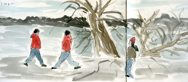
The palette is very different from most off-the-shelf palettes I’ve seen. It’s actually somewhat similar to my Sakura Koi box of 24 colors, and a couple of the blues and greens are really nice. (No brown at all – I suppose that’s the easiest to mix – and only one yellow.) So I’m delighted to try out some new hues. Most of the flowers in the sketch below came straight from the box – hardly any mixing. This set is going to make me lazy!
Sketched on 3/10/12, Akashiya watercolors, watercolor paper
Oddly enough, the palette includes a metallic gold and metallic silver (lower right). I don’t know how much use I have for those, but they’re unusual. One other thing to note is that the square pans are not attached to the palette – they are all individual boxes that come out of the cardboard tray (really just a shallow box) they come in. The whole box is not at all portable, since it’s too large to hold in the field (and if you drop it, all the individual pans would come flying out).

Overall, I’m happy that I gave in to my impulse and am looking forward to exploring these thoroughly transparent colors.

Applied Art

Faber-Castell Pitt Big Brush pens, watercolor paper

Except for the ones you see here on my blog, most of my drawings stay in my sketchbooks. Two recent drawings were made for specific audiences and purposes. The first is a manga-style holiday greeting card. I’m not sure what inspired me to try my hand at manga cartooning – I’ve never read more than a couple of manga books, and cartoons in general are not my interest. Maybe I just wanted to see myself with big eyes.


Faber-Castell Polychromos colored pencils, watercolor paper

The second is a Valentine card to my spouse-man.


100 Hands


Sketched on 3/2/12, "I," Tombow markers, Stillman & Birn Alpha sketchbook

After finishing the 100 self-portraits marathon, I immediately embarked on a new method of masochism, this time based on my struggle to draw hands accurately: sketch my own hand 100 times. A twist I added to this series is that I’m using the American Sign Language alphabet as the basis for at least 26 of them (no, I don’t use AMSLAN, but I once studied it years ago, thinking I might become an interpreter).
Sketched on 2/27/12, "A," Micron Pigma pen, gouache, watercolor paper

Fueled by Caffeine


Sketched on 2/16/12, Copic Multiliner SP pen, Tombow markers, Moleskine watercolor sketchbook
One of my favorite places to sketch is inside coffee shops. With all that free wi-fi, people stare at their laptops, motionless for minutes at a time. They make ideal sketching models. Trying to sketch hands typing on laptops, texting on phones and holding coffee cups led to my next self-assignment: 100 hands.

Sketched on 2/16/12, Tombow markers, Moleskine watercolor sketchbook 

Sketched on 2/16/12, Tombow markers, Moleskine watercolor sketchbook

Sketched on 2/22/12, Tombow marker, Hand Book sketchbook
Sketched on 2/25/12, Copic Multiliner SP pen, Moleskine sketchbook
Sketched on 3/1/12, Tombow marker, Hand Book sketchbook

Urban Sketching

I have admired the sketches of artist and journalist Gabriel Campanario ever since they started appearing weekly in The Seattle Times. Known as the Seattle Sketcher, Campanario takes even the most iconic, widely photographed Seattle scenes, like the Pike Place Market, and gives them his fresh, personal perspective that no camera can capture. I was so inspired that I decided I wanted to become an urban sketcher myself.

(See the remarkable Urban Sketchers website for more information and inspiration. And see my review of Campanario’s equally inspiring book, The Art of Urban Sketching: Drawing on Location Around the World.)

“Urban sketching” is defined by the Urban Sketchers website as “on-location drawing.” At this point, not quite spring in Seattle, my outdoor urban sketching experience is mostly theoretical. I’ve been out a few times to sketch at the zoo and park, shivering in my down parka, but mostly I sketch on-location from inside my car. This was sketched while waiting in the ferry line on Orcas Island, Sept. 25, 2011 – officially my first urban sketch.

Sketched on 9/25/11, Faber-Castell Pitt Artist Pen, watercolor, watercolor paper
I sketched this one while riding the No. 66 Metro bus from downtown to Northgate.


Sketched on 2/28/12, Pigma Micron pen, Hand Book sketchbook
This was sketched at the Woodland Park Zoo on a cold but sunny day.

Sketched on 2/23/12, Copic Multiliner SP pen, Akashiya watercolors

100 Self-Portraits


Sketched on 11/17/11, Faber-Castell Pitt Artist Pen, Moleskine sketchbook

Several years ago when I was working toward my certificate in fiber arts from the University of Washington Extension Program, instructor Layne Goldsmith gave the class an assignment to draw 100 self-portraits. We all moaned and groaned (“What does this have to do with fiber arts??”), and I think I finished only a dozen or so at the time. (Fortunately, it was only a certificate course, so she couldn’t fail me for that unfinished assignment.)

Given that the human face is one of the most challenging subjects to draw, I decided to finish that long-ago abandoned assignment. I bought a small easel-back mirror, and for several months, looked at my face more closely than I probably ever have. (Believe me, there is nothing quite so humbling as drawing a self-portrait.) My goal was to finish 100 self-portraits and be able to find at least one among them that resembles my face enough that I could post it on Facebook as my profile picture, and my friends would recognize me.

The portrait above was sketched on Nov. 17, 2011, one of the first in the series.
Sketched on 1/25/12, fountain pen, Supracolor water-soluble pencil, watercolor paper

This one, No. 64, drawn on Jan. 25, 2012, ended up as my Facebook profile picture.

My $160 Commitment


A few days after I started drawing, I paid $160 for a handmade, leather-bound sketchbook (made by Susie Shipman, Island Bound Books). It is one of the most beautiful hand-bound books I’ve ever seen. It’s about 7 x 7 inches with 160 pages (that’s 320 big white surfaces to draw on).

Although I saw immediately that the book was worth every penny, the price was a bit of a financial gulp for me, and that’s why I bought it without hesitation. I knew that if such a beautiful, handmade, expensive sketchbook sat in my studio unused because I had quit drawing, I would be guilted into drawing again. I also knew I had to "initiate" it as soon as possible, or I would be stifled by growing intimidation. So I simply opened it to the first page and quickly sketched a little polymer clay figure (made by Annie Miller) on my desk. (It's kind of like when you have a new car... once you get that first ding, you can just relax and enjoy it.)
Sketched on 10/10/11, pencil and watercolor on watercolor paper

With relief and a strong sense of satisfaction, I filled the last page on March 9, 2012. That little sketchbook seems even more beautiful now, not because of the sketches in them but because it represents a commitment.

Erasers are for Weenies


Sketched on 10/14/11, pencil on watercolor paper

Like most people learning to draw, I started out using a pencil – light, tentative lines that could be easily erased.

But authors of several books I’ve read insist that you learn more from your drawings if you don’t erase. Make a bold, dark, indelible line, they say, and if you don’t like it, “restate” the line. In other words, erasers are for weenies. Huh. I wasn’t sure, exactly, what I’d learn from all those “restated” lines. But I had to admit that erasing and redrawing was taking a lot of time, and when I’m sketching people going about their business, such as in a coffee shop, they tend to get up and leave eventually. If I’m spending more time erasing than sketching, I won’t have much to show for in my sketchbook.

If I look at it philosophically, it goes like this: Erasing implies that the original line I made was a “mistake,” which erasing and redrawing would “correct.” But for something to be a “mistake,” a “correct” answer must exist. In my sketchbook, I knew a “correct” answer of any kind would not be found. Thus, erasing wasn’t necessary.

Sketched on 3/8/12, Akashiya Sai brush pen on Global Art Materials Hand Book
So I took those authors’ advice (and my philosophical attitude) to heart, and about a month after I started drawing, I stopped using an eraser. In fact, for the most part, I quit using a pencil, since if I couldn’t erase, there were other media I preferred, such as mechanical drawing pens and brush markers. (When I occasionally do sketch with a pencil, I still don’t erase.) This guy working on his laptop was wearing a “restated” ski cap, not a turbin. 

Practice


Sketched on 9/24/11, Faber-Castell Pitt Artist Pen on watercolor paper
When I was a child, I took piano lessons for several years, but I never learned to play well, nor did I enjoy it. Why? Because I hardly ever practiced. If I had, my playing probably would have improved, and maybe I would have enjoyed it more. This is kind of a big duh, but if you don’t practice, it’s hard to get good at something, anything, that requires skill.

Drawing well requires skill, but I don’t believe people are born drawing well any more than they are born playing the piano well. People who draw well practice a lot, and I would bet they practice because they enjoy it (maybe they enjoy it so much, it doesn’t seem like “practice” the way my piano practice did).

I decided to test this theory. During my previous failed attempts at drawing, I usually set myself up for failure by resolving to “learn to draw.” This time, instead of making a resolution, I simply made a commitment to draw every day. Guess what? I’m getting better! More important, I’m enjoying it! So much so that it doesn’t feel like “practice” at all.

This glass mug was drawn on the third day of my commitment.

Edited 7/9/14: This interesting article was just brought to my attention: "Why Are Some People Better at Drawing Than Others?" The article's concluding comment: "There are few human skills which don't improve with practice."
Related Posts Plugin for WordPress, Blogger...