Showing posts with label Sakura Koi watercolors. Show all posts

Tuesday, April 11, 2023

Review: Sakura Koi Watercolor Set


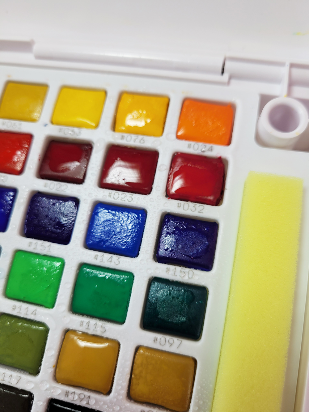
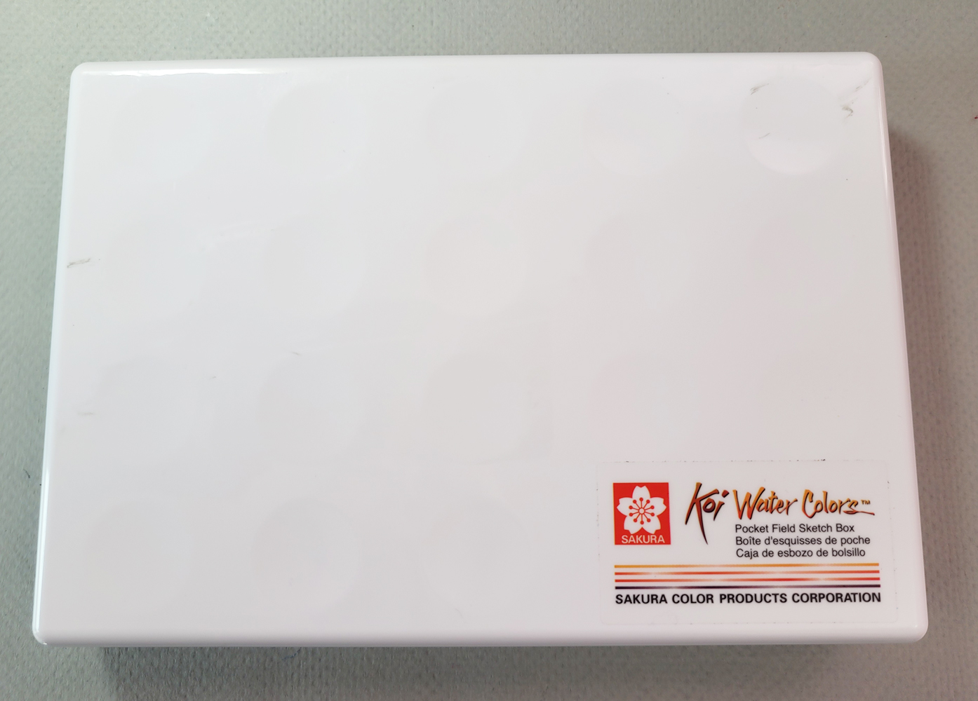
The 48-color Koi set measures 8" x 5 1/2" x 1.1"

You may recall from my review of the Color Meditation Deck that the author had recommended “getting the biggest set of watercolors/gouache you can afford.” This surprised me, as it is contrary to what most watercolor instructors and books advise. Of course, author Lisa Solomon is not teaching watercolor painting; the objective is not necessarily to learn how to mix colors. The paints are just a vehicle for being in a relaxed state of mind that nurtures creativity.

You can read my review to learn why I didn’t want to create a palette with lots and lots of watercolors, but I could see that following the prompts would be more spontaneous if I did have lots and lots of watercolors. In short, I wanted the watercolor version of a large set of colored pencils!

I looked at several such sets of watercolors (many of which are intended for kids), and in a somewhat ironic and humorous turn of events, I ended up getting the Sakura Koi Pocket Field Sketch Kit of 48 colors. It’s ironic because the 18-color version was the set I started urban sketching with. Simple and compact, it served the immediate need, but it didn’t take me long to realize that the paints weren’t high quality. I quickly moved on to making my own mini palettes with high-quality tube watercolors in mint tins. (And unfortunately for my current need, I gave away the smaller Koi set.)

Ordering the set, I chuckled to myself that I had come full circle. The Koi set hadn’t met my needs at the time, but here I was buying another, much larger set of the same mediocre paints because they were exactly what I needed for a different purpose.

(If you’re thinking that 48 is a ridiculously large number of watercolors to have in a palette, take a look at this: The Koi set is also available with a whopping 96 colors! It’s hard to imagine how I resisted that one, right?)


Below are the swatches for the 48 colors. As you can see, many colors are so similar that they are redundant, and 36 or even 24 are probably sufficient for my current needs. And 96 would be outrageous! Yet it’s beautifully satisfying to see a palette of 48 watercolors (I admit, 96 would look even more dazzling, but I draw the line here). It’s as close to a box of colored pencils that I will ever have in watercolor form!
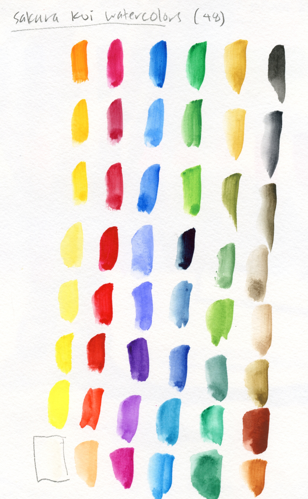

The paints aren’t as bad as I remember them being (or as bad as others told me they were). Certainly, they aren’t artist quality, but they are ideal for the “coloring book” method of urban sketching that I was doing at the time – drawing the picture and coloring it in – as opposed to “real” painting.

The paints may not be the best, but two accessories consistent in all the Koi sets make them a good value. One is the ingeniously designed, two-part waterbrush (which can be purchased separately). Although I prefer the Kuretake waterbrush for general use, the Koi brush comes apart, and a cap for the water compartment keeps the water contained. Disassembled, it’s an extremely compact waterbrush that fits perfectly in the palette box’s compartments. (The Japanese are clever about designing practical products for small living spaces in their tiny island nation.) After I gave away my first Koi set, I got a separate Koi brush that ended up being ideal for my teeny, tiny sketch kit (still a work in progress, by the way).

The ultra-compact, 2-part waterbrush fits perfectly inside the box.

The second useful accessory is the mixing tray, which has pegs that fit into holes in the paint palette. When I gave away the paints, I kept the tray and have used it at my desk ever since. It takes up little desktop space while offering plenty of mixing compartments.
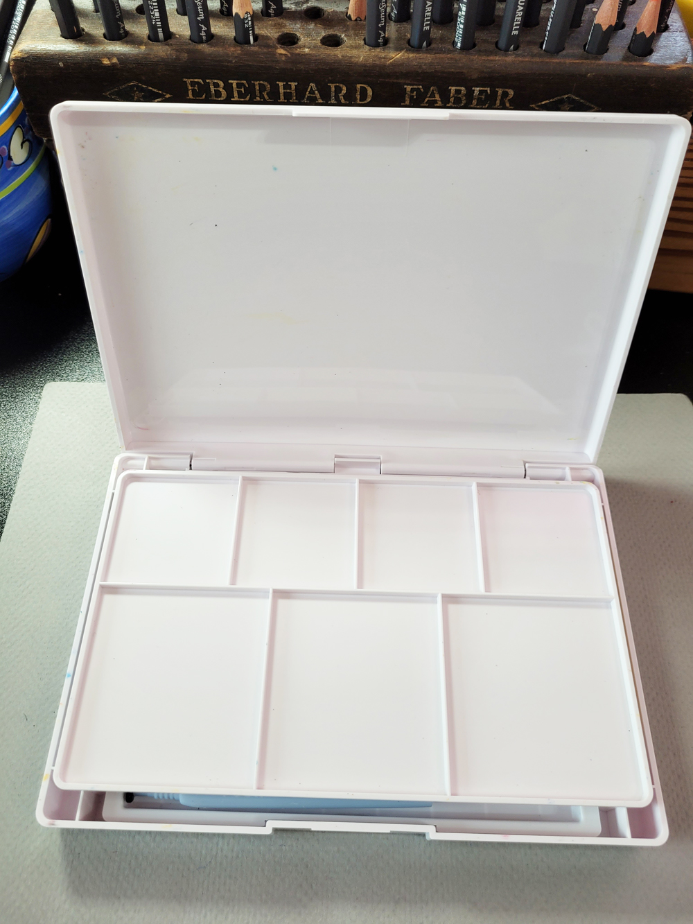
The useful mixing tray sits over the paints.

Although it’s unlikely that I’d ever carry this Koi set on location, its portable, compact design appeals to me in many ways. Alas, it’s not so small that it fits inside my “downstairs studio” portfolio, so I’ve had to break my policy of bringing downstairs only those supplies that will fit into it. Even so, its slender case stands like a book next to The Color Meditation Deck and the portfolio, taking up little additional space. It’s liberating to pop it open and use it almost as spontaneously as colored pencils.
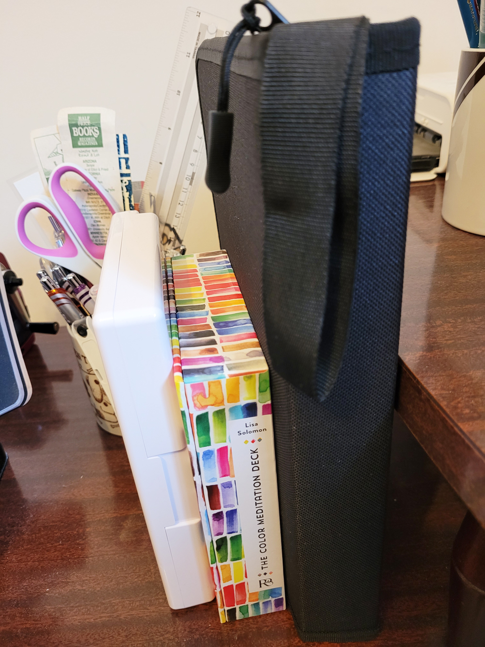
The Koi box (left) fits like a book next to the Color Meditation Deck and my "downstairs studio" portfolio.

Almost as spontaneous as colored pencils!

Tuesday, March 12, 2013

Coming Full Circle


Sketch kit with Koi watercolor box lid as mixing tray.
Not too long after I began sketching, I acquired a Sakura Koi portable watercolor set with 12 colors (and eventually the 24-color set as well), which I knew would be my key to urban sketching. Indeed, it did open up the world of portable paints, and I used that trusty little set all the way through last spring. I liked it so much that I researched the pocket sizes of a number of travel vests to find one with a pocket large enough to comfortably accommodate the box.
 
Once summertime rolled around and I was spending most of my free time sketching outdoors, the Koi kit was no longer cutting it. For one thing, the paints weren’t as concentrated as I wanted. For another, the kit required having a place to set it down as I sketched, which usually meant I had to find a seat. This crimped my style because many of the places in which I like to sketch (such as the zoo) didn’t accommodate chairs or stools well.
 
Thus began my quest for a portable sketch kit that I could attach directly to my sketchbook so that I wouldn’t have to support both the kit and the sketchbook while standing. I eventually developed such a kit with a mint tin and the miracle of Velcro.
 
Akashiya Sai mixing palette
The attachable watercolor kit met my needs almost perfectly. But the rub was always with the mixing palette. Up until last month, I used a small, plastic Akashiya Sai palette of petal-shaped wells (shown at right) that was ideal in size and weight, but the absence of an actual mixing surface was a severe shortcoming. I managed to muddle by, but it partially explains why so many of my sketches have washed-out, wimpy colors (lack of painting skills accounts for the rest).
 
Finally fed up with that limitation, last month I began a fresh quest for the ideal mixing surface. I decided to try the switch plate cover idea (shown below) that I had heard mentioned in various art forums and blogs. Although the indentations and marks on the back side of the switch plate cover kept catching my brush hairs, only one mixing area was large enough to work well, and its cream color gave me slightly inaccurate hues, it was a serviceable (but not ideal) solution.
 
Switch plate cover mixing palette
Fast-forward to last night: I hadn’t used either of my Koi kits in nearly a year, so I decided to clean them up and possibly offer them to someone who might use them. As I scrubbed the inside of the lid of the 12-color set, which serves as a mixing area with divided sections, I had a light bulb moment. The lid is less than a half-inch wider than the switch plate cover and about the same weight. If I could detach it from the box – voila!
 
The Japanese-made Koi box has a fairly high-quality hinged lid that wouldn’t simply snap apart. But spouse-man Greg likes to take things apart and is good at it, and I knew he’d have the right tools. In a few minutes, he had the lid off – and I think I now have the ideal mixing palette for my portable sketch kit: lightweight, the right dimensions, and with smooth, white, divided wells (shown at top). So I’ve come full circle with the Koi kit – but in a redesigned form.
 
Finding the ideal solution gives me goose bumps!

Edited 8/31/13: The evolution continues! Take a look at the Van Gogh mixing tray I'm using now.

Sunday, December 30, 2012

Looking Back on a Year of Sketches


6/4/12 Tombow marker, Hand Book sketchbook
This morning Gabi asked sketchers on the Urban Sketchers Facebook page to post their most memorable sketching experience of 2012. I started going through my scans of sketches from 2012, and each one called up so many vivid memories that I had difficulty choosing one to post. In fact, memories isn’t even an accurate term for the recall I experience when I look at my own sketches. I’m sure neuropsychologists or other people who study the brain could explain this phenomenon: The act of sketching embeds all kinds of sensory data along with the sketch – not just the visual data needed to draw, but also the smells, sounds, textures and everything else going on around me, even if I’m not consciously paying attention to them. So when I see the sketch, all the rest of the sensory data gets replayed along with the sketch. I’ve heard many sketchers describe this phenomenon, so I know it’s common – maybe even universal.
5/20/12 Pitt Artist pen, watercolor

The sketch I finally chose to post on Facebook was this series of gestural sketches of pelicans I made at Marina Del Rey in L.A. last June on a beautiful, sunny, warm morning. Summer hadn’t yet begun in Seattle (and wouldn’t for another month or more), so sketching outdoors wearing a T-shirt and sandals was something I had only dreamed of. This sketch evokes the cool breeze, the smell of brunch still being devoured by the rest of my party at the marina restaurant, the sound of the pelicans’ cries – and the promise of summer sketching!

But I could have just as easily picked this sketch at Magnuson Park – my very first Seattle Urban Sketchers sketchcrawl – in the rain (shivering; wondering where the nearest restroom was). Or this busker at Phinney Farmer’s Market, where I sketched nearly every Friday afternoon (the scent of fruit and pizza; the buzz of bees around the raised flower bed where I liked to set my paint box).

I wonder how I recalled anything I ever did before I began sketching!
7/6/12 Copic Multiliner SP pen, watercolor, Moleskine sketchbook

Friday, October 12, 2012

Greeting Card Sketchbook


Greeting Card Sketchbooks
Ever since I stopped using a designated “sketch bag” and integrated my sketching supplies into my regular, everyday purse, my general habit has been to carry a 5.5” square format Hand Book journal most of the time as my catch-all sketchbook because it’s a good compromise between portability and a decent page size. When I know I’m going to want more page space or higher quality paper, I grab a larger format Stillman & Birn or other sketchbooks. But as a general rule, I don’t carry my preferred sketchbooks day to day because they add quite a bit of weight and bulk to my already-heavy bag.

When I signed up for the Sketchbook Project, I wanted to make sketches in that book in the same way that I make sketches in my other sketchbooks – that is, I didn’t want to deem it “special” in any way, because if I did, I knew that would make me self-conscious, intimidated, whatever – a certain kiss of death. So to keep it un-special, I decided to carry the 5” x 7” Sketchbook Project sketchbook continually in my purse until I’ve filled it. (Here are a couple of my first sketches in the book. Edited 12/19/12: Here's the post about my completed sketchbook.) Part of my decision to do this was determined by the fact that it contains only 32 pages of very thin paper with flimsy chipboard covers, so it’s light as a feather. (As a bonus, the stapled binding opens flat, which is a requirement for any sketchbook I use, and the page size is very comfortable, despite the crappy paper.)

As a result, I’ve been using the Sketchbook Project book in very un-special ways –sketches of the backs of heads on buses, parked cars while I’m waiting for my spouse-man to shop at the hardware store, etc. – exactly as I had intended. And I realized I’ve been leaving even my 5.5” square Hand Book at home when I’m just running errands or going to work because I know the Sketchbook Project book is in my bag already.

All of this prompted me to rethink the concept of the everyday, catch-all sketchbook, and I decided I need something like that very thin, lightweight, flat-opening Sketchbook Project book – but with better paper. The result: the Greeting Card Sketchbook.

First off, I should say that I’m not a bookbinder. I love looking at handmade books, I’ve purchased a few handmade books, I own a collection of books about bookbinding and showcasing handmade art books and, at various times in my life, I’ve taken bookbinding classes because I love the idea of making my own books (although in practice, I don’t enjoy all the careful measuring, gluing and cutting that traditional bookbinding requires).
One of my Coptic-bound books.

When I started sketching last year, in a brief burst of rekindled enthusiasm, I idealistically decided I would make all of my own sketchbooks for the rest of my sketching life because it seemed like such a perfect integration of media and message – hand-drawn images kept in handbound books. To that end, last winter I did a little research on binding formats that would produce a flat-opening page and determined that Coptic binding would suit me best. After taking a workshop in Coptic binding, I made three books that I’m pleased with. But they took quite a bit of time to make, and I realized that I’d rather spend the time sketching than making the books. However, I also learned that the process of hand-stitched bindings is a snap, so I filed that away in my mind for future reference.

Fast-forward to this week, when I was enjoying how lightweight my bag is with that thin, flimsy sketchbook, and I began in earnest to come up with a simple – defined as non-time-consuming and using materials I already have – solution to meet this need.

I pulled from my bookshelf Gwen Diehn’s The Decorated Journal, which I recalled had easy instructions for the pamphlet stitch binding (which, similar to Coptic, allows the page to open flat). I took a sheet of 100-pound, 18” x 24” Canson Biggie watercolor paper, which I happen to have a stack of, and tore it down to eight 6” x 9” sheets. I folded each sheet in half, yielding a comfortable 6” x 4.5” page: a fast and easy single signature.

But what to do about the covers? (I had made collaged and painted covers for my Coptic books that took more time than I wanted to spend on this project.) I dug around in my box of collage materials and considered old calendar covers, decorative boxes, cardboard and other materials that could be cut down. But what caught my eye was right on my desk – a greeting card with a beloved image of a rabbit from a painting by Koo Schadler (at top of page). Would it be too good to be true for the card to be the right size, without even cutting it down. . . ? It was! And a reused material, to boot!

Nothing spurs me on like the serendipity of art materials, so I pulled out my bookbinding tools (that burst of enthusiasm last December wasn’t wasted after all), and in literally a few minutes, I punched and sewed up the pages and covers into a thin, lightweight sketchbook. And since I already had all my bookbinding tools out anyway, I decided to make a second one, below (the card image is from a folding screen by an unknown Japanese artist from the Edo period). This time, I first trimmed a half-inch off the full 18” x 24” sheet before tearing it down, which made the signature fit perfectly between the covers.

Whether the greeting card covers will hold up to daily hauling and handling remains to be seen. But since the book contains only 32 pages (and I’ve been known to fill a 124-page, 5.5” x 8.5” Stillman & Birn sketchbook in a month), how long does it have to last?

Edited 12/19/12: I just finished filling my first Greeting Card Sketchbook, which has been in my bag continually for about two months. The corners of the covers are a tiny bit dog-eared, but because the covers extend slightly beyond the edges of the pages, the pages themselves are not worn at all. I even got a cover a little wet once, but the heavily varnished card stock held up well and wiped off clean without leaving a mark. Downright sturdy for a book made from a reused card! I'm going to go make a few more.

Edited 6/26/13: The Greeting Card Sketchbooks weren’t as durable as I initially thought; see “Catching Up with the Catch-All Sketchbook” for the follow-up report.

Edited 8/11/13: I’ve rediscovered the joy, value and practicality of a handbound sketchbook.

Edited 10/5/13: I've developed a refinement to the Greeting Card Sketchbook.

Edited 10/20/13: Now that I’ve streamlined the process, I’m officially hooked on bookbinding.

10/12/12 Copic Multiliner SP pen, watercolor, 100# watercolor paper in handbound Greeting Card Sketchbook

Wednesday, June 27, 2012

Portable Sketch Kit, Part 2: Velcro is the Key

When it comes to rigging up a portable sketch kit, Velcro is the key*. After devising a tiny paint box made from a Trader Joe’s mint tin and Daniel Smith watercolor sticks, I had to resolve the issue of juggling the paint box, mixing palette and sketchbook when sketching while standing up. Here’s my solution.

Velcro attached to tin and name plate.
I attached a small strip of industrial-strength Velcro to the bottom of the paint box (unfortunately, this means I had to remove the color swatch card, which I found a place for in a sketchbook).

The other side of the Velcro strip went on a door name plate from a previous corporate job (which I found in the bottom of my desk drawer where I keep potentially useful things like that). I chose the name plate mainly because it’s the right size and weight and also firm enough to support the weight of the mint tin. (I also like the mild irony of reusing a relic from my former corporate life to support my current creative life.)


The mixing tray has gone through several renditions, each better than the previous one. Currently it is the detached lid from my old Sakura Koi watercolor box. See the previous renditions in this blog post.


Shown attached to 5 1/2" x 8 1/2" Stillman & Birn sketchbook

Now comes the best part: The whole assembly attaches directly to the sketchbook with a binder clip, which secures the other end of the name plate to the sketchbook cover. The solution works equally well with my pocket-sized Moleskine, 5” x 8” Moleskine and 5 1/2” x 8 1/2” Stillman & Birn. My right hand holds only the sketchbook, and my left is free to paint!

I’m pleased that all of this came together in a very short time. The most time-consuming part about the entire project was removing all the gummy adhesive residue on the mint tin and the back of the name plate with lighter fluid.

*Everything I know about Velcro as a critical sketch kit assembly tool I learned from Jamie Williams Grossman’s incredibly informative and inspiring blog, as well as various discussions on Wet Canvas and the Sketching Forum. Thank you, all, for your great ideas!

See the update to my portable watercolor kit.

Sunday, June 17, 2012

Sketchcrawl for Humanity


6/16/12, Copic Multiliner SP pen
The Seattle Urban Sketchers met at the Seattle Center for a sketchcrawl of a Habitat for Humanity site. Called House of the Immediate Future and World House, the structures being built there are intended to raise awareness of Habitat for Humanity during the Center’s Next 50 celebration.

The construction site – stacks of lumber, bare studs, lots of parallel lines and perspective challenges – was overwhelming, and I didn’t know where to begin. So I took the easy way out and warmed up with several gesture studies of some of the volunteer workers.

6/16/12, F-C Pitt Artist Pen, watercolor, Stillman & Birn sketchbook
Eventually I moved to a different location and spotted a bright yellow forklift, but I thought the composition needed a human or two. Munching a protein bar for lunch, I pondered the composition a while. Cue fellow sketcher Chris, who stopped to sketch the forklift himself. He was exactly what I needed to give the heavy equipment a sense of scale. I sketched Chris first, knowing that he would probably wander away soon, which he did, and I finished the sketch in time to join the others for show and tell.

Thursday, June 14, 2012

Sketching for the Next 50


6/13/12, Copic Multiliner SP pen, watercolor
Our last session of Jane Richlovsky’s “Drawing on Location” class was spent at the Seattle Center with a model dressed in ‘60s clothes to match the mood of Century 21’s 50th anniversary. The format of the sketchbook I brought that day wouldn’t allow me to get both the model and the full Space Needle in the same sketch, but at least I got the fountain. Jane suggested I try using her white pencil, which acted as a resist to the watercolor, to indicate the fountain water.

6/13/12, Copic Multiliner SP pen, watercolor, white pencil

Tuesday, June 12, 2012

If You Don’t Like the Weather, Just Wait. . .

Heading toward the zoo on a sunny Friday afternoon, the top down on my Miata, I suddenly remembered that it was June, and that meant the Phinney Farmer’s Market was now open. Making a quick change of plans, I wandered through this friendly neighborhood market to sniff the pizza and flowers and scope out a location where I could sketch. Directly across from a flower vendor, I found the ledge of a raised planting bed that was ideal for sketching. I was having so much fun that I hardly noticed how dark the sky was growing until the shadows I was planning to paint disappeared. A woman sitting next to me on the ledge smiled at my sketch and said, “You’d better hurry and finish painting before it rains,” pointing to the dark clouds. I made a few quick purchases, still holding my sketchbook open to dry, and got the top up on my car just before the drops started to fall.

Thursday, June 7, 2012

Trees, Water, Clouds

5/30/12, watercolor
6/6/12, Copic Multiliner SP, watercolor

The past few weeks I’ve been taking Jane Richlovsky’s “Drawing on Location” class through Pratt. Each week we meet at a different location to focus on a particular sketching challenge. Last week it was trees (definitely one of the most challenging sketching subjects), at right, at the arboretum.

Yesterday it was water at the Ballard Locks, where I tried to capture the texture of water’s surface with sumi ink (below). But as the class sketched various scenes of water, I was also captivated by ever-changing clouds. With Jane’s help, I gave this equally challenging subject a shot with watercolors (left). The narrow, vertical format enabled me to sketch a slim slice of sky, land and water, which was much less overwhelming than the typical horizontal landscape.
6/6/12, sumi

The J. Paul Getty Museum

A whirlwind weekend in L.A. for my niece Kristen’s wedding allowed me some time to visit the J. Paul Getty Museum. This gem of an institution is impressive not only for its art collection but also for its gardens and architecture. Spending less than a day there, I had barely skimmed the surface, but I did manage to catch a sketching class offered twice a month by local artists. Free! And admission to the museum is free, too! I decided that if I lived in L.A., I would be there regularly, enjoying the art, grounds and education.
6/3/12, fountain pen, Hand Book sketchbook

The sketch at right shows a detail of a sculpture called Python Killing a Gnu by Antoine-Louis Barge (1796 – 1875).

Sharing a table with a museum guard on his lunch break, I stopped at a sculptural fountain for a sketch (below) and some beautiful SoCal sunshine (the June Gloom had burned off by then). After finishing his sandwich, the guard pulled out a sketchbook, too. If I worked there, I’d probably spend all my lunch breaks that way.

6/3/12, Copic Multiliner SP pen, watercolor

Saturday, May 26, 2012

The Space Needle Turns 50


5/26/12, Copic Multiliner SP pen, watercolor
I was almost four years old when my family went to Century 21, the Seattle World’s Fair, in 1962. I remember very little about that Fair – only a yellow plastic lei I received at the Hawaii pavilion (I guess?) and a plastic pen shaped like the Space Needle. I don’t remember seeing the actual Space Needle at all, though I’m sure I must have. The Space Needle is celebrating its 50th birthday this year, so here’s my birthday portrait, sketched from Gasworks Park.

Thursday, May 24, 2012

Like Crack

5/24/12, fountain pen, Hand Book sketchbook
“It’s like crack!” exclaimed Lisa, describing how she feels after the 6 a.m. Jazzercise class we both attend. “That rush keeps me going the rest of the morning,” she said.

I have been going to Jazzercise classes three times a week for 13 years. I work hard, I sweat hard, keeping my pulse rate at the optimal aerobic level for at least 30 minutes, followed by a strength routine and stretching. Yet I have never, ever experienced the endorphin high that Lisa and my runner friends describe.

That always made me feel a bit cheated: This much work, and all I get is sweat? How much harder do I have to work to feel that way? But over the years I have come to accept that if I haven’t experienced a rush from exercise by now, I’m probably not going to. (You may be asking, Then why in the world does she get up for a 6 a.m. Jazzercise class? Believe me, I ask myself that all the time.)

Now I realize I’ve been trying to get high all these years from the wrong drug. Sketching is the real crack! After spending a couple hours at a coffee shop sketching other patrons, I drive home with a buzz that lasts the rest of the day (no, it’s not caffeine – I usually drink decaf). This buzz may be partly due to the surreptitious nature of sketching people without their consent and constantly being alert to avoid being caught. It could be adrenalin as much as endorphins.

But I get the same rush while focusing on a water tower for an hour, painting the struts and girders with watercolors, or while trying to capture the texture of the skin of a Komodo dragon eyeing me from its enclosure at the zoo.

5/8/12, F-C Pitt Artists Pen, watercolor, Hand Book watercolor sketchbook

As a fiber artist working slowly and steadily with needle and thread, I know well the calming, meditative quality of placing tiny stitches, one after the other, thousands of times. There’s no doubt that I enjoy that feeling also.

But baby, it ain’t crack. And I’m always looking for the next fix.
5/24/12, fountain pen, Hand Book sketchbook

Sunday, May 20, 2012

Urban Sketchers’ Manifesto No. 6

5/20/12, F-C Pitt Artists Pen, Sakura Koi watercolor
Urban Sketchers’ Manifesto No. 6: We support each other and draw together.

On a rainy Sunday morning – the kind that would usually see me in my recliner with a second cup of coffee and the Seattle Times’ funnies – I drove out to Magnuson Park to join the Seattle Urban Sketchers at my first sketchcrawl. Introvert that I am, going alone to a social event like this – where I wouldn’t know anyone and I wasn’t sure what it would be like – is usually hard for me. The rain, the coffee and the recliner were all telling me I should skip this and go another time.

But two things pushed me out the door: One was the Seattle Times’ full-page spreads that very morning of Gabi Campanario’s vibrant sketches of the new Chihuly Garden and Glass exhibition. Talk about inspiring!

The second was the commitment I had made to myself to give this sketchcrawl thing a try. It’s part of becoming an urban sketcher and getting out into the world – and really seeing the world.

So I did – and I discovered that if there’s such a thing as an introvert’s ideal social gathering, this would be it. I met and chatted with nice people – but only for a few minutes. Then we all went our separate ways to fill a sketchbook page or three. A couple hours later we reconvened and spread our sketchbooks out on a table to share. This time, chatting was much easier because we were admiring and commenting on each other’s sketches instead of making small talk. Our amazingly varied views of Magnuson Park, including my own, enabled me to see this tiny part of the world in a way that I never had before. And I was already looking forward to participating in more sketchcrawls.

(This is the last of a series of blog posts about how I have interpreted the Urban Sketchers manifesto.)
5/20/12, Copic Multiliner SP pen, Sakura Koi watercolor

Wednesday, May 16, 2012

Urban Sketchers’ Manifesto Nos. 2 (Part 3) and 3

5/16/12, Copic Multiliner SP pen, watercolor, Stillman & Birn sketchbook
Urban Sketchers’ Manifesto Nos. 2 and 3: Our drawings tell the story of our surroundings, the places we live and where we travel. Our drawings are a record of time and place.

With a sense of urgency, I went back to Cloud City Coffee, this time with a mission: To sketch the Maple Leaf water tower behind its sign. Even though I’ve lived in the Maple Leaf neighborhood for nearly 25 years and have seen the tower nearly every day, it was the first time I closely examined the crisscrossed girders around it or the repeating pattern of the maple leaf motif.

After finishing the sketch, I came home and did a Google search to see if I could find out when the tower is slated to come down. According to the Maple Leaf neighborhood blog post dated Aug. 24, 2010, the city decided not to take it down after all because its antennas still generate revenue. I guess that shows how up to date I am on neighborhood news! (I make no claims to be a reportage sketcher.)

(This is one of a series of blog posts about how I have interpreted the Urban Sketchers manifesto.)

Sunday, May 13, 2012

Urban Sketchers’ Manifesto No. 2, Part 1


5/12/12, Copic Multiliner SP pen, watercolor
Urban Sketchers’ Manifesto No. 2: Our drawings tell the story of our surroundings, the places we live and where we travel.

I was wandering around the University of Washington campus on a fabulous sunny day – the kind that Seattleites are willing to wait 10 months of overcast skies for. I’ve visited the campus many times since I graduated (for the second time) in 1981, but on this visit it seemed like everything was different. Several new buildings had gone up since my last visit (PACCAR Hall? What’s that?), and pathways appeared where there used to be grass. A visitor stopped to ask me where the HUB was, the student union building where I had eaten many, many meals over the course of six years, and I had to twirl around to get my bearings before I could point him in the right direction – that’s how disoriented I felt. It’s hard to be nostalgic about one’s youth when everything looks different.

I decided to sit in “Red Square” to sketch the Broken Obelisk (a sculpture by Barnett Newman, 1963), partly because it was far less daunting than Gothic architecture, but mainly because Red Square looked the same as when I was a student. In the brick paved plaza that I had crossed countless times going to and from two libraries on either side, I could imagine, for a few moments, that nothing had changed. (End of the old fart’s walk down Memory Lane.)

(This is one of a series of blog posts about how I have interpreted the Urban Sketchers manifesto.)

Wednesday, May 9, 2012

Urban Sketchers’ Manifesto No. 1, Part 2

Urban Sketchers’ Manifesto No. 1: We draw on location, indoors or out, capturing what we see from direct observation.

5/8/12, F-C Pitt Artists Pen, watercolor
Some of the most marvelous nature sketchers (Elva Paulson springs to mind) are bird watchers who get up before dawn so they can hike to the ideal location to view a particular species, and sketch through binoculars. Of course, birds move fast, so sketching them from direct observation must often be an exercise in frustration.

That sounds like too much work to me, so I go to Willawong Station at the Woodland Park Zoo, where more than 150 colorful parakeets, cockatiels and rosellas fly freely inside a large aviary. Presumably, they are moving at the same speed they would be if they were in their natural habitat, but because so many of them are concentrated in the same space, I can begin to draw one, and if it flies away, another that looks very similar will take its place as my model.

These cockatiels and eastern Rosella were, surprisingly, very patient models who perched for my sketches from start to finish. And unlike birds in the wild, these are so used to humans feeding them with a stick coated with seeds ($1 each) that they let me stand within inches of them without batting a feather. (OK, this isn't the nature sketchers’ manifesto.)

(This is one of a series of blog posts about how I have interpreted the Urban Sketchers manifesto.)
5/8/12, F-C Pitt Artists Pen, watercolor

Wednesday, April 11, 2012

Napping Flamingoes

4/10/12, F-C Pitt Artist Pen, Sakura Koi watercolors
Yesterday I found myself with an unexpected gift of time on a fine sunny (warm, even) afternoon, so I grabbed my sketch vest and popped over to the zoo. Before I started sketching, my favorite zoo animals used to be the more active mammals (such as orangutans and meerkats). But now that I visit with the express purpose of sketching, I seek out the slow, lethargic creatures, as well as the more colorful ones.

On previous morning visits, the flamingoes (as well as other animals) were relatively busy, but the zoo in the afternoon has a completely different rhythm. It was siesta time for a number of critters, including the flamingoes, who were all dozing or preening languorously in the sunshine. The cranes, too, moved slowly enough for my pen to keep up with.
4/10/12, Copic Multiliner SP pen, Tombow markers

Wednesday, March 28, 2012

Learning to Walk

At Green Lake the other day, the first truly spring-like day of the year, I sat on a bench with the intention of sketching people enjoying the day on the walking path. This was one result.
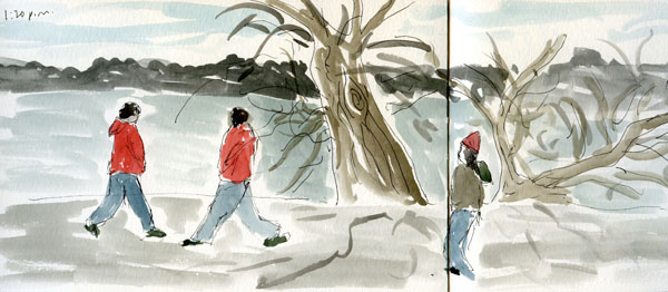
Sketched on 3/24/12, Sakura Koi watercolors, Copic Multiliner SP pen
I wasn’t happy with the “keep-on-truckin’” look of the walkers’ legs, so I decided to forget about sketching people. Instead, I spent a couple of hours filling three spreads in my sketchbook with a series of gestural sketches, attempting to capture nothing more than the motion of walkers and runners (both the two-legged and four-legged kind). It occurred to me that it was the first time I had thoroughly observed the mechanism of humans walking: The front leg is nearly straight, while the back leg is just starting to become straight after flexing. Runners’ legs, by contrast, both appear to be bent simultaneously at a sharper angle than walkers’, and their torsos lean forward slightly. Their arms are usually bent at a sharper angle, too.

At the end of the two hours, I had summarized what I had learned into these two gestural sketches. Not the Green Lake scene I went for, but a good drawing lesson, just the same.

Sunday, March 18, 2012

Product Review: Magellan Classic Travel Vest

Last November Don Colley gave a demo of Faber-Castell Big Brush Artist Pens at Seattle’s Daniel Smith store. In addition to being dazzled by his amazing drawings done with these pens, I was intrigued by a multi-pocketed vest he was wearing, which enabled him to have his art supplies close at hand without having to lug a huge bag around. Given that he likes to sketch in public places, the vest allows him to be discreet.
 

I immediately decided I wanted a vest like that, too, which would enable me to sketch outdoors unencumbered. I found that a number of online stores offer multi-pocketed vests, usually to facilitate travel. But the essential component to my vest would have to be at least one pocket large enough to accommodate my Sakura Koi 24-color watercolor box. I e-mailed makers of several candidates (TravelSmith, Scottevest, Magellan, Lands’ End, L.L. Bean) to get the exact measurements of the pockets (manufacturers seem to think that saying “large pockets” in their marketing copy is somehow sufficient data).

After receiving detailed information from customer service that at least one pocket would have the right dimensions, I finally settled on the Magellan ClassicTravel Vest.  It seems reasonably well made for the price.

Shown in the photo, I’m wearing it fully loaded with my essential supplies. It’s zipped all the way up in the photo, but when I was out in the field, I unzipped it and fastened only the snap at the center front (a very nice touch – without it, the unzipped vest would gape open from the weight of the supplies), which allowed easy access to the inner pockets.

I have pens and waterbrushes in one lower pocket, and a pocket-size Moleskine sketchbook in the other lower pocket. (I show everything sticking out so you can see them, but they all fit nicely inside, and the Velcro flaps close easily over them.)


In the inside pockets, you’ll see my Koi watercolor kit in the largest (the only one that would accommodate it, but it fits easily without struggle), and Tombow, Akashiya and other markers in the second large/tall pocket. One small pocket holds folded paper towels. I could have put my smartphone and wallet into the two upper outer pockets, but I didn’t want all that bulk, so I put my phone and wallet in a small passport wallet that I take on short hikes, and that worked out well.

One downside is that the nylon fabric does not provide any insulation. I tried it on over a jacket, and it felt too tight and bulky, so I wore it with only a turtleneck and thin fleece hoodie underneath. I spent nearly three hours at the zoo sketching all the animals I could keep up with (therefore, mostly only the lethargic or sleeping ones!) and froze my tush off! But that bodes well for the late spring and summer – it probably won’t be too warm to wear over a T-shirt.

In summary, I love it! It meets all the needs I got it for. I’m looking forward to trying it out at a farmer’s market or other crowded public venue, where it is especially difficult to carry a big bag while also trying to juggle a sketchbook and paint box.

Related Posts Plugin for WordPress, Blogger...