Tuesday, October 31, 2023

In the Wild

10/25/23 Ravenna neighborhood

While I enjoy sketching pumpkins and other Halloween decorations at Swansons Nursery, I find I rarely sketch them “in the wild.” On this cold morning, however, the rain had stopped and the clouds suddenly broke open to spill light on these orange characters on a Ravenna neighborhood porch. They were asking to be sketched.

Happy Halloween! And may all your treats be Snickers.

Monday, October 30, 2023

InkTober, Days 21 - 26


10/21 - 26/23 Platinum 3776 Century fountain pen with music nib; Diamine Eclipse ink in Uglybook (Earthsworld reference photos)

In a couple of cases, I used an ink wash (without 
drawing a line first) to "paint" the negative space.

For Oct. 21 – 26, I tried something I considered doing for all of InkTober last year: hatching without making a contour drawing first. Thankfully, I waited a few moments, and the feeling passed. This year, six days of it was plenty!

Inspired by the artist kiwon.05, I first tried hatching without contours earlier that year. I speculated whether it was similar in concept to direct watercolor (which I hadn’t yet done at the time) – painting without the guidance of a line drawing first. Now that I’ve done direct watercolor myself, I’m here to say that it’s very much the same: Searching for the shapes, values and forms instead of the line. When I had a pen in my hand instead of a brush, the hard part was stopping myself whenever I went on autopilot and started to draw an outline! This technique requires focus before putting the pen point down.

Platinum 3776 Century pen with music nib


And speaking of pen point, for this page spread, I used my Platinum 3776 Century fountain pen with a music nib, which I hadn’t inked up in years. While it’s a lovely pen to use, it’s not my favorite for drawing (it can’t hold a candle to my beloved Sailor Naginata fude). It felt good to say hello, though, to a casual friend I hadn’t seen in a while.

Sunday, October 29, 2023

Fall Color Class, Week 3: Memory and Color Wheel


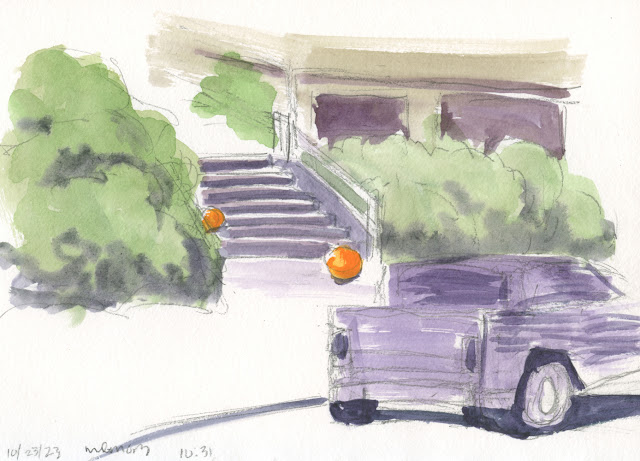
10/21/23 A warm-up sketch from memory while taking a walk.

Whew – Kathleen Moore’s homework assignment for week 3 was a serious brain bender: sketching from memory! Every day, we were to observe a subject, look away, and then draw and paint it from memory. The principle is that building visual memory skills helps us simplify and become faster, more decisive and economical in recording what we see.

I immediately recalled insights I had gained from my own self-challenge last year to draw from memory and imagination for 100 consecutive days. Back then, I had changed the variables to see how they might affect my success, such as duration of time between observation and drawing, and whether I took written notes. The single-most important variable was how long I spent observing the subject: The longer I observed, the more details I retained accurately. In addition, describing aspects I observed with words to myself – “the faucet handle is twice as long as the base is wide; the base looks like a lampshade” – helped immensely.

For my 100-Day Project, I made line drawings only, but an additional challenge in Kathleen’s assignment was to include color. That turned out to be the easiest part of the challenge: Lately I’ve been working toward interpreting colors (instead of being tied to matching “reality”), even when I’m sketching from observation, so painting from memory wasn’t too different. It was important, though, to remember where the light was coming from.

Kathleen didn’t require that we work from life, but since the weather was cooperative at least some of the time, I did all of my exercises either from the sidewalk or from my mobile studio. As you can see, I usually chose simple subject matter that I’m already familiar with drawing – the usual cars, trees and street scenes. When I spotted the parked boat, I knew that would be more challenging because I rarely sketch boats, so I gave that a go, and it was definitely more difficult. 

(In each case, I took a photo of the scene before I began observing, but I didn’t peek until after the sketch was completely finished. It was a good way to check how much I got right. Photo immediately following each memory sketch.)

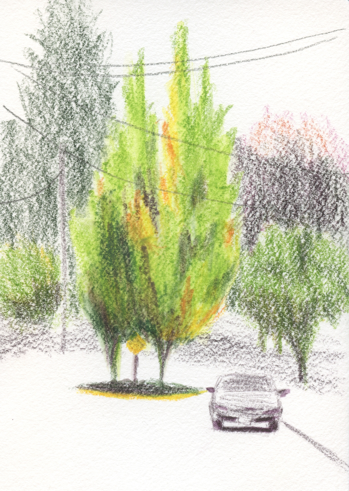
10/22/23 Sketch from memory. My brain remembered a more exaggerated lean to the tree and a sharper angle to the tree's crown, but I think those faulty memories improved the composition.


I described details to myself as I observed (and when I was alone in my mobile studio, I even said the descriptions aloud) – “the distance from the handrail to the roof is about the same as from the handrail to the 
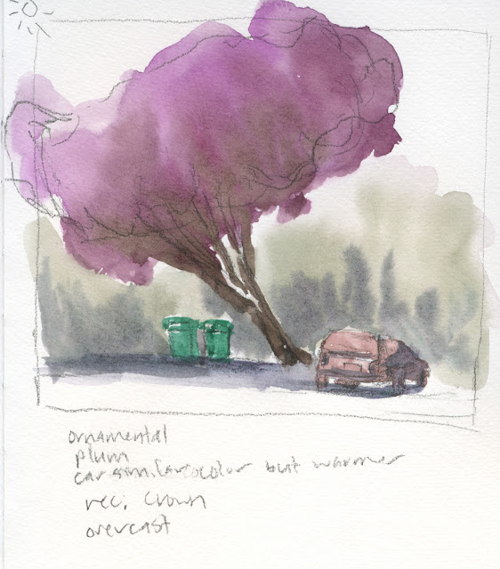
bottom of the truck.” I even did this with color: “The recycle bins are Veridian green; the car is a similar hue as the ornamental plum foliage except slightly warmer.” (In
my current palette, I am trying Veridian green, a color I have never liked or had use for, but Kathleen has talked about interesting mixes that can be made with it, so it was worth a try. Besides, it’s an ideal recycle bin color!)

1/23/23 sketch from memory


What surprised me most about these exercises is that I think some are better than similar sketches I’ve made while drawing directly from observation. When sketching from memory, I was no longer a slave to what I was actually seeing, so I was more at liberty to improve the composition or simplify the scene more than I normally might. That was quite an interesting result that I hadn’t expected.

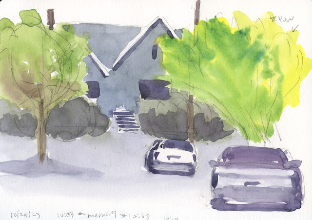
10/24/23 Sketch from memory. I have made many sketches with similar elements, but I like this one better than some I've done because I was more willing to simplify.


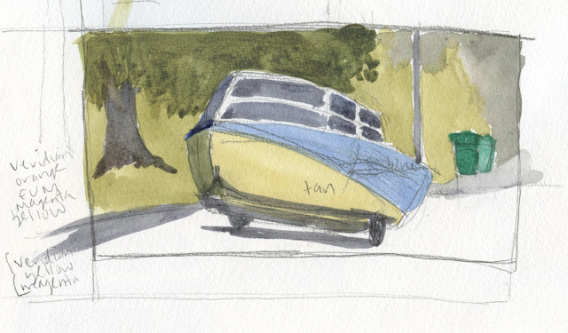
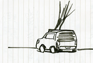
10/25/23 Sketch from memory. This was by far the most difficult because I don't get much practice sketching boats and their trailers. I correctly remembered that the power pole was in the center of the boat, but I erased it before painting and moved it to make a better composition. I used Veridian in most of the color mixes . . . yuck! It's not going to earn its keep in my palette if all I use it for is recycle bins!


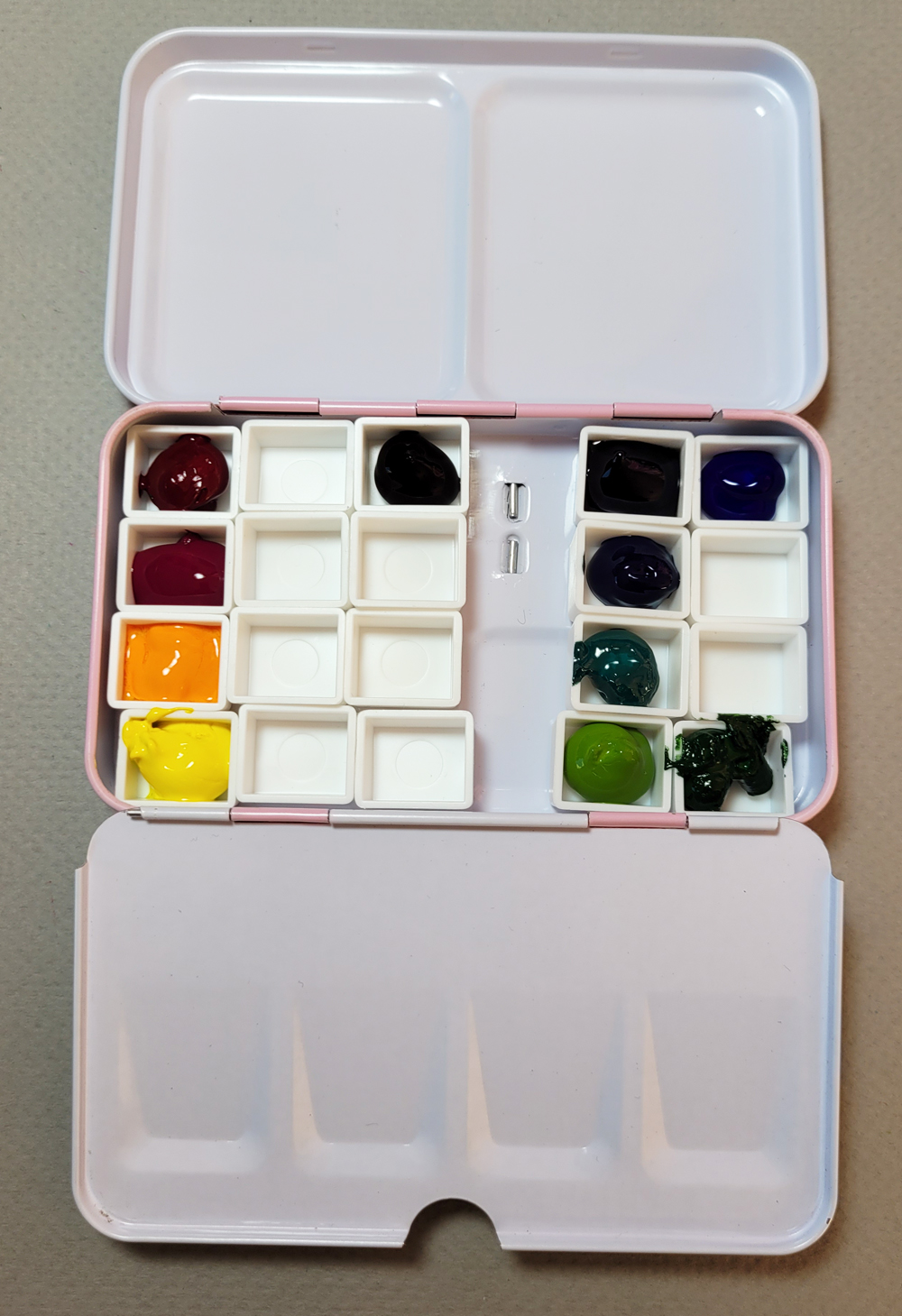
For week 3 we also made a color wheel and mixes. Kathleen demonstrated by using the traditional split primary triad system – a warm and a cool each of red, yellow and blue – but she encouraged us to use whatever paints we had.

Since my current watercolor palette is similar to the colored pencil palette I have been developing for a while, I use only magenta as the “red,” so I don’t have a warm red. (In my color wheel, I painted my Daniel Smith Quinacridone Magenta wedge in the wrong space – it should be in the space closer to violet – but since I don’t have a warm red to go in the other red space, it doesn’t matter.) Another oddball exception in my wheel is that I am using DS Green Gold as my cool yellow. When I dilute it, it’s really quite yellow, so I think I can get away with it. I chose Winsor & Newton Phthalo Turquoise as my cyan.


On the outer rim of the wheel, she suggested making swatches of whatever “convenience” colors we use. Shown to the right of the wheel and below are mixed complements to see what kinds of neutrals we can make. (You can imagine how gleeful this color geek was during that part of the exercise!)


Although I’ve made many, many color wheels over the years – mostly with colored pencils but plenty with watercolors, too – this one was by far the most informative. I think it’s because I’ve finally developed a better sense for what I want to do with color (and what I want color to do) in my sketches. That’s very different from following a palette “recipe” from a book or using an instructor’s recommended palette.

Saturday, October 28, 2023

Chilly But Sunny at Swansons Nursery


10/26/23 Swansons nursery

We’ve had all kinds of weather this week, including a sudden turn toward winter temperatures, but USk Seattle lucked out on Thursday at Swansons Nursery. Although it was cold (I had to get out my down parka for the first time this season), the sun warmed us whenever it popped out from behind spotty clouds.

One of our favorite fall and holiday season venues, Swansons always gives sketchers plenty of colorful displays. I found a stack of pumpkins next to a spray of fall colors and a cone (which makes any scene sunnier).

After walking around and chatting with friends for quite a while, I needed a warm-up inside the nursery’s Barn & Field Kitchen café. Always a bit daunted by the jungle of greenery surrounding the tables and yet attracted to it, I tried a tonal study this time.

We’re all looking forward to getting back to Swansons for the holidays!


Friday, October 27, 2023

Fourth Northeast Maple


10/21/23 Maple Leaf neighborhood

I don’t often sketch the same trees more than once in the same season, but like the Green Lake sweet gums, this particular maple is on one of my regular walking routes, so it got more sketchbook attention than most trees. And it’s worthy of attention: Its colors are blazing on an otherwise ordinary street.

To show how much it has changed, below is the sketch I made two weeks earlier, standing on the same traffic circle one block south.

10/6/23

Thursday, October 26, 2023

Dayton Maples Retrospective


10/22/23 Crown Hill neighborhood

Although I’ve sketched the Green Lake sweet gums often enough, I think the trees I sketch most regularly on my annual leaf-peeping tour are the Dayton Avenue maples in the Crown Hill neighborhood. Usually by mid-October, these trees have been turning for weeks. When I checked on them last Sunday, I was amazed that the color had barely begun. Maybe they’re not going to turn at all this year; maybe they will simply go brown and fall apart.

I’m not posting the entire collection here, but instead I chose sketches that were made as close as possible to the date of this year’s sketch (at right) on Oct. 22. In 2020, I happened to sketch exactly on Oct. 22, and although they were certainly not at peak, they had more color than this year. Three years prior, I sketched them on Oct. 5, and the one on the south side was turning vividly (both below).


10/22/20

10/5/17

I’d like to point out here that although it’s always tempting to exaggerate gorgeous colors (and I know many sketchers and painters use their artistic license in this way), when I sketch trees in autumn, I try to be as accurate and realistic as possible and be “truthful to the scenes I witness” (Part 4 of the Urban Sketchers manifesto). I’m not rigidly adhering to “rules,” and I’m also not judging others who choose to use artistic license. With these sketches, I simply enjoy documenting the varied timetables these maples follow each year. It’s the point where urban sketching and nature journaling come together in the same sketchbook. Heck, it’s even reportage, telling a longitudinal story of a couple of traffic circle trees.

Wednesday, October 25, 2023

Sweet Gum Retrospective


10/20/23 Green Lake (watercolor and watercolor pencil)

My practice for the watercolor class I’m taking gave me the push to do something I hadn’t done in seven years: I took my watercolors to Green Lake to sketch the sweet gum trees. During those early years, I used to drive to Green Lake just to sketch, so it wasn’t a big deal. Now that I walk to the lake as well as walk around it, it just felt like more gear to carry when I especially want to keep my load light. But the brilliance of those trees is fleeting, and many are already past their prime, so last Friday I knew it was now or never (at least for this year).

It was my third time sketching the sweet gums this year, which is probably a record – I rarely sketch them more than once per season. But an opportunity to sketch is always the carrot dangling on the end of my fitness-walking stick, so the sweet gums got more sketchbook attention this year.

Just for fun, I went through my digital files and pulled all the sweet gum sketches I could find (shown below in reverse chronology). In addition to being an interesting retrospective of how my style has changed (or not) over the years, it’s also fascinating to look at the dates that I sketched. For example, last year I sketched on Nov. 18 – a full month later than the most recent one at the top of the post. I’m fairly certain those trees will be mostly bare by that date this year.

9/28/23 (watercolor pencil)

9/2/23 (watercolor pencil and marker)

11/18/22 (watercolor pencil)


10/14/22 (watercolor pencil and marker)

8/31/21 (watercolor pencil)

9/27/18 (watercolor pencil)

9/28/16 (watercolor pencil and ink)

10/6/14 (watercolor)

10/14/13 (watercolor and ink)

11/5/12 (watercolor and ink)

10/8/12

Tuesday, October 24, 2023

Fall Color Class, Weeks 1 and 2


10/13/23 wet-in-wet watercolor practice

Last February when I took Kathleen Moore’s Winter Sketchbook + Watercolor class, we worked mostly from photos by necessity. Kathleen, however, is a big advocate for working plein air, so as long as the weather is decent, I knew she would encourage painting from life in her Fall Color Watercolor class. Fall session would be a crapshoot, though – sometimes we have gorgeous October days; sometimes autumn is just a premature winter – but I kept my fingers crossed. At least for weeks 1 and 2, our luck held out, and I was able to do all my homework on location.

Week 1 was an in-class exercise to help us loosen up (at right). Color was first splashed onto paper randomly and abstractly, then we drew a leaf over the color. Clear water was applied to the leaf shape, and then we painted the leaf’s colors wet-in-wet while still remaining loose.

For week 2, we viewed several pre-recorded video lessons and demos about drawing and painting trees and foliage. The assignment was to sketch at least three trees from life using watercolors and/or ink. Since I draw trees regularly with colored pencils and ink, during this course, I’m focusing on pushing myself to use watercolor, especially on location with my new standing palette.

You already saw the maple in Ballard in my post about the USk troll outing (below). Using a wet-in-wet approach, I had a lot of trouble with water. I flooded the page with too much, and after sopping up the excess, most of the paint came with it. Then the sopped-up page was too dry, so I had to apply more water, then more paint. The result was colors duller than I wanted (though in retrospect, they reflect the rainy day). I used watercolor pencils last to add some texture to the foliage.

10/15/23 maple tree, Ballard neighborhood

After a couple of days of heavy rain, Wednesday was one of those glorious October days I always hope for – an ideal opportunity to finish my homework. I drove to Crown Hill to sketch a street lined with Zelkova trees. These are among my favorites on my fall leaf-peeping tour and even in summer. Sketching in a warm car, I had the opposite problem as the Ballard maple: My initial water started drying too fast. Feeling the time pressure, I painted rather hastily, but I do like the high contrast I achieved between Daniel Smith Carbazole Violet and Green Gold, the two new paints I added to my palette (see yesterday’s post).

10/18/23 Zelkova trees, Crown Hill neighborhood

The afternoon was just as beautiful and also warmer, so for my third sketch, I took my new palette for a walk. While the previous two were done in my A5 Hahnemühle Akademie sketchbook, I made the sketch below in my daily-carry A6 Hahnemühle. I noticed two things right away that were different from using the A5: First, it was easier to control the water simply because the wet-in-wet area was smaller in the A6 sketchbook. But more important, the 100 percent cotton paper in the A6 was easier to work with wet-in-wet.

10/18/23 Maple Leaf neighborhood

All of that said, I was least happy with the tree’s form in the third sketch: It looks like a flat leaf. I think I did the best in terms of form in the first sketch of the maple in Ballard, but I admit that it was mostly “a happy accident” and not intentional. I was too busy trying to manage the water on my page to think about form.

Unbelievably, the next day was almost as beautiful, so I couldn’t resist going out for one more tree (OK, so I’m also an over-achieving student; what else is new?), again in my A6 Hahnemühle (below). My intention was to use ink to draw the exposed branches, but ink often seems too stark, so at the last moment, I changed my mind and used a violet colored pencil instead.

The 100 percent cotton paper is definitely easier to work with. I might have to bite the bullet and buy another in the A5 size. Either that or never work larger than A6, which would be OK, too. By the time I got to this sketch, I was convinced: Holy cow, I love the secondary triad in my new palette! Especially Daniel Smith Carbazole Violet! Considering that I purchased only two new paints, Carbazole is certainly earning its keep.

10/19/23 Maple trees, Maple Leaf neighborhood

As for my new pink paint box, it is still a bit awkward to hold along with the sketchbook in one hand, but I’m learning to get used to it.

Monday, October 23, 2023

InkTober, Days 14 – 20


10/14 - 10/20/23 Uniball gel pen in Uglybook sketchbook (Earthsworld reference photos)

The third week of InkTober turned out to be more fun than the previous week, when I didn’t get into sketching noses with brush pens as much as I thought I would. Inspired by the jaw-dropping work of Kristin Nohe Juchs, I decided to try Uniball Signo DX gel pens – an entirely new medium for me, at least for drawing. In addition, I used Kristin’s favorite 0.38mm point size, which I would never use even for writing, so everything about it was new to me.


Right off the bat, I instantly felt that gel pen is nothing like Bic ballpoint. A hallmark of Japanese gel pens is that the ink flows smoothly and consistently, which makes them a joy to write with. But that smooth consistency is the opposite of Bic ink, which is oily, somewhat sticky and has a tendency to blob – properties that also make the ink layer beautifully (well, maybe not the blobbiness). The gel pen’s tip is not at all pressure-sensitive compared to the Bic, which operates more like a pencil in that regard.

Getting solid ink coverage from the Uniball Signo requires lots and lots of hatching rather than layering. It looks gorgeous in Kristin’s hand and not as much in mine, but I did enjoy learning over the course of the week to use that consistency in my favor. I may not like them quite as much as Bics, but I’d certainly draw with Signos again.

I’m happy with the page spread’s design, too. A good InkTober week! How’s yours going?

Sunday, October 22, 2023

My New Standing Palette (and the Palette Journey So Far)


Small, lightweight and pink!

As seems to be the case with most watercolor sketchers, my explorations in watercolor have taken an interesting route through a variety of palettes. Last February when I began Kathleen Moore’s Winter Sketchbook +Watercolor course, I knew we would be working mostly from photos, so I didn’t care much about the paint set’s physical form (below). Wanting to start as simply as possible, I used a rather austere paint selection – an odd combo of a traditional primary triad and a CMY triad – and ended up mostly unhappy with the paints I chose.

The paint box I used last winter in Kathleen's class.

In June when I impulsively jumped into the 30x30 Direct Watercolor challenge, again, I started out working mostly from photos, so I got out my studio-size Kuretake Gansai Tambi set (which I reviewed at the Well-Appointed Desk). When I got braver and decided to try direct watercolor on location, I used a slightly hacked portable version of the Kuretake set. That worked well as long as I had a seat and table or at least a car center console to put the palette on.

Kuretake Gansai Tambi watercolor set in the studio (and the couch)...

...and the portable version in my mobile studio (or wherever I have a table).

Eventually, though, I knew that I could never tolerate having to find or bring a seat every time I wanted to sketch. If I wanted to use watercolors in the field, I would have to find a palette that I could use easily while standing. That brought me to the SketchBox Urban Sketching Palette, which was utterly ridiculous except for one thing: It taught me that I wanted a palette box with an attached thumb loop. That was the only thing that made using the SketchBox palette possible, despite its laughable design.

The ridiculous SketchBox palette saved only by its thumb loop.

Although I hadn’t used watercolors in the field since the 30x30 challenge, I’d been looking at all kinds of palettes. My requirements: As small and light as possible with a thumb loop and at least one mixing tray. The little pink palette shown here is the result.

The all-important thumb loop

The first thing I did was an easy hack: Remove the center pan tray (which would have required tediously sliding the pans into the slots). Then I simply adhered the included empty half pans directly to the paint box with museum putty. I could comfortably fit 20 pans, but I hope I won’t fill them all. My goal is still to keep my palette as limited and simple as possible.


The paint box came like this...

... and I removed the center pan tray.

Half pans adhered with museum putty

The second hack was more annoying: The enameled mixing trays were so smooth that paints would bead up. I know this is a common problem with new enamel mixing trays, but all my previous trays have been plastic, which I prefer to metal. I roughed them up with a melamine pad as instructed on this web site.

I went on an entirely different but familiar route to choose the paints this time: I used the basic method I use with my daily-carry watercolor pencils! I’ve been refining that system for quite some time now, and I’m not sure why I thought watercolor paints should be so different that the same principles wouldn’t apply: a CMY primary triad, a secondary triad with both a warm and a cool green, and a few convenience or wildcard colors.

The filled palette


Though Im sure the colors will evolve and change regularly, the 11 shown here are what I’m starting out with, and the palette looks very close to the pencils I carry every day.

Most paints came from my existing collection that goes back to my first urban sketching years. The fun part, though, was picking some secondary colors my collection was lacking by using Daniel Smith dot cards. The new additions are DS Carbazole Violet (the darkest violet I could find) and DS Green Gold (my warm green). I tried a few primary and secondary mixes in my color journal

Primary (left) and secondary mixes

The beginning of the rainy season seems like the wrong time to put together a new urban sketching paint palette, but it’s actually just in time – for a new class with Kathleen Moore. This time it’s her Fall Sketchbook + Watercolor course, and I hope to do as much homework on location as possible.

My very first use of the palette was at the Ballard troll outing with USk Seattle (the maple tree below). It felt a bit awkward to hold both the sketchbook and the palette with one hand, but I was using my A5-size Hahnemühle that day; I hope it will be easier with my usual A6-size book.

My right hand holds the palette and A5 sketchbook. A bit cumbersome, but I'm hoping the A6 sketchbook will be easier.

Related Posts Plugin for WordPress, Blogger...