Showing posts with label book review. Show all posts

Thursday, October 16, 2025

Fangirl Gets the Artist’s Guide


The new (left) and original versions of a seminal book on urban sketching

Way back in July, I mentioned that I was reading the newly republished version of the long out-of-print book, The Artist’s Guide to Sketching. Written by James Gurney and Thomas Kinkaid in 1982, the book captures both the philosophy and practice of what we all now think of as urban sketching. My review has finally been published in On the Spot, Gabi Campanario’s online ‘zine of graphic journalism.

A long-time follower of Gurney’s YouTube channel, I was delighted by how closely his and Kinkade’s approach to urban sketching aligned with my own. Although I could never see myself at any age doing what they did, I admired and envied their sheer joy of drawing that led them to hop freight trains across the country just to sketch. Theirs was the ultimate urban sketching adventure!

After thoroughly enjoying the rereleased version, I became curious about how hard it would be to obtain a copy of the original edition. Even as my commitment to downsizing has kept me from purchasing most hard copy books, it felt important to me to own the original. I had heard that copies sell on eBay for a hundred bucks, but with only a bit of searching, I found a used copy online for about $30 (the same price as the new edition).

I took my fangirling one step further: I emailed Gurney and told him of my intention to purchase a copy of the new version directly from his website. I asked whether he would be willing to autograph the original edition I had purchased, along with the rereleased copy. He graciously agreed, so I shipped the old book to him. Then he returned it along with the new copy I had purchased – both delightfully autographed!


The new edition is definitely an improvement. All the original images have been reproduced in color and of higher quality, and the new book includes drawings of that era that were not included in the original edition. Still, it’s fun to know that the original was the outcome of two young men sketching across the country, selling portraits in bars at night to make a buck. And it’s inspiring that 43 years later, their words still resonate with modern urban sketchers (at least this one).


Sunday, June 16, 2024

Maple Leaf’s Street Trees

6/13/24 Maple Leaf neighborhood


When I learned about the very special bigleaf maple in the Ravenna neighborhood from Taha Ebrahimi, I also learned that she had recently published a book devoted to many special trees in Seattle – specifically urban trees growing on public rights of way. Street Trees of Seattle is organized by neighborhood, and each tree is described and shown on hand-drawn maps. In addition, the author’s drawings of many of the featured trees, their leaves and other features are also included in the 288-page book. What a gem of a tree guide for someone like me who knows very little about trees but loves drawing them!

I bought a copy right away and was delighted to find that all eight of the trees documented in the Maple Leaf section are right on my various walking routes! In just two days, I sketched seven (I skipped one that was mostly behind a fence). My summer project will be to choose at least a few to make larger, more detailed portraits.

Although Green Lake is technically not my neighborhood, it’s within walking distance, so I plan to sketch as many as possible of the 10 trees documented in that neighborhood, too.

6/14/24 Maple Leaf neighborhood

Street Trees of Seattle, by Taha Ebrahimi

Saturday, April 8, 2023

Review: Color Meditation Deck


Not a book but a box -- of color prompts!

Around the time I started reading Exploring Color Workshop and other books I found at the library on the subject of color, something called the Color Meditation Deck came to my attention. I was a bit wary of the term “meditation,” which can sometimes be a buzzword for practices that don’t interest me. But reading the introduction online convinced me that the deck could be an interesting creative exercise. I was hoping it would be the kind of thing I could do in the evenings when I’m too tired to draw or study drawing, but I still want to pursue an activity more creative than scrolling through Instagram.

It turns out that author Lisa Solomon’s use of the term “meditation” is more of a metaphor than a literal practice of traditional meditation (of the type I do as part of my yoga practice), which was a relief. I’m already happy with my practice of that type and was not what I was looking for. I was much more interested in the “color” part of the title.

Instead of a book, the product’s format is literally a deck of 62 large cards that stores in a sturdy clamshell box. The set also comes with a 48-page guidebook on how to use the cards.

Eye candy on one side, text on the other.

The deck consists of two types of cards: The bulk are prompts – ideas for lots of non-objective shapes and patterns to make with watercolors. It’s obvious that the author is fond of making neat, symmetrical patterns, which aren’t really my thing (though making repetitive marks does have a meditative quality, which is where the title comes in). But as is the purpose of creative prompts, they get me going, and that’s what I need. After making a few suggested marks on the sketchbook page, I usually find my brush wandering away in some other direction, and then the prompt is no longer necessary.

Prompt card

The other type is the “parameter” cards, which are ways to approach patterns or colors. For example, you might make crescent shapes (a prompt) with a limited palette (a parameter). Some parameters about using color fit in well with the more technical studies of limited palettes and color temperature that I’m doing, but the deck encourages a more intuitive, playful approach, which I also enjoy exploring.

Parameter card

Beautiful images on one side of the card offer examples of the prompt.

You can go through the deck and choose the prompt and/or parameter that strikes your mood, or if you’re feeling wishy-washy, close your eyes and pick a card randomly.

Some of my "meditations"


When I first bought the deck, I had thought I would use colored pencils, markers or any other colored media, not necessarily watercolors. I did try some with colored pencils, but there is something about hitting the page with a wet, juicy brush that is more conducive to the prompts. I think most media could be used, however.

The enclosed booklet made me aware of the author’s preceding book, A Field Guide to Color: A Watercolor Workbook. The deck was produced as a supplement to the book, which features some prompts as part of the overall watercolor exploration process. Although the book covers topics such as color theory more thoroughly than the deck does, the basic principles are included in the deck’s guide booklet, and much of the information is repetitive. As a color junkie, I enjoy reading all that geeky color stuff, so I don’t regret buying the book. But if you’re mainly interested in the prompts, skip the book and just get deck, which has many more prompts than the book.

Solomon's Field Guide to Color preceded the Color Meditation Deck.

One barrier for me was watercolor paints themselves. After taking Kathleen Moore’s class, I wasn’t skittish about using them anymore, but most of my paints are in tubes. Begun in class, my palette is currently set up with a very limited range as I consciously work to avoid the mishmash of randomness I had before. Most prompts require easy access to lots of colors, not the limited palette I am trying to create. Of course, I could mix many colors from a limited palette – that’s the whole point of using limited hues – but then that would take me out of the “playful” and “easy” state of mind that I hoped to have using the prompts. I also didn’t want to confuse myself by putting a bunch of colors on the palette for that type of exploration and then trying to keep track of which I am studying in a more formal way.

Many art instructors and authors suggest buying only a few high-quality colors (of any medium) and building a solid but limited palette from there. Despite my deep, wide collection of colored pencils, I, myself, have recommended a version of the same principle. Contrary to that principle, Solomon states directly, “I recommend getting the biggest set of watercolors/gouache you can afford.” Yes, ma’am! (Stay tuned.)

Saturday, March 18, 2023

Book Review: Exploring Color Workshop


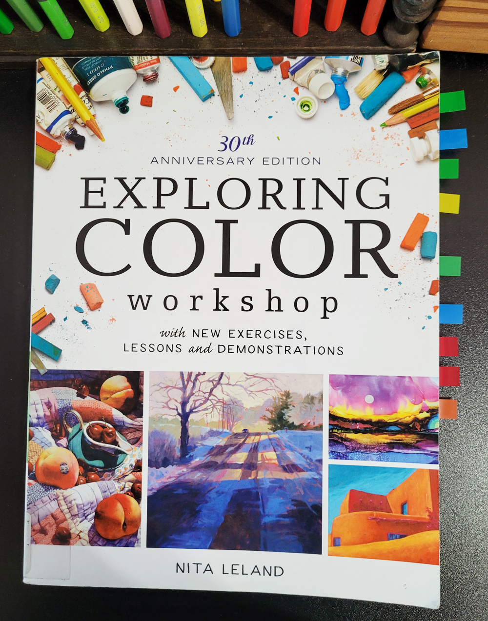
Exploring Color Workshop by Nita Leland 
(All the Post-its tell me that it's time to buy my own copy!)

When I first began sketching, using color seemed easy because I applied it the way I would in a coloring book: Draw the outlines of the shapes I saw, then color them in with hues that matched “reality” as closely as possible. But the more I studied and eventually understood values, the more confusing color became. In fact, I became downright flummoxed and intimidated by color.

In recent years, I’ve made a conscious effort to learn how to use color in support of values – not just coloring in shapes. I still struggle constantly, but studying concepts like color temperature, especially in Sarah Bixler’s workshop more than a year ago, helped me to understand color and values in a whole different way.

Around the same time, I started experimenting with limited palettes, especially CMY-based primary triads and secondary triads, which again changed my perspective of how colors can be used in a more cohesive, harmonious way. In addition to giving me intriguing mixes to play with, such limited palettes encourage me to be less literal with color (Notice all my purple trees lately? And green faces?).

All of that is lengthy preamble for what must be obvious: I’ve become increasingly fascinated with learning how to use color in dynamic ways. Going through every book in the library on the subject, I’ve found the best of the bunch so far to be Exploring Color Workshop (30th Anniversary Edition) by Nita Leland. A long-time writer for North Light Books, Leland has published numerous titles on the topic of color. Originally published in 1980, Exploring Color Workshop was revised in 2016 with new exercises and lessons. Another update is information and discussion of “modern pigments” – the ones that make CMY triads!

A demo of using different variations of primary triads to paint the same scene.

Showing how toned supports and underpainting affect the final hues, temperature contrasts, limited palettes, triads based on both traditional and modern pigments – everything I love is here, plus lots that I didn’t know I loved until I saw it!

Examples of analogous color scheme

Going far beyond basic color theory and color wheels, Exploring Color Workshop shows contemporary art works (and references master works that can be easily found online) that use a monochromatic scheme, for example, or a high-key modern palette. Although I understand those words, it’s hard for me to picture a “high-key modern palette” just by looking at a color wheel, but the painting shown on the page makes it instantly clear.

Example of strong contrasts in color intensity

The “workshop” part of the book consists of 89 exercises to further understand concepts. The author encourages creating a color journal specifically for the purpose of studying color, storing results and notes from the exercises, and ultimately documenting the development of a personal palette. I experiment with palettes all the time, yet I tend to make the mixes and notes next to sketches or in random sketchbooks, so it’s hard to find them again. (In fact, one reason I post my palettes here on my blog is so that I can refer to them!) As soon as I read this idea, I decided to start keeping a dedicated color journal that would serve much better as a reference tool than my current methods.

A demo on using an underpainting to unify a color palette

Although the primary audience is obviously painters, the author addresses artists of all kinds of media, including collage and fiber, so most of the exercises can be done without mixing liquid paints – for example, dry media or magazine cut-outs could be used. I think I could use colored pencils for almost all exercises and still get the concepts.

A self-portrait demo that begins with darks

Another significant part of the book are the stepped-out demonstrations by the author, usually in the form of paintings or sketches, to illustrate concepts.

For diehard color geeks, the book also includes reference tables of ASTM pigment names and their color index numbers. More useful to me are charts comparing various characteristics of pigments, such as staining and granulation tendencies.

After my first pass, my library copy was bristling with Post-its on pages that I need to study further. That’s usually a sign that I might as well buy my own copy, which I did.

Monday, July 11, 2022

Book Review: Spotlight on Nature

Spotlight on Nature -- the latest edition in the 
Urban Sketching Handbook series

One aspect of sketching the urban landscape that has long intrigued me is the interplay between trees and human-made structures and objects. My ongoing series of trees that have been pruned to accommodate utility lines goes back nearly 10 years. In addition to the stories these trees tell about their relationship with humans, esthetically I enjoy and appreciate the tension between their organic, graceful lines juxtaposed with harshly vertical power poles and horizontal wires. Even when they have not been rudely trimmed, trees present the same contrast: Next to a house or car, they offer bold, irregular shapes against sharp architectural angles and unnaturally curving automotive lines. I think neither a tree alone nor a manufactured object alone tells a visual story as interesting as the two together.

The latest book in the popular Urban Sketching Handbook series, Spotlight on Nature: Tips and Techniques for Drawing & Painting Nature on Location, focuses on trees and all kinds of natural elements in the environment. Artists and instructors Virginia Hein and Gail Wong have closely observed nature as they’ve drawn and painted it on location, and their new book collects their best tips, techniques and approaches.

Like all the books in the Urban Sketching Handbook series, Spotlight on Nature is divided into Keys. The first shows us how to look for the role nature plays in a composition: Is it the star or a supporting character? Does it give background context or serve as a foreground frame?

(Images below do not necessarily correspond to my comments; I chose pages randomly to show the types of tips and techniques provided.)


Key II, How We Draw Nature, begins to get into the nitty-gritty of approaching the potentially overwhelming task of depicting the natural world. How can we show depth in a landscape? How do shadows on rocks and trees give them volume? And how do we manage masses and masses of overlapping foliage? (A gorgeous example of the latter by Brazilian artist Eduardo Bajzek takes my breath away.)


Key III is about storytelling: Finding the Character of a Place. How do natural elements contribute to the story of a specific place? Rock formations in Joshua Tree National Park are like no other in the world. Weather almost always affects the appearance of a scene. The quality, direction and color of light at different times of day or year tell much about when you sketched. Even the degree of moisture in the air affects what you see and feel and therefore how you draw or paint.


Key IV is perhaps of most interest to urban sketchers: Finding Nature in the City. It’s everywhere in the urban environment, but sometimes the unlikely spots tell the most fascinating stories. Maybe there’s a peek-a-boo view of trees between skyscrapers, or a tree softens the edges of a steel and glass atrium.


Key V focuses on various media and tools and how they can lend unique qualities to express natural elements. Color from paint, ink and colored pencil can add rich vibrancy. Specialized brushes, salt or sponges can provide organic texture.


Finally, the last Key is a gallery of stunning, varied work by contributors worldwide. (I wish this section were longer. The few images left me hungry for more.)


Tips and how-to instructions for techniques are included throughout as they relate to specific sections. For example, using wet-in-wet watercolor is a useful approach for painting skies. Observing the direction of tree limb growth helps to draw them accurately. “Workshop” sidebars offer challenges and suggestions for practice.


As part of the Urban Sketching Handbook series, the book’s main focus is on the relationship between nature and the built environment, but some sections discuss natural elements on their own. Detailed botanical drawings and portraits of individual trees might not be considered “urban” sketching, but when drawn from life, they offer the same rewarding experience of close observation that cannot be found by drawing from photos (the latter is my own opinion, not theirs).

7/8/22 Reading the book inspired me to look for ways
that nature can act as a frame in the urban environment.
(Maple Leaf neighborhood) 

Throughout the book, plentiful examples come from Virginia, Gail and 40 other well-known artists from the worldwide urban sketching community. As with all the other books in the series, my only complaint is that these gorgeous works have been necessarily reproduced at a tiny fraction of their actual size. They must be glorious when viewed full size!

The human-built environment is never without nature (at least we certainly hope that will remain true). Spotlight on Nature is easily one of my favorite volumes in the Handbook series for exploring this essential element of urban sketching.

(A copy of this book was provided by the publisher, but my opinions are my own. In fact, I had been looking forward to reading it ever since I heard it was coming out, and I had it on hold at the library when the publisher contacted me.)

Sunday, February 27, 2022

Book Review: Every Person in New York


“There’s something about the idea of every person in New York that my mind could get around, more so than the idea of every person in America, or every person in the world. In New York I could realistically, physically, get around the city to draw more than I could get around the entire world. Living in New York is something I think about a lot and I was looking for more ways to learn about it. . . . The project is now over six years old. Every day I am in New York I draw for this project, and I’ve drawn over 30,000 people (I still have a bit to go).”

So explains Jason Polan in the introduction to his book (which has no page numbers but is an inch-and-a-quarter thick), Every Person in New York, about what compelled him to begin drawing everyone in a city of more than eight million. He was an urban sketcher following the Manifesto, perhaps without even knowing about it. In fact, he was possibly more literally “truthful to the scenes we witness” than most of us, who may take artistic license when drawing people who walk off. Instead, Polan tried . . .

“. . . to be as authentic with the drawings as I can. I only draw the person while I can see them. The majority of the drawings are done (mostly) while I’m looking at the person, not at the paper. If they are moving fast, the drawing is often very simple. If they move or get up from a pose, I cannot cheat at all by filling in a leg that had been folded or an arm pointing. This is why some of the people in the drawings might have an extra arm or leg – it had moved while I was drawing them. I think, hope, this makes the drawings better.”


Looking through the massive collection of sketches done from 2008 through 2014, I couldn’t help but be moved by that authenticity and lack of self-consciousness. The works have a pureness of motive like children’s drawings, “certain things I find that I’m so excited to see and draw and share.”


Some sketches are nothing more than scribbles. Among my favorites are ones in which he tried to capture large crowds milling about a museum or train station; those masses of scribbles are exactly what it’s like to draw such a crowd. Others are exquisite gestures or portraits. There is no doubt that each was captured from direct observation in a brief moment in Polan’s day.


While most of the drawn are anonymous strangers, quite a few are celebrities, whom he names, sometimes with an excited exclamation point. “Christina Aguilera on Mercer June 11, 2010,” is sketched right next to “man eating pizza at Ray’s on Prince Street He isn’t wearing any shoes June 11, 2010.” Occasionally the sketches are autographed by the subject. Every drawing is documented with a date and sometimes the time.


Published in 2015, Every Person in New York is optimistically designated Volume 1. Very sadly, there will never be a Volume 2. In 2020, Polan died at the age of 37. I viewed every drawing with amazement that he chose to spend his short life documenting New York in such a unique, singularly focused way – and gratitude that he chose to share that documentation with me. That, by any definition, is urban sketching.


Tuesday, January 11, 2022

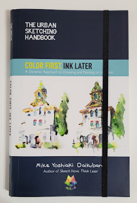
Book Review: Mike Daikubara’s Color First, Ink Later


The latest volume in the Urban Sketching Handbook series 

Four years ago, Mike Daikubara put out Sketch Now, Think Later: Jumping Right into Sketching with Limited Time, Tools, and Techniques, a popular volume in the Urban Sketching Handbook series. Now the Charlotte, North Carolina, sketcher has published a sequel: Color First, Ink Later: A Dynamic Approach to Drawing and Painting on Location.

While the first volume has a strong emphasis on Mike’s philosophy and approach toward urban sketching – the why in addition to the howColor First, Ink Later is intended as a follow-up that dives directly into the how. Novices who are new to urban sketching would probably want to start with Sketch Now first to fully understand the principles behind his “color first” approach.

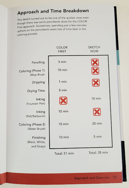
The difference in steps and time between his ink-first approach and his color-first approach.

Although his approach is different, his philosophy remains the same: Mike is always looking for ways to sketch whatever he wants by choosing the tools and methods that best accommodate the available time or circumstance. His watercolor-first method, which takes a bit longer, is more conducive to stationary, outdoor subjects than the line-first method, which he prefers for rapidly changing scenes or when he is sketching restaurant meals (while his hungry and ever-patient wife waits). Since I have developed my own varying sketching approaches based on similar variables, I appreciate how thoroughly and clearly Mike has analyzed his processes to present them in this book.

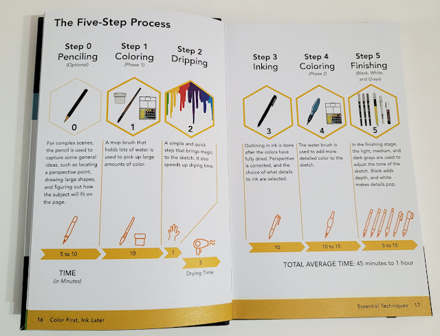
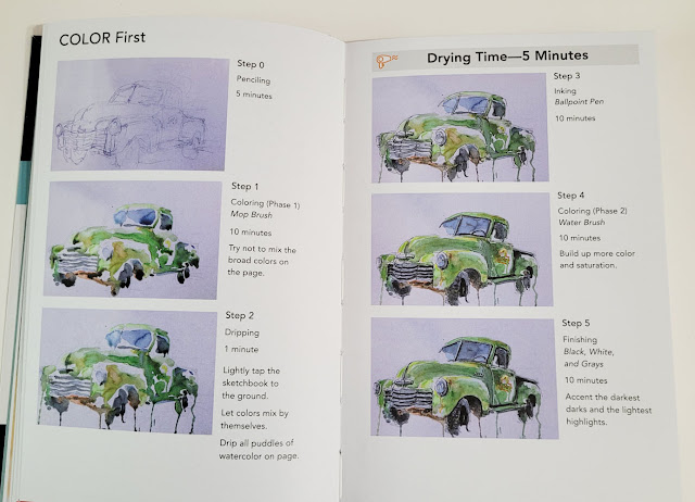
Mike's color first, ink later process: An optional pencil rough-in is followed by paint washes, dripping/drying, ink, more color, then final touches of black, gray or white ink.

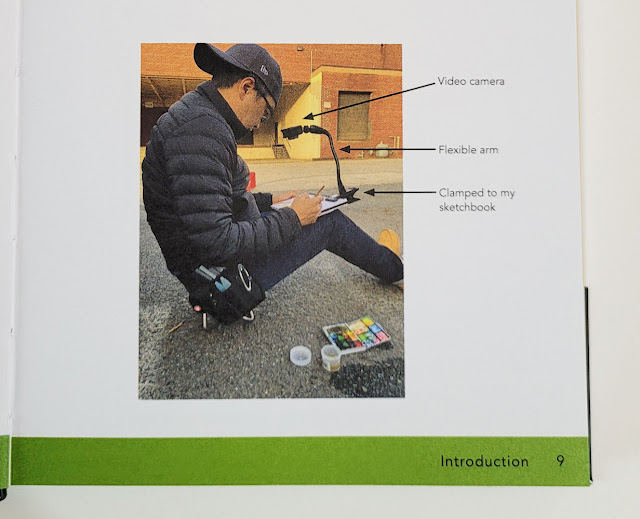
After a detailed explanation of his five-step approach, the book presents several demonstrations based on subject matter or complexity. Using still images taken from videos he made while completing the demo sketches, he was able to show various stages of his process without having to interrupt his flow by stopping to take photos. In addition, his use of video enabled him to document exactly how long each step took. I’m not sure I’ve ever seen an urban sketching book that analyzed a process minute by minute! He’s remarkably consistent from demo to demo, regardless of subject matter – a sure sign of an experienced urban sketcher.

Step-by-step demo

Since the “color” part of his color-first approach is watercolor, one section is devoted to describing his “color bucket families,” which he uses to organize his 20-color palette. This color strategy and arrangement enable him to choose colors efficiently. Rarely mixing on the palette, Mike prefers to let watercolors mix dynamically on the page. This choice not only creates more lively hues and avoids mud; it also saves him the time of trying to achieve the right hue on the palette.

Mike organizes his watercolors by "color bucket families."

Another watercolor step has both a practical purpose and a “magical” result: After the initial wash of color is applied, he allows the excess water to drip down the page, becoming a dynamic part of the composition. These unpredictable drips, which have become Mike’s signature, also have the benefit of making the wet paper dry more quickly for succeeding steps.

Washes followed by dynamic dripping

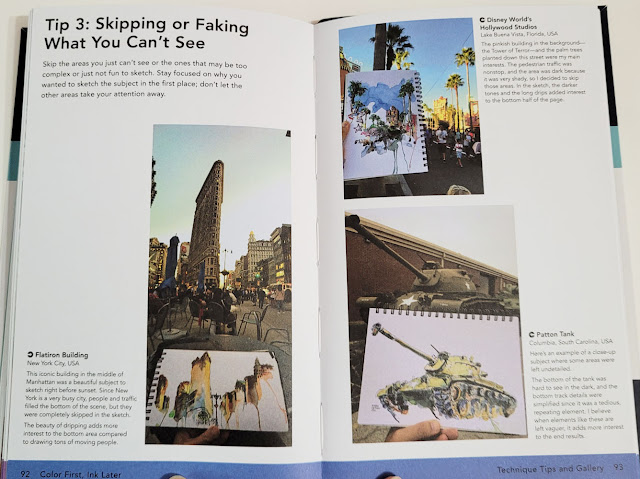
Every step he takes is economical and efficient without sacrificing artistic expression. When faced with a busy, cluttered foreground, Mike suggests simply skipping areas “that may be too complex or just not fun to sketch. Stay focused on why you wanted to sketch the subject in the first place.” Excellent advice for simplifying a scene!

Don't like the clutter you see? Skip it!

Consistent with the Urban Sketching Handbook series format, the final section is devoted to a gallery of Mike’s spectacular work made with the color-first-ink-later approach.

Color First, Ink Later is another winner in the series. I recommend it to sketchers who have already read and used Mike’s first book and have some urban sketching experience under their belts.

One more thing: This volume in the Urban Sketching Handbook series is an improvement in regard to a gripe I have had about most of the previous books. The typeface is slightly darker and, in some areas, larger, making the text much easier for these aging eyes to read.

(Quarto Publishing provided me with a  copy of this book. Opinions are my own.)

I adore this photo of Mike sitting on his teeny-tiny sketch stool! He is showing his video setup that enabled him to capture images used in the demos.

Related Posts Plugin for WordPress, Blogger...