 |
| 3/14/22 Caran d'Ache Pastel Pencils in Stillman & Birn Nova sketchbook |
Although I enjoy using a white General Primo Bianco chalk pastel pencil on dark paper for highlights and other effects, I have not
used other dry pastels much. A few samples were in a symposium swag bag once and
in an ArtSnacks box years ago, but I used them only for a few sketches.
The dusty messiness always puts me off.
And yet, during my recent late-night, winter-doldrums, retail-therapy binge, one of my purchases was a small set of Caran d’Ache Pastel Pencils. (I’m likely to eventually succumb to any medium that comes in pencil form, I suppose, and it was the pastel pencil’s turn.)
On a recent wet and blustery morning, I gave them a spin with my now-favorite media-testing view out the studio window. The messiness is still there, but these Cd’A pastel pencils are so opaque and high in pigment that very little needs to be applied to cover the paper. (I used a gray Stillman & Birn Nova sketchbook page here.) This was a nice surprise compared to colored pencils, which take quite a lot of application for the same degree of coverage. Using a blending stump made spreading the pastel a breeze (and kept the stuff off my fingers).
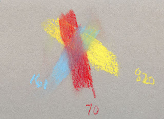 |
| Not exactly blending. |
Blending pastels is a bit weird, especially since I don’t know what I’m doing. My set of 12 doesn’t include a true blue, only a very pale Light Blue (161) (which would probably be good for sky), so I couldn’t try my usual primary triad mix, but I did my best with the colors included. Very opaque, they just cover each other up instead of blending. Maybe with more proper stump action, the pigments would get a chance to mix. I haven’t done much of that yet, but I’ll try it another time.
 |
| Pretty! |
I’m sure there’s potential here for more messability and even mixability with other media. If I get up early enough (which is possible, now that we’ve sprung ahead), it would definitely be fun to try a nocturne with these on black paper. Maybe this set will kill the rest of winter for me.
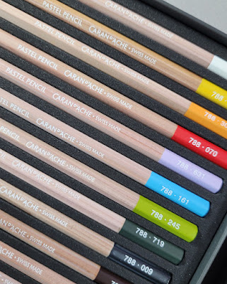
Although this post isn’t a review in which I usually show the product itself, I couldn’t resist one glam shot. The design of Caran d’Ache pastel pencils matches that of Museum Aquarelles except that the barrel is a natural, unfinished wood instead of matte dark gray paint. One of my favorite contemporary pencil esthetics is natural wood with a block of solid color (see the red Blackwing and the non-photo blue Blackwing). The color block here is barely more than an end cap, yet it’s still very pretty.

A popular way of mixing pastels is to do them separate from the art work. Photocopy paper is used as the palette, colors mixed and then applied with a brush.
ReplyDeleteHmmm... interesting. Sounds messy! I'm not sure if I can deal with the dusty mess!
Delete