Sunday, January 31, 2021

Blind

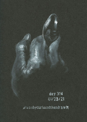
Now that I am nearing my one-year mark of drawing my hand every day, I must work harder to keep the project interesting for myself. The spoon has over-stayed its welcome as a prop, but I haven’t found its replacement yet. In desperation on Day 320, I reverted to a standby that anyone who has ever studied drawing has done: the blind contour. I find the odd tangle of lines strangely intriguing. It’s easy to see where I began, but since the rule is to avoid lifting the pen from the page, a blind contour requires backtracking many times to complete a contour. The result is like the path of a bug.

Then I did another. They are liberating because they are completely without pressure. I might do a few more.


Same pose drawn twice, each starting from opposite sides.

Saturday, January 30, 2021

Review: Bic 4-Color 3+1 Pen/Pencil


A new function for an old-school icon: the Bic
4-Color 3+1
I seem to have come full circle.

Several years ago when I had been dabbling in sketching with ballpoint ink but hadn’t yet embraced it, I tried using a Bic 4-Color Pen. As a teenager, I thought it was the coolest thing ever to have four ink colors in one compact pen. First introduced in 1970 by French entrepreneur Marcel Bich, it’s nostalgic to me. Many decades later, the iconic pen was still cool in my continual search for compact, portable sketch materials, so I gave it a shot. As I said, I hadn’t yet embraced ballpoint ink, and the pen body itself seemed cheesy and clumsy, especially the slidey things used to select the ink colors. (Apparently my standards in product design had come up a few notches since I was 13.) I rejected it almost immediately.

The concept of a multi-pen still had sketch kit potential, however, so I upgraded to a Uni Jetstream 4 & 1 when I observed my first National Ballpoint Pen Day. With far superior design and construction, the Japan-made Jetstream’s body feels more substantial than a Bic 4-Color, and its slidey things move smoothly and engage flawlessly. The Jetstream is still my favorite ballpoint to write with. Unfortunately, the ink it contains is a newfangled “hybrid” that delivers a smoother, blob-free writing experience but, alas, is just not the same as blobby, oily Bic ink. I still keep it in my bag to sign papers or jot quick notes, but I don’t enjoy drawing with it. (Incidentally, in case you are uninitiated, the Japanese have gone hog wild in the multi-pen industry. A quick search on JetPens brings up literally hundreds of options. You’re welcome . . . see you in a few hours.)

From left: a classic 4-Color, one with a highlighter, one with "fashion" colors

Fast-forward a couple of years to InkTober
, when I came to thoroughly embrace drawing with Bics. Something about that sticky, oil-based ink makes it the “pencil of pens”: It’s pressure-sensitive and can be layered gradually like graphite. Any pen that acts like a pencil is good by me!

A 0.7mm pencil component makes this Bic 4-Color unique.
Recently a new Bic 4-Color came to my attention: the 4-Color 3 + 1. Actually, it has only three ink colors, and the fourth component is a mechanical pencil (the Uni Jetstream also has a pencil unit, as designated by the “& 1” in its name). In general, I’m not a fan of drawing with mechanical pencils, but having a pencil option with my beloved Bic ink does make this Swiss army knife of drawing tools more versatile. It was worth a try.

As soon as I got it, I noticed a difference. The body shape is slightly different from the classic 4-Color and – more significantly – the mechanism of the slidey things is much smoother and operates better. Reading the fine print on the packaging, I learned that while most Bic 4-Colors are still made in France, the model with the pencil component is made in Japan. Interesting!

Also interesting is the Bic’s 0.7mm lead instead of the more typical 0.5mm lead found in other multi-pens. I have a heavy-handed habit of snapping most 0.5mm leads, so this was good news to me. The included lead feels like HB. For sketching, I prefer a softer one, so I’m going to swap it out for a 2B (the softest grade I could find in 0.7mm). It’s reassuring not to need a sharpener, which I haven’t carried in my slim pandemic bag in a year.

The ink refills – red, black and blue – are standard medium points that are my favorite for drawing.

Capped eraser

Much-improved slidey things!

Blue, red, black inks

1/26/21 Bic 4-Color 3 + 1, Uni Pin brush pen and colored 
pencil in Field Notes Signature

As much as I enjoy sketching with a ballpoint or graphite pencil, they can be more time-consuming than watercolor pencils or markers because the best use of them involves large areas of hatching. I’m not inclined to do that kind of sketching on the street, so I’ve been using the Bic 4-Color 3 + 1 in conjunction with the Uni Pin brush pen. The latter does the heavy lifting on darker values quickly. I like the combo.

With red and blue the only colors besides black, this so-called 4-Color isn’t as colorful as I would like it to be. Still, during these grayest days of winter, it’s accurate for neighborhood sketching. I have some doubts about how well the 4-Color 3 + 1 will serve my minimalism challenge  needs, but it’s fun to have a “new” tool to try. And regardless of how well it works for my challenge, it’s great to see an improved body for an old-school tool.


Friday, January 29, 2021

Assignment: Tree Branches

1/26/21 graphite on Strathmore Bristol vellum, 7" x 9" (photo reference)

Our first assignment using a photo reference in Kathleen Moore’s class was to interpret this tree’s tangle of branches. In the photo, the tree is a black silhouette against the sky. Ignoring foliage, we were to draw the overlapping network of branches to indicate which were closer or farther away. We could take liberties with filling in with twigs, showing texture or making other changes to enhance the composition.

Initially, I attempted to imagine light coming from an imaginary sun as I did in the fun “crazy tree” assignment, but I realized immediately that most limbs were too narrow to effectively show where the shadows would be. I opted to simply use varying values to bring the closer branches forward with higher contrast. At the time of this writing, I haven’t received feedback on the drawing yet, so I don’t know if my interpretation was effective, but my head is still spinning – in a good way – from the substantial challenge.

Thursday, January 28, 2021

2021 Minimalism Challenge: Most Extreme Ever


Downsized! Here's the sketcher's-eye-view of my extremely slimmed-down sketch kit.

Every winter since 2018 I’ve challenged myself to minimize and simplify my sketch kit (here are reports from other years: 2019, 2020). Not intended as a permanent kit change, the challenge usually lasts about a month during the most colorless time of year. Though it is occasionally frustrating, I enjoy the opportunity to clean out my kit and remove inessentials. With fewer materials to choose from, I look at my sketch opportunities with a fresh eye. Of course, after the end of each challenge, more materials inevitably creep back in, but not without a critical evaluation of whether they would earn their long-term keep in my bag.

This year, because my pandemic edition sketch kit is already smaller and pared down, I was tempted to skip the challenge – how much slimmer could my sketch kit possibly be? But then I looked at it critically one day, and I had to admit that quite a few things kept appearing over the summer and fall during the best color months. The kit could certainly stand to lose a few tools. It was time for a minimalism challenge after all.

A bit over-stuffed.


Before: Everything that was in my daily-carry kit.

And minimal it is – perhaps the most extreme kit ever (below). The kit’s focal point is a new rendition of a very old-school tool: the classic Bic 4-Color ballpoint pen, but with a twist it comes with a mechanical pencil unit. I’ll be writing a full review of this fun tool soon, but for now, I’ll just say that the addition of the pencil makes it an interesting and functional Swiss army knife of ballpoint ink (red, blue and black) and graphite.

After (from left): Bic 4-Color, Caran d'Ache Bicolor, Uni Pin brush pen, Gelly Roll, Derwent
Drawing Pencil, all contained in Rickshaw Waldo field case.

I thought very carefully about color. Of course, I always want all hues, but which colors would be important in conveying meaning in an otherwise monochrome sketch? In my limited geographic sketching area, the only colors I felt that way about are heavy equipment yellow and traffic cone orange. I judiciously picked out the yellow/orange Caran d’Ache Bicolor pencil and called it good.

The Uni Pin brush-tip marker, white Sakura Gelly Roll gel pen and white Derwent drawing pencil made the final cut because I use them whenever I sketch in a red Sweet Tooth Field Notes, which is still one of my favorite fast-sketch approaches.

Slim and trim.

To keep myself honest, I went through my stash of bag accessories and found a bright pink Rickshaw Bags Waldo field case that I had received as a gift a while back. It’s a slightly smaller version of the one I used all last year in my pandemic kit. There’s a bit of space to spare, but not much, so it will prevent too many tools from sneaking in. (I mostly live in yoga pants these days, but every couple weeks, I put on my jeans to make sure I still can. Same concept.)

A tough but significant decision was to use dry materials only. (The Caran d’Ache Bicolor is water-soluble, but I’m using it dry.) This simplifies the kit significantly: I could eliminate both the waterbrush and the spritzing bottle. This also means paper quality is no longer an issue, so I can use any simple sketchbook or notebook. I took out the pocket-size Stillman & Birn Beta book that had been my daily-carry in the fall and replaced it with a slimmer Field Notes Signature. Although the latter’s paper has let me down with light washes, I enjoy using its slightly larger page size with all dry materials. The red Field Notes is already a daily-carry alternative to any white paper book I carry.

Sketchbooks: two Field Notes options

1/25/21 First sketch with the spartan kit

Too spartan? Probably. But it will be fun to find out how long I last and what I can’t live without. I took my ultra-lite kit out for a trial run the other day. News flash: ballpoint ink doesn’t blend well with colored pencil. And I’d like to get a softer lead for the mechanical pencil. It’s an interesting combo, though. Stay tuned for updates.

Wednesday, January 27, 2021

Assignment: Crazy Tree


1/24/21 "crazy tree" from imagination

Another assignment in Kathleen Moore’s class that involved drawing from imagination was this “crazy tree,” which followed a thorough lesson in drawing branches. Much of the lesson’s information was review for me from the half year that I studied landscape drawing with Suzanne Brooker. The big difference is that in Suzanne’s classes, we drew only from photo references. In outdoor photos, the actual sun is always present somewhere, as are the shadows.

In Kathleen’s exercise, we were to draw an imaginary tree with crazy-growing branches, but make the branches realistic in terms of their shapes. The assignment was also intended as practice in showing where the branches are in space using perspective, foreshortening and shading. It was an extremely fun challenge to imagine the light source and apply light logic to shade the unreal tree realistically.

Beyond my general desire to improve my skills in drawing trees, this exercise gave me a good meaty chew on working on my skills in drawing realistically from my head without a visual reference. I want to do more of this on my own.

Tuesday, January 26, 2021

Assignment: Tree from Imagination


1/23/21 tree from imagination

More than two years ago, I took a Gage class from Kathleen Moore called Drawing Nature. Taught entirely outdoors for five summer weeks, it was a dream come true for an urban sketcher like myself (well, except for the one terrible week that the class had to be postponed because of wildfire smoke, but Kathleen was kind enough to give us a make-up session later). Each session, we met at a different city park and learned to draw different natural elements en plein air.

This quarter, I’m taking another Gage class with Kathleen – Drawing Trees with Graphite. It’s kind of the opposite of that delightful previous experience: Instead of drawing outdoors in warm daylight, I’m stuck inside staring at my Zoom screen. Nonetheless, I already know that Kathleen is an excellent instructor, and so far it is the best online class experience I’ve had. I’ll be telling you more about the course as it progresses, but in this post I wanted to show you the drawing from the first exercise because it applies to something else I’ve been talking about here.

For most of the course, we will be drawing from photo references. However, to shake us loose from whatever symbols or stereotypes for trees that we might have stuck in our brains (such as the flat lollypop shape we drew as children), Kathleen started us off with several guidelines on what real trees look like. Then the assignment was to practice gesture, overlapping branches and the tapering shape of branches by drawing any tree from imagination.

Since this assignment meets my personal objective of developing my skills in drawing from imagination and memory, it was especially enjoyable in a challenging way. This tree was probably as much from memory as imagination, as I’ve sketched a few weeping cypresses in my neighborhood that look similar to this. We were encouraged to note any questions we had for discussion later. My struggle was how to draw the foreshortened branches that are coming toward me to show that the tree is three-dimensional and not a flat cross-section of a stalk of broccoli, as Kathleen describes it. I’ve been aware of this challenge since I studied with Suzanne Brooker four years ago, and I practice it when I can (my most successful attempt was with snow-covered branches, which are easier to see), but it’s still not easy to either see or draw those branches.

I’m sure this issue will come up again in future assignments. I look forward to tackling it again.

Monday, January 25, 2021

Product Review: Shizen Designs Journal


Shizen Designs faux leather journals


I’ve been having fun using colored papers for my daily hand series. Most of my hand drawings are tonal studies, and the bright colors work well as the mid-tone between white and black. Last summer I thought I’d give myself a fresh kick in the pants by going completely dark: I filled a black Stillman & Birn Nova sketchbook with hand sketches. After that, I used colors again, but just recently, I got back in the mood for black. Although I do love the Nova sketchbook series, I thought I’d look around to see what other black-paper options might be available.

That’s when I discovered Shizen Designs faux leather journals at Blick. The A5 size is just right for my daily hands. At 200 pages for 10 bucks, it’s also more economical than an S&B Nova (92 pages for about $17). It was worth a shot.

As soon as I got it, I realized that the black Shizen Designs journal is part of the same line as the multi-colored one that I had used sporadically last spring (and occasionally for InkTober, too). It had been years since I bought that one, so I didn’t know if it was still available. It is – I found it at Blick, too.

The “faux leather” covers are flimsy, and I’m not sure how well they would hold up as a daily-carry. The binding does allow the pages to stay open fairly flat (though not as flat as a softcover Stillman & Birn).

The 80 gsm Shizen paper isn’t as heavy as Nova, but the mild tooth is nice for both colored pencil and ink. In black, the paper is fully opaque, so I have no problem using both sides of the sheet, especially with colored pencil.

Black pages are opaque enough to use on both sides.

The lighter colors, however, are less opaque, and any wet ink is likely to bleed. Even heavily hatched ballpoint ink and rubberstamp ink came through the pages shown below, so I used only one side of each sheet in the multi-colored book.

Ballpoint and rubberstamp ink came right through the paper.


I don’t recommend Shizen journals with wet media. Shown below is a sketch I made with Uni Posca Paint Markers (which I reviewed at the Well-Appointed Desk), and they were wet enough that the paper buckled mildly. I don’t mind this degree of buckling (and I do like the way the Poscas pop on the colored pages), but anything wetter would be a problem.

Mild rippling with Uni Posca paint markers

Backside is rippled, but shows no bleeding.

Ideal for dry media, the Shizen book is enjoyable with colored pencil and chalk pastel. During InkTober, ballpoint and fountain pen both took to the surface well (though, as mentioned, you can expect bleed-through where ink is heavily applied). Even drawing on only one side of the page, at the rate I have been burning through books with my daily hand sketches and life drawing, it’s still a less-expensive alternative to S&B.

Bonus: Shizen also makes an all-red sketchbook in the same series! (It comes in a few other single colors, too – yellow, orange and white.) As mentioned before, I find red to be an ideal mid-tone hue – better than the traditional tan or gray, which don’t always provide enough contrast with white or black. After filling the all-red notebook I had been given, I didn’t think I’d ever find one like it again, so I was thrilled to find the Shizen option. I might even try it for urban sketching – it would be a largescale version of my favorite red Field Notes. I’ll find out soon enough.

Debossed branding on the back cover

The multi-colored book on the right is full of InkTober and hand sketches.
The new red one? Maybe urban sketches someday!

Sunday, January 24, 2021

Optimism


On Jan. 20, 2020, the first case of COVID-19 in the U.S. was confirmed right here in Washington State. This past week, many of my friends either received vaccines or have scheduled appointments for them. I won’t be eligible to get in line for a while yet, but even so, for the first time in a year, I feel like the end is in sight. On a practical, day-to-day level, I know that not much will change until a large majority of the community is vaccinated. But just knowing that the end is concrete and tangible fills me with anticipation and gratitude.

Meanwhile, Toni’s sister Fran (my yoga instructor) reports regularly on Caring Bridge that Toni is getting stronger, a tiny baby step at a time. It’s been nearly three months since Toni contracted COVID, and she is still not breathing fully without a ventilator. The damage to her body, some of it permanent, has been devastating and will take a long time to fully heal, but she is bravely on her way.

All of this in the same week as the change in U.S. presidents has made this a week of hope and optimism instead of dread and anxiety. My heart is a hundred times lighter.


Saturday, January 23, 2021

Aaron and Gary

1/13/21 

If you’ve been a reader for a while, you know that I’m a fan of Portland, Oregon, designer Aaron Draplin. He’s a co-founder of Field Notes, a creative maker of colorful merch, and an all-around cool guy. Over the holidays, I bought a hoodie that came with a pack of postcards with dozens of portraits his colleagues have made of him. Included with the postcards was a blank card and an invitation from the paper company that produced it to “Draw Your Own Draplin.” How could I resist an invitation like that?

In fact, I got a second card and drew Draplin’s late dog, Gary, who makes cameo appearances in some of his designs.

The sketch at left was fun to make, but it’s based on a photo. The sketch I like much better is the one I made live when I met him a couple of years ago at a design conference trade show (below).

1/3/21
5/15/18 Sketched in Seattle


Postcards of Draplin portraits made by his colleagues and friends. Autographed box!

Friday, January 22, 2021

Adam


1/19/21 Adam, 10-min. pose

The Life Drawing + “Chiaroscuro” series continues, and model Adam gave us a dramatic session with fantastic lighting! A couple weeks ago when I did the chiaroscuro session, it didn’t occur to me to use black paper until it was too late. This time, I was ready, and Adam’s strong natural light on one side made every pose a delightful challenge. For some poses, he also used a red secondary light, which gave his shaded side a soft, pinkish illumination without competing with the primary light. In addition to holding beautiful poses, he understands the importance of good lighting when modeling.

If you’re wondering what kind of black paper I used, it’s not the Stillman & Birn Nova that I’ve been using for my nocturnal sketches. It’s a Shizen Designs journal. Review forthcoming soon!

2-min. pose

2-min. pose

5-min. pose

5-min. pose

5-min. pose

10-min. pose

15-min. pose

15-min. pose

Related Posts Plugin for WordPress, Blogger...