Thursday, December 31, 2015

Another Year of Mindful Sketching

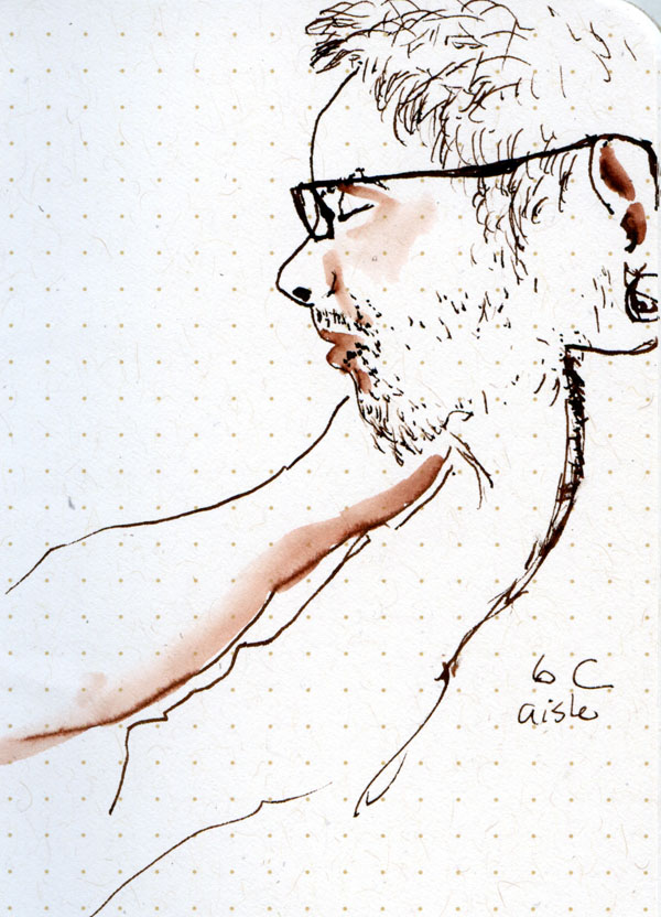
9/3/15 plane passenger
(The other day I mentioned that I have a few personal year-end blogging traditions; this is the last one.) A year ago, I wrote about how I had completed my commitment to sketch every day in 2014. It’s not a resolution, which typically seems to be based more on external pressures (“Join our gym now and save 50 percent!”), unrealistic expectations (“Lose 30 pounds in 30 days!”) or vague ideals (“Be healthier.”). Instead, my daily commitment to sketch is simply that – a commitment to myself.

A long time ago I heard that it takes 21 days to form a habit. That is, if you do something daily for three weeks, it’s likely that the habit will stick indefinitely. Later I read that this was a popular myth; another study showed that it actually takes 66 days to form a habit. In my experience, though, 21 days, 66 days or even 365 days isn’t long enough unless a commitment is behind it.

After 2014’s 365 days of sketching, I was fairly confident that the habit would stick; I didn’t have to put it on my to-do list because it had become automatic, like flossing. In an important way, though, sketching isn’t at all like flossing, because flossing is completely mindless. (Sometimes I’ll get into bed and suddenly wonder, “Did I floss?” It’s so literally automatic that I can’t recall doing it!) Indeed, on some days when I do nothing but fulfill a series of obligations – earn a living, shop for groceries, take out the recycling – making a sketch might be the only mindful thing I do all day.
1/10/15 baby giraffe (from photo)

I have an easy way to track my daily sketches: I almost always scan them on the day I make them, even if I have no intention of posting them online. The files are systematically dated by the PC, and I date them in the file name, which also includes the location of the sketch and other details that are of interest to me. (Incidentally, scanning regularly has another benefit: If I were to lose a sketchbook, I’d be very sad, but not nearly as sad as I would be if I were to lose it before scanning its pages.)

Compulsive? Maybe. But I prefer to think of it as being mindful about the way I organize possibly the only mindful thing I do all day. And it means I can easily look in this year’s sketch folder and see that I made 946 sketches (shown on today’s post are some that didn’t appear on the blog earlier). On many days I was barely able to make one sketch, but on many other days, I made several per day. If I were simply trying to make 365 sketches in a year, I could have stopped on May 21. But that’s not the point.
10/7/15 Smith Tower (from photo)

What is the point? Sketching every day. Mindfully.

Happy New Year, and here’s to the next 366 (leap year!) days of sketching!

8/11/15 presentation audience member

Wednesday, December 30, 2015

Tina’s 2015 Top 10

My Top 10 products of the year!

It’s time for the fourth annual roundup of my Top 10 sketching products of the year! In addition to being one of my most-read posts each year, it’s also one of my favorites to put together because I enjoy assessing which tools and materials have served my sketching needs best this year.

Last year, six of the 10 products on my list were repeats from previous years; in fact, four had remained in the Top 10 for the three years that I’d been making the list. That says to me that, despite my penchant for experimenting with new materials (especially pens!), I stick with what I like as long as it’s still working for me.

That’s why it surprises me to see that several new products made it onto the list this year, including a couple of dark horses (and therefore several had to drop off). Only three items were repeats from last year. I hope that means that while I’m loyal to products that work, I’m also not in a rut of using the same ol’ stuff out of habit.

I was torn about taking some items off the list because they still serve me well, if only sporadically (like the truly amazing Pilot Petit1, which has been inked up continuously for more than a year, gets used only every few months while I’m fitness walking, yet still writes immediately as soon as I uncap it). But my selection criteria change from year to year, and this year I put more emphasis on versatility (especially during travel when I try to keep my bag as light as possible) and convenience (allowing me to sketch faster or more easily and therefore more often). I did, however, want to make room for those surprising dark horses that haven’t been in my bag long. (They may turn out to be novelties rather than keepers; only time will tell.)
12/11/15 Sailor Naginata fude pen,
Sailor Jentle Doyou ink

Items marked with * are repeats from last year. To see how the list has changed – or not – over the years, please review 2012, 2013 and 2014. The photo reference numbers do not indicate ranking.

1. Modified Pilot Parallel fountain pen. In its unmodified state, the Pilot Parallel has a fun and interesting nib, but it wouldn’t have made it onto the list if I hadn’t discovered how to hack it. The first of this year’s dark horses, my 3.8mm and (to a lesser extent) 6mm hacked Parallels have proven to be amazingly versatile in a very short time.

2. Sailor Naginata Fude de Mannen. Unsurprisingly, this pen performs as beautifully as I had always hoped a “grail” pen would, once I got to it on my Epic Search. It’s gratifying to find a pen that works so well and also feels so comfortable in the hand. Of course, by the time I acquired it, I had been trained well on fude nib operation by the Naginata’s various fude brothers – the Profit, Clear Candy and original “calligraphy” pen – so they deserve mention here (indeed, I still keep one or two other fudes in my bag when I need more ink colors), but only the Big Daddy is on the Top 10. (You’re wondering if my new Sailor Cross Point, still on its honeymoon with me, tried to wiggle its way onto this list? Of course it did. But even I wouldn’t put a pen on the list when it’s still on its honeymoon. Let’s see if it’s here next year.)

3. Pilot fountain pen with Posting nib. This remarkable nib makes one of the finest lines of any pen I’ve used, and yet it is also smoother than many with a broader point – and certainly smoother than any with an equivalent nib size. Being both smooth and extra fine put this pen on my list. It’s now my go-to pen for containing waterproof Platinum Carbon Black ink (see No. 5 below) because its fine line is unobtrusive with watercolors.

4. Sailor Jentle Doyou ink. Replacing Diamine Chocolate Brown, Sailor Doyou
4/3/15 Sailor Jentle Doyou ink
(“Midsummer Dark Brown”) is a cooler, darker brown-black that washes to a velvety sable. I’ve been using it almost exclusively in my Sailor Naginata fude (see No. 2 above).


5. * Platinum Carbon Black ink. This waterproof ink is the only product that has been on my Top 10 all four years, and for good reason: It has never let me down. It dries almost instantly, is completely waterproof and has never clogged any pen. At various times I tried DeAtramentis Document, Super 5 and Sailor Nano Kiwa-Guro waterproof inks, but none was as consistently reliable as Platinum. This year I’ve also included Platinum Carbon cartridges in the photo because they’ve proven to be my best back-up plan (along with a lightweight Platinum Preppy) when I travel.

6. Water-soluble colored pencils: Last year my favorite Caran d’Ache Museum Aquarelle water-soluble colored pencils made it onto the Top 10, not only for their rich hues when washed with water but also for their soft, creamy texture when used dry. While Museum pencils are still my favorite line, I’ve given watercolor pencils a generic listing this year simply for their all-around versatility and convenience. The Museum line doesn’t come in as wide a range of colors as Caran d’Ache Supracolor II or Faber-Castell Albrecht Durer, so I use carefully selected hues from all three lines when I need quick spots of color while sketching on the street as well as still lifes and studies at home. For the first time since I started listing my Top 10 products, Kuretake Zig Clean Color Real-Brush Markers fell off the list because colored pencils are proving to be more versatile. (However, I still keep a Bright Yellow Zig marker in my bag at all times. That particularly artificial shade of yellow is ideal for traffic cones, heavy equipment and construction workers’ hardhats – a color that’s not easily mixed.)
11/5/15 Sky and shadow applied with
waterbrushes filled with ink.

7. * Kuretake waterbrushes filled with ink. When I first discovered the trick of filling waterbrushes with inks, I used them primarily with gray inks for easy shadows. More recently, I started carrying green inks for quick foliage and Pilot Iroshizuku Tsuyu-kusa for blue skies. I even filled one with a custom red-orange mix to match the anticipated fall foliage in Kyoto last month. They have essentially become my DIY markers, filled as needed. They may not be as esthetically pleasing as watercolors, but you can’t beat the speed and convenience.

8. Kuretake (“No. 13”) fountain pen style brush pen. Although I’ve named this particular model because it’s the one I’ve been carrying lately, I’d be hard-pressed to say why I prefer it over any other real brush pen I’ve tried (and I’ve tried quite a few). All of the Japanese brush pens are similar (the synthetics are just as good as the more expensive real-animal-hair versions), and I use them interchangeably. One major advantage Kuretake has over some other brands is that it accommodates waterproof Platinum Carbon Black fountain pen ink cartridges (see No. 5 above), so it can be used with watercolors. In fact, this brush pen containing PCB has replaced the twig-and-India-ink combo that made it onto the list last year. While twigmaster Ch’ng Kiah Kiean is inspiring, trying to wield a twig without his particular brand of magic is a formidable challenge. Still, I love the rough, organic look of a twig mark. The brush pen gives me more control than a twig while still imparting sketches with an appealing rustic line. If the cartridge is running dry, I can even emulate KK’s signature dry-twig look (without the magic, of course).
11/30/15 Zebra double-ended brush pen
and colored pencils

9. Zebra double-ended brush pen. The second dark horse on this year’s list, the Zebra double brush pen is a relatively recent discovery that continues to delight with its versatility. I first discovered it at life drawing, where it encouraged me to loosen up. Then in Japan, I found it to be ideal for architecture, too – somehow it took away the intimidation I felt when trying to sketch buildings with a fine nib pen. Its firm, spongy brush tip (not hairs like the Kuretake above) gives me just enough additional control (compared to the hairy brush), and having two tip sizes in one pen makes it all the more versatile.
    10. * My Stefano sketchbook system. There’s no doubt that this simple leather folder with elastic bands has liberated me from the restrictions of store-bought sketchbooks. On my Top 10 since I got it, my versatile, flexible and durable Stefano has been with me on four continents so far. You’ll notice that this year I’ve included a “bare” signature of paper in the above photo, too. That’s because this year I discovered even more flexibility about the “system”: While the leather cover is essential when I’m sketching standing up or using watercolors and need a stable support, many times I can get by with only a thin, light signature of paper. When traveling, I’ve used the signature both ways – with and without the supporting cover. At home, I now do the same thing: When sketching outdoors (and probably standing), I use the cover; when sketching indoors and seated, I use the signature alone. Either way, the system meets my needs exactly.
My "Stefano" doing what it does best: supporting
my sketchbook signature when I sketch
on my feet.

Honorable mention:

Initially I was going to give Field Notes honorable mention for finally putting a paper in its Workshop Companion edition that I found satisfactory for fountain pen sketches washed lightly. It was as close as I have ever come to finding an ideal pocket-size sketchbooklet. But being a limited edition, the source is finite and unreliable, and I don’t even like the covers. I’ll probably keep looking for the perfect pocket-size book for the rest of my life, but in the meantime, I’ll keep making my own.

Instead, I’m giving honorable mention to the Faber-Castell 9000 pencil sharpener that I bought at Sekaido in Tokyo. I’ve been looking far and wide for a portable pencil sharpener that can accommodate my slightly-larger-circumference Caran d’Ache Museum colored pencils (see No. 6 above), and this is the first one that does it sufficiently (not beautifully, mind you – just adequately). It gets bonus points for a sleek design that contains its shavings. It might have made it onto the Top 10 – except it doesn’t sharpen standard-size pencils well! I’m holding out for a portable pencil sharpener that accommodates all my pencils. (Yes, I do sharpen with a knife when I’m home. But I can’t carry a knife when I fly, and Id rather not on the street, either.)

By the way, since I’d been having so much trouble finding a sharpener to fit my Caran d’Ache pencils, it was logical to see if Caran d’Ache made one, right? A little research uncovered one; its price is more than $150. I’ll pass on that. For now, I’m good with the Faber-Castell 9000 that cost me the U.S. equivalent of a couple bucks at Sekaido.

Tuesday, December 29, 2015

Tina’s Top 10 Memorable Sketches of 2015

I have a few year-end retrospective blogging traditions, and this is one of them: my 10 most memorable sketches of the year. (Here are links to my most memorable sketches of 2014 and 2013.)

Note that I don’t call them my “best” sketches of the year or the ones I like the most. These are sketches that bring back the strongest or most meaningful memories. After all, for me, one of the most important aspects of sketching is being able to preserve moments of my life. What are your most memorable sketches? (Clicking the title of the sketch will take you to the original post.)

March 26, Maple Leaf Park, Seattle (left): There I was in late March, sitting under a clear blue sky and 70 degrees – it felt like summer! I knew it wouldn’t last long, but what a treat to sketch the park on a day like that after a long winter.

May 16, Eiffel Tower, Paris (right): Unlike some artists who poo-poo the well-known sights and go for lesser-known views, I don’t have an issue with sketching the world-famous. Sketching the Eiffel Tower felt like a dream come true.

July 17, construction site for 200 Occidental Building, Seattle (left): The main reason this sketch was so memorable is that it was made under the noisiest conditions ever! I was happy that I had ear plugs in my sketch kit.

Aug. 9, Star of India, San Diego (right): After the West Coast Sketchcrawl in San Diego came to an end, a few other sketchers and I decided to do a bit more sketching on the waterfront. There’s no doubt that the Star of India was a memorable sketch subject, but what makes it stand out for me was the record number of people who planted themselves right in front of me to photograph it, completely blocking my view.

Aug. 29, Alix and Seila’s wedding, Half Moon Bay (left): Although I didn’t have as much time as I had hoped, sketching my niece Alix and her fiancé Seila saying their vows was a very special moment for me.

Sept. 2, T-Rex at California Academy of Sciences, San Francisco (right): After spending several hours exploring San Francisco’s spectacular science museum, I was getting antsy because I still hadn’t sketched one of the many dinosaur skeletons. This overpass view of the T-Rex was impossible to resist.

Sept. 27, Top Pot Donuts, Seattle (left): I spend a lot of time sketching people using laptops in coffee shops, so this dude at Top Pot on Alki was nothing special. What made the sketch memorable was that mega-sketcher and artist Don Colley was by my side during his fantastic urban sketching workshop, showing me how to improve the sketch.

Oct. 6, roofers, Seattle (right): I don’t get many opportunities for a front-row sketching seat of roofers at work, so when the house next door got a new roof, I was upstairs sketching from the bedroom window. I’m easily entertained as long as I have my sketchbook!

Nov. 16, Himeji Castle, Himeji (below): The weather was warm and gorgeous (perhaps the best we had during our trip to Japan), it was my birthday, and 800-year-old Himeji-jo was gleaming in the sunlight. That’s a memorable sketch all-around.

Nov. 21, egrets and herons on the Kamo River, Kyoto (right): After spending more than a week in tourist-crowded Kyoto, we were weary of battling crowds. Sketching birds from the nearly deserted bank of the Kamogawa was just the quiet and solace I needed, and it was one of my favorite days of the whole trip. 

Monday, December 28, 2015

Coffee, Coffee Everywhere, But . . .

12/28/15 ink
One thing Seattle is well known for is plentiful coffee. One statistic says that we have 35 coffee shops per 100,000 residents, putting the total at more than 200 in a city of 84 square miles. (Actually, I was surprised to read that the number was that low – it feels like we have one on every block.) With that many choices, you’d think I would have no problem finding dozens of coffee shops I could sketch in on a cold, rainy day (the second thing we are well known for).

The problem is that I’m picky. For the best sketching, the ideal coffee shop is relatively large (plenty of “victims”); has good interior lighting (preferably natural); has tables arranged at various angles so that I can see profiles as well as fronts and backs; has tables that are sufficiently close together so that I can see people well but not so close that they can see what I’m doing; interesting interior decoration or architecture would be a bonus. And of course, they all have great coffee – but do they have fresh scones? I’ve walked by many of those 200 coffee shops and rejected them outright for not qualifying in one way or another. Up until now, only Zoka Coffee fit the bill perfectly.
12/28/15 ink

Cloud City Coffee, within walking distance of home, is probably my closest coffee shop, but I’ve sketched it more often from the outside – either standing on the street or from one of its outdoor tables when it’s warm – than I have from the inside. Although it was the first place I ever dared to sketch in public four years ago, I’ve only been inside for the purpose of sketching a couple of times. The tables aren’t arranged ideally as they are at Zoka, which is also much larger. Architecturally, Cloud City’s interior isn’t as interesting, either. But the last time I sketched at Zoka, the lighting was different, and the interior was much darker than before. I decided it was time to look for a new regular haunt.


12/28/15 ink
This morning I gave Cloud City another try. People waiting in line had to stand right next to me and my sketchbook, and I couldn’t hide in the corner as I usually try to. But maybe that’s just a habit and not really a preference, because I found that I didn’t care if I was seen sketching. The interior lighting is bright, and I also like the natural light coming in from the front windows. Bonus: I could smell scones baking. Maybe it’s a keeper.

12/28/15 ink
12/28/15 ink
12/28/15 ink

Sunday, December 27, 2015

Stopping in Time

12/26/15 brush pen, colored pencils

Running a series of errands yesterday, we stopped first at the hardware store, where I opted to stay in the car for a sketch. Roosevelt Way Northeast is lined with gnarly, knotty old trees – all of them split open on top to make room for wires.

12/27/15 Infinite Painter
I was just thinking about putting in a vague suggestion of the buildings and other background when Greg finished his shopping. I’m glad I didn’t have more time – I think the sketch turned out better because I stopped when I did.

That is one major drawback of digital sketching. With that blessed undo key and dozens of tools to try, I can fiddle and refiddle with any sketch way beyond where it should have ended. An overworked watercolor sketch is usually bad news, but an overworked digital sketch is no better. 

Saturday, December 26, 2015

Like Spray Paint

12/25/15 Infinite Painter
Last night before settling down for the evening, we went out for a drive in the neighboring areas to see the Christmas lights. The temperature was in the 30s (as it still is today), so I didn’t have the courage to get out of the car, but I got Greg to park for a few minutes so I could try sketching a lighted tree with my tablet. As clumsy as my stylus felt, the subject matter seemed ideal for digital sketching – a lighted object in the dark. Last year when we watched the Christmas shipsI had tried it with traditional toned (black) paper and opaque gel pens, but I wasn’t happy with the results. I’m not exactly thrilled with last night’s attempt either, but it’s not bad for a first try at sketching a tree in the dark. I also used a different app this time – Infinite Painter – which I like much better than Autodesk Sketchbook.

This morning I tried again, this time with a still life. With my primitive stylus, which feels like sketching with a chunk of ice that slides all over the tablet surface, I realize it’s much easier to paint rather than draw (which I’d been attempting previously). Again, I’m not thrilled with my result – no matter which tool I chose, it felt like using spray paint with a really huge nozzle – but I’m having more fun now because I’ve accepted my stylus as a paint brush rather than a fountain pen.
12/26/15 Infinite Painter

It’s like using any medium: You have to use the appropriate tool. Until I get a better stylus (which doesn’t seem to exist for Android?), I’m OK with digital painting instead of drawing.

Thursday, December 24, 2015

Christmas Eve Still Life

I’ve been seeing some really fun holiday sketches online the past few weeks – Santas, decorations, special tree ornaments and their related stories (see Joan Tavolott’s blog for a great series!).

12/23/15 colored pencils
As I’ve enjoyed them all, I’ve tried to think of something unique from my personal holiday traditions to sketch. You’ve seen my record-breaking Santa series, of course, but I was trying to think of something in my home to share. I rather hastily sketched our Christmas tree a couple years ago, and in 2012 I included some Christmas tree stories along with the sketch. Other than a tree, I don’t do much holiday decorating . . . what could I sketch?

One food-related tradition for Christmas Eve is that Greg and I pick out some extravagant cheeses, smoked fish, champagne and other favorites that we don’t generally indulge in the rest of the year. The past few years we’ve been getting Dulcet “double cream” cheese from Beecher’s, a local cheese maker that started out in Seattle’s Pike Place Market (there’s now a store in NYC, too). The reason we can’t indulge in this cheese the rest of the year is not so much because of the cost (although it is a bit pricey); it’s the fact that it contains so much fat that our arteries can’t handle it more than once a year! Dulcet is, by far, the best cheese I’ve ever eaten (well, except maybe in France).

Were also going to have some really sweet local pears and juicy satsumas to neutralize the fat in the cheese. (HA!)

So – before we gobble them up tonight, here’s a still life of some of our holiday goodies. Merry Christmas!

Technical note: I sketched this with Caran d’Ache Supracolor II and Faber-Castell Albrecht Durer water-soluble colored pencils. I decided to use water only on the cast shadows because I like the texture of the paper showing through on the fruits. One thing I really like about sketching with colored pencils is that I can draw the initial contour lines with the same color that I will be filling in the contour with (rather than a black pencil or pen), so the contour line fully disappears. Another thing I love about colored pencils is how easy it is to blend a mix of colors (see photo below of all the colors I used). What I don’t like is that it takes me so much longer – this little sketch took a full hour, and I’m sure I could have done it with watercolors in less than half that time. 


Wednesday, December 23, 2015

Fun with the Modified 6mm Parallel

My modified 6mm Pilot Parallel nib.
Right before I left for Japan, I had discovered Andrew Tan’s instructions for modifying Pilot Parallel pens. I tried the mod immediately on my 3.8mm Parallel. As a general rule, I bring only tried-and-true art materials and tools with me when I travel, but my first impressions of the hacked nib gave me such a kick that I took it with me on my trip. Even while I was still traveling, I ordered a 6mm Parallel to modify when I got home.

I’ve been using the 6mm ever since, and the fun continues!

This is the unmodified 6mm nib right out of the box.
 As you can see, I had to sand off quite a bit of the nib.
Because I’d already been enjoying the unmodified 6mm Parallel, I left the first one unchanged. Out of the box, the flat-cut 6mm nib is good for making straight, angular marks, which I like for some things, but it’s difficult to make smoothly rounded lines. That’s where the modified 6mm nib comes in. I find it much easier to make curved lines with its rounded edge (see below), and a varying line can be made more gradually. It’s become a different nib altogether. Still, I’m happy that I left one 6mm nib unmodified, because it might still have its place.

Now that I’ve been using the hacked 6mm Parallel for several weeks, I’m thinking that the modified 3.8mm that I took to Japan might be the more versatile of the two. While I can’t get the broad strokes of the 6mm nib, I can still get smooth, curved lines as well as a finer point with the 3.8mm. But both modified Parallels seem to give my line a more spontaneous look, which I prefer to a rigid, calculated line. The modified Parallel line isn’t as fluid as the one either my Sailor fude or my newest Sailor Cross Point can make, but those steel Parallel nibs are a whole lot of bang for the buck (less than 7 bucks, to be exact). (But darn those non-posting caps! I almost dropped one into the Kamo River in Kyoto!)

Want to read a veritable encyclopedia on fountain pens? See Liz Steels recently completed series of seven fantastic posts on the subject!

9/25/15 The unmodified 6mm Parallel makes more angular
marks.
12/21/15 The modified 6mm Parallel can
make smoother curved lines. 
10/30/15 The modified 3.8mm Parallel allows
slightly finer detail.
12/18/15 modified 6mm Parallel

12/18/15 modified 6mm Parallel

12/5/15 modified 6mm Parallel

Tuesday, December 22, 2015

Caught!

12/22/15 inks, colored pencil
Cozy and warm, sipping hot tea, I heard an annoying buzzing sound outside. Through my studio window, I saw the source: Our neighbor’s huge and very lopsided tree – one I’ve sketched numerous times through that window (see below two sketches from earlier this year) – was getting hacked by the city utility! I couldn’t miss this sketch! After all the hacked trees I’ve sketched, this would be only the second time I’d catch one in the act!

Unfortunately, I couldn’t see much of the workers and cherry picker without going out on our little front deck (where I’ve sketched utility action on previous occasions), so I reluctantly left my tea behind and pulled on a parka (sigh  no rest for the wicked).

In less than 15 minutes, they were done, and so was I, because that was about as long as I could sketch in 42-degree weather. (It’s gone up a whopping 3 degrees since this morning.) Im grateful for one thing: The workers trimmed off that one lower branch that stuck way out like a bad cowlick!


Here's how the tree looked in February. . . 
 . . . and in March.
Related Posts Plugin for WordPress, Blogger...