Friday, April 30, 2021

Seduced by Hot Press Again (This Time, Stonehenge)


4/23/21 Caran d'Ache Museum Aquarelle
pencils on Stonehenge hotpress

Other than trying a student-grade pad of Fabriano years ago, the closest I have come to regular use of a hot press paper was when I thought Stillman & Birn Zeta could be “the one” (a commercial sketchbook as my daily-carry for urban sketching after years of binding my own). I had grown to love Zeta (and its lighter-weight sister, Epsilon) at home, where I used it frequently to draw still lives with colored and graphite pencils as well as all kinds of ink. But the honeymoon with Zeta ended when I discovered a weird mottling that occurred when I had spritzed the surface, one of my favorite techniques with watercolor pencils. Although Zeta is heavy enough to take wet washes and claims to be suitable for wet media, I had discovered something unpleasant about its sizing. I still enjoy using it with more traditional watercolor pencil techniques, but not with spritzing.

S&B Beta, with a surface closer to cold press and better sizing, turned out to be a better all-purpose urban sketching book, and it’s been my daily-carry for a couple of years now. I almost always prefer a visible cold press texture, which brings out the best in watercolor pencils. And yet, every now and again, I find myself seduced by the delightfully smooth surface of hot press.

A tiny sample pad of Stonehenge Aqua hotpress

In addition to Aqua Coldpress and White, another paper I tested in the Legion Stonehenge sampler set (full review at the Well-Appointed Desk) is Aqua Hotpress. With a surface that feels identical to the 90-pound White, Aqua Hotpress has a 140-pound weight and is sized for wet media. What makes the White and Aqua Hotpress (and several other Stonehenge papers) special is a unique, velvety surface with a clearly visible tooth compared to most hot press papers, including Zeta. From my paper experience, its tooth is somewhere between Beta and Zeta – which could be quite a sweet spot for me (if other important factors such as spritzability are also present). The little taste I got while testing the sample gave me a craving for more.

[Pardon me while I pause here to say that it drives this former editor crazy to see Stonehenge’s use of “Hotpress” and “Coldpress” as single words while the rest of the paper industry uses the terms as two words. Auughh! OK, I’ve recovered and can move on.]

4/23/21 Museum Aquarelle on Stonehenge Aqua Hotpress

Before buying larger sheets of Hotpress, I took my tiny sample pad out with me on a recent neighborhood walk. The pad’s 2 ½-by-3 ¾-inch size was tricky for urban sketching – scaling is a challenge for me under any circumstance – but I found a basketball hoop and an excavator that fit. As during my initial tests, that light but distinctive tooth was a joy to use with watercolor pencils. At home, I spritz-tested a sheet in the two ways I use most often when urban sketching: wet-in-wet by applying color with the “licking” method; and spraying dry pigment previously applied to the paper (below). The results look satisfactory, but both techniques require real-world sketching to evaluate fully. These mini sketches and tests were enough to convince me to spring for a 9-by-12-inch block of Aqua Hotpress.

Museum Aquarelle applied wet-in-wet

Dry Museum Aquarelle pigment spritzed


At more than a dollar a sheet, the block is a bit pricey to burn through at my typical urban sketching rate. (Though I just did the math, and it works out to be about the same as the softcover S&B Beta I use regularly.) Tearing down full-size sheets would be much more economical, of course, but it’s difficult to find space to do that in my small studio. Perhaps I’d use sheets from blocks only when I travel, when I still intend to bind a sketchbook (ahh, travel. . . remember that?). Just muttering aloud here as I anticipate a renewed paper tizzy.

Regardless of how well the Aqua Hotpress fares in urban sketches, I can still use the block during a class that I’m looking forward to taking next month. I think the paper would be scrumptious with colored pencils, dry or wet.

Thursday, April 29, 2021

Orange is the New Pink


4/22/21 Northgate neighborhood

Last week, on what was expected to be the last beautiful day in our lucky weather streak, I went out aiming for pink trees. With one in my sights, I was looking for a place to park, when bright orange caught my eye: Road work ahead! I pulled over where I had a good view of the crew worker turning her sign from STOP to SLOW and back again.

You can tell it’s been a long pandemic year when I crave sketching people so much that I’ll give up a pink tree for them.

Wednesday, April 28, 2021

The Second Jab


4/26/21 Microsoft Conference Center
Unlike my first jab, when I had the place nearly to myself, Monday’s second dose was a Disneyland attraction: It took me more than an hour to get through the long, snaking line. The efficient staff at the Microsoft Conference Center kept the line moving, though, so it was frustrating and ironic that I had plenty of time but couldn’t sketch – I was too busy moving ahead a few steps at a time. As before, all I got was one little sketch in the waiting area – but this time, I also got a sticker.

And as before, I drove home filled with gratitude. The photo below doesn’t show it, but my heart was beaming with hope.

My pin is from dissentpins.com!

Tuesday, April 27, 2021

Day 407


You saw the first half of this drawing on Day 386, when I received my first Pfizer dose. Yesterday I received dose No. 2, so I could complete the drawing – and with it, the series!

Grateful and relieved to have my vaccinations done, I’m almost as relieved to stop drawing my hand. Strangely, though, I also feel a bit of anxiety: What will I do now as my daily ritual? In the same way that drawing my hand became a symbol of enduring the pandemic, letting the series go is perhaps symbolic of emerging from my cocoon of safety and re-entering the unpredictable public world.

There’s a lot of talk these days about what it will be like to return to pre-COVID life. Eventually unmasked and without needing to distance, we might look like we did pre-pandemic, but we have all been changed. Even if the world returns to “normal,” we will be different.

Unfortunately, we have a long way to go before we are post-pandemic. Infection rates are climbing again in Washington State, especially with new COVID variants, and an alarming number of people have no intention of being vaccinated. I may be somewhat safer, but I am not without uneasiness. Although I plan to get out more, I will be taking small steps. I’m still wearing a mask. And I’m still washing my hands. (However, it may be a long time before I draw one again!)

Thank you, dear readers, for staying with me – I’m sure you became as weary of this series as I did! If you didn’t, and if you ever want to see the 407 hands again, you can use my search label “hand” on this blog. Or to see the images together, view my Flickr album called “Wash My Hands.” Just for fun, I used the lazy girl’s digital collage method below: screenshots of my Flickr album.


Monday, April 26, 2021

Almost There

Chisel point of Sharpie used on its end to make marks instead of "drawing" lines
For the final week, I continued to use unconventional materials, and I must say I’m relieved to be done – I’m out of ideas! And not all of them were good; the worst by far was embroidering a bubble wrap envelope with dental floss. With my history in fiber arts and needlecraft, I thought the embroidery would be a snap. What I didn’t know was that the needle wouldn’t easily pierce the plastic on the bubble side; it merely stretched it. Halfway through each stitch, I had to cut the plastic away from the needle. Almost as bad was that the flimsy plastic often tore if my stitches were too close together – an embroidery nightmare!

This afternoon, I will receive my second Pfizer vaccine and will make the last drawing in this series (I’ll show it here tomorrow). How will I feel to finally stop what I’ve done for 407 consecutive days? Although on some level I grew tired of drawing my hand long ago, I managed to stay engaged by keeping the exercise challenging. As I’ve mentioned, this series has pushed me to try many things – new materials, new approaches, heck, even a new drawing hand, twice – that I probably wouldn’t have tried otherwise. More than anything, though, I came to rely on the ritual of starting each pandemic day consistently: Eat breakfast, finish coffee, draw hand. When everything else in our world has been turned on its ear, it’s important to have things we can count on. 

Staples

Painter's tape

Bubble wrap envelope embroidered with dental floss

Sharpie on bubble wrap envelope

Brush handle and India ink


Acrylic matte medium dries clear, so I photographed
 it as quickly as possible while it was still a bit wet.

Here's what it looked like when it was completely dry.

Crest toothpaste applied with toothbrush to corrugated cardboard. One more to go!

Sunday, April 25, 2021

Leaning


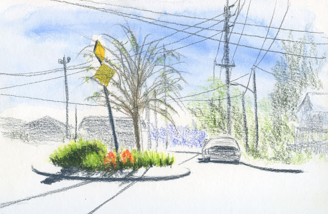
4/21/21 Maple Leaf neighborhood

After an errand, I was planning to hunt for more pink trees, but when I came upon this traffic circle, I was seduced by the backlighting on its plantings. The leaning tree, the leaning post, the cheery tulips – so much beauty in the commonplace.

Saturday, April 24, 2021

Kwanzan Cherries


4/20/21 Kwanzan cherry trees, Maple Leaf neighborhood

Kwanzan blossom cluster
I think it was only as recently as a year ago that I learned to identify the Kwanzan cherry tree. Before that, I knew that a bright pink tree blossomed later than the more common (around here) ornamental cherry that I think of as the quintessential sakura, but I didn’t know if it was a different cherry variety or something else entirely. Then I saw photos of trees on Instagram identified as Kwanzan cherries, and I recognized them immediately: A much brighter pink than the nearly white sakura, the blossoms grow in large, distinctively round clusters.

Now that the ornamental cherries are all done, the Kwanzans are in their full glory. I know of a couple more in the ‘hood that I hope to catch before the season of pink is over for the year.

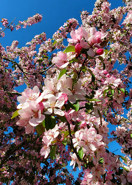
Below is another tree that is just starting to blossom. A Facebook friend identified it as flowering crabapple. I don’t expect to be able to ID every flowering tree in my neighborhood, but I do like to learn the names of any tree I sketch. I want to catch this one with my sketchbook, too, but I may be out of time: Our streak of unseasonably gorgeous weather is over (we broke a record by having seven consecutive days of temperatures at or above 70 degrees in April), and the normal rain is back.


Flowering crabapple

Friday, April 23, 2021

Northeast


4/19/21 Northeast corner of 4th NE and NE 85th St.

Standing on the same traffic circle where I sketched the new twin houses, this time I faced the northeast corner. Compositionally, I enjoy these corner views because I can get interesting angles on the houses. I also like the challenge of sketching whatever is there without having much leeway. I think I’ve finished the corners with the most potential, though . . . the last two are going to be harder. 

Thursday, April 22, 2021

Our Neighbor’s Tree


4/18/21 Our neighbor's tree

Whenever we’re enjoying our backyard deck during warm weather, I see this tree, which is just on the other side of the fence we share with our neighbor. I don’t know what it looks like from their yard, but the side that faces us shows an amazing branching structure. When I follow certain branches with my eyes, they look like they have braided themselves. Every time I see it, I say to myself, I have to draw this tree sometime. For many years, however, I had no idea how to approach drawing its complex mass of trunk and branches. After taking Kathleen Moore’s class in drawing trees with graphite, I finally felt ready to take it on.

Last Sunday afternoon, the sky was perfectly blue, the temperature was 75 degrees, the deck was shady, and I had just poured myself an iced beverage. “Sometime” finally came.

Wednesday, April 21, 2021

Facing East


4/16/21 Maple Leaf neighborhood

Knowing that by afternoon our upstairs deck would be too warm, I went out in the morning. Trees across the street shimmered with backlighting. Some trees have foliage in April that’s more yellow-orange than green and look oddly like fall. But the sky, the slant of the shadows, the color of the light – they all shouted spring.

That dark reddish blur on the left, by the way, is one of the ornamental plums I sketched a few weeks ago. They were fun to sketch that day, but usually they just block my view. I let the texture of the Stonehenge cold-press paper do the work of conveying their annoying presence.

Tuesday, April 20, 2021

Northwest Twins


4/15/21 Northwest corner of 4th NE and NE 85th St.

Just about a year ago when we were only a month into the pandemic, I had accepted that my urban sketching radius had become necessarily small. Challenging myself to look for views I could sketch safely on my daily walking route, I saw that the traffic circle at Fourth Northeast and Northeast 85th had potential. By mid-May, I had finished a small series: a sketch from each of four directions.

A year later, things haven’t changed much. As I continue to wait (im)patiently to be fully vaccinated so that I can feel safer sketching further afield, I see new potential in the same traffic circle. This time I’m going to sketch the four corners.

Shown here is the view facing northwest. Those two tall houses are the ones I sketched from the back last August when they were still under construction. Now finished, one has been sold; its twin still has a “for sale” sign in the yard. Although better looking than some shoeboxes going up in the ‘hood (I like the small triangular windows just at the peaks), these twin behemoths dwarf their neighbors.

Monday, April 19, 2021

A Fresh View Facing West

4/14/21 Maple Leaf neighborhood

Last week was a well-deserved treat for Pacific Northwesterners: Clear skies, sunshine, and temps in the high 60s and 70s – so rare this early in the season. This overly familiar view from our upstairs deck doesn’t excite me much. But my opportunities to sketch up there are fewer than you’d think – it can get hot quickly. Last week was ideal – sunny and warm but not too warm.

To freshen the view, I pretended I was a visitor who had never seen a typical Maple Leaf residential street from above ground level. Bare only a few weeks ago, our neighbors’ trees were now a luminous yellow-green. The rooftops formed a geometric contrast to the organic haze of leaves. As a “visitor,” there was plenty to catch my eye. And it felt so good to be sketching in the warm sunshine that I would’ve been happy with a mud hole as my subject.

Technical note: I tried Legion Stonehenge White again, this time with wax-based Caran d’Ache Luminance pencils. The light tooth grabs pigment beautifully and reveals an appealing texture. After trying it with water-soluble pencils the previous week, I loved the texture’s appearance then too, and the 90-pound paper held up well to spritzing, but it warped enough that I didn’t want to use the reverse side. I think this paper is best with dry media. I’m looking forward to using it in the colored pencil class I’m starting next month.

Sunday, April 18, 2021

Unconventional


Pencil eraser used as stamp

For the remaining days of my series, I am challenging myself to use unconventional materials – either the media, the tool, the support or all three. I don’t test first; I simply decide what I’m going to use, then hit it.

Of the 398 drawings so far, the one done in ketchup is the only one that no longer exists; after the photo was taken, it went straight into the trash (we have an ant problem as it is). It was also the most disappointing in appearance – I always thought ketchup would be a brighter red.

My favorite so far is the blending stump used with fountain pen ink. I’ve only ever used a stump with graphite and charcoal, so I had no idea how it would behave with a liquid medium. The soft marks are surprisingly beautiful.

Every idea is worth trying.

Toothpick and Simple Truth organic ketchup

Blending stump and Pilot Iroshizuku Kon-peki ink

Sailor Naginata fude de Mannen fountain pen and Iroshizuku Yama-budo ink on Kirkland brand paper towel

Mitsubishi Dermatograph grease pencils on newsprint

Vintage rolling date stamp
Q-Tip and India ink on catalog page


Related Posts Plugin for WordPress, Blogger...