Showing posts with label Etchr. Show all posts

Thursday, August 24, 2023

Green Lake Mixed Media (and Etchr Deal-Breaker)


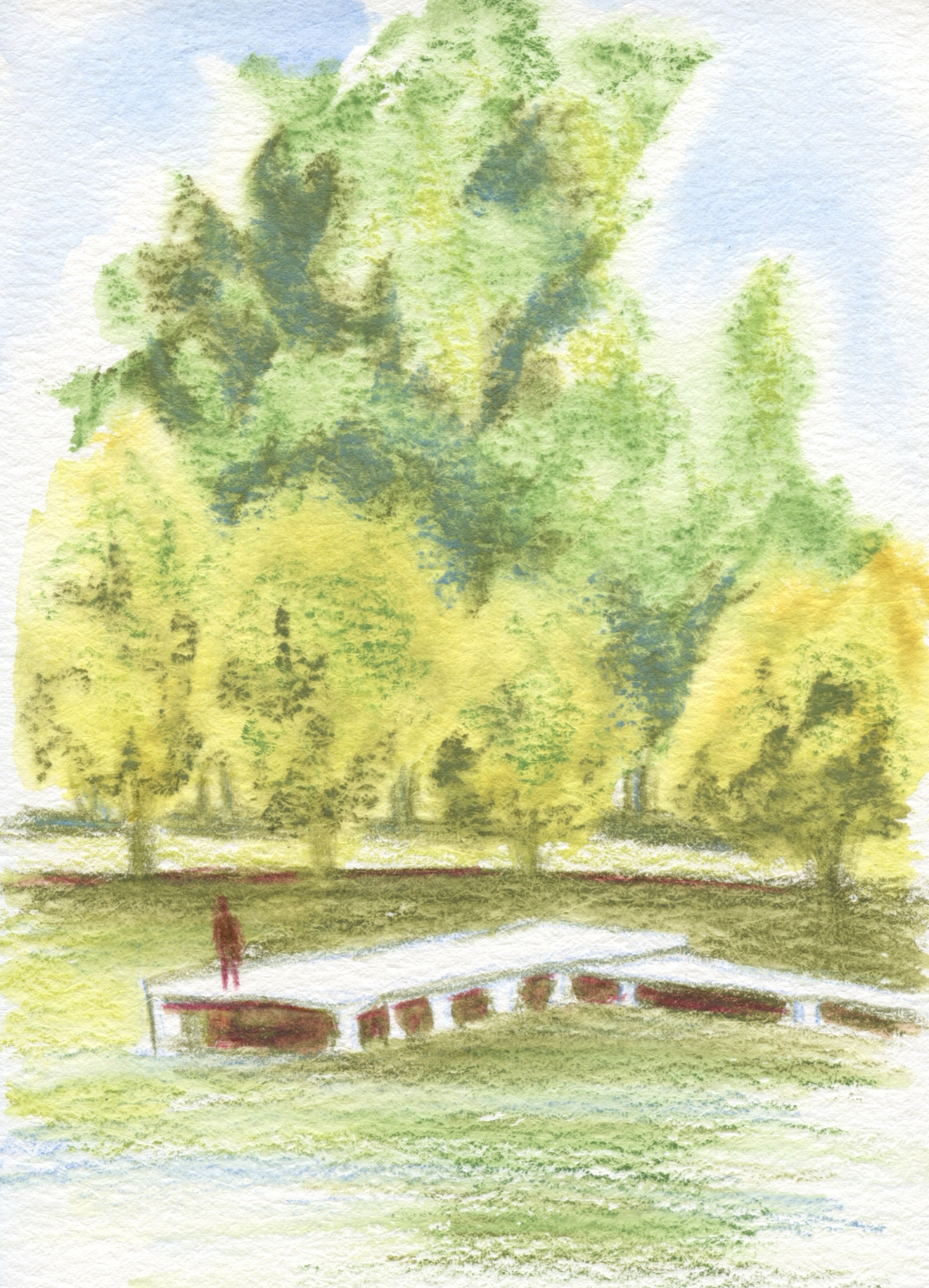
8/19/23 Green Lake (Supracolors and Fibralo brush
marker in Etchr sketchbook)

Although I walk and sketch often in the Green Lake neighborhood, I hadn’t been down to the actual lake in a couple of weeks. Last Saturday I was dismayed to see how yellowish many of the trees are getting. Some of it is the weary, dehydrated hue of late summer, but I’m sure I also see early hints of that river in Africa.

The sky over the lake that morning was still mostly blue, but by afternoon, a haze of smoke was starting to drift in from wildfires in the North Cascades and Canada. In California, they talk about the year having an additional season: smoke season. I guess we have to add smoke as a regular season to our calendar, too.

Color and media notes: With three natural greens in the Caran d’Ache Mixed Media Botanical Set, it was easy to get a good variety reflecting the range of foliage around the lake. Wanting to keep the “mix” in mixed media, I tried something new with a Fibralo brush marker: The foreground trees along the shoreline had the yellowest tint, so I first used the Golden Ochre (033) marker to roughly shape the sunny side of those trees. Then I spritzed the Fibralo marks and the whole top half of the page liberally with water (see below). The water-soluble Fibralo blurred nicely, and I could then easily go in with three Supracolor greens (Olive Black 019, Moss Green 225, Light Olive 245) on the very wet page for all the trees.
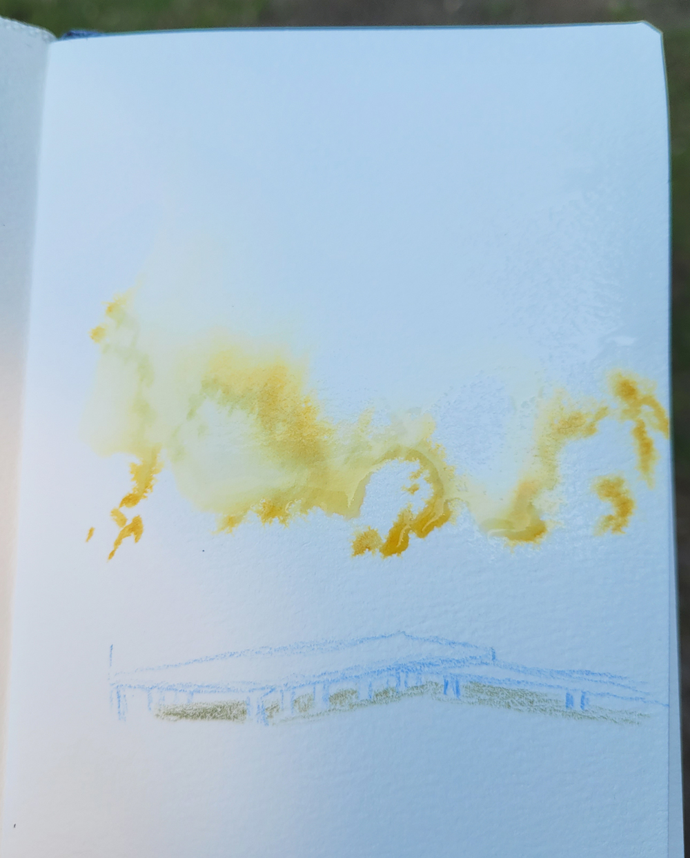
Fibralo brush marker used to shape trees, then spritzed liberally. (Apologies for the dark image... I was sketching in the shade.)

I like the textures and blurry color blends I got from this part of the palette, and I especially like the way the Fibralo dissolved completely like watercolor instead of leaving a lot of hard marker lines. This might be my favorite use of water-soluble markers so far.

I’m still struggling, though, with mixing sufficiently dark darks with this palette, such as the shadow under the pier. In this serene sketch, I really wanted to avoid the garish purple marker (Lilac 110) that I’d been using, so I tried mixing the darkest Olive Black with Supracolor Dark Carmine (089). The hue is OK, but I couldn’t get it any darker. I might have to break out of the palette and add something cooler and darker to the mix.

Etchr sketchbook notes:

Toward the end of the 30x30 Direct Watercolor challenge, I used some Etchr Lab paper samples. In the same Etchr order as the samples, I had also gotten an A6-size, cold press sketchbook that I was planning to try as soon as I finished the current Hahnemühle. The results I got on the samples were especially encouraging.

Eager to crack it open, I took the Etchr to Green Lake for this sketch, and I’m sad to report that it’s a deal-breaker – but probably not in the way you’d expect. The paper is beautiful. The sizing keeps heavy spritzing afloat, and the 230 gram, 100-percent cotton easily holds up to my vigorous penciling, even sopping wet (thinner, cheaper papers will start pilling at that point). The substantial tooth is also ideal for the textures of foliage and ripples on water. All the qualities I love about Hahnemühle are comparable in the Etchr.

The bulky Etchr (left) compared to Hahnemuhle.
But here’s the deal-breaker: The fabric-covered hardcover is too thick, making the book too bulky in my tiny bag. As soon as I had received it, I was afraid that would be the case, but I wanted to take it out on a walk to see if it could be tolerated. Alas, it’s just too fat. In addition, although it contains only 52 pages compared to the Hahnemühle’s 60, slightly heavier pages, the Etchr book weighs a bit more, so that thick cover adds quite a bit of useless weight.

It’s a good, sturdy cover that can probably withstand heavy abuse, but since I can fill 52 pages in two or three months, I don’t really need a cover that strong. I’d rather have a thinner, lighter cover even if the corners are a little frayed by the time I fill it. (Hahnemühle or Etchr, please make a softcover edition with 100-percent cotton paper!)

I have other complaints about the Etchr, too. The binding is so stiff that it’s hard to get it to open as flat as the Hahnemühle. You can see below how it won’t stay closed without fastening the elastic. But I could have tolerated the binding issue if the bulk hadn’t been a deal-breaker.

Stiff binding will not allow cover to stay closed.

It won’t go to waste – I will certainly enjoy using the paper at home. But if I can’t take it out with me on walks, that lovely paper isn’t going to get nearly as much use as I had hoped.

My tiny everyday-carry Rickshaw mini Zero Messenger bag (shown most recently in this post) is a fairly restrictive factor in what my sketch kit can include. But I’ve been enjoying the ease (on my shoulder) and freedom of a small bag so much that I can’t go back to my larger Rickshaw bag. I’ve thought about looking for a bag that’s somewhere between the two sizes, but that’s a well-known slippery slope. If I have more space, I’ll just be tempted to carry more. I’m holding firm.

It’s back to a Hahnemühle.

An unfortunate deal-breaker.

Monday, July 3, 2023

30x30 Direct Watercolor Finale


6/21/23 photo reference

This primary triad, used in the sketch at
left, is my favorite from the Kuretake Gansai
Tambi set. I used it frequently during the challenge.

Thirty consecutive days of watercolor painting without a drawing to guide the brush – whew! Whose big idea was this, anyway?? (The answer is Marc Holmes!)

Despite my month-long whining about how hard it was, I must admit I learned more about using watercolors during the 30x30 Direct Watercolor challenge than I have from any class or book. I can say with full confidence that if you practice anything for 30 consecutive days, you will get better and, with any luck, maybe make a breakthrough in your own creative growth (which is exactly what Marc intended when he first initiated this annual challenge in 2018).

6/22/23 Crown Hill neighborhood (on location)

Personally, I didn’t have any moments that felt quite like “breakthroughs,” but after years of avoiding watercolors (especially on location), it did feel satisfying to push past resistance and use them again. Taking
Kathleen Moore’s Winter Sketchbook+ Watercolor class in February was a good introduction, but direct watercolor – painting without guidelines – is a whole different ball of wax. Nothing like plunging headlong into the deep end without a lifeguard to make me swim fast and hard!

6/23/23 Roosevelt neighborhood (on location)

Shown in this post are sketches from the last 10 days. Some general learnings and insights (notes on specific sketches are in cutlines):

  • One thing I found most intolerable about my past uses of watercolors was wimpy washes when I needed strong washes. Learning to get better at making strong mixes was an important goal for the month, and I feel good that I did improve.
  • While wet-in-wet techniques weren’t part of the challenge, something about not having lines to follow seemed to encourage that technique of painting, which I enjoyed exploring. Thinking back to my early urban sketching days when I was stumbling along with both drawing and painting, I know that having a drawn picture to color in with paint inhibited mixing on the page because my technique was simply to fill in the spaces – the “coloring book” method.
  • Wet-in-wet also supported my goal of avoiding wimpy washes. If I didn’t use a mixing tray, then I was more likely to retain the intensity of hues that came out of the tube as they hit the page. As I discovered during my struggles in Kathleen’s class earlier this year, nothing creates wimpy washes faster than trying to achieve a specific hue in a mixing tray, continually adding more water, then more paint, then more water, then more paint again. Argh.
  • For the past couple years, I’ve been intrigued by color mixing, especially with triads. Using watercolors was a prime opportunity to explore the same principles with a different medium. In all of my direct watercolors, I never used more than four paints, usually no more than three. When working wet-in-wet, there’s so much to think about quickly anyway; I didn’t want too many colors to choose from. Except for a few tube paints I added to my portable Kuretake Gansai Tambi palette, I stayed with the colors that came in that set plus the larger Kuretake Gansai set when I was at my desk. Ultimately, even with those 19 or 24 colors easily accessible, I found I kept using the same six or seven paints repeatedly, and some I never used. All of this is very informative for refining and reducing my palette going forward.

6/25/23 Both of these old cars were sketched from photos I took at the Greenwood Car Show. In each, I played with color compliments -- blue and orange in this one. . . 

. . . red and green in this one.

From a broader perspective, participating in the 30x30 confirmed something I’ve long suspected, at least for myself (and probably many people). The most effective sequence for learning to paint is this:

1. Develop a solid foundation first in rendering – understanding and practicing proportions, form, light logic, etc.

2. At the same time, practice making drawings with a range of values.

3. Practice seeing and studying composition.

4. Study and practice color mixing with a dry medium (optional but very helpful).

5. Finally, learn to paint. With all the other stuff out of the way, learning to apply and mix paint can have one’s full attention.

I think back on how I (and so many other beginning urban sketchers) started out using watercolors from Day 1 of urban sketching. With so many other things to think about (see list above) at the same time, it’s no wonder watercolor painting was so difficult (and still is)! But this several-years-long pause I’ve had since the last time I used watercolors gave me time to focus on drawing and rendering so that now I can focus on painting. If I have any word of basic advice to beginners now, I would point to that sequence above.

6/26/23 photo reference

Overall, I’m happy that I took the plunge and pushed myself to try a challenge I didn’t feel ready for. After all, if I had felt ready, then it would not have been much of a challenge.

6/27/23 photo reference

6/12/23

6/28/23 Green Lake Village (on location). This sketch was done in 
the same location as one I did on 6/12 (shown at right). I did not like
the wimpy washes and weak composition I got the first time.
I think my second attempt is much better, both in value contrast and composition.

6/29/23 Earthsworld reference photo. This triad is my take on the Zorn portrait palette from the Kuretake Gansai Tambi studio set.

6/30/23 After abusing several Earthsworld strangers, I thought it was only fair to give myself the same treatment as my 30x30 finale. Whew -- a direct watercolor selfie! Someone, please give me a medal for bravery!

Friday, June 30, 2023

Etchr Paper Samples


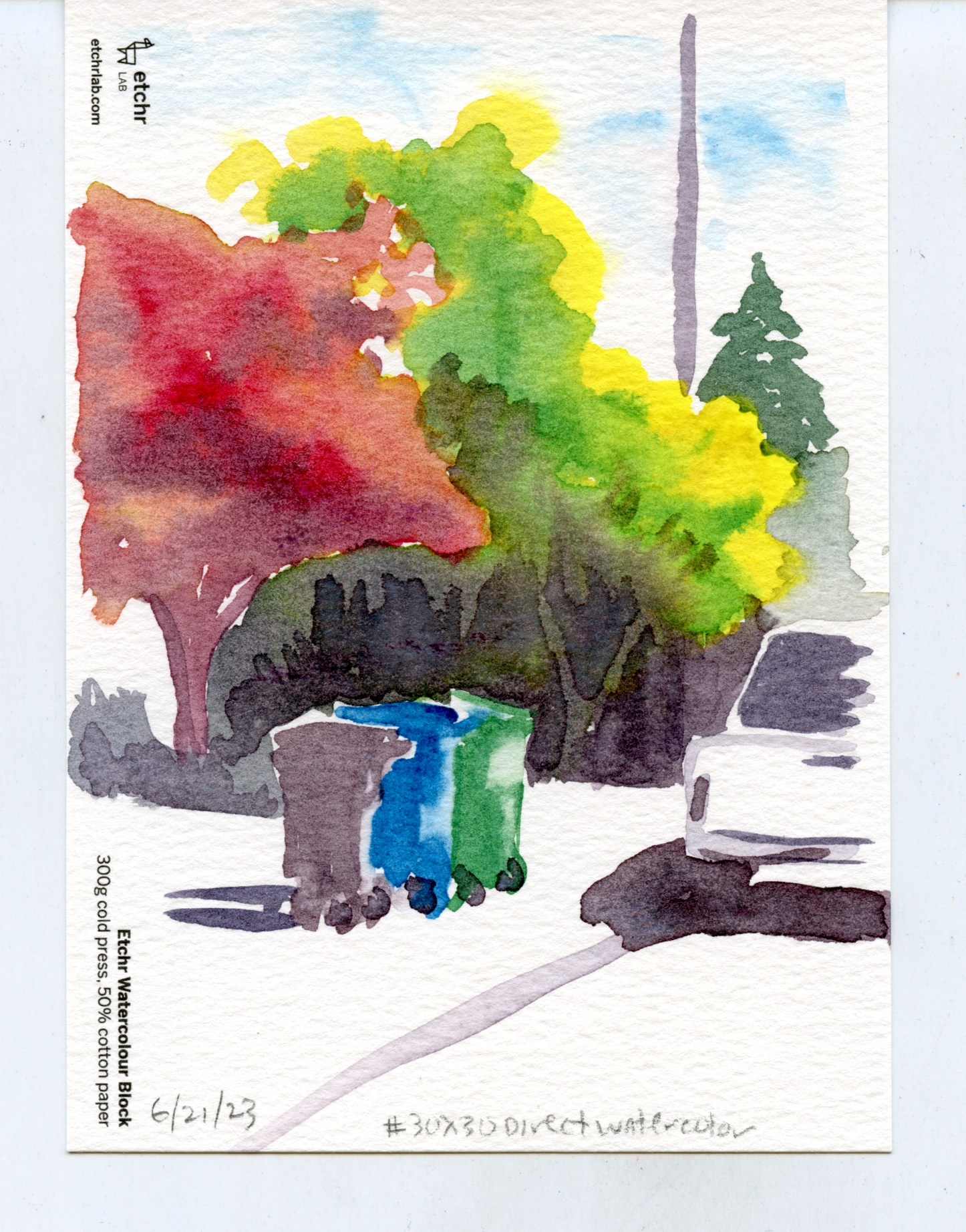
300g cold press, 100% cotton paper.  This paper comes in the Perfect Sketchbook, Etchr's top-of-the-line book. It was definitely the easiest to work with wet-in-wet, even outdoors, because the surface stayed wet longer.

A couple of months ago when Parka was showing daily video coverage of the Urban Sketchers Symposium in Auckland, he gave a discount code from Etchr Studios, a symposium sponsor, that was offered to anyone viewing, not just symposium attendees. Wanting to try an Etchr sketchbook for a while, I took advantage of the discount and ordered a pack (review forthcoming as soon as I get around to using one). I also got a swatch pack including samples of four Etchr papers. The pack price, $10 for four A6-size sample sheets, seems a bit steep – until you see that the $10 can be applied toward purchase of a sketchbook in the next order. Fair enough!

So that my experiences would be relatively fresh in my memory, I decided to use all four paper samples on consecutive days during the 30x30 Direct Watercolor challenge. You’ll see some of these sketches again in my direct watercolor finale post, but here they are together uncropped so that the paper type is visible. With only one sample of each paper, I can’t give any a thorough review. But at least with the techniques I used – mostly wet-in-wet, some with multiple layers – all four performed very well, even the 50 percent cotton cold press. (A few specific comments are in the captions.) I’m looking forward to using an Etchr sketchbook as soon as I fill my current Hahnemühle.  

230g cold press, 100% cotton. Even this lighter-weight version of 100% cotton paper took to multiple layers of wet-in-wet work well.

300g cold press, 50% cotton. Although I've been converted to 100% cotton by Hahnemuhle's excellent paper (250g), I must say that even this 50% cotton Etchr paper performed beautifully, maybe because of its weight. I'd want to use it several more times before recommending it, though.

220g hot press, 100% cotton. Whoa, after using nothing but cold press (except for a few random tries years ago), this hot press paper gave me a rattle -- and not in a good way. I imagine it's great to use with a fine nib fountain pen line that would be painted over afterwards, but otherwise, I would surely miss the texture of cold press. The paint flows very differently on hot press without all those bumps to catch on. It would take me a while to get used to this. Actually, it might be worth trying with super-soft watercolor pencils like Caran d'Ache Museum Aquarelles . . . hmmm.

Related Posts Plugin for WordPress, Blogger...