Tuesday, December 31, 2013

No Retrospection Here

12/31/13 Diamine Eclipse ink, Sailor pen, Zig marker, Canson Montval 140 lb. paper
All the way home from Zoka Coffee, I tried to think of something mildly profound or insightful to blog about befitting the last day of the year. I thought about the sketch I’d just completed there – layers of people who came and went during the hour that I sipped my mocha – hoping to find a metaphor for the passage of time or some other retrospective musing. I’ve already done a post of my top 10 products of the year, and I’ve also blogged about my 10 11 most memorable sketches of the year. I looked at my blog post dated Dec. 31, 2012, to see if I could get some ideas, but I found that post equally uninsightful (not surprisingly, two of the sketches that day were done at Zoka Coffee).

What’s left to say? Nothing but “Happy New Year!” And may 2014 bring all of us many days of sketching happiness.

Monday, December 30, 2013

Leafless in Seattle

12/30/13 Diamine Chocolate Brown and Platinum Carbon inks,
Sailor pen, Zig markers, Canson Montval 140 lb. paper
Two months ago I sketched this same maple tree in all its autumn splendor just a couple blocks from my house. Although it has lost all its leaves, it has gained a yellow caution sign, which was missing last time. It’s nice to have that spot of color, even if it’s only a sign.

I was struck by how many tiny, twiggy branches extend from all the limbs. As much as I miss the brilliant orange and gold leaves, I am fascinated by the complex network of lines formed by the now-visible branches. Instead of the wet-on-wet watercolor challenges I had in October, I now have equally difficult pen-and-ink challenges (ideal for my Sailor pen, which can render the heavier main trunk branches as well as the thin twigs). As long as I can find trees that can be sketched from the car, I hope to have as much fun sketching them this winter as I did during the fall.

Sunday, December 29, 2013

Product Comments: Fabriano Studio and Bimoji Brush Pen

12/29/13 Kuretake Bimoji brush pen, Zig marker, watercolor, Fabriano hot press 140 lb. paper
I was on my way to returning a DVD to Reckless, our neighborhood video rental store (yes, we still prefer to go there instead of using Netflix; it’s fun to chat with the friendly, knowledgeable staff about movies and get their recommendations) when I spotted this tree. Instead of being strung with holiday lights, it had only these huge red ball ornaments hanging from its very bare branches – a bright spot of color on an otherwise overcast, colorless day.

This sketch was the last in the signature of Fabriano Studio hot press 140-pound paper that I recently mentioned purchasing on a whim from DickBlick.com, sight unseen (or rather untouched, since touch is usually a more discriminating sense than sight when it comes to paper). So it’s a good opportunity to make a preliminary report on it (I’m sure I’ll have more comments after I’ve used a few more signatures of it).

Fabriano Studio hot press paper
The paper’s hot press surface reminds me of Stillman & Birn’s Epsilon series of sketchbooks, which I tried out about a year ago. The Epsilon’s plate surface was like a smoothly polished floor that my fountain pen nib could glide across effortlessly, and I’ve been delighted with the same effect I get on the Fabriano Studio’s hot press surface. My sketch of “LeRoy, the Big Pup” at the Tacoma Art Museum was nothing but my Sailor pen and a light wash from a waterbrush, and the Fabriano was pure joy. Unlike the Epsilon, however, the Fabriano is made for wet media, so I can sketch and paint on both sides of a sheet with no show-through at all (which was a major problem with the Epsilon paper, especially when scanned). Markers also take to the Fabriano surface beautifully (I sketched the 1964 Porsche at the LeMay Car Museum with Zig markers).

I’ve only used it a couple times with watercolor, which is what it’s intended for, so I need to do several more examples before I can determine whether I really like it for this. So far, I’ve sketched the 1957 Corvette at the LeMay with watercolors, as well as Gabi’s exhibit at MOHAI, and the paper showed no warping. The part I don’t like is that the Fabriano surface has no texture at all, so watercolors take on the smooth, textureless look of markers without showing the subtle separation of hues that makes watercolors so lovely. The conclusion I came to about the S & B Epsilon is that I preferred using it with fountain pen and ink and markers rather than watercolor, and maybe that’s what I’ll conclude about Fabriano Studio, also. In any case, this impulsive paper buy is turning out to be a good value, since I work in pen and ink frequently.

Kuretake Bimoji brush pen, designed to look like a sumi-e brush.
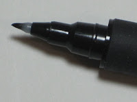
While I’m at it, I’ll make a few preliminary comments about the Kuretake Bimoji brush pen that I picked up a couple weeks ago at our local Kinokuniya. I sketched the tree above with the Bimoji, which has a hard felt tip, not an actual synthetic hair brush like the Kuretake Fountain Brush Pen and Zig Clean Color Real Brush markers do, both of which I love. I generally avoid hard felt-tip markers because they produce that harsh-edged “marker” look. Call me a sucker for packaging, but this Bimoji is made to look like a traditional sumi-e brush and is designed to act like one, so I was compelled to try it.

The Bimoji's hard felt tip.
Although this sketch might not be the best example, the Bimoji does produce nice thick-and-thin lines (similar to my Sailor pens). What’s more, its ink is waterproof, so after drawing the bare tree’s limbs, I could use watercolor to paint the red balls. Having taken a class long ago in traditional sumi-e painting in which we had to grind the ink from sticks of soot and used traditional sumi brushes, I’ll say that this felt-tip pen is a far cry from that brush. OK, I’m a sucker. But the pen and the Fabriano paper were made for each other. 

Saturday, December 28, 2013

Tina’s Top 11 Memorable Sketches

This time of year, it’s a media standby to list the top 10 events of the past 12 months, so I might as well do it, too. Instead of choosing my 10 “best” or “favorite” sketches (I don’t like to evaluate sketches that way; they are all part of the same process), I’ve selected 10 that are the most memorable for various personal reasons. Some evoke particularly strong sensory feelings of a place; others represent a change in perception; still others simply took place in unique circumstances. (Clicking the title of the sketch will take you to the original post.)
Suzzallo Library

Jan. 20, Suzzallo Library: Sketching this gothic window during a Seattle Urban Sketchers gathering completely exhausted me!

"Terror Bird"
Feb. 22, Brazilian “Terror Bird,” Burke Museum: Before I tried it, I used to think sketching a skeleton would be too challenging for me. This “terror bird” changed my view: Skeletons are indeed challenging, but they are also so fascinating that they became my favorite natural history subject matter. In fact, I became a Burke member this day so that I could look forward to sketching many more skeletons.

UW cherry trees
March 30, University of Washington cherry trees: On a record-breaking warm spring day (wearing flip-flops in March is unheard of!), I joined hundreds of people simply rejoicing in the beauty of cherry blossoms.

"Waiting for the Interurban"
May 10, Waiting for the Interurban, Fremont neighborhood: On a particularly sunny and pleasant day, the Friday sketchers gathered in Fremont to sketch icons like this sculpture. Despite the continually obstructing stream of traffic as I sketched, I remember being perfectly comfortable in the mid-day sunshine, basking in the fun.

Greenwood Car Show
June 29, Greenwood Car Show: Sketching these classic cars and chatting with their owners helped me to slay a sketching nemesis. Though they remain challenging, now I think cars really aren’t so bad, a thought that was reinforced a few days ago at the LeMay Car Museum.

Arc deTriomf
July 13, Arc deTriomf, Barcelona: Sketched at the culminating gathering of hundreds of sketchers during the International Urban Sketching Symposium, the Arc de Triomf is now a symbol for me of feeling a part of that worldwide community.

Koln Cathedral
July 18, Köln Cathedral, Köln: This sketch was a record-breaker for me, the longest I have spent on any one sketch – two hours. The day was sunny and warm but not yet hot. As I sat with my back against a pillar, hundreds of commuters busily walking by without so much as a glance at the cathedral, I continually marveled to be in the presence of such architectural splendor.

Maple in Wedgwood
Oct. 12, maple tree, Wedgwood neighborhood: Just one of many trees I sketched last autumn, this maple helped me slay a second sketching nemesis. How could I find an enemy in a sketch subject that gave me so much joy to portray?

Smith Tower
Nov. 15, Smith Tower sketched from the Columbia Tower: It wasn’t just that it was my birthday celebration that made this day special. A view from the 73rd floor makes everything seem grand and amazing.

The Seattle Sketcher on New Day
Dec. 16, Gabi’s appearance on New Day Northwest: I had never been in a live TV studio audience before, so the event was memorable in that regard. Sketching the Seattle Sketcher on the program made the event even more memorable.


From Hiroshima to Hope
Edited 12/29/13: I suddenly remembered a sketch event that was especially memorable for me because it was one of few opportunities I’ve taken for actual reportage sketching: The “From Hiroshima to Hope” annual commemoration in honor of the victims of the bombings of Hiroshima and Nagasaki during World War II. I thought about eliminating one of the other sketches from this post, but who says a “top 10” list has to be limited to 10?

Friday, December 27, 2013

Santa Wears a Hoodie

12/27/13 Diamine Eclipse ink, Sailor pen, Zig marker, Fabriano hot press 140 lb. paper
Although I didn’t meet this year’s goal of sketching more than two Santas, I think I should get extra credit for sketching someone who could easily be Santa on his day off – dressed in a hoodie.

He was one of several people I sketched today at the Seattle Center Armory who looked like they might reside there permanently – or at least during all of its open hours. Many of them seemed to be carrying all their worldly belongings in a knapsack and using the Armory tables to nap or read.

12/27/13 Diamine Eclipse, Zig marker, Fabriano hot press paper

The Friday sketchers chose the Armory for today’s outing because we knew it would still be decked out for the holidays, and the Seattle Center’s Winterfest was still ongoing. But to tell you the truth, I am over Christmas, especially hearing “Jingle Bell Rock” and “Santa Baby” on Dec. 27. So I was content to sketch the Armory’s “residents” instead of decorated trees and wreaths (Santa in a hoodie not withstanding).

12/27/13 Diamine Chocolate Brown and Iroshizuku Take-Sumi inks,
Fabriano hot press paper


My last sketch subject was Stephanie Bower. She was only a few feet away from me but was so focused on painting the elaborate turn-of-the-century train and village in the Armory’s center that she didn’t notice me sketching her.


Thursday, December 26, 2013

Scott Fife’s LeRoy, the Big Pup

A few years ago I took a workshop from sculptor Scott Fife at the Pratt Fine Arts Center. The workshop’s focus was using ordinary corrugated cardboard as a sculpting medium by attaching sheets together with wood glue and wallboard nails. I wasn’t crazy about the idea of sculpting with cardboard, but I was a huge fan of Fife’s work, and I decided I was willing to give his medium a try just to learn a little about how he works.

I did, indeed, learn a lot about working in three dimensions, and using such an inexpensive, commonplace material gave us permission to be as experimental as we wanted to be. While some students created impressive figurative sculptures (one was of Amy Winehouse, the young vocalist who had recently died, and another was a large penguin-like bird), mine was more. . . shall we say “organic” and “freeform” (I’m being generous; see below). Ultimately, my sculpture ended up in the recycle bin (and thankfully, because it was made of cardboard, it could go in there instead of the trash bin), and I decided that working with cardboard was not really my thing. Nonetheless, my admiration for Scott Fife’s work continues.

For quite a while, one of my favorite Fife works, “LeRoy, the Big Pup,” commanded a large, soulful presence on the main floor of the Tacoma Art Museum. Eventually the piece moved to a permanent location on an upper floor, and the beloved piece is so popular that LeRoy has become a museum icon. After visiting the LeMay Car Museum, Greg and I went through TAM’s exhibits, and I stopped for a few minutes to sketch LeRoy, who stands more than 11 feet tall.

At right and above are two views of my cardboard
sculpture, which eventually was recycled.


LeMay Car Museum

12/26/13 Platinum Carbon ink, watercolor, Zig marker, Fabriano 140 lb. hot press paper
Several of my most-admired sketchers have lately taken to sketching old classic cars. In the forefront is Lapin, who just successfully crowdsourced publication of a collection of his classic car sketches. Others are Inma Serrano, Mike Daikubara and Nina Johansson. As you know, cars have long been one of my nemeses as far as sketch subjects go – all those smooth, reflective surfaces and curved yet not organic lines. But when it comes to old classics, I’m as much a sucker for cars as anyone is. I decided to jump on the bandwagon.

12/26/13 Platinum Carbon ink, watercolor, Canson XL 140 lb. paper
Greg and I have long talked about visiting Tacoma’s LeMay Car Museum, so we finally made the trek down south. I had heard that it was a big place, but until you walk into the main showroom, it’s hard to imagine exactly how big it is. The museum is four stories high – nine acres “celebrating America’s love affair with the automobile” (according to the brochure).

First I took a quick walk-through of the four floors to scan all the cars (and ogled only a few). Then I settled on three that caught my eye (all convertibles, of course): a 1947 Lincoln (unfortunately, with its top up), a 1964 Porsche 356C and a 1957 Chevrolet Corvette “Fuelie.” Apparently the exhibit on the main floor is used for special collections, and showing right now are a bunch of lovely ‘Vettes.

12/26/13 Platinum Carbon ink, Zig markers, Fabriano 140 lb. hot press paper
We spent three hours sketching and photographing, but I could have easily stayed all day. As an indoor sketching location, it’s a dream come true: walls and corners to stand against with good views; plenty of benches if you prefer to sit; good lighting everywhere. The main showroom has the best unobstructed view, though. The other floors have support pillars that can get in the way.

Exterior of the LeMay Car Museum in Tacoma.
Main floor of the LeMay Car Museum with a special exhibit of Corvettes.

Wednesday, December 25, 2013

Not Too Late

12/25/13 Uniball Signo opaque gel pens, Strathmore Grayscale paper
Although our Christmas tree has been up for a couple of weeks, I didn’t get around to sketching it until this morning while Greg made French toast. I hope you had or are still having a wonderful day!

Tuesday, December 24, 2013

“Drawn to Seattle”: More Than a Peek

12/24/13 Platinum Carbon ink, watercolor, Fabriano hot press 140 lb. paper
Before I started sketching, I used to read the Seattle Sketcher’s column every Saturday in The Seattle Times and think about how much fun it would be to peek inside his sketchbook. At that time, I didn’t really know anyone who did that type of sketching (nor could I imagine myself ever doing it), so it seemed like such a novelty to be drawing pictures for a newspaper rather than photographing them.

Inspired by the Seattle Sketcher and compelled to finally draw, I eventually joined Seattle Urban Sketchers (the Seattle chapter of the international organization Gabi founded), met Gabi Campanario, and actually did peek into some of his sketchbooks. Today I got the biggest peek yet – some literally larger than life – at “Drawn to Seattle,” the Seattle Sketcher’s exhibit at the Museum of History and Industry (it continues through May 26, 2014).

If you’re a regular reader of Gabi’s column, the sketches will be familiar. Even so, when you view the span of sketches from 2009 to the present all at once, it’s surprising to see how much his style has changed and matured over time. And I think some sketches in the exhibit were never published in the paper or online, so even faithful readers will find something new.

Sketches are presented in their original form and greatly enlarged.
The MOHAI exhibit presents the sketches in a variety of ways – the original pages taken right out of sketchbooks; intact sketchbooks mounted and framed; full-size facsimiles that you can page through; and huge reproductions on the walls. You can step back and see familiar “characters” larger than life, or you can squint closely and try to read the tiny scribbles Gabi wrote to himself in the margins as he interviewed sketch subjects. It’s also fun to see the messy watercolor swatches at the bottom of sketches – all that stuff that gets cropped out when published.

Familiar "characters" appear larger-than-life.
The sketches are curated around themes like “Hidden Places,” “Community Stories” and “Changing Landscapes.” As a Seattle native and lifelong resident, I have seen most of the places shown in Gabi’s sketches, yet I am always struck by how fresh those familiar scenes look when they are viewed through his drawings. Even more, I am struck by the stories Gabi writes – the little anecdotes his sketch subjects told him while he sketched, no doubt, and the small yet important histories he recorded there, in words and pictures. I am reminded that Gabi is not just a sketcher; he’s a journalist, and every sketch is a story.

This case shows Gabi's sketch kit materials -- look at those messy palettes!
Gabi’s spectacular exhibit is a fun and interactive space. Sketchbooks are provided by MOHAI so that visitors can participate on the spot. Tips from Gabi offer encouragement to sketcher wannabes: “Sketching is a form of visual documentation that is accessible to all. No easels or expensive oil paints needed, just a pen and a piece of paper and you are all set to get started.”

If I weren’t already an urban sketcher, seeing this exhibit would inspire me to become one.

There's my sketchbook with the yellow cover!
Shameless self-promotion: I will be among the “Urban Sketchers in Residence” who will be leading mini-sketchcrawls at MOHAI every Saturday 1 – 3 p.m. through March 2014. And my own sketchbook, along with those of other Seattle Urban Sketchers, is displayed in a case in the adjacent participative gallery! (On Christmas Eve morning when we visited the exhibit, Greg and I practically had the place to ourselves. But whenever I saw others coming through, I wanted to shout, “There’s my sketchbook over there! I’m part of this, too!”) 

More sketchbooks contributed by members of Seattle Urban Sketchers.

Opaque White Pens on Black Paper

I’ve tried sketching lights at night only a couple of times – once to sketch lanterns floating on water at the From Hiroshima to Hope event last August, and once to sketch the moon reflected on water a couple months ago. Neither sketch turned out quite the way I wanted it to, and I realized the difficulty of trying to sketch a mostly-dark scene on white paper. In anticipation of sketching holiday lights, I needed a different approach: black paper.

I’ve been wanting to sketch on black ever since I tried using dark gray paper to sketch my X-ray last month (inspired by David Hingtgen’s sketches in a black Moleskine sketchbook). Sketching the X-ray taught me that I prefer using a Uniball Signo gel pen (the most opaque marker I’ve found) to white gouache, which was much harder to keep opaque. But I also want to be able to show all those colored lights I’m anticipating. . . how to put bright colors on black paper?

One way is to use colored opaque gel pens. But it occurred to me that I could put down some white opaque ink first, then apply colored markers over it. With that in mind, I tested three opaque white pens I happen to have: the Uniball Signo gel pen; a Pen-Touch paint marker (it smells solvent-based and therefore is probably nasty stuff); and a white Faber-Castell Pitt Big Artist Pen with a “bullet nib.”

As I’d found before, the Uniball Signo is the most opaque of the three, completely covering black paper. Unfortunately, it’s also the only one of the three that is water-soluble, so when I put a water-soluble Zig marker or even a permanent Pitt Artist Pen over it, the color got mixed into the white and turned somewhat pastel-tinted.

The Pen-Touch paint marker is waterproof when dry, but it left a rough surface that I don’t like (and bled through to the back of the paper and left a stain on my desktop – I knew it was nasty stuff!).

The white Pitt Big Artist Pen, with a “bullet nib” too wide to do much with while sketching, was the least opaque of the three, but it also left a nice, smooth surface – and it’s waterproof when dry. So both a permanent Pitt Artist Pen and a water-soluble Zig marker didn’t mix with the white. Unfortunately, the colors also don’t show up very brightly, since the opacity isn’t complete.

Then the question became: Which is more important for a white background behind colors – full opacity (Uniball Signo) or being waterproof (Pitt)? Oh, what the heck – I brought both! (This is the type of situation during which it really pays off to be an art supply junkie – I didn’t have to go buy a thing.)

As it turned out, I used mostly the white and colored Uniball Signo gel pens to sketch the lights on a Maple Leaf home, with just a touch of a red Zig marker (that turned pink over the white Uniball) and the white Pitt Big Artist Pen. But if the weather cooperates, I still have at least one more opportunity to sketch holiday lights, so I might give my experiments another try. (Incidentally, my Mighty Bright XxtraFlex2 book light came in handy last night!)

Illuminated

12/24/13 Uniball Signo opaque gel pens, Pitt Artist Pen, Zig marker, Strathmore Grayscale paper
Candy Cane Lane, one of a few Seattle neighborhoods that gets really dressed up with lights during the holidays, is popular and crowded during the weeks before Christmas. We talked about going last night, but since the temperature was dropping rapidly toward the 30s again, we weren’t up to walking through the Lane (it can be done by car, but it’s a lot more enjoyable on foot). Instead, we opted for a block in our own Maple Leaf neighborhood that borders the new Maple Leaf Reservoir Park, which is easily drivable (and I had hoped to sketch from the car).

As it turned out, I needed a better angle on this fully illuminated, interfaith house, so I sketched it while standing across the street. The pastel hues of my opaque gel pens really couldn’t do justice to the number of lights and colors displayed on George Banton’s house. A sign on the sidewalk invites visitors to walk through the yard to tour the various themes portrayed in lights – Valentine’s Day, Halloween, Star Wars, the seashore, rainbows, etc. On a cold winter’s night, the tropical theme was one of my favorites, highlighted by the palm tree. I was also struck by the presence of both the Star of David and Star of Bethlehem.

In anticipation of sketching holiday lights, I did a little prep, but ultimately, I didn’t use products the way Id planned. See next post for the product review.

Monday, December 23, 2013

Two Days Before Christmas

12/23/13 Diamine Chocolate Brown ink, Sailor pen, colored pencils, Canson Montval 140 lb. paper
“So. . . have you got big plans for the rest of the afternoon? Some last-minute shopping. . .?” The Zoka barista was making small talk as he rang up my Americano.

“None at all – that’s why I’m here,” I replied happily. And apparently none of the other Zoka patrons were concerned about last-minute shopping, either. Although rain was pouring down outside (yet also simultaneously sunny! Bizarre weather today), the room was serene and comfortable.

12/23/13 Diamine Eclipse ink, Sailor pen, Canson XL 140 lb. paper

Sunday, December 22, 2013

Full and Empty

A second bookshelf cleared, waiting to be filled with sketchbooks.
Last year around this time, I showed a photo of the bookshelf I had cleared off to make dedicated space for my sketchbook collection. That shelf is now full, so I cleared off the shelf below it to make room for more. It’s delicious to anticipate all the sketchbooks yet to fill! (I considered cropping out the disheveled pile of “studio mascots” next to my bookcase, but hell, I show you all of my sketches – you might as well see the rest of the way I live.)

Those of you who are bothered by visual disarray are probably wondering about those three sketchbooks lying on their sides above the other books on the left. They are among the generous supply of sketchbooks I received at the Urban Sketching Symposium last July, and I used one or two pages each in Barcelona. For two of them, I decided quickly that I didn’t like the paper enough to continue using them, so I can’t really count them among the completed sketchbooks that fill the rest of that shelf. The third is a Stillman & Birn, which I do like, but it seems random to use it now after so much time has passed since I made one symposium sketch in it. I’ve considered cutting the few sketches out and giving the books away. But I’m also sentimental about those books, since they all have the USk Barcelona logo on them. (One is even autographed by Lapin! There’s no way I can give that one away!) Hmmm. Another first-world sketcher problem, I guess. 

Saturday, December 21, 2013

Northgate Carolers

12/21/13 Private Reserve Velvet Black ink, Zig marker, Canson Montval 140 lb. paper
So call me crazy.

I actually get a perverse thrill from going to the mall on the last Saturday afternoon before Christmas – as long as I don’t have any shopping to do. Just like on Black Friday last month, I had only one thing to look for: a holiday sketch.

Since I’ve already sketched the Northgate Santa, I didn’t bother to go down to that end of the mall, and as it turned out, I didn’t have to. Four Roosevelt High School students were caroling to raise funds for a local food bank. All decked out in Santa hats, with the boys in red neckties, they were as festive as I could ask for. During their break, one of the girls approached me to see what I was doing. Delighted by the sketch, she was also relieved: She had thought I was writing a review of their singing performance. 

Once again, I left the mall feeling smug that the only money I had left there was in the carolers’ basket.

Friday, December 20, 2013

Fourth Sketchbook Bound (and Yet Another Hot Press)

Another sketchbook bound with Coptic stitch.
Another handbound sketchbook is finished. One of my favorite parts of the handbinding process is choosing the sketches to highlight on the covers. As I’ve mentioned previously, I don’t necessarily choose the “best” sketches; instead, I like using sketches that represent the span of time covered by the volume. The covers then become a visual table of contents. In this case, the still life on the front cover recalls my series of alphabetical still lifes that I sketched during NaNoDrawMo, and the Santa on the back cover reminds me that I finished off the volume during the holiday season.

Now that I’ve bound four sketchbooks with the Coptic stitch, I’m learning that the single-most critical aspect of stitched books is consistent thread tension that’s also exactly the right tension. If it’s too loose (as it was on my first volume), the signatures shift around easily, and I’m guessing that the binding will weaken over time from the movement. If the tension is too tight (as it was with the last one and the one I just finished), the covers splay open, and the book doesn’t lie flat (although putting a weight on it for a few days seems to help). If the tension is inconsistent (as it was with my first try on my first volume that I then restitched when I discovered I had misarranged the signatures), then the spine looks crooked. As with anything handmade, the only way to arrive at the just right is by practicing. Fortunately, I seem to be burning through sketchbook pages faster than ever, so I see plenty of binding practice ahead in the foreseeable future. And also fortunately, I really enjoy the bookbinding process, so practicing is a pleasure.

A pad of 140 lb. Fabriano Studio
hot press paper.
Speaking of sketchbook pages, I found another paper to try: 140-pound Fabriano Studio (hot press). Available in a 9” x 12” pad at DickBlick.com (rather than large, expensive, single sheets as the other two hot press papers I tried were), I took a chance and bought a pad, sight unseen. Although technically it’s the same weight as the artist-grade hot press Fabriano I tried previously, this student-grade paper folds much more easily, which leads me to believe it’s thinner. The surface also feels much smoother – almost as smooth as Bristol illustration board. Intuitively, it seems too smooth for watercolor and probably difficult to control, so I may regret this purchase. But I’ve stitched up a signature to try, and if it turns out to be a paper that I like, itll be a great value. Stay tuned.

Thursday, December 19, 2013

Red Bull for Breakfast

12/19/13 Diamine Eclipse ink, Sailor pen, colored pencil, Canson XL 140 lb. paper
Way back in the dark ages, caffeine came in two flavors: coffee and tea. Now you can get it in just about any flavor you want, and it comes chilled in a tall, slender can.

In a previous life, when I had just started working for a large software company (the kind that gave its employees free caffeinated, sugar-filled soft drinks all day long and called it a benefit), it was still a novelty to see someone coming into a morning meeting armed with a can of cold caffeine instead of coffee. Now it’s commonplace to see someone like this young man at Whole Foods enjoying his Red Bull with breakfast as he scans the news on his phone. 

Tuesday, December 17, 2013

Three’s a Charm: Mighty Bright XtraFlex2 Book Light

The Mighty Bright XtraFlex2 attached to "the Stefano."
After trying two book lights (one of which was a dismal failure and the other so-so) for the purpose of sketching in dark or dimly-lit auditoriums, I finally found a third one that I think will meet most of my needs: the Mighty Bright XtraFlex2. The light has two levels of brightness. I tested it out at home in a dark room, and I was afraid even the lower level might be too bright (and therefore annoying to others) in a dark auditorium. I put a piece of white tape over the two LED bulbs, and that brought the illumination down to the right level.

I was hoping the Seattle Choral Company concert that I attended Saturday night would be a prime opportunity to test it, but St. Mark’s Cathedral was relatively well-lit during the performance. Still, I took advantage of having the light with me to fully illuminate my sketchbook, and it did make sketching easier. Unlike the Mighty Bright Ultrathin Book Light that I reviewed previously, the XtraFlex2 casts a wide, even light that illuminates my whole sketchbook spread, not just a 2-inch circle. The tension clip attaches firmly to the Stefano’s leather cover. The XtraFlex2’s gooseneck flexes in all directions and stays in whatever position you put it in (much better than the Ultrathin, which is like a flip phone).

My only complaint about the XtraFlex2 is that, while being lightweight, it’s a bit bulkier than I would like. (That was one benefit of the Ultrathin, which took up no more space than a thin flip phone.) But then, ever since I started sketching, I haven’t been able to carry a little evening bag to concerts – I bring my full-on Rickshaw Bagworks bag, just like I do everywhere else – so maybe bulkiness isn’t much of an issue. By folding the gooseneck in half, the XtraFlex2 fits acceptably, but it’s not something I’d keep in the bag all the time as I could with the Ultrathin.

I think it’s a keeper (until I find something better).
Related Posts Plugin for WordPress, Blogger...