Showing posts with label Stillman and Birn Alpha sketchbook. Show all posts

Sunday, November 17, 2024

Planar Head in Positive and Negative


11/13/24 Gekkoso 8B graphite in Stillman & Birn Alpha sketchbook

Ching gave me a 3D-printed planar head. With all the facial and skull planes structurally delineated in plastic, it seems like it should be relatively easy to draw. On a recent wet morning, I found it to be surprisingly difficult to draw with graphite. As usual, proportions are the trickiest part.

Instead of measuring as I would with a human model, I decided to correct or adjust as needed on the fly. I resisted erasing restated lines so that I could see my mistakes and learn from them, but in some areas, it got so messy that I could barely distinguish the good lines from the bad, so I erased a bit for clarity.

11/14/24 Prismacolor in Uglybook
On the next wet morning, I tried again, this time with a white colored pencil on black paper. I thought this would be even trickier, since drawing in negative is usually a brain twister, but in fact, I found it easier. Maybe it was just that it was my second time, so my proportions were more accurate before corrections. Drawing white on black also made it easier to abstract the whole thing, which somehow helped.

Anyway, I found the exercise great practice, and I’ll likely draw Mr. Planar again with different lighting and different media. (You can see that I’m gearing up for the long, wet winter ahead.)

Wednesday, January 25, 2023

Review: Techjob Mechanical Colored Pencils


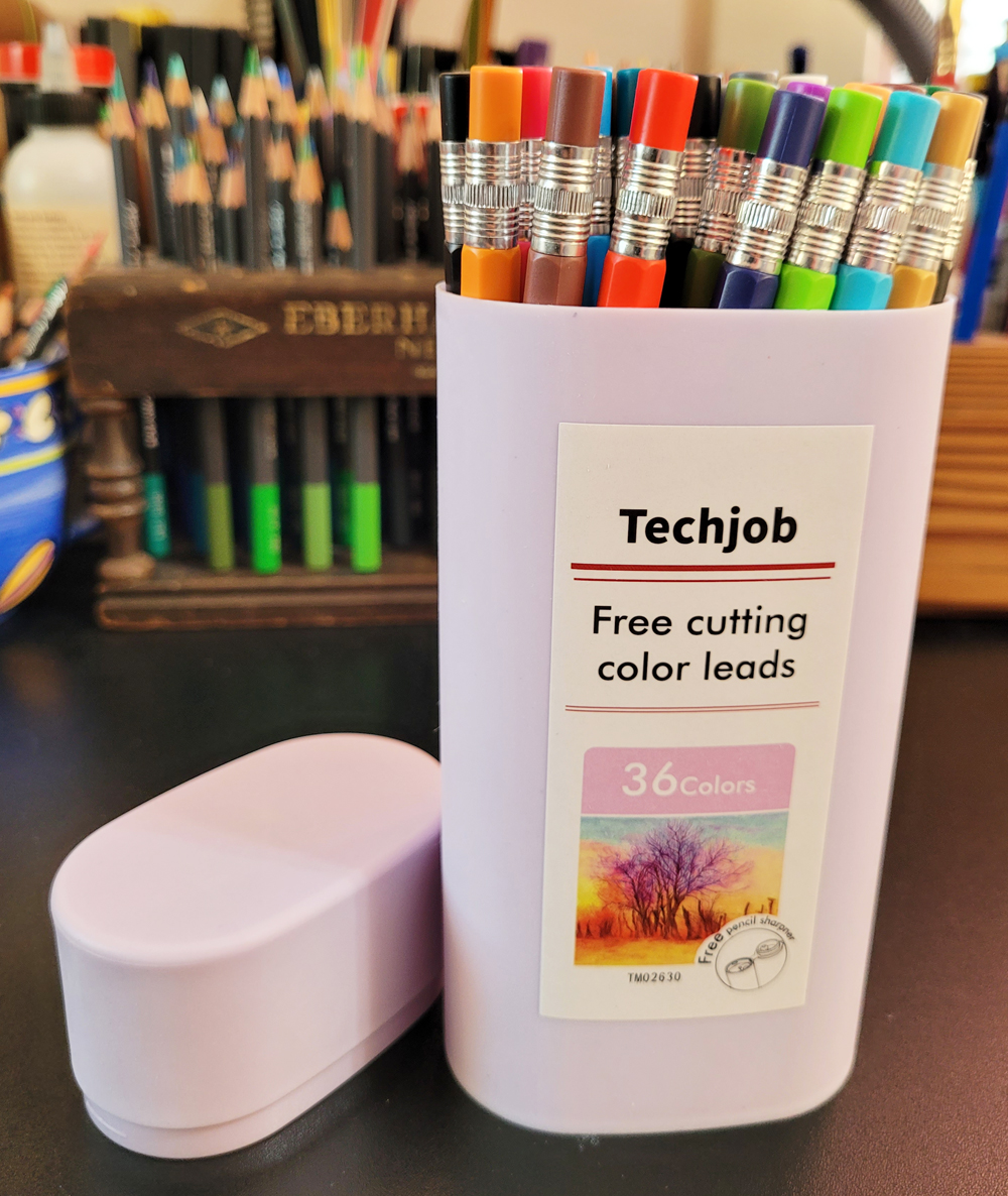
A set of 36 Techjob mechanical colored pencils

How the heck did I even get on the Amazon trail that led me to these pencils? I can tell you for sure that I was not searching for “mechanical colored pencils.” For one thing, I generally prefer woodcased pencils over mechanical lead holders any day (epic searches not withstanding). And for another, almost all colored leads are hard, low in pigment and usually disappointing in other ways.

Whatever I was actually looking for, Amazon presented me with a set of 36 Techjob Mechanical Colored Pencils. With mild curiosity, I scanned the reviews, which were surprisingly positive. Being in the depths of the dark, cold, wet winter doldrums, $17.99 seemed a low price to pay for potential entertainment. I bit. (Ah, Amazon, you win again.)

The non-water-soluble Techjob pencils (I can’t imagine what kind of technical job would use these pencils, but I hope, somewhere in the world, there is one) with “free cutting color leads” come in a distinctive, sensible, oval-shaped plastic tube. It takes up little space on the desktop compared to the flat tins that most sets of 36 pencils come in, and the pencils are easy to pull out. I like that.

End caps indicate the color numbers.

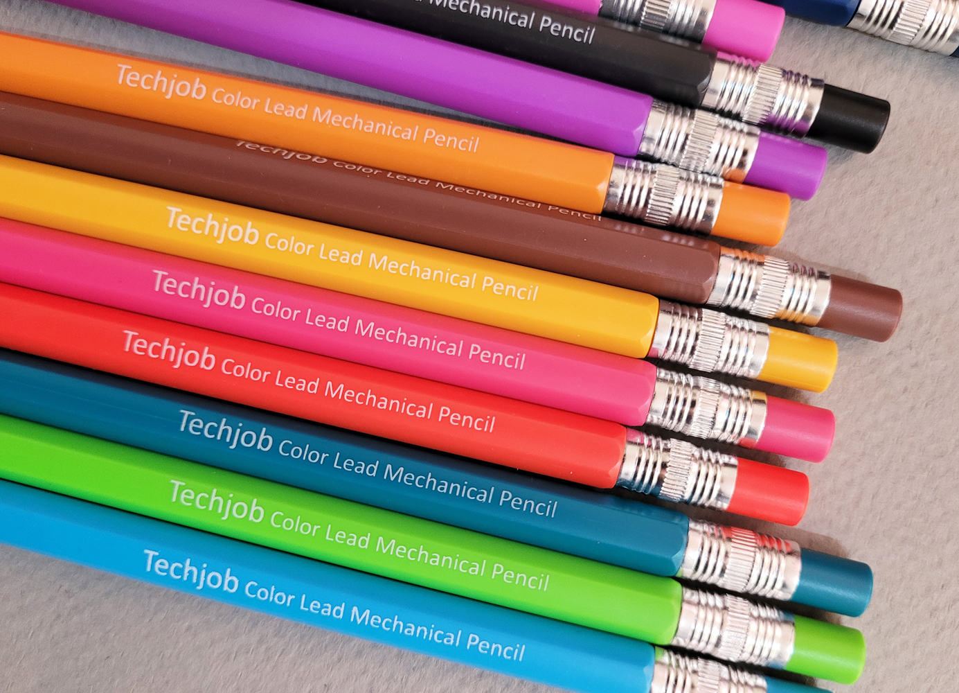
Less likeable is the esthetic of the pencil itself, which, despite its desire to resemble its woodcased counterpart, looks and feels very . . . plasticky. The color-matched end cap, which looks like an eraser attached with a ferrule, pulls off for lead insertion. The end cap also identifies the color number (a color name does not appear on the barrel).


When I first opened the container, I saw what looked like an empty tube that I thought was intended for storing refill leads. Instead, it turned out to be the included
 “free pencil sharpner” [sic], and a good one, at that. Although many lead holders come with pointers either attached or as separate units, most are open, allowing the shavings to fall out, so they have to be held over a wastebasket while in use. The Techjob’s lead pointer enables shavings to fall neatly into the transparent tube, and the cap snaps shut over the pointer. (I do fear for the longevity of the cap’s hinge, however; it feels like it could break off at any moment.)

Lead pointer

Shavings drop down into the tube.

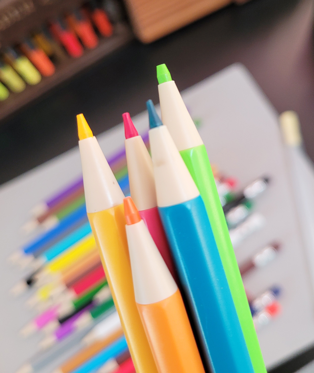
Swatching the 36 colors in a Stillman & Birn Alpha sketchbook, which has a medium tooth, I was immediately impressed by the pigment level and vibrancy. The 2.6mm leads are as soft and vibrant as the Caran d’Ache 2mm colored leads I reviewed a few years ago for the Well-Appointed Desk – but at one-tenth the price! The slightly crayon-y leads produce some dust, but not an intolerable amount.

Each swatch is 3 layers in a Stillman & Birn Alpha sketchbook.

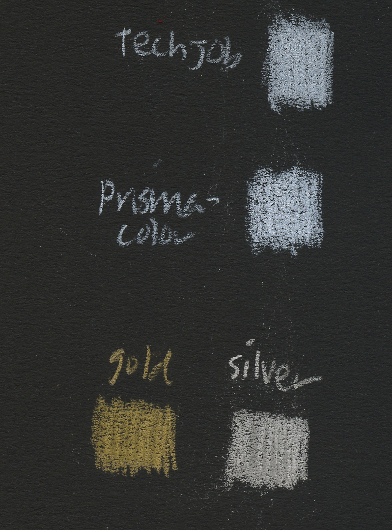
I compared the white Techjob to a white Prismacolor, and they are equally opaque. The set also includes metallic gold and silver (the sparkle doesn’t show much when scanned, but they are average for metallic colored pencils).

Swatches made in black Uglybook.

For my first test sketch, I picked out three pencils that come closest to a Zorn palette for a portrait from an Earthsworld photo reference. In a relatively smooth Stillman & Birn Zeta sketchbook, the leads were easy to apply and blend multiple layers. I spent more time on this portrait than I usually do because the pencils are so enjoyable to use. Their softness meant that I had to sharpen often, but I like the tidy lead pointer.

1/21/23 Techjob mechanical colored pencils in S&B Zeta sketchbook
(Earthsworld reference photo)

I had so much fun on that portrait that I immediately made a second one, this time with a secondary triad and in the toothier Alpha sketchbook. You can see how soft the pencils are by the paper’s visible tooth, and yet I had no problem layering colors. Sometimes I don’t enjoy using soft pencils on paper this toothy, but these were just as pleasant to use as they were on the smoother Zeta.

1/21/23 Techjob mechanical colored pencils in S&B Alpha sketchbook
(Earthsworld reference photo)

At 50 cents each, these Techjob pencils are amazingly good! I am hard-pressed to think of any woodcased colored pencil in a similar price range that I enjoy using as much. They also set a technical precedence: I always thought that colored leads were hard and lacking in pigment because it was not possible for them to be made as soft as woodcased leads without the wood support. The Caran d’Ache leads mentioned earlier proved that it is possible to make soft leads – but at an extremely steep price (not to mention a range of only four colors). And now I see that it is possible to make excellent soft leads for a very low price.

Several Amazon reviewers had pointed out that refill leads were impossible to find; my own searches seem to confirm that. If no refills exist, I suppose that’s no worse than all the many sets of colored pencils on the market that offer no open-stock replacement singles. And yet it’s somehow worse to have a full set of refillable, color-matched mechanical pencils with nothing to refill them with. It’s hard to recommend all that plastic left behind with nothing to do.

One reviewer said that 2mm June Gold colored leads will fit, but I immediately tried mine, and they do not fit. Besides, I think the Techjob leads are better than June Gold (which, up to this point, would have been my recommendation for low-cost leads in a full range of colors). I don’t expect to use up all of these leads, but I’ll keep looking for refills, just on principle.

Oh – and wouldn’t it be nice if I also found a set of equally soft and highly pigmented water-soluble Techjob leads? That would make a better use case for plastic mechanical clutches: When I use the “licking” technique with woodcased pencils, I’m always concerned that the wood may be compromised if it doesn’t dry completely. A plastic barrel would be a practical solution. Something to put on next year’s sketch material wish list!


Sunday, January 8, 2023

Gestural vs. Detailed Portraits


12/29/22 Faber-Castell Pitt Artist Soft Brush (SB) Pen
Using a brush pen has been a great way to shake up my portrait practice. My objective is to see how few marks I can make and still capture the expression or facial gesture. I’m also still practicing more detailed portraits that attempt to capture form, light, shadow and resemblance as usual.

A couple Earthsworld reference photos I used were ones that I had drawn previously, sometimes more than once already. Even if it had been quite a while since the last time I drew the face, familiarity made it easier to capture the expression with gestural marks than a completely unfamiliar face would be. My memory still informed the later attempt.


12/26/22 colored pencil

12/28/22 Pitt SB pen

12/29/22 Pitt SB pen (You've seen this guy before at least twice)

I thought it would be an interesting experiment to draw from the same photo – first in a gestural style, then in a more detailed style, or the other way around – to see how each attempt informs the next. I tried it with the four sets below, allowing at least 12 hours between the first and second attempts so that the source would be a little fresh, even if I had drawn it before.

In the first pair, I made the gestural version first. When I made the more detailed one, I realized I had not observed very closely the first time, because I totally missed how foreshortened and turned the head was. Even after I realized this, I still didn’t foreshorten the forehead enough, but I caught it in time to correct it before finishing (you can see where I changed his hairline, which should have been much lower from that angle). My experience with the gestural version is what I think of as the difference between “loose” and merely sloppy: I thought I was being loose and gestural, but I was simply not observing well – that’s sloppy. I believe that no matter how “loose” or “tight” the intended result, the observation needs to be careful.

12/28/22 I made this one with brush pen first.

12/30/22 Two days later, I made this one...
and realized I hadn't studied the reference well
.


For the next three sets, I drew the detailed, more studied version first, which required closer observation and more time to capture the form. When I eventually did the more gestural version, my memory of the studied version informed my sketch, and it was much easier to capture a more accurate yet minimal gesture.

12/29/22 colored pencil

12/30/22 Pitt SB pen


1/2/23 colored pencil

1/2/23 I tried this one twice with a brush pen.
1/2/23


1/2/23 Bic ballpoint. The reference photo for this pair
was like an anatomy lesson! It was fascinating to observe
all the facial muscles involved in sucking through a straw!

1/3/23 Pitt SB pen


The last pair I’m showing are selfies I did on the last day of the year. I did the detailed version first, but I followed up with the gestural version immediately after (I figured that allowing time to go by in between would not freshen the view of my own face, which is fairly familiar by now 😉).

12/31/22 Pitt SB pen

12/31/22 colored pencil


The last time I made a mirror selfie, the lighting in the bathroom wasn’t ideal. This time I devised a better setup: I propped a mirror on a bedroom windowsill with the shade closed behind it. I turned off the overhead light, then stood next to the adjacent side window with its shade open. That’s ideal portrait lighting: an indirect but strong single source of light on one side.

Ideal lighting.

Wednesday, January 4, 2023

Mishmash: Alpha Sketchbook Retrospective


Cartooning exercises

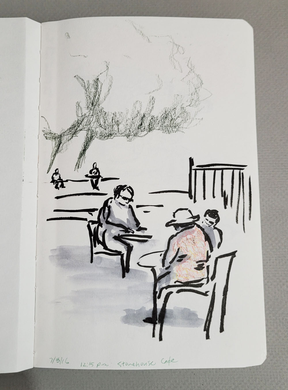
I just finished filling a sketchbook that I began on July 8, 2016. It’s a Stillman & Birn Alpha that I initially cracked open for urban sketching, but after only a few sketches, I decided I didn’t like the paper for that purpose. It was during a period when I was still happily binding my own sketchbooks, so I’m not sure what the dalliance was about, but it didn’t last long. I set it aside and didn’t pick it up again for nearly a year.

An urban sketch at Stonehouse Cafe appears on the first page dated July 8, 2016.

As I thumb through it now, I see what a mishmash it contains: After the initial urban sketches are a few thumbnail studies from the colored pencil course I was taking at Gage and then a few more urban sketches in 2017. Then there’s a big leap to 2021 when I was working on cartooning and drawing from imagination; a few blind contours; and some doodles that might have had an idea behind them, but that part is now long gone (apparently the idea wasn’t worth noting with written words). The final third of the book is filled with human and animal portraits from the past few months. It’s clear to me now that I used this Alpha only when paper choice wasn’t important for the task. (Except for the doodles, I think all the other pages have appeared on the blog at the time that I made them, so most of the images shown here will not be new to you.)

Seattle mayoral candidates debating on TV.

I filled the last page on Dec. 29, 2022 – six-and-a-half years after beginning it! That must be a record for me!

Who knows what idea was behind this, if any?

I had to laugh ruefully at myself: For most of my sketching life, I’ve fantasized about having a sketchbook that chronologically follows my life, page after page, regardless of subject matter, media or size. This fantasy is partly fed by images and flip-throughs I’ve seen of Nina Khashchina’s wonderful sketchbooks. She sketches on a variety of papers and uses a huge range of media, but the bits and pieces and loose pages eventually get bound into a central sketchbook bulging with all the glue-ins. Each sketchbook is so much heavier when she has filled it compared to when it was brand new that part of her process is to weigh the book before and after completion! This post explains how and why she does it. I love her intention, process and result.

Thumbnail value study from photo for a colored pencil class.

I’ve tried sporadically to come up with a way to make this type of book work for me (a partial attempt was made last March), but the process never lasts long. As much as Nina’s bulging books of paste-ins appeal to me, I thrive on sketching in multiple neatly bound books, each for a different purpose.

Another urban sketch from April 2017. One reason I rejected the book for urban sketching is that the paper is too thin to withstand my spritzing technique (buckling evidence at the top).

Although the Alpha book is the exact opposite of my chronologically perfect unicorn, I had to laugh because it’s probably a more accurate reflection of my sketching life. It’s OK; unicorns are meant to be searched for, not to be found.

The final third of the book is filled with recent portrait practice.

A blind contour of our bathroom sink.

Monday, January 2, 2023

Portrait Questions


12/26/22 colored pencil in Uglybooks sketchbook

I’m still having a ball practicing portraiture with Earthsworld’s reference photos. His massive image collection gives me a central location to choose one, either at random or based on the type of portrait I want to make, at any time, whenever I feel like it. I never used to sketch much in the late evening when I was tired, but lately I’ve been doing some portraits then because it’s so easy to look for source material. Anything that makes it easier for me to practice or practice more often is a terrific resource.

Sometimes I visit a Facebook group I joined recently that is totally devoted to making art from Earthsworld’s photos. The moderator chooses an image, and group members post their renditions of the photo. It’s fascinating and inspiring to see all the varied styles and approaches that result from many artists using the same reference photo. When I’m having difficulty deciding on a face to draw, I use the moderator’s pick, which is often more challenging than one I would pick for myself.

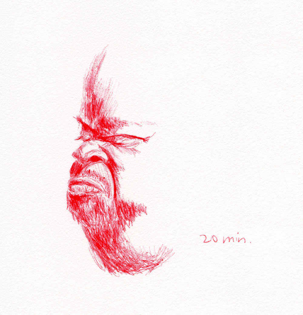
In today’s post, I’m showing a couple of different approaches: My more comfortable “realistic” approach and a couple that are caricatures. The latter, which are still a greater challenge for me, have reopened an ambivalence that I had mentioned previously. Sometimes I have felt disrespectful of the models when I’ve tried caricatures or exaggerated features. My intention is not to mock them in any way, and I realize that it’s very unlikely that the models would ever see my sketches. Even so, if they did happen to see them, how would they feel?

12/21/22 Bic ballpoint in Stillman & Birn Alpha sketchbook
This started out with the intention of a caricature, but it remained mostly realistic
until I gave him different glasses and changed his hair and facial hair. Does that count
as caricature?

When I make caricatures, I push aside these vaguely uncomfortable feelings in the name of art practice, but the Facebook group recently brought those feelings back to the forefront. After the moderator had posted an image, a couple members made unkind comments – not about anyone’s work but about the person in the photo. I had already drawn from it, feeling a certain discomfort because I did not have to exaggerate much to make it look like a caricature. How would this model have felt upon seeing my sketch or those of others? Or read the comments?

12/22/22 Bic ballpoint in S&B Alpha sketchbook

Then I continued pushing my thoughts further: What about all my sincere attempts to capture the likenesses of strangers? If the result is flattering, perhaps the model wouldn’t mind. But in any case, how would they feel if they saw my sketches? If I saw that a stranger had randomly sketched me and posted the work on the Internet, how would I feel? I never have these concerns when I sketch people live on location because I know they would not be recognizable. Somehow, though, a portrait from a photo seems more personal (and ironically, when my objective is resemblance, then making a recognizable result is more likely).

12/12/22 Bic ballpoint in S&B Alpha sketchbook
12/16/22 Bic ballpoint in S&B Alpha

I haven’t stopped making the portraits because I still enjoy it, and more important, I continue to learn from the practice. But I’m going to keep thinking about these questions.

12/24/22 Bic ballpoint in S&B Alpha sketchbook
This may look like a caricature, but it's actually realistic. I was so fascinated by the
intriguing headwear that I unsuccessfully tried to Google it to see if it had a traditional ethnic origin.
It looks like it was folded diagonally from a single piece of fabric.

Process note: When I studied portraiture with Gary Faigin several years ago, he stressed the importance of getting the larger proportions and structural forms of the head right first before moving on to features, an approach that is very difficult for me. The classical method he teaches probably works better with charcoal or paint, which are easier to make large shapes with. Even in a small sketch, I waste a lot of time correcting and recorrecting the head shape and structure before I can even get to the features, and sometimes I have to correct again after drawing features.


  12/26/22 Bic ballpoint in S&B Alpha sketchbook  
Taking France Van Stone’s crosshatching courses and watching her portrait demos changed my approach completely. I observed that she usually begins with a few blocking marks, but then spends very little time on the face shape before going straight in with the eyes. After she has the eyes figured out, then she works on other features and the overall face.

For “realistic” portraits in which achieving resemblance is an objective, I find I am having much more success when I begin with the eyes and build the rest of the proportions around them. I find this approach easier, faster and more likely to get a reasonable likeness. It might not be recommended for a large painting, but it’s effective for small sketches.


12/27/22 Bic ballpoint in S&B Alpha

Wednesday, December 28, 2022

The Crayola Challenge


Mini-sized pencils, jumbo-sized aggravation.

Sarah Renae Clark is a popular, entertaining YouTuber who reviews lots of colored pencils and also designs coloring books. (If you think I have a lot of colored pencils, you should view this video in which she claims to have purchased every colored pencil she could get her hands on “to find the best colored pencils in the world.” More than 4,000 pencils! I’m not worthy!) I also appreciate that she talks about nurturing the creative learning process.

I recently came across a video in which she challenged herself “to see if I can draw a realistic colored pencil drawing with cheap Crayola colored pencils.” (In another video, she puts Crayolas head-to-head with Caran d’Ache Luminance!) Using a solvent to help blend the nearly non-existent pigment (my opinion, not hers) in the kids’ Crayolas, she manages to make an impressive piece of art with the worst colored pencils I’ve ever used.

What I found most interesting was that she said exactly what I’ve been saying about the importance of using the highest quality art materials you can afford (scroll to the end of that post), even if you are a beginner (in fact, I would say, especially if you are a beginner). Sarah points out that when you use low-quality products, you are constantly fighting with the materials instead of learning and supporting your creative growth. Using the Crayolas, she mentions that she’s not enjoying it, and if making art is not enjoyable, it’s much harder to keep practicing and improve skills.

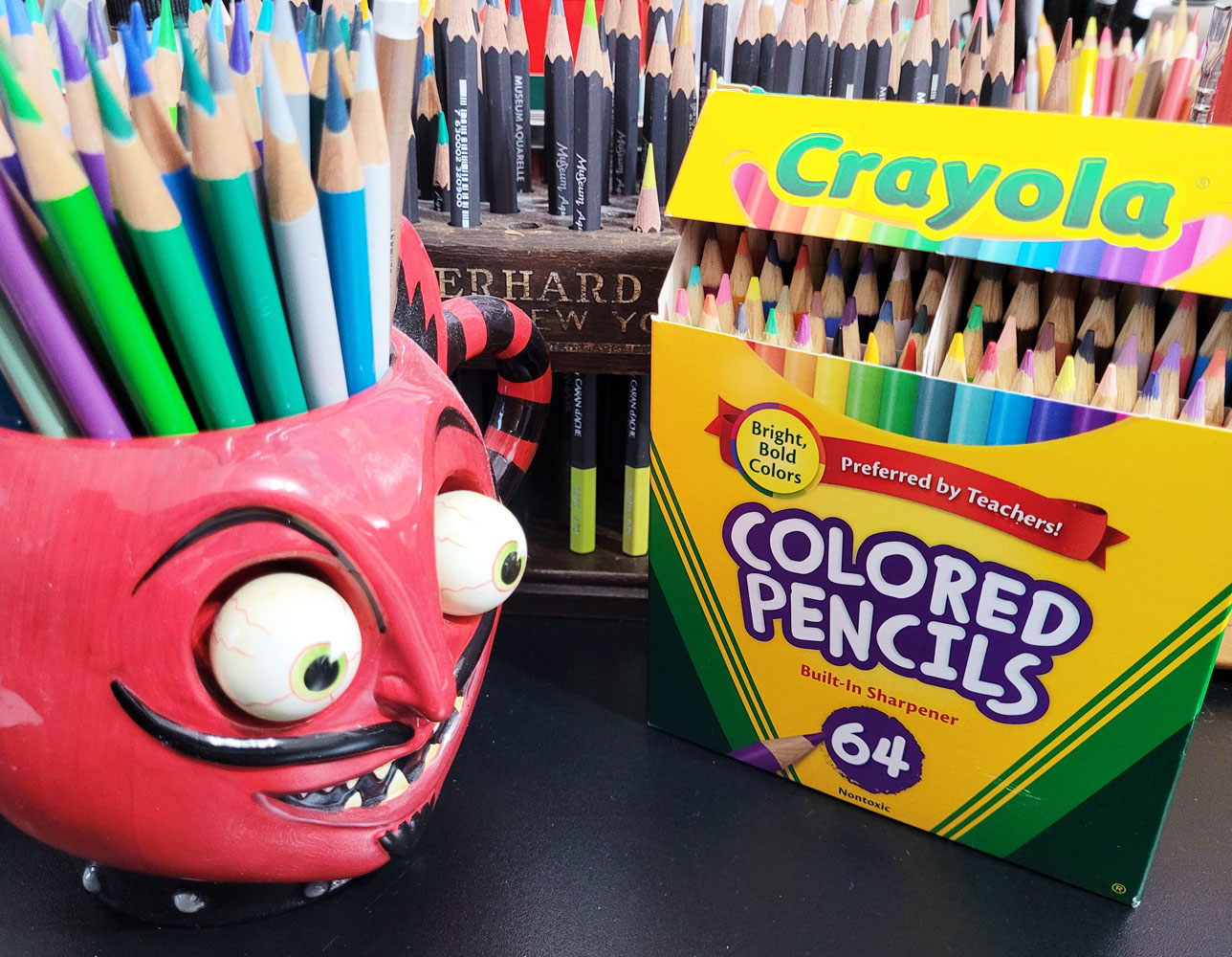
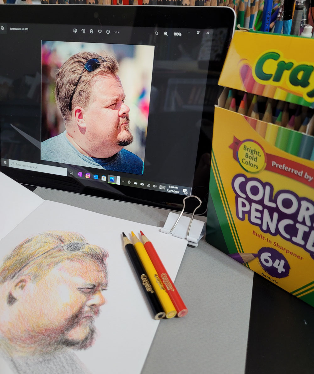
I happen to have a fairly recently acquired set of Crayola colored pencils – 64 mini-sized “bright, bold colors.” I never intended to use this set – I bought it because I love mini-size pencils, and the box is nostalgic, of course. In solidarity with Sarah and our similar perspectives on crappy art materials, I decided to make a sketch with Crayola colored pencils, too.

12/22/22 Crayola colored pencils in Stillman & Birn Alpha sketchbook
(Earthsworld reference photo)

Unlike Sarah, however, I limited my self-torture to a typical small portrait made in my usual messy, crosshatchy way rather than solvent-blended, multiple layers. Choosing a Zorn palette from the Crayolas (poor Zorn is again rolling over in his grave), I couldn’t stand more than 35 minutes with these pencils. Although I’m not unhappy with the results, I certainly found no pleasure eking pigment out of those little sticks, which was like squeezing juice from a stone.

Knowing that Crayolas are hard, I chose a Stillman & Birn Alpha sketchbook with a lightly toothy surface that did at least some of the work of picking up and retaining pigment. I kept the points sharp. Instead of trying to blend, I used a rougher, optical-mixing method (which I prefer anyway). Toward the end, I was scrubbing pretty hard to make the pigments show up, and I could already feel the points sliding on the waxy buildup.

As both Sarah and I found, it’s not impossible to get decent results from bad materials, but it will take much longer, be more frustrating and be less fun. She and I know how it feels to use good materials, and we have enough experience with colored pencils to know when we’re fighting them. Someone with less experience, however, might think their frustration was their own faulty execution or lack of skill and become discouraged or give up. The latter, I think, would be the worst possible outcome of using low-quality materials.


I certainly wouldn’t expect a beginner to invest in a set of Luminance or Museum Aquarelle when they aren’t even sure they will like colored pencils, but using very inexpensive materials can be a false economy if they end up being a frustrating waste. Sarah recommends starting out with a good quality, mid-range set and upgrading gradually later; I concur.

Another point Sarah makes is paper (in her Luminance vs. Crayola video): “If you want to get good results with cheap pencils, you can’t rely on cheap paper, too,” she says, and credits her decent results to her paper choice. I certainly don’t have it in me to make another sketch with Crayolas on bad paper just to prove a point, so I’ll take her word for it that my results could only be worse. As I have learned myself, the right surface can make a huge difference in how a pencil feels and performs and certainly in the results.

This isn’t the first time I took part in self-torture; several years ago, I did a similar exercise using watercolor pencils I had previously rejected. 

Related Posts Plugin for WordPress, Blogger...