 |
| 4/21/22 Maple Leaf neighborhood, morning |
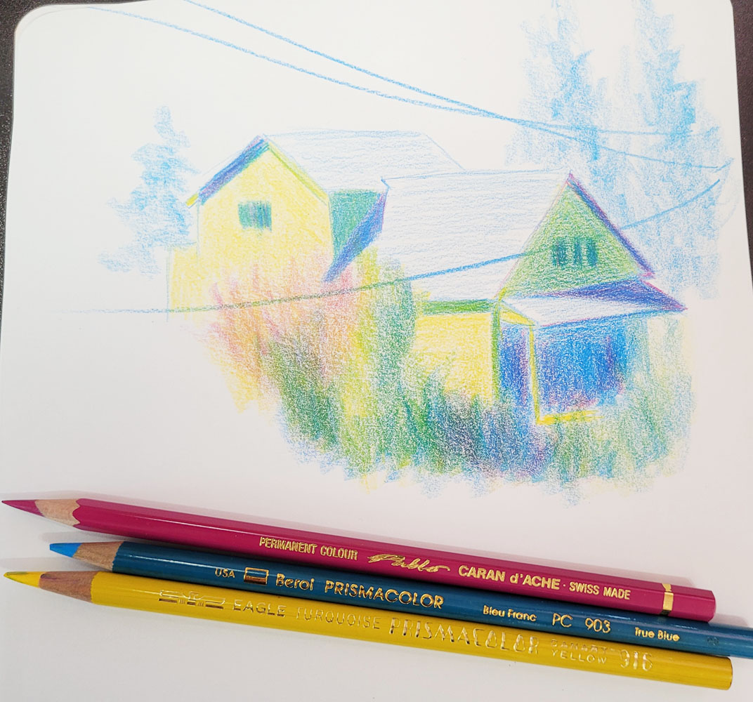
My fascination with color temperature continues. Although
this house across the street is more awkward for me to sketch from my studio
than the back view I sketch more often, it’s a better subject for studying
values as well as color temperature. One sunny morning, I sketched it using my
favorite CMYK primary triad (above). The side of the house being hit with full
sunlight was an easy place to start with straight-up yellow, the warmest hue. I
stayed with that local color (the house is actually a pale yellow) on the shady
front of the house, and brought in blue to cool it down. I also used blue in
the darkest areas under the porch and cast shadows on the roof. Then I started
to add magenta to those areas, thinking the resulting violet would make them
darkest, but it warmed up the blue even as it made it darker. As a pure temperature
study, the magenta was probably wrong here, but I like the sparkle it added to
the shadows. To check the values, I converted the sketch to black and white,
below.
 |
| Black and white version of sketch above |
Several hours later, the sun was almost directly overhead, and some clouds had come in, so there was less contrast between the front and side of the house. This time I thought I’d try a secondary triad, which I knew would be more challenging (below). In retrospect, I think I chose an orange and a green that were too similar in temperature – a cooler green probably would have been better. The rooftops were still in full sun, but their actual hue is a cool gray. I was afraid if I used violet there, they would end up being too dark in value, so I waffled and used green. The only easy part was making the darkest shaded areas and silhouetted trees dark violet, which was clearly the coolest hue.
 |
| 4/21/22 Same house, early afternoon |
Again, to check the values, I converted it to black and white.

When I look at the black and white versions, I think I got the relative values mostly right (at least they “read” correctly). And according to Ian Roberts (and most instructors and books that discuss values), if the values are correct, then the actual hues don’t matter (the oft-quoted “Value does the work. Color gets the attention”). All of this reinforces the basic principles that I learned in Sarah Bixler’s color temperature class months ago: Areas facing the light will be warmer; areas moving away from the light will be cooler. And yet, while I’m applying color, it’s never as straightforward as monochrome values. Maybe it’s just that I’m always simultaneously fighting the urge to use “real” colors.
(Seeing the sketch at the top of the page, a Facebook follower asked if the house really is painted yellow and green! I wish it were . . . then I could just sketch it with “real” colors and be done with it.)


Good idea to check the values with a black & white conversion.
ReplyDeleteAlthough I just learned that it's not that straightforward! LOL! Stay tuned.
Delete