Showing posts with label Moleskine sketchbook. Show all posts

Friday, August 21, 2026

Selfie as Dog


8/16/26 Self-portrait from mirror

Roy texted us a self-portrait he had made that morning. He challenged Mary Jean and me to make self-portraits by the end of the day for Selfie Sunday (which I guess is a thing, as I’ve long seen the hashtag, but I’ve never participated).

The last time I made a self-portrait, I had treated myself like a dog. I decided to do the same again, but this time I used a brush pen. Unusual for a self-portrait, I like this one, even with the severe selfie scowl.

Friday, March 20, 2026

An Old Moleskine


3/4/26 photo reference

I’ve lately had less need for my doomscrolling prevention program. It helps that we’ve flipped the clocks forward, and the Big Dark is over. Gloom and doom in the news is somehow easier to bear when there’s still light left after dinner. In a few weeks, I’ll be able to take short golden hour walks again – the best time to simply enjoy walking without a fitness goal or destination.

After being inspired initially by Orla Stevens’ mixed media and other approaches (even imaginative), I seem to have settled into monochrome sketches using Derwent Drawing pencils. It’s the most relaxing and therefore the most direct in taking my mind off whatever unpleasantness it might be occupied with.

3/18/26 photo reference
Trees in the urban landscape from my own camera roll are an easy go-to. But recently I was thinking about all the portraiture I practiced several years ago using Earthsworld’s reference photos. I’m very rusty, and portraiture always includes some tension because I can’t shake the desire for resemblance. But portraiture also offers interesting challenges that continue to captivate me, even if more mental energy is required.

The prompt for portraiture came from the sketchbook I used for these three sketches: a very old Moleskine that contains that weird, heavy, manila-folder-like paper. The first half of the book is filled mainly with portraits I made with ballpoint pen or marker – the ideal media for use on this smooth, strangely water-repellent paper. Since the surface feels similar to Stillman & Birn Zeta, I thought I’d give it a try with Derwent Drawing pencils – and I like it! Those soft pencils seem to glide effortlessly. (My mission to complete partially filled sketchbooks continues!)

3/18/26 Earthsworld reference photo
Skimming the portraits gave me a heavy pang. Dated 2022 and 2023, those portraits were a large part of my original doomscrolling prevention program: Instead of news reports of current events, I was doomscrolling my own anxiety as I taught myself how to navigate caregiving responsibilities. Despite all that is going on in the world now, nothing in the current media gives me as much pain and stress as that period of my life did. Seeing the portrait practice gives me compassion for my former self, and I feel much gratitude.

Friday, August 22, 2025

A New Look for Pets


8/16/25 (all sketches made with photo references)


Just a couple of weeks ago I had mentioned that I was thinking about ways to change up my pet portraiture style. At the time, I didn’t have a specific client or project in mind, but an opportunity to put a new style to work came up serendipitously. I’ll tell you about that soon, but here are some sketches I’ve been doing as practice for that opportunity.


My main M.O. for these sketches is that they have to be fast to execute – like less than five minutes each. I wanted them to fit on an A5-ish size page or sketchbook, so I practiced in an 8-by-5 inch Moleskine (the old kind with the weird, thick, smooth paper that evokes manila file folders; I don’t generally like this paper, but it’s great with ink). For both speed and expressiveness, I chose my favorite Pentel Pocket Brush Pen. Initially, my plan was to use only that, but since the black ink took less than five minutes, I pulled out a gray Faber-Castell Pitt Artist Pen with a brush tip to add a bit of shading. The shading isn’t essential, but it does define the forms of the heads better than the brush pen alone.


My goal with these is to capture the animal’s essence without necessarily being an accurate resemblance (which I do try to achieve when I make more finished colored pencil drawings for commissions). Although I want to continue practicing proportions so that I can be reasonably accurate without making measurements, I’m pleased with the fresh, comic-y look of these sketches.

(All of these were made with reference photos that I had used previously during the past couple of years for commissioned colored pencil portraits.)

Tuesday, November 19, 2024

Diary Comics from My Head


11/12/24

My imagination-based diary comics continue, inspired by the prompts and template I learned from Drewscape. I’ve been making these at the end of the day when I’m tired, have the lowest level of creative energy (and apparently the messiest penmanship!), and the hardest time being motivated to sketch. Given all of those potential barriers, I really need a structured format to draw from my head.

11/13/24

The Nov. 13 page (above) does not follow Drewscape’s format; it’s more of a traditional comics story arc with a linear sequence. It happened to fall into place because of the events of the day, but on an ordinary day when not much happens, coming up with this type of arc is usually much more challenging. I’ll take them when they come, and use Drew’s prompts when they don’t. In any case, I’m enjoying this process.

11/15/24

Friday, November 15, 2024

Diary Comics with Prompts


11/11/24 Memory and imagination (Ha-ha -- I just realized I drew the envelope wrong!
Sometimes the simplest things. . . )

As I mentioned in yesterday’s post, I’ve sometimes felt disengaged from my comics-based sketch journaling process. My single-panel, sketch-plus-words format is OK for documenting something, but it can feel static (see below; cutline contains a potential idea). One-offs have no sense of sequence or the passage of time, which is part of what defines comics (according to Scott McLeod). When they weren’t made on location, my past attempts at autobiographical comics with multiple panels have been hit-or-miss. I usually tried the traditional three-panel story arc, but often my “story” didn’t feel like it had enough of a narrative arc, and I was forcing it to fit. I didn’t know what I needed. I wanted more structure . . . but not too much!

Earlier the same day, I had made this single-panel
comics about the interaction with the leaf raker. I like
 the implied simile of the leaves and the papers I recycled,
but I had to do it with words, not images. The multi-panel
approach lacks the simile, but rearranging the panels
might put it back in. Hmmm... something to think about.

In a recent YouTube video, Drewscape
showed how he uses self-made prompts to structure his diary comics. The prompts can be changed easily to suit his subject matter for the day, so the format is not overly structured. At the same time, the prompts offer questions to respond to, so it’s easier than facing a totally blank page (or, in my case, a blank mind).

Shown at top of post is my first diary comics using Drew’s format. Using an old A5-size Moleskine sketchbook, I quickly drew a grid and chose the following six prompts: something I did; something I saw; a conversation (two middle panels); something that made me happy; something I ate. There’s no particular sequence for the events – except for the conversation, the panels could be rearranged on the page without changing the meaning – but I still have some sense of the passage of time.

Although it wasn’t necessary for the format, I also followed the spirit of Drew’s approach by drawing straight in with ink instead of planning first with pencil. I kept it simple by avoiding fussing about shading and other rendering tactics. I also avoided drawing myself, which is perhaps a comics cop-out, but it also helped me keep things moving instead of getting bogged down with how to draw myself. (Do you miss seeing me, as the narrator, in these panels? Should I draw myself more?)

I am especially pleased that I did all six panels from memory and imagination – no photo assist. That’s a big deal to me because I am always trying to practice drawing more from my head, and it’s always extremely challenging. This felt relatively effortless because I kept the drawings simple.

The only way in which I strayed from his format was that I didn’t label each panel to indicate the prompt, such as “Something that made me happy.” I didn’t have enough space in the small panels, and I think the prompts are implied anyway.

On this particular day, I had enough to fill six panels. That’s probably not always going to be the case, but then I can always choose other prompts – or make fewer panels. (Drew’s video notes include other potential prompts, and I can always make more of my own.) Of course, this six-panel page took longer to draw than my previous single panels, but I definitely found the result more satisfying and engaging. Although I probably won’t do it every day (and I give myself permission not to!), I am going to give this format a solid try for a while to see how it goes.

Wednesday, November 1, 2023

Giving the Brain an Opportunity


10/25/23 Prismacolors in Uglybook
10/24/23 unfinished


My sporadic portrait practice continues in different media and approaches. Earthsworld’s seemingly endless supply of portrait reference photos makes it too easy to try a new medium or idea with a portrait. Sometimes I just want to feel productive when I’m tired and would rather eat chips while I view silly YouTubes. All of these shown here were late-night works of the latter type.

All were made from Earthsworld reference photos except the first one (above), which has an interesting process story. Christophe Swijsen, a French cartoonist and caricaturist, is the tireless moderator for the Facebook group dedicated to artists who are fans of working from Earthsworld portraits. Every day, he selects and posts an image from Earthsworld’s vast catalog, and group members respond to his challenge by sketching the selected reference and sharing in the group. The group is such a fun, inspiring collection of wildly different styles and skill levels.

9/11/23 Prismacolors in Uglybook
On the occasion of his birthday, Christophe posted his own selfies and challenged members to draw from them! It was late, and I was tired, but I couldn’t resist honoring Christophe with a portrait. Unfortunately, all of the images he offered were taken in the shade with flat, mostly consistent lighting on his face – the hardest kind to draw. Although I knew it wasn’t ideal, I gave it a shot anyway.

The next morning when I was going to share it on the Facebook group, I realized I was dissatisfied with my tired, half-hearted attempt the previous night. That same week, I was working on sketching from memory in Kathleen Moore’s class. I had been thinking about how different the experience of drawing is when I don’t have a reference to observe as I draw. Instead of going back to the reference photo of Christophe, I just gave stronger contrast to the sketch where I thought it should be, even though it wasn’t in the photo.

10/4/23 AmazonBasics colored pencils in
Field Notes Streetscapes sketchbook

I know many painters use reference photos only as inspiration and a point of departure, and eventually they stop looking at the reference while they turn their painting into something that is much more than a copy of a photo. But because I’d done nothing but draw from direct observation for so long, it is taking me a while to learn not to depend so exclusively on my eyes. I should give my brain more opportunities to show that it knows what to do, even without having something to observe. This isn’t much, but it’s a start.

Since I’ve just wrapped up InkTober (final post coming soon), this is an ideal opportunity to again acknowledge France Van Stone, whose online courses in crosshatching a year ago gave me the confidence to take on portraiture like I never had before – and gave me the skills to keep right on going beyond InkTober. Even when I’m not crosshatching, the principles she teaches still apply. I think about them with any medium or technique. 

9/15/23 Derwent Drawing pencil in Uglybook

10/29/23 Bic ballpoint in Moleskine sketchbook

Thursday, April 13, 2023

Corrections from the Teacher


4/9/23 initial sketch

One evening I made a ballpoint portrait of a girl from the Drawing Earthsworld Challenge Facebook group. When I finished, I thought her features looked OK, and when I remeasured the proportions, they weren’t too far off . . . but something was definitely amiss. Unlike with the raccoon I had sketched on another evening, I had more energy to see if I could figure out what the problem was.

Studying the reference photo more closely, I saw that a key problem was that I had positioned the eyes wrong. The face is almost a profile, but it is turned just enough that the far eye is visible – and the two eyes are not aligned in a straight horizontal line from this view. (This is an easy error to make – the brain always wants to align two eyes or make them symmetrical – and I have made it frequently.)

I remember in Gary Faigin’s portraiture workshop several years ago, he would walk up to my easel, ask permission first, then proceed to make corrections that seemed so obvious as soon as he made them. “Now why didn’t I see that??” I’d be asking myself.

So, as an instructor might, I took out a red pen and corrected the eyes. That change required that other features and proportions be corrected slightly. Now I think it’s closer to the reference photo. (You thought I had exaggerated the hair, didn’t you?)

Red ink corrections from the teacher.

Earthsworld reference photo

Drawing a portrait is always good practice. It’s a small breakthrough, though, when I can see my mistakes and correct them on the spot. It means I’m finally becoming my own teacher.

(Incidentally, when the Facebook group’s moderator had mentioned International Mullet Week as an introduction to posting a new mullet image each day, I thought he was joking – but no! It’s a real thing!)

Monday, March 27, 2023

Advice I Would Give to My Newbie Self


3/23/23 Le Pen Flex brush pen, Moleskine sketchbook
(all reference photos by Earthsworld)

Back when my primary drawing tools were fountain pens, one of my techniques of choice was the ink-line wash. For years, I made line drawings with water-soluble inks, then washed the lines for shading. It was a low-maintenance technique on location – all I needed was a fountain pen and a waterbrush.

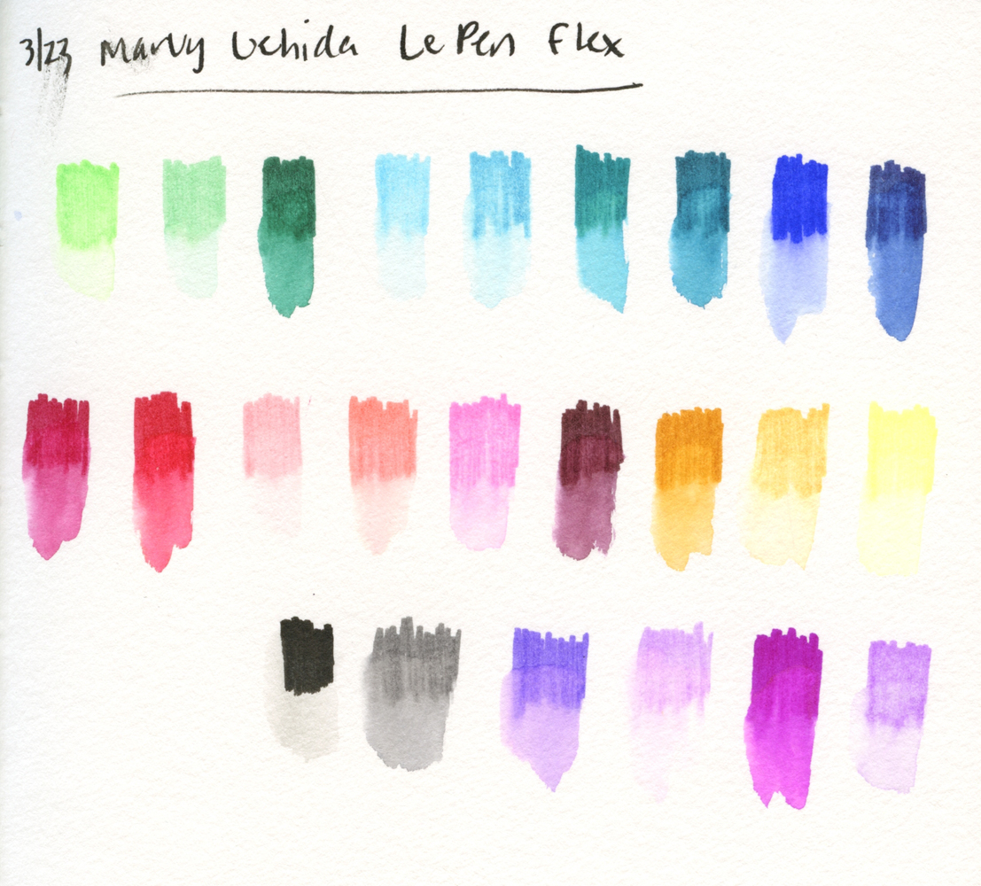
Using that technique with Marvy Uchida Le Pen Flex brush pens reminded me how much fun it is. It also made me realize that it may be a simple technique in terms of tools, but it is not necessarily easy. In fact, it’s quite challenging to make subtle modulations in tone, and controlling water flow is finicky with a waterbrush. In addition, paper sizing and texture affect the results significantly. All of that explains why I spent a lot of time and research back then trying to find the best combinations of inks and papers.

Perhaps most important from my then-newbie-self’s perspective is that it’s almost impossible to get a good range of values using nothing but a washed ink line. My darkest values were always relatively wimpy. (I recall vividly a sketch I had made of Fremont’s statue of Lenin during my first urban sketching workshop nearly a decade ago. I had washed the lines made with a gray fountain pen ink, and I thought I had done a decent job of bringing out tones and shadows. Squinting at the sketch, workshop instructor Frank Ching had remarked on the absence of darks. I recall thinking, “Oh – those pale gray marks aren’t dark enough?”)

In retrospect, I think it was a simple technique for a newbie to use – but not necessarily a good one to learn with.

3/24/23 Le Pen Flex, Hahnemuhle Akademie sketchbook

I thought a lot about this conflict – ease of use vs. ease of learning – during the weeks that I was taking Kathleen Moore’s Winter Sketchbook + Watercolor class (I have some comments on it in my summary of the last session). When I first began sketching, I looked around at all the other urban sketchers (online and in person) and saw that the vast majority used watercolor, so I thought I should, too. Easily cleaned and mostly non-toxic, watercolors seemed friendly – even kids use them.

Watercolors give the impression of being an easy-to-use medium. In fact, they are: All you have to do is wet your brush and stick it into the paints. But as anyone who has ever used them knows, they take a lot of practice to get good results and many years to master.

Thinking about everything beginning urban sketchers have to learn, all at once – how to draw, what to sketch, how to compose, where to stand or sit, what to bring – no wonder learning to sketch with watercolors was challenging, and my results were often disappointing.

3/23/23 Le Pen Flex, Hahnemuhle 100% cotton sketchbook

Sometimes I wish I could go back in time and tell my newbie self to skip the watercolors and maybe skip ink-line washes, too. My newbie self would hate me, but I would recommend something that would aid my learning instead of impeding it: How about a single soft graphite pencil? It’s easy to carry, and I can use any paper. With it, I can learn form and values while studying composition, and I can still sketch any subject matter I want. Gain a little confidence and skills with that before I add color.

A single graphite pencil??! Boooring! Noooo way!

Well, I tried.

Sunday, March 26, 2023

Review: Marvy Uchida Le Pen Flex Brush Pens


How did these Marvy Uchida Le Pen Flex brush pens hop into my
shopping cart?

Years ago, I tried a few Marvy Uchida Le Pens with the standard writing tips, but nothing about them impressed me enough to keep using them. In fact, the skinny barrel was uncomfortable to hold. I’ve ignored them since.

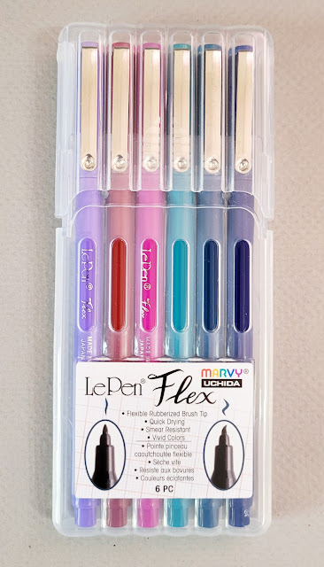
Perhaps you’re familiar with this scenario: You need a few things at JetPens, and you’re getting close to free shipping. Hmmm, you’d forgotten that Le Pens are available with a brush tip you’ve never tried . . . a couple of colors would get you to free shipping – but oh, the six-pack is a better value! That’s how the “Jewel” color assortment of Flex Brush Pens fell into my shopping cart recently.

The product information describes the Flex as a “rubberized felt tip that is flexible yet firm.” The only other brush pens I own with a similar “rubberized” tip are much larger, and I enjoy how flexy they are.

Unlike a fude fountain pen or the hard brush tip markers I have been using lately (like the Uni Pin and the Faber-Castell Pitt Fude Pens), which vary their line widths by changing the points’ angle to the paper, the Le Pen Flex responds to pressure. It was a delightful surprise to get the same “rubberized” flexiness that I knew from the larger brush pens in a much smaller point size. I’m a little concerned that the tips will mush down quickly under my heavy hand, especially when I get overly enthusiastic about their flexibility. (I’ll update this review if my concerns are warranted.)

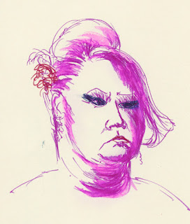
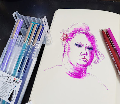
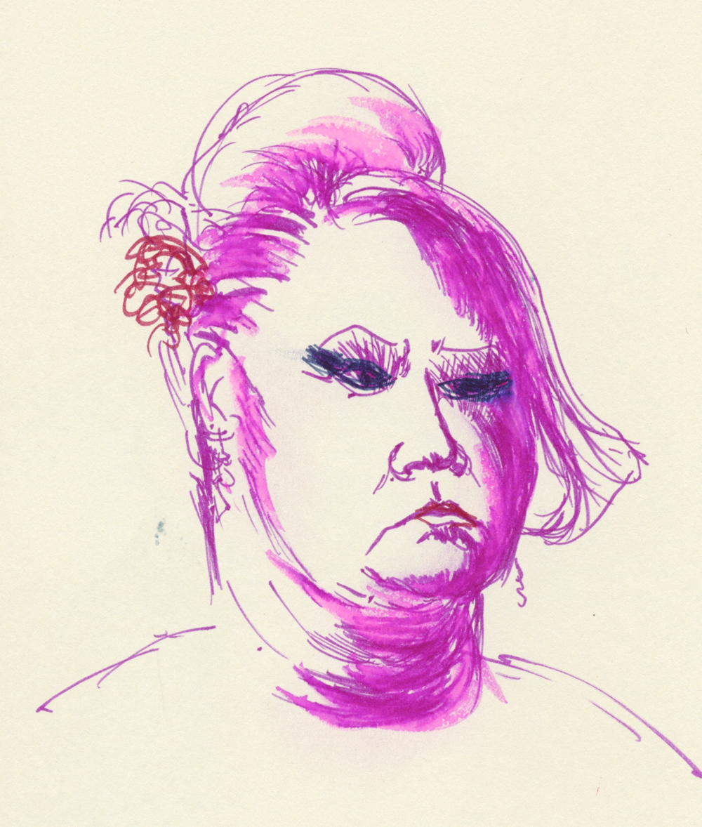
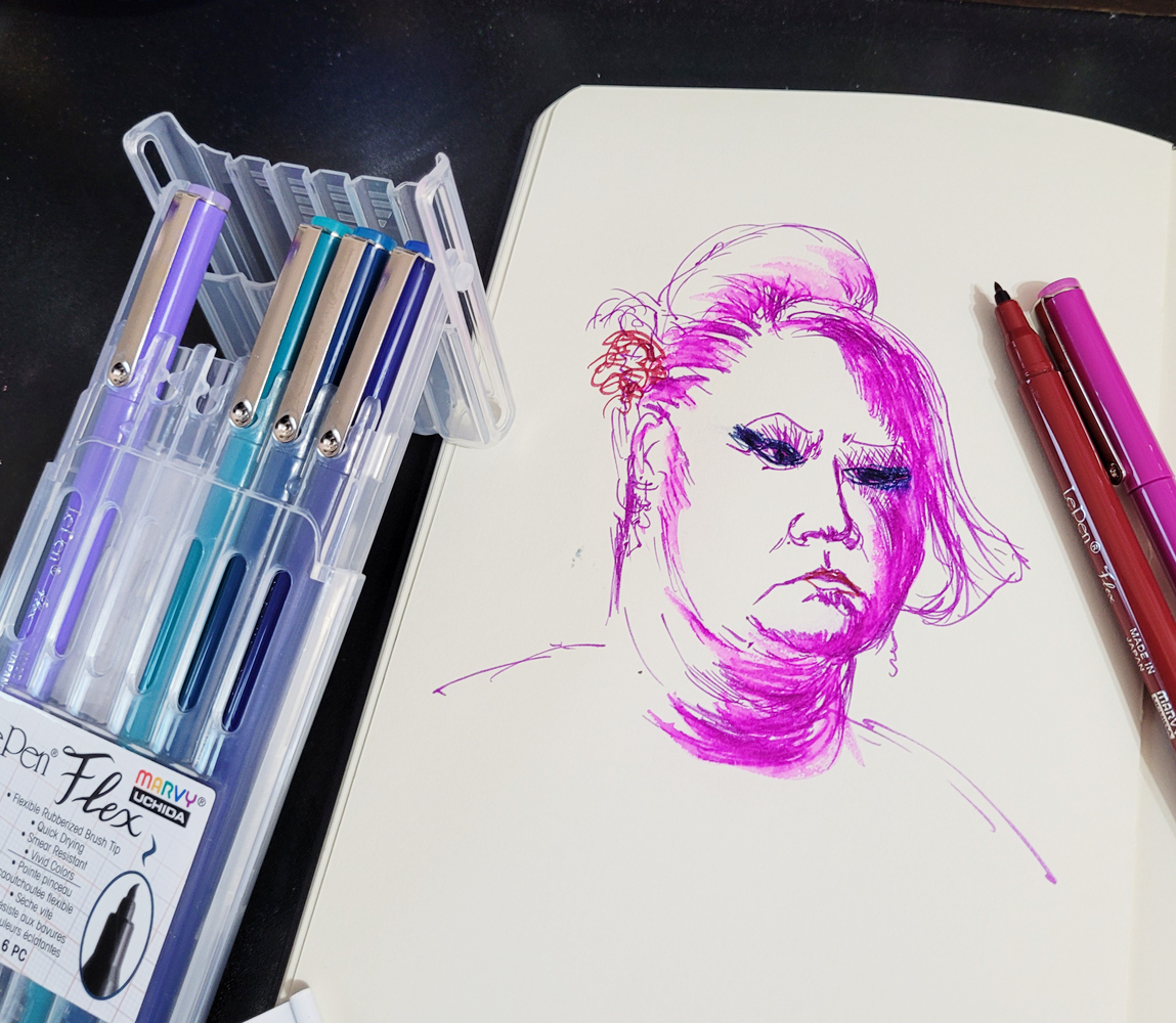
First I tried making a couple of Earthsworld portraits (Earth recently featured one of these on his website!) in a Moleskine sketchbook (the old kind with the manila-folder-colored pages and odd, waxy surface). I noticed that the ink took a while to dry, especially on that paper, and if I acted fast enough, I could smudge the ink deliberately the way Don Colley famously works his Pitt Artist Pens. I used a waterbrush to test the ink’s water-solubility, and it literally beaded up on the weird Moleskine paper. Strange but interesting!
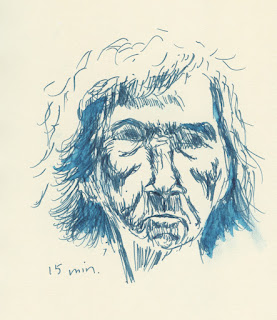
3/19/23 Le Pen Flex brush pen in Moleskine sketchbook

3/20/23 Le Pen Flex in Moleskine

The 6-pack pen wallet has a handy easel top for desktop use.

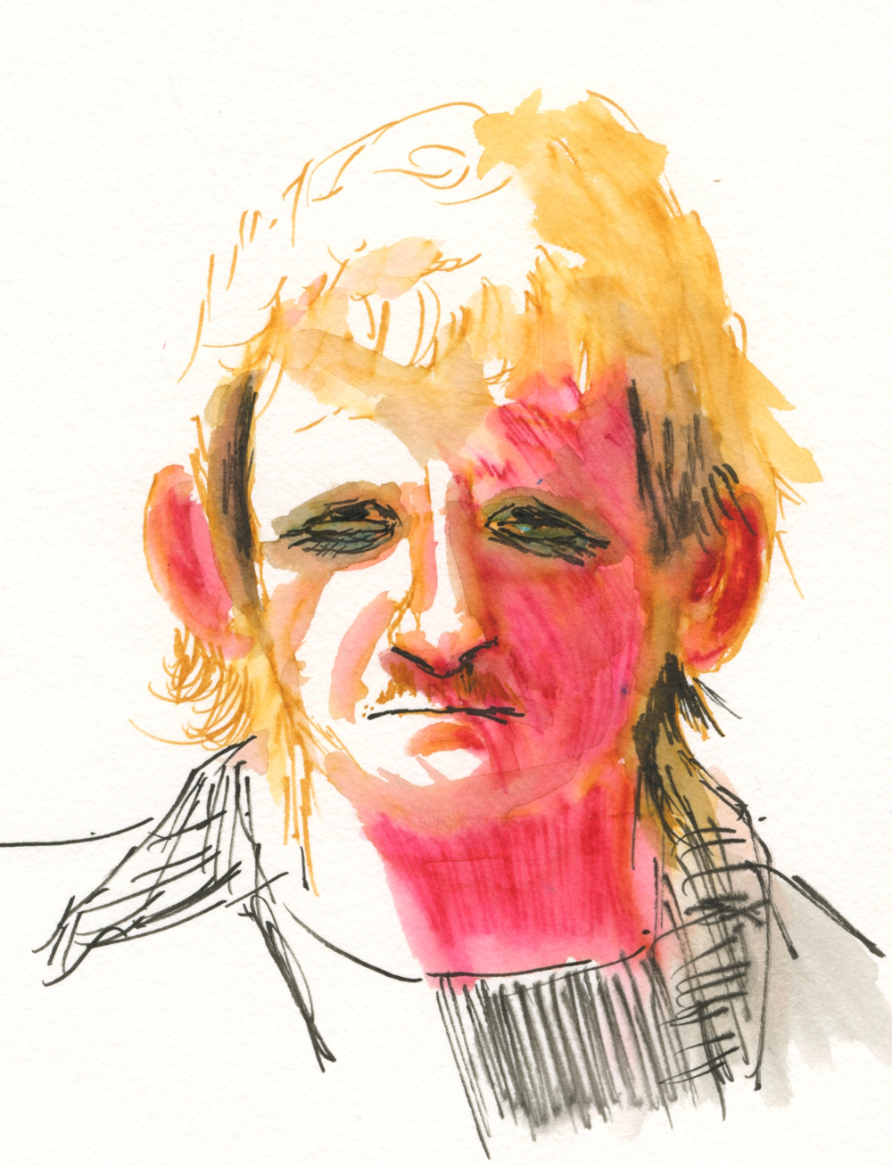
Next I pulled out my Hahnemühle Akademie watercolor sketchbook to see how the Le Pen ink would respond to paper with better sizing. Though I didn’t think these vibrant colors would do well in a portrait mix, I perversely chose a Zorn palette – red, ochre and black.

3/21/23 Le Pen Flex in Hahnemuhle sketchbook

Look at the black... it's nearly waterproof!

They are rather garish here, but the big surprise was that the black Le Pen Flex barely moved compared to the other very water-soluble colors. I even wondered if black came only in a water-resistant version. I read the product information, but it still claimed that black is water-soluble. It’s strange that only one color would behave this differently.

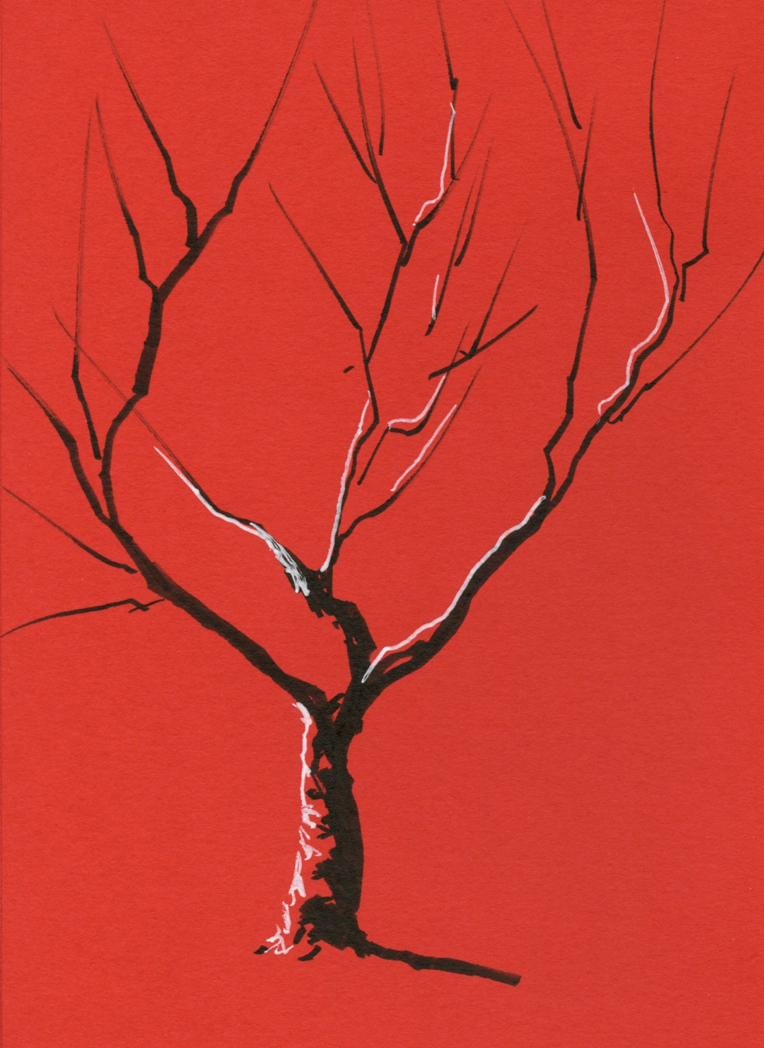
3/22/23 Le Pen Flex and white Gelly Roll in Uglybook 

Of course, if you put any black brush pen in my hand, I will take it out on my next walk and sketch a tree or two – the fastest way to test a brush tip’s line variability. And what a beauty this one is! I love how easy it is to apply pressure for the thick lines like the trunk, then ease up on the pressure gradually to taper the ends of the branches. (Is it even possible to sketch a tree without a brush pen? Of course it is, but it’s not nearly as much fun!)

While I had my color journal out, I decided to see if I could make a CMY triad from Le Pen Flex colors. Unfortunately, the only yellow available is fluorescent, which is a bit weak when mixed, but look at the lovely violet I got when I mixed magenta with oriental blue.
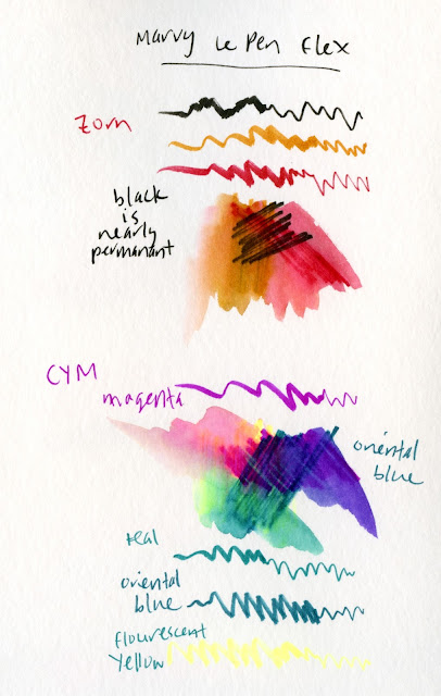


Zorn palette and CMY primary triad mixes

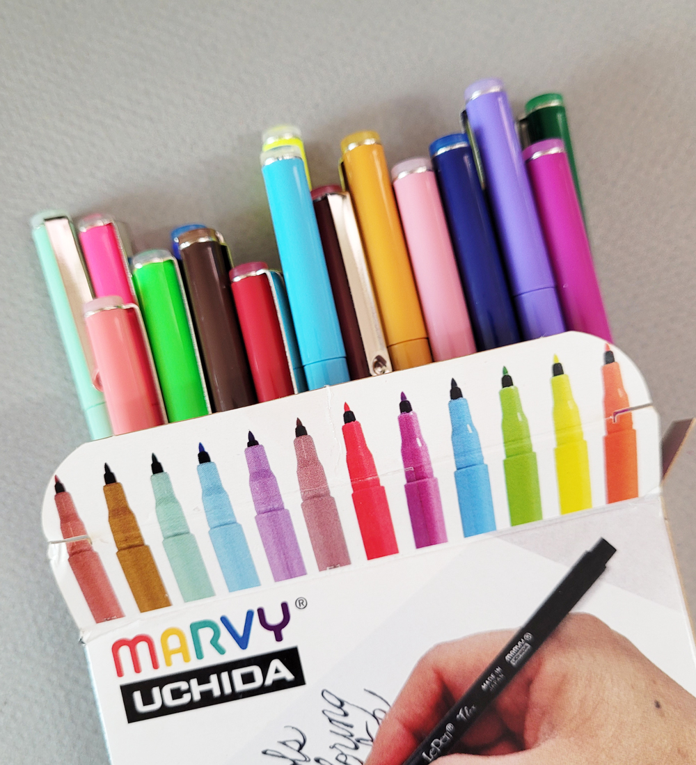
If you’re wondering how I got those Zorn colors and fluorescent yellow from my “Jewel” set, it’s because by then I had already decided I needed more colors – like all 24 of them (a much better value than smaller sets or individually!). I still find the slender barrel uncomfortable, and I admit, I am unlikely to use some of these colors. I find myself smitten with the flexy brush tips, though, and the ink is weirdly fun to smudge and bead on Moleskine paper.

7/22/23: Here's the update on the pen tip.
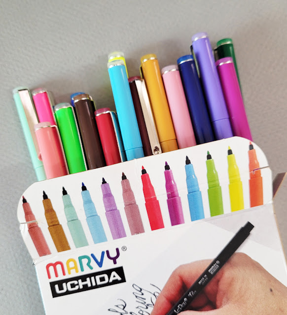
Unlike the heavy-plastic wallet that the 6-pack comes in, the set of 24 comes in a flimsy cardboard box.


Like many water-soluble colored pencils, some colors wash more vibrantly than others. Black (lower left) hardly washes at all. I'd call it waterproof.)

Wednesday, February 1, 2023

Portraiture as Playground

1/23/23 Pitt Artist pen and Prismacolors in Uglybook sketchbook

My portraiture practice based on Earthsworld’s photos has become an excellent playground for trying different media as well as approaches (for those of you who do not have access to Instagram, that link above goes to his website instead). At right, I again used a colored “grisaille” with a Faber-Castell Pitt Artist Pen, this time in dark, cool green. Inspired by the pale green Uglybook paper, it was an odd choice for a portrait, but I thought the complement with the mostly red Zorn palette would be interesting, and I’m pleased with the result.

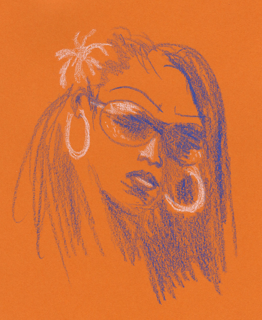
The portrait below was a dabble in Caran d’Ache pastel pencils. Despite my ongoing aversion to the messy dust they produce, I keep wanting to explore pastels because of their vibrant opacity. I worked on it one evening up to the point shown at left. When I looked at it in the morning, I realized what it needed to make that brilliant white hair pop – and what an easy fix! I also used a stump to blend the facial colors a bit.

1/24/23 Pastel pencils in Uglybook
1/25/23


For the next two portraits, I tried some Stabilo Arty brush pens. Yikes – markers can be so harsh and unforgiving! Apologies to these models!

1/26/23 Stabilo Arty brush marker in Uglybook

Below, I tried one with a vintage Walnut Hollow Farm colored pencil, which was such a delicious match with the slightly toothy Uglybook paper. (I was given a few colors of these rare, much-sought, long-extinct pencils, which are now on my eBay saved-search list!)

1/28/23 Walnut Hollow Farm colored pencil in Uglybook

1/22/23 Bic ballpoint in Moleskine sketchbook

As much as I love to explore different media, sometimes I go back to a beloved Bic ballpoint – an instrument that I struggled with for a long time but that now feels like a familiar, old friend. I now make all ballpoint sketches with gratitude to France Van Stone, whose online courses changed both the way I approach portraiture as well as this common tool.

Most of the reference photos for these portraits were selected by the Drawing Earthsworld Challenge Facebook group. The moderator tends to choose photos that I would typically avoid – those that are either fully in shade, fully lighted from the front, wearing large hats or are otherwise “difficult” by my initial glance. This is exactly why it’s an excellent challenge for me: I am “forced” to use references I would otherwise avoid, and I always learn from them.

Saturday, January 21, 2023

More Than a Hundred and Still Going


1/3/23 Prismacolor, Derwent colored pencils (all reference photos by Earthsworld)
When I first started practicing portraiture in late September, I didn’t commit to a certain quantity, frequency or time span (other than the 31 days of InkTober). Initially inspired by France Van Stone’s crosshatching course, I figured I would keep going for as long as I was challenged and engaged and stop when I felt like it. I recently decided to collect all my Earthsworld-inspired portraits into a Flickr album, and I found I had made more than a hundred. (Please check out the album – the grid of faces is visually fun!)

Before I began this self-challenge, I had always been reluctant to take on portraiture because there’s such a natural pressure to capture resemblance when drawing a face. Although resemblance is still hit and miss (I’m trending in the direction of more hits than misses lately), the biggest change I’ve observed is in my ability to capture the essential facial gesture more quickly and without hesitation. In the early part of the hundred, I often hemmed and hawed about how and where to begin and fussed about measuring or not. Somewhere along the way, I began to simply pick an Earthsworld reference photo and draw it – no fussing at all. (If I’m too lazy to choose, I simply go to the Drawing Earthsworld Challenge Facebook group and draw whichever face the moderator has chosen for the day.) If I have any hesitation, it is in choosing the medium (a process which, of course, I relish).

1/4/23 Neocolor I

1/4/23 Neocolor I (same photo reference as above)
I enjoy practicing different approaches – looser and more gestural as well as more precise and detailed. I want to practice in a variety of ways so that the approach will be my choice – not a default setting. 

1/5/23 white charcoal, graphite

1/6/23 Prismacolor, Derwent colored pencils

I would like to eventually practice on more live models, which I still believe is the only way to study portraiture thoroughly. But there’s also much to be said for the vast variety and range of faces I have practiced drawing by using Earthsworld’s photos – a far greater variety than I could ever draw in a life-drawing studio (even a good one like Gage, which is well known for bringing in excellent, varied models). Any book on portraiture will give you the handy guidelines for proportions and placement of features on the average human face. After making more than a hundred of these portraits, I’m here to say that no face is “average”! Humans and their utterly unique faces are fascinating to study and draw, and each must be studied as a unique exercise.

1/11/23 Bic ballpoint 

1/11/23 Neocolor I (two takes on the same photo reference)

An Instagram follower recently commented on one of my portrait posts: “although I find your earthworld [sic] subjects ugly and non-inspiring, your approach as well as the rendering are noteworthy and a great source of inspiration for my own learning.” I was happy to hear that this follower was inspired, but I felt that she had entirely missed the point. If we draw only people we deem attractive and “inspiring,” our screening process will keep us from practicing as much – and the whole point is practicing.

1/11/23 Bic ballpoint

1/13/23 Nero pencil, chalk pencil

As long as I am engaged, challenged and having fun, I’m going to keep practicing. 

1/13/23 Prismacolor

1/14/23 Bic ballpoint

1/15/23 Bic ballpoint


1/15/23 Prismacolors

1/15/23 graphite

1/16/23 colored pencil


Related Posts Plugin for WordPress, Blogger...