Friday, December 31, 2021

A Facebook Memory

 Facebook pulled up an interesting “On this day” memory for me from Dec. 19, 2009:


The interesting part is that I didn’t begin what I think of now as my drawing commitment until September 2011. That means that for nearly two years after I declared my goal publicly on Facebook (and privately to myself in my journal; see below), I still continued to quit and restart, quit and restart, quit and restart. I remember well the cycle: A renewed burst of enthusiasm and excitement for learning to draw was usually prompted by a book, class or idea I had heard about. Eventually I would get discouraged and give up. Then something else would reignite my interest, and the cycle would begin again. Over and over.

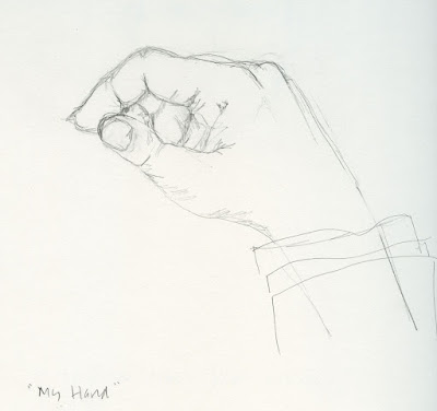
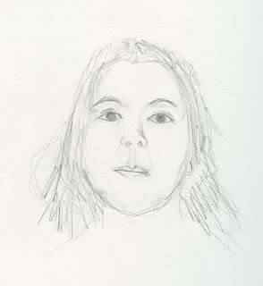
12/17/09 self-portrait
I’ve heard from enough blog readers over the years to know that many of you have begun sketching only recently. Some have had difficulty keeping up an art-making practice – just as I did for many years (most of my adult life, actually). Even when the desire is strong, learning and practicing are difficult. It’s easy to quit and hard to keep going.

Although I remember clearly the anxiety I had about drawing back then, it’s almost astonishing to realize that the same activity brings me so much joy and pleasure now. For continually pushing through the anxiety, fear, resistance, laziness, discouragement and whatever else I had encountered back then, I feel nothing but gratitude toward my former self.

Many individuals and organizations (Sketchbook Skool and Karen Abend’s Sketchbook Revival come to mind) are devoted to helping others develop a creative habit. I’m not one of those individuals. I don’t know how to explain how to do it – I can only serve by example here on my blog.

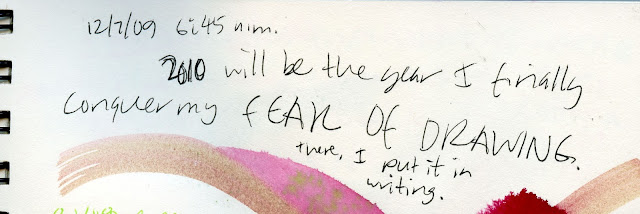
12/7/09 journal entry (shortly before the public declaration on Facebook)

As my annual year-end retrospective post, however, I thought I’d offer this: It’s OK if you stop drawing for a while. I don’t want to sound like a 12-step program or something, but learning to draw is a day-at-a-time thing. Just because you’ve stopped for a day or a month or 20 years doesn’t mean you can never go back to it. Someday the desire to draw will be stronger than not to draw, and you’ll be drawing again. Just draw again – even if it’s not forever. Someday, it might be.

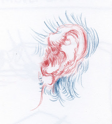
12/24/09 negative space exercise
Amused by that 2009 declaration on Facebook, I dug out my old sketchbooks and journals from that period to find the Betty Edwards work I had done. Shown on this post are a few exercises from that time.

Tomorrow is the beginning of a fresh year. I hope it will include the joy of drawing for you as I know it will for me. Happy new year!

1/11/10 negative space exercise
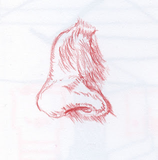
12/17/09

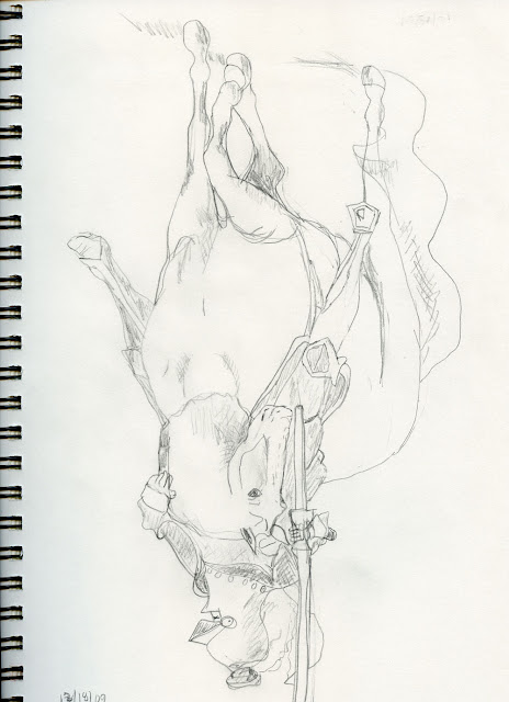
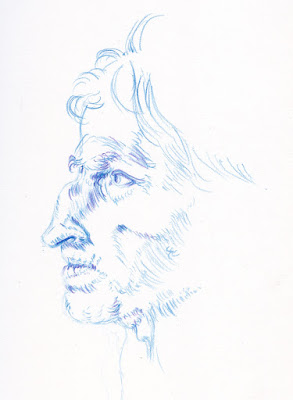
12/18/09 Draw from a photo upside-down. I vividly recall this exercise because I was so amazed by how well the drawing came out! I kept thinking at the time, "Maybe if I stand on my head, all my drawings will come out better."

Thursday, December 30, 2021

Snow Shadows (and Violet-Yellow Mixes)


12/27/21 Maple Leaf neighborhood, 8:30 a.m., 15 F degrees

In addition to falling snow, another thing I rarely have opportunities to practice are those lovely cool-blue shadows on snow-covered surfaces that Shari Blaukopf captures so beautifully. Our snow days are rare enough, but sunny snow days are rarer still.

After breakfast on our second snow day, I saw a spot of early light on the yellow house across the street (the same one I sketched from upstairs on Christmas Eve; this time I had to cram myself into a corner next to our Christmas tree, which is blocking most of the front window). I knew I had only a few minutes to catch it, so I grabbed a convenient Caran d’Ache Night Blue for the shadows. As soon as I started applying yellow to the house, I remembered that the shadows would now appear green – bad choice. You’d think with all my recent color-temperature studies that I would have remembered some of my purple/yellow mixes that would make a much more neutral shadow blend. I saved the green from happening by leaving the pencils dry where the yellow and blue mixed and then deepened the shadows with Payne’s Grey, but now I’m working out some better mixes (see end of post).

In the early afternoon the same day, I gave the shadows another shot, this time with Greg’s car parked out front (which hadn’t budged since Christmas Eve). I tried Faber-Castell Albrecht Durer Delft Blue (141), which is a cool blue-violet. If I get the right sunny view again, I’ll try mixing it with yellow.

12/27/21 1:30 p.m., 23 F degrees

Here are some violet/yellow mixes I tried from a few watercolor pencils at hand. I prefer the cooler violets (checkmarked). The yellow is Museum Aquarelle Yellow (10) in all cases.

Here’s something strange about Caran d’Ache: Look how different Supracolor Violet and Museum Aquarelle Violet are (both 120)! Supracolor Cobalt Violet (620) looks closer to MA Violet (120) than Supracolor Violet (120) does. Supracolor 620 looked so weak mixed with yellow that I mixed it a second time (at left) using more Cobalt Violet. It was still fairly weak. If I use this, I have to go easy on the yellow.

Wednesday, December 29, 2021

First Snow


12/26/21 11:15 a.m., 27 degrees, Maple Leaf neighborhood

We had been promised a white Christmas. Although some areas of the region got a dusting on Dec. 25, we didn’t see it in Maple Leaf until Boxing Day – several inches of nonstop snowing and blowing. Fortunately, we didn’t have anywhere to go, so we could enjoy the quiet beauty through windows.

My first sketch of the day was one of our suet feeders from the kitchen (I sketched a snow scene with a different focus a few years ago from the same window). Using only graphite and a blending stump on white paper, it was challenging but satisfying to depict the snow piled up on the feeder and fence. What I didn’t capture, though, was the falling snow that was coming down hard and sideways. I didn’t think that erasing out the snowflakes would stand out sufficiently, so I left it alone.

12/26/21 2 p.m., 25 degrees, wind from north 

Later that day, I still wanted to try for falling snow, so I lowered the shade to a side window with a view of not much more than our neighbors’ downspout. This time using a gray Stillman & Birn Nova sketchbook, I had hoped that either a white Gelly Roll or a white Derwent Drawing Pencil would do the trick. Gray toned paper never quite seems dark enough, though, to make white stand out (and I didn’t mean for the wires to look like they were inside our window!). Not as satisfying.

Whenever we get the first snow of the season, I feel some pressure to sketch it as much as possible, since I never know how long it will last (unless we get another snowpocalypse, of course). I see more snowflake icons in the forecast, though, so I might have another chance soon.

Tuesday, December 28, 2021

Rachel the Pig


12/25/21 Caran d'Ache Prismalo pencils in Stillman & Birn Nova sketchbook

For many years, one of our Christmas traditions was to exchange ornaments. After 30-plus years, though, the collection got out of hand, so in recent years we have made only occasional additions. This year Greg gave me a couple of ornaments of local icons made by a local company. This is Rachel the Pig, the Pike Place Market’s mascot, whom I sketched in the (bronze) flesh years ago.

In general, I’m not a big user of metallic colored pencils – I prefer the challenge of emulating metallic colors by using standard colors. But sketching Rachel was a fun and irresistible opportunity to use the gold/silver bicolor in my Caran d’Ache Wonder Forest Prismalo set. Although Prismalo is a student-grade pencil, I found this metallic gold to be more opaque and shinier than Faber-Castell’s metallic gold Polychromos.

A fun excuse to use my gold/silver bicolor!

Rachel sketched in a black Stillman & Birn Nova sketchbook turned out to be an unexpected challenge. Her form was easy enough, but leaving her shadow as the negative space and drawing only the light on the standing surface was a brain buster.

Monday, December 27, 2021

The Olympics’ Dark Cave


12/20/21 The dark cave

At the base of a small section of the Olympic Mountains visible from Maple Leaf is an intriguing phenomenon: It’s a dark, cave-like shape that appears occasionally a bit north of The Brothers’ twin peaksI had assumed it was a deep shadow that requires a certain angle of light to appear. The strange thing, though, is that whenever I’ve searched for Google images of the mountain range, I’ve never found one that shows this “cave” as prominently as I see it.  

Shortly after I posted this sketch on social media, a follower provided this link as explanation of what I was seeing: The “dark cave” is where trees are visible, and the lighter parts around it are clearcut areas. Mystery solved!

It was 37 degrees but dry where I stood on a traffic circle to sketch this quickly. Elsewhere in the region, snow was falling or expected even as my toes and fingertips grew numb.

The "cave" is clearly visible in my photo. The Brothers are at far left.

Sunday, December 26, 2021

Christmas Eve Nocturne

12/24/21 Maple Leaf neighborhood

Our Christmas tree has been blocking the livingroom window where I usually sketch nocturnes. From my upstairs studio, I can see a little further west down our street than I can from downstairs, so it was a good opportunity to sketch some different houses from up there. My habit has been to make nocturne sketches before dawn, but 4:30 p.m. is plenty dark enough, especially on a rainy night.

Saturday, December 25, 2021

Silent Morning


12/18/21 A Maple Leaf livingroom

Last Christmas was the first time in our marriage that we didn’t put up a tree. I wasn’t sad about it – it was the right time to simplify – but we both missed the pine scent. Rather late in the season, we decided to get a small tree this year. Decorated with a strand of blue lights and a few favorite ornaments, it illuminates the livingroom during the long nights with a soft, cool light.

Since the tree now blocks my street view, I won’t be making any more nocturne sketches from that window until we take the tree down. I’m OK with that, though. The scent of pine is worth it.

Merry Christmas and happy holidays!

Friday, December 24, 2021

Tina’s 2021 Tops and Flops


At the top of my tops: Stonehenge papers
Another favorite year-end blog ritual is to look back on products that were new to me during the past year, especially those I’ve reviewed, and pick out the best and the not-so-best. This year had fewer discoveries than previous years, but I always find something worth noting here. Thankfully, I didn’t have many flops, either.

This ritual has become some of my most-read blog posts. See past product retrospectives: 2020, 20192018201720162015201420132012. 

Tops

Legion Stonehenge papers (above): I had the good fortune of discovering Legion Stonehenge’s line of excellent art papers when I was asked to review the company’s sample set at the Well-Appointed Desk. I had heard of the line, of course, but I’ve been so happy with my usual Stillman & Birn sketchbooks that I hadn’t felt compelled to go looking for something new. After trying them in the field, I decided they wouldn’t replace my favorite S&B sketchbooks for urban sketching. But the Stonehenge papers, especially White, Hotpress and Lenox Cotton, have stellar surfaces for graphite and colored pencil work. They have replaced the Strathmore Bristol line in my studio, which used to be my standard go-to (mainly because drawing instructors tend to recommend it).

Tombow pencil "sandwich"

Tombow pencil case
: Once again, I have the Well-Appointed Desk to thank for helping me make this product discovery when I first reviewed it there more than a year ago. During those dismal early pandemic months, the Tombow pencil roll made me feel like I had somewhere to travel to – even if I was going only as far as my front yard. In general, I didn’t think a roll would suit my sketching style – until I realized it was perfect for winter sketching! I’ve been using it regularly only for a short while, but I am smitten with its elegant simplicity and light weight.

Faber-Castell's new Pitt Graphite Matt pencils
Faber-Castell Pitt Graphite Matt Pencils: This new product is not going to change my life
(see the review for reasons why), but I do think it is truly innovative and unique and therefore deserves to be on my list.

Honorable mention (below): Caran d’Ache Wonder Forest Prismalo Bicolors: Two years ago when Caran d’Ache released its first-ever bicolor watercolor pencils, you can bet it made my Top Products list that year. The latest limited-edition, the holiday-themed Wonder Forest set is a variation on the same thing, so it’s not quite a “top.” It’s exciting, though, that it might mean we’ll see more Cd’A bicolor sets in the future.

Honorable mention: Caran d'Ache Wonder Forest Prismalo bicolors


Creepy color shift
Flops

Prismacolor colorless blender marker
: I didn’t give this product a full review, but testing it once during a colored pencil class convinced me I wouldn’t use it again. As we were encouraged to experiment with solvents and other blending materials, I tried this blending marker that I happened to have. Intended for use with alcohol-based markers, it is also promoted as effective in blending Prismacolor colored pencils. Maybe it works better with markers, but I found it to change pencil hues significantly. If I’m working hard on a time-consuming colored pencil drawing, I don’t want a surprise like that.

Derwent Chromaflow: No, thanks


Derwent Chromaflow Colored Pencils
: There are plenty of mediocre-to-bad colored pencils on the market that I don’t bother to review or mention as flops. Derwent’s new Chromaflow, which is getting a lot of promotions lately, is worth the bother.

That’s it for 2021! Which tops and flops did you encounter this year?

Thursday, December 23, 2021

More Sketching and Hygge at Freya

12/17/21 Cinnamon strudel at Freya Cafe

I so enjoyed sketching at the Nordic Museum’s Freya Café that I went back for more, and this time I invited a couple of friends to join me. I ate breakfast at home so that I would have a chance to sketch my pastry before scarfing it down. Natalie and Ching agreed that it’s a wonderful place for both sketching and hygge, and we vowed to return.

Technical note: I’ve made only a few sketches in my Hahnemühle sketchbook, including this one, but I can tell you already that I love it with watercolor pencil. The texture is just a bit toothier than Stillman & Birn Beta, which has been my go-to for a while now. I’m not unhappy with Beta; I might never have considered a change if Daniel Smith’s closure hadn’t happened, causing me to rethink my shopping. But the Hahnemühle has two key features that Beta lacks: Hahnemühle’s A5 dimensions are only a smidge different from S&B’s 8 ½-by-5 ½ inches, yet it’s somehow easier to make both horizontal and vertical compositions with that slightly wider aspect ratio.

Hygge with friends

Secondly, Hahnemühle’s stitched binding allows each page spread to open completely flat on my scanner. Although S&B’s softcover binding opens flat most of the time, some pages still have a gray shadow on one edge when I scan them. Per page, the Hahnemühle book price is about the same as S&B, but since it has a sturdier hard cover, I’d say it’s a better value. I thought the hard cover would add to the overall weight, but it’s only two ounces heavier, and I don’t notice that additional weight at all. I won’t give a full review until I’m closer to filling the book, but so far, I’m a happy sketcher!

Wednesday, December 22, 2021

Copying Masters


Hale says this about Dürer’s drawing of the ear: “The ear is well drawn.
Get a medical anatomy book; study the helix and the anti-helix,
the tragus and the antitragus; and you will be able to draw ears for the rest of your life.”
Years ago I took a pen and ink class at Gage Academy with a focus on copying masters. Each class session began with a short slideshow lecture on a period of art history and images of drawings and prints made by masters of the period. Then the assignment for the week would be to copy one or more masterwork that the instructor provided. A classic method of study, copying the works of masters helps the student to “feel” the direction and weight of lines, marks or brush strokes that were made by the artist. It’s probably a hundred times more effective as a learning tool than simply looking at a work or reading an analysis of it.

As soon as I finished the nose, I saw that I got the angle of the nostril wrong,
but I corrected it in the larger version the next day. Trying to duplicate Dürer’s
contoured hatch marks helped me to “feel” as well as to see
the artist’s keen knowledge of exactly how that nose was formed.
A fascinating book recently came to my attention: Drawing Lessons from the Great Masters, by Robert Beverly Hale. Originally published in 1964, the one I found at my library is the 45th anniversary edition of a classic. Hale was a world-renowned teacher at the Art Students League of New York for 40 years and a curator at the Metropolitan Museum of Art.

The book includes a hundred figure drawings by Rembrandt, da Vinci, Michelangelo, Dürer, Rodin and many other masters. Each work is methodically analyzed by Hale as he explains how the artist used fundamentals of drawing – lines, planes, mass, values, contours, etc. – to make the work. Many examples are not finished drawings but small studies in sketchbooks, yet they still demonstrate complete mastery of technique and understanding of anatomy.

By following and reproducing the marks as closely as possible, students can begin to “acquaint the subconscious mind with a certain amount of material, so that the subconscious can largely take over the control of our hand.” The idea is that copying masters helps us to eventually integrate the technical skills demonstrated by those artists. It’s an ages-old method of learning.

When I took a workshop once from Melanie Reim, she advised me
to make every mark intentional, not random. Copying this profile drove
home that point: As I tried to follow every mark that Dürer made,
I could see that nothing is random. Every line has an essential purpose;
no mark is wasted. My dude looks younger than Dürer’s,
and I realized it’s because his eyelid is less droopy. A tiny detail –
yet it makes a huge difference when trying to achieve likeness.

Although I’m trying not to purchase more books (it’s bad enough trying to get rid of the ones already overflowing my bookshelves), this one will be hard to resist owning. I am trying to both read the 271-page book and copy as many drawings as I can before the book comes due. I know I won’t get far with the copying, but the examples shown here are how I am attacking them: A piece at a time until I get up the gumption to do the whole drawing. Instead of pen and ink, I’m using colored pencil.

See the image cutlines for observations from each study.

Dürer’s mastery 

Tuesday, December 21, 2021

Review: Blackwing Lab 11-26-21 (Extra-Soft Core)

Blackwing's 11/26/21 Lab edition with a new extra-soft core.

Among the many limited-edition pencils that Blackwing puts out is the California company’s Lab series, which began in 2020. (A Lab edition released in July 
that I reviewed briefly is the Blackwing non-photo blue pencil.) These very small batches “may see us experimenting with new features, or putting new spins on old favorites.” The most recent Lab edition, which was released Nov. 26, experiments with an extra-soft graphite core, which is “softer, darker, and smoother than anything we’ve done before.” As a huge fan of all soft, dark, smooth graphite, I immediately ordered a box (which is essential if you want one, since these Labs tend to sell out within hours, not days).


I received box 1,184 out of a limited edition of 2,000.


The glossy blue barrel is fine but nothing special. On the reverse side of the Blackwing logo is the “Lab 11-26-21” imprint.


Unlike most Japanese and European graphite pencil manufacturers, Blackwing does not use the conventional H/B grading system. Instead, the current five grades are named extra firm, firm, balanced, soft and now extra soft. To further complicate matters, the grades are not imprinted on the pencils themselves, so I have to pull up Blackwing’s spreadsheet or memorize which edition contains which core. For the purpose of this review, I used four Blackwing Volumes pencils in grades from extra firm (XF) to soft (S), plus the new extra soft (XS). (I apologize that the B may be confusing; it does not indicate a B grade but stands for “balanced”).


Pulling one out of the fresh box, I sharpened it up. The core is slightly thicker than Blackwing’s soft core.

The extra-soft core at left is slightly thicker than the soft.

Since I already know and love Blackwing’s other grades for drawing, I didn’t bother to test before making a first sketch on Stillman & Birn’s Zeta paper. As expected, it is smooth, dark, Japanese graphite (assembled in California, Blackwing’s pencils contain graphite cores made in Japan). Typically, I would start a graphite drawing with a harder grade and build up to this degree of darkness, but this extra-soft core is smooth enough that it wasn’t a problem. I’ve often found that low-quality graphite will have uneven chunks and bits, so when a soft grade is applied directly on paper without several layers of harder graphite first, the application will be spotty and inconsistent. Even with high quality graphite, it’s easier to get a smooth, consistent result by using several grades instead of one soft one (examples of this effect shown in this post).

12/14/21 Blackwing extra-soft graphite pencil in Stillman & Birn
Zeta sketchbook

Next I pulled out two sets of comparable Japanese graphite: Mitsubishi Hi-Uni and Kitaboshi. Using the range HB through 6B, I looked for closest matches with Blackwing’s cores. The chart below is what I came up with for extra soft: 6B in Hi-Uni and 5B in Kitaboshi.

Swatches made on Strathmore Bristol Smooth paper

Curious about the thought I had while sketching, I made several comparison swatches with the three brands – Blackwing, Hi-Uni, Kitaboshi. I applied graphite from hardest to softest with each brand. I also made swatches to the same degree of darkness using only 6B or extra soft. The Blackwing extra soft used by itself is almost as smooth and consistent as using all five Blackwing grades together – impressive. It’s a very good pencil.

Swatches made on Strathmore Bristol Smooth paper

As a general, everyday user, however, the extra-soft core is probably less versatile. For example, I almost always carry a soft grade Blackwing in my bag because it can be used for both drawing and writing – a highly versatile pencil. While the extra soft is lovely to write with, the point will be gone in a minute, so it’s less practical.

Still, I’m pleased that Blackwing offered this excellent extra-soft grade, even in a limited edition. Like the non-photo blue edition, it acknowledges the drawing side of pencil use, not just writing. I hope that this is a sign that Blackwing may eventually offer extra soft, like the other four grades, as a standard edition. 


Monday, December 20, 2021

Interior Lights


12/15/21 6:35 a.m., Maple Leaf neighborhood

Last year this family put a few strings of lights around the door and on the handrails. This year their lights are only on the inside. I love the tiny tree in the upstairs window.

Sunday, December 19, 2021

Masks


During the year-plus of the pandemic before I was vaccinated, I stayed mostly isolated at home, so I wore a mask only for minutes at a time, not hours, while running quick errands. I’ve been getting out more the second half of this year and therefore wearing a mask for longer sustained periods. I have gained a lot more empathy for everyone who has had to wear a mask all day at work for nearly two years. How tiresome that must be! During classes, sketch outings and other occasions when masking for hours is necessary, I can’t wait to take it off – and those are all recreational activities that aren’t required for my livelihood. Sometimes I take breaks outdoors just so I can remove it and feel fresh air on my face for a few minutes. But I’m resigned to the reality that masks in confined areas will likely remain the norm for a long while yet.

I miss sketching entire faces – there’s not as much challenge in just the eyes and hair – but I’m trying to make it more interesting by looking for ways to draw masks to show their form. On the light rail train, some seats face each other at a fair distance. It’s easy to sketch frontal portraits without my victims noticing that they are being sketched. Even a back view will give me a new way to draw a mask. I hate wearing them, but I don’t hate sketching them.


12/12/21 light rail passengers

Saturday, December 18, 2021

Sketch Material Wish List for 2022


From left, these are the Museum Aquarelle colors I chose – one warm and one cool from each of the primaries and secondaries: Vermilion (60), Purplish Red (350), Orange (30), Raw Sienna (36), Gold Cadmium Yellow (530), Lemon Yellow (240), Olive (249), Phthalocyanine Green (710), Phthalocyanine Blue (162), Middle Cobalt Blue (660), Dark Plum (106), Periwinkle (131), Faber-Castell Albrecht Durer Payne’s Grey (181) (which I use only for initial blocking), Night Blue (149), Cassel Earth (046).


Typically a wish list consists of things (by “things,” I mean art materials and tools, of course) that we would ask Santa for – products that currently exist. My annual tradition is to come up with products that don’t yet exist – but
should. (And sometimes these wishes are fulfilled, so it never hurts to make the list!) This year my list is short and sweet.

When I was switching back recently to my Caran d’Ache Museum Aquarelles after using a Cd’A Luminance palette in the field, I was surprised by how many important colors are missing from the Museum Aquarelle line. (Shown above is the Museum palette I selected.) I hadn’t really missed them before because I had always used my own eclectic palette. When I was picking out my Luminance palette, though, I was specifically seeking a warm and a cool in each of the primaries and each of the secondaries, which prompted me to choose colors I might not have otherwise. After getting to know the new palette, I discovered several useful hues that are simply not available in Museum Aquarelles:

Golden Bismuth Yellow (820)
Indanthrene Blue (649)
Ultramarine (140)
Quinacridone Purple (115)
Violet Brown (129)

Ultramarine, for cryin’ out loud! Isn’t that a basic hue in any palette? Instead, the Museum Aquarelle line includes Dark Ultramarine (640). Since I always use the slightly warmer Middle Cobalt Blue (660) for Seattle blue skies, I had never missed Ultramarine – but now I do!

Violet Brown, a subdued, neutral violet, makes a nice complement with Golden Bismuth Yellow. Quinacridone Purple is not one I use often in urban sketching, but in general, the Museum Aquarelle line lacks good purples. This would be a good one to add.

Indanthrene is a useful cool dark for winter shadows. Prussian Blue (159) or Night Blue (149) will suffice, but why not Indanthrene, too?

I don’t think the Museum Aquarelle line of 76 colors has grown at all since it was introduced in 2013. After the Luminance line was expanded to 100 a couple of years ago, I had hoped and speculated that Cd’A would do the same for Museum. Come on, Caran d’Ache – give your world-class watercolor pencils equal time!

What’s on your wish list this year?

Friday, December 17, 2021

Tina’s Top 10 Memorable Sketches of 2021


2/27/21 6th & Westlake

One of my year-end rituals is to look back at the sketches I made and pick the 10 most memorable. Not necessarily the “best” or my “favorites,” they are sketches that stay with me for emotional significance or personal meaning. Not surprisingly, every one of the 10 this year somehow relates to the pandemic. Even when the subject was mundane (as it most often was), the emotional impact was not.


Feb. 27, Sixth and Westlake (above): My first sketch downtown in more than a year, this view of Westlake was right around the corner from the Amazon SuperVax site, where Greg was receiving his first Pfizer dose. After highly competitive and aggressive scheduling tactics, the shot itself felt triumphant. But more than that, we both felt immensely grateful that we were one step closer to being safer.

March 25, Toni (from photo, below): Although I have many friends and acquaintances who have been affected by COVID in some way, no one has touched me more deeply than Toni, my yoga instructor’s sister. I made this sketch from a video image that Fran took as Toni was transported from her hospital bed (where she had fought COVID for five harrowing months) to another facility where she was supposed to begin her long rehabilitation. We all believed she had beaten the odds. Days after the transfer, she succumbed to pneumonia – only one of nearly 800,000 dead so far in the US from COVID-19. Although I never knew her, Toni’s suffering and courage stay with me still.

3/25/21 Toni

April 5, Microsoft Conference Center vaccination site: I documented my own first dose of the Pfizer vaccine with mundane sketches of fellow jab recipients waiting out their mandatory 15 minutes. It was both amusing and poignant to see sketchers worldwide sharing similar sketches. 

4/5/21 Microsoft Conference Center vaccination site

April 26, my 407th hand: Completing the drawing I began on April 5, I added a second hand in a gesture of gratitude, ending my series. Although the pandemic was far from over, receiving my second vaccine dose represented a measure of safety I hadn’t known in 407 days. 

4/26/21 The culmination of 407 consecutive days of drawing my hand

5/17/21 St. Edward State Park
6/13/21 Gas Works Park


May 17, St. Edward State Park (above): A new sketch location for me, St. Edward State Park is memorable in another way: It was the first time I had sketched with friends in more than a year.

June 13, Gas Works Park (above): For the first time in 15 months, Urban Sketchers Seattle was able to sketch together again. How I had missed everyone!

July 8, outdoor life drawing (below): Almost as much as urban sketching with my friends, I had missed life drawing. Joining an informal plein air group at Gas Works Park for an outdoor session felt like one more step toward a return to normalcy.

7/8/21 life drawing at Gas Works Park

Sept. 15, Ocean Shores cottage porch: This Washington Coast town is only a couple of hours away by car, but as our first “travel” in two years, it was an enormous treat. Several days on the beach rejuvenated our pandemic-weary souls.

9/15/21 Ocean Shores

Oct. 17, light rail rider: A sketch outing at Pike Place Market gave me the incentive to take my first ride on public transportation in 19 months.

Nov. 16, sashimi at Kisaku: One more milestone in our return to normalcy, we dined inside a restaurant for the first time in 21 months.

10/17/21 Sound Transit light rail, southbound

11/16/21 sashimi appetizer at Kisaku Sushi


Related Posts Plugin for WordPress, Blogger...