Sunday, April 30, 2017

Breaking for Lunch

4/27/17 ink, water-soluble colored pencils
Rain was heading my way, so I figured I’d better not venture too far for a sketch. Just a couple blocks away is Seattle City Light’s North Substation. I had sketched this Erector Set-like eyesore a few years ago, so I thought I’d do it again from a different view. Just as I approached, a few workers were packing up their utility vehicle to break for lunch, and I liked the scale they gave to the nearby tower.

How about that sky? I used a technique similar to the one I had described last week, except I skipped the ink-filled waterbrush and used only water-soluble colored pencils for the blue sky as well as the gray clouds. Pencils don’t granulate beautifully the way paints do, but for their ease and versatility, I’m sure happy with colored pencils.


I wish I could say the same for the Stillman & Birn Alpha sketchbook I’ve been using this week. Since I just finished binding a sketchbook, and since I’ll be starting a fresh signature when I begin my travels, I didn’t want to start a new one this week. I decided to use this Alpha softcover, which I had abandoned after a few sketches last summer. As soon as I sprayed the page to prep for the sky, I remembered why I had abandoned it. I’m too spoiled by Canson XL and Beta papers when I use any kind of water.

Saturday, April 29, 2017

Sun Break at Freeway Park

4/28/17 ink, water-soluble colored pencils
What a lucky break at Freeway Park! It could have just as easily rained (and did earlier in the day), but when a small group of Urban Sketchers Seattle gathered mid-morning, it was already warm enough in the sun to enjoy the whole time outdoors.

Built in 1976, Freeway Park was considered innovative enough to include in the 2016 PBS documentary, “10 Parks that Changed America” (which includes Seattle’s Gas Works Park, too). The five-acre public area isn’t wide open as most parks are. Instead, it has many concrete stair-stepped nooks filled with trees and other plants, art works and even a waterfall (though it was turned off today) that make you (almost) forget that I-5 is just a short distance below.

Occasionally skirting clouds, the sun warmed my back most of the time as I sketched the park’s most open part near the entrance to Convention Center. In the background is the top of the US Bank Centre Building (where we sketched inside a couple of months ago).

4/28/17 ink, water-soluble colored pencils

A little later I walked around a corner and found “Seattle George Monument,” a sculpture by Buster Simpson. While sketching it, I perceived only Washington’s distinctive profile (facing left). But when I read the artist’s statement about the piece later, I learned that it “simultaneously portrays Chief Seattle (originally Chief Sealth) and George Washington.” The nose cone of a Boeing 707 forms the bottom of the planter beneath the profiles.

I had only seven minutes until the sketchbook throwdown, but I was loathe to squander even a second of outdoor-sketching time, so I used those minutes to sketch a trash can with its top askew.


I’m almost afraid to say it aloud, lest I jinx it: Is outdoor sketching season finally here?

4/28/17 brush pen, gel pen, white colored pencil

Thursday, April 27, 2017

Travel Bag Dump: Colored Pencil Refresh

Bound for Italy!

Whenever I prep for major travel (somewhere new or for longer than a week), I go through my everyday-carry Rickshaw Zero messenger bag and purge any sketch materials I haven’t been using much the past several months. With strict self-guidelines to manage bulk and weight, I also consider new things to put in. My personal tradition is to document those changes here. I also write a post-travel follow-up to review how well my sketch kit served me. Both posts are very useful in helping me further refine my kit (and they also seem to be popular posts among my readers!). For example, looking back at all that I brought to the UK last year and then thinking about what I actually used most made me slim down my daily haul by quite a bit.

A slim signature of paper instead of a
heavy, bound sketchbook.
The past couple of years I’ve found that my sketch kit has been so well-honed from basic daily use that I’ve only needed to make minor tweaks. In some ways that’s still true for my trip to Italy that begins next week – items 2 – 8 in the photo above are all things I carry every day with no changes at all.

The most obvious change, though, is a significant one: the number of colored pencils – now housed in my fantastic Tran Portfolio Case (item No. 1). Before I got the Tran case, I could carry only about 15 because they got quite bulky and bunched up in the largest compartment of my Kutsuwa bag organizer. But in unfamiliar territory, I’ve sometimes felt frustrated that I brought the wrong or not enough colors. Not this time – the Tran case has slots for 25 pencils while also being less bulky! My carefully selected palette (see below) is made up of my usual “urban” colors plus the secondary triad palette I fell in love with in my colored pencil class last week. In addition, I always take a few “local” colors specific to the place I’m going. In this case, it’s the pastel peach, pink and turquoise for the candy-colored architecture of the Cinque Terre and the Amalfi Coast.

The rest of the items in my bag are as follows:

2. Two Sailor fountain pens (with Naginata fude and Cross Point nibs) – one with waterproof Platinum Carbon Black ink, one with water-soluble Sailor Jentle Doyou ink.

3. Three Kuretake waterbrushes in various sizes.

4. A two-hole Kum pencil sharpener that miraculously accommodates all the pencils I use (though its not ideal for any of them. . . the perfect portable sharpener remains my grail).

5. Four writing instruments specifically intended for use in a Field Notes notebook might seem like overkill. But often when I’m short on time (both at home and while traveling), a quick sketch – almost a visual notation, really – is all I can manage, and that’s what the Field Notes is for. A couple of brush pens, a white Gelly Roll and a white colored pencil all fill that quick but essential need. (OK, I might take out one of the brush pens.)

6. Two Kuretake waterbrushes filled with ink – diluted sky blue Iroshizuku Tsuyu-kusa and, for easy shadows, Iroshizuku Kiri-same (a warm gray). I call them cheater watercolors.

For quick sketches on the fly.

8. Two graphite pencils – a Palomino Blackwing and a Mitsubishi Hi-Uni 8B.

9. Six hand-stitched sketchbook signatures of Canson XL 140-pound watercolor paper. I carry only one 16-page signature at a time. Although I treat it almost as a footnote now, carrying one signature of paper instead of a heavy, bound sketchbook or even one with a leather cover is my single best space-saving and shoulder-saving sketch kit improvement ever.

10. One Field Notes notebook (probably a brightly colored Sweet Tooth edition) for quick sketches on the run.


And finally there’s the one non-essential but hope-I-have-room-for new item: my Daiso Banquetta Leisure Chair! I won’t know until I fully pack my bag this weekend whether it can go with me, but I hope it can. It came in very handy last Saturday at David Chamness’s workshop.

A closer look at the colors in my palette.

Wednesday, April 26, 2017

Springing

4/24/17 water-soluble colored pencils, ink
While the bursting exuberance of blossoming cherries is always a delightful harbinger of spring, I also enjoy watching the more gradual changes of other trees as they get their leaves back. Most of the leaves on this Wedgwood neighborhood tree were so tiny that they were barely visible from a half-block away except as a sheer haze of yellow-green. Although it was still chilly enough that I sketched this from my car, those leaves give me hope that outdoor-sketching season is finally coming.

(Yes, I was illegally parked on the wrong side of the street. 😉)

Tuesday, April 25, 2017

December – April Sketchbook

December through April sketches.
Over the past winter, I spent a lot more time than in previous years making still life studies at home, which I do in Stillman & Birn hardbound books (I’m trying to fill the ones in my stash before moving on to my preferred softcover editions). I’ve also been working on weekly homework assignments for my colored pencil class on loose sheets of Bristol board. In addition, I used the gray winter months to explore graphite, which I did mostly in a Baron Fig notebook.

In all those cases, I didn’t use my everyday-carry sketchbook signatures, which are generally for urban sketching. As a result, I think I broke a new record: the longest period covered in a six-signature sketchbook – nearly five months. (Typically, I fill six signatures in about two months.) On the front cover is a sketch from the first Sunday USk Seattle outing of 2017 for Lunar New Year. On the back cover are a sketch from the Women’s March in January and a late-blossoming cherry tree in April. It was a particularly long, wet winter.

A page of toned paper tipped in while binding.
It bothers me a bit that the graphite sketches are in a different sketchbook (though I do like that they are at least bound and not on loose sheets), but I made that sacrifice because I didn’t enjoy using graphite on the cold-press Canson watercolor paper in my handmade signatures. However, I am happy that for the two sketches I made on toned paper during that period, I was able to easily tip them into the Coptic binding in chronological sequence.


Here’s food for thought: Maybe I should find loose paper I enjoy using with graphite and simply tip those pages in when I bind the rest of my sketchbook instead of using a separate sketchbook for graphite sketches. I’ll think about that for next winter (as much as I enjoy sketching with graphite, once spring and summer outdoor sketching begins, I’m loathe to sketch without color).

Monday, April 24, 2017

Middle Fork – Backwards and Forwards

4/23/17 water-soluble colored pencils, ink

John Grade’s Middle Fork is a remarkable piece of art inspired by a 140-year-old tree in the Cascade Mountains. Along with a huge team of volunteers in Seattle, Grade built the 105-foot-long work from thousands and thousands of tiny pieces of reclaimed cedar glued together. Hanging above the Seattle Art Museum’s lobby, Middle Fork made my jaw drop, and I couldn’t keep my mouth closed even as I sketched. I’m guessing others felt the same way, as it was a popular sketch subject yesterday morning with Urban Sketchers Seattle.

First I went all the way to the back of the museum lobby and sat under it to take in as much of its full length as would fit in my sketchbook spread. Then I went upstairs to the museum’s third floor to look down on the opening of its wide end. In either case, I don’t think I quite captured its enormity, but I tried.


4/23/17 water-soluble colored pencils, ink
Nearly five years ago, USk Seattle met in SAM’s lobby, where I sketched a small part of Inopportune: Stage One, a sculpture by Cai Guo-Qiang, consisting of actual cars and flashing neon lights suspended from the same ceiling where Middle Fork now hangs. While Inopportune was controversial during its long exhibition there (many loved it, many hated it – it’s difficult to feel indifferent about a bunch of cars hanging overhead at various angles), Middle Fork seems to be unanimously praised. I have no doubt I will gaze at it with awe each time I enter SAM for as long as it’s there.

Sunday, April 23, 2017

David Chamness Frees Us from Worry and Details

4/22/17 ink, watercolor
As all construction sites are, the building going up at Ninth and Howell in downtown Seattle is a formidable and intimidating sketch subject. But David Chamness promised us “freedom from worry and the details” as we tackled the site in his USk 10x10 workshop. He encouraged us to stay loose and fast with the sketch while having fun and engaging with passers-by.

On a cloudy but fortunately mostly dry morning yesterday, a dozen of us began by making small thumbnails to divide the intimidating scene into manageable compositions. David suggested taking smartphone photos to help us view various compositions. Giving a brief drawing demo, he explained how to identify the horizon line and vanishing point and how to take relative measurements of elements and angles with our pens.

Next we drew a complete scene using one of our thumbnails as a reminder of the composition. (“Look at the thumbnail briefly, then put it away and look at the actual scene while you draw,” he said, “don’t draw from the thumbnail.”) David urged us to draw with bold, confident ink lines, not dashed, sketchy pencil lines. (“You don’t want to draw it twice or spend time erasing.”) As we drew, he gave us more pointers like using the whole arm – not just wrist – to draw long, straight lines, and using the “rule of thirds” to make interesting compositions.

David giving a watercolor demo.
During a brief watercolor demo, David showed us his signature painting style: bold, sometimes “unrealistic” colors put down quickly with a large brush. Moving from lightest to darkest colors, he showed us how values support the forms and shapes in the drawing. He also moves from the top down on the page to avoid dragging his hand through wet paint. After the demo we made our final sketch of the workshop – on large paper, at least 9-by-12 inches, and finished with watercolor. (He recommends taping a sheet of watercolor paper to a board for support.)

Shown at the top of the post is my final sketch. Whenever I take workshops, I usually end up feeling like the resulting sketches are not my spontaneous responses to the subject because they are assigned by the instructor, who has a specific objective in mind for the exercise. I maintain the attitude, however, that I’m there to learn more than to make spontaneous sketches, so the results don’t bother me. I have to say, though, that this sketch is one of few workshop sketches I actually like because it did feel like a genuine, fresh response. Influenced by David’s approach and feedback, it is looser and bolder than most scenes I’ve sketched under the duress of being intimidated by huge and complex subject matter. Free of worries, indeed!
A few thumbnails

Incidentally, this was the first time I used watercolors on location since I committed to using colored pencils exclusively last fall. Although I haven’t missed watercolors, it was fun to splash around with a wide brush (I even used a real ¾-inch brush recommended by David instead of my usual waterbrush) to make bold streaks of color. While I’m generally more attracted to the finer lines and details I can get with colored pencils, there’s a place for loose, splashy marks, too. I’d like to find a way to get both from one medium, but that’s a tall order.

One thing that was definitely confirmed, though, was that I don’t like the extra baggage that painting requires – somewhere to sit; supporting a painting board with my lap; bending over to dip into paints, a mixing tray and water; cleaning up afterwards. Each sketching medium has its pros and cons. I think I’ve made my choice with colored pencils, but every choice means giving up the benefits of the alternatives not taken. 


Our intimidating sketch subject!

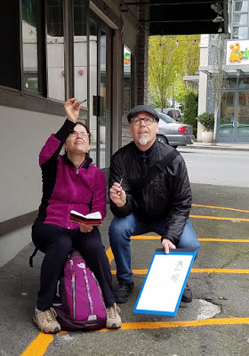
Workshop students hard at work.


A bus shelter makes a handy studio.

David helps Svetlana take a measurement.
Final throwdown and critique.

Saturday, April 22, 2017

Cloud Experiments

4/20/17 water-soluble colored pencils, ink
A couple of days ago we got a brief reprieve from the relentless rain and wind, so I ran out the door before it started again. It was still chilly and breezy, so I drove up the street and stayed in the car to sketch this. Although there was enough sunshine to cast shadows (what a treat!), huge, gray, billowing clouds hung low – a typical Seattle sky much of the year.

In just about every way, I am enjoying using colored pencils more than watercolors when sketching on location, but one element I haven’t been able to do successfully with colored pencils is the sky. Sure, I can take several hours to do it with dry colored pencils or a little less time with water-soluble colored pencils, but that doesn’t work on location. So I’ve been looking for shortcuts.

For a few years I’ve been using a waterbrush filled with ink to make a quick splash of blue sky, but that handy trick doesn’t work as well with clouds. I tried a waterbrush filled with gray ink for quite a while, but I haven’t been happy with the results.

With the sketch above I tried an idea I’ve been playing with at home – it’s similar to the waterbrush trick but using water-soluble colored pencils. I first spray the paper with a light mist, then use a clean brush to spread it evenly. I hit the wet paper with the blue ink. Then I put down a swatch of gray colored pencil on a piece of scrap paper. I use a second waterbrush (filled with water) to pick up the gray pigment, then dab it onto the wet paper. The effect is better when the paper has dried just a touch – but not too much.


Below are some practice clouds I’ve been doing at my desk. I’m not completely happy with the effect, but I’m happy with the speed and efficiency, and especially the mechanical ease of doing all of this while standing and without juggling paints. 


Friday, April 21, 2017

The Secondary Triad

4/20/17 water-soluble colored pencils (photo reference)
This week’s lessons in my colored-pencil class are depicting distance and using the secondary triad. I’m not too pleased with my result in terms of showing distance, and I wasn’t at all inspired by my photo reference of a marshy field – something I would probably never choose as subject matter on my own. On the other hand, I love the secondary triad palette I used and the process for mixing those hues!

During most of the previous lessons, we’ve used a primary triad palette (red, yellow, blue) with a warm and a cool of each hue – a classic paint-mixing structure. When I used watercolors, my tiny paint box allowed only eight half pans, so I generally carried some variation of a primary triad with a couple of secondary or other “convenience” colors. I’ve also experimented with colored pencil primary triads on my own, so I’ve gotten used to mixing primaries.

This week when Suzanne introduced the concept of using a secondary triad, I was very excited! Orange, green and violet is my favorite color combination for almost everything (someday I might show you my dishware, towels and downstairs bathroom), and I’m always attracted to it when I see it in the work of others. (One of my favorite urban sketchers who uses the secondary palette beautifully is Richard Sheppard.) But I’ve never consciously used it as a painting palette myself. It was high time for me to use it with pencils!
 
The secondary triad palette I used for the exercise above.
While picking out warms and cools of the primaries is easy, it took a little more thinking to choose the secondaries, mainly because I don’t do it often. Finding the right purples and greens was relatively straightforward, but the oranges were more challenging – it’s strange to think of any orange as being cool. With Suzanne’s help, and keeping in mind the marshy subject matter of the photo reference, I chose a dark reddish orange for the cool and a yellower one for the warm.

Mixing the cool green and cool violet for the darkest shadows was fun and surprisingly rich (instead of garish, which I feared).


My uninspiring photo reference.
I’m going to be using this palette again . . . in fact, I think it will be ideal for Italy next month! 

Updated 4/27/17: Here are the specific colors in the secondary triad above:

Caran d'Ache Supracolor - Russet (065)
Faber-Castell Albrecht Durer - Terracotta (186)
Caran d'Ache Museum - 245
Faber-Castell Albrecht Durer - Deep Cobalt Green (158)
Faber-Castell Albrecht Durer - Delft Blue (141)
Caran d'Ache Supracolor - Purple Violet (100)

Thursday, April 20, 2017

Follow-Up Review: Baron Fig Paper

Baron Fig Vanguard: standard edition at left (the plain gray covered
with my own stickers) and the limited-edition Infinity.
Ever since I supported its Kickstarter campaign several years ago, New York stationery maker Baron Fig has captured my attention on and off. The hardbound Confidant I initially reviewed held more promise than usefulness, but I was happy that I held onto it. Nearly two years later when I became interested in sketching with graphite, that notebook’s paper turned out to be one of my favorites.

Spotting my review about graphite sketching, Andi at Baron Fig got in touch asking permission to tweet it. I mentioned that I was considering trying a more portable softcover Vanguard, and she kindly offered to send me one in the same A5-ish Flagship size. (She also sent an Archer pencil, which had been recently released.) All winter as I sketched the graphite-gray landscape, the Vanguard became my everyday-carry pencil sketchbook.

Fast-forward to a couple of months ago, when Ana at the Well-Appointed Desk noted that the paper in the limited Black Box edition had changed – it was now toothier and more creamy than white. I was actually fond of the old Vanguard’s slightly-but-not-overly-toothy surface, so I wasn’t sure if I’d find the change to be an improvement or not. A short time later, the next Vanguard limited-edition Infinity came out, and I was curious enough about the new paper to order one.

Initially I was a little disappointed by the additional tooth, but I got over that quickly because I discovered other differences that were definite improvements. I ran through my usual battery of media tests – graphite, water-soluble colored pencil, fountain pen, brush pen, Pitt marker. Although the weight (unspecified by BF) feels the same, the new paper has more sizing, so the water-soluble materials washed nicely when brushed lightly with water instead of sinking into the paper immediately. On the old paper, the reverse side shows a little bleed-through where I gave the scribbles a wash. The new paper shows almost nothing. The paper is still not intended for wet media, of course, so the page buckled where I got it wet, but not too badly.

Old paper
New paper

 
Old paper (reverse)
New paper (reverse)


Perhaps a more significant consequence of this paper change is greater durability where the binding is stitched. When sketching on location with a softcover sketchbook, my habit is to fold the side that I’m not using backward, making the book easier to hold with one hand. When I did that with the old Vanguard, I noticed that the pages would tear away a bit from the stitching, especially near the bottom. I’m not seeing that at all with the new Vanguard. Perhaps the binding is exactly the same, but the paper might be slightly stronger, so it’s not tearing from the stress of bending the page away from the stitching.

Old binding
New binding

Incidentally, one thing I really appreciate about all of Baron Fig’s notebooks (hardcover and softcover) is that the bindings open completely flat, which makes them easier to use as well as scan.

Tombow marker on new Vanguard paper
Since the paper is not appropriate for heavy washes, I wouldn’t make the Vanguard my standard, everyday sketchbook. But now that I know the paper can stand up to various media besides graphite, I’m using it more. Last month when I took Sue Heston’s urban sketching workshop, she had suggested tonal markers, so I grabbed pigment-ink-based Faber-Castell Pitt Artist Pens and water-based Tombow Dual Brush markers to use in the new Vanguard. The paper held up to both types of markers beautifully with no bleed-through at all, even where I applied the markers solidly. (I don’t have any alcohol-based markers to test, but I’m guessing they would still bleed through.) It’s great for fountain pen line drawings washed lightly for shading, too.

While the gray cover, standard edition Vanguard is available in a choice of rulings, including blank, the limited-edition Infinity is available only with dot-grid ruling. (Strangely, the pale gray dots apparently resist water-based marker ink, because the dots show up white. The Pitt markers obscured the dots completely.)


The standard edition pocket-size Vanguard is also available with blank paper. Hmmm . . . that might be worth trying now.

Updated 5/30/17: Baron Fig just came out with a limited-edition Vanguard called Clear Sky. Not only are the covers beautiful – the paper inside is blank! I’m going to grab some before they sell out.

Faber-Castell Pitt Artist Pens
Fountain pen ink and colored pencil

Wednesday, April 19, 2017

A Game Changer

4/14/17 water-soluble colored pencils, 140 lb. paper (detail)
Learning to use multiple dry/wet/dry/wet layers of water-soluble colored pencils has become something of a game changer for me. These pencils that I love so much (though previously for mostly irrational reasons) have suddenly become much friendlier and more forgiving. I have more time to think or change my mind.

The first sketch I made from life with watercolor pencils after learning that basic technique was the lightship moored outside MOHAI last Friday with Urban Sketchers (detail at right). Although I had tested the red pencil I used on the ship before applying it, I didn’t like the garish pinkish tone it took on when I wet it. So after that dried, I went over it again with a brick red pencil and applied water again, and I liked the result better. In the past, I would’ve assumed I was simply stuck with that initial garish color. I’m not sure why it had never occurred to me to try adding more layers, but sometimes incorrect beliefs get planted firmly and have to be weeded out severely!

4/15/17 water-soluble colored pencils, Stillman & Birn Beta
The next day I tried sketching the over-ripe red Bartlett with multiple layers of dry/wet/dry/wet (at left). Once I got the hues the way I wanted, I applied additional dry pencil to some areas and then dabbed the waterbrush to get the mottled skin. Except the stem, the result looks more like pure watercolor, and in this case, I like the painterly look. I left the pear’s shadow dry to contrast with the fruit. I’m not sure whether I like it, but its texture definitely contrasts with the fruit.

On Monday I attempted a red bell pepper (much more challenging than an apple or pear!). In my first attempt at applying water to the pepper’s shadow (below, top) made of a blend of red and green, I didn’t move the brush fast enough, so I got an annoying line where the water started to dry. This is the kind of thing that happens to me a lot with watercolor paints, and as far as I know, there’s no way to fix it (and attempts to do so usually end up looking worse than before).


With the pepper’s shadow, however, I thought I’d see what would happen if I tried again: After it was completely dry, I reapplied light layers of the same red and green pencils. Then, remembering to move the waterbrush more quickly and consistently, I washed over the shadow, and I managed to obscure most of the previous attempt’s telltale drying line (below, bottom). Much more forgiving than pure watercolor paints – and also more forgiving than I ever knew water-soluble colored pencils could be!

4/17/17 water-soluble colored pencils, Stillman & Birn Beta
(First attempt at shadow)
4/17/17 (Second attempt at shadow)

Tuesday, April 18, 2017

Getting Toned

3/21/17 ink, colored pencil, gel pen, graphite
Using toned paper is an ideal way to focus on values in a sketch. Every now and then I get in the mood for it and bind a sheet or two into my everyday sketchbook. Unfortunately, the 80-pound Strathmore toned paper I have is intended for dry media, so my fountain pens and some markers can bleed through.

The past year I’ve been getting my toned paper fix by using a red Field Notes Sweet Tooth notebook, which is not only bright red – the paper is heavy enough to withstand anything I’ve thrown at it, including markers and a light waterbrush wash. Both black shadows and white highlights pop beautifully on that red. But sometimes I wish the page were a little larger. I’ve also wanted to experiment with colored pencils on toned paper. . . 


Guess what? I heard from a very reliable source that my favorite sketchbook maker is coming out with a toned paper edition! I’m betting that the papers will be of similar heft and quality as the rest of its stellar sketchbook line. I can’t wait! (You heard it here first!)

Monday, April 17, 2017

An Easter Treat

4/16/17 colored pencils, ink

Although it stayed hazy all day, Easter was the warmest spring day yet – all the way up to 64 degrees in my ‘hood! After the wettest winter in decades, it was a treat to visit Maple Leaf Park without our raincoats, hats and gloves. We walked a lap around the park, and then I plunked myself down at a picnic table to make this sketch.

The forecast is not looking promising for the rest of the week, but as long as I get an occasional spring treat like that, I can manage until summer.


And here was my other Easter treat. I hope the Easter Bunny was good to you, too!


Related Posts Plugin for WordPress, Blogger...