 |
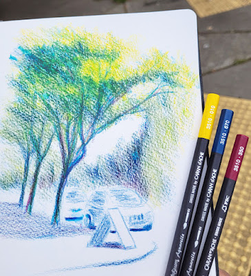
| 6/13/22 Green Lake neighborhood (new primary triad 1) |
A recent sketch at Green Lake made me realize that I’m
tired of the reliable colored pencil palette I’ve been using for years. I also
realized that I lean too much on “normal” greens and neutrals for the typical
urban landscape that I find myself sketching 99 percent of the time. By “normal,”
I mean too realistic. Whenever I experiment with a primary or secondary triad,
I’m usually pleased with the vibrancy, but unless I push myself that way, I
just fall back into my lazy realism. And yet, seemingly paradoxically, I also
recently surprised myself when I acknowledged that using a primary triad actually requires less thinking than using “realistic” colors! All of this
led me to the same conclusion: I’m long overdue for a palette refresh.
I decided that the easiest way to give myself a swift kick
in the palette pants is to keep the palette limited and try some new primary
triads. I love the CMYK-based triad I’ve been using for a while (Caran d’Ache Phthalocyanine
Blue [162], Lemon Yellow [240] and Purplish Red [350], shown at bottom of post and which I last used in the sketch in yesterday’s post), but it’s
on the cool side. Since summer is just a few days away (though you’d never know
it from our thermometer), I went through my Caran d’Ache Museum Aquarelle
palette and looked for colors to warm up the basic CMYK.
 |
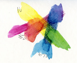
| Caran d'Ache Museum Aquarelle primary triad 1 |
 |
| New triad -- a bit too cool? |
I picked out two variations. The one I’m showing you today includes
the same Purplish Red (350), but I’ve swapped in a warmer Yellow (10) balanced
by a cooler Permanent Blue (670). My first sketch with this trio, made near
Green Lake, makes me think it may be cooler than I want, but I’ll try it a few
more times.
Tomorrow I’ll show you the second primary triad I’m trying. It
didn’t make sense to carry two primary triads when I’m trying to simplify and
limit my palette, so I’m keeping one triad in my everyday-carry bag and the
second in my tiny walking bag (which has no other colors except “heavy
equipment yellow”). I haven’t jettisoned my “realistic” palette from the everyday-carry
bag, but if I find myself getting lazy and using convenience greens and neutrals
again, I might have to take stricter measures. But if the triad excites me, it
will be incentive enough to keep using it!
By the way, I had to chuckle at the conversation I overheard as I was sketching at Green Lake. A small party that had been dining outdoors nearby walked past me. “Is it always this cold here?” the visitor asked. “Oh, no – we usually get summer by July or August,” her friend reassured her.
 |
| My previous CMYK-based primary triad |


Nice combination. I smiled when you mentioned "convenience greens."
ReplyDeleteA little too convenient. ;-)
DeleteGreat minds think alike. I've also been in the mood to shake up my color palette. Thanks for the inspiration.
ReplyDeleteYay! Shake it up!
DeleteI like the tones and hues you've achieved in the shadows.
ReplyDelete