 |
| 1/14/22 colored pencils in Stillman & Birn Zeta sketchbook |
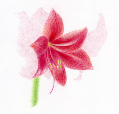
Here’s the fifth and last amaryllis blossom that I was worried
wouldn’t bloom because it was so far behind the others. Obviously, I didn’t
need to be concerned!
For this final drawing, I used the methods I have studied in Crystal Shin’s botanical illustration workshops. While the nature journal sketchbook pages were done by making a line drawing first, I made this drawing entirely with colored pencils and with the intention of trying to make the initial contour lines disappear as much as possible. Using both methods back-to-back on the same subject got me thinking about the differences, though they are still mostly muttered musings. Being the process-oriented sketcher that I am, I thought I’d mumble out loud in this post to see if I could clarify and articulate my thinking.
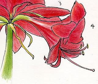
When I first began sketching and for several years after, I used the “coloring book” method of making an initial line drawing, then coloring it with watercolor. Popular with many urban sketchers, it must be one of the most intuitive and natural ways to draw, since we all did it as children. The actual coloring books we used as kids reinforced the method: The line drawing was done for us, and all we had to do was color within the lines. Prehistoric cave artists also seemed to use a similar approach. Drawing a line around a shape is the most straightforward way to distinguish it from whatever is around it.
Around the time I started using colored pencils on location, it no longer made sense to use a pen to make an ink line drawing first: I’m already holding a colored pencil in my hand – why not use it to draw the contour lines? So I did. It then became natural to make the initial contour lines blend in with whatever color filled in the space.
Ultimately, when I started learning to make more formal drawings with graphite and colored pencils, the technique was the same as what I was doing in the field. In classes and books focused on classical realism, we are taught that the line (as in a contour drawing) does not exist in reality. A visible outline tends to flatten a shape into a comic character (such as Charlie Brown, not a highly rendered comic book Batman). Since a goal of classical realism is to render a form as three-dimensionally as possible, eliminating a visible contour line helps to reinforce the illusion of form.
 |
| Lines define shapes but flatten the forms. |
Although I’ve studied all of this in various ways, it wasn’t until I sketched the amaryllis repeatedly that I started thinking about these concepts more actively. In the nature journal sketches, the ink contour lines help to efficiently define one petal from another, a bud from a leaf, or a change in plane. On the other hand, the outline does seem to flatten the forms, even when I tried to use color and values to help show dimension. I like the style for a nature journal format, so I’m not arguing against it; I just became aware of the effect.
My drawing at the top of the post is closer to the approach painters take, which is to avoid the visible line. Painters may make a pale graphite sketch to guide them, but they use a brush to make the shapes, and the under drawing disappears. Without ink lines, I had to work harder to distinguish one petal from another with subtle color or value changes, but it was somehow easier to create the illusion of form without the lines.
A few more comments about this final amaryllis drawing:
I wanted to make a “portrait” of this one late bloomer without drawing all the other blossoms, but I also wanted to somehow indicate that it was part of a larger plant. I tried ghosting the other blossoms lightly in the background, but now I think the drawing just looks unfinished. I’m not sure I like the effect, but it was something to try.
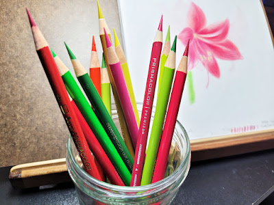 |
| Faber-Castell Polychromos, Caran d'Ache Pablo, and vintage and contemporary Prismacolor pencils used in this drawing. |
I had technical difficulties with lighting. The amaryllis is so tall that I had to put it on a box on the floor to put the blossom at the right height for me to see. It was not at all an ideal placement for either my desk lamp or the window, so it’s actually backlit (but not well). But as I’ve talked about here before, I enjoy approaching botanical drawing in the same way that I make urban sketches: Accepting whatever conditions I have to capture whatever is possible.
Of course, I could have put the blossom under ideal lighting and taken many photos to draw from; I’m sure that’s what a botanical artist would have done. The result would likely have been better, if by “better” you mean something that looks closer to a photo. But I don’t want to replicate a photo; I want to express life. (Maybe I should put that on a T-shirt or a bumper sticker. 😉)
I think both methods have their merits and each of them came out really well! Bravo for documenting the amaryllis' growth and bloom. I was totally jealous that you had one and I didn't. I'll have to get one earlier in the season and not wait so long next year. My sister ordered hers online this year and picked out the color she wanted. I know she did a few sketches of hers but I don't know if she kept up with it.
ReplyDeleteThanks, Joan! My amaryllis is only now beginning to fade, so it has lasted a good month! It might still give me one more sketch... I love the look of fading flowers as much as peak ones!
Delete