Friday, October 31, 2014

Hoodie Season at Whole Foods

10/31/14 Diamine Eclipse ink, 1.5mm calligraphy
nib, Caran d'Ache Museum colored pencil,
Canson XL 140 lb. paper
Whenever I sketch people out in the urban landscape, I can’t resist the temptation to zero in on the nearest head and use my finest pen point to carefully draw facial features as accurately as possible. I really enjoy the challenge of trying to capture the delicate curve of a cheek, the angle of an eyebrow or the sharp point of a nose in profile.

Those might be worthwhile goals for portraiture, but I’ve learned from reading Thomas Thorspecken’s book, attending Melanie Reim’s Sketchbook Skool course, and starting Veronica Lawlor’s SBS lesson this morning that it’s the body – not the face – that tells a “story.” Body language – posture, gesture, attitude – tells so much more about a person’s mood, the type of conversation people are having or the stage of a relationship than the expressions on their faces. Capturing body language – that’s my new goal when sketching people.

Knowing how tempted I would be to pull out my favorite Sailor pen (whose nib, when turned upside-down, has a very fine point), I went to Whole Foods’ café vowing to use nothing but my Lamy with a 1.5mm calligraphy nib on it. Ideal for unruly tree branches, that nib would be nearly impossible to sketch delicate facial details with. I knew I’d be forced to focus on the larger “story” told by people’s bodies. And unlike at Zoka Coffee, where people tend to sit motionlessly in front of laptops, Whole Foods’ patrons eat and run – often taking no more than five or 10 minutes for their meals. I wouldn’t have the opportunity to slide leisurely down the long ski slope of someone’s nose with my pen point.

10/31/14 Diamine Eclipse ink, 1.5mm calligraphy nib,
Caran d'Ache Museum colored pencil
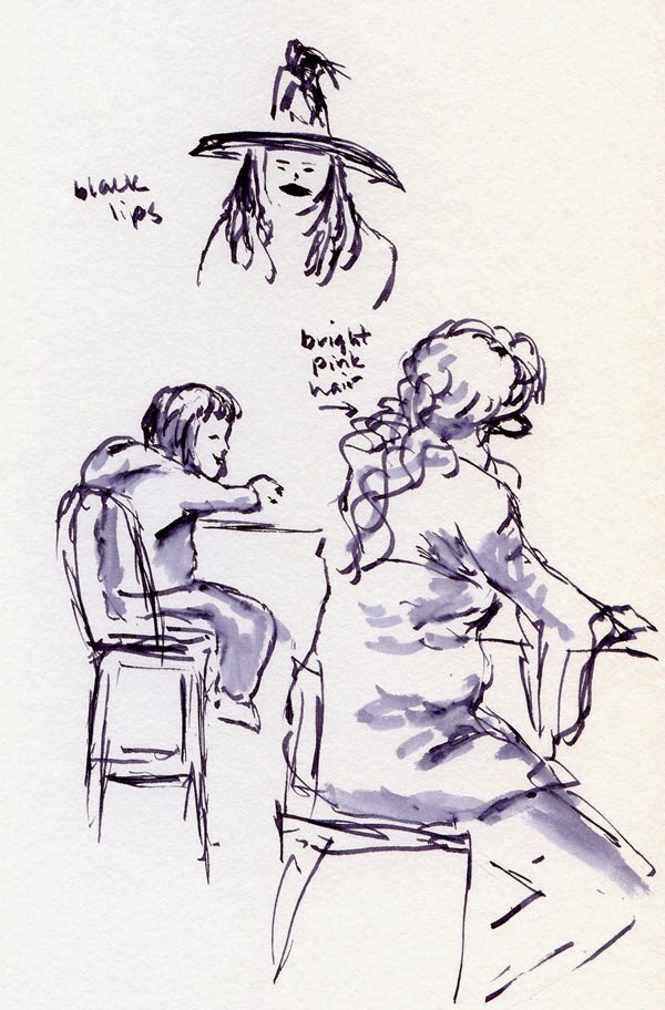
Today is Halloween, but you wouldn’t know it from most of the clothes I sketched – it’s hoodie season again. Around 11 a.m., the lunch bell must have rung at nearby Roosevelt High School, because dozens of teenagers suddenly appeared in a rushed, giggling flurry of costumed hair and makeup. I only managed to catch the witch with black lips, and then they all disappeared as quickly as they came.

(Im not sure whether the woman with the hot-pink hair was in costume or not. In Seattle, you cant be too sure. But hows that for resisting temptation? If Id had my pink Zig marker, you can bet I would have colored it!)


10/31/14 Diamine Eclipse ink, 1.5mm calligraphy nib

10/31/14 Diamine Eclipse ink, 1.5mm calligraphy nib

10/31/14 Diamine Eclipse ink, 1.5mm calligraphy nib

Wednesday, October 29, 2014

Peek-a-Boo View from Starbucks (Sketch No. 7)

10/29/14 various inks, watercolor, Zig markers, Canson XL 140 lb. paper

I haven’t been back to sketch at the Roosevelt Light Rail Station construction site for a while. It’s frustrating because I can see the tops of the red and yellow cranes from quite a distance, but once I get up close, it’s hard to find a place where I would be allowed to stand and also see anything worth sketching.

Grabbing coffee at the Roosevelt Square Starbucks, which is on the upper level, I realized that the yellow crane was now in a position that I could see part of it from the outdoor tables. Partially blocked by the Square’s façade as well as lots of trees, it’s still a frustrating view, but at least I had a comfortable to table to sit at and unexpected blue spots between the clouds (yesterday’s weather report was wrong; not a single shower all day!).

(By the way, did you spot the worker up there? I know it looks like he’s walking on the outside of the railing, but he’s really safe inside. Well, “safe” is a relative term. My heart was pounding just imagining what it must be like to walk around up there.)

Rained In with Calligraphy Nibs

10/28/14 Sailor Jentle Doyou ink, Sailor pen,
Stillman & Birn Alpha sketchbook
Yesterday I stayed in all day, partly to work but mostly because the rain that Seattle is so famous for is back (after an unusually dry summer and early fall) with a vengeance.

To distract myself from tedious tasks such as earning a living, I started thinking about the calligraphy-shaped “nib” I had crudely tried to carve on the ends of my sketching twigs. That made me remember the actual calligraphy nibs I had purchased quite a while ago for my Lamy pens. My intention at the time – long before I discovered the Sailor bent-nib pen – was to see if I could get a variable line width from the calligraphy nibs. I’m not a calligrapher by any means, so I wasn’t sure how to hold the nibs properly, and my lack of ability to manipulate the thick and thin strokes discouraged me. I took the nibs off the pens and forgot about them – until now.

Yesterday I dug out the 1.5mm and 1.9mm nibs again and put them back onto a couple of Lamys. (See, this is why I maintain such a large collection of pens that I don’t use much anymore for sketching – you never know when you’ll need some spares for impulsive ideas on a rainy day.) Through my studio window I can see a very tall, unattractive, particularly lopsided tree silhouetted against the sky. It would make a good subject for sketching with a twig, so I decided to try it with the calligraphy nibs. I also sketched it with my trusty Sailor (as sort of a “control” in my completely scientific experiment, above).

Of the three, the Sailor definitely moves the most freely and fluidly. But interestingly, the two calligraphy nibs remind me quite a bit of sketching with the twig – difficult to maneuver, unpredictable, somewhat haphazard – and entirely fun! While even the 1.9mm nib can’t make the bold strokes that twigs can, both calligraphy nibs have one advantage over the twigs: Ink flows easily. (With twigs, ink “flow” is more like ink blop.)

10/28/14 Diamine Eclipse ink, 1.5mm calligraphy
nib, S&B Alpha sketchbook
10/28/14 Diamine Sapphire ink, 1.9mm calligraphy
nib, S&B Alpha sketchbook

Nothing like having a new toy on a rainy day! And it's a good thing, because here's what I have to look forward to this week.

Tuesday, October 28, 2014

Book Review: Architecture and Cityscapes

Gabi's latest book is designed to look like a
sketchbook -- complete with a Moleskine-like
elastic band. 
Gabi Campanario has another book out! The Urban Sketching Handbook: Architecture and Cityscapes – Tips and Techniques for Drawing on Location is the first in a series, so that means I can look forward to more volumes in the growing library of books on my favorite topic. (It was only a few years ago that a search for “urban sketching” on Amazon brought up very few titles . . . just now I counted 20!)

Unlike The Art of Urban Sketching, Gabi’s first book, which is a huge, coffee-table gallery of sketches from around the globe, Architecture and Cityscapes is a compact manual of key principles that are essential to fully expressing oneself when sketching on location. It’s an ideal companion piece to the Art of Urban Sketching’s inspirational eye candy.

The six principles – composition, scale, depth, contrast, line, creativity – are illustrated with Gabi’s sketch examples as well as those of many urban sketchers worldwide who exhibit a vast range of styles and media.

Each of the book’s sections presents direct and practical information as it relates to architectural and street sketching along with an example to illustrate each concept. For example, in the section on composition: apply the rule of thirds; use thumbnails to plan; choose interesting formats. Depth is one section that was especially useful to me: How do you show the three-dimensionality of a building on a flat piece of paper? Perspective is one obvious choice, and Gabi gives simple tips on learning to convey perspective accurately. But there are other ways to give depth to a sketch – putting an element in the foreground; silhouetting areas of a sketch that would otherwise detract from the subject; using tonal values.

The book’s sixth key, creativity, encourages the reader to push beyond simply rendering a building to finding one’s unique style. “Developing your own drawing style takes time. Be patient,” Gabi urges. “You risk not finding it if you give up too soon.” The last section is a slim gallery of works organized by media by artists well-known in the urban sketching community.

Gabi’s personal approach and attitude toward urban sketching and toward drawing as a form of personal expression are apparent throughout. “A line made with assertion, even if it’s in the wrong spot, is worth a thousand marks made with hesitation,” he says. He encourages sketchers to engage with interested bystanders who comment on your sketch. “Urban sketching is about immersing yourself in your city or the places you travel. You’ll miss out if you wear headphones or don’t welcome interaction.”

To a would-be urban sketcher who has never even touched a sketchbook, I might not recommend this as a first reference, as there’s no information about materials or practical suggestions (bring a hat and stool!) for on-site sketching. (To those folks, I might recommend James Hobbs’ Sketch Your World, which is a more comprehensive guide on how to become an urban sketcher.) For all the rest of us, though, Architecture and Cityscapes is a handy, compact volume small and thin enough to throw into our sketch bags. (It even has an elastic band to look like a Moleskine and a few blank pages inside to sketch on!)

(A shorter version of this review appears on Amazon.com.)

Monday, October 27, 2014

Half-Hearted Ghouls

10/27/14 various inks, Caran d'Ache Museum water-soluble
colored pencils, Zig marker, Canson XL 140 lb. paper
The house on 80th that always goes all-out with Halloween decorations seems a little tired and lackluster this year, like the owner ran out of steam. Last year I sketched the whole house from across the street, enjoying all the details in the skeleton-themed scene. I had been looking forward to sketching it again and making the house my annual Halloween sketching tradition, but today’s sketch turned out as half-hearted as the decorations looked. Hoping to perk up my own enthusiasm, I moved in closer to capture a small gathering of ghouls. They seemed somewhat thrown together, barely able to sustain enough energy to keep their coffin lid open. Even the plastic vulture looked bored and indifferent.

Saturday, October 25, 2014

My Twig and Ink Setup

10/25/14 India ink, twig, Stillman & Birn Alpha
A blog reader recently requested more information about the twigs I’ve been using to sketch with. Then yesterday’s sketch of maple trees at U Village generated more questions and comments than I’ve ever gotten from a sketch posting on Facebook (including a comment from the twig master himself, KK, which thrilled me!). One Facebook commenter even asked if I had really used an actual twig – or if that was the name of some kind of art tool! So I decided it was time to write a post on the subject.

I call this “my” twig and ink setup, but most of it is just what I learned from KK during his two-hour presentation and demo at the Urban Sketching Symposium in August. He talked a little about the types of trees he gets his twigs from, but after several questions from the audience, it became clear that the type of tree the twig came from wasn’t very important, as long as the twig was dry and not freshly broken from that tree. KK gave out samples of Chinese ink and had prepared a pile of sharpened twigs for demo participants to try, but the activity was so popular that he ran out by the time I got up there. DIY girl that I am, I just looked around the park where the demo was taking place and picked up a couple of twigs from the ground. When I asked KK whether they would do, he said they would, but then he broke off the tip of one and said to use the freshly broken end rather than the naturally pointed tip. He recommended that I sharpen the end to a point when I had access to a knife.

My sketching twigs shown next to a Platinum Preppy pen for scale.
I noticed that KK’s own personal set of twigs included a variety of point sizes and widths. Since he prefers to use full-size sheets of watercolor paper as well as long landscape sheets for his paintings, many of his twigs were relatively heavy and thick, making large, bold marks. Since I rarely use paper larger than 9-by-12 inches, I made a mental note to keep my twigs on the small size.

A couple of weeks later at home, I went out to my backyard and picked up several twigs about the length of a pen but thinner. Since they were already on the ground and I knew it hadn’t rained recently, I figured they were sufficiently dry. I used a craft knife to cut the bark away and attempted to shape the ends into something like a chisel edge or an italic pen nib. Never having been very handy with a knife, my results were rudimentary at best. Still, I prefer the ability to vary the line width (apparently my lovely bent-nib Sailor has spoiled me; I can’t ever be happy again with a single-line-width drawing instrument!), so making a flat end intuitively makes sense. (I tried cutting one with more of a pencil point, but that proved to be even more difficult than the chisel edge.)

A small glass jar containing gauze saturated with India ink.
The second critical component in KK’s sketch kit is a small jar of Chinese ink, which he said is water-soluble but dries permanently so that watercolor washes could be applied on top. I wasn’t able to find anything called “Chinese ink” at the art supply stores I looked in, so I tried sumi ink, which I happened to have a huge bottle of and which I assumed to be the Japanese version of Chinese ink (after all, Japanese sumi-e is adapted from traditional Chinese painting techniques). Sumi ink turned out to be less intensely black compared to KK’s ink and seemed to have a thinner consistency. I kept digging through my vast bins of art supplies and pulled out a bottle of India ink most recently used in Steve Reddy’s workshop. Closer to KK’s ink in consistency and intensity as well as being waterproof when dry, India ink is now my ink of choice when twig-sketching.

Other than the magic of watching KK’s sketching demo itself, the single-most-important tip I learned from his presentation was how to set up the ink jar. He places a couple of squares of ordinary medical gauze in the bottom of a small jar and then pours in enough ink to saturate the gauze – but not much more than that. (Later at home, I tried both cotton balls and cosmetic squares, which I happened to have on hand, but neither worked as well as gauze.)

This setup has two benefits: The most important to KK is that the gauze allows only a small amount of ink to transfer to the twig, which gives his sketches the “dry,” highly textured and highly expressive look that he is known for. The second benefit is important to any urban sketcher: If you accidentally tip the jar over, you might spill a drop or two (or not at all), but it won’t be the huge disaster an overturned bottle of ink could be.

Ink bottle attached to a ruler with Velcro. The ruler is attached
to my Stefano sketchbook cover with a binder clip.
My personal modification to KK’s brilliant ink jar setup is that I adhered a small piece of Velcro to the bottom of the jar so that it can be attached directly to my “Stefano” sketchbook cover, just like my watercolor paint box can. It’s a critical modification if you often sketch standing up the way I do, or if you just want a handy place to put your ink.

Simple tools and setup, eh? Well, as I mentioned in my post in which I channeled my inner KK in an attempt to summon the same magical powers he possesses when he wields a twig, I learned that there’s nothing magical about the twig itself – it’s all in the hand holding the twig. So far, my channeling hasn’t resulted in getting that magical hand for myself. But in the few weeks I’ve been twig sketching, I’ve learned a couple of things I’ll pass along here:
  • If you cut the twig end with a flat, italic-like “nib,” you can use the narrow end for fine lines, the flat end for wider lines and turn it within a line stroke to get a calligraphy-like thick-and-thin line. (So far, I’ve only succeeded sporadically, but that’s the theory!)
  • The twig can hold only a very small amount of ink, so you’ll be dipping into the jar constantly.
  • When you first touch the twig “nib” onto the paper after dipping, that’s where the darkest blob of ink will be, so plan accordingly: Use that first stroke to apply the darkest-value areas.
  • After that first blob, the twig will be scratchy and dry, so that’s a good opportunity to hatch in texture and medium-value areas.
  • Forget about “control”; twig sketching is all about letting go. (Ah, such a Zen technique!)
  • Forget about detail; twig sketching is all about large shapes and values. It’s closer to painting than drawing.
Now go channel your own inner KK and give twig sketching a try!

Friday, October 24, 2014

Tight People, Loose Trees at U Village

10/24/14 India ink, twig, watercolor, Canson XL 140 lb.
The University Village Starbucks was supposed to be only the meeting place for the Friday ad hoc urban sketchers, not the sketching destination. But this morning started out cold enough that I decided to stay and warm up – literally – with a cup of coffee and as many sketches of people as I could do in half an hour. Inspired by Melanie Reim’s loose yet angular style, I was trying to loosen up, but I’m not sure I succeeded. I can usually get loose with figures that are moving quickly, but I have a much harder time with faces. I’m going to keep working on that.

Sufficiently warmed, I went out to the village fountain, which I had sketched several months ago when I was doing temporary battle with an ongoing sketching nemesis – fountains and falling water. Trying to reserve the paper’s white for running water is always the tough part! Getting an odd reverse logic in my head, I pulled out my twigs and India ink, somehow thinking I might be able to indicate the white water by using dark ink for the negative spaces. A good concept poorly executed – but at least the twig loosened up my lines.


10/24/14 Private Reserve Velvet Black ink
That done, I turned my stool 90 degrees and spotted some maples past their prime but still blazing in the sunshine, as well as a couple of lamp posts. Two years ago, I had sketched the same type of lamp posts elsewhere at U Village, and I remembered how easy it was to get caught up in the trim and individual blossoms in the hanging baskets. I still had my twig and ink out, so I let ‘em rip. Sufficiently loosened up by the trees in the previous sketch, I was happy with the way the blunt twig stressed the shadows without letting me fuss with details.


10/24/14 Private Reserve Velvet Black ink
10/24/14 India ink, twig

The Friday ad hoc sketchers bundle up for a chilly morning at U Village.
Top row from left: Robin, Nilda, Gwen, Natalie, Linda, Anne.
Bottom: Tina and Peggy.

Thursday, October 23, 2014

Wildlife – But Not Much of it Living

10/20/14 Pilot Iroshizuku Take-sumi ink, Canson XL 140 lb. paper
(cormorant in Port Townsend)
I had hoped for some opportunities to sketch wildlife while I was in the Olympic National Park this week, but the rain kept us out of areas where we might have seen some. We did see a few deer near the roads to and from the park, but I couldn’t get out of the car to sketch them.

My only sketch of living wildlife was a cormorant resting on some rocks that I spotted while we were lunching at Fins Coastal Cuisine in Port Townsend on our way up to the peninsula.

10/21/14 various inks, Caran d'Ache Museum water-soluble colored pencils
(dead rabbit)
The other two wildlife specimens that I sketched were, unfortunately, dead. The first was a rabbit just beneath the livingroom window of the cottage where we stayed. Although I felt sad sketching a bunny that had recently died, I enjoyed using water-soluble colored pencils to sketch it; the soft pencils are ideal for sketching the texture of fur.

The second sketch opportunity was a “Roosevelt elk,” whose head was mounted over the fireplace at the Lake Crescent Lodge. My first try was in ink, but as I’d done a couple years ago when sketching (live) reindeer, I scaled the composition wrong and couldn’t fit the full width of the elk’s impressive rack in my sketch. Somehow it doesn’t seem possible for the rack to be so huge! Anyway, I felt I had dissed the elk, so I came back the next day to try again. This time, remembering the dead bunny, I used water-soluble colored pencils, and I managed to scale it proportionally.

10/21/14 Diamine Chocolate Brown ink
(Lake Crescent Lodge, Olympic National Park)
The plaque under the elk’s head reads: “Near Record. Roosevelt Elk Taken by Chris Morganroth, Bogachiel River, 1902.”

One bit of fun I discovered was the Olympic National Park “passport” stamp, which I stamped onto my sketches done within the park. I wonder if all national parks have such stamps? I must have missed them at Yellowstone, Zion and Bryce.

10/22/14 Caran d'Ache Museum water-soluble colored
pencils, Pilot Iroshizuku Fuyu-syogun ink
(Lake Crescent Lodge, Olympic National Park)

A Lesson in Trees on the Olympic Peninsula

10/22/14 J. Herbin Vert Olive ink, Caran d'Ache Museum
water-soluble colored pencils, Canson XL 140 lb.
paper (Olympic National Park rainforest)
Rain, trees, rain, trees, rain and more silence than I’ve heard in a long time: that describes my past few days on the Olympic Peninsula. 

Greg and I decided to celebrate our 25th anniversary by renting a small cottage near Lake Crescent. (“Small cottage” was the description used on AirBnB, but it turned out to be bigger than our house! I guess they have different standards for “small” in a place where the landscape is covered with mountains and trees as far as the eye can see.) The rain kept us indoors most of the time, but the quiet seclusion and beautiful landscape almost made up for the disappointing weather.

As it turned out, I got three ideal days for making trees studies in various media because our cottage was literally surrounded by forest, so I could sketch trees from every window. On one day the rain let up for about an hour, so we quickly dashed out to see some of the rainforest that we had hoped to hike through. I managed to get one sketch of a bizarre and ghostly tree dripping with moss (which the rainforest is full of) before the rain started up again.

We also spent some time at the Lake Crescent Lodge in the Olympic National Park, where I sketched a bit from inside the car. The lake and surrounding mountains were lovely when we could see them, but they were often shrouded in mist.

On the way home we drove through Port Gamble and parked outside the Buena Vista Cemetery for an in-car picnic lunch. The cemetery is an ideal Halloween graveyard with a bunch of aged and crooked markers and mostly bare trees tossing about in the wind. At night, it might have given me the creeps, but at noon with the sun finally breaking through the clouds for a few minutes, it was a delightful treat.

10/21/14 watercolor (Lake Crescent)
10/23/14 India ink, twig, Museum pencils (Buena
Vista Cemetery, Port Gamble)

10/22/14 Diamine Chocolate Brown ink, Museum
pencils, watercolor

10/22/14 India ink, twig, watercolor

10/22/14 India ink, twig

10/22/14 Pilot Iroshizuku Take-sumi ink (tree studies)

10/21/14 India ink, twig, Museum pencils
10/20/14 watercolor
10/23/14 Platinum Carbon and Pilot Iroshizuku Fuyu-
syogun ink, watercolor, Museum pencils
(Buena Vista Cemetery, Port Gamble)
10/23/14 India ink, twig, Museum pencil (Buena Vista
Cemetery, Port Gamble)

Sunday, October 19, 2014

Summer in October on Capitol Hill

10/19/14 various inks, watercolor, Zig markers, Pitt Artist Pen, Canson XL 140 lb. paper

The October gatherings of Urban Sketchers Seattle the past two years have been at pumpkin farms – Craven Farm last year (which was really cold) and Fall City Farm (which was rainy) the year before. This year we broke from tradition and met in the Capitol Hill neighborhood near Seattle Central Community College, and someone must have danced the right sun dance, because we got summer – 70 degrees and a nearly cloudless sky! 

10/19/14 Diamine Chocolate Brown ink, Caran d'Ache
Museum water-soluble colored pencils
From the corner of Broadway and Pine, red and yellow cranes caught my eye. I could see no less than four, but I could fit only three into my composition.

At the Broadway Farmers Market, I captured a busker singing in the bright sunshine, but not before wandering slowly through the colorful produce and flower stalls, wishing summer were just starting.

In the last 15 minutes before our meet-up time, I sketched a line of trees growing on the SCCC campus grounds. Actually, what first caught my attention was the very top of the Space Needle hovering over a rooftop like a spaceship.

Rain is predicted for the rest of the week, and I can already see clouds gathering on the horizon, so today was a special treat right before we all get out our Polartecs and parkas for good.


10/19/14 various inks, Caran d'Ache Museum
water-soluble colored pencils

Saturday, October 18, 2014

Taking My Stegosaur for a Walk

10/18/14 Sailor Jentle Doyou ink, Caran d'Ache Museum water-soluble colored pencils, watercolor, Stillman & Birn Gamma

I’m enrolled in Sketchbook Skool this term.

As an urban sketcher, I think of every sketch I make as a story. Not necessarily a newsworthy one – I rarely sketch anything that would qualify as sketch reportage. The way I look at, a “story” can be as simple as a few coloring maples lighting up the parking lot of a grocery store where I shop; trees butchered to make way for power lines; the neighborhood store where I still rent videos. In other words, the “story” might be nothing more than something that caught my attention at a certain time and place.

The descriptions of the first two semesters of Sketchbook Skool didn’t interest me much, but the third one – “Storytelling” – felt like it would be right up my alley. Although I’ve enjoyed most of the video presentations of the first two instructors (especially watching Melanie Reim’s demo of the way she wields a conventional fountain pen in a most unconventional way! If I could figure out how to do that, I wouldn’t need my Sailor!), I wasn’t inspired enough to complete the homework assignments (I’m such a bad student!). The third and current instructor, however, is a different matter.

I’ve been a fan of Mattias Adolfsson’s amazingly imaginative drawings for a long time. Drawing from imagination has always felt like something that other people do – people with imaginations more vivid or at least more illustratable than mine. Imaginative storytelling is not even something I necessarily aspire to – I’m perfectly happy simply trying to sketch what I see in the real world – yet Mattias’ drawings are so strange and wondrous and his explanations so seemingly straightforward that I felt compelled by his invitation to give it a shot.

Bad student that I am, I didn’t exactly follow the first assignment, which was to sketch a childhood memory. Instead, I latched onto something else he said in a lesson: Take any real-life experience and use that memory to start the sketch.

I didn’t have to go too far back in my memory to dig up a real-life experience – just to last Tuesday, when I sketched a stegosaur skeleton at the Burke. With that skeletal structure still fresh in my mind, I sketched some flesh onto it, and voilà – a fantasy childhood memory. It was much easier than I had expected – and, more important, it was fun! I’ll probably never be another Mattias, but it feels good to give myself a whack upside the brain once in a while.

Friday, October 17, 2014

Book Review: Seattle Sketcher

Cover of Gabi's new book, which shows one of my most favorite
Seattle Sketcher sketches -- the Smith Tower.
Visitors to Gabi’s exhibit at the Museum of History and Industry earlier this year will feel like they are at the exhibit all over again when they view his new book, Seattle Sketcher: An Illustrated Journal by Seattle Times artist Gabriel Campanario. Most of the same sketches and accompanying text are included in the beautiful hardcover book published by the Times and organized in a similar way. And as in the sketch reproductions we saw in the exhibit, we can see the scribbled marginal notes and paint swipes that usually get cropped out when the sketches appear in the newspaper.


But while the exhibit had a literally larger-than-life quality – many sketches were reproduced to fill entire walls – the book gives you the opposite feeling: something you can curl up with on the couch with a cup of coffee, paged through slowly – like a sketchbook.

I’ve seen all of these sketches many times – first in the newspaper; then at the exhibit; and now in the book. But I never tire of Gabi’s fresh view of Seattle. Leonard Garfield, MOHAI Executive Director, said it best, as quoted on the back cover: “The work of Gabriel Campanario is both beautifully drawn and brilliantly observed, revealing Seattle in ways that allow us to see the city as if for the first time.”

Indeed, those who missed the exhibit and don’t have access to his column will be able to see Seattle for the first time in this delightful collection. The book publisher keeps saying it’s available in a “limited quantity.” I don’t know what that really means, but if you haven’t already, you might want to get a copy soon!

Multiple Models

10/17/14 Pilot Iroshizuku Take-sumi ink, Caran d'Ache
Museum water-soluble colored pencil, Canson Mixed
Media sketchbook
I hadn’t been to life drawing practice in nearly six months, so I was feeling rusty this morning as I drove over to Gage Academy in the drizzle. My preference is to attend short-pose sessions, but the session scheduled for today was an “Artist’s Choice” long pose, which means a painter has reserved the model and determines the pose, and the rest of us can sketch alongside that artist.

A couple of other surprises awaited me: The model was clothed (wearing a wedding gown), and the room was somewhat larger than the previous Gage life drawing sessions I’ve attended, so I had more space to choose a variety of positions. It brought to mind Thomas Thorspecken’s suggestion in his book, Urban Sketching: The Complete Guide to Techniques: Use life-drawing sessions as an on-location sketch opportunity by drawing the other participants or the whole room, not just the model.

I spent most of the three-hour session sitting in the back sketching the other artists. They all stayed in the same positions, and the model stayed in the same (boring) pose, but I moved to a different location at every break. For my last sketch, I decided it was time to focus on the “bride,” so I sketched her with India ink and a twig. 

10/17/14 India ink, twig
10/17/14 Diamine Chocolate Brown ink, Museum pencil

Related Posts Plugin for WordPress, Blogger...