Showing posts with label book binding. Show all posts

Saturday, September 21, 2024

Handbound Hahnemühle


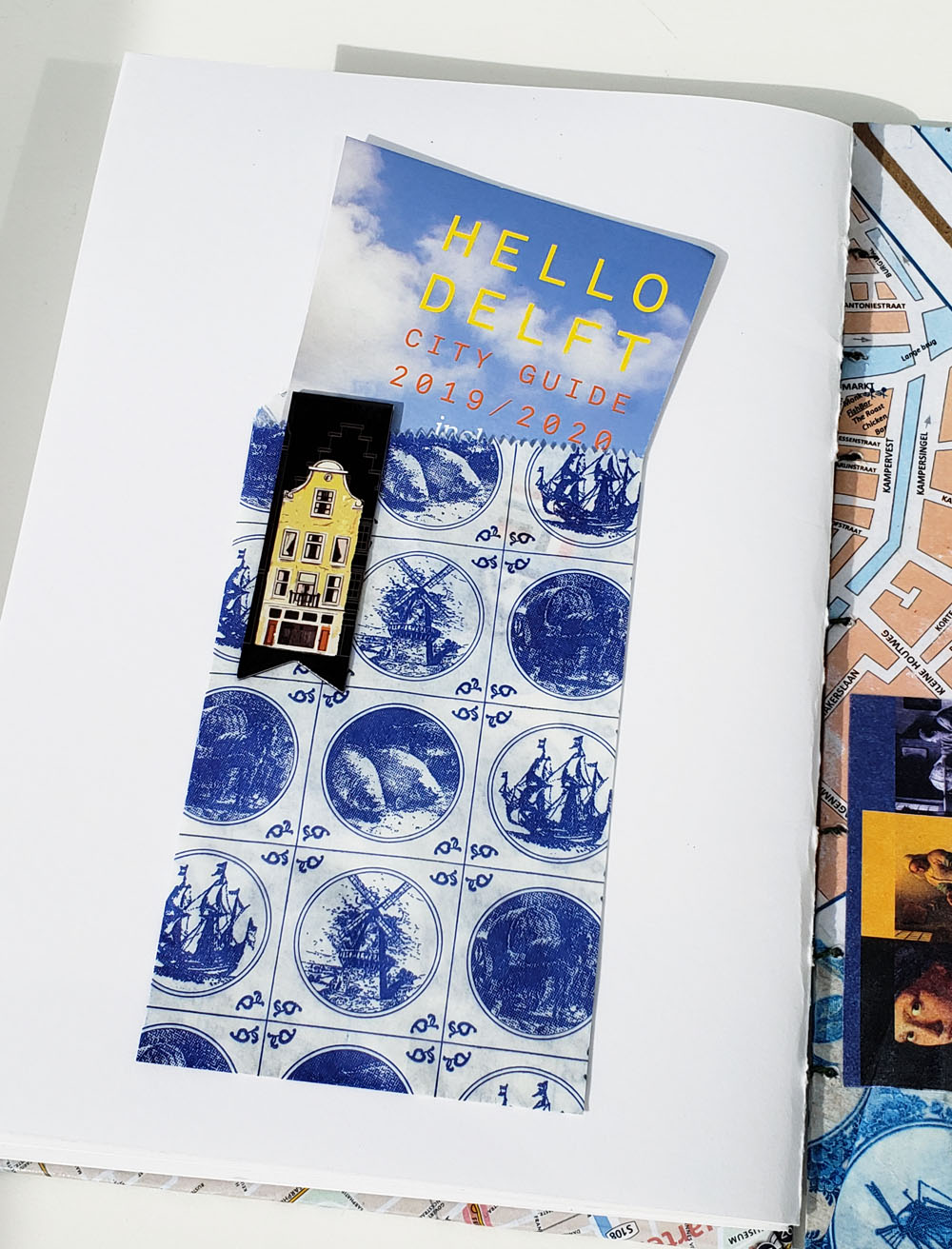
I stickered up the cover with Notegeist Bindery's stickers!

When I use wet media, my hands-down favorite sketchbook for more than a year has been Hahnemühle with 100 percent cotton paper. The A6 size has been the most portable and actually the only practical size with my everyday-carry mini-size Rickshaw bag. My only complaint with the otherwise excellent edition is that it only comes hardbound, and the sturdy covers add to the weight and bulk.

My favorite A6-size Hahnemühle that is, unfortunately, available only in hardcover.

When I discovered that
Hahnemühle offers the same paper in watercolor blocks, I started thinking about hand binding again. (For those coming late to my blog, I used to hand-bind my sketchbooks for many years. This tag will take you to all the posts related to my bookbinding; this post explains why I stopped bookbinding.) Cut the 9-by-12-inch paper in half, fold, and stitch or staple into thinner, lighter A6-ish books – it seemed like an ideal solution.

The price, too, was appealing: An A6 Hahnemühle works out to be about $0.26 per page (I’ve found the best prices at St. Louis Art Supply). Making my own books from blocks of paper would be about $0.18 a page. Last spring I bought and cut a block of paper with this intention, but then good outdoor-sketching weather happened. Around the same time, I had become focused on making on-location comics in UglybooksIn any case, I never got around to binding.

Hahnemühle at left compared to Uglybook
I was chatting about all this with a friend one day – a friend who had recently started a notebook-making business. Gary thought it would be an interesting opportunity to try some custom prototypes with different binding styles. I provided the paper, and he got to work.

An immediate issue he discovered was the paper’s thickness. I realized a long time ago that this is probably the reason softbound sketchbooks with heavy paper are rare – Stillman & Birn is the only one I can think of (and I loved and used them for many years). Glue bindings are often insufficient for thick pages (as we found out from one of the prototypes), and even stapling can be difficult.

Hand-stitching, which would have been my only option if I had done it myself, turned out to be the best solution after all. I’m now using the first prototype, and it’s working out beautifully. With 24 pages, it’s about the same size and thickness as an Uglybook, half the thickness of a hardcover Hahnemühle and much lighter in weight, too. This single-signature form is so simple that I may just have to go back to binding my own after all.

By the way, if you’d like to see some of the handmade notebooks Gary sells in his shop, check out Notegeist Bindery. (Mine, however, were made just for me!)

Commemorative note: Thirteen years ago today, I started drawing. Usually on the anniversary of that date, I write a retrospective or introspective post about practice, process, learning and other thoughts about drawing and creativity. Last year’s post on Murphy’s Laws of Urban Sketching is one of my favorites. Drawing has become such an integral part of my life that I can’t think of anything new to say about why this daily practice is so much more to me than a hobby. Today I’ll just say, Happy drawing anniversary to me! I’m happy that I started 13 years ago, and even happier that I kept going.

The same as my favorite Hahnemühle but lighter and thinner

Friday, September 13, 2019

Holland Sketchbook Finally Bound

Sketchbook from my travels in the Netherlands

I finally had some time over a couple of rainy days to make the covers for my Holland sketchbook and bind it. You might recall that I used to hand-bind all my sketchbooks, but I stopped last spring when I started using Stillman & Birn softcovers as my daily-carry. It’s been a relief not to maintain that task anymore, which had become burdensome instead of fun. Going forward, I decided I would hand-bind only my travel sketchbooks. As I’d hoped, putting together this book of my trip to the Netherlands was fun and felt special again instead of routine.

As is my custom for travel sketchbooks, I drew a map of the country on the first page, along with the flag. (The flag of the Netherlands sure was easy compared to Portugal’s last year!) I got the idea for drawing a map as part of a travel sketchbook years ago when I saw that Joel Winstead does that. Adding the flag came from my own embarrassment when I went to Germany in 2013. Seeing several flags flying in front of a building, I realized I didn’t know which was the German flag. From then on, I always research it before traveling (and make sure I take the appropriate colors so I can sketch it when I see it).
 
I sketched the map and flag of the Netherlands on the first page before my trip began.

Another thing I do whenever my travels include an Urban Sketchers Symposium is to bind the symposium program right into the sketchbook. Coptic stitch is ideal for incorporating any folded stack of paper, such as a brochure.
 
The symposium program is bound right into the book.

Wherever I had spaces left on sketchbook pages, I filled them with postcards or other ephemera I picked up along the way. The covers are also made of a collage of maps, postcards and brochures.


This is probably the thinnest of all my travel sketchbooks from trips of about the same duration (the Amsterdam heatwave took its toll; I made smaller and fewer sketches), but it’s still thick with fond memories.

Sunday, April 7, 2019

Winter Sketchbook Bound

My winter sketchbook is finally bound.

My sketchbook containing work from the end of November through the end of February is finally bound. I usually put color sketches on the covers, but this time I thought I’d go with two in graphite: one of Haystack Rock at Cannon Beach, and the other of a snowy scene across the street. (My inkjet printer seems to give gray tones a bluish cast.)

This is probably the last day-to-day sketchbook I’m going to hand-bind for a while. Despite minor issues with paper surface sizing and other compromises, I’m committed to using at least two more volumes of Stillman & Birn Zeta as my everyday-carry sketchbook. My plan is to bind only the sketchbooks I use during major travel (more than two weeks long).

Three kinds of paper in this sketchbook: Bristol smooth, toned, watercolor
After nearly six years of making my sketchbooks, the process of which I enjoyed for the most part, I’m relieved to be using off-the-shelf sketchbooks for a while. I knew it was time to take a break from it when I found myself putting off the task of binding; it took me more than a month to get around to this one. It had become a chore rather than something I looked forward to and took pleasure in. I think when I start making a sketchbook only after I’ve traveled, the task will become special again, and I’ll enjoy it again. After all, my whole hand-binding process began as a solution to issues that arose when I was preparing for my first trip abroad as a sketcher.

Aside from the practical matter of carrying only a thin, lightweight signature of paper instead of a whole sketchbook (see more of my pros of hand-binding in this post), one benefit of binding is that I could use any paper I wanted and switch around easily. Although using more than one signature at a time made it impossible to keep my sketches in chronological sequence, I still found ways to bind the general time period into the same volume.

The few toned and Bristol pages were tipped in to get rid of the unused pages.
In this book, I had used parts of two signatures that I had made with toned paper and smooth Bristol (for use with graphite), but I didn’t want to wait until I had filled the remaining pages in each to bind them. So I cut off the unused pages and tipped in the pages I used (shown at left). It’s a practical way to get rid of unneeded bulk, and I don’t like the idea of having unused pages in the completed book. It’s another benefit of hand-binding.

Someday I might return to binding my everyday sketchbook, but for now, I’m happy with this choice. I’m still getting used to Zeta paper – it always takes a while to learn how any paper behaves with various media – but for the most part, it’s working well.


Friday, November 30, 2018

Early Autumn Sketchbook Bound (Plus Biennial Sketchbook Angst)

My sketches from August through October are within.

I finally got around to binding my sketches from August through October. On the covers are the east side of Green Lake (one of my favorite fall color sketches this year) and the crazy cell tower on Queen Anne Hill.

It’s been a couple of years since the last time I went through sketchbook angst, and it seems to be that time again. I’ve been mostly happily binding my own sketchbooks since 2013. Hand binding meets all my sketchbook needs perfectly: I can use any papers I want while keeping my sketches roughly in chronological sequence; I can carry a slim signature at a time instead of a bulky, heavy commercial sketchbook; I enjoy the Coptic stitching process; it’s significantly less expensive than buying commercial sketchbooks. And yet . . .

Making the covers has become a tedious rather than an enjoyable process. I looked for alternative materials to the chipboard I’ve been using – something that could perhaps be painted with acrylic instead of covered with paper – but nothing has been quite right. If I could stitch the signatures without covers, I would, but the Coptic binding stitch needs some kind of support. I’ve even considered simply storing the completed signatures on a bookshelf as they are without binding them together, which would certainly be the fastest process of all. But I do love the bookness of collecting several months’ worth of sketches into a volume. It gives me a very satisfying sense of order and completion that a stack of loose signatures does not.

So here I am again considering switching to Stillman & Birn softcover sketchbooks. Carrying one is heavier and bulkier than a single signature, and I’ll have to constantly choose which book to take when I leave the house (Beta for watercolor pencil sketches? Epsilon for graphite? Nova for toned paper?). My sketches will be scattered among several books instead of in chronological order. And then there’s the mechanical issue I discovered two years ago that made me return to binding my own again: Although the softcover binding opens flat, I can’t fold back the side I’m not using – a major benefit of my DIY signatures when I’m sketching while standing.

I’ll soon be choosing one of the S & B softcovers for my annual winter minimal sketch kit challenge. That experience will refresh my memory of how it feels to use one on location again (I use them regularly in my studio). We’ll see if that increases my angst or leads to a resolution.

Monday, August 27, 2018

Early Summer and Portugal Sketchbooks Bound

My early summer sketchbook

The smoky skies have been keeping me indoors with the windows and doors tightly closed. I don’t like it at all, especially in August, but being shut in has enabled me to get several things done that I haven’t otherwise made time for. At the top of my list was binding my Portugal sketchbook and the last sketchbook before that.

My early summer sketchbook (above) includes our trip to Yosemite in May, so the front cover shows my sketch of upper and lower Yosemite Falls. On the back is the sketch of our house, which I had made just before we left for Portugal.
 
My Portugal sketchbook

As is my tradition for all my travel sketchbooks, the covers of my Portugal sketchbook are collages of maps, postcards and other ephemera. I bound the symposium program right into the sketchbook: I just removed the staples and drilled the program pages and related planning papers using the same hole template that I use for all my signatures. In the center of that signature I included my “certificate of participation” from the symposium (yes, I spotted the typo 😕). I filled blank spaces with cards that I had swapped with new people I met in Porto.
 
The symposium program is bound right into the sketchbook.

I taped in the cards I collected from sketchers I met in Porto.

I "graduated" from another symposium!

Before I started sketching, I used to save ephemera from trips by shoving it all into a bag or box and then forgetting about it. Now I find a place in my sketchbook for any scraps of paper I really want to save, and the rest get recycled. I like the tidiness of everything in one bound book, and it cuts down on clutter that I never look at. My travel sketchbooks, on the other hand, are so much fun to look back through, again and again.

Friday, August 17, 2018

Hemming and Hawing about Paper

8/4/18 University Village
(graphite on Canson XL 140 lb. watercolor paper)

For the past four years, I’ve been happily using Canson XL 140-pound watercolor paper as my go-to for my handbound sketchbooks. Although it’s only student grade, I’ve found its cold-press surface and hefty weight pleasant and reliable for all the media I’ve ever thrown at it – watercolor, colored pencils, water-soluble colored pencils (even when spritzed heavily with water), ink, brush pens, everything. It’s available in 9-by-12-inch pads, which means I don’t have to cut it – just fold and stitch. (Frankly, if it weren’t available in that size, I’m not sure I would be using it – the convenience is hard to beat.) Although I use other sketchbooks at home, like various flavors of Stillman & Birn, and occasionally dabble in other papers on location, the Canson watercolor paper has given me no reason to look around for anything else.

Until now (you knew I was going to say that, right?). As you’ve seen, I’ve been fascinated with graphite ever since I took Eduardo Bajzek’s workshop, and I’m discovering that the paper choice with his technique is more critical than I had initially realized.

On his supply list, he had suggested a relatively smooth paper, but during his workshop I tried the Derwent sketch pad we had been given, and I liked the light tooth on it with the sketch I’d made. I also enjoyed using Strathmore Bristol – a very smooth paper that Suzanne Brooker had recommended for both colored pencil and graphite – for a few sketches I made in Portugal (the paper was in a signature I had brought for use in Eduardo’s workshop, but I ended up using the larger Derwent pad instead).
8/11/18 St. John's Church (graphite on
Strathmore Bristol)

Since I had enjoyed using the slightly toothy Derwent surface, I tried a sketch with his method using my usual Canson XL watercolor paper, and it was too toothy for my taste (sketch above at University Village). When I used a tissue to blend and smudge, the graphite got trapped by the texture and looked grainy instead of forming an even haze of tone. It ended up looking murky. It was also more difficult to erase.

I decided to stitch up a signature containing sheets of the Derwent, the Strathmore Bristol and some Canson Bristol that I had initially tried and rejected during Suzanne’s class (it’s smooth, but not as smooth as the Strathmore). At the Greenwood neighborhood sketchcrawl last Saturday, I used Strathmore Bristol (St. John’s Church at left).

My plan is to make several graphite sketches on each paper and see how they compare. Stay tuned for the results.


Three papers I'm trying with graphite


Tuesday, June 12, 2018

Spring Sketchbook

My February through May sketchbook

I just finished binding my sketchbook that includes sketches from mid-February through May. On the covers are the ordinary corner of Fifth and Pine in downtown Seattle and one of the not-so-ordinary Victorian homes I sketched in Alameda.

I enjoyed juxtaposing these two sketches because they represent the two extremes for me of urban sketching. Whether I’m traveling or at home, I can’t resist sketching the big icons or “wow” scenes – the Space Needle (repeatedly), the Eiffel Tower, the Public Market sign at the Pike Place Market, the Golden Gate Bridge, or eye candy Victorian architecture. At the same time, I love sketching a “nothing view” (a concept that Marc Holmes talked about recently) – a scene like 5th and Pine, where a bunch of glassy buildings and some scaffolding overpowered the monorail, and it all felt very ordinary. Without spectacular subject matter, the “nothing views” require more effort to compose to keep them from being boring, but I guess that’s the challenge I enjoy.

Something or nothing – I love sketching both.

Tuesday, March 13, 2018

Shelved and Tidy

My new bookcases

For the past two Christmases, my gifts from Santa were Ikea bookcases  one case per year. I had requested them to help me get my ever-growing collection of sketchbooks – which were starting to stack up on every horizontal surface, including the floor – in order. Until very recently, however, both bookcases remained unassembled in our basement in their original Ikea cartons because I realized I couldn’t move them into my studio until I took a bunch of unwanted stuff out.

In January I finally got organized and hauled the stuff out (see the photo in this post), and Santa’s helper had space to assemble the bookcases. This week the sketchbooks are off the floor and in their new home at last. Ahhh! (After several years of feeling burdened by my excess of “stuff,” that’s the sound of relief and satisfaction.)

Arranged chronologically from top to bottom, the sketchbooks on the top shelf are a mish-mash of assorted sizes and types as I tried many, many books to find ones I liked. Several were only partially filled before I rejected them. The next three shelves look more uniform as I settled on my handbound books, with only occasional experiments with other types. I left one shelf empty to hold future books, and the bottom shelf holds the larger spiral-bound sketchbooks I use at life drawing. 

March 2018
Not stored in the bookcase at all are another dozen sketchbooks I keep on my work table for still lives and experiments with various media.

What about that whole second bookcase that remains empty? That’s for future sketchbooks, too. But I have plans for all those empty shelves in the meantime. Stay tuned.

Shown below are photos I’ve taken over the years of shelves in another bookcase that I had been using previously to store sketchbooks.

2015

2014

2012

Sunday, January 14, 2018

Autumn Sketchbook Bound

Autumn 2017 sketchbook

My sketchbook from August through December is finally bound. On the covers are the Funko storefront from the October USk outing and the Space Needle under construction in December.

I usually bind six signatures together, but I filled a seventh before switching to a Stillman & Birn Nova for my minimalist challenge, so I decided to squeeze the seventh into the same book to maintain chronological continuity. I’m not sure it was a good bookbinding decision, though – seven signatures is pushing it for paper of this thickness (140 pound). The spine, where the signatures are folded, is always thicker than the fore edge, so the book doesn’t lay as flat as it does with six signatures. Also, I try to avoid knotting the thread in the middle of Coptic stitching, so I had to use an extra-long piece to get through seven signatures, and pulling all that thread through became unwieldy.

My typical rate for filling six signatures is about two to three months, so this book might break a record by including five months of sketches (although I had a similar experience last winter, too). I didn’t feel like I was sketching less than usual, so I tried to figure out why it took me so long to fill – and then I remembered that I had been occupied with my graphite drawing class for most of that period. Lots of days I spent many hours on homework assignments, and the only additional drawings I made were small quick ones in a Field Notes notebook, especially during InkTober. 

Now that I’m working consistently in the S&B Nova (except for the usual occasional Field Notes sketches), I won’t be using handmade signatures for a while. On the one hand, I miss carrying the slim, lightweight signatures. On the other hand, it’s nice to have 92 contiguous pages in a single volume. I haven’t worked this consistently in one store-bought book in years – and while I use several sporadically for certain purposes, this is the longest continuous run I’ve had in any one S&B softcover, ever. I’m not sure it’s going to persuade me to stop bookbinding altogether – there’s still too much to love about binding my own – but it’s reassuring to know that the S&B softcover is holding up well as a daily-carry. If I ever do decide to stop binding, I know that I’d be happy with this line of books long-term.

Thursday, August 17, 2017

Two Sketchbooks Bound

My Chicago sketchbook

My sketchbook from my week in Chicago is thin – only two signatures of 16 pages each – but it’s thick with memories. As I did last year with my UK and Manchester symposium sketchbook, I bound the symposium program right into the sketchbook between the two signatures. On the covers are two of my favorite street scenes – the El tracks at Wabash and Congress, and Michican Street looking out toward the pointy blue Two Prudential Tower.
The symposium program is bound right into the book between the two signatures.

While I had my bookbinding supplies out, I also stitched together my signatures from May through the beginning of August, including our short trip to the Twin Cities. On the covers are the walrus on the Arctic Building sketched at the beginning of summer and the construction going on outside our Minneapolis hotel. Looking back through the sketches as I bound the book, I have to say it’s been a great season! 

If you detect a bit of wistfulness, it’s because I’ve been seeing traces of yellow and orange in some trees just lately. At the first signs of fall, some years I either panic or go into denial; other times I’m ready to let summer go. This year I feel mostly the latter: We had one of the best summers on record, weather-wise, and I sketched the heck out of it. (And now we could certainly use the rain.) Still, the outdoor-sketching season is always shorter than I want it to be, so the waning days of summer are also bittersweet.

My sketchbook from May through early August

Tuesday, June 6, 2017

My Thin Italy Sketchbook

Collages of maps and postcards are on the covers of my Italy sketchbook.

I spent a recent rainy morning binding my sketchbook from Italy. Only three signatures thick, I think it’s the thinnest book I’ve bound with the Coptic stitch and certainly the thinnest of my 37 total handbound sketchbooks. As I mentioned in the sketch kit follow-up post, I ended up making a dozen full spreads in my Stillman & Birn softcover landscape-format sketchbook, which is unusual for me – I typically make only one or two in that book when I travel.

My Stillman & Birn landscape-format sketchbook
did a lot of the heavy lifting in Italy.
I’m certainly happy that I had the Stillman & Birn along when I needed it; I would have felt constrained and frustrated by my usual 9-by-12-inch spreads if long-and-skinny is the shape I was looking at. Still, it bothers me a tiny bit that such a large number of sketches from the trip are not in the same book in chronological order. There’s no way around it, of course; even if I were to cut and fold my own signatures in the long-and-skinny direction, I still wouldn’t be able to bind them together with the portrait-format 6-by-9-inch signatures in the same book.

It did occur to me that the next time I travel, I could try making only landscape-format signatures, since smaller sketches can still be done on the pages without going across the spread. But the long-and-skinny format is also awkward to hold, especially when sketching while standing. (I remember several times on crowded, narrow streets in Venice and Positano when a corner of my landscape book got jostled and bumped by passers-by.) And without the support of a cover, a thin signature of paper would probably be too flimsy when held open as a spread. In general, landscape is not my format of choice – until it is.


Choosing a sketchbook is just like the rest of life: As soon as I make one choice, it means giving up others. At least I’ve got my travel sketchbooks down to these two formats – DIY signatures and the S & B softcover landscape. That’s a far cry from the half a dozen types and formats I used to use simultaneously years ago. Talk about sketchbook schizophrenia! Compared to that, being split in two isn’t so bad.

Tuesday, April 25, 2017

December – April Sketchbook

December through April sketches.
Over the past winter, I spent a lot more time than in previous years making still life studies at home, which I do in Stillman & Birn hardbound books (I’m trying to fill the ones in my stash before moving on to my preferred softcover editions). I’ve also been working on weekly homework assignments for my colored pencil class on loose sheets of Bristol board. In addition, I used the gray winter months to explore graphite, which I did mostly in a Baron Fig notebook.

In all those cases, I didn’t use my everyday-carry sketchbook signatures, which are generally for urban sketching. As a result, I think I broke a new record: the longest period covered in a six-signature sketchbook – nearly five months. (Typically, I fill six signatures in about two months.) On the front cover is a sketch from the first Sunday USk Seattle outing of 2017 for Lunar New Year. On the back cover are a sketch from the Women’s March in January and a late-blossoming cherry tree in April. It was a particularly long, wet winter.

A page of toned paper tipped in while binding.
It bothers me a bit that the graphite sketches are in a different sketchbook (though I do like that they are at least bound and not on loose sheets), but I made that sacrifice because I didn’t enjoy using graphite on the cold-press Canson watercolor paper in my handmade signatures. However, I am happy that for the two sketches I made on toned paper during that period, I was able to easily tip them into the Coptic binding in chronological sequence.


Here’s food for thought: Maybe I should find loose paper I enjoy using with graphite and simply tip those pages in when I bind the rest of my sketchbook instead of using a separate sketchbook for graphite sketches. I’ll think about that for next winter (as much as I enjoy sketching with graphite, once spring and summer outdoor sketching begins, I’m loathe to sketch without color).

Monday, January 2, 2017

Tipping In

My November - December sketchbook is bound.
To start the new year on the right foot, I spent yesterday afternoon binding my sketchbook from November and December. On the covers are Pee Wee Herman’s T-Rex, which I sketched on our way home from Joshua Tree, and my bird’s-eye-view sketch of Santa at Pacific Place.

By strange coincidence, the first page of the sketchbook turned out to be the topiary dinosaur I sketched at Swanson’s Nursery. 😉

A topiary dinosaur on the first page.
There’s one other point of interest to mention about this sketchbook. When I was packing art supplies for our trip to California in November, I was aware that we would be in L.A. for the Super Moon – apparently the closest the moon had been to the Earth in 70 years. It would be at its peak very early in the morning of the day we would be driving to Joshua Tree, so I didn’t know whether we’d be able to view it at all – from our hotel or anywhere else. Just in case, I packed a sheet of black toned paper.

We set our alarm for 5:30 a.m., and amazingly, we had a fantastic view of the huge moon right from our L.A. hotel room. Greg went out to climb to the roof of a nearby parking garage so that he wouldn’t have to photograph it through glass, but I stayed in my jammies and sketched from the window. Although the sketch didn’t come out very well – I had to keep the lights off in the hotel room so I could see out the window, and of course it was pitch dark outside – it was fun giving it a try on the black paper with colored pencils.
Sketch of the Super Moon setting over downtown L.A.

The trimmed-off side of the tipped-in page is visible on the
opposite side of the bound signature.
Yesterday when I was binding, it was easy to slip the single folded black page between the pages within a signature in the appropriate chronology. On the opposite side, I simply cut off most of the black sheet that I didn’t use, so only a narrow flap of paper remains. I believe this bookbinding technique is called “tipping in” the black page. I used the same process last year to add a page on which I sketched the lunar eclipse – except that time it didn’t occur to me to cut off the excess paper. After doing that yesterday in my latest book, I went back to the older book and cut the excess paper off.

If I’d been using a store-bought sketchbook, I would have had a random page of black paper without a home that would certainly eventually get lost. I love the flexibility of hand bookbinding that enables me to bind in whatever pages I use.

Sunday, November 6, 2016

September – October Sketchbook Bound

My September - October sketchbook.
On the front cover of my September – October sketchbook is Fairchild, the Minnesota State Fair mascot, and it’s bittersweet to recall sketching that delightful event because it signaled the end of summer. On the back cover, however, is a blaze of maples during the best sketching season of the year for color, which makes saying good-bye to summer almost bearable.  

Monday, September 5, 2016

UK Sketchbook Bound; Back to Rolling My Own

My UK sketchbook is covered with a collage of maps and ephemera from
places we visited. 
It’s been a month since I got back from the UK, and I finally finished binding my sketchbook from the trip. Since I put all my symposium sketches in a separate Stillman & Birn sketchbook, my handbound book has fewer signatures than books from other trips of the same duration. With the space to spare, I filled some pages with postcards and ephemera. As I did with sketchbooks from previous symposiums, I bound the symposium program right into the book. In addition, my correspondent colleagues and I used two heavily annotated maps and a color-coded spreadsheet throughout the event. They were such an important part of my activities in Manchester that I wanted to keep them, so I bound those right into the book, too. I love the flexibility and versatility of bookbinding that enables me to incorporate such ephemera so easily.
The symposium program is bound right into the book. . . 

Which brings me back to the Stillman & Birn question I raised in early July. After I saw that the softcovers had been fully redesigned (you can read all about the prior problems and their resolution), I decided to give a softcover Beta book a full trial. I started it on July 10, left it at home while I was traveling in the UK for three weeks, and then picked up the Beta again when I returned. I filled its last page Aug. 24.

After carrying it around in my bag during the time I was using it, I was mostly pleased with its
. . . and so are workshop maps and other guides I used as a correspondent.
weight and bulk (certainly much lighter and thinner than its hardcover counterpart), and yet I was constantly aware of two things: One is that it’s still twice as heavy and twice as thick as one of my single signatures of hand-stitched paper. And more significantly, when I’m not using a full page spread, I can’t easily bend the cover and the opposite half of the book backward as I habitually do with my signatures. I didn’t realize how much I’d come to rely on folding the unused part back, making the book so much more compact for holding in one hand while sketching on my feet.

So I gave it a fair shake, and while there’s much to be loved about the Stillman & Birn softcover editions, I’ve decided to go back to rolling my own. Despite the convenience of buying off the shelf (at the cost of nearly four times that of binding myself), my handbound system still meets my needs better – and gives me bonuses like being able to incorporate oddball pieces like programs and maps.

However – all of the above is related only to sketchbooks I carry with me. Seated comfortably at home, I have none of the issues of weight, bulk and portability that I do in the field. I’ve been using hardcover S&Bs all along at home for still lifes, self-portraits and other desk-bound subjects. Beta has been a long-time favorite with watercolor, and I’ve lately grown fond of Epsilon and Zeta for use with colored pencils. One thing about hardcover S&Bs that has always bothered me, though, is that despite the company’s claims that its hardcover editions open flat, it’s still impossible to scan a page spread without a telltale gutter shadow. (That’s true of any hardbound sketchbook I’ve used.)

Thanks to Daniel Smith, I have a nice stash of Stillman & Birn
sketchbooks!
On the other hand, the S&B softcover binding opens absolutely flat without effort. A full-page spread scans beautifully without showing any shadow at the gutter – a huge benefit. I’ve decided to switch completely to the softcover editions for home use going forward. And to lock in that intention, I took advantage of the very generous discount coupon I received from Daniel Smith in my goodie bag at the West Coast Sketchcrawl to stock up! I’m still a tried-and-true S&B girl – at least when I’m sketching at home.

It’s also reassuring to know that if I ever decide I don’t want to roll my own anymore, or if I have some other reason not to make books, I can simply reach for a softcover S&B without having to hem and haw about what kind of book to use. Although I may appear to enjoy testing lots of products (and truth be told, I do enjoy that process), I enjoy even more knowing where my next book is coming from.
Related Posts Plugin for WordPress, Blogger...