Friday, September 30, 2022

As Big as a Pumpkin


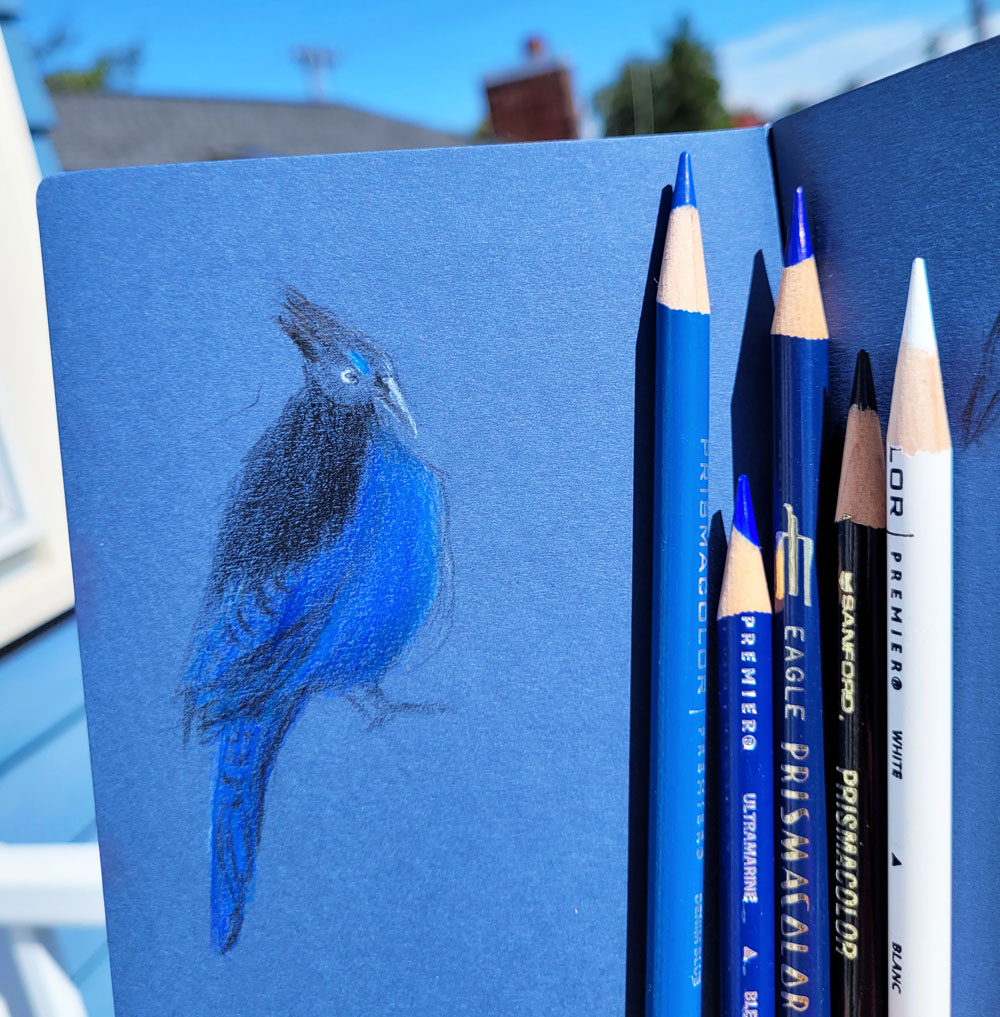
9/26/22 Caran d'Ache Museum Aquarelle pencils on Canson XL 140 lb. paper

Alice, our friend and neighbor, has done it again. Sometimes it’s plums, sometimes it’s tomatoes, but whatever comes from her garden is amazingly delicious as well as gorgeous. This year one of her tomatoes was the size of a pumpkin! She was about to hand it to me when I admired the equally beautiful chili peppers on her kitchen counter, especially one with both red and green streaks. She knows we don’t eat hot peppers, but she offered to lend me a few to sketch, which I happily accepted. I gave them back as soon as I finished the sketch, but you can bet we kept and enjoyed the tomatoes she gave us.

 And how about that – an ideal still life for a secondary triad! Caran d’Ache Museum Aquarelle Vermillion (060) is closer to red than to orange, so I included Golden Yellow (020) to the palette to warm it up. The other two colors were Light Olive (245) (possibly my most-often used green for foliage) and Periwinkle Blue (131).

I wanted to show a photo of that tomato next to the pencils
so you can see how huge it is!

Believe it or not, I was trying to be looser and more painterly than I have been with some
tomato still lives and get away from the botanical study look, but that’s always a challenge for me. At least I did not carefully draw each one of those highlights as I often have. Instead, I roughly marked where they were on each piece, applied the first layers of color, and then activated without trying to “draw” too much with the brush.

The other challenge was the purple plate. After finishing most of the sketch, I left the plate for the next day so I could think about what to do with it. Drawing it to the same degree of realism as the produce would detract, I thought, and I’ve been disappointed when I’ve done that in other still lives. This time, I tried leaving the plate “sketchy” and unfinished looking. I’m not sure about this look either, but I do like the interesting gray shadow I got by mixing the green and violet.

Thursday, September 29, 2022

The Most “Me” Tool


9/22/22 I don't often use both a brush marker and colored pencils
in the same sketch, but this view seemed to need both a firm, strong line
and a fuzzy softness.

Commenting on some sketches she had posted on Instagram, Eleanor Doughty said that “line drawing with a parallel pen feels like the most ‘me’ of anything I make.” I understood exactly what she meant and said that if I had seen those sketches randomly somewhere, I would have recognized them instantly as hers. “It’s cool when we find a medium or tool that expresses us as if they were part of our body,” I said.

Afterwards, I thought more about my comment and how it applied to myself. What feels like my most “me” type of sketching? What is the medium or tool that I’m so comfortable with that it feels like part of my body?

I have quipped that I was born with colored pencils in my left hand. Since 2016 when I first embraced them, I have gradually become increasingly comfortable using colored pencils for all types of subject matter. They have long been my primary color medium, even in the field. More than any other medium, they enable me to express form and color in a way that feels the most “me.” A close second might be a soft graphite pencil, which has the same range of expressiveness (but obviously lacks color).

8/29/22 Brush pen (with help from a white gel pen):
How few lines can I make and still evoke this car?

But if that were true, wouldn’t pencils be the default tools I reach for every time, under any circumstance? More often, especially when time is short, I reach for a brush tip marker to capture a minimal line drawing. It meets an almost intuitive desire to make a contour drawing – the kind we first made as kids. And yet I wouldn’t say that a brush tip marker, at least in my hand, has the same range of expressiveness as soft pencils. Nor is it as satisfying, in either process or result, as pencils. Although my quick line drawings may be closer to the first drawings I made as a kid, I wasn’t born with a brush tip marker in my hand.

With further thought, I realized that those two go-to’s – brush tip markers and pencils – are less about how innate each feels to my body and more about the question of line versus form. A Uni Pin brush pen (my current favorite) demands confidence; it offers no second chances or opportunity for equivocation. I use it in circumstances when I don’t have time or inclination to develop the nuance of form – all I want to do is put the line down as quickly as possible. I adore it for quick gestures. In some ways, it’s always a direct challenge to myself: Do I have the confidence to draw that subject with such an unforgiving tool?

9/8/22 Soft pencils describe form better than 
any other medium I like to use.

(Incidentally, at one time I thought my
Sailor Naginata Fude de Mannen fountain pen was the tool that felt the most like an extension of my body. Its responsive nib follows my hand with thicks and thins like no other pen I’ve used. But the main reason it stopped being my everyday-carry go-to is that it requires more maintenance than I want a pen to have if it’s going to serve the needs I described above. If I’m concerned about losing its impossible-to-replace cap when I drop it on a moving bus [which has happened, though I did retrieve it before it rolled out of my reach], or when it runs out of ink without warning [which also happens], it can’t do the job that an easily replaceable brush pen can. I still bring out the Naginata occasionally when I want that feeling of a pen growing out of my hand, and it’s a nice feeling.)

By contrast, a pencil, either colored or graphite, gives permission to search, explore and restate a shape or form. I find it easier to express the soft, organic forms of humans, animals and foliage with pencils, which are pressure-sensitive, deepen in value with added layers, and make a wide range of marks. I also prefer pencils when I don’t want the contour line to be visible. A pencil is what I choose when I think I will have enough time to use it in the way I want to and that yields an expression that is usually the most satisfying.

9/18/22 A brush-tip marker is ideal for capturing quick gestures with a few strokes.

So which tool is more “me”? In meeting unique needs, I’d have to say both. The one that gives me the most pure joy, however, is pencils. From that perspective, they are certainly the most “me.”

8/21/22 Pencil allows searching for the form and
restating lines again and again....

9/23/22 ...but this brush pen does not.


Wednesday, September 28, 2022

A Few Thoughts on Metallic Colored Pencils

9/16/22 Cretacolor metallic colored pencils in Uglybook
(photo reference)

Though prompted by a set of Cretacolor MegaColor Metallic Pencils, this post is not a review. Frankly, I’m not very objective about metallic colored pencils because I don’t really care for them. I don’t expect to use these enough to give them a fair shake. Nonetheless, I have a few thoughts about them (what??! Tina has a few thoughts about colored pencils??), so here they are.

First, in response to anticipated comments such as, “Shiny, blingy, reflective colored pencils? What’s not to like?!” I can only shrug. Sparkle is just not my thing (don’t even get me started on glitter, which I despise!). I may also be a snob about metallic colored pencils from a classical drawing point of view: If my intention is to make something look metallic, then I should do it with value and form, not with a special-effects pencil that doesn’t really look metallic anyway.

In response to the obvious next question, “Why did you buy this set, then?” Again, I can only shrug. Attack of the late-night retail gremlins? The only response that makes sense (and is, in fact, legitimate) is that I thought metallic pencils would be fun to play with in all the dark-colored Uglybooks I have.

Cretacolor Megacolor Metallic set

Jumbo-sized barrels and a nice natural finish


I must also confess that it’s not the only set I own. I also have a set of Derwent water-soluble metallic colored pencils purchased more than a decade ago when I was trying lots of media in abstract collages. I learned a few years ago that they were discontinued by Derwent, which still makes a non-soluble version of metallic pencils. No loss there; water-soluble metallic colored pencils have no reason for existence, in my opinion, since applying water makes them lose their metallic properties. What’s the point?

In addition, I have a few metallic vintage Berol Prismacolors. (Years ago, most of the metallic colors were discontinued and are now hard to find. They are now among my few remaining vintage “collecting” grails.) They are they shiniest and most opaque of the metallics I’ve tried. Interestingly, they are also harder and less creamy than other Prismacolors (either contemporary or vintage). Those shiny metallic properties must make the formula harder.

Comparison swatches of a few metallic colored pencils. My scanner seems to have taken all the sparkle out of these swatches. 

With all of that prejudice and preamble out of the way, I
am having fun with these jumbo-sized metallic Cretacolors on dark-colored Uglybooks. Harder than I like (though not as hard and dry as those Derwents), the Cretacolors have a decent amount of pigment and are not too dusty for such a dry pencil. They are nicely opaque on dark papers, and I’m looking forward to using them on nocturnes this winter. If I have more than that to say about metallic colored pencils, I’m sure I will. 

Scanned image of the photographed sketch at top of post. Camera
used in direct sunlight shows the metallic sheen more realistically.

Tuesday, September 27, 2022

Humboldt Penguins


9/20/22 Humboldt penguin, Woodland Park Zoo

At a recent visit to the Woodland Park Zoo, we got an unexpected treat: We arrived at the Humboldt penguin exhibit just as the keeper was about to feed them. The penguin exhibit had been closed for a while due to avian virus risks, so it was good to see the birds again.

Surprisingly patient and orderly, the penguins slowly and quietly surrounded him as he held a bucket of herrings. Calling each by name, the keeper fed them individually to make sure each got one and wasn’t hogging more than its share. Some of the names I heard were Merlin, Groucho, Domingo, Diego, Chewie and Fiona. He seemed to be taking attendance, and when most had been fed, he looked around for ones he knew he had missed, calling for them.

I recognized John, the keeper, from a 2016 visit, when newly hatched flamingoes were the main attraction. I’m sure it’s not all fun and glamour, but it’s hard not to have at least a little envy for someone who gets paid to cuddle flamingo chicks and knows members of the large penguin flock by name.


A couple other zoo residents I sketched: orangutan and Malayan tapir.

Patiently waiting for herrings from keeper John. They must know they don't have to rush him because their names will be called when it's their turn!

Monday, September 26, 2022

Secondary Triad Harbinger


9/18/22 Maple Leaf neighborhood

The maple across the street, my designated early harbinger of fall, has begun to turn – almost overnight. I start checking it in early September, and in some prior years, it has started turning in late August, as it did last year. On Sept. 18 when I sketched it, it still didn’t have as much color as when I sketched it last year more than two weeks earlier. I’ve noticed that the sweet gums at Green Lake are a little later this year, too.

Color notes: It was fun looking back at last year’s sketch, when I used a primary triad. I’m pleased to be using this secondary triad now – it pushed me to make the sky lavender!

This sketch was also a terrific color temperature study. The house is actually pale yellow, but instead of bringing in the warm orange, I used a bit of the warm green as an experiment. Looking at it now, I think I should have gone with my initial thought to use orange, but I didn’t want the house to compete with the orange in the tree. In retrospect, maybe it would have balanced the tree’s orange.

I played with a combo of the cool green and dark violet for the two small but sharp cast shadows – one on the warm siding, and one on the gray rooftop. I also used varying degrees of green and violet on the two faces of the rooftop, which were both in sunlight, but the side on the right had slightly more light.

I debated on activating the dark green shadow on the whole front of the house to make it darker, but I didn’t want to bring the eye to such a large, dark shape, where it would fall off the picture’s right edge (a huge no-no in the composition-wary world). For the sake of values, however, maybe I should have made it a bit darker without activating it.

Every sketch is made with thoughts and after-thoughts!

Sunday, September 25, 2022

Level Achieved at Pike Place Commons

9/23/22 Pike Place Commons

 Almost a year since our last outing there, it was great to be back at the Pike Place Market with USk Seattle on Friday. Last year, still in my post-vax frenzy of wanting to sketch people again, I spent the whole outing sketching nothing but. This time I had a different goal: I wanted to make sure I had nailed the concepts I had learned from Gabi Campanario at Gas Works Park.

Post Alley

As a warm-up, I made a thumbnail of Post Alley, where the angles of awnings and rooftops came together in an interesting pattern (at left). Then I made my way north to Market Commons, the newest addition to the Pike Place Market. Looking out toward the waterfront, I was amazed by all the construction that was still going on where the Alaskan Way Viaduct used to be. I thought more progress would have been made since I last saw it a year ago. No problem, though – I found an excavator busily moving dirt from one pile to another (below).


Waterfront construction
It was time to get down to business. Pivoting 180 degrees from where I had made the excavator sketch, I looked up at the Market Commons building, which is full of eateries and shops. I could see its entire span from Old Stove Brewing’s tanks (on the right) to the edge of Steinbrueck Park (the umbrella at far left). Behind it were skyscrapers and apartment buildings. In the foreground were tables, foliage and fencing that kept pedestrians from falling down into the construction zone. It’s exactly the kind of compositional scope that I find compelling but that I would typically avoid. Using the scaling and measuring tips Gabi had given us, I quickly blocked in the extremes of everything I wanted to fit onto the page spread. Most of an hour-plus was spent drawing the complicated Commons building (I should have simplified it even more). Whew! I fit it all in (top of post)!

Although I still had a half-hour before the throwdown, I was too famished from the ambitious sketching workout to make another. I got a delicious snack from Honest Biscuit and stuffed my face with it as I walked to the throwdown at Steinbrueck Park. I had a terrific morning at the Market on a beautiful day!


Fellow lefty light rail commuter


A small but enthusiastic USk Seattle group!


Saturday, September 24, 2022

My 11th Year: Still Learning


9/19/22 Green Lake

A while back, a newbie urban sketcher had posted a sketch in the USk Seattle Facebook group, expressing disappointment in it. Commending her for sharing it anyway, I said, “It’s disappointing only if you think in terms of the result. As a process, every sketch you make takes you closer to whatever you see as your end goal. And regardless, every sketch tells a story – which is the goal of urban sketching.” 

Recently at Green Lake, I spotted some trees across the playfield, quite a distance away. Just beginning to turn, they were pretty but not spectacular. The real problem was that there was no composition to speak of – just a bunch of trees next to the community center building. Even as I sketched, I was thinking that the composition lacked depth, lacked a focal point and lacked a clear path for the eye. Hmmm… maybe putting geese and cones in the foreground would help, I thought. I could have stopped and looked for a better composition, but it was 70 degrees and sunny in September – my favorite kind of fall weather. On a day like this, I could be drawing a rock in the driveway and be happy, I told myself, and continued.

When I finished (above), I had to concur with myself: Yup, still no composition. I was mildly but predictably disappointed. That’s when I had to remind myself of my own advice to that sketcher (which I have also offered to many other sketchers over the years): It’s disappointing only if I think in terms of the result. As a process, every sketch I make takes me closer to my goal, which is to keep learning to draw.

9/21/22 Green Lake (sketched quickly on my 11th anniversary so that 
I could get out of the smoke as soon as possible on an otherwise gorgeous day)

On
Sept. 21, 2011, I started drawing
, and I’ve been drawing ever since. My 11th anniversary was a few days ago, which I had meant to commemorate here on my blog, but I didn’t remember until it was too late to plan. (For last year’s 10th anniversary post, I had been thinking for weeks about what I wanted to say about that milestone.) However, I did observe the anniversary date as I do every day: I made a sketch (at left). I like this one a lot better – it has a good composition, and the secondary triad is effective in capturing the dull, hazy hues of a smoky day. In this case, I’m happy with the result, but it’s still just one more step toward my goal.

Mahatma Gandhi said, “Live as if you were to die tomorrow. Learn as if you were to live forever.” I’ve learned much in 11 years, and I still have much more to learn. I intend to continue learning for the rest of my life. The way I do it is by turning to the next page in my sketchbook.

Friday, September 23, 2022

Ripe (and Thoughts About Color on Color)


9/15/22 Grapes on the vine (watercolor pencil;
color completed at home from memory)

On one of my neighborhood routes, I have been walking past a grape vine all summer. Initially the tiny grapes were as green as the leaves. Last week they were finally plump and ripe. Fall is such an ideal time to be using a secondary triad palette!

Standing on the sidewalk under an overcast sky is not the best way to make a botanical study, but I got as much as I could in the 15 minutes I had before an appointment (shown below is what I did on location). Later at home, I wanted to make the grapes stand out a bit more while staying with the secondary triad, so I tried layering green and purple together. I like the way the Uglybook paper’s light texture sets the grapes off.

What about the cooler green of the paper, though? I didn’t choose it specifically for these grapes; it just happened to be the one in my bag. I think something warmer might have been better. I might try again before the grapes are gone.

Done on location


This brings me to a topic that I have lately been intrigued by: using colored pencils on colored papers. The red paper in Field Notes Sweet Tooth changed my life in 2016, and I have been using black and white inks on colored paper ever since. I have also used more traditional tan and gray papers sporadically, especially at life drawing, and I love using black paper for nocturnes. Discovering the wider range of colors in Uglybooks, however, has opened my eyes to the greater potential of colored papers.

Colored pencil and pastel artists have long used colored supports, and now I’m beginning to understand the appeal. Even if a paper’s toned surface is entirely covered by the medium, its color still shows through subtly, especially with colored pencils, giving everything a consistent undertone. I also love how easy it is to put in highlights with a white pencil. Learning how to best take advantage of colored papers, of course, takes practice. I’m only just beginning to see the possibilities.

9/7/22 Steller's jay (colored pencil)

A couple of weeks ago after sketching a Steller’s jay on black paper, I got the idea to try it on dark blue, too. The next time a jay posed on our deck, I was ready (dark blue paper is not just for supermoons!). The blue paper gave me a head start on trying to capture all the subtle variations in blue hues that I could see in its feathers. In this case, I wanted the bird’s blue to be as intense and saturated as possible while still being dark blue. But if the subject matter requires subtler, less saturated hues, maybe the paper should be a complement? I see exciting and fascinating experiments in my future!

Thursday, September 22, 2022

Summer Skyscapitos


Summer was not the best season for my skyscapitos. Sunrises were too early for me, and sunsets were so late that I was distracted by evening activities. Now that the days are getting shorter again, though, I hope to sketch more notable skies.

Before fall comes, I thought I’d catch up on the few skyscapitos I did manage to capture recently. The most exciting was the supermoon on Aug. 11, the last of the year. Although I knew it was coming, I wasn’t prepared to sketch it when I suddenly saw it rising – huge and orange in the deep blue sky. I knew instantly what I needed to run and get, though: my Uglybook containing dark blue paper! I didn’t think I’d use it until this winter for nocturnes, so I was delighted to have it handy.


More disturbing than exciting was the sunset I caught on Sept. 11. I sketched it a little too early; if I’d waited longer, it would have had more brilliant purples, oranges and pinks. It was the type of spectacular sunset we are treated to only at the end of a smoke-filled day, which makes me shake my head at its terribly ironic beauty.

8/18/22 sunset and 8/30/22 sunrise

Wednesday, September 21, 2022

Frustration


9/14/22 Across the street

You may recall several weeks ago when I sketched the Honey Bucket that appeared across the street. Anticipating heavy equipment or other fun things to sketch, I waited patiently for some action. Since then, we have seen lots of trucks come and go, and we hear plenty of noise, but all the action is in the back of the house, where we can’t see a thing.

Two small excavators showed up last week. One was on the side of the house that is blocked from my view by trees. The other was in back, dumping debris into this dumpster parked in the narrow driveway. I could barely see the bucket reaching over. So much action, so nearby . . . so frustrating!

P.S. Today is my 11th anniversary since I began learning to draw. Last year’s 10th anniversary was such a milestone that I wrote an introspective post about it. This year, I forgot until it was too late to plan a post for the anniversary! But I’m sure I’ll have something to say belatedly.

Tuesday, September 20, 2022

Learning about Gas Works – in More Ways Than One


9/17/22 Gas Works Park

As often as I have sketched at Gas Works Park, and as much as I enjoy it, I am still daunted by the scope and scale of the gas works structures themselves. I usually bite off a chunk that I think I can reasonably chew (this post shows the typical bites I take). Even when I’m brave enough to tackle the entire main gas works assembly, I don’t scale it on the page to allow space for much context.

When Gabi Campanario offered a Great(er) Seattle Sketching Tour at the park last Saturday, I jumped at the opportunity to see how the master does it while also learning more about Gas Works Park.

After hearing his brief lecture about the park’s checkered history, sketching the gas works along with its context tells a deeper story. For example, I didn’t know that Kite Hill had to be built up over an existing smaller hill as part of the park restoration. Including Lake Union (OK, it’s barely visible at left, but I got a bit in) is also important, because obviously having a water source for the gas works was critical.

Gabi has enhanced his viewing aid!

Guidelines like the sketchbook’s gutter (the horizontal center of the composition) helped to ensure that I wouldn’t run out of space for everything I wanted to include in the composition. My only regret is that I placed the bottom of the gas works too close to the bottom edge of the page, so I didn’t have space for a foreground element that would have added to the depth (the bike riders at left would have been nice to include in the foreground). But overall, using his suggestions, I’m thrilled that I was able to make a sketch that I could not have made the day before.

As I thought about the concepts he talked about, I realized they were no different from ones I learned in other workshops I’ve taken from Gabi. Or maybe I should say, they were no different from concepts he taught – I obviously hadn’t learned them (or at least hadn’t internalized what I’d learned).

I think this is another example of something I’ve observed about my own creative learning process many times: It often takes hearing and practicing the same concepts over and over to make them “stick.” And sometimes I might not be ready to learn a concept until I’ve had a certain body of experience behind me that prepares me to learn it.

In addition to being illuminating and informative, the sketch tour was a lot of fun! This time the participants included two professional architects – that says a lot about Gabi as a teacher!

The daunting gas works simplified by Gabi


Workshop throwdown

I couldn't resist sneaking a photo of Gabi's sketch kit! ;-)

Monday, September 19, 2022

Secondary Triad Season Has Begun


9/12/22 Secondary triad season is just getting started!

Bittersweet but without regrets, I’ve let summer go. I’m ready to embrace the coming fall in my favorite way: with secondary triads! Last spring when I was trying to wrap my head around color temperature, a secondary palette was helpful, but autumn is the best time of year to focus on orange, green and purple.

My chakras were mostly balanced, but this
palette otherwise didn't do much for me.

Before I get to my new palette, though, I want to close off the chakra palette I’d been using the past few weeks. It was fun using colors chosen for their spiritual associations rather than by esthetics or color wheel formulas, but ultimately, the palette didn’t hang together for me. As a seven-color rainbow, it seems like it should have been basic, and yet somehow it lacked coherence. Maybe it was just that I was conscious of trying to use as many of the seven colors as possible in each sketch (to balance my chakras). Interestingly, that part wasn’t as hard to achieve as I had expected. I thought purple might be difficult to work into urban sketches, but it reminded me that it’s an excellent shadow hue, which gave me more confidence about my secondary triad plans for fall. Although the chakra palette wasn’t a keeper, I’m glad I gave it a shot. And now – onward to my secondary triad palette.

To choose the specific pencils, I used the traditional “split” formula that painters use to create primary palettes: one warm and one cool of each of the three secondary hues. From my Caran d’Ache Museum Aquarelles, I auditioned the likely candidates. Good purples and violets are the hardest to find (since all colors in the Museum Aquarelle collection are supposed to be lightfast, notoriously fugitive purples must be difficult to formulate). For a wider range, I brought in a couple of Cd’A Supracolors, including the Violet (120) that I had just used in my chakra palette. Shown below are the trials:

These are the Caran d'Ache colors I auditioned for my secondary palette. Most are Museum Aquarelles; a few are Supracolors.

Initially I selected the six Museum Aquarelles in the triadic mixes shown at the bottom. But MA Periwinkle Blue (131) lacked intensity for the way I like to use purples as dark shadows. I decided to swap out MA Periwinkle Blue for Supracolor Violet (120) as the warm violet. But what am I using for the cool violet? It’s Museum Aquarelle Violet (120)! Whaaat?! I’m sure I’ve mentioned it before, but these two Caran d’Ache violets (at left) with the same number are several shades apart! I can only assume that the brighter Supracolor 120 has fugitive properties that had to be changed in the Museum Aquarelle version. But why give them the same number when they are so different? (Notice also that Periwinkle Blue 131 is the name and number given to two different hues in the Supracolor and Museum Aquarelle lines, though the difference isn’t quite as dramatic as with 120.) My final palette is shown below:

My final palette

Cool and warm mixes

In the traditional split primary triad scheme, the theory is that if you mix warms only with warms and cools only with cools, you avoid mud. Should I stick with that theory with my split secondary scheme? Or does it even apply? With secondaries, I am always dancing dangerously close to the edge of mud, even if I keep to the warms-only or cools-only theory, so it probably doesn’t matter much. The greater risk might be in using too many pencils, even if they’re all secondaries, and spoiling the cohesiveness of a nicely limited triad.  

All 6 colors used... maybe too many.

In the sketch at the top of the page, I did just that – used all six of my selected split secondary colors, especially in the trees. The result isn’t bad, so maybe I got away with it (this time).

In the sketch below, I used only the cool triad, and I think it looks more cohesive. I like the way the purple and green came together on the shaded side of the house – an interesting cool neutral. The only spots where I used all three hues are the foreground stones and the little Japanese maple in full shade next to the door. Muddy? Maybe – but in a good way. (I guess you have to like near-muddy neutrals to use a secondary triad palette at all.)

Here’s to a secondary autumn!

Incidentally, James Gurney has a great video demo in which he paints on location using a secondary triad palette – but he’s thinking in terms of a primary triad. Whaaat?! Another brain blowout for Tina! (While making the video, a spontaneous conversation occurs between Gurney and a man who used to live in the old house that Gurney is painting. He could have edited out the dialog, but he didn’t. Gurney is an urban sketcher after my own heart.)

9/13/22 Maple Leaf neighborhood

Only the cool secondaries used

Sunday, September 18, 2022

My New, Very Old Eberhard Faber Pencil Stand


Nearly a century old and now on my desk. When I purchased it, the Eberhard Faber pencil stand came with several vintage and affectionately hacked pencils from the seller.

Despite my obvious love for vintage colored pencils, I’m not a collector or hunter of antique furnishings or other objects. In general, I stay out of antique shops to avoid temptation (though occasionally I can’t resist). Apparently I always have one eye open, though, for special items that are exactly right.

One day in the Erasable Podcast Community Facebook group, a member posted photos of a vintage Eberhard Faber pencil display stand that he was selling. A 1923 Eberhard Faber catalog shows the pencil stand, which means the model is nearly a hundred years old. As soon as I saw it, visions of pencils danced through my head: It’s the perfect display for some of my favorite vintage pencils! In fact, it’s exactly what I’d been looking for, although I didn’t know it until I saw it.

Image from Pen Collectors of America

The advertisement for the Eberhard Faber Diamond Star “No. 29 Mahogany Stand With Assortment of High-Grade Items” indicates that it was a retail display. (What?? Consumers didn’t display pencils in their homes this way??!) Here’s what it says about the stand, which came with pencils:

The mahogany stand is an extremely useful advertising display piece, as well as a handy “silent salesman.” It is a high-class stand, with high-grade articles, and the finest stationery stores of the country will be proud to display it.

Imagine walking into a stationery store (sadly, such stores are becoming increasingly rare) and seeing “high-grade articles” displayed this way! Indeed, that “silent salesman” wouldn’t have to work very hard on me.

With some signs of age and wear, the pencil stand has many stories to tell. I could clean and polish it if I wanted to, but I think I’ll hear those stories better if I leave it as is.

Of course, I had initially intended to fill it with vintage colored pencils; in fact, I have several Eberhard Faber sets I considered. But the rack had probably been sitting in a dark storage unit for years, despondently without purpose. It deserved to be put to daily use as well as admiration.

With 72 holes, it was almost perfect for my favorite Caran d’Ache Museum Aquarelle pencils. After weeding out duplicates and some stubs too short to fit in the stand, my Museum Aquarelles fit beautifully – with a couple of holes to spare. The Eberhard Faber Diamond Star retail display is once again both high class and functional.

Still functional and beautiful after all these years.

Two empty holes after filling with my Museum Aquarelles.

Nicks and wear have a hundred years of stories to tell.

Museum Aquarelle stubs and duplicates

Incidentally, the seller was Ali Serra, owner of the Etsy shop Ernest Theodore, where I have made fun and inspiring purchases the past few years. He’s local, and we had met last year at an in-person pencil meetup (yes, there is such a thing). Shortly after I had made the purchase, a few Erasable members got together for another meetup. With my pencil peeps admiring my new acquisition, it was an appropriate handoff for the old Diamond Star.


A parking lot transaction. 

Although we would have preferred to chat about pencils over a table of food or beverages, we settled for a tailgate meetup at a Tesla charging station (where one member had to make a quick stop while breezing through Seattle). With me are Ali, Julia, John and adorable Ernest Theodore, the namesake of Ali’s shop.

A new home for the No. 29 Diamond Star display

Related Posts Plugin for WordPress, Blogger...