Showing posts with label Bristol. Show all posts

Wednesday, July 6, 2022

Trees Again – But Not a Do-Over


7/1/22 Volunteer Park (Mitsubishi Hi-Uni graphite on Strathmore 400 Bristol smooth)

After more than a year of nothing but Zoom classes, Kristin Frost’s plein air drawing class last summer was my first Gage Academy class since the pandemic began – and what a breath of fresh air (literally) it was! It was joyous – thrilling even – to be joining other students in person. Beyond that pleasure, it was simply a terrific class learning to draw trees with graphite. In fact, I enjoyed it so much that I decided to take it again.

It’s not a do-over for me, though. With students of all levels enrolled, I knew it wouldn’t be a rerun. Observing Kristin’s teaching style last year showed me that she gives feedback appropriate to each student’s level of experience. In addition to my continual interest in improving my rendering skills, I’m especially interested in composition now, so those are my personal objectives during this five-week course.

In Week 1 when we met at Volunteer Park, we were to focus on an individual tree. Although I didn’t plan it, the tree I chose became more beautifully illuminated as the afternoon wore on – what luck! I loved the ground shadows, too. (But when it’s 73 degrees and sunny at one of Seattle’s best tree parks, I could be happy drawing a slug.)

Most of the upper part of the tree was illuminated. One way to show this is to darken the background, where a few darker trees stood, but the bright, bare sky was also in the background. I wanted to retain the “portrait” look of the single tree without drawing the trees behind it, but I wasn’t sure how else to show the lit top without drawing an outline. Kristen had suggested a faint, broken line, so I tried that, and I like this result.

(Not shown: The thumbnail we were required to make first. As I now well know, that step is essential! I think I would have done it even if she hadn’t required it. What a 180 turnaround for me!)

A simple class kit

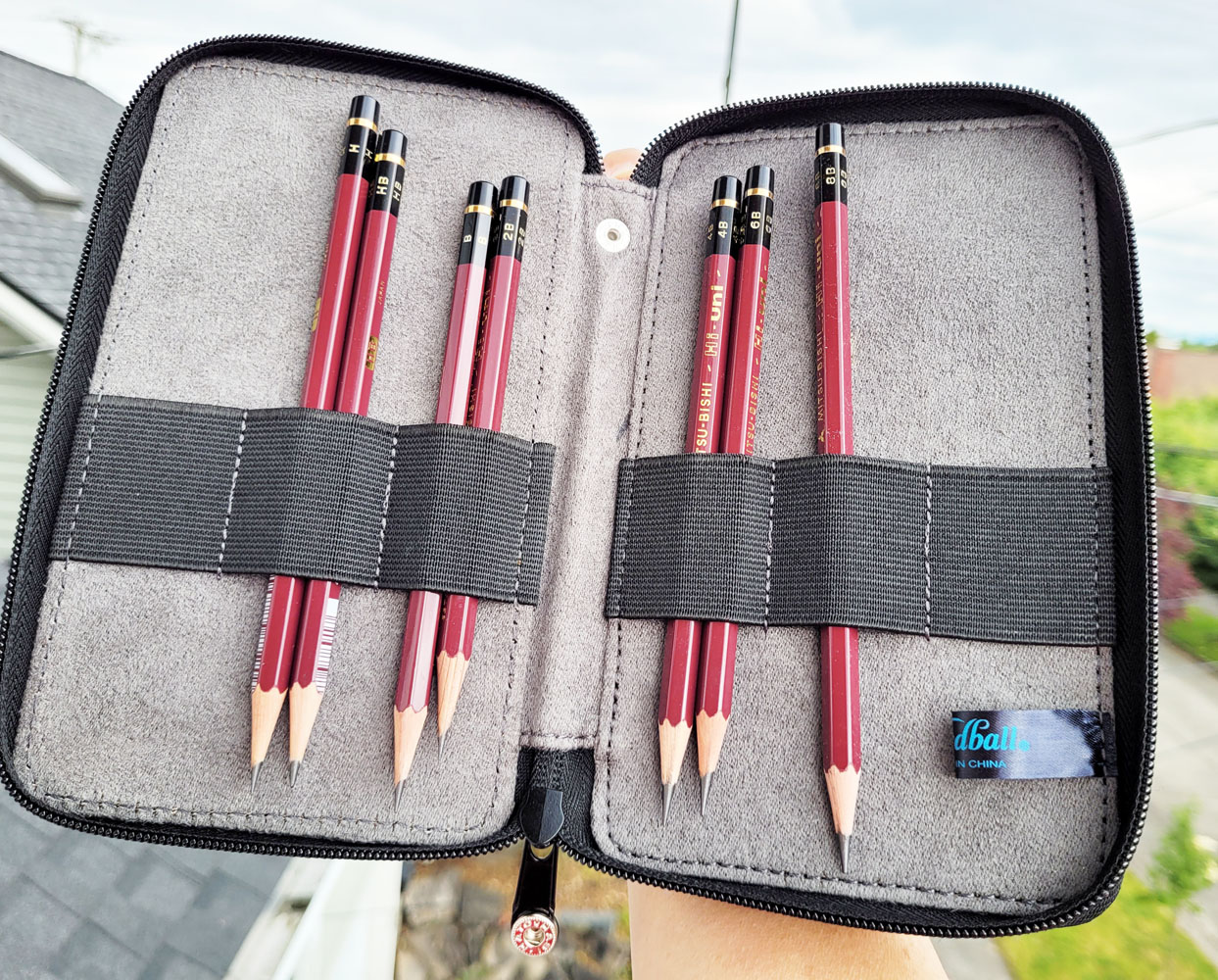
Assembling the supplies for this class was a snap – a drawing pad, graphite pencils in a handful of grades, blending stumps, an eraser and a sharpener. The item that took the longest to choose? The pencil case! I had more than 20 to consider! I ended up using a reliable Global Art book-style case, which was also a favorite when I last took a colored pencil class. (I reviewed it at the Well-Appointed Desk.)

One other critical piece in my supplies this time was a new chair! Last year, I used my ultra-portable, ultra-tiny Daiso folding stool, which is fine for a half-hour sketch (and the maximum weight and size I can tolerate schlepping around at symposiums and such). In a three-hour class, however, it’s less than ideal. I’ve been shopping for something else, and I found one that’s a bit larger but a hundred times more comfortable. Review coming up soon.

Tuesday, January 4, 2022

DIY Avatar


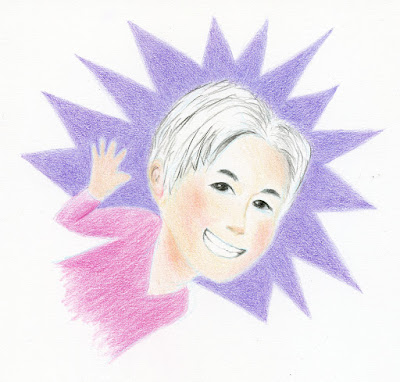
12/22/21 Polychromos and Prismacolor on Strathmore Bristol Smooth 

If you’re on Facebook, you know there’s an app that will enable you to design an avatar for yourself by the Mr. Potato Head method: You start with a generic, genderless template, then pick eyes, nose, mouth, hair color, body shape, etc. as desired. During a bored moment, I tried it, but I didn’t like the result. After wasting 10 minutes of my life on that, I struck myself upside the head and said, What am I doing? I don’t need no stinkin’ Facebook app . . . I can draw this avatar myself!

From there, the process was more interesting than I expected. First I studied the avatar that Facebook had generated for me (below) as well as those of my friends. I started recalling things I’d learned in Taylor Dow’s Observational Cartooning workshop about how cartoon characters are developed. Some cartoonists design a whole cast of characters based on a template they create with minor changes in features. I started to see how Facebook’s app was doing something similar.

The avatar I made with Facebook's app

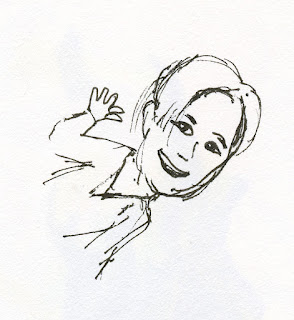
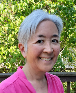
As a basis to work from, I used the photo of my face that has been my Facebook profile image for a while now. I made a quick sketch based on the “Hi!” avatar image shown above. (So the 10 minutes I thought I had wasted weren’t a waste after all.) Then came the fun part: Colored pencils!

Rough sketch


But which pencils and which paper? I gave that some thought, too. To emulate the flat, digital look of the Facebook avatar style, I chose my smoothest drawing paper – Strathmore Bristol Smooth. With that choice made, I knew that Faber-Castell Polychromos would pair well with it to give me the untextured look I wanted.

For the initial contour line, I used a Blackwing non-photo blue pencil. Then I completed most of the drawing with Polychromos. When I thought I was done, the white hair washed out with a white paper background, so I realized some background color was needed – the purple starburst.

As I was coloring the starburst, I thought about the drawing method I had mentioned in my recent review of the Blackwing extra-soft core graphite pencil: It’s easier to achieve a smoother, more consistent result if I start with a harder grade and step up gradually to the softest grade (explained in more detail here). Although I use various degrees of hardness and softness in colored pencils for specific reasons or effects, I don’t usually think of layering based on the graphite method just described. By that point, I had applied a solid base of several layers of hard Polychromos to the smooth paper. I pulled out a soft Prismacolor in a similar hue and applied it over the Polychromos. Although I often mix pencil brands, I’m not sure I’ve ever applied Prismacolor over Polychromos for this smooth, flat result. They are an effective pairing: Hard, oil-based Polychromos covers as much of the paper’s minimal tooth as possible, and soft, wax-based Prismacolor spreads pigment quickly and efficiently without having to be concerned about paper coverage. I’ve heard some artists say that applying oil-based pencils over wax-based can be troublesome, but vice versa gave me no trouble at all.

So this silly, rainy-day drawing turned into a useful technical exercise for learning more about colored pencils.

Wednesday, November 24, 2021

Color Temperature: Back for More


11/20/21 Dee, 5-minute pose (Prismacolors and Strathmore Bristol Smooth used on all drawings)

After I took Sarah Bixler’s portrait workshop a couple of weeks ago, I felt like I had barely touched the tip of the iceberg in terms of understanding color temperature. I wanted another opportunity to internalize the concepts so that I can apply them on my own. Last weekend, she offered a second workshop on the same concepts, this time for two days in figure drawing, and I jumped right on it.

5-minute pose; warm/cool scale

The exercises during Day 1 were similar to ones we did in the portrait workshop. With a complete figure to work with, though, instead of a head and clothed shoulders only, we could more fully explore a wide range of color temperatures. Humans have a remarkable range of subtle hue changes throughout the body: The palm is a different color from the back of the hand; the thigh is different from the forehead. In the previous workshop, I thought that the same concepts could be taught using inanimate subjects like still lives, but I no longer think that’s true. The human figure is a much richer though subtler “palette” of local hues than a blue vase of red flowers – a palette that’s much more challenging to see.

Further complicating matters is the type of lighting – natural or synthetic – and how close it is to the model: Skin closest to the light source tends to be warmer in color temperature, and local color is usually more apparent on the side away from the light. In the morning, we took advantage of natural light in the studio and kept the spotlight off. By late afternoon, we needed the lamp, which was cooler than natural light.

After a set of one-minute poses to warm up, we used two contrasting colors – one warm, one cool – to draw model Dee for a series of five-minute, 10-minute and 40-minute poses. Before settling on this pair of muted blue and red, I tested it by making a scale from warmest to coolest in two values (above).

40- and 10-minute poses

For the final 40-minute pose, we were to use two analogous colors (I chose green and blue), which made it much harder to make distinctions between cooler and warmer areas. By the end of the second 20-minute session, I felt I had lost the warmest spots, so Sarah suggested I add something like neon yellow to make those spots pop.

40-minute pose - analogous colors

On Day 2, with Randy as our model, we explored a wider range of exercises and palettes. In the morning, we used a veritable rainbow of hues. The colors were not used randomly, however; they were all still used to express color temperature differences (though not very subtly). Since the human figure is basically a palette of neutral tones, these extremely non-neutral, saturated hues really forced us to observe and then decide on the relative color temperatures we saw. One of my stated goals for the workshop was to get out of my rut of depicting colors so literally in sketches, and these exercises in drawing “rainbow man” certainly helped!

11/21/21 Randy, 40-minute pose

40-minute pose

In the afternoon we did a fun value study using adhesive tape in two colors to make a collage.

Tape collage value study, 20-minute pose

For the final two drawings, first a 40-minute and then a 20-minute pose, we were to choose three colors and then two. For the 40-minute pose, I used a secondary triad of a bright purple, a muted orange and a bright olive green. Surprisingly, the green turned out to be the warmest hue when I made the initial color swatch (shown below after the sketch).

Secondary triad, 40-minute pose

Testing color mixes in a triangular format

When testing three hues such as a triad, Sarah prefers this triangular-shaped format instead of the traditional circles. With circles, the blended areas end up being fairly small. Triangles give all the swatches equal space. I prefer triangles too and will be making my blends this way going forward.

When we got to the final 20-minute drawing (I chose complementary orange and blue), I repeated the neon yellow trick to bring out the warmest spots at the end.


20-minute pose

Throughout the weekend, Sarah showed us examples from art history and even computer animation in which the artists had manipulated color temperature to give the sensation of the direction of the light. It was all so fascinating!

In the same way that I marveled at Crystal Shin’s sharply honed eye for color inbotanical subjects, I was impressed by Sarah’s equally keen eye for subtle differences in color temperature.

With a more intensive weekend of training under my belt, do I know enough now to apply what I learned about color temperature to real-world sketching? I guess we’ll both find out! In any case, it was an amazing opportunity to have my eyes opened to an aspect of color that I had never paid much attention to before.

Instead of the Faber-Castell Polychromos I used at the first workshop, I used Prismacolors this time. I found the softer Prismacolors to be easier to work with when under time constraints of even the longer poses. 

Tuesday, November 9, 2021

My Color Temperature Brain Blowout


11/6/21 Final exercise. Polychromos on Strathmore Bristol Smooth

“Temperature” is a color concept that I have long been familiar with and have actively worked with when a book or instructor has made me conscious of it. The traditional painter’s palette is based on color temperature principles: To avoid mud, mix cool with cool or warm with warm; mixing the right warms and cools together creates interesting neutrals. So color temperature is not new to me.

Yet something about the way Gage instructor Sarah Bixler presented these principles in a colored pencil workshop last Saturday blew the top of my skull right off!

I was first introduced to Sarah’s work and unique approach several years ago when I was thumbing through the sketchbook of a sketcher friend. Some striking colored pencil life drawings caught my eye, and my friend had described Sarah’s class in which she had learned the techniques. I had been wanting to take a class from Sarah ever since, but she offered it only sporadically or when I had conflicts. This quarter was the first time the stars had aligned in my favor.

As a painter, Sarah mixes colored pencils with a very painterly approach. As a bonus to me, her method takes advantage of “optical mixing,” which I have lately been intrigued with, so the workshop sparked my interest in more ways than one. Although the workshop subject was portraits, the principles she taught could be applied to any subject, of course, and I’m eager to eventually use them with urban sketches. In fact, if I ever decide to take up painting, I’m sure those principles I learned with colored pencils would apply to paints. (Incidentally, this workshop probably could have been taught with a still life because there was no instruction at all in terms of “how to draw” a portrait. Human skin tones, however, are challenging opportunities to mix beautiful neutral tones, which is why I think a model was chosen as the subject.)

We began by making “clouds” of color blocks using only primary colors (another key interest of mine! You can imagine why I was so inspired last Saturday!). The objective was not to “render” the subject but to simply squint and look for the relative color temperatures and apply those hues. For example, the model’s skin tones are warm, while her dark hair is cooler by comparison. Her hair is warmer than her dark shirt. How do any of these warm or cool color tones compare in temperature to the background? Even one wall is cooler than the adjacent wall. These are things I had never thought about while drawing anything!

Identifying blocks of color temperature

Next we did the same exercise twice using only two complements (one warm, one cool). In all of these exercises, we were to mix the complements and push the resulting neutrals in either the warmer or cooler direction.

Purple and yellow as cool/warm complements

Blue and ochre as cool/warm complements

We then chose one neutral to do a value study.

Value study

When urban sketching, I tend to sight-size everything: Draw the subject at the same scale as what I see. The next two exercises were a good challenge for me in scaling. We were to choose one small area on the model – for example, just the area between the ear and shoulder – view it through a rectangular hole cut in a piece of paper to eliminate everything around it, and work out color temperatures combined with values. The limited view would force abstraction of what we see: The ear would stop being an “ear” and would become a warm-colored shape with cooler shapes around it. The first attempt was my usual sight-sized scale. For the second one, she encouraged us to work larger so that we could put in more small areas of dark or just see different things. I made the earring a bit too large!

Two limited-area studies at different scales

For the last exercise of the day, we spent two sessions (the model always gets a break every 20 minutes, so we worked for a total of 40 minutes) putting together everything we learned to make a portrait (top of post). I don’t know if it shows in the sketch, but at this point, I was working with the top of my head blown open! Stay tuned as I put my brain back together and try to apply what I learned in the real world!

Although I’m still not thoroughly comfortable spending extended time indoors with others, I am reassured by Gage’s vaccination requirement and am trying to move toward normalcy. I’m so excited and happy to be off Zoom and back in the Gage classroom again!

The instructor had recommended Faber-Castell Polychromos pencils, so that's
what I brought. It felt good to have somewhere to bring my pencils to instead of clicking on Zoom!

A few Prismacolor neons that the instructor had also suggested are on the end. I didn't get a chance to use them, though.

The muted triad I used in the final exercise was Ultramarine, Light Yellow Ochre and Sanguine.

Friday, February 19, 2021

Final Assignment: Foliage

2/16/21 maples (graphite on Strathmore Bristol vellum, 5.5" x 8", photo reference)

The last assignment in Kathleen Moore’s tree-drawing class was foliage, which, at least for me, is the single-most challenging part about drawing any tree. Although this lesson, like the rest of the course, was done from a photo, I think it will be the most useful for sketching on location because it focused on the large, massive shapes of trees in the distance rather than the details of trunks, roots and branches.

Digging through my files for a reference photo, I had several that would have been easier – taken on sunny days with trees nicely lighted on one side. However, I purposefully chose this one of a couple of blazing maples that I took last October in my neighborhood (on a cloudy day, to boot). This is exactly the kind of tree scene that confounds me when I try to sketch it from life. I am dazzled by the brilliant colors, but they confuse me, and I can no longer see the values and forms. I end up with lots of pretty colors, but the trees look flat.

As Kathleen suggested, I converted the image into black and white and used prints of both the color and monochrome images as references (see below). Initially, the black and white image was more useful in seeing the values. As I was finishing, though, I put the black and white one away and tried to squint at the color image to continue refining the values. On location, I will not be able to convert the scene to monochrome (well, I could do it with my phone, but I’m not inclined to bother), so I want to learn to see those values and forms with my own eyes – even when I’m dazzled by colors.

Yes, it broke my heart to draw this with graphite, but I know I learned much more from the exercise than I would have if I had drawn it in color. Maybe next time I try to tackle trees like this from life, I’ll get the payoff. (And yes, it also broke my heart to omit those power lines. 😉)

Dazzled by color!

It's always surprising to see the values I missed when I viewed only the color image.

Monday, February 15, 2021

Some Thoughts on Paper

Some drawing papers I have used.

I am often asked for recommendations on the “best” colored or graphite drawing pencils. I usually inquire about how the pencils will be used and try to make recommendations based on the need and budget. But the part of the equation that often gets lost is the type of paper that will be used with the pencils: “Oh, I don’t know – whatever paper I have, I guess.” I believe that the pairing of a pencil with a paper is almost more important than the choice of pencil alone.

Watercolor painters discuss paper to the nth degree, and rightly so – using inappropriate paper with wet media can result in frustration at best or disaster at worst. Sometimes it’s fun to deliberately use inappropriate paper just to see what happens (Roz Stendahl is famous for this), and results can be interesting and surprising. If you are just beginning to learn to use a medium, however, an inappropriate paper does nothing to help you learn and, even worse, it keeps you from understanding whether an undesirable result is because you lack skills or because you are using the wrong materials.

With dry materials like colored or graphite pencils, the importance of the paper/medium relationship is more subtle because pencils are likely to be more forgiving. They can still make satisfactory marks without the paper buckling or falling apart. That’s probably why many people think that any kind of paper can be used. But if a disappointing result occurs, perhaps it’s time to look at the paper and not just the pencil.

At various times, I have thought intensely about paper, most recently a couple of years ago when I was trying to decide which Stillman & Birn sketchbook to use as my daily-carry. I’m happy with my current choices (Beta with watercolor pencils; Zeta with almost everything else), but the paper issue still comes up occasionally.

For this amount of spot color, it hardly matters which
colored pencils I use. Still, I prefer softer ones for
a pleasant feel on Leuchtturm journal paper. Here,
I used very soft Uni Posca colored pencils.

For example, when I started the new year with a fresh book for my scribble journal, I chose a Leuchtturm 1917 journal. It’s a format I’ve been using for years for my written journal, so it’s familiar and comfortable. I knew that the paper would not be the best with colored pencils, but I also write in the same journal, and I like to write with a variety of pens, including fountain. I decided that the paper would be an acceptable compromise for the small spots of color I would be putting onto it.

The Leuchtturm has worked out well in general, but it has made me more judicious with the colored pencils I use because some are not pleasant on the surface (I enjoy my softer pencils best). Graphite feels and looks downright awful.

More critically, my current class in drawing trees with graphite has made me think about paper again. Instructor Kathleen Moore has pointed out that the two sides of most papers have slightly different surfaces. I have several pads of Bristol drawing papers with vellum and smooth finishes, so it’s been illuminating to try a different paper or a different side of the same type of paper with each assignment. For the branch assignment, I used the “wrong” side of Strathmore 300 Bristol vellum, which Kathleen prefers. During the trunk lesson, I used the slightly toothier “right” side of the same paper, which imparted a subtle tree bark texture. However, sometimes I had difficulty building up heavy graphite when I wanted areas to be darker. The following week on the roots assignment, I used Strathmore 300 Bristol smooth, which was much easier for accumulating heavy areas of graphite. Fine lines and details were also much easier to make. The downside is that it has almost no texture, so I had to work harder to create that texture myself. I can’t say which is generally “better,” but each requires a different technique and has different results. I would choose the paper based on subject matter, desired texture, degree of detail, and other factors.

Below are some test swatches I made of hard and soft graphite pencils (Mitsubishi Hi-Uni in H and 4B), a relatively hard colored pencil (Faber-Castell Polychromos) and a relatively soft colored pencil (Prismacolor) on two types of paper – smooth and toothy. In addition, with any paper, the sharpness of the point is an important aspect to consider, especially with colored pencils (which Crystal Shin talked about extensively in her workshop last year). To test that, I used Caran d’Ache Museum Aquarelle (probably the softest colored pencil I’ve ever used) – one with a very dull point and one freshly sharpened. (I typically would not use a pencil as dull as the one tested here, but I do keep a dull one handy for quick life-drawing sketches.) All other pencils tested were freshly sharpened before each swatch was made.

In each case, I applied as much graphite or pigment as possible without flattening the tooth. In the case of graphite, that’s usually when it starts to look shiny. With colored pencils, it’s when it feels like wax is simply sliding around on itself and additional pigment is no longer being applied.

The papers I compared are Canson XL 140-pound cold press watercolor paper and Strathmore 300 Bristol smooth.

Very smooth Strathmore 300 Bristol smooth

Relatively toothy Canson XL 140-pound cold press watercolor paper


I hope the results are clear in these low-resolution images (I scan them at high res, but I know the blog platform reduces the resolution significantly). It’s easier to apply graphite or pigment evenly onto smoother paper, especially with softer pencils. (My Hi-Uni H sample looks strangely mottled in this test; I can’t explain that, as I’ve certainly gotten very evenly applied results on the same paper with the same pencil.) The difference between the dull and sharp Museum Aquarelles is especially visible. A soft, flat point simply cannot get into the recessed areas of paper, even a very untoothy one like Bristol smooth.


Using these artist-grade drawing papers for the course reminded me of similar class discussions when I studied with Suzanne Brooker several years ago (she had recommended Bristol smooth with colored pencils) and with Kathleen McKeehen last year. McKeehen had discussed papers at length and graciously gave each student a variety of small paper samples to try so that we could see all the differences in weight, texture and even color (just like wall paint, there’s no such thing as one generic “white”).

Paper and pencil: Equal partners in an important relationship.

For more thoughts and tests on the pencil and paper partnership, see these posts:

Material Lessons (In and Out of Class)

Demo: Stay Sharp

On Location with Traditional Colored Pencils

Soft and Hard

Saturday, February 13, 2021

Roots: Another Sunset Hill Cherry


2/10/21 Cherry tree, Sunset Hill neighborhood (graphite on Strathmore Bristol smooth, 7" x 9", photo reference)

This week’s tree-drawing lesson was on roots, and what surprising structures they can be. It’s easy to think of trees hiding their roots underground, but many have roots that are clearly visible – and some are as elaborate as branches.

This old cherry is a “sister” to the one I drew last week when we were studying trunks. It’s on the same block in the Sunset Hill neighborhood. Resembling the folded legs of someone sitting on the floor, the roots begin at the top of the trunk right below the branches and twist around before eventually digging underground. Other photos I took of the same tree show that the pavement next to it is badly cracked and buckling where the roots push continuously against soil, rock and concrete, seeking nourishment and stability. Trees are amazing!

My indispensable desk easel.
Incidentally, my desktop easel is an indispensable tool for this drawing class. I use it for the daily drawings of my hand too, but those don’t take much time, so it’s less essential (though helpful in keeping my sketchbook at the same angle as my “model”). Each graphite tree drawing is taking several hours over the course of a week, and the easel keeps me from hunching over my table and getting a sore neck and shoulders. When working with graphite, which is shiny and reflective, it also keeps the paper at an angle so that the desk lamp isn’t illuminating it directly. Finally, it’s critical for my drawing to be at the same angle as the photo reference to avoid distortion.

Friday, February 5, 2021

Sunset Hill Cherry Tree

2/1/21 Cherry tree, Sunset Hill neighborhood (graphite on Strathmore Bristol vellum, 6" x 8", photo reference)

Although I understand the value of drawing from photos as a classroom learning tool, I don’t care for it under most circumstances. Worst is drawing from a photo of a place or object that I haven’t experienced or seen with my own eyes. I have no connection to it, and it feels like a mechanical copying exercise. That’s why I appreciate that, unlike some classes I’ve taken in which we were required to draw from provided photographs, Kathleen Moore is allowing us to use our own photos of trees if we wish.

In her graphite drawing class this week, we are studying tree trunks and how their forms can be described by emphasizing shadows as they wrap around the trunks. As she described the assignment, I thought immediately of the trees I wanted to draw: the amazingly gnarly ornamental cherries that I sketch every year in the Sunset Hill neighborhood. Their trunks, or perhaps it’s actually their bulging roots, are as thick as thrones, yet fairly short. Then their stout branches suddenly reach toward the sky, filling it with pink blossoms (at least during one spring week). A block on Sunset Hill must have about a dozen of these old cherries.

Although I take lots of photos whenever I’m in the neighborhood to sketch, many were poorly lighted on overcast days or didn’t show shadows that would describe the form. The photo I chose is of a cherry that isn’t quite as dramatic as others, but it has its own regal character, and the lighting was right.

Below is a sketch I made three years ago of some similar trees nearby. Since the blossoms get all the attention during that one week in spring, I appreciated focusing on a trunk and branches during this decidedly non-spring-like week in February.

3/20/18 Sunset Hill cherry trees (on location)

Friday, January 29, 2021

Assignment: Tree Branches

1/26/21 graphite on Strathmore Bristol vellum, 7" x 9" (photo reference)

Our first assignment using a photo reference in Kathleen Moore’s class was to interpret this tree’s tangle of branches. In the photo, the tree is a black silhouette against the sky. Ignoring foliage, we were to draw the overlapping network of branches to indicate which were closer or farther away. We could take liberties with filling in with twigs, showing texture or making other changes to enhance the composition.

Initially, I attempted to imagine light coming from an imaginary sun as I did in the fun “crazy tree” assignment, but I realized immediately that most limbs were too narrow to effectively show where the shadows would be. I opted to simply use varying values to bring the closer branches forward with higher contrast. At the time of this writing, I haven’t received feedback on the drawing yet, so I don’t know if my interpretation was effective, but my head is still spinning – in a good way – from the substantial challenge.

Thursday, November 26, 2020

Toni

11/22/20 Toni (from photo)

 Last Friday, I participated in a healing circle for Toni, who is struggling mightily against COVID-19. A cancer survivor years ago, Toni is a fighter, but her foe is formidable. Fran, my long-time yoga instructor and Toni’s sister, asked her students to join family and friends in the circle to send healing energy to Toni.

The circle leader had encouraged us to participate with prayer, meditation or “whatever was our personal tradition.” I had never been to a healing circle before, let alone on Zoom (what a bizarre platform for making a spiritual connection! Zoom feels about as spiritual as the TV remote or an air conditioning unit!). The leader had put on some music that I thought was weird (but maybe that music is important to Toni? I guess I should listen). It lasted 20 minutes, and although I tried hard, I felt uncomfortable and distracted the whole time.

Prayer? Meditation? What is my “tradition”? I don’t have one. Of course, I meditate during yoga, but that’s because Fran leads it! That’s why I take classes! I don’t know how to meditate on my own. The participants that I could see all had their eyes closed, deep in prayer or thought, but I didn’t even have the courage to turn on my video because I didn’t want them to see how distracted I was.

At the end when we were invited to share comments, I couldn’t turn on my audio. I didn’t have anything I could say. Although Fran has told many stories about Toni so I have a general sense of her as a person, I have never met her, so I didn’t even have an anecdote about her to share. (Edited 12/4/20: Here's a blog post by Fran that taught me much about what Toni is all about.) Although I was hoping Toni would receive the healing energy that I was trying to send, I felt I had failed her and her family. I didn’t know how to make a spiritual connection with someone I hadn’t met, and I spent the whole time thinking about how wrong I was doing it.

I thought about Toni the rest of the day. I finally realized that whenever I draw something, I make a connection with it – even if it’s a trash can, a head of garlic, or a stranger on the bus. I realized then that I needed to draw Toni to connect with her.

In her blog posts and email updates about Toni’s health, Fran has included many photos of Toni at various ages. I don’t like to draw from photos, especially of people, and certainly people I don’t know. It feels like an academic exercise to copy the paintings of masters or simply duplicate an image. But it was all I had.

Studying Toni’s face, I tried to channel Gary Faigin and the portrait workshop I took from him last year. Faigin says that capturing a likeness is not about getting every eyelash and other facial details exactly right. It’s far more important to accurately gauge proportions and describe the planes of the face with shadow and light. I tried my best to do that, but I also knew it was important to capture her “essence.” It’s not enough to describe the shape of her radiant smile – her essence is in the light behind the smile (Fran says Toni always lights up the room with her presence).

In the reference photo, she is wearing a pendant, barely visible, on a gold chain. It’s the kind of detail that I might omit in a sketch. I noticed, though, that she is wearing the same pendant in every adult photo I saw, whether she was dressed up for a special occasion or in a tank top. In one photo, I could see that the pendant holds someone’s portrait. If Toni always wears it – a face close to her heart – it’s obviously special to her. It belonged in the drawing.

I had to stop many times as I drew because I could not see through my tears. I don’t know if I captured either likeness or essence, but I do know that I made the connection I needed. All my healing energy went to Toni as I drew.

Most would say that the act of drawing is neither prayer nor meditation, but it is obviously my personal tradition. Today I am thankful to Toni for teaching me this.

Updated 11/28/20: Toni is not doing well. Here is her sister Fran's update.

Wednesday, March 18, 2020

Kale

3/9/20 graphite on Strathmore 300 Bristol smooth

I admit it: I am not a fan of kale. I have tried it at salad bars and in alien forms such as “chips” (all of which helped me determine that I wasn’t a fan), but the first time I bought some at the store was for last week’s botanical drawing class lesson in textured leaves. I had to read the label to identify it because the huge, bumpy leaves didn’t resemble what I’d tasted earlier. I was instantly intrigued by that challenging texture!

Instructor Kathleen McKeehen recommended that I use a small cardboard viewfinder to select an area of about 2 to 3 inches square within the leaf – not try to draw the whole leaf. It’s a good thing I took her advice, because what you see here is all I accomplished during the three-hour class. More than anything else I’ve drawn before, the hills and valleys of my kale leaf recalled the landscapes I drew from photos in previous classes. The large center vein was like a river.

Bumpy!
Though I’m happy that I got a good start on it, I may or may not finish this drawing. Like eating kale, once is enough.

(Sadly, the kale lesson was my last in this class. . . Gage Academy closed a couple of days later.)

Friday, March 13, 2020

It’s Not Folly

3/4/20 PCC Market courtyard, Green Lake neighborhood

After I had posted the sketch of Costco shoppers in a Facebook group, a member sent me this private message:
“Do you think it’s folly for someone who likes art a great deal but still draws like a kid to keep drawing?”
This Facebook group is for users of Field Notes Brand notebooks, and many (if not most) of its members are journal writers, so I knew the member who messaged me would relate to that kind of writing. Here’s how I responded: 
I absolutely believe that it’s valuable to draw, no matter what the results are, because you learn so much about the world around you when you pay attention and observe closely, which drawing requires. It is valuable the way writing in a journal is valuable – to help you remember, reflect, observe. In the same way that we keep a journal without the intent to publish, sketching for yourself is not with the intent to make great art to hang in a gallery. It’s just for you to enjoy the process.
I find myself saying some version of this response frequently to people who have admired my sketches and have the desire to draw, but they are either discouraged by their own attempts or believe that “talent” is necessary to do it. I usually don’t respond to the “talent” part because that gets tiresome. But I do respond enthusiastically to people who seem to be trying, because that’s how we all got started, and we all need encouragement at any stage.

I often have to use various metaphors to help people understand that drawing is no different from anything else that is both a process and a result. With people who imagine that the ability to draw is somehow innate, I use the metaphor of music: Do you believe every concert violinist was born knowing how to play? (This gets used during the tiresome “talent” discussion.)
 
3/5/20 Blackwing pencil sketched with Musgrave pencil
With people who have experience with journal writing, it’s a little easier. They understand writing for themselves – to document, understand, reflect – and they know they have no intention of publishing their notebooks for public consumption. They understand the pleasure and value of this type of process without focus on the result, so I hope it’s less of a leap for them to view drawing in the same way.

I’m not sure why drawing is seen so differently. I suppose it’s our culture’s emphasis on making art for the purpose of the enjoyment of others – to make it marketable so that others will buy it. (Another conversation that has grown tiresome is the one that begins, “Wow, you draw good! I bet you could sell that!” I know people mean well when they say this, and I thank them for the compliment, but it’s not a discussion that interests me.)

On the other hand, it brings me great joy to scan through my Instagram feed and see the sketchbook pages of all the people who get it. They share their work because it gives them pleasure to make it. For me, that’s the part that counts.

(Sketches shown here are unrelated to the thoughts above, other than that they were fun to make.)

Related Posts Plugin for WordPress, Blogger...