Tuesday, December 31, 2019

Hit and Miss

12/17/19 a few folks at Green Lake Starbucks

A couple of weeks ago, dashing into Starbucks for a quick break, I opened my sketchbook and aimlessly went after some victims – no plan or page composition in mind. Usually I’m good at reading body language to gauge how long someone will remain, but I was wrong; first one and then another victim got away before I could finish. By the time I got to the third victim, I sketched faster than ever, not wanting to lose him, too. It’s the older man at lower left, deeply engrossed in his book.

12/17/19 detail
I make lots – lots – of small portraits like this whenever I ride public transportation or otherwise have a few minutes to kill with people in view (I don’t post many of them here on the blog, but you can see most of them on Instagram). This tiny ballpoint pen sketch, which I finished in literally a couple of minutes, is possibly my favorite small portrait of the whole year. I think I captured a relatively good resemblance, but the reason it’s my favorite is that I captured his essence. I don’t really know how to define or describe a person’s essence except that it’s the thing that I believe his family members or friends would recognize as him if they saw this sketch. It’s the thing that indicates that he’s a living, breathing individual reading at the Green Lake Starbucks – not a mannequin.

Today is the 365th day of 2019, which means I finished my sixth year of drawing daily. Of all those sketches, some were carefully planned compositions, and some more spontaneous; some were of dazzling, exotic subject matter, but most were of the mundane. Sometimes when I start out making a sketch that is somehow “special” – either the subject matter is exciting or important or just intriguing to me – the result disappoints me. Equally often, I’m faced with a boring scene that I don’t care about but I want to draw that day, so I’ll make a “throwaway” sketch – and I end up liking it better than anything I’ve done that week or month (or year).

Despite daily practice for six years (and mostly daily practice the two years before that), my skill level is such that I still can’t make reliably good sketches every time. (I always imagine that at some magical point, every single sketch I make will come out great. I’m sure that’s a myth, but I keep hoping.) Lately, I hit more than I miss, but it’s still hit and miss.

The point is, I never know when I’m going to get a hit; it might be on some random trip to Starbucks when I wasn’t even planning to sketch. But the only way to be ready for the hit is to sketch all the misses. Every day.

Best wishes for the fresh year and decade that begin tomorrow!

Monday, December 30, 2019

Winter 2020 Minimalism Challenge Begins

My walk/sketch fitness program materials (from left): Caran d'Ache Bicolor watercolor pencils,
ArtGraf water-soluble graphite pencil, waterbrush, Uni Pin brush pen, Bic ballpoint

My walk/sketch fitness program has motivated me to lighten my load. Let the annual sketch kit minimalism challenge begin!

Before I put my kit on a diet, I reviewed previous years’ attempts to see what went well during this temporary challenge and what didn’t. Last year’s challenge was less successful because I took out too many colors, forcing an extreme palette reduction, and I felt like I never had what I wanted. I was also wishy-washy about which sketchbook to use (the previous year I had stuck with a toned-paper Stillman & Birn Nova, which went much better), so I was constantly switching back and forth. Paper choice always leads the decision on which materials to use, so I kept that in mind this time. I’ve learned that minimalism only works for me if it’s not a radical departure from but more of a simplification of “normal.”

As you might guess, a key component of this winter’s kit is the Caran d’Ache Bicolors water-soluble colored pencil set that made my top products of the year list. Although they don’t have the pigment quality of my favorite Museum Aquarelles, they still have good quality pigment. More important, the bicolor form factor enables me to carry half the number of pencils compared to my usual daily-carry. I carefully selected five pencils (10 colors), so it’s not a drastic change from my usual full palette but a lot less bulk and weight.

In addition to the bicolor pencils, I put in one ArtGraf water-soluble graphite pencil, one compact-size Kuretake waterbrush, one Uni Pin brush pen and one Bic ballpoint pen. For the sketchbook, I’m taking a Field Notes Signature edition notebook. For a while I considered a pocket-size version of a Stillman & Birn Zeta or Beta, but the Signature has a slightly larger page size while being thinner, so it gives me more options. In the same way that the Cd’A Bicolors are a compromise in terms of quality, the Signature’s paper isn’t as good as Stillman & Birn’s, but I enjoy using it with all the media I will be carrying in my minimal kit.
 
Field Notes Signature notebook as sketchbook

These items all fit nicely into the Rickshaw pen case I used last year (below; this prototype design has not been produced and probably never will be at this point). The case has two important functions: It limits the number of tools that will fit comfortably, so it self-enforces my minimizing restrictions to the number of items you see here. (If I put something in, I have to take something else out.) Secondly, it is super-easy to switch materials from the small fitness-walking bag (see below) to my usual daily-carry bag. Nothing gets lost in the shuffle.
 
Everything fits nicely in this Rickshaw pen case.
Mini-size Rickshaw messenger bag with coordinating pen case!

My fitness-walking bag is the waterproof mini-size Rickshaw Zero Messenger Bag (at right) that I use in transit when I travel. It’s actually large enough to accommodate my daily-carry 5½-by-8½-inch S&B, so if I decide the Signature isn’t working out, I can switch books without changing the whole bag. Other than the sketch kit materials, the mini Rickshaw also holds my wallet, glasses, keys and phone.

Total weight of walk/sketch fitness program mini bag:
1 lb., 10 oz. (light as a feather compared to my everyday-carry; see below).

As my daily-carry (my usual small-size Rickshaw Zero Messenger Bag), I take all the same tools from my fitness-walking bag, plus the following (below): my usual softcover Stillman & Birn, a kneadable eraser, a tortillon, one Blackwing pencil, an M+R pencil sharpener, a white Derwent Drawing Pencil, a white Gelly Roll and a red Field Notes.
 
For my usual daily-carry, I added only the items not enclosed in the pen case.

Below are the items I took out: my full palette of watercolor pencils and Tran Portfolio pencil case, a Faber-Castell waterbrush (used only to spread clean water on the page), a full-length Kuretake waterbrush, a soft graphite pencil and my spritzer bottle. I might miss some colors and the ease of use of pigment-rich Museum Aquarelles, but I rarely use the spritzer or the F-C waterbrush in winter when the landscape is so colorless, so I probably won’t miss them at all.
 
These items came out: Tran Portfolio pencil case of my usual palette, 2 waterbrushes, another graphite pencil, water spritzer

The top view of my everyday-carry bag doesn’t look much slimmer, but the difference in weight is a half-pound:

Weight of daily-carry bag before diet: 4 lbs., 2 oz.
Weight of daily-carry bag after diet: 3 lbs., 10 oz.
 
The flap of the pen case stays folded back inside my bag so that everything is always accessible as usual.

As in the past, I intend to stick with this slimmed-down kit until at least the end of January. (I thoroughly enjoyed using a toned book during my minimalism challenge a couple of years ago, so I may make a switch at some point.) Even after I go back to my full kit, I plan to use the minimal kit indefinitely on my walk/sketch program.

Edited 1/29/20: See the results of my minimalism challenge.

Minimizing my kit was so satisfying that I looked at my studio desk and decided it needed to go on a diet, too. Shown below are the “before” and “after” photos (unretouched and without filters! The light through my window shows that that the sun went down while I worked). I put away some pencil sets I wasn’t using as much and weeded out at least a dozen waterbrushes that I had tested and rejected (so many bristled from the top of their mug that they could no longer be shoved in). Less obvious are two mugfuls of miscellaneous pens that kept multiplying, yet most were never used. Again, there were so many that I couldn’t shove them further in. A thorough weeding left the two mugs with only the tools I use regularly, and I can find and grab one easily without the rest falling out.
 
Before . . . 

. . . and after.

Some items that I cleared off the desk went into storage boxes for now. Many others went into the bag where I’m collecting items for the next Urban Sketchers Gab & Grab. One sketcher’s unneeded items are often another sketcher’s treasures.

Sunday, December 29, 2019

Review: Koh-i-Noor 5340 Clutch with Magic Leads

The Koh-i-Noor clutch with Magic lead!

You know how much I love rainbow pencils. Santa brought me a new one: a Koh-i-Noor clutch with “Magic” leads! The clutch will accommodate any 5.6mm leads (but why would anyone use ordinary leads if you can use magical ones?). Magic lead refills can be purchased separately.


I already have several woodcased Koh-i-Noor Magic pencils, including a jumbo and some standard-size ones. (Caution: If you shop for these, check the prices carefully on all options… they seem to vary widely for no reason. I’m sure I paid less than what these links are showing.) Unexpectedly, the clutch leads feel slightly softer; I would have expected mechanical leads to be harder than their woodcased counterparts.
 
From top: Koh-i-Noor Magic clutch, jumbo-size woodcased Magic pencil, standard-size rainbow pencil

The metal clutch is heavier than I typically prefer in a drawing instrument, but the hefty girth makes up for the weight: It’s slightly larger in diameter than a jumbo. It’s a very comfortable size for the loose kind of sketching I do with it.

I like using Magic leads most on toothy paper. On Field Notes’ standard French Opaque Smooth, I have to use more pressure to get good marks than on Stillman & Birn Alpha, which has more tooth.
 
12/27/19 Koh-i-Noor Magic clutch in Stillman & Birn Alpha sketchbook

It’s a ton of fun to make small gesture sketches from the book, People of the 21st Century!


Koh-i-Noor Magic clutch in Field Notes Signature notebook

Saturday, December 28, 2019

Cleo

12/26/19 Cleo

Friends invited us over for Boxing Day brunch. Shy at first, Cleo eventually wandered into the livingroom to take a nap in Tony’s lap. I don’t get many opportunities to sketch cats. She’s all black – the most challenging animal color to sketch – and it took me a couple of tries to get the shape of her face right.

Friday, December 27, 2019

My Walk/Sketch Fitness Program

11/24/19 Green Lake neighborhood

During the warmer, dry-weather months, it’s easy to get the recommended five-days-per-week of aerobic exercise with a combination of Jazzercise classes and walks around Green Lake. When the long wet and cold season begins, though, I have a hard time getting out the door for a walk, and I start slacking.

I thought about how I could motivate myself to continue walking during inhospitable weather, and I knew that one carrot on the stick would always work for me: sketching. I worked out a walking route that would give me a total of about 45 minutes of walking time (the same as one lap around the lake), but after about a half-hour, several coffee shops would be on the route. When the weather is wet and dreadful, I could stop for coffee and a sketch before finishing the walk home.

I’ve only done it a few times, but so far, I’m enjoying it, and the reward of a sketch is exactly the incentive I need to get myself out the door. The bonus that I hadn’t even thought of is that when the weather is tolerable, I can sketch outdoors along the walking route. If I were to simply step outside in temperatures in the 30s and 40s, I would be too cold to sketch. But after walking for 30 minutes, I’ve warmed up enough that stopping for a short sketch is bearable (and a treat during indoor-sketching season).

Last week, I made the palm tree sketch on one of those walks. On this day, I spotted a yellow excavator, orange dump truck and blue Porta-potty adding color to the winter dreariness.

So far I’ve been bringing along my usual everyday-carry bag on these walks, but I want to lighten my load. Now I’m motivated to put together a sketch kit for my annual minimalism challenge – both for my walk/sketch fitness program and for everyday-carry (at least for a while). Stay tuned!

Updated 12/30/19: My new minimal kit is in action!

Updated 1/25/20: A New Yorker magazine article talks about the benefits of walking in stimulating creative thought for writers. . . and I think it applies to drawing, too!

Thursday, December 26, 2019

Offbeat Primary Triads

12/22/19 Caran d'Ache Museum Aquarelle in Stillman & Birn Beta sketchbook
Vermilion 60 (w), Gold Cadmium Yellow 530 (c), Night Blue 149 (c)

Though I may have mixed cools and warms in unexpected ways, the primary triads I showed you a couple days ago were mostly predictable. With a hard pear that still has a way to go before it fully ripens, I thought I’d experiment with a few more triads – this time looking for slightly offbeat shades and tints.

The first sketch was made with my favorite Caran d’Ache Museum Aquarelles (at left) using a warm red (Vermilion 60), a cool yellow (Gold Cadmium Yellow 530) and a cool blue (Night Blue 149). I could see from the mixing swatch that the warm red and cool blue made a brown that didn’t look anything like the expected violet – a clear case of mixing a warm and a cool to make mud. But I decided to give it a go anyway. And as long as I was experimenting, I thought I’d try a more painterly approach (with more water than usual) than I ever usually try on location (or anywhere else, for that matter). What I miss most about working with a brush is that I can’t render the form slowly, which is something I really enjoy doing when I have a pencil in hand. The upside of this painterly approach should be freshness, but I gave in to the temptation to overwork it – so hard to resist! At least I managed to mostly evade mud, despite that murky red/blue swatch. (By the way, if you’re planning to overwork watercolors, Stillman & Birn Beta will take all of it – lots of water, lifting and scrubbing – like a champ.)
12/23/19 Caran d'Ache Pablo in S&B Epsilon sketchbook
Dark Carmine 89 (c), Light Ochre 32 (c), Cobalt Blue 160 (w)

The second triad, tested with Caran d’Ache Pablo pencils (right), included the most subdued trio so far, with a cool red (Dark Carmine 89), a cool yellow (Light Ochre 32) and a warm, light blue (Cobalt Blue 160). After the previous, nearly shouting Museum Aquarelle triad, this sketch seems to whisper by comparison. Since Pablos are relatively soft, I was surprised that I had difficulty building up stronger hues, but maybe that was just the low-key colors I chose. I didn’t like this triad while I was working with it, but now that the sketch is done, it’s growing on me in a classical kind of way. The cast shadow’s cool gray is especially nice.

After that one, I went in the opposite direction – three warm, high-key primaries from my vintage Sanford Prismacolor watercolor pencils (below). Carmine Red 2926, Sunburst Yellow 2917 and True Blue 2903 are so high key that the mixed swatches look downright Easter egg-ish. But I must have hit the three primaries just right in terms of temperature, because the resulting secondaries are all pure and bright, especially the lovely green and purple. With this butt end of the pear, I tried to stop before overworking it. I love the contrast between the washed color blends on the pear and the “TV screen” pixilation of the dry cast shadow.
 
12/23/19 vintage Prismacolor watercolor pencils in S&B Beta sketchbook
Carmine Red 2926 (w), Sunburst Yellow 2917 (w), True Blue 2903 (w)
You’ll probably be seeing more of these triads...I’m finding them addictive!

Wednesday, December 25, 2019

Merry Chickadee

12/6 - 12/17/19 chestnut-backed chickadee at our feeder

We are seeing a couple of new regularly visiting birds at our feeder lately: a nuthatch and a chestnut-backed chickadee. Black-capped chickadees have been among our most common visitors, but we’ve never noticed the chestnut-backed before this year.

The nuthatch is especially fast, furtive and unpredictable, so I have yet to complete a sketch of one. But the chestnut-backed chickadee has visited often enough that I’ve been able to sketch this much over the course of a couple of weeks, adding a detail or two each time I see one. I apologize that it’s a rather rough sketch to send you as my holiday greeting, but since chickadees are frequently shown on Christmas cards and such, it will have to do. Merry Christmas!


12/25/19

Tuesday, December 24, 2019

More Primary Triads: Studying Warms and Cools

12/20/19 Caran d'Ache Supracolor in Stillman & Birn Beta sketchbook
Scarlet 70 (w), Golden Yellow 20 (w), Ultramarine 140 (w)

Last week when I posted about my earlier triad experiments, I regretted that I hadn’t kept track of the specific hues I was using, whether they were warm or cool, and other useful (or at least interesting) color-mixing details. This time I’ve documented better and even made mixing swatches next to the sketches so that individual hues are easier to see.

The first thing I learned from doing these triad sketches is that I’m not as confident as I thought I was about identifying cool/warm yellows and blues. I had a lot of practice identifying and mixing cool and warm hues in the secondary triad palette during my watercolor pencil class a few years ago, and those seem very straightforward. For example, a warm green has more yellow in it, and a cool green has more blue. Easy-peasy. Likewise, among the primaries, a warm red has more yellow in it (and therefore appears red-orange), and a cool red has more blue in it (magenta).

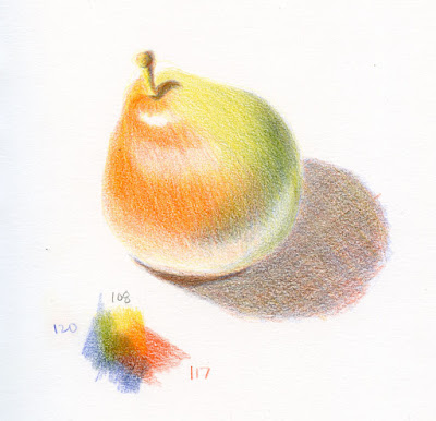
12/18/19 Faber-Castell Polychromos in Stillman & Birn Epsilon sketchbook
Light Cadmium Red 117 (w), Dark Cadmium Yellow 108 (w), Ultramarine 120 (w)
But what about yellow (the warmest hue, according to color theory) and blue (the coolest)? Logically, to make yellow cooler, it would be mixed with blue, but that would give it a strong greenish hue. In the same way, what is blue mixed with to make it warmer or cooler? Adding red to blue should warm it up, but the resulting violet changes the hue significantly.

When we had discussions about this in class, we learned that one approach to cooling a hue is to simply mix it with its complement. So, mixing a bit of violet with yellow would push it toward gray and therefore cool it down. In the same way, blue could be warmed by mixing it with a touch of orange. This approach is easier for me.

Why is it important to understand how to identify cool and warm hues? According to watercolor books I’ve read, if you stick with either all warms or all cools, you are much less likely to mix mud. Logically, this makes sense, especially in view of the complement-mixing discussion: If you were to mix a warm yellow, a warm blue and a cool red, that cool red is already leaning toward violet, which would mix with the warm yellow and become grayish-brownish mud. A warm red has no violet in it, so the mix is likely to be brighter and less muddy. Or so goes the concept. But I’m here to learn for myself, so in many cases I deliberately mixed cools and warms.

 
12/19/19 F-C Polychromos, S&B Epsilon
Deep Scarlet 219 (c), Light Yellow Glaze 104 (w), Helio Blue-Reddish 151 (w)
Of course, the pigment-mixing color theory (which is the one painters use and that I learned in class) isn’t the only color theory. Another one says that the three primaries are cyan, yellow and magenta (plus black, the four hues used in printing). I’m sure there are other color theories. No wonder it’s confusing!

Anyway, as I made these sketches, I examined my primary hue options carefully and tried to identify whether a hue was warm or cool, but I wasn’t always confident in my choices. Ultimately, I was having so much fun that I didn’t care. I simply decided, “Hmm, let’s just try it and see what happens.” (The latter attitude is always faster and easier than caring.)

One thing to note: As much as I love watercolor pencils for their intensity and efficiency when sketching on location, I find it much easier to control hues for this type of exercise with traditional colored pencils. If a color is off, I can just add more of something to change it; water complicates this process because many watercolor pencils take on an entirely different hue when water is applied. In one case, water activation changed a cool, subdued blue in its dry state to a very bright warm blue. It was apparent in my swatches before sketching, but I decided to go with it anyway and see what would happen.

12/21/19 Cd'A Supracolor in S&B Beta sketchbook
Carmine 80 (c), Golden Ochre 33 (c), Blue permanent 670 (w)
(This blue looks cool and subdued when dry, but when activated,
it appears much brighter and warmer.)

In the cutline of each sketch, for my own documentation (and your interest, if any), I’ve indicated the type of pencil, color numbers and whether I thought they were warm (w) or cool (c). To simplify my choices, I stayed within a single brand of pencils for each sketch. In all sketches, I used all three primaries for the cast shadow and left it dry, even when using watercolor pencils. I enjoy seeing these optically mixed masses (sort of like the red/green/blue dots making up TV images that fascinated me when I was a kid).

I hope you enjoy seeing my varying results. Ultimately, though, looking at my experiments isn’t nearly as much fun or as informative as doing your own triad studies. On your next yucky-weather day, whatever medium you use, I recommend making primary triad studies. You will learn more about your medium as well as about color.

(As I write this on the solstice, we’re in our third day of the Pineapple Express. Gratefully, my car is not submerged in a river of standing water as one was shown doing on TV news, though our basement had some minor leakage. It’s ideal weather for making triad studies.)

12/21/19 Cd'A Luminance in S&B Epsilon
Alizarin Crimson 589 (c), Lemon Yellow 240 (w), Cobalt Medium Blue 66 (w)

12/21/19 Tombow Irojiten in S&B Epsilon
Cherry Red 1 (c), Mustard 15 (c), Hydrangea Blue 8 (c)

Monday, December 23, 2019

Maple Leaf Palm

12/17/19 Maple Leaf neighborhood

To me, palm trees evoke the desert climate of southern California, so I’m always amused when I see one in Seattle. A horticulturalist once told me that the ones we see around here are Chinese windmill (or pinwheel) palms, or Trachycarpus fortunei, a variety that doesn’t mind cold and rain. Our neighbors across the street have a small one (currently decorated with festive lights), which I especially enjoyed sketching when it was covered with snow a couple years ago. My favorites are the tall pair growing inexplicably in front of the Wedgwood Top Pot Doughnuts.

Walking through the ‘hood last week, I spotted this palm in front of a quintessential Craftsman-style bungalow that Seattle is full of. Seeing them together (with a mandatory trash can, of course) tickled me.

Sunday, December 22, 2019

Neptune Theatre

12/16/19 Neptune Theatre, U-District

The Neptune Theatre has been in the University District for nearly a century. On the corner of Northeast 45th and Brooklyn since it opened in 1921, it is “the only survivor of five neighborhood theaters built during the silent film era.” It was called the U-Neptune back then.

I’ve been wanting to sketch the Neptune for a long time, afraid that any day now it could disappear the way two of Seattle’s other historic theaters, the Guild 45th and Seven Gables, suddenly closed in 2017 (I managed to sketch them only after the sad news). But the Neptune still seems to be going strong, showing indie films and staging a variety of musical concerts. It’s been years since I saw a movie there, but I know the inside is beautiful with dramatic nautical scenes painted on the walls. They just don’t make movie theaters like they used to.

In 2018, the 70-year-old marquee was replaced with a historically accurate digital one. I’m not sure if that includes the mint green, illuminated Neptune name sign, which looks identical to the one I’ve seen for decades. You probably can’t see it in my sketch, but the final E has arrowheads like Neptune’s trident.

While I was in the U-District getting my car’s battery replaced, I looked around for a coffee shop with a good window I could sketch through on that 39-degree morning. The Poindexter inside the Graduate Hotel was perfect: A corner window kitty-corner to the Neptune.

Bonus thrill: the Poindexter’s counter. It’s covered with thousands of pencils!


Saturday, December 21, 2019

An Afro-Celtic Christmas Concert

12/14/19 City Cantabile Choir at Green Lake Methodist Church

Attending a chorale concert at a neighborhood church is one of our favorite holiday traditions. City Cantabile Choir always puts on a lively, creative concert with innovative musical interpretations, and this year was no exception. Collaborating with Shades of Praise Gospel Choir, City Cantabile presented a spirited mix of traditional Celtic, jazz and gospel Christmas music last weekend.
12/14/19 Members of City Cantabile and Shades of Praise Gospel choirs

I’ve brought along my sketchbook every time we’ve attended, and I remembered that the liturgical drape on the cross is always purple. The choir members usually wear traditional black with a red accessory – often just a scarf or necktie. Our seats were further back than usual, so I couldn’t see much detail, but I could count on those tiny touches of color.

The highlight of the concert was two teenage girls (twins, in fact) who performed a traditional Irish stepdance. For me, it was frustrating because I could barely see their legs, but I tried my best to capture their moves. (It was a good warmup for the next day, however, when I had more opportunities to sketch dancers at Winterfest.)


12/14/19 Irish stepdancers
12/14/19 a drummer and a few gestures of the
choir director


Friday, December 20, 2019

Dead

12/11/19 Green Lake neighborhood

Years ago when I was sketching in my car at a Green Lake parking lot, I had inadvertently left my headlights on, and my battery eventually died. The other morning, I was again at Green Lake, but this time I had walked around it, and when I got back to my car, the battery was simply dead (I hadn’t even left the lights on).

The drizzle had turned to a steady rain, the car was cold, and all the windows had completely fogged up. Not ideal conditions for sketching, but what else is there to do while waiting for Allstate Roadside Assistance to come to my rescue again?

Thursday, December 19, 2019

Rainy Days and Primary Triads

9/25/19 vintage Prismacolors, Stillman & Birn Epsilon


The dark, cold and mostly wet days of indoor sketching season are upon us. I’ve been amusing myself by exploring primary triads. Visually, the color combo of red, yellow and blue doesn’t necessarily appeal to me; it evokes kindergarten, McDonald’s and Brillo pads (though I do love Mondrian and the new Bauhaus-themed pencil by Blackwing). I know, however, that painters are endlessly fascinated with experimenting with various primary triads, and I do understand that appeal. Some combos make intriguingly rich browns or grays, while others make mud. I haven’t met an orange I didn’t like, but some purples sparkle, while others are blah. Greens are surprisingly tricky; this must be why many painters carry a “convenience” green along with their primaries so that they don’t have to spend too much time mixing the right ratio of yellow to blue.
 
12/10/19 Uni Mitsubishi watercolor pencils (activated), S&B Beta

Unfortunately, I haven’t been very systematic in how I choose my triads; I simply grab and go. It’s a long winter, though, so I might try to be a bit more analytical in my selections going forward – compare all-cool and all-warm triads, for example, or mixes of cools and warms. Since dry colored pencil pigments mix optically, the blended effects are very different from activated water-soluble pencils, which blend more like watercolors. The dry effect is more like glazed transparent watercolors rather than mixed pigments. It’s easier to get mud when water is added, so I often leave the triad shadows dry. I really like the optical mixtures that result. All but one of these sketches (above) were done with dry colored pencils only.
 
12/11/19 Uni Mitsubishi watercolor pencils (dry only), S&B Epsilon

In addition to being a triad exercise, the still life from back in September (top of post) taught me a different lesson. I noticed that the shadow of the tomato was a bit reddish while the shadow of the pear was more greenish; their shadow hues were influenced by some reflected color.


12/12/19 Van Gogh colored pencils, S&B Epsilon

12/12/19 vintage Prismacolors, S&B Epsilon

Wednesday, December 18, 2019

Tina’s Top 10 Memorable Sketches of 2019

2/2/19 Alaskan Way Viaduct

It’s time for another year-end tradition: A review of my most memorable sketches of the past 12 months. These aren’t necessarily my favorite or “best” sketches; they’re ones that evoke strong memories and feelings when I see them. After all, one of my primary motivations for sketching is to remember how I felt when I sketched. (Click the title of the sketch to read the original post.)

Here are links to my most memorable sketches from past years: 2018, 2017, 2016, 2015, 2014, 2013.

2/11/19 Snowpocalypse
Feb. 2, Farewell to the Alaskan Way Viaduct: Along with 100,000 other nostalgic (or curious) Seattleites, we bid farewell to the viaduct during an event that allowed pedestrians to walk its length for the first and only time.

Feb. 11, Snowpocalypse: Fighting cabin fever during many days of snow, I got some rare practice sketching the white stuff through every window.

3/16/19 Kite Hill

March 16, Kite Hill, Gas Works Park: After our record-breaking cold winter, it seemed like the whole city was out and about on this brilliant, sunny day.

June 30, Gas Works Park USk celebration: Although I’ve sketched at Gas Works Park many times, both alone and with Urban Sketchers Seattle, this sketch outing was extra-special: We celebrated our 10th anniversary of sketching together.
 
6/30/19 Gas Works Park USk celebration
7/1/19 cement mixer at my friends' house
July 1, driveway renovation: My friends in the Greenwood neighborhood invited me over to sketch the heavy equipment and activity around their driveway renovation project.

7/25/19 Amsterdam symposium


July 25, Amsterdam symposium thumbnails: There’s nothing special about these thumbnails I made in Norberto Dorantes’ workshop, but they evoke the beginning of the blistering, triple-digit heatwave we endured during the four days of the Amsterdam symposium. Sketching in that record-breaking heat was unforgettable.

July 30, Delft canal: A few days after the symposium, we wound down in quiet Delft, where I sat in tranquility to sketch a canal. As much as I adore graphite, I use it only when I know I can take my time. This sketch reminds me of how relaxing and comfortable it was after the intensity and heat of Amsterdam.
 
7/30/19 Delft
8/11/19 taiko concert
Aug. 11, taiko conference: In Portland for a family event, we got to attend a taiko conference, where the percussionists seemed to infuse my brush pen with their dynamic energy.

Aug. 27, Minnesota State Fair: Cows, chickens, sheep and the butter head sculptor I’d been wanting to catch for years – they were all mine to sketch at the Minnesota State Fair! Meeting up with Roz Stendahl and other Twin Cities Sketchers made the day even more fun.
 
8/27/19 Butter head sculptor, Minnesota State Fair

Oct. 17, Pfeiffer Beach, Big Sur: The main reason this sketch is so memorable was the terrific high winds I had to battle for the duration. My mouth and shoes filled with sand, I was happy to be done!

10/17/19 Pfeiffer Beach
Related Posts Plugin for WordPress, Blogger...