 |
| 4/23/22 overcast morning |
I apologize if you’re tired of this house. Although it’s
awkward for me to sketch (looking through a window at an odd angle), it turns
out to be a good color temperature and value study subject because I can easily
see the sun traveling around it.
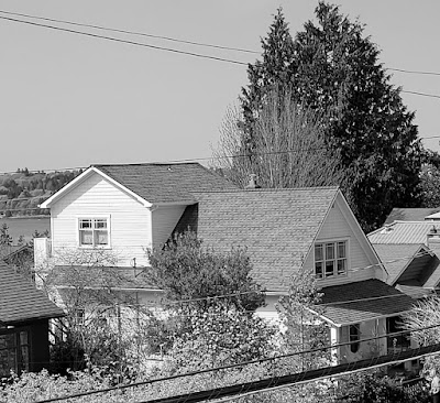
On two consecutive mornings – the first under an overcast sky; the second in sunshine – I gave color temperature two more tries. To test my values, I went out on the deck to take a photo (the angle is slightly different from my drawings) each day and converted the photos to black and white. I also converted the sketches to black and white. Whoa – it’s an excellent test because it’s easy to see when I’m off!
First is a primary triad on the overcast morning (top of page). Based on my previous studies, I chose a cooler magenta as well as a cooler blue than those in my previous CMYK triad, thinking that they would indicate the cooler, overcast light better. When I finished, I thought I got the rooftops too dark, but the black-and-white conversion compared to the photo indicates that I didn’t get them dark enough. I have a habit of making the windows the darkest value, but they are actually about the same value as the rooftops.
 |
| Black-and-white conversion of 4/23 sketch |
The next day on the sunny morning, I tried a secondary triad with a cooler green so that its temperature wouldn’t be as close to the orange as it was in my previous try. But I chose a warmer violet to better indicate the sunnier day. Based on the black-and-white conversion compared to the photo, I think my relative values are better this time. The cool green worked out well as a relatively warm, sunlit roof that is, in reality, dark gray.
 |
| 4/24/22 sunny morning |
 |
| Black-and-white conversion of 4/24 sketch |
Of course, I can’t just slavishly copy the values I see in
the photos – or even on the actual house. In this video by Ian Roberts,
he explains how it’s not about “accuracy of value in service of the photograph”
or how something really looks in life. “The only thing that’s important is that
we are using the accuracy of our values in service of our painting.” And then
he goes on to demonstrate this by painting from a photo reference but
manipulating the values for the sake of his painting – not just to copy what
the photo shows. More thinking required!


Wonderful study! I think you nailed it in the second sketch 👍
ReplyDeleteThank you, Ching! (It's me -- Tina. My own blog won't let me comment. :-( )
DeleteThat's so weird!
DeleteTina, that second sketch is especially nice! You're having such success with these secondary triads that it makes me want to try them as a tool to, hopefully, jostle loose my current roadblocks in coloring people without sticking to local color. Great work!
ReplyDeleteThanks, Lee! Strangely enough, I find it easiest to sketch people in weird (non-"real") colors... I guess they are easier to abstract! - Tina (wish I didn't have to be anonymous on my own blog, but Google won't let me comment as my account. :-( )
Delete