Showing posts with label notable. Show all posts

Wednesday, March 9, 2022

Notable Pencils: The Colors of Michael Graves


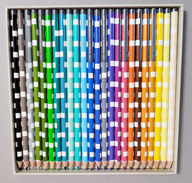
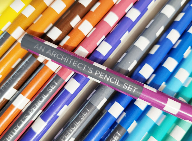
At least a year or two ago, I had spotted an interesting set of colored pencils online. Although the theme caught my attention, I knew the pencils would likely be disappointing, so I kept those 25 dollars in my pocket (see, I do occasionally exercise willpower). Fast-forward to a few weeks ago, when I was perusing the unusual and unique wares at Princeton Architectural Press. There it was again: An Architect’s Pencil Set: The Colors of Michael Graves – but on sale for 6 bucks! Score!

I didn’t know much about architect, industrial designer and professor Michael Graves (1934 – 2015), so buying the set prompted me to learn more about him. In addition to award-winning architectural work, he was also well known for consumer product designs for companies like Alessi, Target and J.C. Penney. The New York Times described Graves as “one of the most prominent and prolific American architects of the latter 20th century, who designed more than 350 buildings around the world but was perhaps best known for [a] teakettle and pepper mill” (quoted by Wikipedia).
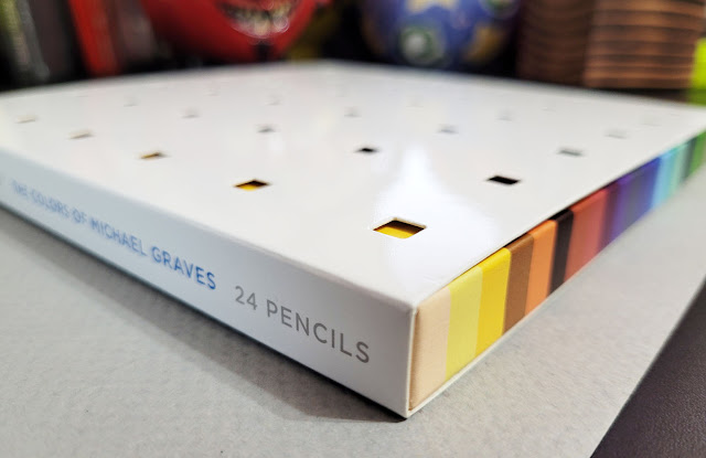

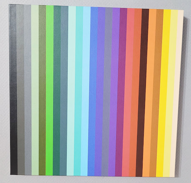
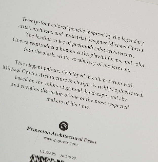
As I had surmised, the pencils are nothing to write home about, but the chosen palette is what makes this set intriguing. The enclosed brochure, taken from text Graves wrote in 1990, explains his concepts for how color can be used in architecture:

“If we use nature as a reference, then the floor refers to the ground, the ceiling to the sky, and the columns to trees. Interpretation in color would call for warm, heavy tones at the base of the structure, shades of green in the middle range, and cool, light yellows or blues at the top – colors of the ground, landscape, and sky. . . .

“Although color is two-dimensional, when used in this way to replicate nature, we understand it in three-dimensional terms. If a surface is painted terra-cotta to allude to brick, our first association is with brick, in its full depth. Even though we are conscious that the color is applied to a surface, we see color first as representational. To some degree, therefore, it possesses the quality of an object.”

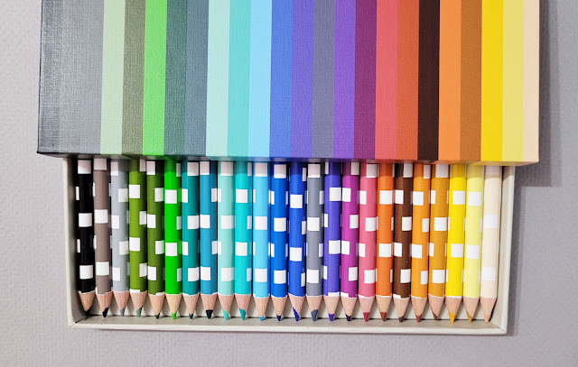
Learning Graves’ principles of architectural color is certainly worth 6 bucks! Not to mention the packaging – what a visual delight! I’ll stop talking now so you can enjoy the pictures.
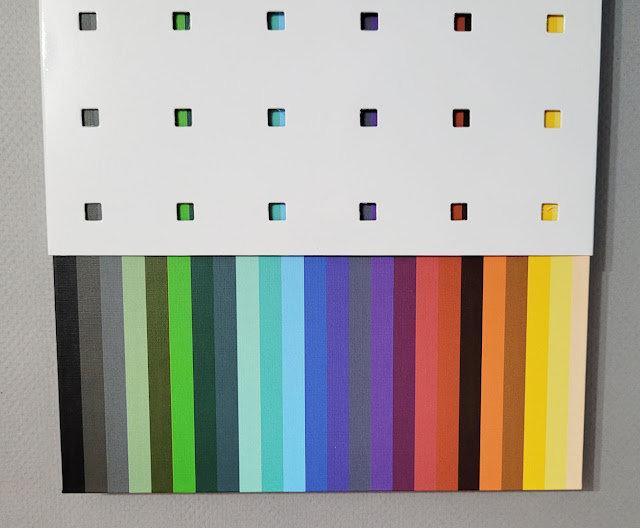
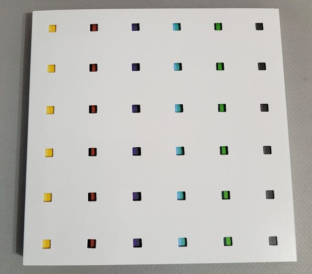
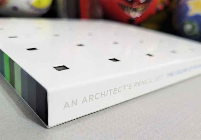
The outer box is perforated to reveal color stripes on the inner box that correspond to the pencil colors.


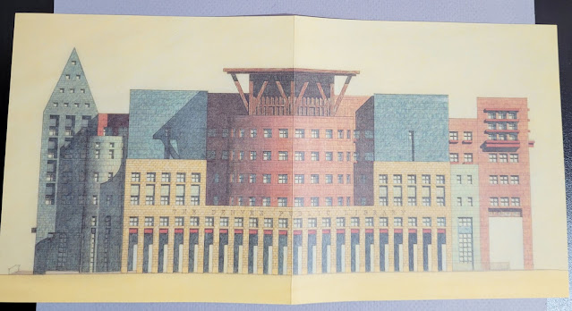
The opened brochure shows a rendering of the Denver Public Library, 1995

Thursday, November 11, 2021

Festive! Caran d’Ache Wonder Forest Prismalo Bicolors


The festive Wonder Forest Prismalo Bicolors!

The holiday elves are already hard at work, and they brought me a set of Caran d’Ache Wonder Forest Prismalo Bicolor Pencils! Actually, I’m the one who did all the work looking for this darn set, which is none too easy to buy in the U.S. But since Wonder Forest is apparently Cd’A’s limited edition holiday theme this year, I knew I had to get a jump on Santa!

You may recall that two years ago, Caran d’Ache released its first-ever set of bicolor watercolor pencils, fulfilling a long-standing wish. The new set is similar to the original set but not identical. The new Wonder Forest set includes 12 pencils (24 colors) instead of ten. Six of the 12 are duplicates of the original set, and six are new. (All colors in both sets are part of the standard Prismalo line.) In place of a waterbrush, the Wonder Forest set includes a traditional watercolor brush.

Wonder Forest set shown with original bicolor set (bottom) released in 2019.

The new Wonder Forest set includes 6 bicolors (top) not included in the original set. Festive green/red and silver/gold!

A small watercolor brush is included.

The Wonder Forest set comes in Caran d’Ache’s iconic red tin, the latest design change that appears to be used for the Swiss company’s “professional” product line
(Supracolor, Pablo, Neocolor I, Neocolor II, gouache, Fibralo markers, Fibralo brush tip markers). Although Prismalo is part of its “hobby” line and doesn’t normally come in the red tin, this set has been upgraded for the holidays. (The dark green sleeve slides off.)

Upgraded iconic tin

As Caran d’Ache’s flagship colored pencil – the world’s first watercolor pencil, according to Cd’A – Prismalo is a natural choice, but I still wish the bicolors contained slightly thicker Supracolor cores.

As for the Prismalo bicolors’ performance, this post is not intended as a product review (for that, please see my review of the original set). Briefly, though, I’ll say that although Prismalo is not anywhere close to Cd’A’s premium Museum Aquarelles or high-end Supracolors, you could certainly do far worse in a watercolor pencil. In fact, I’d love to recommend Prismalo to people who ask me for a starter watercolor pencil, as it is comfortably soft and sufficiently pigmented for casual use. But since Prismalo is not easily available in the US, I can’t recommend it, at least outside of Europe.

Wonder Forest Sharpening Machine
(Image snipped from Cd'A's website)

Just in time for holiday gift giving, the Wonder Forest collection also includes two 849-model ballpoint pens (one red, one forest green), the Ecridor Star ballpoint pen with leather case and a forest green Sharpening Machine. Although I had long lusted after Cd’A’s ridiculously overpriced hand-crank pencil sharpener, I recently learned that the Sharpening Machine’s pencil grip leaves bite marks on the pencil, which fills me with dismay and outrage. If I want a sharpener that mars my pencils with every sharpening, I don’t need to spend a couple hundred Euros; I can find many hand-cranks that will do that for 20 bucks! It was easy to let that fantasy go. Still, it’s a lovely shade of green, isn’t it?

If you want a set of Wonder Forest bicolors, you’d better hurry. They are likely to go out of stock before Santa is even done checking his list. So far I’ve found European shops in the Netherlands, Germany and the UK that ship to the U.S. I have found no U.S. distributors. (Two years ago, I bought my original bicolor set from CW Pencils in New York City, but it has very sadly closed its doors.)

You can see that my holiday season is already colorful. The only question that remains is this: Can we expect Caran d’Ache to put out a new set of limited edition bicolors every couple of holiday seasons? I certainly hope so!

'Tis the season for bicolors!

Monday, February 22, 2021

Notable: Vintage Red/Blue Editing Pencils


6/19/19 A values study made 2 years ago with a
Uni vermilion/Prussian blue bicolor pencil.
Within my overall obsession with colored pencils is my special love for bicolor pencils (rooted in nostalgia), and a subset of that is my fondness for red/blue editing pencils. Although I didn’t set out to collect vintage red/blue pencils specifically, I have acquired enough over time (as a subset of my more general collection of vintage colored pencils) that they seem to have formed a collection on their own. I do love contemporary red/blue pencils too, and they are getting harder to find.

A couple of years ago, I went through a period of urban sketching with a red/blue pencil specifically to help me see and interpret values more accurately. Without having to think about the “real” colors I saw, I could focus on the values and convey them relatively quickly compared to monochrome. It was a useful tool. (I liked the idea so much that I still have thoughts now and then of someday developing an urban sketching workshop around the concept.)

My favorite contemporary red/blue bicolors for sketching are the Uni Mitsubishi Vermilion/Prussian Blue and the Caran d’Ache Bicolor 999.

Two of my favorite contemporary red/blue pencils for sketching.

Beyond sketching, I don’t have many uses for red/blue pencils, though I wish I did. (Ironically, I worked for more than 30 years as an editor, but I never once used a red/blue pencil to mark up copy.) Now my red/blue collection is mostly for admiration rather than use.

Shown in this post are select favorites and some of the more unusual specimens from my collection. The more exotic ones came in a lot from my favorite eBay vendor. Others came from Brand Name Pencils. Still others were gifts or swaps with fellow pencil afficionados.

Look at the A.W. Faber Castell in the center -- very unusual for a red/blue pencil to have a green barrel. The Canadian Eagle Ensign's all-red barrel is also unusual.

For a truly inspiring look at red/blue bicolors and interesting information about how they were traditionally used (and still are), you must see Ana’s posts at the Well-Appointed Desk (here’s a good place to start, with more info here). She’s the one who made me realize that collecting red/blue pencils could even be a thing!

Edited 3/4/21: My dentist uses a red/blue pencil! Explaining the work he would do on a molar that needs a crown, he sketched my tooth in blue, then indicated the cracks with red. Ideal use of a bicolor! Unfortunately, I didn’t see what kind of red/blue it was . . . I was too distracted thinking about the cost of that crown.

Edited 8/16/21: This blog was recently brought to my attention, and author Gunther has unearthed fascinating information about how red/blue pencils have been used historically. This blog is worth bookmarking . . . tons of great info on colored and other pencils!

Saturday, February 6, 2021

Name Dropper


When I was in my mid-20s, nearly done with graduate school but clueless about what I would do with a creative writing degree and my life in general, I went through an interesting phase: I bought all kinds of stuff personalized with my name. The usual coffee mugs, keychains and other kitsch, but even some high-end stationery items, including a metal business card holder from the Levenger catalog. It’s hilarious now to realize how my identity crisis had manifested in such a literal way!

Thankfully, that phase was short, and I eventually found a direction. Apparently, though, I still have a hard time resisting certain personalized items.

Thursday, May 21, 2020

Notable Pencils: Vintage Mitsubishi Boxy Turbo Bicolors

Vintage Mitsubishi Boxy Turbo Bicolors

Some of my favorite “notable” pencils have come to me as gifts from generous friends who know I have a thing for colored pencils. This set of Mitsubishi Boxy Turbo Bicolors is not only bicolored (my all-time favorite form for colored pencils) – it’s also vintage!

Marked with the JIS (Japanese Industrial Standards) symbol, which means the pencils were manufactured in 2008 or earlier, the image of the car inside the tin lid is a clear indication that the set is much older than 2008 – it screams of the boxy late ‘80s or ‘90s. A design that’s “approved by Honda”!
 
The JIS symbol is shown on the blue side of this bicolor.


The JIS symbol also appears at the tin's upper left.

Approved by Honda!


(This is part of my series of occasional posts that are not really reviews but stories about products I find notable for one reason or another.)

Tuesday, May 12, 2020

Notable Pencils: Viarco ColorADD

Viarco ColorADD pencils

The Viarco ColorADD Color Identification System set of colored pencils is a unique specimen that I received as a gift from someone who knows I appreciate all colored pencils and collect unusual ones. Developed specifically to aid colorblind users, the pencil colors are identified with symbols as well as the usual colored end caps that match the cores.

According to the package, the Color Identification System “was developed based on a process of logic association and easy memorization by using primary colors, represented by graphic symbols. The concept of adding colors becomes a ‘game’ for the colorblind person, who using his own knowledge connects symbols – identifying colors and their respective representations, through the association of simple shapes to elementary chromatic combinations.”

For example, if you mix the pencil marked with a triangle (blue) with the pencil marked with a diagonal line (yellow), the resulting color would be green (marked by the same triangle and line). I have talked to a few people with normal vision who have had so much difficulty understanding basic color-mixing theory that perhaps this set would be helpful to anyone in learning these principles, not just those with colorblindness.


As for the pencils themselves. . . let’s just say they are not ones I would choose to do anything with except understand colors if I were colorblind. But the concept of the system is intriguing and unique.


Incidentally, the ColorADD pencils are made by Viarco, the Portuguese manufacturer that also makes my very favorite water-soluble graphite pencil, the ArtGraf.

(This is part of my series of occasional posts that are not really reviews but stories about products I find notable for one reason or another.)

Wednesday, April 15, 2020

Notable Pencils: The Many Dresses of Blackwing Colors

Initial releases of Palomino Colors (prior to 2010)

I gave Blackwing Colors a full review a few years ago, so I won’t say much about pencil performance in this post. What is “notable” about this colored pencil set put out by the brand that is better known for high-end graphite pencils is the variety of packaging and appearances it has had.

When I wrote that review in 2017, I didn’t know yet that California Republic had released traditional and water-soluble (Aquas) sets of colored pencils under the Palomino brand several years before the set I reviewed. With a round barrel, silver band and finished, rounded end cap, the look reminds me a bit of Faber-Castell Polychromos. The barrels of both the traditional colored pencils and the Aquas look identical except the latter include a paintbrush icon.
 
California Republic's Palomino logo
I was told that these Palomino sets came out prior to the first Palomino Blackwing graphite release in 2010. They bear the same horse logo (at right) that also appeared on the Blackwing graphite pencils of 2010 - 2015. I acquired both through swaps long after they were no longer available at retail. They came packaged in flimsy plastic cases (above).

At some point I acquired a more durable wood-boxed set on eBay that must have been released as a gifty item around the same time (below). I’m not aware of a corresponding gift set of the Aquas. (4/15/20 correction: A friend on social media has pointed out that there was a gift set of Aquas!)


The gift set came in a wood box


Next came the Blackwing Colors set I reviewed in 2017 that had been released the year before. This matte black windowed box is one of the nicest presentations I’ve seen for a small set of colored pencils. The windowed “door” opens to silver-capped, hexagonal pencils – a complete change in appearance from the prior Palomino sets. The Palomino pony disappeared (as it did from the graphite Blackwings of 2016), and the simple italic-slanted Blackwing logo is imprinted in silver.
 
The first windowed box (2016)


In early 2020, Blackwing changed its corporate identity and logo and re-released all its standard edition graphite pencils with new logos and redesigned packaging. A curious thing happened with the Colors, however: First the unchanged 12 pencils were re-packaged in the old Blackwing box – the same kind that the standard edition and limited edition Volumes had come in prior to the 2020 change – with a new Colors sleeve.


New sleeve, old box, old pencils (2020)


Although I wasn’t necessarily fond of the new branding, I couldn’t help feeling a bit miffed: What – aren’t colored pencils good enough to wear the new look, too? Just give the hand-me-down old boxes to the stepsister Colors, shall we? (OK, so I took it a bit personally.)

It turned out that the stepsister repackaging was a transitional step: Very shortly later, the Colors, too, were re-released bearing the new logo in a redesigned windowed box similar to the one of 2016 but with new branding. I’m not sure why the transitional packaging was necessary, especially for such a short time (maybe a month or two?), but I am already imagining the tizzy of future colored pencil historians asking the same thing (as they frantically hunt down the sleeved box on eBay).
 
The current look: Redesigned windowed box, new logo (2020)


The questions I ask today are these: Whatever happened to the Aquas, and why was it apparently dropped as a Blackwing product line? Granted, it is not a high-quality watercolor pencil, but it would have been fun to collect all of its many clothes, too. And perhaps a wistful, rhetorical question: Will Blackwing ever come out with more colors for Colors? It seems doubtful, though I wouldn’t be surprised if new packaging comes along again sometime.

(This is part of my series of occasional posts that are not really reviews but stories about products I find notable for one reason or another.)

Friday, April 3, 2020

Notable Pencils: Polychromos 111th Anniversary Commemorative Set

This commemorative set is 3/4 the size of a standard Polychromos.

In 2019, Faber-Castell celebrated the 111th anniversary of the German company’s flagship colored pencil, Polychromos, by releasing several limited-edition sets. One set immediately caught my eye: The 12 pencils are three-quarters the size of a standard pencil! How adorable is that! Since it’s one of my favorite traditional colored pencil lines, of course I wanted to help Polychromos celebrate its 111th birthday. (Heck, if I were turning 111, I’d want everyone to help me celebrate, too.)

The tin and the pencil barrel design are a close reproduction of a set that originally came out in 1908. Apparently intended for travel sketching, the set fits nicely in the compact tin, which I can easily hold in one hand. According to the insert, to create an appropriate commemorative design, “We found just what we needed in old product catalogues: presented as a new addition, the Polychromos is offered well-sorted in different packaging and advertised with the colourful image of a spectacular sunrise – the symbol for the start of a new era!”
 
"The start of a new era."
Although the colors in the set are close to existing contemporary colors, the numbers are different. The short pencils do not include color names, but an included color card indicates that the numbers refer to traditional color names that are no longer used, such as Hooker’s green II and Van Dyck brown. While the glossy round barrel and gold stamping are the same, the anniversary set has an unfinished end (the current Polychromos has a rounded end cap with a gold band).

For a colored pencil historian, perhaps the most useful part of the commemorative set is the insert that includes a Polychromos product timeline showing packaging designs from the past 111 years. If I ever decide to collect Faber-Castell colored pencils the way I collect Caran d’Ache, it will be invaluable to my research.

(This is part of my series of occasional posts that are not really reviews but stories about products I find notable for one reason or another.)


Following the color names, the text reads as follows: "Through careful testing and selection of natural pigments I have after much experimentation been able to put together a selection of 12 new colored pencils which is unparalleled in the trueness of their color. It goes without saying that the pencils and their cores are durable and strong. Count Alexander on Faber-Castell" (translation by Tony Messent)


Related Posts Plugin for WordPress, Blogger...