Sunday, April 30, 2023

Review: Stabilo Original Colored Pencils (Plus Tár Pencil Sightings)


Stabilo Original colored pencils

My introduction to Stabilo colored pencils was when a thoughtful pencil friend in Slovenia sent me a handful of vintage Stabilo Schwan pencils several years ago. I’ve acquired a few other examples since then, including a set of contemporary Stabilo Original (a gift from another generous pencil friend), which Im reviewing here.

(On Amazon, I’ve also seen sets of Stabilo Original under Stabilo’s “Arty+” line. Images of the pencils look the same as the ones I have, so I assume it’s just a branding change on the packaging.)

Vintage Stabilo Schwan end caps

I’ve seen the Originals packaged in both tins and cardboard boxes, but my friend gave them to me in a pencil roll, which makes it easy to photograph the Originals’ best angle (below) – the charming end caps! Although the German “Schwan” name no longer appears on the barrel, Stabilo’s white swan icon remains nearly unchanged from the vintage specimens I have (right). I like the salute to its heritage.

The same swan icon on the Original end caps

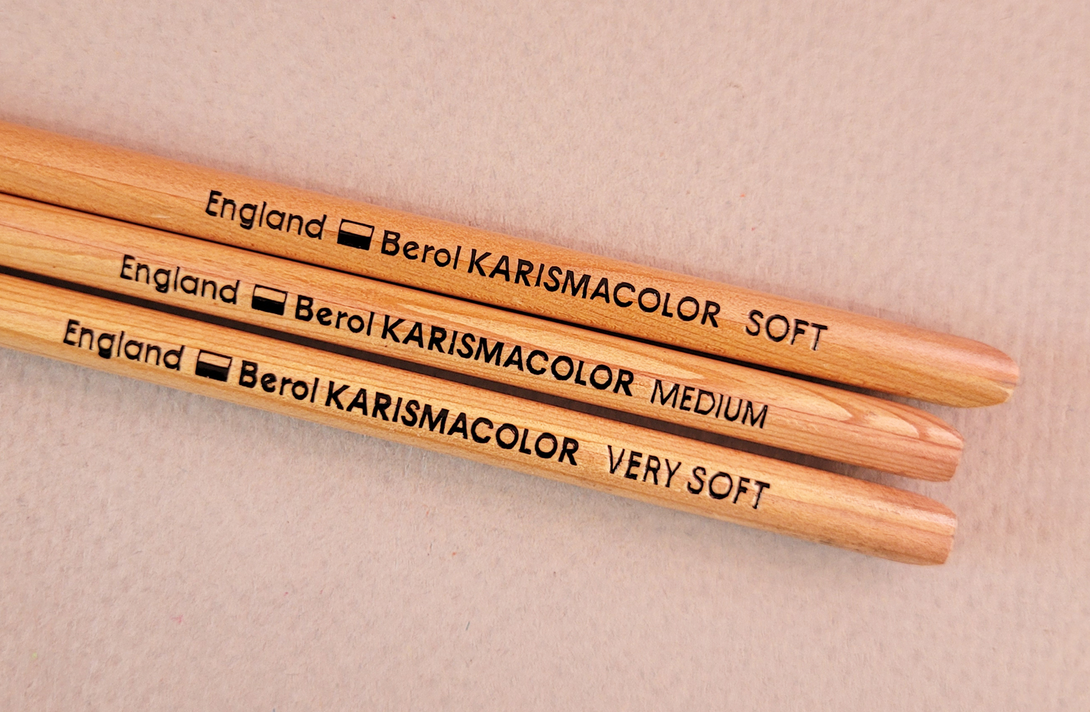
As for the 2.5mm cores, they are among the hardest colored pencils I own. (My recent post of right-handed sketches shows what happens when I try to use such hard pencils with my weakling hand!) Interestingly, just as I found with the vintage Stabilo, the Originals have decent pigment, so even though they are hard, most colors apply with good coverage. It was surprising, however, to find that black (shown in my swatch chart below in the lower-left corner) is extremely pale.

Stabilo Original swatches made in Stillman & Birn Epsilon sketchbook


In fact, in my test portrait using a Zorn palette (black, red and ochre), I had so much difficulty drawing the all-important eyes with black that I finally brought in a black Faber-Castell Polychromos for assistance. It almost seems defective because it’s so different from the other colors.

4/18/23 Stabilo Original colored pencils in Field Notes 
Streetscapes sketchbook (Earthsworld reference photo)

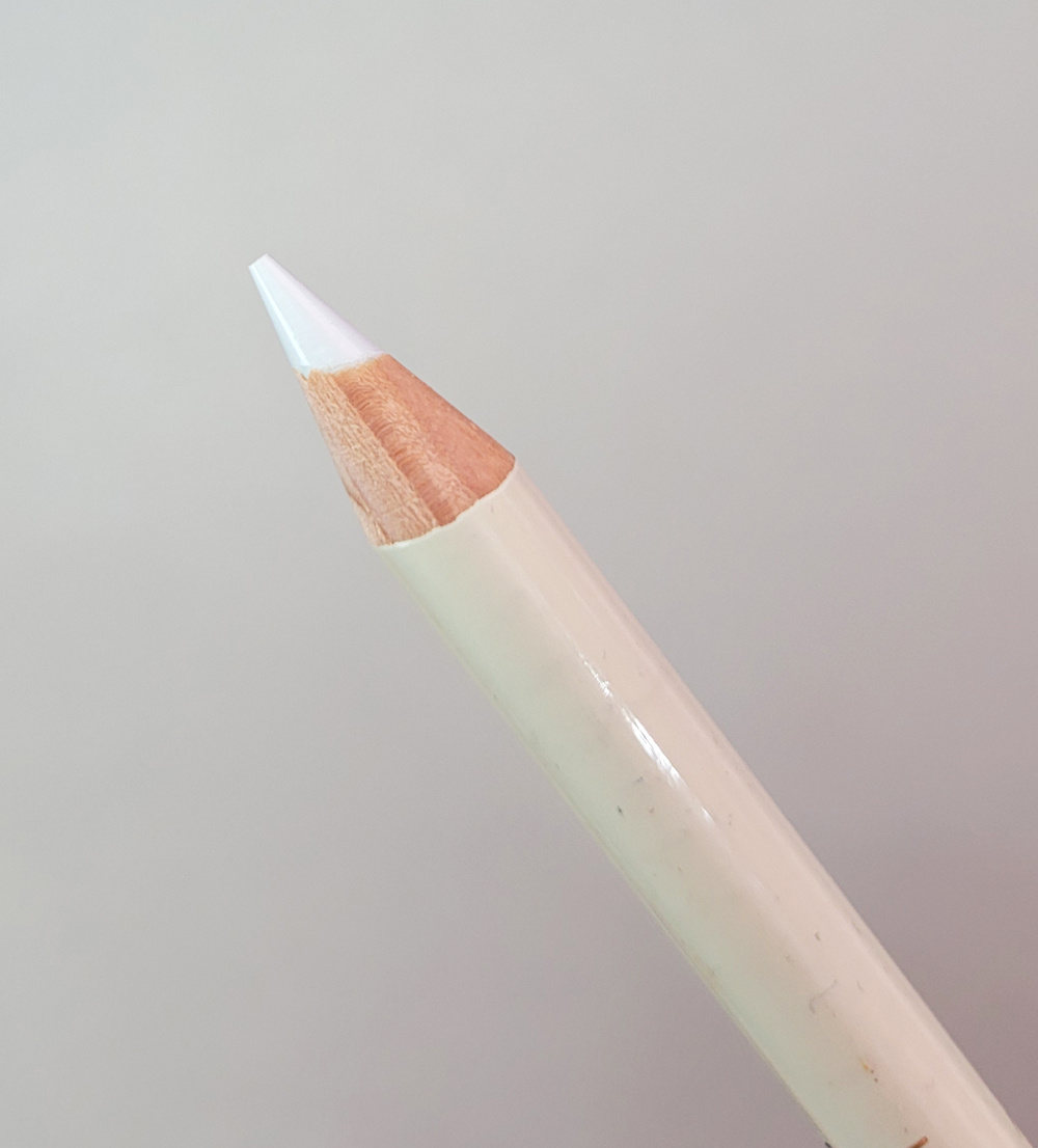
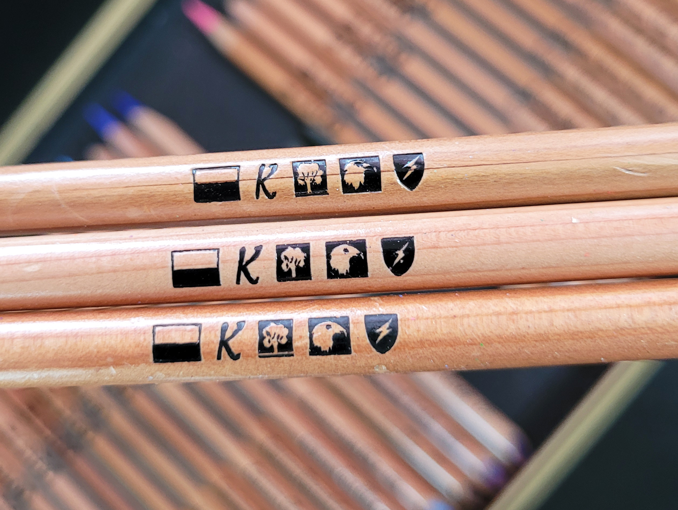
I’m not sure if these pencils are considered artist quality, but the barrels do indicate lightfast ratings.

Lightfast ratings on the hexagonal barrels
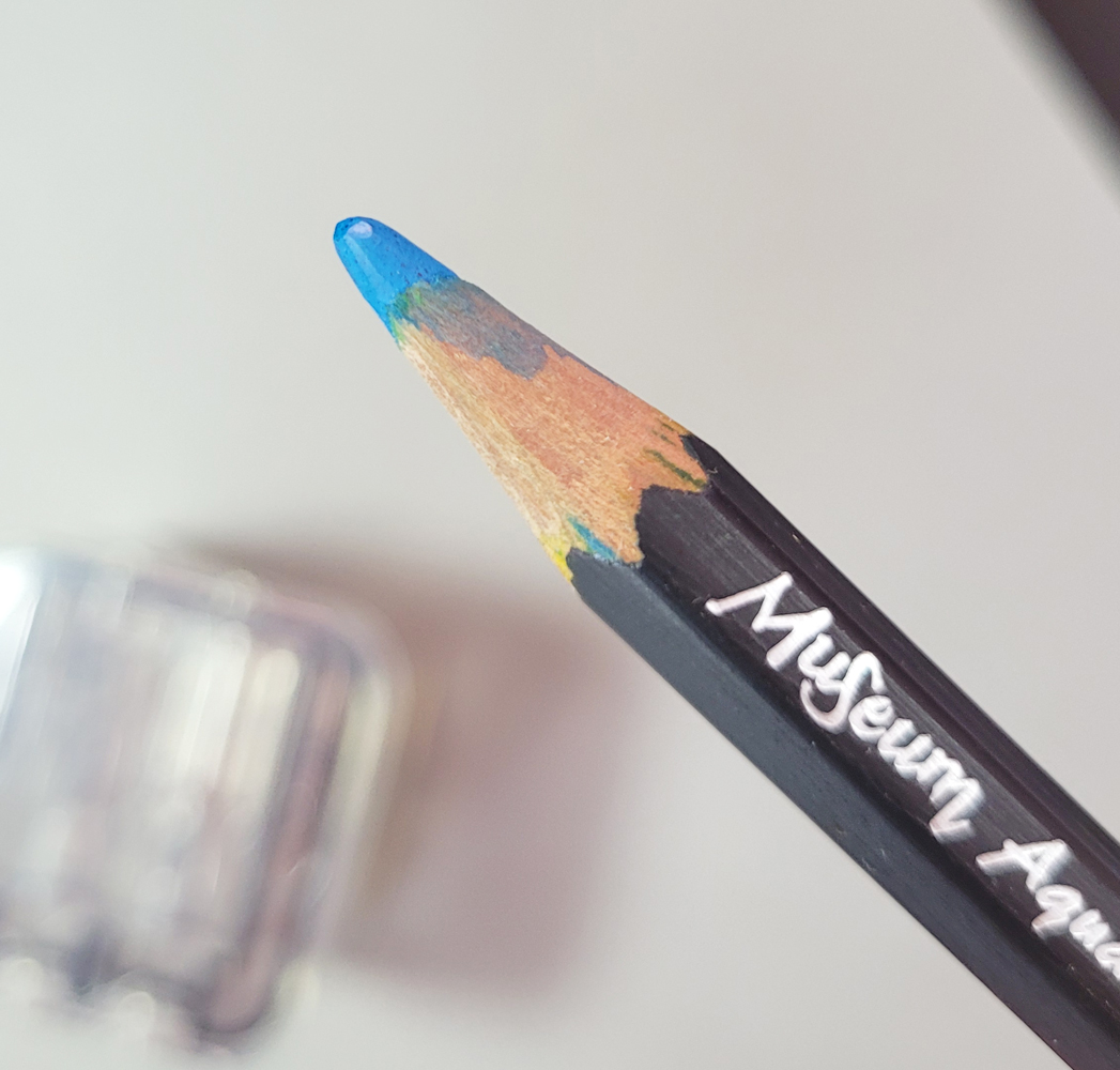
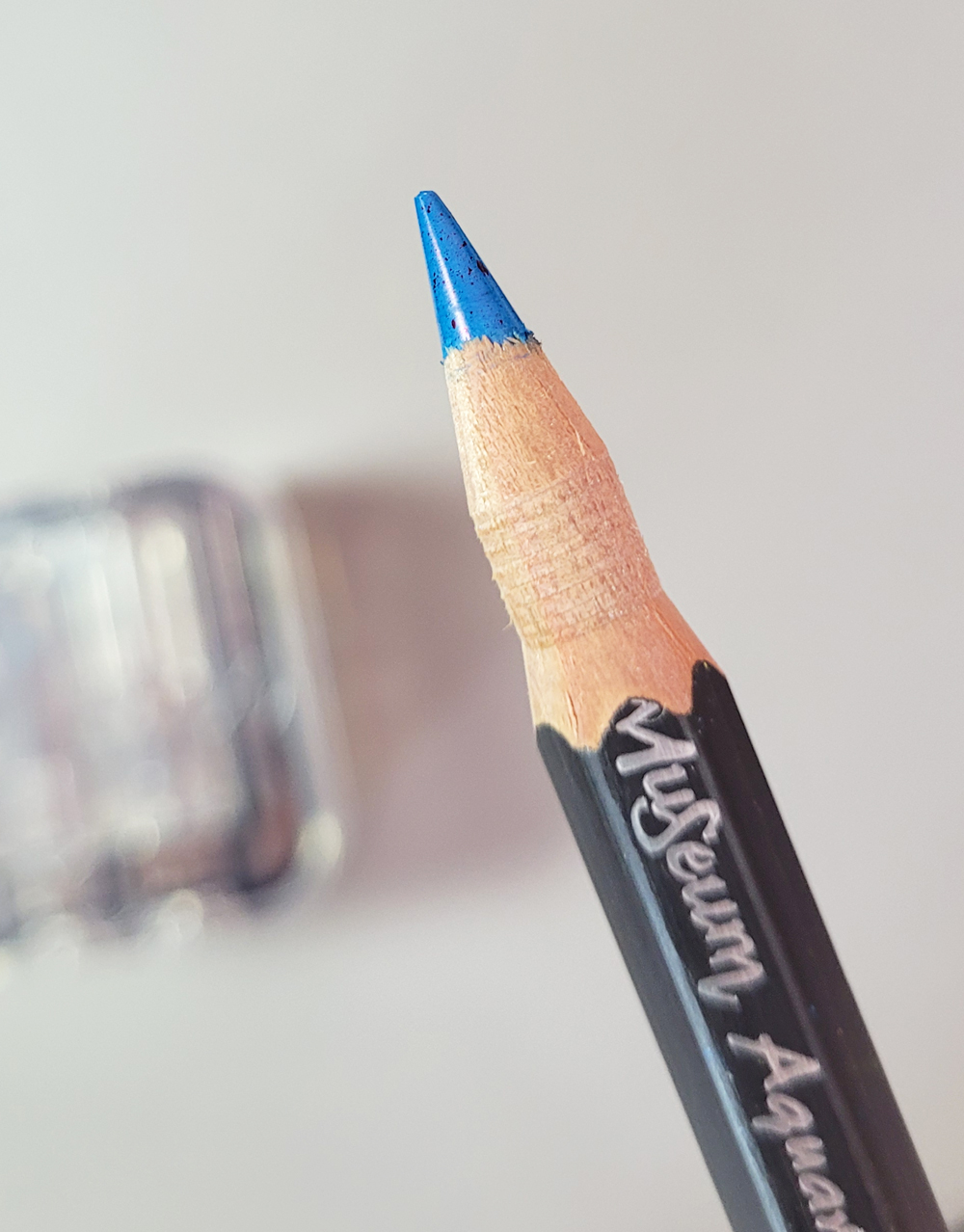
Water-soluble!

Another curiosity about the Originals is that although they are not billed as water-soluble, they are, in fact, at least slightly water-soluble. Stabilo also makes a corresponding water-soluble Aquacolor line, so it’s strange that the Originals would show this much solubility. (One of these days, I’ll review the Aquacolors and compare their water-solubility to that of the Originals.)

Other than for making fine details, I’m not a fan of drawing with such hard colored pencils. However, because Originals have decent pigment while also being hard, they would be ideal for writing. I would add them to my list of colored pencils hard enough to write with (where the vintage Stabilo is already one of my favorites for this task).

Speaking of writing with colored pencils, as an editor and writer for decades, I recall only a few early years when I marked up text with an analog pencil, and it was plain graphite at that. If I had had the colored pencil collection then that I have now, surely I would have packed a few of these Originals to work. Imagine the flair of using the lovely magenta to cross out trite phrases! Or the marine blue to gently add a comma. Sigh. I worked during the wrong era.

And still speaking of writing with colored pencils, did you see the Oscar-nominated film Tár? The main character, a conductor, is frequently seen using Blackwing pencils and a red/blue Caran d’Ache bicolor pencil to notate musical scores. (I didn’t actually see a Cd’A logo on the bicolor, but seeing other Caran d’Ache products convinced me that the red/blue was likely a Caran d’Ache, too.) A Caran d’Ache Sharpening Machine was also visible on her desk. During one scene, the Cate Blanchett character reaches into a cabinet filled with boxes of Blackwings!

Cameo appearance by Caran d'Ache bicolor and Blackwing pencils.

The scene that caused me to leap out of my chair (don’t worry – we were streaming at home, not in a theater) and pause the film showed her selecting a red colored pencil from a tray of more (mostly red) pencils: It was clearly a contemporary Caran d’Ache Pablo pencil – and yet it had a dark end cap! Whaaat??! Pablo pencils have no such end cap! If it was meant to be Caran d’Ache product placement, why would its appearance be altered? Or if it’s an actual Pablo pencil with a different barrel design, why don’t I know about it??!

A Pablo with a dark end cap??!

These questions seared my mind for the rest of the over-long movie because, unfortunately, seeing pencils was the highlight of the film. Very disappointed, I resented paying $4.99 for the Amazon Prime viewing. Well, maybe seeing all those pencils made it worth a dollar, but no more than that.

Saturday, April 29, 2023

Time for Kwanzans


4/25/23 Kwanzan cherry tree, Green Lake

The Kwanzan cherry trees are always late to the party – several weeks behind their pale pink sisters – and this year they seemed later than usual. It’s a good thing, though, that traditional ornamental sakura don’t have to compete with them, because when the Kwanzans finally appear, they steal the show: A true, bright pink that sometimes borders on magenta. In addition, their leaves are orangey, giving the whole crown a warmer glow. 

At right is a tree I caught along Green Lake’s shoreline on an overcast morning. The next day, with the luxuriously warm sun on my back (no gloves! No down parka!), I sketched a flamboyant beauty on a residential street (below).

4/26/23 Green Lake neighborhood
Pencil notes: These were my first full-blown tests of Derwent Inktense – on location from start to finish and color activated with a spritzer – used in the same ways I usually use Caran d’Ache Museum Aquarelles. They are not the same as my beloved Museums, and yet, at least during this current trial, I have not found fault with them as I have in the past. An important consideration is the mix of hues you see here – that cool magenta and cool, dark purple are not available in the Museum line (or even Caran d'Ache Supracolor).

I’m well aware that the Inktense line is known for being fugitive, especially the brightest reds, pinks and purples. Perhaps in a few years these sketches will be a faded memory – but right now, these hues are just right for the Kwanzans. (My current Inktense mutterings will eventually be pulled together into a thorough review.)


Just when we think the pink party is over, the Kwanzans show up and strut their stuff!

Friday, April 28, 2023

My Right Hand Captures the Essence


4/1/23 Art Stix

My right-handed portrait practice continues sporadically (often late in the evening when I’m low on energy, so I have nothing to lose: My drawing skills couldn’t be much worse anyway). Resemblance is hit-and-miss as usual. I could blame proportional mistakes on my right hand, but I know that’s really the brain’s fault, and the hand is just following orders. I would have made the same mistakes with either hand.

What’s more interesting, though, is that I often find that my right hand can capture the essence of a face better than my left hand can, even if resemblance is not spot on. Maybe it’s like making blind contours when my expectations are lower. Or maybe the brain is not as familiar with controlling the right hand, so there’s a bit of a lag, and the right hand is freer to interpret the face without as much “control” from the brain. It’s hard to say why, but all of these feel successful as quick captures of the models’ essence (all portraits from Earthsworld reference photos).


4/1/23 Le Pen Flex

4/2/23 Museum Aquarelle

The sketch of the woman (below, right) was a hard lesson to learn – literally. I knew that Stabilo Original colored pencils were very hard – possibly harder than most colored pencils I own – yet I felt like using them anyway because I had just received them as a gift. They require pressure to use even with my full-strength left hand, but with my weak right, it was nearly impossible to eke out enough color for this sketch. The more frustrated I became, the more scribbly I got, but ironically, I like the very messy crosshatching that resulted. France Van Stone’s “dirty crosshatching” had a good influence on me.

4/14/23 Stabilo Original colored pencils

4/23/23 Le Pen Flex, Neocolor I


Thursday, April 27, 2023

Review: Kitaboshi 6-3-4 Pencil Sharpener


The Kitaboshi 6-3-4 pencil sharpener

When it comes to my larger-barreled pencils that are hard to fit, I’ve mostly resigned myself to the portable sharpeners I already use. They aren’t great, but they accommodate my favorite Caran d’Ache Museum Aquarelles, and they do the job when I’m in the field and need to sharpen before I get home. So although I’m not actively looking for alternatives, if a sharpener fits the Museum’s 8.3mm diameter barrel, I’m always curious. The Kitaboshi 6-3-4 sharpener not only fits; it has an unusual two-step process that seemed worth a look.

With a cute cubic shape, the 6-3-4 is a bit bulky to carry. I had difficulty photographing it, but the top view shows three sides of the lid with each having a pair of holes – one marked 1 and the other 2. The three sides accommodate pencil barrels of 7mm, 8mm and 10mm.

Each of three sides has holes for the 2 stages of sharpening.

The lid with holes comes off. Rotate it and place the desired holes so that they align with the sharpeners. Shavings fall neatly into the compartment below. It’s a compact, elegant design (as we’d fully expect from a Japanese stationery maker). The instructions are entirely in Japanese, but the images seemed clear enough.

Sharpener with lid removed. Shavings are stored neatly below.


Instructions in Japanese only.

Since I had an unsharpened Berol Prismacolor, I thought it would be a good one to start with: A standard-size barrel and medium-thick core. I chose the middle-size stage 1 hole, which shaved off only the wood in a cylindrical fashion.

Fresh Berol Prismacolor ready for sharpening.


Stage 1 sharpening

Stage 1 complete

Next I put the Prismacolor into the stage 2 hole, which sharpened the exposed wood into the expected conical shape. The point was blunt, which isn’t bad for colored pencil use, but the exposed core is a bit short if one likes to sometimes use the side of a colored core as I do. It was a clean sharpening.

Stage 2 complete

Next I tried an all-important Museum Aquarelle, already sharpened, which fit in the largest hole. I sharpened it at stage 1 longer than I did on the Prismacolor, wondering if that would affect the point. It took down quite a bit of wood, but when I put it into stage 2, the conical section is the same length as the Prismacolor (and I’m left with a bizarre-looking collar), and the point length is the same.

Previously sharpened Museum Aquarelle ready for sharpening.

Stages 1 and 2 complete. An "interesting" collar.

Finally I tried an unsharpened standard-size Tombow Mono R graphite pencil. I obviously used stage 1 too long, because I got the same goofy-looking result. Even if the blunt point were acceptable to me for writing (it isn’t), the core exposure is too short for drawing.


Well, that’s $15 I would have preferred to have wasted on a hat that looks like a pizza. If you like blunt, short points and potentially ridiculous collars, let me know. I’ll send you the Kitaboshi.

By the way, if you’re wondering what the “6-3-4” signifies, based on the packaging image, it indicates that the sharpener will take pencils with hexagonal, triangular and even square barrels.


I wish I had bought the pizza hat instead.

Wednesday, April 26, 2023

Live Portraits at Last


4/21/23 Cafe Javasti patron 

Needing a warmup after sketching the new Macrina Bakery site, I stopped in at Café Javasti. A smallish coffee shop, its main attraction is its to-die-for scones, as it’s a bit dark for sketching other patrons. On this morning, however, I found a table facing the windows, which cast a nice backlight on the people seated next to them – a perfect opportunity for live portraiture.

Compared to the Before Times, when I used to sketch regularly in coffee shops throughout the bad-weather seasons, I can probably count on one hand the number of times I’ve spent doing that during the past three years. I’m feeling rusty, but I must say that it has helped to have made so many portraits (more than 150 since October) from Earthsworld reference photos. Drawing from life is always more challenging than from photos, of course, and in cafes, I can’t hold up my pencil to the subject’s face to measure (that might be a tad suspicious!). But that’s where the photo practice has helped: I’ve been trying not to measure as much with photos, and it has made me faster and more accurate at gauging proportions by eyeballing.


I would like to say that the practice has made me more confident when I sketch portraits from life now, but I’m not sure I am. It’s always hit and miss. In this case, I’m pleased that I got a reasonably strong resemblance of the first two women. Something went wrong with the third one shown here, however, and I gave her a decade of additional years and at least 20 pounds (oopsy – sorry, lady!). But I’m happy if I can get two out of three.

Speaking of confidence, about a month ago in On the Spot, Gabi Campanario’s newsletter about reportage sketching, Gabi quoted an interview with veteran visual reporter Lynn Pauley. In response to the interviewer’s comment that she has been “sketchbooking for a long time,” Pauley responded: “I don’t sketch, I draw. I make one true line. I don’t try to draw, I draw. My marks are immediate, raw and sure. Many have said I draw like a man.”

I’m not sure what to make of the comparison to drawing like a man, but my immediate reaction was, What must it be like to draw with that much confidence?

I wish for all of us that we will one day know.

Tuesday, April 25, 2023

Macrina is Coming to Maple Leaf


4/21/23 Site of new Macrina Bakery, Maple Leaf neighborhood

Macrina Bakery is opening a new location in Maple Leaf this summer! It’s the most exciting thing to happen in the ‘hood since last October’s big pumpkin. It’s not just that it’s a bakery within walking distance (which could be good or bad news, depending on whether you’re gluten-tolerant); it’s also the first major retail venue to open here since long before the pandemic (when a few venues sadly closed). Despite winning a national Neighborhood of the Year award, Maple Leaf has very few restaurants and even coffee shops. Macrina will be a welcome addition.

Directly across the street from the entrance to Maple Leaf Park and next door to The Reservoir Tavern, it’s a great spot for people walking and driving by on Roosevelt. The former LeBlanc Floors & Interiors store space has been completely gutted, and I see space for lots of tables. Most important: Big windows on two sides will bring in plenty of natural light for sketching. I hope it will be next winter’s rainy-day sketching spot!

Monday, April 24, 2023

Vintage Colored Pencils: Berol Karismacolor (the Sequel)


A complete set of 36 vintage Berol Karismacolors!

Nearly four years ago, I wrote about vintage Berol Karismacolor pencils, a handful of which had been given to me by a generous member of the pencil community. Discontinued in 2005, Berol Karismacolors are now hard to find, and thus they are hoarded by users and collectors alike. Even used sets go for ridiculous auction prices (how about $2,551 for a set of 108?), and ultra-rare, unused sets are even more outrageous (here’s a sealed box of 36 that had a starting bid of $622). Needless to say, I was thrilled to receive them and appreciated the opportunity to give these “grail” pencils a try.

With prices as they are, I had given up the thought of owning a complete set of any size. When you’re a member of a pencil community, however, one conversation can lead to the next, and along the way, deals are made. A pencil friend offered me a set of 36 Karismacolors in a swap – an offer I couldn’t refuse!

Distinctive, angle-cut ends that reveal the cores.

The handful I had received in 2019 were factory rejects, with the flaws most often being chips on the angle-cut ends. Unique and distinctive, the design is eye-catching, but I can see why it hasn’t caught on with other pencil manufacturers – it’s obviously vulnerable to breakage. I do love their appearance, though.

Like the seconds I had received, the set includes a mix of pencils marked “made in USA” and others marked “England.”

A mix of US- and England-made pencils in the set

Intriguing, cryptic symbols

Lightly used by the original owner before my friend had acquired them, the set came with a product brochure – always a useful and sometimes valuable resource for collectors. One panel shows the 108 colors that were available in the largest set at the time that they were produced (the tick marks indicating colors included in this set were made by the original owner).

I did a little more research this time than I did when I wrote the previous post. The most useful, comprehensive site I have found so far on the subject of Berol Karismacolors is Step-by-Step Art based in the UK. This explains why the pencils are marked with both USA and England:

These pencils were originally made by Berol in the UK before Sanford acquired the company in 1995 and production was then moved to the USA. These were the European version of the Prismacolor pencils, although the design differed from the Premier pencils, the colours and product code were the same, apart from a few colour names that differed but these were later changed to match.

The article mentions that while the largest set available had 108 colors, 129 total colors were available overall. Some colors had been in production for only a short time and are therefore extremely rare. Some colors were only ever made in the USA and others only in England. No wonder Karismacolors have become so collectible! The vintage pencil site, Brand Name Pencils, has exactly one specimen of one of these super-rare colors – and the price for the single pencil is $800!

Enclosed brochure with instructions in several languages


Color chart

Since the article states that Karismacolors are the European version of Prismacolors and that all the colors are the same, I made my swatch chart with that in mind. In each pair of columns, the one on the right is the Karismacolor, and the swatch to its immediate left is the Prismacolor of the same color number. Whenever possible, I compared with a vintage Berol Prismacolor. If I didn’t have a Berol, I used an even older Eagle (marked with E) or, in a few cases, a contemporary Prismacolor Premier. In the cases where the colors didn’t match exactly, the Prismacolor was an Eagle, and the difference may be as much from age of the Eagle as anything else. Otherwise, all colors look identical to me.

Swatches made in Stillman & Birn Epsilon sketchbook

4/13/23 Berol Karismacolor pencils in Field Notes Streetscapes
sketchbook (Earthsworld reference photo)

The test sketch I made confirmed that Karismacolors do, indeed, feel exactly like Prismacolors. I’ve heard some artists who used and loved Karismacolors in the ‘90s insist that these pencils are incomparable to anything made currently. Perhaps that’s true, but I think their cores are identical to vintage Berol Prismacolors, which are still available at reasonable prices if the pencils are slightly used. But I can also understand pining for the perfect pencils that are no more, and nothing can take their place.

If I were that kind of collector, I can also see how much fun it would be to chase down all those super-rare colors – if the prices weren’t so shocking.

By the way, I have a few of the Karisma Graphite Aquarelle pencils (below), given to me by another generous pencil friend, shown at the end of the Step-by-Step Art article. Although they are also discontinued, they are apparently not nearly as rare or “collectible” as their colored sisters, and I see them come up on eBay fairly often.

Very nice Karisma Graphite Aquarelle pencils... but not as "collectible" as their colored sisters.


Of much greater interest is the other pencil set shown near the end of the article: the Karisma Aquarelles! They have been on my radar for a while, and based on eBay sightings, I think they are even more rare than Karismacolors. That might be because fewer sets were produced (in general, watercolor pencils always seem less popular than their non-water-soluble counterparts, and fewer sets are made by manufacturers). When I have seen Karisma Aquarelles, they are just as unaffordable as Karismacolors. Normally, I would put them in the unattainable category, but sometimes pencil friends (or blog readers?) ride in on unicorns. Maybe I have something that someone else wants, and a swap will happen. I can always dream.

Updated 7/14/23: Sanford Karisma Aquarelle achievement unlocked!

The swap included 3 additional singles 

Sunday, April 23, 2023

Unfinished in Five (Plus Another Inktense Redux)

4/19/23 Green Lake neighborhood

“When is a sketch done?” On her blog, Suhita Shirodkar recently asked that question and tried to answer it for herself. She likes to bring a sketch to a stage that, if she doesn’t have time to work further, it still looks finished. Then if she has more time, she might add color and details that give the sketch a different look – what she calls “a new avatar.”

Although at first glance Suhita’s method might seem similar to that of sketchers who use the “coloring book method” – make a line drawing first and color it in afterwards, sometimes after they’ve left the scene – her first stage is more than a line drawing. She puts in values and indicates enough compositional depth that it feels complete.

After describing her interesting process, she invited readers to leave a comment about how they answer that question. I wrote, “If it’s a sketch on location, then it’s done when I leave the location. Even if it feels ‘unfinished’ (I got interrupted or didn’t have time to do something I wanted to do), I don’t add more later. I kind of lose momentum and even motivation if I’m no longer at the location.”

I can count on one hand the times I’ve finished a sketch after I’ve left the scene (I recall one I made about a year ago). If I used the “coloring book method,” I think I might be more inclined to finish a sketch afterwards. Even so, my motivation is usually gone.

Unfinished stage reached on location in 5 minutes.

Coincidentally, the day after I read her post, I found myself with exactly five minutes to make a sketch before I had to leave for an appointment. (Yes, a more reasonable sketcher might have decided it wasn’t enough time and not attempted it, but apparently that’s not me.) Grabbing my secondary triad pencils so that I wouldn’t have to think about local color, I quickly blocked in the composition and the values (at right). I snapped a photo in case I needed it, then left for my appointment on time.

Unlike Suhita’s ink and graphite stage, I don’t consider this sketch done – it was definitely unfinished when I left the scene. But because I had put in the necessary information, I didn’t have to look at the photo. All it took was an additional five minutes at home to add more color and use a little water to intensify the pigments. It was a rare case of finishing a sketch later, but that’s because I had done the important parts – the composition and reminders of the values – on location. The end of my first stage didn’t look finished as Suhita’s did, but I think we are using the same principles.

Pencil notes: A couple of keenly observant Instagram followers noticed immediately when I showed my on-location photo: I used Derwent Inktense for this sketch instead of my usual Caran d’Ache Museum Aquarelles! Whaaat??! I’ll talk more about why in a future post, but I’m giving Inktense – a pencil I haven’t given much love to in the past – another try. And I’m all in this time: I removed all the Museum Aquarelles from my bag and replaced them with Inktense so that I wouldn’t be tempted to grab the Museums.  

The skeptical side of me wonders how long it will be before I switch back. But another part of me has always wanted to love Inktense. Like a “complicated” relationship, I keep going back, despite being disappointed repeatedly.

Related Posts Plugin for WordPress, Blogger...