Wednesday, September 30, 2015

Museum of Flight: More Values with Markers

9/28/15 ink, Pitt Big Brush markers, fountain pen, colored pencils (Lockheed Super G Constellation)

The day after Don Colley’s urban sketching workshop, he met Urban Sketchers Seattle at the Museum of Flight for more sketching. Other than at life drawing, I have never been much of a fan of toned paper. But I’d seen Don’s effective use of it, especially with his favorite gray Pitt brush markers, so I grabbed my Strathmore Toned Gray sketchbook to give it a try.

9/28/15 Pitt Big Brush markers, fountain pen (WWI Caproni Ca 20)
Like the previous workshop day, Monday afternoon turned out bright and sunny. I climbed up to the museum’s “control tower” for a great view of the Lockheed Super G Constellation. It seemed almost a travesty to make a sketch including that gorgeous blue sky – on gray paper (although it would work well most of the year)!

Next I wandered to a part of the museum I’d never seen before – the World War I gallery. Unfortunately, it was very dark, making it difficult to identify the values in the Italian fighter plane, the Caproni Ca 20, let alone shade them accurately.

9/28/15 Pitt Big Brush markers, fountain pen, colored pencils
(USAir 737 demonstrator)
I had only about 20 minutes before the scheduled meet-up time to share sketchbooks. With that time constraint to keep me from getting bogged down with details, I chose a challenging but fun composition: a nearly nose-on view of the USAir 737 demonstrator. Its polished surface reflected the light in the Great Gallery’s all-glass walls in crazy ways!

I have to say, I’m still not a fan of the Strathmore Toned Gray paper (which, admittedly, is made for pastels and graphite, not markers). The marker ink seemed to sink into its surface, causing it to appear lighter once it dried. The smudging and blending trick did not work at all. I might try a tan paper next to see if I like a warmer tone better. Still, with the markers in hand, I find I am observing values more carefully, and if that practice ultimately improves my sketches, I’m all for toned paper. 

See Dons Faber-Castell Road Trip blog for his sketches from the Museum of Flight.

Don sketching in the Great Gallery
From left: Kate, Feather, Frances, Tina, Michele and Don

Tuesday, September 29, 2015

Urban Sketching with Don Colley

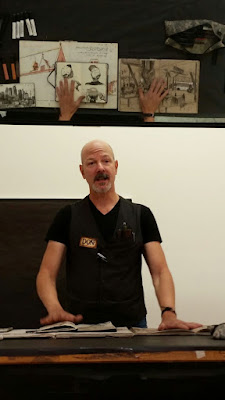
Don Colley teaching at the Daniel Smith store.
The mirror above reflects his sketchbook
examples.
About four years ago, only a couple months after I had started sketching, I went to a demo at Daniel Smith’s Seattle store by Don Colley. Although I had already been hooked on urban sketching by then (seeing images online had gotten me hooked long before I had actually put pen to paper), Don’s sketchbooks opened my eyes – wide. Up to that point, most of the sketches I’d seen online were of buildings and urban landscapes, and as much as they inspired and dazzled me, they also intimidated me. I wanted to sketch them, but I didn’t know how to approach all that architectural stuff. Then I discovered Don’s work – in addition to buildings and urban scenes, he makes breathtaking sketches of people sitting in cafes, sleeping on buses and doing other ordinary things – all the stuff that goes on inside those buildings. It made me realize that people and interiors were part of urban sketching, too, and that seemed much more approachable.

During his demo using Faber-Castell Pitt Artist Pens, Don let us skim through his piles of extraordinary sketchbooks, and one particular sketch stays with me even today – a woman reading in a coffee shop, head down over her book, the light illuminating her hair in a way that is nothing less than magical – sketched with dark blue markers. He did that with markers? Whew. I’ve been following Don’s sketches ever since, continually marveling at his mastery of the human form – both captured in the urban landscape as well as in the life-drawing studio.

Of course I bought a set of Pitt markers after that demo. Unfortunately, my set was defective – it didn’t come with the super powers in Don’s pens, so I soon gave them up.

You can imagine how thrilled I was a few weeks ago when I heard that Don would be in Seattle to teach a workshop called “Travel Drawing - People and Figure”! At last I could learn the magic! Although the course description said that we could use any media we wanted, I decided it would be my opportunity to give those markers another try.

9/27/15 Pitt Artist Big Brush Pens, fountain pen,
Zig marker, colored pencil
On a crispy-cold but beautiful Sunday morning, a bunch of eager sketchers arrived at Daniel Smith to learn Don’s ways. For the first hour, he described his approach to urban sketching and showed many examples from his sketchbooks. He always tries to catch the fleeting elements first – the person who is likely to walk off or other things that may change. Using a lightly toned marker, he quickly sets up his composition, including making small marks to place any figures who might imminently run from the scene. Then, using a range of cool and warm gray Pitt brush markers in a grisaille manner, he builds up the scene. Strategically placing warm and cool tones enables him to differentiate between foreground, middle ground and distance.

Using shading is the most common way to describe three dimensions in forms, but Don also likes to look for patterns to do the job. He showed examples of how sleeve stripes bending around a person’s arm or the upholstery pattern on a chair can give dimension to those forms.

When I asked how he manages to avoid the streaky “marker-ish” look, he said he uses the markers’ tendency to make bands to help describe the texture and direction of a surface. We all watched with fascination as he extended the typical possibilities of markers by using his thumbs to smudge and blend the ink before it dries. He prefers sized paper because the sizing retards absorption of ink, and if sized in the right manner, it prevents feathering and wicking so the drawn lines are crisper, and there is more fidelity to the marks. He also applies the ink directly from the marker to the paper with his thumb, bypassing the marker tip altogether. And that ink all over his thumb? He uses that, too – like a stamp to add texture to fabrics and foliage!

Don’s approach toward urban sketching is to create a “narrative” of the scene before him. “I’m not a camera; I’m an interpreter,” he said, encouraging us to be selective in choosing our composition.

Don uses Pitt markers on more than paper!
Dazzled by what we’d seen in an hour, we were hungry for more. What surprised us, though, was that we would be moving from the cozy classroom to nearby Alki Beach for the rest of our workshop. Remember that crispy-cold weather I mentioned? Had I known, I would have worn more than two layers! Brrrr!

Some hardy sketchers braved Alki’s biting wind, but not me – I ducked into a Vietnamese tea shop with Frances for my first workshop sketch. Through the window was one of my favorite scenes: a utility pole and lots of wires. As Don had suggested, I tried using the warm and cool marker tones to create a sense of distance.

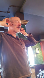
During lunch, while the rest of us scarfed down pizza, Don pulled out more sketchbooks to talk about concepts and techniques. The highlight of our lunchtime “lecture” was when he used a marker on his own face to show how to place features accurately on a head!

The afternoon didn’t warm up as I had hoped, so again, while some sketchers opted to sketch on the beach, I went indoors – this time with Michele to Top Pot Doughnuts. Lucky for me, a laptop-absorbed victim gave me plenty of opportunity to try sketching a person with gray-tone markers. And lucky for both of us, Don decided to get out of the cold at Top Pot, too, so we were able to get his feedback on the spot. With a few deftly made marker strokes, he improved my sketch immensely. (And what was Don doing while we were sketching? He sketched us!)
9/27/15 Pitt Artist Big Brush Pens, fountain pen

As has been true in many a workshop, the key lesson in Dons class was values, values, values. If you get them right, the whole sketch looks right. I don’t know if Pitt markers will become my medium of choice, but one thing is certain: Using a range of gray tones is one of the fastest ways to learn to “read” and understand values. The second thing that’s certain is that there’s nothing magical about Pitt markers – it’s the man holding the markers that makes the magic.

Stay tuned for tomorrow’s post when I show the sketches I made at the Museum of Flight – more value studies with Pitt markers.

Check out the workshop swag from Faber-Castell!

Monday, September 28, 2015

Eclipse

9/27/15 colored pencil, acrylic marker
After a fun but tiring full day in Don Colley’s workshop (my report soon), I went up to Maple Leaf Park with Greg to see the total lunar eclipse. The eclipse started around 5 p.m. PDT, but moonrise was around 7 p.m., so by the time we could see it easily, it was near totality. Although the sky was clear, there must have been a slight haze near the horizon, because the lighted part of the moon looked a bit blurry.

I had big plans to use the sketching app on my tablet so I could sketch in the dark. But I was so tired by then that it was easier to bring along a piece of tinted paper and a white pencil (lighted with my smartphone) then to figure out an app!

We came back home for the second half of the eclipse, and by then the sky must have been clearer, because the illumination was crisp. I switched to my Molotow acrylic marker and a flashlight to make the last two sketches from our bedroom window.

Sunday, September 27, 2015

Ambivalence

9/26/15 ink, watercolor, colored pencil, Zig marker
This maple in my neighborhood is a bit ambivalent about turning for fall. Unfortunately, it is losing leaves faster than its colors are turning.

Saturday, September 26, 2015

Dinner and Graduation at FareStart

9/24/15 ink, colored pencils
Seattle’s FareStart program has a worthwhile mission: Give life skills and training in the food service industry to homeless and other disadvantaged people so that they can get jobs and become self-sufficient. Although I’d known about the program for a long time and had heard that the meals they serve are delicious, I’d never eaten in the organization’s restaurant.

Every Thursday night a local guest chef takes the lead in creating a menu that the FareStart students prepare. (They also serve lunch in the restaurant every weekday and prepare lots of meals for homeless people.) Last Thursday my friend Kathleen invited several friends to her birthday party at FareStart, so it was my opportunity to finally give the place a try. Chef Holly Smith of Café Juanita fed us a spectacular meal (heirloom tomato soup, polenta with chanterelles and green beans, and vanilla panna cotta for dessert! Most of the ingredients are donated by local farmers and businesses). As part of the evening, the current graduates of the 16-week program are honored in front of their peers, the volunteer staff and all of us diners.

The graduation ceremony lasted all of about 10 minutes, so I didn’t have much time, but I wanted to sketch Andrew, one of the two students graduating that night. (His peers were all stacked up behind him on the stairway  an unusual and challenging perspective!) He talked about his personal struggles and how he almost gave up on the program, but now he feels confident that he can be successful doing whatever he chooses.

All proceeds from meals served at the FareStart restaurant go back into the program to support job training and placement. 

FareStart Restaurant
From the tall street-side windows, you can
get a full view of the busy kitchen. I wanted
to sketch this view, but I was hungry, and
dinner was still ahead!


Friday, September 25, 2015

Seawall Construction and the Waterfront

9/25/15 inks, watercolor, colored pencils

The waterfront is a busy place these days. Construction of the seawall had halted during the busy summer tourist season, but now that the dreary weather is back, so are the big, noisy machines and lots of action. Anne had suggested that the waterfront (if weather permitted) and the ferry terminal building (if it did not) would make the area a good sketch outing for the Friday Urban Sketchers, and indeed it did.

9/25/15 inks, watercolor, colored pencils
David Hingtgen has some particularly terrific sketches of the seawall construction activity that I was hoping to take a crack at myself from the pedestrian overpass, but this morning’s drizzle was discouraging. Instead, I sheltered under the ferry terminal building’s awning to sketch the overpass itself (with the Alaskan Way viaduct behind it).

Chilled, I ducked into Caffe Apassionnato inside the ferry terminal building. The café’s window-facing table gave me a warm, dry view of CenturyLink Field, Safeco Field and a bright red seawall construction crane. If you look to the far left, you’ll see two yellow cranes from some other project (plus a tall black thing that looked like some kind of pump).

After the group shared its sketches, Kate and I stopped for lunch at Ivar’s fish and chips bar. Due to all the construction, the sculpture of “Ivar Feeding the Gulls” (which I sketched a couple years ago) is temporarily sequestered from the sidewalk with a chain-link fence. Kate was disappointed that she couldn’t sketch Ivar from the front, but we had a full view of the sculpture from the back as we ate lunch.

9/25/15 ink, colored pencil

Of course we both saved some fries for the gulls


Wednesday, September 23, 2015

Abandoned

9/23/15 ink, watercolor, colored pencils
For about a mile between the Crown Hill and Ballard neighborhoods is a stretch on Eighth Avenue Northwest where the arterial is divided by a long row of trees. It’s one of my favorite streets to sketch in the fall (I sketched it in November last year). Since so many trees in my own ‘hood are already turning, I wondered if Eighth had turned yet. Bound for an appointment in Ballard this afternoon, I allowed a little extra time so that I could stop on the way for a sketch.

I was too early; most of the trees are still dark green. I did get an unexpected spot of color, though – an abandoned couch on the boulevard.

Tuesday, September 22, 2015

Street Colors

9/21/15 inks, watercolor, colored pencil, Zig marker
At right is the traffic circle in the Greenwood neighborhood that is one of my favorites. Instead of just one tree, it has three relatively slender maples growing in it. (Ironically, the trees are leafy enough that the yellow caution sign in the center is barely peeking through.) Last year at just about the same time, the tree on the northern side of the intersection was showing lots of color while the other two were still mostly green. This time I sketched the circle from the opposite side, facing west, and found that the trees are following the same coloring pattern. Last year I intended to return later to see what it looked like when all three trees had turned, but I forgot. This time I made a note on my calendar to go back in a few weeks.

A couple of miles due east in my own ‘hood is the traffic circle below. A dirty brush and some leftover yellow in my Cobalt made for a greenish streak in the sky that got worse when my tree bled into it. But I’m not that picky – color is color – and this is definitely the time of year for it.

9/22/15 inks, watercolor, colored pencil, Zig marker

Monday, September 21, 2015

My Fourth Year of Drawing

Sketched on Nov. 2, 2011 -- one of my first urban sketches. (The view out
my studio window.)
Yesterday at the opening of our Urban Sketchers outing in the International District, a few new people showed up. (Happily, we see new faces at almost every meeting.) Jane suggested that we go around the circle to introduce ourselves and say, briefly, what we enjoy about urban sketching. (This is the moment I dread at any meeting: I don’t speak well on my feet, and I’m convinced that no one listens to what others are saying because they are too busy thinking about what they are going to say when it’s their turn.)

The people who came before me all said things that rang true for me: “When I sketch, I learn about my city,” “Drawing helps me see things more clearly,” “It’s fun.” What could I come up with that hadnt already been said? Then it was my turn, and wanting to quickly get on with sketching, I blurted something like, “Uh. . . I like urban sketching because it helps me learn about myself.”

At that point, I was not listening to what the people who came after me were saying because I was thinking, “What a stupid thing to say! I don’t do urban sketching to learn about myself! Why did I say that?”

Sketched on Nov. 2, 2011 (Green Lake)
As a writer (commercial, creative and introspective) for most of my life, I know that writing teaches me not only about my subject matter but also about myself. The process of composing a sentence, an article or a poem requires understanding my own thoughts enough to arrange them into coherence. And sometimes (often) the actual process of writing is what clarifies the thinking that I thought I had already understood. As a result, I learn about myself.

Four years ago today, I started drawing. I had tried many times in the past to learn to draw, but it wasn’t until I discovered urban sketching that the subject matter resonated strongly enough to keep me practicing. And the reason I wanted to learn to draw in the first place was that I already knew how to tell stories with words. I wanted to be able to tell stories with pictures. Urban sketching is the best way I know of to tell stories with pictures.

I realize now that what I blurted out yesterday was, in fact, true. When I decide what to sketch, when I choose the medium that seems best for describing the subject, when I think about the “story” told by that sketch (as simple as that story might be), when I make the necessary intellectual and visual calculations to render the subject as accurately as I can, when I decide to forget all the calculations and instead just wing it – all of these choices teach me a bit more about drawing. And the act of drawing clarifies my own creative process just a bit more.

Urban sketching teaches me about myself.

Sunday, September 20, 2015

Slices of Many Lives at Danny Woo Gardens

9/20/15 inks, colored pencils
9/20/15 ink, colored pencils

The Danny Woo Community Gardens in the International District offer a fascinating cross-section of urban Seattle. First there’s the interesting mix of architecture – new, boxy apartment buildings stand in the same line of sight as the stately Smith Tower. Scrappy-looking vegetation grows right next to tidy gardens and stands of trees that make you forget you are still in downtown Seattle. Gardeners weeding their P-patches look slightly askance at homeless men who, in turn, look askance at the sketchers occupying their favorite benches. And then there are the chickens (which I sketched last year, too). It’s an ideal sketch outing location for Urban Sketchers Seattle because no matter what your subject interest – architecture, trees, plants, people, fowl – you can find it there.
9/20/15 inks, watercolor

My favorite sketch of the morning is the one at the top of the page – the stone lantern (a 200-year-old gift from Seattle’s Japanese sister city, Kobe) marking tiny Kobe Terrace Park, which is your reward if you climb the gardens’ terraced hillside. A Japanese maple was just beginning to turn behind the lantern. Asleep nearby on the stone wall was a homeless man, covered in blankets.

9/20/15 brush pen, ink, watercolor

Saturday, September 19, 2015

Museum of Flight Celebrates 50 Years

9/19/15 inks, colored pencils, Zig marker

The last time I visited the Museum of Flight in March (and all the times prior to that, even on a Saturday), people were everywhere, but the facility is so huge that I never felt overwhelmed by the crowds.

Not so today.

Several hours after opening time, a long line of people still flowed
steadily into the museum.
To celebrate its 50th birthday, the museum rolled its usual $20 admission price back to its 1965 ticket price: 50 cents! That – not to mention the fact that the Astronauts on the Town Instagram contest winner would be announced – brought in an astounding number of visitors. A huge line of people was waiting at the door when I arrived about 10 minutes before opening, and a line was still flowing down the walkway when I left a few hours later.

Needless to say, the already-substantial challenge of sketching in the museum was compounded by crowds everywhere. I went up to the third floor to sketch the Great Gallery, where all 25 Astronauts on the Town surrounded a couple of the aircraft on the floor.

Dressed in '60s garb, Kate poses with her fave astronaut!
Speaking of the Astronauts on the Town, while I got around to sketching only three of them (at Fran’s Chocolates, Salty’s on Alki and Third Place Books), Kate Buike sketched all 25! The Museum of Flight, where Kate is a volunteer, was so impressed that her sketches were used in the promotional placards about each astronaut. 

Friday, September 18, 2015

A Kid With a New Box of Crayons

9/18/15 rainbow pencil
There’s no doubt about it – fall is here. Yesterday we had a good, solid rainfall, the trees are all turning, and I’m wearing socks again. I decided to give the change in seasons my personal initiation ritual, which was to sketch at Zoka Coffee.

It had been months since I’d sketched there, and even longer since I’d been to life drawing at Gage. To quickly get past that feeling of creakiness when I start drawing people again, I pulled out my new favorite toy: multi-colored pencils! You already know about the Koh-i-Noor Tri-tone colored pencils that I recently rediscovered. They are so much fun that when I saw some rainbow pencils on Amazon, I had to get a bunch of those, too. Seven colors are together in a single lead! I’m sure they’re intended for kids (the marketing information recommends them for party favors, Easter baskets and stocking stuffers), and Im obviously the target audience – whenever I use them, I feel like a kid with a new box of crayons!

9/18/15 rainbow pencil
I’ve never been a fan of sketching with graphite, but colored pencils are something else entirely. I wish the leads in these multi-colored pencils were a bit softer (I’m used to the delightful softness of my favorite water-soluble Caran d’Ache Museum pencils), which would make shading easier. But they more than make up for softness with the fun factor. After a few sketches with these, I’d gotten over my creakiness, and I was ready for rainy-weather coffee shop sketching again (maybe I’ll even take these pencils to a life drawing session). 


9/18/15 Tri-tone pencil


Thursday, September 17, 2015

Interrupted

9/17/15
At South Lake Union Park this morning, the sky looked iffy; the weather report had said rain was imminent. But on our way into the Museum of History and Industry, I spotted a lovely wooden schooner moored in front of the museum. I told Greg and Mary to go on inside, and I’d catch up with them, because I had a feeling that if I waited until after we finished going through the exhibits, the weather would change, and I’d miss this sketch. I was wrong. It started raining after only a few minutes, so I missed only half the sketch.

It got me thinking about all the parts and pieces of half-finished sketches in my sketchbooks over the years. Interrupted by rain, circumstance or, most likely, the subject walking (or flying) away, these are a few I found just from the last couple of months. A pity that they remain unfinished, but on the other hand, a half-finished sketch is still better than twiddling my thumbs.
7/14/15
8/16/15
8/3/15
8/19/15
9/8/15
8/30/15

Wednesday, September 16, 2015

Verrrrry Interesting Pilot Parallel Pen

Check out the wide, flat nib on that Pilot Parallel pen!
The Pilot Parallel fountain pen has been on my radar at various times. I have been curious about the very flat, straight-across nib that calligraphers use to achieve amazing effects (just Google “calligraphy with Pilot Parallel pen,” and you’ll see dozens of impressive videos and images), but I’m not a calligrapher, so I knew I wouldn’t use it for that purpose. More recently I started seeing examples of expressive drawings done with the pen (try Googling “sketching with Pilot Parallel pen”) that got me curious all over again. I found a good deal on a set of four nib sizes on Amazon (about $6 each), so I decided it was time to satisfy my curiosity.

We were heading out this morning to show our visitor Kubota Garden, so I grabbed the 6mm size Pilot Parallel on my way out the door (that’s the largest size in the set; others are 1.5mm, 2.4mm and 3.8mm). I’ve been resisting spending too much time sketching while playing host and tour guide, but I’ve sketched at this garden several times now (most recently with Urban Sketchers Seattle in June), so it was a little easier this time to resist the garden’s rugged yet serene beauty. Still, I grabbed that Pilot Parallel for a reason: I had a hunch it would be a good implement for sketching trees quickly – and I was right!

9/16/15 ink, Pilot Parallel pen
Taking only a couple of minutes each, I was able to scribble these studies of a pine, a fir and (incongruently!) a banana tree. The pen can make a very broad mark when pulled in one direction, yet can also make a very fine line. Although I’ve tried sketching with Lamy calligraphy nibs as well as the Platinum, Sailor and Franklin-Christoph music nibs (which aren’t technically calligraphy nibs but seem to behave like them), the 6mm Parallel nib is an extreme case. And I love it! These trees were only my first attempts, but I can clearly see the potential of the very interesting Pilot Parallel.

I’ll write a full review after I’ve had a chance to mess around with the pens more, so consider this a teaser. 

9/16/15 ink, Pilot Parallel pen

Tuesday, September 15, 2015

Star Stuff and Chocolates

9/15/15 inks, colored pencils
Still playing tourists in our own town, we took our visitor to Fran’s Chocolates in Georgetown for a chocolate break. I’d forgotten about the Astronaut on the Town there, so while Greg and Mary watched the ladies making chocolates by hand, I got my opportunity to sketch one more astronaut. (It was probably my last chance to enter the selfie contest; the Museum of Flight’s 50th anniversary celebration culminates this Saturday. The other two astronauts I’ve sketched were at Third Place Books and Salty’s on Alki.)

Star Stuff,” painted by Abigail Kinney Maxey, is inspired by a quotation by Carl Sagan. According to the artist’s statement, “Common living things, such as a dandelion plant, are celebrated in constellations to honor the existence of life in our vast universe. Design patterns bring to mind a starry night sky, bubbles in water, grains of sand, or single living cells.” I don’t know about the universe, but eating Chocolate Imperiales while chatting and coloring the astronaut’s suit is a delightful way to honor the existence of life here on earth.


One more selfie with an astronaut to enter the Museum of Flight's
competition!

Related Posts Plugin for WordPress, Blogger...