Showing posts with label ballpoint pen. Show all posts

Saturday, June 13, 2026

Getting My Ballpoint Chops Back


6/10/26 The Sanctuary and Smith Tower, downtown Seattle

MJ and Roy sketching inside Columbia Center

Last winter when USk Seattle met at Madison Centre, Roy and Mary Jean both missed out. Since our art play date on Wednesday began with a cold morning, it was a good opportunity to introduce them to this cushy, indoor location. With floor-to-ceiling windows all around, this office building’s lobby offers great views of old and new downtown architecture.

Since it was National Ballpoint Pen Day, which I observe annually, I brought along a trusty Bic 4-Color, one of my favorite ballpoints for drawing. It had been a long time since I last sketched with ballpoint, and my hatching felt rusty. While I was a little reluctant to take on architecture, the lovely domed top of The Sanctuary inspired me to push ahead anyway (above). Behind the dome was the glassy, ultra-modern F5 Tower (F5? Whose dumb idea was it to name a skyscraper after a function key?).

Feeling warmed up, I moved on to my beloved Smith Tower (like the Space Needle, it’s a subject I can’t resist if I see it). Hatched clouds – now, that’s something I don’t recall trying before!

W Hotel and Columbia Center lobby stairway

Bic 4-Color for the win!

By the time I finished that page, the morning began warming up, so I walked across the street to the federal courthouse’s sunny lawn. From there, I had a nice view of the pyramid atop the W Hotel. (Can you see the pattern here? I like to draw only the tops of buildings.)

After lunch at Columbia Center’s food court, Mary Jean and I both tackled the intriguing lobby staircase that offers seating along the sides. As soon as I began, I regretted the subject – all that horizontal hatching!

It was a fun day of getting my ballpoint chops back.

Wednesday, June 18, 2025

Ballpoint at Stone’s Throw


6/10/25 Stone's Throw Coffee and Market, Wallingford neighborhood

I recently heard about a coffee shop that opened just a couple of months ago in the Wallingford neighborhood. Ever searching for my ideal “third place,” I like to try every nearby venue. In addition, it was National Ballpoint Pen Day, giving me another reason to check it out, Bic in hand.

I should have known by the address that Stone’s Throw Coffee & Market would be noisy – it’s right on the busy intersection of North 45th and Stone Way North (Get it? Stone’s throw?). The spacious, shady patio has a decent sketching view that I would have enjoyed, if not for the traffic noise (amplified by the leaf blowers working on the adjacent sidewalk). A pity on an otherwise lovely afternoon.

The interior could be promising, as the coffee shop is also a small store of gourmet-ish, picnicky foods and such that could be sketchable. I’ll give it another try on a rainy day.

Friday, November 1, 2024

InkTober Finale: Lackadaisical


Gel ink

Bic ballpoint

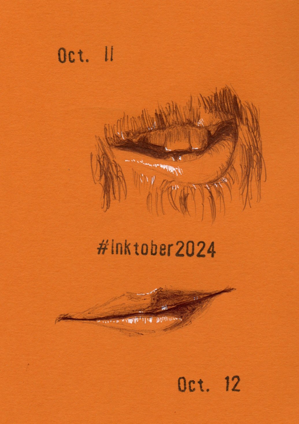
I began InkTober 2024 lazily, and I finished lackadaisical. Less than halfway through the month, I was already bored because I didn’t challenge myself enough, which I regret. By the third week, I was just going through the motions. As I always say, what’s the point of doing any drawing challenge if it’s not actually challenging? It bothered me that I didn’t think of a way to push myself harder (and truthfully, I was so preoccupied with my ongoing downsizing tasks that I didn’t want to spend more than 15 minutes a day on InkTober).

Bic ballpoint

Uni Pin and Sakura Micron technical pens

That’s not to say that I didn’t learn
anything. Just as I’ve discovered from all my face-parts series, human mouths are fascinating – the infinite range of shapes and forms – and exposed teeth really kicked up both the fun and the difficulty. OK, so maybe it was a bit challenging – I can live with that.

Sailor Fude de Mannen fountain pen and 
Platinum Carbon Black ink
As always, many thanks to Earthsworld for his daily Instagram photo references (all but Oct. 31) that made finding inspiration so easy.

Edited: I just put all my Inktober 2024 sketches into a Flickr album. I rarely make a series that looks consistent throughout, but I do like the way they all look together in a grid!

My apparent tradition for these face-parts series is to end 
with a selfie. ;-)


Wednesday, October 23, 2024

Ballpoint Nuances


Both sketches made with Bics

I rarely discuss the nuances of ballpoint pens, but if not during InkTober, when? Now that I’m three-quarters of the way through the month, I’m finally running out of styles and unique specimens of Bics – my favorite ballpoint pens for drawing. Of course, I certainly have numerous Bic 4 Colors in various color combos and probably an infinite number of advertising Clics and Stics (or at least I used to; I was merciless during my recent dejunking of drawers). But I thought the challenge would be more interesting if I started trotting out other ballpoints I have.

Oct. 17: Bic; Oct. 18: Caran d'Ache

Although Bic is still my favorite by a wide margin, if I had to choose a No. 2, it would be the Caran d’Ache 849 ballpoint (Oct. 18 at right). I have several, but they differ only in body color. It’s kind of the opposite of the Bic: Overpriced but made of a solid yet lightweight metal body and a quiet, bouncy knock. I wouldn’t own so many just for the varying bodies, though, if I didn’t like the ink (contained in Caran d’Ache’s overpriced, proprietary cartridges, of course). It’s not Bic, but it’s smooth and reliable to draw with (at least for small studies like these). It just takes longer to build up values. One positive quality is that it never blobs like Bic ink is prone to doing regularly.

Worse yet for building values is the Uni Jetstream, which is my favorite for writing but one of my least favorites for drawing. The sketches for Oct. 19 and 20 (below) made a convenient page (almost like a product comparison test) of basic Bic Clic and Cristal pens (Oct. 19) and a Jetstream (Oct. 20). I’ve said this before, but Bic ink is like a graphite pencil in its pressure sensitivity and ability to layer with subtle gradations. My technique is the same in both of these sketches, but the individual lines are more apparent with a Jetstream.

I should also pause here to mention that I’ve been using a white 0.5 Sakura Gelly Roll all month for highlights, and I’ve been pleasantly surprised by its good behavior. It hasn’t clogged yet. (I have more than week to go . . . I hope I haven’t jinxed it.)

Oct. 19: Bics, Oct. 20: Uni Jetstream


Two "grades" of Bics used for this one


Friday, October 18, 2024

Upping the InkTober Challenge


Despite my claim of seeking laziness, I was feeling bored and unchallenged by my InkTober mouth theme. What’s the point of doing any drawing challenge if I’m not challenged? It was time to up my game – with exposed teeth! Anyone who has ever made a smiling portrait knows that one of the hardest features to render are the teeth without getting the jack-o-lantern look. It’s a worthy challenge.

I especially enjoyed rendering the unusual
view and lovely backlighting of Oct. 10.

In particular, I’ve become intrigued by the complex values involved in these close-up, small studies of the mouth. In addition to the usual form shadows of the lips, the upper lip usually casts a subtle shadow on the teeth. If the tongue is visible, the teeth may be casting a shadow on it, too. And the darkest value always belongs to the deep cavern of nothingness behind (or between) the teeth.

As always, my thanks to Earthsworld for an endless source of reference photos. Now that I’m looking specifically for exposed teeth, I have to scroll a bit sometimes to find what I need, but I’m still trying to be as random as possible by picking the first one I see.


Monday, October 7, 2024

Lazy InkTober


Painter John Singer Sargent once said that a portrait is “a likeness in which there is something wrong about the mouth.” Indeed, with all the portrait practice I’ve done with Earthsworld’s reference photos, I have definitely found the mouth to be challenging. If the head is turned even slightly, perspective and foreshortening complicate matters. Worthy of concentrated practice, the mouth seemed as good a theme as any for InkTober this year.

Despite that inherent challenge, I must admit that my primary motivation in choosing the theme was sheer laziness. As I did last year with noses (and ears for Pencilvember), using Earthsworld’s daily image posts makes finding a reference photo fast and easy. In fact, I upped my laziness game further this year by deciding I would sketch whatever mouth Earth posted that day – no scrolling required!

As for ink, I’ve been using Faber-Castell Pitt Artist Pens and acrylic markers so much lately that I’ve been missing good ol’ Bics. I may change it up later in the month, but for now, I’m just going with that basic of pens. Paper was a no-brainer: October screams for an orange Uglybook.

Happy InkTober to those who are participating (it’s my 10th year)! I’m posting daily on Instagram, and I’ll report in here on my blog periodically.


Happy birthday, WB!

By the way, Oct. 5 was Weather Bunny’s eighth birthday! Although I don’t always remember to observe her birthday, it was during InkTober of 2016 that I first made the prototype sketch that would eventually evolve into the WB we know today. The organic way in which she developed is one of my best examples of how a creative challenge like InkTober can lead to unexpected and unplanned results – which makes them worth doing, even if the challenge itself might not feel productive.


Tuesday, June 18, 2024

“Untethered” Sketches

5/16/24 Maple Leaf neighborhood. On a golden hour walk,
I found the distant downtown buildings to look more silvery than gold.
As I sketched, a bird nearby caught my attention, so I quickly used the
Merlin app to identify it while also trying not to lose the rapidly falling light.
OK, I guess this sketch does have a story!

Although it may seem like all my urban sketches are now taking a comics-like form, I still make some one-off sketches on location that have no sequence or inherent story. (And some one-off sketches do have a full story – at least told in words.) My current focus on the comics approach, however, makes those sketches feel incomplete in some way – like I left the scene without finding one more sketch that would have given the first sketch more context. Regardless, I value all sketches, even the ones that now feel story-less. They are simply part of a different process.

5/17/24 Ducks near Green Lake

6/6/24 Rabbit seen on my walk

I recently read Craig Thompson’s Carnet de Voyage, a sketchbook diary about the comic artist’s travels through Europe. Initially, I thought all of the exquisite brush pen drawings were made on location, but that’s not the case; I think many were done with photo references and from imagination. Nonetheless, they were all done during the trip itself, not afterwards, and are impressively finished drawings that do not look “sketchy” at all.

5/23/24 Roofers at our neighbor's house (On second thought, I think this qualifies as comics.)

This quotation from Thompson’s book resonated with me and helped me identify the difference between a comics sequence and a one-off sketch:

A page of comics has its home – in a story; in a book. But a sketch is untethered, exposing process. The lines themselves aren’t special, but the memory attached to the stillness while making those lines.

Whether a sketch is part of a sequence or “untethered,” it always becomes special from the memory of making it. That has always been the most important part of urban sketching: My sketches are not necessarily about “special” moments; they are moments made special because I sketched them.

5/10/24 Maple Leaf. A walk during the golden hour.

6/10/24 Maple Leaf. A sketch for National
Ballpoint Pen Day.


Sunday, January 28, 2024

Kittens’ Skin


1/26/24 Kittens' recently shed skin and open jaw

It was time for a haircut, and you know what that means: Another opportunity to sketch the resident snake! A mix-up when I made the appointment meant that I had to wait a while, but I didn’t mind at all – I spent the entire half-hour observing Kittens. Very actively slithering around her tank, she occasionally raised her head in my direction. With her tank full of props and toys, I can never see all of her at once, so I sketched various segments separately. At one point, she suddenly opened her jaw to its full extension – maybe yawning? I was so startled that I didn’t get a look at her teeth.

In the bottom sketch, she was resting her head on her tail,
and it made me think of the classic snake-biting-its-own-tail symbol. 

She had recently shed her skin, which made it easier to see and sketch the beautiful network pattern.

My barber told me that Kittens really loves being handled. Non-venomous, she doesn’t bite (I wish I knew what kind of snake she is so that I can learn more about her). When the owner (of the shop and of the snake) is working, some clients will ask to hold Kittens, and she enjoys the attention. When I think of animals to cuddle, snakes do not come instantly to mind, but I’ve also never known one personally. If the owner is ever there when I am, I think I might ask to hold Kittens. Apparently she gently wraps a few times around your arm, then raises her head to look at you. (Maybe I’ll first find out how long it has been since her last meal before asking to hold her.)

Saturday, December 9, 2023

Birch Bark: An Ideal Blank Canvas


Looking forward to filling more blank canvases!


When Field Notes Brand released its fall quarterly edition, Birch Bark, its white, subtly speckled cover was supposed to evoke the “simple, elegant and austere” bark of birch trees, but I saw only one thing: a blank canvas waiting to be sketched on! But what would the cover stock be like to draw on?

Field Notes likes to try lots of different cover stocks for its quarterly limited editions, but many tend to be smooth and even glossy – not ideal for some drawing materials. The first thing I did was to scribble a bunch of media on a back cover. For something like a notebook that’s going to get daily wear, tear and possibly splashes, I don’t want to use anything water-soluble, but just for fun, I tested a few anyway. As suspected, the paper is not great for wet media, but markers and other inks did well. More surprisingly, the cover stock has a delicious tooth that’s great for graphite, colored pencil and – the pencil of pens – Bic ballpoint!


Graphite would probably be beautiful, but constant handling would likely end up a smudgy mess. As a compromise, I chose a Bic for my first try. It has the closest look and behavior of graphite, but it’s both water- and smudge-proof.

Initially I thought a technical or fountain pen would also work well, but now that I’ve drawn on the stock’s texture, I’m wondering if it might be too toothy, especially for a fine nib. A brush pen seems OK, though, and my Platinum music nib did well, too.

Drawing this raccoon (the one who begged from our backyard a couple months ago) was so much fun that I think more animal portraits would be the ideal subject for Field Notes covers. Birch Bark might be the most fun edition since Sweet Tooth!

Wednesday, November 1, 2023

Giving the Brain an Opportunity


10/25/23 Prismacolors in Uglybook
10/24/23 unfinished


My sporadic portrait practice continues in different media and approaches. Earthsworld’s seemingly endless supply of portrait reference photos makes it too easy to try a new medium or idea with a portrait. Sometimes I just want to feel productive when I’m tired and would rather eat chips while I view silly YouTubes. All of these shown here were late-night works of the latter type.

All were made from Earthsworld reference photos except the first one (above), which has an interesting process story. Christophe Swijsen, a French cartoonist and caricaturist, is the tireless moderator for the Facebook group dedicated to artists who are fans of working from Earthsworld portraits. Every day, he selects and posts an image from Earthsworld’s vast catalog, and group members respond to his challenge by sketching the selected reference and sharing in the group. The group is such a fun, inspiring collection of wildly different styles and skill levels.

9/11/23 Prismacolors in Uglybook
On the occasion of his birthday, Christophe posted his own selfies and challenged members to draw from them! It was late, and I was tired, but I couldn’t resist honoring Christophe with a portrait. Unfortunately, all of the images he offered were taken in the shade with flat, mostly consistent lighting on his face – the hardest kind to draw. Although I knew it wasn’t ideal, I gave it a shot anyway.

The next morning when I was going to share it on the Facebook group, I realized I was dissatisfied with my tired, half-hearted attempt the previous night. That same week, I was working on sketching from memory in Kathleen Moore’s class. I had been thinking about how different the experience of drawing is when I don’t have a reference to observe as I draw. Instead of going back to the reference photo of Christophe, I just gave stronger contrast to the sketch where I thought it should be, even though it wasn’t in the photo.

10/4/23 AmazonBasics colored pencils in
Field Notes Streetscapes sketchbook

I know many painters use reference photos only as inspiration and a point of departure, and eventually they stop looking at the reference while they turn their painting into something that is much more than a copy of a photo. But because I’d done nothing but draw from direct observation for so long, it is taking me a while to learn not to depend so exclusively on my eyes. I should give my brain more opportunities to show that it knows what to do, even without having something to observe. This isn’t much, but it’s a start.

Since I’ve just wrapped up InkTober (final post coming soon), this is an ideal opportunity to again acknowledge France Van Stone, whose online courses in crosshatching a year ago gave me the confidence to take on portraiture like I never had before – and gave me the skills to keep right on going beyond InkTober. Even when I’m not crosshatching, the principles she teaches still apply. I think about them with any medium or technique. 

9/15/23 Derwent Drawing pencil in Uglybook

10/29/23 Bic ballpoint in Moleskine sketchbook

Tuesday, October 10, 2023

InkTober, Days 1 – 7


Inktober 10/1 - 10/7/23

Less ambitious than last year, InkTober is nonetheless focused and still fun: A nose a day with the added challenge of designing the sketches on a page spread. I finished the first spread, so it seemed like a good time to make a post here. Without much of a plan, I used various versions of Bic ballpoint pens for Days 1 through 7.


I’m already appreciating the nose more than I ever have, both as a facial feature and its anatomical structure (to draw, though I suppose I appreciate its anatomy every time I take a breath). I sometimes wonder if someone would recognize their own nose if the rest of their face were cropped out of an image (all sketches here were made from Earthsworld photos). Each nose is so unique that I think they would.

Without the context of the rest of the face, can you tell whether a nose belongs to a man or woman? Whether the owner is young or old? White, black, Asian?

The nose on the left belongs to a face so interesting that I sketched all of it
a couple days later (you'll see it eventually).


I had left the stamps as they were on April 26, 2021.
To give the page spreads a more cohesive appearance, I’m using my Shiny DIY Printing Kit to stamp the dates. Purchased for the 407 consecutive sketches in my pandemic hand series, the stamps still showed the date from my last use on April 26, 2021, when I ended the series. It felt nostalgic and even poignant to see the stamps again.


Happy birthday, Weather Bunny!


Speaking of nostalgia, last week I celebrated Weather Bunny’s seventh birthday. Her first prototype was an InkTober sketch on Oct. 5, 2016. She went through many iterations and organic changes until she became the character I eventually came to call Weather Bunny. Although some years may be less ambitious than others, InkTober always nudges my creative growth in some way. I look forward to seeing what happens by Oct. 31 this year.

Related Posts Plugin for WordPress, Blogger...