Showing posts with label vintage pencil. Show all posts

Tuesday, May 27, 2025

The Best of Collecting


The keepers from my well-used random lot

Several years back during the pandemic (when I had time to do most of my heavy-duty colored-pencil geeking – one of the few positive outcomes of that era!), I wrote a lengthy post about Canada-made Eagle and Berol Prismacolors. At the time, the only Canadian Prismacolors I owned were a heavily used, random lot I had purchased on eBay plus a few that were given to me. The lot was sort of a placeholder that I could use and test until I achieved my goal, which was to eventually find a reasonably priced, complete set made in Canada.

The full Canadian set

By the end of the pandemic, I did manage to find such a set – intact, unused and fully made in Canada. It’s a prize specimen that I cherish!

One of my main downsizing criteria has been to eliminate duplicates. It was time to offload the random lot I had enjoyed sketching with and had also used to make informative comparison tests with US-made Prismacolors of the same era. 

Before donating most of them, I took the time to appreciate each pencil and pick out a few favorite colors. I also picked out at least one each that had been self-ID’d by MB, Sylvie and Alex. I enjoy imagining these (probably) Canadian children or their parents diligently knifing off the paint on each pencil so that their names could be written (Alex seemed to prefer carving directly into the paint with a ballpoint pen). I sharpened up the handful and put them in a jar for display.

Hard work getting those names on!

One of many things my downsizing project has taught me is what “collecting” is about (at least for me). Early on, it was about my growing fascination with learning about vintage pencils, which rapidly developed into obsessive (and sometimes indiscriminate) acquisition. Eventually I learned what I wanted to collect, which made me more judicious, but by that time, the acquisition phase had gotten out of hand. Now I’ve come full circle to the best part of collecting: Letting go of the excess so that I can appreciate what I’ve chosen to keep.

I don’t feel guilty or regretful about any of it; it’s a process, and I enjoyed and learned from every stage while I was in it. Someday I’ll probably have to part with most (or all) of my collection, but until then, I can enjoy this best and final stage.

Monday, May 19, 2025

Downsizing, Phase 2: Done! Really Done!


This part of the livingroom has been transformed into my personal museum plus a much-needed utility table (at right). The desk at left, which I've had since I was a teen, blocks the fireplace that we stopped using decades ago for safety reasons. The drawers are filled with vintage pencils and contemporary stationery supplies. The two clocks on the mantel are family heirlooms: Greg's (on the left) and mine (on the right).

The last mile isn’t the longest. It’s the last 10 feet.

Despite being enough “done” with my massive downsizing project to celebrate with a trip to LA last month, I still had three boxes of randomness to contend with – all the dribs and drabs that I didn’t have a proper home for, yet wasn’t quite ready to get rid of. I’m still packing boxes that will go to Seattle ReCreative, where I’ve been donating art and craft supplies that weren’t ready for the last gab & grab. Most, though, wasn’t supplies; it was artifacts from my past that are just so hard to let go of. I finally managed to fit the vast universe of indecision into one box – and hauled it to the basement for further procrastination. “Someday” I’ll have to reopen that box, but that’s not bad for nine months’ work!

Although it's not as fun as my "museum," this utility table (formerly my drawing table) is something I have been wanting forever -- a dedicated space for my paper cutter, postage scale and shipping supplies. I used to have to haul each of these things out whenever needed, and then clear space on my drawing table to use them. Not anymore!

Meanwhile, I’ve been thoroughly enjoying displaying and arranging my remaining pencil collection – the part that actually sparks joy instead of just taking up space – and lots of personal memorabilia and family heirlooms. I’ll probably continue tweaking endlessly, as my intention is to rotate the vintage pencils on display with the ones stored in drawers so that they all get a chance to see the light of day once in a while. But as of today, I am really and truly done done with Downsizing, Phase 2! (Details in the cutlines.)

This image and the one below are the two built-in bookcases flanking the fireplace. My very judiciously culled books remain on the bottom shelves, and the upper shelves hold some of my more picturesque vintage colored pencil specimens. The rustic broom was handmade in Kyoto's last remaining craft broom shop (which has since closed).


I have a couple of vintage Japanese desktop drawers. . . .

. . . these drawers hold most of my remaining fountain pens . . .

. . . and yes, a whole drawer just for erasers!


The inlaid-wood tray was made by my maternal grandfather while he was incarcerated in Tule Lake internment camp during WWII. My family owns several other items that he made during that time. (In case you're concerned, the vintage and heirloom pieces are secured to the wall and mantel with museum putty. I do live in earthquake country.)

My childhood piggie bank, bronzed baby shoes and beloved Spirograph set (all pieces still intact)!

I'm not clear on who made the shogi (similar to chess) board and pieces (displayed in a drinking glass behind the board) -- either my grandfather or an uncle. I have fond memories of my dad playing this game in the evenings with our neighbor for many years.

These are mostly contemporary pencils that I don't use but that hold special interest.

Vintage stationery items, Century 21 World's Fair stamps, and my father's Eagle Scout ribbon are visible here.

A handmade teddy bear and some colorful vintage sets, plus a vintage Nicholson's Peerless watercolor set in front.

On the facing wall is the TV console and matching credenza (we got both pieces at our neighbors' moving sale years ago for a hundred bucks! So much storage space!). The drawers are full of my vintage colored pencil collection and watercolor supplies. Also visible: hand weights and yoga props, since this room is also my gym and yoga studio. On the wall is a beadwork piece I made in 2008. My plan is to move this large piece to a back hallway and replace it with several artworks I've purchased from urban sketchers. The hold-up is that I still have to get them framed.

Here's a peek inside the largest compartment, where vintage pencils must share space with the dang DVD/BluRay player, which I still can't quite let go of -- yet.

Thursday, January 30, 2025

Vintage Colored Pencils: “Triple Stripe” Caran d’Ache Supracolor II

A grail from an unexpected place!
 

If you’re surprised to see a new post from me about vintage colored pencils, believe me, I’m equally surprised – not to mention thrilled!

My St. Bernard tin of Prismalo II
Since you’re geeky enough to care (and if you’re not, you’re following the wrong blog 😉), this would be a good time to review the Caran d’Ache watercolor pencil history post that I began in 2019 and last updated in 2023. Toward the end of that post, you’ll see a small tin of Prismalo II Soft pencils with an image of a St. Bernard. I purchased that tin on eBay containing a mishmash of well-used pencils. The ones imprinted with “Prismalo II Soft” notably include three gold stripes near the white end cap. Since the inexpensive “set” was such an incomplete mess, I didn’t think it was reliable in terms of determining without doubt what kind of pencils came in the St. Bernard tin. However, other specimen images I had examined on eBay led me to believe that the “triple stripe” pencils did belong to the St. Bernard era.

As my historical post surmises, the softer form of Caran d’Ache’s water-soluble colored pencils during this era was called Prismalo II Soft, and that name would morph into the current product name, Supracolor II Soft (and eventually just Supracolor II). I’d seen other Prismalo II sets on eBay with variations of the St. Bernard image, and I’d also seen Supracolor II tins with a mostly solid red lid. All of these sets seemed to contain pencils with the triple stripes. Based purely on eBay sightings, I surmised that the triple-stripe era had been somewhat shorter (and therefore rarer) than other designs.

The stripe pattern changed a bit also: The Prismalo’s stripe pattern was thin/thick/thin. In its Supracolor II form, the pattern had changed to three stripes of equal width. It seemed to be of historical significance (if only in my brain) that the triple-stripe design marked the transition between the Prismalo II name and the Supracolor II name. (If, by this point, your eyes are glazing over, don’t say I didn’t warn you! 🤓)

Triple-striped pattern of Prismalo II

I got a bee in my collector’s bonnet to hunt down a complete set of triple-striped Supracolor II pencils, preferably with the St. Bernard image on the tin (the latter just because it’s adorable). It was still on my “hunting” list early last year when I made the commitment to downsize and, therefore, to stop collecting. Although I had not added any new vintage specimens to my collection since then, it’s hard to delete the list from my mind.

That’s why you could have pushed me down with a feather at last week’s Gab & Grab when I spotted this tin: A complete set of Supracolor II with a whole family of St. Bernards! And – gasp! – three gold stripes on the barrel! The Urban Sketchers G & G is just not the kind of place I would expect to find a grail, and yet there it was – and the owner was my good sketching buddy, Roy! Neither he nor I had known that my grail had been in his studio all that time!

Slightly different triple-stripe pattern on the Supracolor II set I recently acquired.


Price sticker on the tin

He had purchased the set at a store called Amsterdam Art (for $16.56 on sale!) in the Bay Area where he had been living from 1977 to 1982. Now I have a definitive date marker for this set’s design and the era when Caran d’Ache made the name transition from Prismalo II to Supracolor II.

What a score! The only item I took home from the Gab & Grab, the St. Bernard family will now have a happy home in my new studio. Thanks, Roy!

Incidentally, I have plans to display my vintage collection properly once my furniture is in place. Back in 2018 when I first began collecting, my entire collection fit beautifully on a few bookshelves. That era certainly didn’t last long! I want to get back to that type of collection display – small enough to see and appreciate everything, not just stacks and stacks that I have to move around just to find what I’m looking for. It may take a while to get there, but I will certainly photograph the results when I arrive.

(While digging through my blog for that post, I also came across this one in early 2018 about my resolution to de-stash! I’m happy that I had documented that event – it makes me realize how much re-stashing had occurred in seven years!)

Edited 3/5/25: Caran d'Ache just posted these images on Instagram, one of which includes nice historical pencil logos. 

Thursday, January 18, 2024

Vintage Berol Prismacolor “Limited Edition” Set


Berol Limited Edition set of 48 Prismacolors

This Berol Prismacolor set in the gold foil “limited edition” box was taken off my wish list a while ago because I had acquired a used, incomplete one – a good “user” set that I am, in fact, using. But I have always had doubts about whether it was in its original state. Some pencils had different logos on them, as if they had been replaced by a previous owner. (Although I know that manufacturers sometimes mix production lines when a design is in transition, surely this wouldn’t be the case with a “special” set like this.) The back of the box offers no information at all about which colors the set is supposed to contain. When I matched the colors to currently available colors, almost all are still available, so it’s not as if the color selection was “limited” in production. In what way, then, was the set “limited”? For example, how different is it from the “standard” set of 48 Prismacolors from the same era?

The second gold set I found (for a decent price – seems like the vintage Prismacolor secondary market is getting a bit softer lately) was unsealed but complete, and all pencils were unsharpened. The Berol logo and other branding are identical on all pencils. I feel confident that this set is in the same state as when it was new.

Complete, unsharpened set


The back of the box, with a 1996 trademark date, identifies Sanford (“a Newell Company”) of Bellwood, Illinois, as the maker, which is typical of Prismacolors from this era. (Berol was acquired by Empire in 1987, and Sanford acquired Empire-Berol in 1995.) Otherwise, the shiny, gold packaging is totally uninformative – no marketing information about the pencils, no color swatches, names or numbers – nothing. It’s obviously intended for “collectors” and not for general consumers.

The back of the gold box is particularly uninformative.

I also have a 1997 set of Berol-branded Prismacolors (also made by Sanford) in the standard packaging of that era. Although the back of the box does include some typical product and marketing information, its list of included colors is a very non-functional table of swatches with no color names or numbers! I compared the branding on the pencils from the two sets and also matched the colors one-to-one (this was the relaxing activity I was occupied with the other day): All the pencils and colors are identical.

Standard Berol Prismacolor set of 48

Back of standard Berol Prismacolor box

Extremely uninformative swatches with no color names or numbers.

So the answer is that nothing at all is “limited” about the set except the shiny, gold box. So if Prismacolor fans of the mid-‘90s had missed out on the 1996 “limited edition,” they only had to wait a year for an identical, standard set to be released, missing out only on the gold box. I guess that’s fair; I’ve certainly purchased contemporary sets from Caran d’Ache, for example, containing standard products that had been repackagedin some way. I wonder how consumers of that era felt about that?

The problem with being a vintage pencil collector is that even if the Internet had existed when the pencils were originally released, certainly blogging and YouTube hadn’t yet been invented. There’s no place to go to hear a buyer ranting about how all 48 of the “limited edition” colors were the same as the regular edition. We can only speculate that some were annoyed while others (like me) were thrilled to have the gold box.

Come to think of it, without blogs, YouTube and other social media for consumers to rant or rave about a “limited edition,” how did people even find out about them? And if they did happen to stumble upon them in a store, there’d be no way to excitedly “unbox” them for followers to drool over. If a box of Prismacolors falls in a forest, and there’s no one to notice that it’s a limited edition, does it make a sound?

Perhaps falling silently. . . but ahhh -- so relaxing!

Edited 1/19/24: A blog reader requested the names of the colors in this set, so I have happily obliged (what else is a colored pencil geek for except to provide public services such as this?). Amazingly, except for just two or three, all were in numerical order in the box! While I was at it, I checked the colors against Blick's current open stock listing. The only color that is no longer available is Lilac (956), which was discontinued about a year ago.

901 Indigo Blue
902 Ultramarine
903 True Blue
904 Light Cerulean Blue
905 Aquamarine
908 Dark Green
909 Grass Green
910 True Green
911 Olive Green
912 Apple Green
913 Spring Green
914 Cream
916 Canary Yellow
918 Orange
921 Pale Vermillion
992 Poppy Red
924 Crimson Red
926 Carmine Red
927 Light Peach
928 Blush Pink
929 Pink
930 Magenta
932 Violet
933 Violet Blue
935 Black
937 Tuscan Red
938 White
939 Peach
941 Light Umber
942 Yellow Ochre
943 Burnt Ochre
945 Sienna Brown
946 Dark Brown
947 Dark Umber
949 Metallic Silver
950 Metallic Gold
956 Lilac (discontinued)
989 Chartreuse
992 Light Aqua
994 Process Red
995 Mulberry
1002 Yellowed Orange
1003 Spanish Orange
1005 Limepeel
1008 Parma Violet
1011 Deco Yellow
1027 Peacock Blue
1034 Goldenrod

Edited 1/20/24: The plot thickens! My reader who was interested in the set’s colors reported that she has a set of Berol “limited edition” Prismacolors in a box that looks nearly identical to mine – with a key difference: It does not have the 1996 trademark year; in fact, it has no date at all, but was purchased in 1994 or 1995. Even more significant – her set has several colors that mine doesn’t, and mine has others that hers doesn’t! Whaaaat!? All this time I had thought this edition had been in circulation for a relatively short time, but it sounds like mine is a younger version. This makes sense in terms of the identical 1997 standard set I noted above. After taking the “limited” set off the market, Prismacolor simply transitioned the colors to the standard set of 48.

For the record, these are the colors in my reader’s set that are not in mine (there may be others, as she is missing a few):

993 Hot Pink
1007 Imperial Violet
1009 Dahlia Purple
1015 Deco Blue (discontinued)
1022 Mediterranean Blue

All of the above colors are still available except Deco Blue.

These are the colors in my set that her set does not include:

929 Pink
932 Violet
994 Process Red
1002 Yellowed Orange

I knew this set wasn’t rare, as it appears on eBay often enough. But I had no idea it had been in circulation long enough to have different selections of colors. No wonder the color names do not appear on the packaging! Was that, in fact, what made it a “limited edition” – the consumer would not know which colors they were getting? A mystery set?!

Another possibility also occurred to me: Perhaps a previous owner or the eBay seller had simply put all the pencils from a standard set of 48 and put them into the gold “limited edition” box. But that’s highly unlikely because my previous (incomplete) gold set has all the same colors as my newer set except the two it was missing (white and black).  

If any readers have related info, please comment below!

Can you see the gleam in my geeky eye?

Wednesday, January 3, 2024

Vintage Prismacolor Premier Lightfast Set

Prismacolor Lightfast set of 24

Back of tin

Among the several used, incomplete assortments of vintage Prismacolors I have acquired over the years, I have found a couple of random pencils with a different labeling. In addition to the usual Prismacolor Premier branding of the late Sanford era, the pencils say “Lightfast” with a sunrise sunburst in silver foiling.

The Lightfast barrel includes the sunrise and lightfast rating.

With a little research, I discovered that these pencils were released in separate Lightfast sets around the beginning of the 21st century. To create the sets of 24 and 48, apparently Sanford simply took the most lightfast colors in the existing collection and rebranded them in the Lightfast packaging, which is identified by the silver metallic tin with an Aztec-like sun design.


I also learned that most of the 48 colors were eventually reincorporated into the standard Prismacolor sets without the Lightfast branding, so it was just a temporary branding change to call attention to the colors with the highest lightfast rating (perhaps in response to lightfastness criticism or to compete with other artist-grade colored pencil brands that were being marketed for their lightfastness? That’s just my own speculation).

I rarely see these short-lived Lightfast sets on eBay, and when I do, they are always overpriced (I’ve never seen a set of 48). One day, I spotted a set of 24 in a slightly banged-up tin but all unsharpened and at a decent price; I snapped it up.


With a 2004 Sanford copyright date, the set was made in the USA. The American Society of Testing and Materials-approved lightfast ratings of I or II is boldly imprinted in silver next to the Lightfast sunrise.

Made in USA by Sanford in Bellwood, IL.

The set’s color range is basic but solid for most types of drawing subjects. As expected, pigments that are known to be fugitive like bright reds, pinks and purples are not included, but the set still includes a few hues that would take care of many flowers and heavy equipment. (My question is: Why bother including white?)

The color numbering system is straightforward and logical. In my swatch chart, each number is preceded by LF. The last two digits of the LF number correspond to the current Prismacolor PC number. For example, LF197 Beige is the same as the current PC997 Beige; LF143 Burnt Ochre corresponds to PC943 Burnt Ochre. I was able to match all 24 in my set to corresponding current colors, at least by number. I haven’t compared all the colors one-to-one, but some look different from my memory of the contemporary colors.

Prismacolor Lightfast colors in Stillman & Birn Epsilon sketchbook

In this
2014 ArtPencilsRare blog post (one of the most useful in my research of the Lightfast sets), the writer lists quite a few colors in the set of 48 that are no longer available or are now available with different names. Of notable interest is another blog post I found that was published in 2007, which had this to say:

What is the most important thing to remember about these Lightfast pencils is that they are not as soft as Prismacolor Premier. They are closer to the hardness of other artist grade colored pencils such as Cretacolor Aqua Monolith or Derwent Studio/Artist or other brands. They lack the supersoft creamy texture of Prismacolor Premier, but are still within the ‘soft’ range and quite softer than Verithin. They're about halfway between Prismacolors and Verithins.

When I read this, I braced for a much harder pencil (like Polychromos, perhaps, which I would put “halfway between Prismacolors and Verithins”?). Making swatches, however, I would not have said they are much harder than slight variations in hardness I sometimes detect among various pigments within the same pencil line. They are certainly not anywhere near the hardness of Derwent Studio or Artist! It surprises me that this writer would perceive them to be that much harder than standard Prismacolors.

Finally, I made a test sketch of an unusual subject: I used no less than 10 pencils on this colorful reptile named Timmy. On the Field Notes Birch Bark cover, the pencils did feel just slightly harder than standard Prismacolors, but not enough to call out. The points still wore down just as quickly, and the application felt just as creamy and pleasant.

12/29/23 Timmy, the bearded dragon (reference photo by Holly Thurston)

Compared to many colored pencil users, I’m less concerned with lightfastness because I keep most of my sketches in closed sketchbooks. The only time, however, that I do consider lightfast materials is when I am making a gift or a commissioned drawing that might be displayed. In this case, the Field Notes was a gift, and I thought using this set was a good choice. It’s unfortunate that Prismacolor no longer offers a lightfast-colors-only set, which would be convenient for people who prefer lightfast art materials. (At least these 24 lightfast colors can still be selected open stock.)

In case you’re curious about Timmy, I’m tickled to tell his story: I am currently doing a test-run of commissioned pet portraits with all proceeds going to a local pet rescue/adoption organization (more about that in a future post). I was commissioned to make a drawing of one of two pets the owner was considering: a bearded dragon or an adorable white pup (you’ll see him soon, too). Although I was cautiously up for the challenge, I knew the dragon would be more difficult (all that spikey skin!), and I admit I was relieved when she chose the dog.

Lots of Lightfast colors used!

Meanwhile, she told me Timmy’s backstory: He is wearing a rainbow-striped bowtie in the reference photo because it was taken when Timmy appeared in the owner’s wedding! I smacked myself upside the head: What was wrong with me? How could I pass up drawing a bearded dragon wearing a rainbow-striped bowtie? (After finishing the commissioned drawing of the dog, I drew Timmy as a surprise gift.)

Material notes: I figured out why I love drawing on Field Notes Birch Bark cover stock (Mohawk Loop) so much – it recalls one of my favorite drawing papers, Legion Lenox Cotton. Mohawk Loop, a recycled paper, is certainly not 100 percent cotton as the Lenox is, but both papers have a similar velvety texture – a definite tooth, but not a “bumpy” or “ridgey” one (like some cold press papers).

I started searching, and it seemed that Mohawk Loop was available only in huge sheets and in huge quantities intended for the printing industry. But then I contacted Bryan Bedell at Field Notes (whom I got to know when he had “consulted” with me on Streetscapes last year), and he gave me some leads on lighter weights in smaller sizes. Will report back if that search turns out to be fruitful.

Monday, November 6, 2023

Ears Big News: It’s Pencilvember Time!

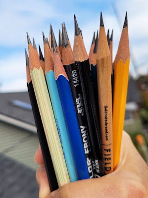
Ear are the 30 pencils I'm using this month!

Immediately on the heels of InkTober, I decided to try Pencilvember – 30 days of pencil drawings in the month of November. Unlike InkTober, Pencilvember doesn’t seem to have a clear genesis (if anyone knows how it was initiated, please let me know), though it seems to have been going on for a while now. I mentioned it in my blog seven years ago, but I was kidding and didn’t even know it was a thing. Maybe it began with a hashtag that simply caught on. In any case, I’m in – and the ears have it!

Several days into nosey InkTober, I kicked myself that I hadn’t thought to focus on ears, which I routinely give short shrift to in portraits. Maybe because ears are not much involved in facial expressions, and therefore don’t affect resemblance, they are easy to ignore. Right on Day 1, though, I realized what I had been missing: Ears are fascinating structures with all those canals and channels that begin and end mysteriously. Why had I ignored them for so long?

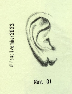
11/1/23 Hokusign 4B (all reference
photos by Earthsworld)

With a shiny, metallic blue barrel, the 
Hokusign has a typically excellent Japanese core
and the delightful tagline, "Hardly broken pencil."

I used only five different types of pens during InkTober, but I own so many pencils that I knew I’d have a hard time choosing. Initially, I considered using both graphite and color. Then I realized that I’ve given all of my colored pencils at least cursory sketching attention at one point or another, but I had many, many graphite pencils that I had never even sharpened, let alone used. It was a prime opportunity to give graphite the attention it deserved (like ears, worthy of attention but neglected).

I didn’t want the burden of choosing a pencil each day to be part of the challenge, so instead, I took a ridiculously long time pre-selecting 30 pencils before Nov. 1. Now all I have to do is randomly pull one from the mug. A few are favorites, but most are unfamiliar to me. My only criterion was a tolerably soft grade for drawing – at least HB but usually softer.

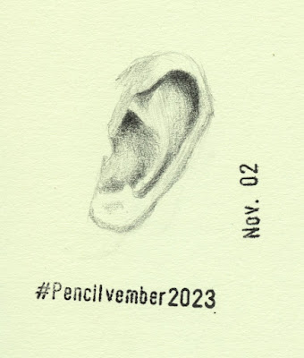
11/2/23 Faber-Castell Goldfaber 6B

This Goldfaber is the hardest 6B I have ever encountered! I hate to imagine how hard an HB might be!


Without being an active collector of graphite pencils, I have accumulated a hefty collection (the 30 I’m using are only a tiny part of the lot). How did that happen? Almost all came to me as gifts or in swaps with generous members of the Erasable group on Facebook. I’m having a ball getting to know new pencils as I get to know the human ear.

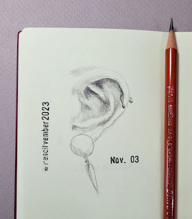
11/3/23 vintage England-made Eagle Draughting 

I know and love the vintage USA-made Eagle
Draughting pencil, but this England-made version
was new to me. They both have the same Eagle logo, so they must have been made around the same era.
The USA-made is slightly softer.

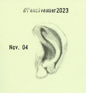
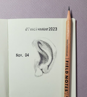
11/4/23 Field Notes pencil

Field Notes gives me one of these in every order.
It's worth every penny I paid for it -- possibly one of 
the worst pencils I've ever sketched with. I already
knew it would be bad, so I'm happy that I got it over
with early in the month so I won't have to continue 
dreading it.


Related Posts Plugin for WordPress, Blogger...