Wednesday, February 28, 2018

Long Shadows, Bright Sky

2/26/18 Wedgwood neighborhood

After Sunday’s crazy hailstorm – pea-sized stones pelted us for nearly half an hour! – it was surprising to see sunshine and blue sky the next day. Still, the temperature was only in the mid-30s, so I stayed in my car again, marveling at the long, long shadows even at high noon.

It’s no longer pitch when I wake, and there’s still some twilight left when we sit down to dinner. But this winter stuff is getting old. Who’s ready for spring?

Tuesday, February 27, 2018

Demo at Daniel Smith

2/24/18 Julia Carpenter and her reflection giving a demo

Daniel Smith’s art supply stores offer many free product demos regularly. I don’t attend as often as I’d like to because the Seattle store isn’t very convenient for me, but I occasionally do, and I’ve learned interesting techniques and met inspiring artists that way. (I initially met Don Colley at a demo and instantly became a fan only a couple of months after I started sketching in 2011; some of his sketches that I saw that day are still seared permanently in my brain as the kind of urban sketches I aspire to.)

Last Saturday I was especially interested in that day’s demo – drawing animals with Derwent Drawing Pencils (my link goes to Blick.com because, sadly, Daniel Smith doesn’t sell anything but paints online anymore). I have a set of those colored pencils, and they are very soft and have especially thick cores. The relatively narrow palette of 24 colors is unusual in that all the hues are earthy and subdued – ideal for landscapes and other natural subjects. The white one is a favorite with toned paper, and I have used a few rocky, sandy hues when I’ve sketched at a beach or a national park.

Julia Carpenter, the artist who demo’d the Derwents that day, put the soft colors to good use drawing a cat and then a dormouse from photos. Of course I was paying attention – but I also couldn’t resist sketching her.

Monday, February 26, 2018

Leaner Sketch Kit Update - Details


This is the same kit you saw last week, but a reader asked for the details on the specific items, and I realized I hadn’t updated my Current Favorite Art Materials page since last summer, so it’s a good time to take care of both:

  1. Pentel sign pen (a hard-tipped brush pen). I change out the brush pen frequently, so this one is not necessarily a favorite, though I do like it. The Pentel has water-soluble ink, which is nice for fast and easy shading. But now that I’m back to using water-soluble colored pencils, I’ll probably switch to one with waterproof ink. I also like to switch between real (“hairy”) brush tips and formed “non-hairy” tips, because each has benefits (and drawbacks). The Copic Gasenfude is a favorite hairy one containing waterproof ink. See the post on my favorites in all categories for details. Diet tip: I used to carry four brush pens – two hairy (one with waterproof ink, one with water-soluble ink), and two non-hairy (one with waterproof ink, one with water-soluble ink). Now I make a choice and carry only one.
  2. Two Sailor Naginata Fude de Mannen fountain pens, one with waterproof Platinum Carbon Black ink (very waterproof and non-clogging) and one with water-soluble Sailor Doyou ink (fast drying). These have been my stable, consistent pen-and-ink combos for several years now. For variety, I occasionally rotate in my Franklin-Christoph with fude nib, but it’s not a sketch kit standard.
  3. Faber-Castell Pitt Artist brush marker in warm gray. I like it because it’s waterproof and is handy for quick shading on both white and toned papers.
  4. Two Kuretake waterbrushes with the largest and smallest tips.
  5. An emptied hand sanitizer bottle that I’ve filled with water for spritzing (see my demo for one technique I use).
  6. A low-quality traditional brush that I use only to spread water that I’ve sprayed onto paper.
  7. A white Gelly Roll gel pen. I use it for sharp highlights on red or toned paper and whenever I need to write white signage lettering.
  8. A white Hester & Cook Midtown grease pencil. Unlike most grease pencils, this one can be sharpened with a sharpener, so I can get a good point on it. But I sometimes use a traditional white colored pencil, too. Its purpose is for subtle highlights (especially nice for skin and other rounded surfaces) when using toned or red paper. (If I’m not carrying either a toned or red sketchbook, I take it out of my kit.)
  9. A Viarco ArtGraf water-soluble carbon pencil. I also use water-soluble graphite pencils in a soft grade (the ArtGraf 6B is a favorite), but this carbon pencil has the darkest darks I’ve ever seen when activated with water. It also doesn’t have the shiny look of graphite.
  10. A Blackwing pencil with the softest (ungraded) core. I swap this out frequently with other soft-core pencils – usually 4B or softer. Other favorites are the Mitsubishi Hi-Uni in 4B or 6B and the Gekkoso 8B.
  11. An ever-changing palette of water-soluble colored pencils (mostly Caran d’Ache Museum Aquarelle). Right now I’m carrying 14 colors, but as you can see, my Tran Portfolio pencil case still has a few slots to spare. I always add one or two specialty colors when I travel (based on what I see in photos of the place I’m visiting). My goal is to carry no more than 18 colors under any circumstance, which would fill all the slots in the Tran Portfolio.
My overall sketch kit diet principle is to carry only one of each type of product (such as brush pen, gray tonal marker, water-soluble pencil, graphite pencil) instead of multiples as I used to. I always think I need to have choices, but the fact is, having to choose just adds to the time it takes to make a sketch. This principle is enforced by one rule: When I put something in, I must take something out.

Now, the sketchbooks: Unlike pens, pencils and colors, my sketchbook selection is narrow and rarely changes. The sketchbook is an integral part of any sketch kit and is often the heaviest element in it, so it needs to be chosen thoughtfully. It is also the foundation for the rest of the sketch kit elements, because if you choose paper that is inappropriate for the tools and media you want to use, it’s likely that you’ll be unhappy with your results. I tried many, many different sketchbooks – some more than once, many for only a few pages before I abandoned them – before I reached resolution on my carefully considered selection. While I always love experimenting with new art materials, I’m firmly devoted to my sketchbook selection because it just works for me.


  1. A self-made signature – four sheets of 9-by-12-inch Canson XL 140-pound watercolor paper folded in half and stitched with a temporary cover. This is my daily-carry sketchbook. When I have filled six of these signatures, I bind them together with Coptic stitch. This is the lightest, thinnest, self-supported sketchbook I have found containing paper I can use with any media – but I have to make it myself. It’s a small price to pay for getting all my needs met.
  2. Stillman & Birn softcover sketchbook in the 5½-by-8 ½-inch size. Except for the two-month period when I challenged myself with a minimal sketch kit, the S&B books are not my daily-carry. I keep a variety of books with different papers (Alpha, Beta, Epsilon and Nova) on my desk for use on still lives and other experiments in the studio. I also take one 8 ½-by-5½-inch softcover landscape-format Beta book when I travel, since that tends to be when I use a landscape format most often.
  3. and 4. Field Notes notebook. I always carry one, most often a red Sweet Tooth edition, but occasionally others for variety, like the slightly larger Signature edition. This is handy for quick, perhaps discreetly made sketches of people on public transportation or other situations when I don’t necessarily need or want my full-size sketchbook.
Top view of my slimmer bag! This is my waterproof Rickshaw Bagworks Zero Messenger Bag in the "small" size.

Sunday, February 25, 2018

A Lime LimeBike

2/22/18 Maple Leaf neighborhood

My phone’s weather app said it was 37 degrees, and clumps of crunchy snow still stuck to the grass from the previous night’s flurry, but the sun was shining, and I was getting cabin fever. I pulled on my down jacket and headed out for a brief walk through the ‘hood.

Within a couple of blocks I spotted a ubiquitous LimeBike standing on a corner. Seventeen minutes later, I was cold and done. It wasn’t much of a sketch, but it made me happy to be able to give it its true colors.

Saturday, February 24, 2018

Toe-Tappin’ Sketchin’ at Wintergrass

2/23/18 Wintergrass jammers

It’s hard to sketch when your toes are tapping to lively bluegrass music!

For the fifth year, Urban Sketchers Seattle met at Wintergrass, the Puget Sound area’s weekend-long annual bluegrass festival at the Bellevue Hyatt Regency. I missed it last year because I was out of town, so I was especially looking forward to this year’s event, which is one of my all-time favorite sketch outings.

As I sketched the musicians who had gathered in the hotel hallways for impromptu jams, friends greeted and embraced each other, happily reuniting. Some had apparently come from distant states to participate in this long-anticipated event. I overheard them comparing program notes and planning which concerts and demos to attend. All morning, even as I heard the literal vibes of traditional music, I also sensed the vibes of happy people doing what they enjoy most – playing and listening to music. I don’t play an instrument, yet somehow their excitement felt familiar . . .

And then I suddenly realized what Wintergrass reminded me of: The Urban Sketchers Symposium. Instead of sketchbooks, pens and paints, they used fiddles, banjos and mandolins to express their common passion. Tapping and nodding to the music, I knew how they felt.


Thursday, February 22, 2018

Product Review: Field Notes Signature Sketch Book

Field Notes Brand's latest Signature edition is just a smidge larger than
its standard pocket-size editions. Shown here with a Sweet Tooth.

Last September, Field Notes Brand came out with Dime Novel, a limited-edition release of its pocket-size notebooks with several surprises – a new size, a new binding style and a new paper. You can read about the details in my review at the Well-Appointed Desk, but overall, I found almost everything about it to be a welcome change from the standard format (which I still enjoy using; my favorite is, of course, the red Sweet Tooth).

The slightly larger 4 ¼-by-6 ½-inch size offers just enough more sketching real estate while still keeping the book portable. Like the usual stapled binding, the new Smythe-sewn binding enables page spreads to open completely flat, which is a non-negotiable requirement for any sketchbook I use. I also like that the squared-off spine has a more polished, finished look than a stapled spine. Finally, the paper – Strathmore Premium Wove 70-pound – has a pleasant tooth and can withstand just about any medium I have abused it with so far. Although not without flaws, Dime Novel has come as close to a “real” sketchbook as any of the hundreds of otherwise similar pocket-size notebooks on the market.

Apparently others agreed with me, because the limited edition sold out in record time. Just this month, however, Field Notes Brand released a new regular edition based almost exactly on Dime Novel: Signature. Available indefinitely, the Signature edition comes in a ruled version as well as blank. It contains the same Strathmore Premium Wove 70-pound paper as Dime Novel except in a bright “Ultimate White” color, which I prefer to Dime Novel’s ivory paper (at least for sketching with color; for writing or drawing in monochrome, the creamy color is a easier on the eye).

Other than a redesigned cover and the omission of the (unneeded, for my purposes) overly large page numbers in Dime Novel, Signature looks, feels and acts exactly the same as its limited-edition model – but I had to test the paper anyway (partly as a public service; mostly because I enjoy abusing notebooks and sketchbooks to see their true mettle). Here are the results:

I tested all the media I typically use for sketching, and even some I rarely use for sketching, plus various writing instruments. The very light tooth is pleasant to use with any implement (though I wouldn’t mind a slightly heavier tooth for graphite and colored pencil drawings). The only thing that bled through was (as expected) a Sharpie marker.

All my favorite brush pens, juicy fountain pens, markers and water-soluble pencils. Water-soluble media were swiped with water.

As it did when I tested Dime Novel, my Sailor fude nib with waterproof Platinum Carbon Black ink feathered slightly, while my second Sailor fude with water-soluble Sailor Doyou ink did not. However, in my test sketch of the knotty tree below, the mild feathering enhances the quality of the organic line. Wherever I paused slightly or applied more ink, it bled through a bit (see the reverse side below the sketch).

2/21/18 Sailor fude nib fountain pen with Platinum Carbon Black ink
Reverse of the tree sketch shows ghosting
and a bit of bleed-through where I paused or the ink
was heavily applied.

With wet media, I really went to town on the abuse. On my watercolor, water-soluble colored pencil and Pentel Brushwriter swatches, I spritzed them with water – a technique I would not typically use on anything less than 100-pound paper. As you can see (test pages below), the spraying buckled the paper badly, but watercolor applied normally fared reasonably well.

If there’s one thing I’ve learned from all the abuse I’ve given over the years to many types of paper that are often inappropriate for wet media (such as most notebooks), the sizing on a paper can be more important than its weight. In my Dime Novel review, I noted that the 70-pound paper in the Workshop Companion edition has the most wet-media-friendly sizing of all of Field Notes’ interior papers. Even my super-juicy Sailor fude with Platinum Carbon ink doesn’t feather or bleed on it, and lightly brushing water-soluble media with water results in relatively rich washes. Although FN has deemed the 70-pound Strathmore Premium Wove used in Dime Novel and Signature to be “the highest-quality body paper we’ve used in any Field Notes edition ever,” highest quality” is a mushy term determined by the specific need.
More abuse -- Sharpie, more pens, soft graphite and various water-soluble media that I spritzed with water.
Sprayed page buckled badly.

That said, I’m not complaining, as my particular casual sketching needs don’t exceed the quality of this paper. I use these small, daily-carry books as a supplement to my full-size, handmade sketchbooks – not a replacement. It sufficiently supported the multiple layers of Caran d’Ache Museum Aquarelle water-soluble colored pencils and the light wash I used in the apple sketch below. The colors show vibrantly despite the less-than-stellar sizing.

2/21/18 Caran d'Ache Museum Aquarelle watercolor pencils with a light wash.

Although I don’t use watercolor much anymore, I know many sketchers do, so just for fun, I did a comparison between Signature’s paper and the student-grade 140-pound Canson XL watercolor paper I use in my handbound books (below). Although Signature’s sizing kept the pigments on the surface longer than I expected, the hues look slightly more vibrant to me on the Canson. For light washes and spot colors in a casual sketch, I’d say the Signature can take watercolors adequately (though I wouldn’t recommend it to anyone who was serious about watercolor sketching).


140 lb. Canson XL watercolor paper
70 lb. Field Notes Signature paper

My mixed-media sketch of the street scene below is more typical of the type of sketches I put in a small-format sketchbook. I used a Pentel sign pen (a hard-tip brush pen with water-soluble ink), Museum watercolor pencils with a little water, and a Blackwing graphite pencil. I love the bright white color, and the tooth is a good balance for all of these media.

2/21/18 Pentel sign pen, Blackwing graphite pencil, Museum watercolor pencils (lightly washed)

If I have any complaint, it would be the paper’s opacity. In my tree sketch above, I included in the scan an image of the facing page, which reveals ghosting from the street scene sketch on the previous page. That’s not too bad for 70-pound paper; even 100-pound Stillman & Birn Alpha paper isn’t perfectly opaque. (I’ve come to learn that color has a lot to do with a paper’s opacity. In my beloved Sweet Tooth edition, which comes with three colors, the red paper is completely opaque, while the yellow and even the blue are less so. Stillman & Birn’s toned Nova edition is opaque, but the white Alpha is not, even though they are both 100-pound weight.)

Look -- it actually says Sketch Book!
Overall, I am pleased as punch with Signature – both its qualities and the fact that it’s going to be around indefinitely so I won’t feel a need to stockpile a limited supply. As I said in my review of Dime Novel, it’s an ideal cross-over book for both writing and sketching – it’s going to be my next travel journal.

This is just a small thing, but I am tickled by it: While Field Notes has offered blank paper before (Sweet Tooth, of course, and its basic Kraft notebook has an unruled option, plus the forgettable Arts & Sciences edition is half plain), this is the first Field Notes product (possibly the first of any of the ubiquitous pocket-size notebooks offered by many makers) to be called a “Sketch Book.” Finally, I feel recognized as part of a small but ever-growing segment of the notebook-using community. (OK, after all the whining I’ve done, I also feel just a teensy bit vindicated.) We all write; some of us draw, too. At last, there’s a place for both – in the same notebook.


Wednesday, February 21, 2018

More Holiday Cheer

2/20/18 Maple Leaf neighborhood

A couple of weeks ago I spotted a tree in the ‘hood decorated with one Christmas ornament. Just yesterday, only a few blocks away, I spotted another festive tree. Holiday decorations in February are getting a bit old, in my opinion. But on the other hand, it started snowing as I sketched this, and there’s a chance of more snow later this week too, so maybe we’re just getting started with winter.

P.S. Yes, I am happy to have color back in my bag!

Tuesday, February 20, 2018

30-Minute Pears

2/18/18

I’ve been busier than usual lately with several volunteer projects with firm deadlines, and it’s been hard to squeeze in time for leisurely sketches. I usually spend an hour or so on a typical still life (a single fruit done with colored pencils), but the past couple of days I’ve given myself the challenge to make one in a half-hour or less and still feel like the sketch is finished. It’s not as satisfying to rush – I prefer the more meditative quality of taking my time – but on the other hand, it’s kind of exhilarating to move quickly the way it feels when sketching on location and the light is changing or the rain is about to start.


2/19/18

Monday, February 19, 2018

Sketch Kit Diet: Lighter, Slimmer, More Essential

Svelte and ready for action.

My minimal sketch kit challenge is done, and it taught me many things – not the least of which is that I appreciate a lighter bag, and I don’t need as many colors or tools as I always think I do. I intended the experiment to be temporary – I didn’t want to be colorless forever – but I also didn’t want to simply shove all the stuff I used to carry back into my bag.

I dumped every minimal item I’ve been carrying the past two months as well as every item I had taken out before the challenge and laid them all out on my desk. Some things were easy to eliminate because I didn’t miss them at all during the past two months – an extra waterbrush, two brush pens, a second Pitt tonal marker. Of course, some things, like the spray bottle and traditional brush for spreading sprayed water, are used only with water-soluble colored pencils, so without the latter, I had no use for them. With all of that in mind, I evaluated each pencil, pen and brush by asking it this question: Will you earn your keep – enough to make me want to carry you every day?

The items you see in the photo above made the final cut. All items that were in my minimal kit remained except the rainbow pencil. To that, I added:
  • A second fountain pen containing waterproof ink (the one with water-soluble ink in my minimal kit served me fine without color, but when I start using water-soluble colored pencils again, I’ll want one with waterproof ink, too)
  • A second waterbrush (the smaller size is handy for details)
  • The spray bottle (for my spritzing technique)
  • A traditional brush (for spreading sprayed water on the page)
  • 14 water-soluble colored pencils. Previously, I carried 25. I chose the 14 colors judiciously based on the current season (the pink one for plum and cherry blossoms is overly optimistic, I know, but I need something to hope for) here at home. When I travel this spring and summer, I’m sure I’ll need to change the palette for the locations. But here’s a bonus: I eliminated enough colored pencils that I now have space in my Tran Portfolio Pencil Case for several other implements (with slots to spare!). This compression enabled me to eliminate one of two Lihit Lab Slim Pen Cases I had been using to organize the other implements. The result is a less bulky bag.
  • Not shown: My usual signature of paper in place of the Stillman & Birn sketchbook.

It’s easily apparent that once I added color back in, the tools that support it (brushes, sprayer, waterproof ink) also had to be included. But I’m pleased to say that several items proved to be excess, and they didn’t make the cut.

With that strict diet, how much weight did my bag lose?

Bag before diet: just under 4 lbs. (1.78 kg)
Bag during minimal challenge: 3 lbs., 4 oz. (1.49 kg)
Bag after diet: 3 lbs., 11 oz. (1.67 kg)
Net weight loss: 4 ounces (0.11 kg)

Even with the addition of watercolor pencils, the tools needed to support them, and the two bag organizers (Tran Portfolio and Lihit Lab), my bag weighs only 7 ounces (0.18 kg) more than it did with my minimal kit. A significant factor is the sketchbook itself: A signature of paper (four folded sheets of 140-pound watercolor paper) is much lighter than the softcover Stillman & Birn. As much as I enjoyed using the S&B Nova, that difference in weight is a worthwhile tradeoff. I’m going to continue rolling my own (that’s the same conclusion I came to when I tried the S&B softcover a couple of years ago).

Here’s how everything looks in the newly arranged organizers:

Trim and tidy.

And here’s the pre-diet kit:

Too many cookies over the holidays.

Sunday, February 18, 2018

Minimalism Challenge Completed!

My minimal sketch kit for the past 2 months.

The last page of my Stillman & Birn Nova sketchbook has been filled, which means my self-inflicted minimal sketch kit challenge is over!

After years of daily-carrying a full palette of colors and a formidable arsenal of pens, pencils and markers, how did it feel to have only nine implements in my bag for the past two months?

Weight: The first thing I appreciated right away was how lightweight my bag became. As a former sufferer of shoulder issues, I try to be conscious of how much weight I carry in a messenger bag. I never thought my former daily-carry was harmfully heavy, but once I slimmed the bag down, I realized how much easier it is to carry less.  I’m going to be more mindful than ever about what I put back in; I’m motivated to keep the bag as slim as possible.

Color: I thought that going from my usual 25 colors to two (in a single blue/red bicolor pencil) would be an extreme case of withdrawal for my color-junkie system – but I found it easier than I expected. If it had been the middle of summer or while traveling, I probably would have found it intolerable, but I didn’t miss color much during the bleak gray of winter. Certain colors, however, I did miss almost immediately – especially the bright yellow I use often for traffic cones and heavy equipment.

This Spin bike should be bright orange, but all I had was red.
Even more significant, I became more conscious of how much color can be a part of an object’s identity. The best example I encountered during my challenge was Seattle’s multiple shared bike companies. In bright citrus colors, LimeBike (green), Spin (orange) and Ofo (yellow) bikes are littered all over the city, sometimes adding the only spots of color to an otherwise dreary landscape. I would stop to sketch one, delighted to see color – but there I was with nothing but blue and red!

It’s not that the specific color is a big deal – we all use artistic license in choosing colors now and then. But in the case of these shared bikes, their specific colors distinguish them from ordinary bikes owned by individuals. If I couldn’t color them accurately, I was missing a large part of the visual story I was telling. This was an important lesson to learn – one that hadn’t occurred to me in all the years I always had a full palette at my disposal.

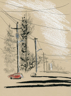
Tone: The other part of my colorless strategy was using a tan sketchbook for the duration of my challenge. Although I had used toned paper before, it was only sporadically. This was the first time I tried it for a continual length of time. A toned page automatically makes it easier to focus on values – the page is already the mid-tone, so all I have to do is put in the shadows and highlights. Working for a concentrated time on toned paper was helpful in making me more aware of highlights (which I especially enjoyed when sketching people). I think it will help me stay more focused on values even when I switch back to white paper and a wider color palette.

Tools: Did I stick with the same nine implements for the full two months? In terms of function, yes – though I made a few changes to the specific tools:
 
A few tools that I swapped in.
  • A few weeks ago I was given a Hester & Cook Midtown pencil, which is a white grease pencil that can be sharpened in an ordinary pencil sharpener (instead of peeling a cord to expose more core, as is typical of most grease pencils). It’s more opaque than white colored pencils, and I like that I can get a relatively sharp point on it, so I swapped out the white colored pencil for it.

    2/15/18 We all need more rainbow-colored excavators
    in our lives, right?
  • The blue/red bicolor pencil was annoying – I missed yellow too much. (I probably could have cheated and added one yellow pencil, but I knew adding even one thing would be a step on the slippery slope, so I resisted.) Fairly late in the game, I swapped out the bicolor for a rainbow pencil containing a mixed core of red, yellow, green and blue. It’s not ideal as a lone coloring implement – if I want only one color, it’s difficult to hold the pencil at just the right angle – but what I lost in accuracy I made up for in fun.
  • The ArtGraf 6B water-soluble graphite pencil was still giving me reliable results, but I also had an ArtGraf water-soluble carbon pencil that I wanted to try, so at some point, I swapped out the graphite for the carbon. Although the carbon smears a bit more than the graphite, I am delighted by how dark it gets when a little water is applied (see below). It became the only pencil I used most of the time, and I probably could have eliminated the Blackwing I was also carrying. (When you carry only nine implements, every item gets scrutinized constantly about whether it is earning its keep. The Blackwing was nearly jettisoned several times.)

ArtGraf water-soluble pencil delivers strong darks.
The experiment is over; what’s next? I enjoyed the toned book so much that for a brief time I pondered continuing with my gray Nova. But people in other neighborhoods keep telling me they are seeing buds, crocuses and other early signs of spring (never mind that the temps have been in the 30s lately), so I’m going to be optimistic and save the gray book for another time (maybe I’ll switch to a toned book each winter as an annual exercise . . .?). I’m going back to my usual self-bound white paper signatures.

The more important change, though, will be my tools and colors. I’m not going to mindlessly put all the usual things back in. Now that I’ve learned how little I can get by with, I’ll be evaluating each item with scrutiny before it makes the cut. Stay tuned for the results.

Saturday, February 17, 2018

Paley Exhibit Dazzles at Museum of Glass

2/16/18 Museum of Glass hot shop

Tacoma’s Museum of Glass is a beautiful (and challenging) building to sketch from the outside. The last time I tackled its shining hot shop cone was a couple of years ago with USk Tacoma. Yesterday was too cold and drizzly to sketch outdoors – a good day to stay inside the museum and the toasty hot shop.

I made one sketch of an artist working hot glass at the *****, but our real purpose in being at the museum was to see Complementary Contrasts: The Glass and Steel Sculptures of Albert Paley. Several years ago we saw an exhibit of Paley’s stunning metal work, so I was already a fan. This show takes his abstract, sensuous, organic work to a new level, putting glass and steel together in surprising yet fully integrated ways.

Despite the difficulty of resisting the temptation to touch, I was pleased that none of the sculptures were in cases – viewing art is so much better without a barrier. (By comparison, all of Michael Taylor’s work in the same museum was displayed behind glass, and it felt remote.) But I didn’t dare try to sketch these twisting, twining expressions of texture and form – they were better enjoyed and appreciated without attempting to capture them.

Another part of the exhibit that I appreciated was the inclusion of several proposal drawings and sketches Paley produced. It’s fascinating to see his mind at work as he imagines a piece, transfers that vision to a 2-D image, and then transforms that into a 3-D form.

Below are some of my many favorite works in the exhibit.

Edited 1/27/23: I was notified by Blogger that this post had been put behind a warning to readers due to "sensitive content." I believe it's because I used the term that I have now replaced with ***** (although you can still see the term written on my sketch). 


Proposal drawings

Sketches


Thursday, February 15, 2018

Striped and Soggy

2/15/18 Wedgwood neighborhood

Although it’s not unheard of, urban couches usually hibernate in winter. People move out of rentals at all times of the year, but “free” furniture doesn’t sell well when its all wet. Which explains why this striped one in the Wedgwood neighborhood has been in the same spot for at least three days – it’s getting soggier every minute. I’ve been wanting to sketch it since the first time I saw it, but to do so would require parking illegally across the street. Today I threw caution to the wind, parked dangerously close to a stop sign for a few minutes, and bagged another trophy.

Wednesday, February 14, 2018

Market Buskers

2/13/18 Pike Place Market
With plans to meet friends for lunch, I arrived at the Pike Place Market a little early so I could sketch. As it has been the past few days, the morning started out bright and sunny but cold.

While the Market can be intolerably crowded on a warm summer day, it’s laid back and almost quiet in February. In one of the busiest spots, where the fishmongers entertain tourists by tossing salmon to each other, two white-bearded guys performed an eclectic mix of tunes from blues to the theme song to the Mary Tyler Moore Show. When a band’s instruments include ukulele, kazoo and washtub bass, you know the music is going to be interesting! The red bird attached to the can attracts viewers’ attention to their busking funds.

It was getting close to the time I was meeting my friends, so I walked in the direction of The Pink Door. Nearby in Post Alley, a young man sang and played guitar to some tourists who dined outside a cafe, despite temperatures in the 30s. I sketched faster and faster before my fingers went numb while this musician shed his coat after a few songs. Some people are made of heartier material than I am, I guess. After two sketches, I was ready for the warm restaurant. 

Editorial comment: Readers of this blog know that one of my favorite sketch subjects is buskers. Wherever I travel and especially here at home in the summer, I seek out events where I’m likely to encounter musicians entertaining people on the street. To me, they add color, life and character to any urban space. Many people must agree with me, because they all snap photos of these buskers (stepping right in front of me to do so and blocking my view, I might add). And yet after they’ve taken a photo and enjoyed the music, most walk off and don’t contribute to the bucket. My personal policy is that if I sketch a busker, I always give them money afterwards. Even if I haven’t sketched them, if I’ve stopped to enjoy the music, I give them money. It’s a fair exchange either way.
Related Posts Plugin for WordPress, Blogger...