Showing posts with label watercolor paints. Show all posts

Saturday, March 30, 2024

Limited Palette for the Petra


Color journal page with results for the Petra palette

Now that I’ve finally reviewed my latest standing watercolor palette, the Peg & Awl Petra, I can get to the paint colors currently filling the six non-standard half pans. As a long-time fan of limited palettes when using watercolor pencils, narrowing the colors to six was basically a refinement of the same principles I have been using for quite a while. I got a solid start on those principles with the previous standing palette, which contained 11 colors, then eliminated several.

This sketch of the UW Quad cherry trees was made with the CYM primary triad named.
 I used a pink pencil to add texture to the blossoms.
What made the cut? First, I chose Phthalo Turquoise, Lemon Yellow and Quinacridone Magenta as my CYM primary triad (all Winsor & Newton, although I’m not necessarily brand-loyal to WN – they are just what I have now in those hues; I ran out of Phthalo Turquoise with this fill, so I replaced that tube with a Daniel Smith).


Green and violet: My favorite mix for darks


Then, because I’m smitten with mixing darks from a secondary triad, especially green and violet, I put in Daniel Smith Deep Sap (which also makes an excellent fir tree green when I add a bit of blue to it) and Daniel Smith Carbazole Violet. I left out orange for now because I hardly need it for urban sketching, and it’s easy enough to mix.

(You might say that all the secondaries are easy to mix from the right primaries, and you’d be right. With all my other practical considerations on location, though, it’s simply more efficient and cleaner to use good secondaries straight from the tube rather than risk getting a big puddle of mud on a small mixing tray.)


In addition, I considered this important question: Why would I choose to use paints on location instead of watercolor pencils? The answer always comes down to trees and foliage. For almost any other kind of subject matter, it’s just as easy or easier to use pencils, but when I see a multi-hued maple in October or a fully blossomed cherry in March, it seems to cry out for paint. The selection is necessarily seasonal, so for this first filling, I reserved a pan for a pre-mixed pink. It’s mostly white gouache with a tiny touch of Primary Magenta and an even tinier touch of Primary Yellow to warm it up (all from the Holbein CYMK mixing set). After cherry season is over, I’ll clean out the pan and probably refill it with orange.

The swatches at the top of the post show the results of various color-mixing experiments in my color journal that helped me decide which paints to choose.

Sunday, October 22, 2023

My New Standing Palette (and the Palette Journey So Far)


Small, lightweight and pink!

As seems to be the case with most watercolor sketchers, my explorations in watercolor have taken an interesting route through a variety of palettes. Last February when I began Kathleen Moore’s Winter Sketchbook +Watercolor course, I knew we would be working mostly from photos, so I didn’t care much about the paint set’s physical form (below). Wanting to start as simply as possible, I used a rather austere paint selection – an odd combo of a traditional primary triad and a CMY triad – and ended up mostly unhappy with the paints I chose.

The paint box I used last winter in Kathleen's class.

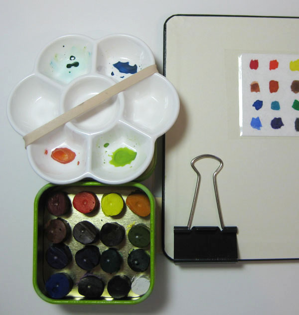
In June when I impulsively jumped into the 30x30 Direct Watercolor challenge, again, I started out working mostly from photos, so I got out my studio-size Kuretake Gansai Tambi set (which I reviewed at the Well-Appointed Desk). When I got braver and decided to try direct watercolor on location, I used a slightly hacked portable version of the Kuretake set. That worked well as long as I had a seat and table or at least a car center console to put the palette on.

Kuretake Gansai Tambi watercolor set in the studio (and the couch)...

...and the portable version in my mobile studio (or wherever I have a table).

Eventually, though, I knew that I could never tolerate having to find or bring a seat every time I wanted to sketch. If I wanted to use watercolors in the field, I would have to find a palette that I could use easily while standing. That brought me to the SketchBox Urban Sketching Palette, which was utterly ridiculous except for one thing: It taught me that I wanted a palette box with an attached thumb loop. That was the only thing that made using the SketchBox palette possible, despite its laughable design.

The ridiculous SketchBox palette saved only by its thumb loop.

Although I hadn’t used watercolors in the field since the 30x30 challenge, I’d been looking at all kinds of palettes. My requirements: As small and light as possible with a thumb loop and at least one mixing tray. The little pink palette shown here is the result.

The all-important thumb loop

The first thing I did was an easy hack: Remove the center pan tray (which would have required tediously sliding the pans into the slots). Then I simply adhered the included empty half pans directly to the paint box with museum putty. I could comfortably fit 20 pans, but I hope I won’t fill them all. My goal is still to keep my palette as limited and simple as possible.


The paint box came like this...

... and I removed the center pan tray.

Half pans adhered with museum putty

The second hack was more annoying: The enameled mixing trays were so smooth that paints would bead up. I know this is a common problem with new enamel mixing trays, but all my previous trays have been plastic, which I prefer to metal. I roughed them up with a melamine pad as instructed on this web site.

I went on an entirely different but familiar route to choose the paints this time: I used the basic method I use with my daily-carry watercolor pencils! I’ve been refining that system for quite some time now, and I’m not sure why I thought watercolor paints should be so different that the same principles wouldn’t apply: a CMY primary triad, a secondary triad with both a warm and a cool green, and a few convenience or wildcard colors.

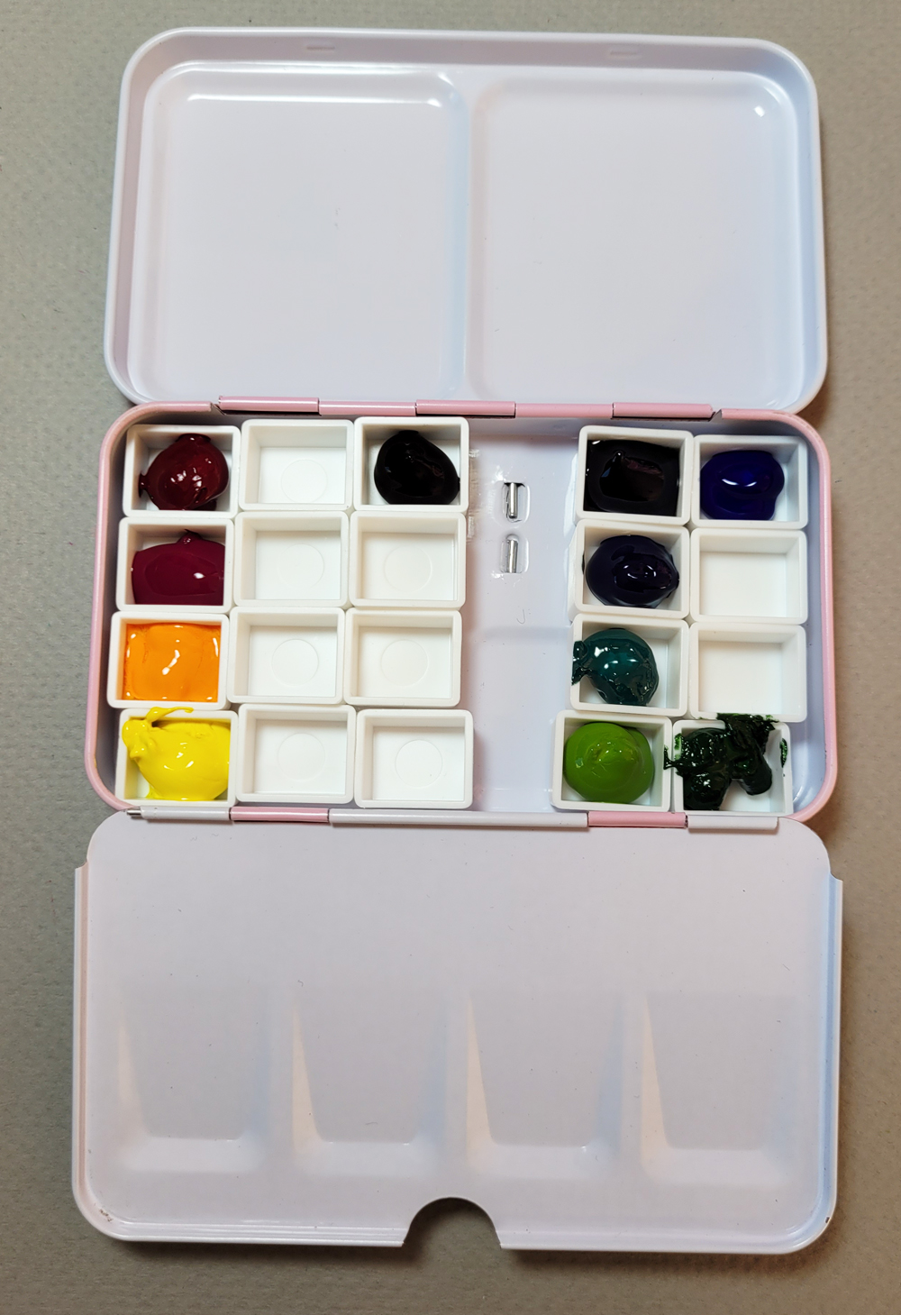
The filled palette


Though Im sure the colors will evolve and change regularly, the 11 shown here are what I’m starting out with, and the palette looks very close to the pencils I carry every day.

Most paints came from my existing collection that goes back to my first urban sketching years. The fun part, though, was picking some secondary colors my collection was lacking by using Daniel Smith dot cards. The new additions are DS Carbazole Violet (the darkest violet I could find) and DS Green Gold (my warm green). I tried a few primary and secondary mixes in my color journal

Primary (left) and secondary mixes

The beginning of the rainy season seems like the wrong time to put together a new urban sketching paint palette, but it’s actually just in time – for a new class with Kathleen Moore. This time it’s her Fall Sketchbook + Watercolor course, and I hope to do as much homework on location as possible.

My very first use of the palette was at the Ballard troll outing with USk Seattle (the maple tree below). It felt a bit awkward to hold both the sketchbook and the palette with one hand, but I was using my A5-size Hahnemühle that day; I hope it will be easier with my usual A6-size book.

My right hand holds the palette and A5 sketchbook. A bit cumbersome, but I'm hoping the A6 sketchbook will be easier.

Monday, June 19, 2023

Fun With Daniel Smith Color Dots


238 colors to play with!

As mentioned in my review of the Kuretake portable watercolor palette, I like the dark violet that’s included in the Kuretake Gansai Tambi desk set (reviewed at the Well-Appointed Desk), which, unfortunately, is not included in the portable palette. I thought I would try to find a similar substitute for it in a tube paint that I could add to my portable palette. Looking at color swatches online is unreliable at best; digital images do not always reproduce colors accurately, nor the granulation or other properties.

I decided it was time to invest in a set of Daniel Smith’s color dot sheets. Initially the price seemed high (about $25 for the full set if you can find it at a local shop; higher on Amazon), but I’ve certainly spent way more than that on tube paints that I ended up being disappointed with because they were different from swatches. The DS sample cards contain blobs of 238 actual paint samples with color numbers, lightfast ratings and other useful info right next to the blobs. You can wet the blobs just as you would paint from your palette, make swatches and mix them.

Looking for a deep violet like the Kuretake is an example of how deceptive online swatches can be (I was looking at Blick’s). Before the dot cards arrived, I had noted several likely candidates. When I got the cards, I tested those paints in my color journal, and I was surprised by how pale some paints apply, no matter how concentrated the pigments are, even if the hues are close. Since mixing dark shadows is a primary purpose of having a strong violet in my palette, I would have been very disappointed if I had gotten any of those paints.

Testing secondary triad hues, especially in search of a deep violet. Look how pale Cobalt Deep Violet and Ultramarine Violet are.

From my swatches and mixes, DS Imperial Purple probably comes closest in hue to the Kuretake color I’m looking for, but DS Carbazole Violet is even richer in pigment – nearly black when I lay it down like “honey” (Marc Holmes term for the most concentrated application of watercolor; he dubs more watered-down concentrations “tea” and “milk,” all terms I learned a decade ago in his Barcelona symposium workshop). I’m still testing, but I’ll probably get a tube of Carbazole.

I also auditioned several hues that I thought might be good candidates for variations on CMY primary triads. I had hoped to find a cyan that is more intensely pigmented than the DS Manganese Blue Hue I had gotten based on Kathleen Moore’s suggestion that had come from John Muir Laws’ recommendation. That paint is fine for mixing a delicate green, but it will never be a dark shadow color when mixed in a triad. The dot cards showed me that DS Phthalo Blue Turquoise might be a good cyan, so I mixed up several triads. I haven’t decided on that one yet.

Auditioning some primary triad hues

For a color geek like me, you can imagine the fun I’m having with these paint color dots! Even if you’re not a geek, it’s a good investment if you plan to put together your own palette. (And if you do want one, you should get one now, as the full set has been discontinued by DS. That’s unfortunate, but I imagine it’s an extremely labor-intensive, unprofitable product.)

Edited: St. Louis Art Supply still has an even larger set in stock that includes gouache. Jerry's Artarama and Cheap Joe's still have the 238-dot cards in stock.

DS color dots + color journal = geeky fun!


Saturday, June 17, 2023

Review: Kuretake Gansai Tambi Portable Watercolor Palette

The compact Kuretake Gansai Tambi palette looks like a makeup compact! 

(Please indulge me with a long, process-related wind-up . . . I promise I’ll get to the product review eventually!)

During my first couple years of urban sketching, I spent much time researching and trying out many portable watercolor kits. It was a large part of becoming an urban sketcher: How many paints could I squeeze into a tiny mint tin, and what are the latest creative kit ideas others have come up with? It’s a deep rabbit hole that I happily leapt into.

One of many portable palettes I had devised in the early
days. This one is from 2013.

Although I enjoyed the fun, I soon learned that the important question was not how many colors but how to juggle all the painting supplies while sketching. If I would sit like most watercolor sketchers, it wouldn’t be an issue, but my task was made worse because I prefer to stand. When I started to see how often my watercolor setup – getting out my paints, attaching the palette to my sketchbook, holding it all at an awkward angle for both drawing and painting – was discouraging me from sketching, I knew it was a problem. That’s how I gradually moved to markers and then colored pencils. And here I am, so happy with watercolor pencils that I’ve never looked back.

Until now – and I’m still ambivalent. My explorations during the 30x30 Direct Watercolor challenge have made me think about using watercolors on location again. It’s not the “direct” part of the challenge that keeps me going (I’ll be relieved to go back to a preliminary drawing when the challenge is over), but the color mixing. Just as I have been fascinated with various triads and other limited palettes in colored pencils the past few years, watercolor mixing can be both magical and intriguing (and unfortunately also mud-making).

I am amused at the irony that a primary reason I was attracted to the 24-color Kuretake Gansai Tambi set (which I reviewed at the Well-Appointed Desk) is that it has a wide range of colors. After my frustrating class experiences with color mixing a few months ago, I was planning to avoid mixing whenever possible. That didn’t last long; I realized that if I want to avoid mixing, I might as well use colored pencils!

Unfortunately, my conditions for urban sketching haven’t changed: I still prefer to sketch while standing. In addition, I’ve only recently committed to my small walk/sketch bag as an everyday-carry, including switching to a smaller, lighter A6-size sketchbook. The stuffed bag can’t possibly fit another thing, no matter how small the watercolor kit might be. It seems like I just don’t have room in my bag or my urban sketching life for watercolors.

In the mobile studio

But you know me – nothing feels “real” unless I do it on location. Learning from photos is all well and good, but if I can’t eventually learn to use watercolors on location, I’ll get bored working from photos and stop.

For now, my immediate solution is to take watercolors only when I know I’ll have a seat and a table (or at least a flat spot next to the gear shift) to put my supplies on. I am using my larger Rickshaw bag, formerly my everyday-carry, which can also accommodate an A5 sketchbook. If I find I’m hooked on watercolors long-term, then I’ll work on the standing solution. But in any case, I wanted to jump right in during the direct watercolor challenge, and I didn’t want to take the time or experimentation to put together a carefully selected palette of paints. To do that, I needed a readymade palette.

Thank you for the indulgence. On to the review!

As anyone who has been down the watercolor rabbit hole knows, the number of premade palettes on the market is staggering. For the most part, I’ve been happy with the Kuretake Gansai Tambi studio set (I’m calling it the “studio set” for lack of a better way to differentiate it from the portable set), so without looking much further, I decided to try the portable version of the Kuretake Gansai Tambi set.

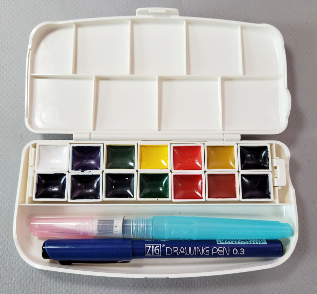
The portable palette comes with 14 color, a waterbrush and a waterproof fineliner.

I assumed that the paints would be a subset of the studio set with the same color numbers. Unfortunately, they are not – they have different color numbers. I haven’t learned whether they are lightfast as the studio version’s paints are, but the pigment quality seems the same from my brief usage so far.

A confusing factor is that two sets of colors are available in the portable form factor (and not very well distinguished from each other). I chose the set linked above in the floral box (Amazon) because it had three greens and a violet. Another set is available on both Amazon and JetPens in a box with a cat design and more earthy paint hues, including browns and grays. If I could read the packaging, my guess is that the set I chose is themed for nature, and the second set is themed for . . . pets? Anyway, if you buy a set, pay attention to the box design, as the Amazon product descriptions aren’t necessarily explicit (some reviewers grumbled about unintentionally buying a different set than was intended).


My set came in this floral box.

Each set of 14 colors comes with a waterbrush and a Zig fineliner pen. The pen differs with each set, so that’s another identifier of the set.

The palette box has a unique design. Half-pan-sized pans have pegs on the bottom that slide and lock into place in the tray, which also comes out. Once they are in the tray, those pans will never fall out, even if you were to drop the box. A quick search did not come up with any, but my guess is that refill pans are available in Japan. In addition, the pans could be rearranged in some color logic, such as all the primaries together or all the secondaries. Although the tray and pans are clever (and very Japanese in their compact, elegant, well-designed esthetic), the proprietary pans cannot be replaced with standard (cheap and easily available) half pans.

The paint tray comes out... 

...and the individual pegged pans come out of the tray.

Color numbers and names (in Japanese) are printed on the bottom of the pans.

Underside of the paint tray

What I like about this compact set (that does look, literally, like a makeup compact) is the compartment intended for the waterbrush and pen. Although the color selection is functional – in addition to the three greens and violet, the set includes two yellows, two reds, two blues, white and the less useful brown and black – I knew I’d want to add at least a few more colors. I immediately took out the waterbrush and pen and used museum putty to adhere 15 empty half pans in the compartment. I can’t imagine needing 29 colors, but what the heck – the pans are in place if I need them.

Waterbrush/pen slot filled with my own half pans.

After swatching the set’s colors, test-mixing various triads, and using my usual basic principles for primaries (including a CMY primary) and secondaries, I added five tube paints from my existing supply (I did not buy a single new tube – yet!): French Ultramarine, Sap Green, Lemon Yellow, Cadmium Orange and Quinacridone Pink (a color I learned about from Kathleen Moore as a good CMY magenta).

New colors added

The first two rows came with the palette; my five additional colors below.

I’m not sure why I put in French Ultramarine; I’ve found it to be one of the less useful blues unless I’m mixing it with the traditional Burnt Sienna, which I didn’t add because the mix looks so traditional that I’m tired of it. But it seemed sacrilegious to put together a paint palette without it. I suppose it makes a good winter sky.

I have many, many more tube paints from my early sketching days that I could fill the palette with randomly, but I’m going to resist heartily. Although I still want a solid range of colors like the Kuretake studio palette, I want the selection to be logical and useful (umm, like that French Ultramarine).

Speaking of the Kuretake studio palette, it comes with a beautiful, deep violet identified as “cobalt violet” but is not anything like the tube of Winsor Newton Cobalt Violet I happen to have. I’m currently searching for a close duplicate of it in a tube paint. The violet that comes with the portable palette is acceptable but a bit cooler. I’ve also mixed a gorgeous violet from Quin Pink and the warmer blue that comes in the portable palette, but it’s handy to have a “convenience” violet for shadows.

So far I’ve taken the set out in my car and to the Green Lake Village courtyard, which has lots of tables, and the Kuretake portable palette has been working out well. The palette and a couple of waterbrushes fit nicely in the “Keeper Pouch” I got a while ago from Peg & Awl (which also made my Sendak and mini Sendak pencil cases).

The Peg & Awl Keeper Pouch holds my watercolors and brushes together.

It’s funny – I sketch in that courtyard frequently with my usual colored pencils, and I have never attracted attention from the many passers-by. As soon as I sat down with watercolors, though, a woman who self-identified as a watercolor sketcher wannabe came by to look at my kit and sketch, and we had a nice chat. We all get it: There is something irresistibly alluring about a small palette of watercolors – so much potential for luminous, plein air sketches (and as much potential for frustration, but I soldier on).  

I put the paint swatches in a transparent sleeve (near center) as reference until I get used to this palette.
My wiping rag looks prettier than my sketch!

Watercolor PSA: In searching for a tube paint close to the Kuretake cobalt violet I mentioned, I thought I’d get a set of the Daniel Smith dot cards that enable sampling all of their pigments. My local Artist & Craftsman store was out and offered to order me one -- until they found out that the large set of dot cards has been discontinued (the small set is still available). I had to get mine on Amazon, but it’s more expensive there. If your local shop stocks it, and you’ve been thinking about getting it, now is the time to grab one. (These dot cards will be a fun way to discover some new triads without investing in full tubes!)

Daniel Smith full dot card set... get it while you can.

Saturday, June 3, 2023

More Peonies (and Thoughts on a Maximal Watercolor Palette)


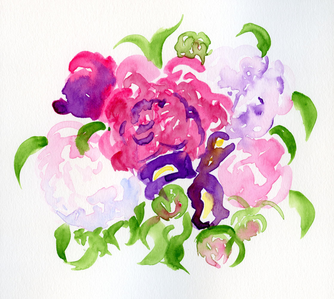
5/27/23 Kuretake Gansai Tambi watercolors in Stillman & Birn Beta sketchbook (My favorite spot is the blue shadow on the nearly white peony at lower left. I just know I couldn't have gotten that effect if I had been mixing colors . . . my wet-in-wet approach would have dried.)

I bought another bouquet of peonies (including one perfect iris), this time to take to the cemetery. I just happened to have at my fingertips a brand-new set of Kuretake Gansai Tambi watercolors that I’m reviewing for the Well-Appointed Desk. Tossing caution to the wind, I saw the bouquet as another opportunity to try direct watercolor.

As I implied last time when I was using my set of 24 Akashiya Gansai watercolors, it’s really fun to have easy access to so many colors without mixing – just pick up the paints as if they were colored pencils! (I discovered the same freedom and fun with my Sakura Koi set and Color Meditation Desk exercises.) I’ve been “painting” with colored pencils; I guess now I’m scribbling with watercolors! ðŸ˜‰

In fact, I seem to be doing a 180 flip-flop in the attitude I had when I was taking Kathleen Moore’s winter sketchbook + watercolor course. Back then, I was determined to apply the color principles I had been learning with colored pencils to paints, so I was keeping my palette as minimal as possible. One major frustration during class, however, was that my paint mixes would become increasingly diluted as I tried to achieve the hues I was looking for. I’d add more paint to get the concentration thicker, but then I’d have to adjust the mix again, over and over. It’s no wonder that I always had such wimpy washes as a novice urban sketcher using watercolors. The class was a good education in watercolors when I could work leisurely from photos or still lives at home – but I’m not interested in working that way in the field.

The more colors the better!

As I painted this bouquet straight from the paint box without using a mixing tray, I remembered that in his book, Color First, Ink Later, Mike Daikubara discusses his preference for using a large palette of 20 colors. Saving time by not having to mix on the tray, he prefers to let colors mix dynamically on the page. Knowing how fast and efficient he is at sketching in the field, I now see how much sense his strategy makes for his style.

I don’t know if or when I’ll be ready to take watercolors back out in the field, but new light bulbs are now firing above my head.

Tuesday, March 7, 2023

Rosehips (Plus Watercolor Palette)


3/3/23 Winsor & Newton watercolors (Sap Green, Alizarin Crimson, Cadmium Yellow, French
Ultramarine) and Museum Aquarelle watercolor pencils in Hahnemuhle sketchbook

In addition to the snow-covered fir bough and the mossy twig, the second week’s assignments in Kathleen Moore’s Winter Sketchbook + Watercolor class included holly berries (or any kind of winter berry). For the life of me, though, I couldn’t find any in my ‘hood, despite my wet walks looking for some. (I’m no expert, but it seems a little late in the year for holly berries.) Kathleen said rosehips would do, so I asked my neighbors next door if I could clip off a small sprig.

Except for the cast shadows, I got the assignment done just in time for class. Using watercolors for most of it, at the end, I used watercolor pencils to draw small details (some of which I obliterated when I painted the cast shadows later). My favorite part was dabbing a watercolor pencil into the wet paint to get the splotchy marks.

In the previous class, Kathleen had discussed giving cast shadows slightly blurred edges to keep them from stealing visual attention from the “diva” (her term for the primary focus). Since I hadn’t had time to paint mine yet, I asked Kathleen how to avoid the hard edges, and she suggested going back into the dried paint with a mostly dry, clean brush to “tickle” the edges gently and soften them. I followed that suggestion in the result you see above. I think my brush was too wet and reactivated more than just the edges of the shadow, creating some new hard edges.

Other than those cast shadows, I’m mostly happy with the finished sketch, but I must say that I didn’t enjoy the process much. It felt overworked – I spent a lot of time lifting, repainting, rewetting hard edges to soften them, and finally drawing in details with pencil. The result looks closer to a botanical illustration than a nature sketchbook study – much tighter than I had intended. My goal for the rest of the class will be to stay away from the illustration look and aim for more of a sketchbook look. (I think one major issue is that I made this sketch in the comfort of my studio. Had I stood in the driveway where it was 37 degrees on the morning when I clipped the sample, I can guarantee my results would not have been as overworked!)

By the way, if you’re planning to overwork your watercolors, be sure to use good paper. I was impressed by how well my Hahnemühle watercolor sketchbook – the Akademie student grade book, not even the 100-percent cotton one – held up to all my lifting, blotting and futzing.

Hmmm... I seem to have few tubes of paint...
Palette notes: I still have lots of watercolors (lots of colors? Who – me?!) from my early urban sketching years, but they were all acquired haphazardly based on recommendations from books and other sketchers, whatever was on sale, or the usual whim, with no regard to a palette that made sense. I’m using some of those paints, but I’m eager to try Kathleen’s favorite CMY triad (which she says is modeled after John Muir Lawsfavorite CMY triad because the pigments are non-staining): Daniel Smith Manganese Blue Hue (cyan), DS Quinacridone Pink (magenta) and DS Hansa Yellow Light (yellow). Those are the only new paints I purchased. I’m looking forward to getting to know a familiar palette with a new medium.

Digging out my bin of watercolor supplies, I had to laugh at the many palettes I had tried during my first several years of sketching (there were actually more, but I’ve given some away). On location, my favorites were the small, lime green Trader Joe’s mint tins with transparent lids that neatly fit eight half pans (in my very first edition, I used Daniel Smith watercolor sticks).

... and a few old palettes.

Unfortunately, I didn’t label the paints (and if I had swatched them, the charts were long gone), so I have no idea which colors are which. The Schmincke palette (far right) was a gift from another sketcher with all the pans prefilled, so I can’t even try to match them to my existing tubes to identify them. I have no fondness for the larger palettes shown, which take up a lot of desk space. Instead of trying to figure out the paints in the palettes, I decided to start fresh with a simple box of 12 empty half pans.

New paint box, very old mixing tray, old waterbrush

I’m adding colors to the new palette judiciously. If I’ve learned nothing else from my decade-plus of continually refining my sketch kit, it’s that using a limited palette makes more sense and is ultimately easier than using lots and lots of colors. I haven’t jumped into the CMY triad yet, but even with the rosehips and the other class sketches I showed previously, I’ve used no more than three or four paints each. I’m trying for no more than a dozen colors (please remind me if I forget).

Top: Museum Aquarelle CYM color wheel; bottom: DS watercolor CYM color wheel

My fresh palette: Somewhat traditional primary triad at left, CYM triad at right. Sap green was always my favorite "convenience" green in the urban landscape, so I'm starting with that.

Shown under the paint box is the mixing tray I’m using, which is the one that came with my Sakura Koi Field Sketch Box. Although that kit, possibly one of the first I had acquired as a new sketcher, was adorable and well designed, the paints were mediocre at best. The mixing tray, however, is compact for studio use.

Also shown is the brush I’m using, which is my trusty and familiar Kuretake waterbrush! Since she is a studio painter as well as a nature sketcher, I was expecting Kathleen to recommend “real” brushes. To my surprise, she prefers and recommends waterbrushes in the field for their convenience. The materials in her field kit (you can see them in next quarter’s class supply list) are indistinguishable from a typical urban sketching kit.

Thursday, March 10, 2016

Fresh Palette, Old Paper

Ahhh. . . a fresh and clean paint box!
This rain is not letting up – for the next five days, the forecast is 90 to 100 percent chance of it each day – and we’ve also been having high winds since last night. It’s a good day for spring cleaning, which, in my case, was all about finally doing something about my truly gross watercolor box!

You would not believe how many layers of gooey, gunky paint coated all sides of each half pan, dripping down into the Trader Joe’s mint tin and all around the sides. Yuck. I was going to clean out the tin, too (the one I’d been using for more than three years), but I’ve got plenty more, so I tossed it out and replaced it. Now my hands are nearly as stained as the tin was from scrubbing all the half pans, but at least my paint box is cleaner than it has been in years.

While I was at it, I changed some of the colors, too. A couple of years ago I worked hard to wean myself of greens and put together a primary triad palette that I’ve been using ever since:

Alizarin Crimson (WN)
Quinacridone Sienna (DS)
French Ultramarine (WN)
Cobalt Blue (WN)
Indigo (WN)
Nickel Azo Yellow (WN)
Quinacridone Gold (DS)
Lemon (WN)

This palette usually served me well, but I finally decided I didn’t need three yellows (although it was nice to keep Lemon clean while I used the other two for mixing). Indigo was my designated “dark,” but it was too dark, so I hardly used it, and it wasn’t earning its keep (my tin holds only eight half pans, so every color needs to work hard).

During today’s cleanup, I took out Indigo, Nickel Azo Yellow and Quinacridone Gold. In their place, I put in:

Sap Green (Da Vinci)
Sepia (WN)
Cobalt Violet (WN)

Although I liked the simplicity of an all-primary palette, I also spent a lot of time trying to mix a green I liked and was never completely happy. I’m going back to convenient Sap Green, which works well in most sketches I do. Sepia is now my “dark” of choice; we’ll see if I use it more than Indigo.

And what’s up with Cobalt Violet? For a while I had the bad habit of collecting paint colors whenever I saw them on the palette of an artist I admired, or if the colors appeared on a supply list for a class I was taking. After reading many books and taking several workshops, I’ve long since figured out that the “ideal” watercolor palette is as idiosyncratic as the painter holding it, so using someone else’s list isn’t meaningful; I have to figure out a palette that works for me. I can’t remember whose list of “recommended” or “favorite” colors Cobalt Violet appeared on, but there it was in my paint collection. I wanted one more secondary color to be the eighth in my tin, so Cobalt Violet it is. (We’ll see how long it lasts.)

For the record, this eight-color palette is the one I use only when I’m in the field. When I’m sketching at my desk (like yesterday’s kabocha), I have a much wider choice of colors, and therefore I’m less judicious about what I stick my brush into.

My dirty old palette -- ick.
In other news, you’ll recall that for the past couple months I’ve been using Canson XL 98-pound Mix Media in my everyday sketchbook (you can read all about my reasoning behind the change). I had stitched up six signatures with it, and I diligently filled the last one while I was in Portland last week. To last me through Cannon Beach, I had brought along a couple of signatures of my old favorite, 140-pound cold-press Canson XL watercolor paper, as well as a mixed signature made from loose sheets of Stillman & Birn Beta and Zeta papers.

I'm back to my tried-and-true 140 lb. Canson XL
cold-press watercolor paper.
Ahhh – it felt so good to use 140-pound (and thicker – S&B Beta and Zeta are 180 pound) paper again! While I had made a valiant effort to give 98-pound paper a chance because I really wanted it to resolve my other issues, I think I’d been holding back with water whenever I sketched on it. In addition, I never felt fully comfortable with how flimsy it is, even a 10-page signature of it, without its supporting leather cover.

Once I switched back to the heavier papers, I suddenly felt re-liberated. The other day when I was sketching at Whole Foods, I laid down a lot of water at times and even rewashed spots I’d already washed to further blend the ink shading, and those papers really took it all. As much as I wanted 98-pound paper to work for me, I’ve decided to go back to my tried-and-true 140-pound Canson XL. It’s still the best all-around solution for my everyday sketchbooks – the ideal tradeoff between paper quality and cost.

As for the S&B loose papers. . . well, you can imagine what a treat it is to use those! But at a potential cost of $21 to make a 72-page book (not counting the paper wastage from cutting down the full-size sheets to my usual 9-by-12-inch format), I can’t justify that hefty price. I’m sticking with economical yet highly serviceable 140-pound Canson XL.
Related Posts Plugin for WordPress, Blogger...