Showing posts with label Pilot Posting pen. Show all posts

Friday, November 3, 2017

My Fountain Pen Best Friends

My fountain pen BFFs.

Pencils – both graphite and colored – have been getting most of my drawing love the past year or so. But in the second week of InkTober when I decided to switch from ballpoint to fountain pen, I was reminded (yet again – I had a similar InkTober revelation two years ago) of how much I love sketching with the latter. It’s not that I forget, exactly, but since the fountain pen was one of the first tools I started drawing with, I sometimes take it for granted. While pencils, colored pencils and brush pens all have unique qualities that I love, a fountain pen delivers an unequivocal line matched by none (at least in my hand). Unlike any other drawing instrument, it seems to express my hand’s movement and direction most closely – like it or not. There’s no erasing, covering up or backing out. I don’t always love what it reveals, but like a brutally honest friend, it never falsely flatters me, and it can still surprise me with its elegance. So today’s Fountain Pen Day post is dedicated to my BFF pens:

Nos. 1 and 2: Sailor Naginata Fude de Mannen. My epic search nearly three years ago led me to No. 2 (1911 full size in matte black), and when I sourced a second one (1911 full size in standard black), grabbed it, too. ‘Nuff said.

No. 3: Franklin-Christoph Fude. My newest fountain pen, it is the most surprising in that I did not have high expectations when I bought it. Besides my beloved Sailors, the F-C fude has proven to be the only acceptable fude I will use.

No. 4: Pilot Posting. I don’t often have need for an ultra-fine or even fine fountain pen when drawing because when I have one in my hand, I find myself getting too fiddly with details in a way that is not flattering to my sketches. But every now and then I need a line finer than what my fudes can produce, especially if I have the urge for line work that mimics traditional pen-and-ink hatching. Pilot’s under-rated posting nib does the job.


No. 5: Sailor Cross Point. Although it doesn’t have quite the same range of line widths as my fudes, the Sailor Cross Point is even smoother (which I thought was hardly possible). Because of its more limited range, it doesn’t get as much sketching mileage, but I still take it out now and then to remind me of what a joy it is to use. Most of the time it stays inked up on my desk as my favorite journal-writing pen. I also love it for sentimental reasons: It’s the only high-end fountain pen I purchased in Tokyo. 

Monday, June 6, 2016

The Starbucks Roastery, Unblocked

6/3/16 inks, colored pencil

I’ve sketched inside the Starbucks Reserve and Roastery several times, both by myself and with USk Seattle, but it’s always been in the winter when I didn’t want to spend much time outside. The last time I sketched there in January, I swore I’d return another day in warmer weather to sketch the outside of the building.

Don't you hate it when this happens?
That day finally came last Friday when I was downtown on my donut mission. On that beautiful sunny morning, I walked across the street from the Roastery and found the perfect shaded spot. I had just opened my sketchbook when a truck pulled up right in front of me. I could tell by the kinds of stuff being unloaded that it would be there a while, so I crossed kitty-corner to another spot. It turned out to be a more interesting angle on the building anyway, so I have that truck to thank.

Wednesday, June 1, 2016

Mostly Birds

6/1/16 ink (ring-tailed lemurs)
Greg and I both wanted to see the new baby gorilla at Woodland Park Zoo, but when we got there, we learned that her public appearance had been rescheduled for next week. I didn’t mind, though, because it was a lovely afternoon for strolling through the zoo.

The only mammals I sketched today were a black and white colobus (with an amazing, yard-long white tail) and a few ring-tailed lemurs. A lemur keeper was talking about them as we approached, and we heard about things they like to eat – kale, Romaine lettuce and especially fruits.

Birds got a lot more of my attention on this trip, and the ones in the tropical conservation aviary are my favorites. Extremely colorful and exotic, most are rare and endangered. Several years ago I sketched the Nicobar pigeon with its iridescent rainbow-colored feathers, but it was way beyond my watercolor capabilities to capture all those beautiful hues. Today I tried colored pencils with not much more success, but I still enjoyed trying.

6/1/16 brush pen (black and white colobus)
The flamingos were squabbling and dozing as usual. I think I sketch them every time I pass through that side of the zoo – who can resist all that pink?

On the way out we passed the penguins, where I spotted a frequent interloper: a neighborhood heron that likes to take advantage of the penguins’ food. I guess the penguins don’t protest – the heron is bigger by quite a bit.

6/1/16 colored pencils (Nicobar pigeon)

6/1/16 colored pencils (wood duck)
6/1/16 ink, colored pencils (Chilean flamingos)
6/1/16 ink, colored pencil (Chilean flamingo)

6/1/16 colored pencils (vulturine guineafowl)
6/1/16 brush pen, white gel pen (heron)

Saturday, May 14, 2016

The Eagle Wins

5/13/16 ink, watercolor, colored pencils
Riding the bus into town yesterday morning to meet Urban Sketchers Seattle at the Olympic Sculpture Park, I swore I would sketch something different this time. I’ve sketched at the park at least three times with USk in as many years (twice in 2014, in fact, and once in 2013), and somehow I managed to sketch Alexander Calder’s Eagle every time. But darn it if I found myself magnetically drawn to it again. No wonder, I suppose – it’s arguably the most visually compelling piece there.

I’m not the only one who thought so: Of the seven sketchers who stayed for the sketchbook sharing, six of us had sketched the Eagle!

At least I sketched one thing at the park that I haven’t sketched before: A fashion photography shoot in front of Seattle Cloud Cover, the colored glass wall on one side of a pedestrian walkway.


5/13/16 brush pen, colored pencils


Six out of seven sketchers recommend Calder's Eagle!

Sunday, May 1, 2016

A Slice of Sky

5/1/16 ink, watercolor

This May Day is amazingly gorgeous: 73 degrees, according to my weather app, and not a cloud to be seen. Walking through my neighborhood, I turned the corner onto busy Roosevelt Way Northeast and looked up at a slice of sky. It was as good a celebration of this day as any.

Saturday, April 30, 2016

Mallow Plant

4/30/16 ink, colored pencils
A neighbor up the street has an amazing jungle of a garden filled with beautiful exotic plants. On my walk this afternoon, I was attracted to some huge plants near the sidewalk with broad leaves that looked like they were covered with frost. As I sketched one, another neighbor taking a walk came by and told me it’s a mallow plant. I tried Googling for images to see if I could determine the variety, but there are lots of them, apparently. I could just barely see a few tiny spots of yellow where the blooms will be one day soon.

A little less exotic was this Kymco scooter parked on the street. With Texas plates, it must have had a long ride to Seattle!

4/30/16 brush pen, white gel pen

Sunday, April 24, 2016

Discovering and Losing Edges with Liz

4/21/16 line weight exercise
As I mentioned briefly yesterday, I’ve been taking Liz Steel’s SketchingNow Edges online course the past couple of weeks. A mix of generously illustrated written lessons (on her website and downloadable as PDFs) and video demos, the course is rich in content for all levels of urban sketchers. (For sheer beginners, Liz recommends going through her Foundations course first.) Two concepts she presents are especially of interest to me right now: Using varying line weights to emphasize the visual focal point of a sketch; and “losing” very specific edges in a composition to let the viewer fill in the part that’s unstated (undrawn). Liz herself is very excited about the latter concept, and although I haven’t practiced it much yet, now that I understand it, I find it very exciting, too.

Although I went through all the lessons in the presented sequence, I’m a bad student J, so I skipped some of the exercises and did others out of order. You’ve seen most of these sketches already on the days that I made them, but I’m including them all here again so you can see them as I summarize what I learned from the exercises.

The first sketch shown (above) was an exercise in varying line weights. I used a fine-tip brush pen (with a firm tip, not a hairy brush) for the foreground water bottle and desk, and then I used a very fine point fountain pen for everything else behind them.

4/18/16 line weight exercise
The second sketch (at left) was the one I did at University Village last week. An on-location example of the same lesson in varying line weights, in this case I deliberately made the line weight of the foreground tree much heavier than I normally would to bring it forward. Instead of using a light pen line for background elements (as Liz did in her demos), I used colored pencils very lightly. I’ve been doing this colored pencil trick for quite a while, but not with the intention of pushing those elements into the background. Instead, when I'm not interested in stuff in the background, I scribble them in with colored pencils just to get them done quickly. Perhaps my intentions aren’t the best, but at least those elements get pushed into the background!

4/23/16 line weight and tone exercise
Yesterday at the Pike Place Market, I completed two more Liz assignments. My first was the front entrance of the Market and its iconic clock and sign. As recommended by Liz, I chose the central column supporting the shelter and the right side of the “Public Market Center” sign as my vertical lines to guide the placement of the rest of the compositions components. My initial intention was to use full watercolor as Liz did in her demo, but standing on this busy intersection on a crowded Saturday morning wasn’t ideal for painting (I was frequently jostled by crossing pedestrians, and once I had to pin myself to a lamp pole when a passing truck drove up onto the curb!). I decided to stick with gray and black tones for value instead of color, but I think I was still able to practice Lesson 4’s objective of prioritizing tones even without using color.

I had also intended to use the sunlit building on the right as an example of some “lost” edges, but I became so much more interested in the sign and the shelter that I forgot. As Liz said in her own demos, it’s exactly the sort of thing that happens when you’re sketching on location. J

Of even greater interest to me was being able to incorporate what I learned in Lesson 3 about prioritizing lines. After putting in set-up lines for the composition and drawing secondary elements with my finest-point fountain pen, I then took my heavier Sailor fude nib to sketch the elements I wanted to draw attention to: the central column holding up the free-standing shelter, the “Public Market” sign and its scaffolding that supports the neon letters, and the clock. Finally I used a brush pen to put in the darkest areas (the windows, the dark Market interiors and the underside of the shelter). Although I was pleased that I had darkened the underside of the shelter and column for contrast and to draw the eye, I may have gone overboard with all the windows! (Once I get started doing something to one window, it’s almost impossible not to keep doing it to the rest of the windows.)

Unlike in the first two sketches, which were also an exercise in varying line weights, in the Market sketch I used a heavier line to emphasize the visual focal point, not just the spatial relationship of the foreground to the background elements. I feel like this sketch was sort of my Edges “term paper,” as it solidified many of the main concepts presented in the course!

4/23/16 hard and soft edges exercise
Another assignment was to sketch food because of the variety of textures, colors and shapes that are usually present in a meal. (She did advocate sketching dessert or cold food so that we wouldn’t waste a hot meal!) These varied textures are a useful way to practice both “hard” and “soft” edges. In addition, when you have hunger and rapidly cooling food as motivators, you have to sketch fast, which encourages spontaneity.

As you know, I rarely sketch my meals, hot or cold, because I just cant seem to focus when Im hungry! Yesterday after the sketchcrawl when several of us decided to continue sketching over lunch, it was a prime opportunity to sketch my food. Unfortunately, true to form, I devoured my veggie burger as soon as it arrived, but the remains on my plate left plenty to sketch. The onion slices (a beautiful shade of pinkish-purple) and a few home fries, as well as the knife handle, were good examples of hard edges. By contrast, the lettuce had many challenging folds and ruffled edges – kind of a combination of hard and soft. I forgot to save highlights on the ketchup blob, so its just a red blob. (In the spirit of the assignment, I did finish the sketch in probably 10 minutes, so even though I wasn’t motivated by hunger or cooling food, I’m always motivated by a desire to have a fresh, spontaneous and therefore relatively fast sketch.)

Although Liz recommends using a real paint brush rather than a waterbrush, I still used my waterbrush for convenience (especially at a café table). I didn't have much space on the table for both my mixing tray and paint box, so I didn’t get out the mixing tray until I was almost finished and needed to mix the gray shadows. Consequently, almost all my colors were mixed right on the page or in the paint pans themselves with the waterbrush. I like the intensity of the hues much more than when I try to mix paints in the tray (which usually results in watery, washed-out hues). In fact, I thought it was a good solution for getting more intense color when using a waterbrush (which, for me, is all the time).

I still have a long way to go in mastering all the concepts in Liz’s Edges, especially the whole exciting “lost” edges idea that engages the viewer’s involvement more actively. But I think making these four sketches with those concepts firmly in mind will help me to integrate them into my own sketching process going forward.

Saturday, April 23, 2016

Pike Place Market for 51st World Wide SketchCrawl

4/23/16 inks, colored pencil

Our five-day “summer” may be over, but the tourist season is just beginning at the Pike Place Market. Urban Sketchers Seattle pushed our way through the crowds with the best of ‘em as we sketched one of our most iconic locations for the 51st quarterly World Wide SketchCrawl.

4/23/16 ink, colored pencils
My first self-assignment of the day was to make a sketch or two for Liz Steel’s online SketchingNow Edges class (more details on those exercises soon). I knew exactly which scene I wanted to do: that famous Seattle postcard, the Public Market Center sign. This sketch is a simplified version of the composition I did a couple of years ago from a slightly different angle.

After that I just wandered around the Market, enjoying the energetic bustle, and stopped for a couple of buskers along the way. While I waited for the others in the Atrium for our sketchbook sharing, I caught a few people having lunch with the Sasquatch.

4/23/16 ink, colored pencils
4/23/16 ink, non-hairy brush pen
Speaking of lunch, several of us decided to continue sketching at Sound View Café, which has a great view of – surprise! – Puget Sound, the Great Wheel and those ubiquitous cranes on the waterfront. In the back of my mind, I was thinking I could knock off another Edges assignment if I sketched my meal, but as soon as the veggie burger appeared, I devoured it. Filled with remorse that I’d lost an opportunity for doing an assignment, I left enough lettuce, onions and home fries (plus lots of ketchup) for a full-color sketch.

4/23/16 non-hairy brush pen, white pencil
4/23/16 ink, watercolor (remains of the meal)
Michele and me
Feather and me

Tuesday, April 19, 2016

Elvis Sighting at West Seattle Junction

4/19/16 inks, watercolor, colored pencil
Just about two years ago I sat outside Easy Street Records and Café to sketch the view of multiple construction cranes on California Avenue Southwest. I hadn’t been to the West Seattle Junction since then, so I was curious about what I could sketch from the same spot this morning. But nothing there caught my eye, so I wandered around the corner to Southwest Alaska Street. A tall fir shot up into the sky like a lopsided rocket, although this time the utilities couldn’t be blamed for the asymmetrical pruning job.

Back on the busy intersection of California and Alaska, I stood in the shade of a bank’s awning to sketch the lively shadow pattern cast by a tree. Looking for one last sketch before Greg was scheduled to pick me up, I glanced across the street and saw – could it be? Yes – Elvis, waiting for a bus!

4/19/16 brush pen

4/19/16 brush pen, white gel pen

Tuesday, April 12, 2016

Sequoia or Seuss?

4/12/16 colored pencils, inks, watercolor
Here’s a tree I spotted in my own ‘hood only a few blocks from home. Asymmetrical as any tree mangled by the utilities, this one’s odd shape can’t be blamed on power lines – it seems to grow this way. It looks like it’s straight out of Dr. Seuss. After much Googling for images, I’m guessing that it must be a weeping sequoia (anyone know for sure?). A couple of years ago I sketched a much larger one at the Point Defiance Rose Garden that looked even stranger.

Friday, April 8, 2016

Sunshine and Shades on Capitol Hill

4/8/16 brush pen, inks, watercolor, colored pencils 
4/8/16 inks

Urban Sketchers Seattle’s Friday group had planned to meet at Elliott Bay Books this morning, just in case the weather turned out bad. As much as I like the book shop, it couldn’t compete with our lucky weather – 73 and sunny with a breeze as gentle as June. As most of us did, I opted to sketch outdoors.

On a day like today, I could be sketching dog poo (as at least one of us did!) and be happy. You can imagine my near-ecstasy to finally sketch a Seattle streetcar, which I’d been wanting to do for quite a while now. Having ridden one just last week, I knew the trolley stopped for less than a minute at each stop, so I had to have a strategy. I took my time drawing the shelter and power lines and even painted the sky. When the next streetcar pulled up, I grabbed a fat brush pen to roughly capture its shape and a few details, then splashed on some paint after it was long gone.

4/8/16 brush pen
Next I walked over to Cal Anderson Park, where the conical fountain caught several sketchers’ eyes (though we all wondered why we’ve never seen it with water). Since I was nearly looking into the sun, I decided to keep this sketch monochrome, but I couldn’t resist another opportunity to point out that blue, blue sky.

With just those two sketches, I would have gone home happy, but my favorite sketch of the day? This guy I caught on the light rail wearing awesome flip-up shades!

Thursday, April 7, 2016

Cloud City Redux

4/7/16 inks, colored pencils, Zig marker
Cloud City Coffee, a great coffee shop (and occasional sketching spot) in Maple Leaf, repainted its sign and changed its logo a while back. I’ve been wanting to sketch its new look ever since (I sketched its old sign a couple times, once in 2012 and again in 2014), but I wanted the weather to improve.

Improve it did (by some weird fluke, it’s 74 degrees this afternoon!), so this morning I stood across the street to capture Cloud City’s new colors that coordinate so well with that blue, blue sky.

Wednesday, April 6, 2016

Apple Blossoms (and Bonus Couch)

4/6/16 brush pen, watercolor, colored pencil
When Nilda told me about a block in Ballard filled with “pink clouds” of apple blossoms, I was a little confused; I’d always thought apple blossoms were white. Yet I’d also seen many trees all over Seattle that had recently exploded with bright pink blossoms (a much brighter pink than cherry blossoms, which peaked in mid-March). I didn’t know what those pink trees were, but then I started to wonder – are those apples, too? *

On an afternoon like today – 66 and sunny! – I didn’t need much incentive to take a top-down drive to Ballard to see the trees for myself. From a block away, I could already spot the pink on both sides of the street. I could have picked any of them to sketch, but I chose the one that had recently had a low branch completely torn off. (I guess I have a thing for mangled or dismembered trees.)

4/6/16 ink, colored pencil
At the same intersection of 14th Northwest and Northwest 63rd Street, a white (faux, I think) leather couch had been abandoned on the grassy divide between the two sides of 14th, so I bagged another one for my “urban couches” series.

* A quick Google image search confirmed that some apple blossom varieties are bright pink while others are white. I’ve sometimes observed grafted trees displaying mostly pink branches with one or two white, or vice versa. I had assumed that a cherry or plum had been interracially mixed with an apple to come up with those trees. Now I’m thinking it’s more logical for them to be a mix of two varieties of apple.

4/6/16 inks, colored pencils

Sunday, April 3, 2016

Spotted on My Sketchabout

4/3/16 ink, colored pencils
Last October on a surprisingly beautiful afternoon, I remember walking through my neighborhood making small sketches of the variety of maple leaves just within a couple-block radius of my house. In the fall, the brilliant colors motivate me to observe and sketch trees more often, but it occurred to me today that I should appreciate the reappearance of leaves just as much. (In fact, I should appreciate them even more, since spring signals the return of outdoor sketching weather, and nothing makes me happier!)

With that appreciation in mind, I went out for a short sketchabout this afternoon. Again, within a two-block radius, I found three types of trees whose tightly clustered leaves or blossoms at this time of year I had never noticed before. I know the green one is a maple, and the spikey red one may be a Japanese maple. I’m clueless about the blossom.

I’m not much of a nature journaler; if I were, I’d take the time to identify these leaves as part of my sketching. Instead, I simply enjoy the moment – the sun, the breeze, observing these leaves just long enough to sketch them.

Friday, March 25, 2016

Springtime at Swanson’s

3/25/16 ink, colored pencils

Swanson’s Nursery has become an annual holiday tradition for the Friday sketchers because this garden store always brings in a couple of reindeer, a camel and Santa for kids, and the Christmas decorations are beautiful. I think springtime at Swanson’s might become a new tradition – the flowers were plentiful and colorful today.
3/25/16 ink, colored pencils

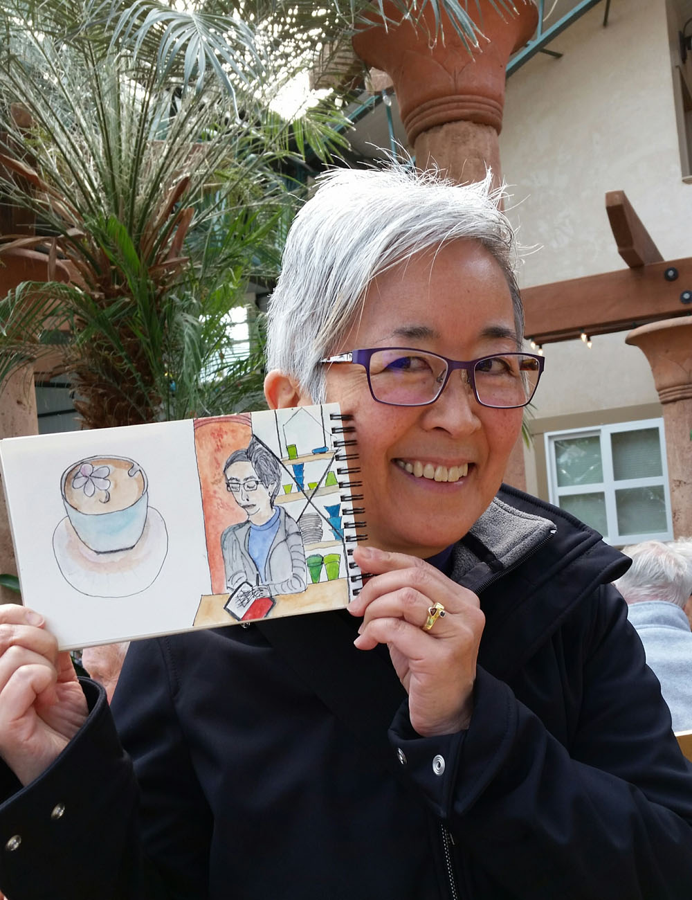
Unfortunately, I was too cold this morning to sketch outdoors where the flowers were. Wimp that I am, I sketched inside the café, which is a jungle of oversized tropical plants. I even made a hatched study of one of the pillars, while Natalie sketched me!

A few minutes before the sharing time, the sun came out, so I ventured out and spotted St. Francis of Assisi.

Natalie Taylor sketched me!
3/25/16 ink, colored pencil
Related Posts Plugin for WordPress, Blogger...