Monday, May 31, 2021

Flags at Sunset Hills

5/29/21 Sunset Hills Memorial Park, Bellevue

The cemetery where I pay my respects on Memorial Day weekend is undergoing construction at its main entrance. The display of flags at Sunset Hills Memorial Park’s secondary entrance wasn’t nearly as grand as usual, but it has become my personal tradition to sketch the flags every year, so I did it anyway. It’s always an interesting challenge to capture the motion of flags. It’s also a good opportunity to remember family members I’ve lost as well as people I never knew but who gave their lives for my benefit. This year I feel more fortunate and grateful than ever.

Sunday, May 30, 2021

Green Lake Drive


5/26/21 W. Green Lake Drive N.

Kathleen and I have been walking around Green Lake together every Wednesday for well over a decade – probably closer to two decades by now. The only times we haven’t were when one of us was out of town – plus the past 14 months. Both of us now fully vaccinated, we have finally resumed our weekly walks. I had dearly missed her company and our conversations.

While Rip Van Winkle was asleep, Green Lake Drive went through a lengthy revision and pavement improvement project, so I also (thankfully) missed most of the traffic mess. Last Wednesday the whole street was being restriped, so I had to park several blocks from our usual meeting place. Heading back to my car after our walk, I liked the way a row of funny flat-topped trees followed the curve of the street. I stopped in my tracks to sketch the scene.

Unlike Trader Joe’s or Artist & Craftsman, this “nothing” view of Green Lake Drive is not a specific venue I had missed. It represents something I had missed even more: The sheer and simple joy of walking down a sidewalk and being able to stop anywhere for a sketch without a second thought. I will never again take that luxury for granted.

Saturday, May 29, 2021

Between a Rock and Loose Place


5/26/21 Museum Aquarelles in Stillman & Birn Beta sketchbook
Before taking down the small pile of rocks I had set up for my assigned still life, I wanted to try it one more time (at left), but this time deliberately trying to be looser. Something about traditional wax-based colored pencils seems to encourage tightness, especially when I’m seated at my comfy desk with a still life in front of me. When I’m sketching on location, I seem better able to be looser if only because I’m usually standing, and I don’t want to take too long. For the second still life attempt (at left), I used my favorite urban sketching colored pencils, Caran d’Ache Museum Aquarelles, to see if they would put me in a looser frame of mind.

Does it look looser? I hope so. It certainly took less time: 35 minutes compared to the three hours I spent on the first one. I’m sure it helped that the forms were already familiar, so I had nothing new to learn, and the first attempt also served as a value study. On a purely practical level, it’s much faster to achieve saturated colors with watercolor pencils. Even so, I don’t think I would have been able to be looser if I hadn’t been tight first. I’d like to be able to make a loose first sketch whenever I want to without having to get the tightness out of my system first. It’s an ongoing struggle that I continue to work on.

5/27/21 Museum Aquarelles in S&B Beta
The next day, I set up a fresh pile of rocks and used Museum Aquarelles again (at right). It took the same length of time as the one above with about the same degree of looseness. It still isn’t as loose as I would like, but I think I did a better job of capturing higher color intensity and highlights in a short time.

I’m diggin’ rocks as a quick still life subject. Their colors aren’t as bright as apples and lemons, but I enjoy looking for the subtle hues. And I don’t have to worry about produce going bad on my desk.

Friday, May 28, 2021

Rock, Paper, Colored Pencils


5/25/21 Prismacolor pencils on Stonehenge White

Learning to draw trees with graphite from Kathleen Moore a few months ago was both informative and inspiring. When I heard she would be offering a new class in drawing nature with colored pencils, I was interested, but what made me sign up was that we would be drawing from life, not photos. Although I had gained a solid foundation in drawing with colored pencils when I studied with Suzanne Brooker several years ago, we worked entirely from photos then. We drew from real plants in Crystal Shin’s botanical workshop, but there wasn’t much time in a weekend to sink our teeth into small studies. I’m excited about this five-week Gage course with Kathleen and doing some deeper teeth-sinking.

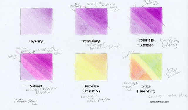
Week 1’s lessons were on the basics of making and blending marks with the colored pencil medium. Much of this was review for me, but what was new was using various types of blending materials, which I have dabbled with on my own but hadn’t learned to use formally. The purpose of all these blending materials, I learned, is to freshen the surface of previously applied pigment so that more layers of pigment can be added without flattening the paper’s tooth. (I dont think I was using them properly before, as they seemed to flatten the tooth in my previous experiments.) If more than one color has been used, they also blend the pigments.

Edited: After today's class, I understood more about blending materials, and I misstated part of the paragraph above: Solvent is the only material that will blend pencil pigments without flattening the paper's tooth so that more color can be applied afterwards. That is why many colored pencil artists use it. Dry materials like white pencil and colorless pencil will flatten the tooth. 

The materials we are using are a Prismacolor colorless blending pencil, a White Prismacolor as a burnishing/blending tool, and a solvent (Kathleen had suggested odorless mineral spirits called Gamsol, but I couldn’t find it in a small bottle, so I’m using the similar Turpenoid). In addition, I happened to have a Prismacolor colorless blender in marker form (which can be used to blend both colored pencils and alcohol-based markers), so I gave that a shot, too.

Kathleen recommended Prismacolor pencils for this class. My worksheet below is messy because I used the wrong materials in the labeled boxes, but you can see the results of my experiments. The White pencil gave the smoothest blending results, but the dry colorless blending pencil was the easiest to apply and control. I didn’t like using the colorless marker at all because it altered the hue significantly. The first four squares were all made with the same Prismacolor Dark Purple, but the colorless marker turned the color bright pink.

Worksheet using various blending tools (printer paper)

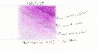
Turpenoid solvent (Stonehenge hotpress)

The worksheet above was done on basic printer paper, which has a terrible surface for use with colored pencils. For my last sample using Turpenoid (left), I wanted a heavier paper, so I made that one on Stonehenge Hotpress, which has a much better surface for colored pencils. Although I generally avoid using toxic solvents, I wanted to try the odorless mineral spirits to see how it compared with the other options. I’m sure my technique is lacking, but I wasn’t impressed with its blotchiness. I don’t see a compelling reason to use a poisonous substance when benign, potentially better options are available (like the colorless pencil), but I’m keeping my mind open to see how Kathleen uses it.

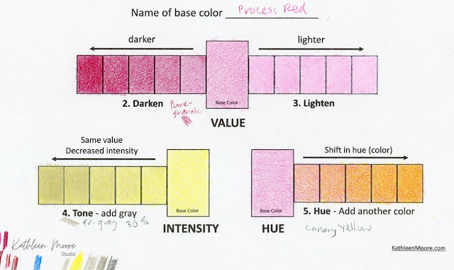
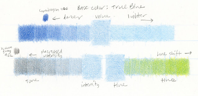
Another lesson from Week 1 involved making worksheets to change the value, intensity and hue of a pencil color. I made my first worksheet using Process Red and Canary Yellow as base colors on printer paper. Again, I hated applying colored pencil pigment to that paper (and I also realized too late that I was supposed to do all three exercises with the same base color; apparently reading directions is not in my skill set!), so I made a second worksheet with True Blue as the base color, and this time I used Stonehenge Hotpress paper.

Printer paper

Stonehenge Hotpress

For both value exercises, we were to use a darker shade of the base color applied in increasing layers to darken the base color; we were to use a White Prismacolor applied in increasing layers to lighten it. On either type of paper and for both Process Red and True Blue, I found the White Prismacolor to be ineffective at lightening the hues. I don’t know what I’m doing wrong, but I saw no difference in the tone, no matter how many layers I applied. The White pencil just isn’t opaque enough.

For the intensity exercises, the assignment was to find a gray of the same value as the base color and use it to decrease its intensity with increasing layers of the gray. The challenging part was identifying a gray of the right value. (She recommended using a grayscale attached to a color wheel, which I have somewhere . . . . I’ll have to dig it out.)

Week 2’s assignment was to make a simple still life with a few rocks (top of post) and apply the techniques we learned from the Week 1 exercises. I admit, I am typically not too excited about drawing rocks, but I was thrilled by this assignment! It made such a difference to be drawing from life instead of a photo. Once I started observing the rocks closely, I became fascinated by all the subtle colors I could see. I ended up choosing nine, which might be too many for a small drawing, but I enjoyed practicing blending the various hues.

The nine Prismacolor colors used in the still life

I tried using the White Prismacolor to lighten areas (such as the barely distinguishable highlights), but as with the worksheet exercises, I found it to be ineffective. I liked the subtle texture imparted by Stonehenge White paper for these rocks. In the case of cast shadows, however, I wanted to remove the specks of paper showing through. Easy to apply even in small areas like the top rock’s slender cast shadow, the Prismacolor colorless blender pencil was especially effective for that. It was also effective in blending colors evenly. I think it’s a keeper in my colored pencil tool box.

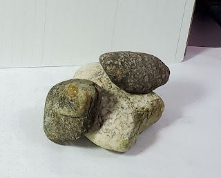
Part of the assignment was to photograph the still
life from an angle as close as possible to the one from which
 it was viewed to aid critique discussion
.
We are drawing from life, which makes me so happy!

Incidentally, although I’m tired of Zoom, Kathleen is an excellent online instructor. Using multiple cameras, she videorecords her demos in advance so that students can view them at their convenience, repeat sections, slow them down or speed them up as needed. Then we meet on Zoom for live critique and discussion. I’m eager to get back into the Gage classroom whenever it becomes safe to do so, but the one thing I’ll miss about virtual learning is being able to see demos easily and clearly, which is not possible when peering around other students or over the instructor’s shoulder in a classroom.

Thursday, May 27, 2021

Book Review: Sketching Techniques for Artists


In the past decade, I’ve read (and reviewed) quite a fewbooks on urban sketching. The vast majority seem to be aimed at beginning and early-intermediate sketchers. As someone who has been sketching long enough to put myself in the intermediate-to-early-advanced camp, I don’t read as many books on urban sketching as I used to. Of course, even books targeting beginners can have useful tips or approaches for sketchers at any level (Suhita Shirodkar’s Techniques for Beginners and Virginia Hein’s 5-Minute Sketching – Landscapes come to mind), but I rarely see books that seem to be targeted more toward someone at my level.

That’s why I was pleasantly surprised to come across Alex Hillkurtz’s Sketching Techniques for Artists: In-Studio and Plein-Air Methods for Drawing and Painting Still Lifes, Landscapes, Architecture, Faces and Figures, and More at the library recently. Although beginning basics like tools and materials are covered, my impression is that the intended audience might be a seasoned studio artist who already has basic drawing skills but hasn’t done much on-location sketching.

Many artists make on-location sketches only as preliminary work for more finished studio paintings later, and at first I thought the book was intended for those artists. But then I read this in the introduction: “A sketch is a memento. A quick jot to remember a place, listen to the birds, feel the breeze, let conversations wash over us in a language we may not yet know.” I thought, “That’s urban sketching; he gets it that sketches have a life of their own,” and I knew that the book was for me.

I found the lessons on composition especially useful and informative. With a background in storyboarding for the film industry, the author approaches sketching as a filmmaker might, showing how the angle or viewpoint of a scene can add drama and emotional impact to the story. As an example, he shows his sketch of a Paris building, indicates the various points of view he could have taken to make the sketch, and why he chose the one he did to create the mood he hoped to evoke.

Film storyboarding experience gives the author a filmmaker's perspective on sketching.


In a lesson on lighting, he showed the same building photographed at various times of day and shows how the story changes, depending on the direction of the light.


He covers many aspects of sketching on location, such as perspective, architecture, figures and faces, but there’s not much step-by-step “how to” here. This is why I think the book is aimed at sketchers who already have some years of experience under their belts and are looking for ways to bump their work up a level.


Living in Paris, he gives special attention to architectural details like doorways, balconies and café awnings, none of which I see much of in Seattle (but they help me dream of seeing Europe again someday).


The section on watercolor painting is so cursory that I wouldn’t want to depend on it to learn to use watercolors, but I enjoyed seeing his examples of using color to convey atmospheric perspective.


By the way, although it’s clear that he makes his sketches from life, he doesn’t claim to be an urban sketcher. He eliminates lots of garbage bins (what!?), cars and boring storefronts and cleans up other inconveniences that may result in sketches that are not completely “true to the scenes he witnesses.” His work is beautiful, however, so I forgive him. 

This book is a needed addition to the constantly growing field of books on urban sketching. In fact, the book market could use a few more titles that are a step up from the overflowing beginning level.

Wednesday, May 26, 2021

Artist & Craftsman


5/24/21 U-District Artist & Craftsman
In addition to food shopping at TJ’s, another thing I missed greatly during my 14-month, self-enforced isolation was shopping for art supplies from actual shelves. Of course, I certainly purchased plenty of art supplies online during that time (what else was there to do?), but we all know that’s just not the same as strolling down aisles to see what’s new.

When I looked at the supply list for the Gage class I just started, I was dismayed to see that I already owned everything on it – What??! Nothing new to buy?? – except for one item. Gleefully, I grabbed a mask, jumped into my car, and dashed over to Artist & Craftsman in the U-District. Although it doesn’t have the widest selection in town, it has the funkiest, “artsy” ambiance. A bit dark with uneven floors and somewhat confusing aisles, it has no shiny displays or matching aprons on the employees. Working artists shop there with paint still on their hands, and the staff look that way, too.

On a rainy afternoon, I could barely see the nondescript storefront (which, oddly, doesn’t indicate the store name on its sign – only “Art Supplies”) from the parking lot across the street. But like my trip to TJ’s, I want to document my life on the other side of vaccination.

Tuesday, May 25, 2021

Value Studies – Tree


5/15/21 ArtGraf water-soluble carbon on Lenox Cotton
I’ve used this little tree next door many times for various studies over the years, mainly because it’s conveniently viewed from our upstairs deck. In the late afternoon, though, on bright, sunny days, I love the fringe of backlighting around it.

You saw the monochrome one recently in my review of Stonehenge papers. It was the easiest to execute because I could focus on the values, and the ArtGraf carbon pencil was a speedy way to achieve super-rich darks. Of the three studies shown here, I think it’s the best rendering of the tree’s volume in that I managed to capture the forward-facing branches.

On another bright day at around the same time of the afternoon, I tried it in color (below). I think I captured the fringe of light that I like so much, but I lost the tree’s volume. Choosing Stonehenge Hotpress for a tree study was frustrating. Although the soft Caran d’Ache Luminance pencils enjoyed the smooth surface, I had to work harder than I wanted to for the tree’s texture, and I think I lost most of that, too.

5/22/21 Luminance on Stonehenge Hotpress

5/23/21 Museum Aquarelle on Stillman & Birn Beta

The next day was overcast, so I took on the challenge of trying to see values in the diffused light (at left). Once in a while the sun peeked out briefly. I used those moments to define the values, but it was still difficult. A strong wind was blowing, making the deck uncomfortable, so I used my tried-and-true Caran d’Ache Museum Aquarelles, which are so much faster than traditional colored pencils. Stillman & Birn Beta’s cold press surface was a good choice; it has just enough tooth to give foliage texture easily. Without textured paper, it’s hard to retain the sparkle of light that comes through this tree. Volume, however, is so-so.

Even when (or maybe because) I sketch the same tree multiple times, every study teaches me something. Now that I’ve been sketching for nearly a decade, it doesn’t mean I necessarily draw everything better or avoid mistakes more often. I think experience just makes it easier to analyze what I could do better next time.

Monday, May 24, 2021

U-District Trader Joe’s

5/21/21 Trader Joe's, University District

On March 3, 2020, we had already begun hearing about the hoarding that was going on in stores – shelves emptied of staples like bread, milk, rice and, inexplicably, toilet paper. Stocking up but resisting the urge to hoard, we shopped at Trader Joe’s as we usually do, unaware then that it would be our last trip there for more than 14 months.

Last Thursday we finally returned – the first in-store shopping trip of our post-vax life. As Rip Van Winkle continued to rub the sleep from bleary eyes, I had to concede that not much had changed (we missed the free coffee and food samples, of course). Most of our favorite TJ’s products were still there, and we discovered a few new (at least to us) things to try. We carefully followed the one-way arrows on the floor that were largely ignored by other shoppers. They had probably long ago figured out how to efficiently navigate the aisles during a pandemic.

Checking out, we had to be reminded by the clerk to wait within the circled area to stay safely out of the way of others. Embarrassed, we told him that it was our first shopping trip in 14 months, so we hadn’t learned the rules yet. He welcomed us back “out,” and we thanked him for his service all year while we had stayed safely at home.

With frozen foods in our bags, I couldn’t take the time to sketch then, but I made a separate trip the next day to make this sketch. The University District Trader Joe’s dark, dreary storefront is not the kind I would typically want to sketch. But it was important to me to commemorate this trip.

Sunday, May 23, 2021

Rusty at Gas Works Park


5/20/21 Gas Works Park
If you’ve been to Gas Works Park, you know that the primary color there is rust. A few days ago, the gas works weren’t the only things that were rusty; I hadn’t been to my favorite Seattle park in so long that I felt thoroughly rusty myself. As much as I’ve sketched in my own neighborhood and at home during the whole pandemic, and as many times as I’ve sketched at Gas Works Park, its scope and scale and having so many choices made me feel like a beginning sketcher.


Ever since I became fully vaccinated a couple of weeks ago, I’ve felt like Rip Van Winkle awakening after more than 14 weeks of isolation. Greg and I walked around Lake Union’s shore, climbed Kite Hill, slowly rotated to take in the 360-degree panorama, and I felt like a tourist instead of a native. Families and small groups picnicking, couples strolling, kit fliers taking advantage of the breeze – nothing had changed in more than a year, and yet everything had changed. Or maybe it was me who had changed. I appreciate everything more.

A bit stunned and bewildered, I eked out a quick sketch of some gas works and another of a few geese. I knew it didn’t matter what I sketched; it was just a teaser. I would be back for much more.


Saturday, May 22, 2021

More Clouds


5/19/21 Wedgwood neighborhood

Driving home from the post office, I took a meandering route through the Wedgwood neighborhood. In the early afternoon heading in a northerly direction, I always look for backlit or top-lit views when trees shimmer around the edges. The sun kept darting in and out of clouds, so I worked on my sketch accordingly: quickly putting in shadows and lighted elements when the sun appeared; working on other areas when it shied away. This time, I didn’t feel like messing around with dry pencils to attempt those clouds, which demanded to be treated right with water.

Friday, May 21, 2021

Clouds

5/19/21 Clouds over Maple Leaf

I believe the ideal medium for capturing clouds is watercolor. They need to be painted, not drawn. Even though I haven’t sketched with watercolor in years, I still put clouds in my sketches with my “licking” technique that is essentially a variation of traditional wet-in-wet watercolor. And yet every now and then, especially this time of year when clouds seem especially spectacular, I insist on trying to capture those dynamic, amorphous shapes with pencils.

5/18/21

About a year ago, I tried it from our upstairs deck. A few days ago on my morning walk, I didn’t have a large sketchbook with me, but the clouds were so dramatic that I couldn’t resist giving them a shot in my small red Field Notes (at right). When they seem to have a solid formation rather than wispiness, they fool me into thinking that they will be easier to depict with a dry medium.

Better prepared the next day, I took my gray Stillman & Birn Nova sketchbook to Maple Leaf Park, where I knew I’d have my pick of clouds unobstructed by trees or houses. White pencil never shows up as brightly as I want it to on gray paper (top), so I wasn’t happy with this attempt, either, but I still enjoyed the challenge.

Thursday, May 20, 2021

Review: Mitsubishi Uni Water Color Pencils


Mitsubishi Uni Water Color Pencils

Five years ago when I was just beginning to embrace colored pencils as my primary color medium, I was given a set of Mitsubishi Uni Water Color Pencils (I wasn’t able to find a current link for it on Amazon, but I’ve seen it on eBay and at other retailers). Already convinced that Caran d’Ache Museum Aquarelles were my watercolor pencils of choice, I didn’t take these too seriously. Of course, as a colored pencil geek, I was interested in how a Japanese-made watercolor pencil compared to Caran d’Ache, Faber-Castell and other European brands I was more familiar with.

A little research indicated that Japanese watercolor pencils are surprisingly rare. Japan is known for high-quality stationery products, including some of the best graphite pencils in the world. While traditional (wax- or oil-based) colored pencils are certainly available from Mitsubishi, Tombow, Holbein and other major Japanese manufacturers, these Uni Water Color Pencils seem to be the only water-soluble ones. Could that be true? Surely there must be others – perhaps some available only in Japan? (If you know of any, please leave a comment.)

Beyond my geeky interest, the pencils themselves didn’t grab me at the time, so I put them away and moved on. Just recently they piqued my interest again (more on that in a moment), so I pulled them out to re-view.

The set of 24 comes with a small brush (which I seem to have taken out of the tin and mislaid) and an unusual palette. No purple or violet is included, which is surprising, but three greens are included that are all relatively natural, which I appreciate. Most colored pencil sets include greens that are only useful for street signs or trash bins, which of course I need, but not as often as a good range of natural greens. The red range includes several that would be useful for brickwork and tile rooftops. While no gray is included, the Dark Sepia is a useful choice that I don’t often find in sets of 24. I daresay this palette was chosen with urban and landscape sketchers in mind!

A solid urban sketching palette (swatches made on Canson XL 140 lb. watercolor paper)


The hexagonal barrel is elegantly adorned with simple double bands and end cap. (I would expect nothing less from Mitsubishi, which makes some of the most beautiful graphite pencils I’ve ever seen.) The color name and number are stamped on the opposite side of the branding.


Nearly as soft as Caran d’Ache Supracolor, the Unis apply with more dust. Their pigment content is also a bit lower than Caran d’Ache’s artist-quality pencils but higher than Cd’A’s (or most other) student grades. My guess is that the Unis are not artist grade, but compared to most watercolor pencils I’ve tried at the student level, they contain good pigment.

Digging through my digital files, I found some sketches I had made a year and a half ago, probably intending to review these but somehow getting distracted. I sketched the pear two ways – once with water activation and once using dry pencils only. (They were made around the time I had experimented with the varying qualities of watercolor pencils when used without water.) This is an important attribute for me, since I often do leave some of the pencil work unactivated.

12/10/19 Uni Water Color pencils in Stillman & Birn Beta sketchbook (water-activated)

12/11/19 Uni Water Color Pencils in S&B Epsilon sketchbook (dry only)

5/14/21 Uni Water Color Pencils in S&B Beta sketchbook

To refresh my memory, I made the sketch of the mushroom and tomatoes. I found that the Unis blend and layer well through a few cycles of dry-wet-dry. In fact, I liked them enough after that still life that I decided they were ready for the “final exam”: sketching on location. Most watercolor pencils never make it to this stage – if I don’t like using them in the studio, I don’t bother to take them out in the field.

On a sunny afternoon, my “location” was our upstairs deck. (Here’s something good that came of my self-enforced isolation during the pandemic: I sketched on our deck and in our yard many times, which I discovered are convenient places to test new materials before taking them out in the “real” field. While out urban sketching, I tend to depend on the tried and true because I don’t want to be frustrated. But at home, if I realize I need something, it’s easy enough to go back into the house to get it.) I had fun trying out different greens for foliage than my usual palette – the unusual Night Green is much closer to blue than green and makes a striking shading color. The Unis are soft enough that they take well to my hard-and-fast field application method and contain enough pigment to respond well to spritzing and even my wet-in-wet “licked” sky method.

5/16/21 Uni Water Color Pencils in S&B Beta sketchbook

Although I might not choose Unis over Supracolors (for one thing, the color range of 36 is much narrower) and certainly wouldn’t prefer them to Museum Aquarelles, they are much better than my first impression must have been, and I regret that I dismissed them years ago. I like them now and will use them more going forward.

Now, here’s the reason for my renewed interest: A new-to-me online shop recently crossed my radar – St. Louis Art Supply. Cruising through the shop’s nice but conventional range of materials, I suddenly stumbled on something I had never seen before: an adorable set of half-size Uni Water Color Pencils! The tiny, compact kit includes a waterbrush, a sharpener and even an extender to make the short pencils easier to use. What a precious and portable urban sketching watercolor pencil kit! (Can you hear me squealing with delight?)

Lemon for scale (not included)

A short waterbrush and plastic extender!

Identical to the full-size set except that they are half the length, the pencils happen to be in the 12 colors that are not included in my set of 24, serendipitously completing the 36 colors available in the line. The package indicates that it is “volume 3,” which was puzzling until I did a bit more searching: Volumes 1 and 2 are also available in the mini sets (I saw them on eBay and Amazon). Each volume contains 12 colors from the total 36 without overlap.

At this point, you are wondering, “Why buy a set of short pencils? Why not just use regular pencils, and soon they’ll be the right length?” One answer is that I wouldn’t have this adorable set! But the better answer is that this adorable set led me down a whole new line of thinking . . . stay tuned.

Updated 3/11/22: A very curious discovery about Uni Mitsubishi watercolor pencils! 


Wednesday, May 19, 2021

Snippets


4/29/21 Maple Leaf neighborhood

Here are a couple of snippets from my neighborhood walks – a pickup truck (sketched with the Moonman fude nib pen that I reviewed at the Well-Appointed Desk) and another basketball hoop.

The third wasn’t made in my ‘hood; I sketched a tree outside my ophthalmologist’s office in Renton while I waited for my ride. Fully dilated, I squinted hard, making it easier to see the values. Sometimes sunshine is such a joy that I can’t keep myself from sketching, even when it’s nearly impossible to keep my eyes open.

5/14/21 Renton


Related Posts Plugin for WordPress, Blogger...