 |
| 11/18/22 Neocolor I in Shizen Design journal |
I first learned about the Zorn palette from Ching,
who has been using it to paint portraits in gouache and oil. Coincidentally,
around the same time, a book I was reading mentioned the Swedish painter Anders
Zorn (1860 - 1920) and his palette, and I became even more curious. Some quick
Googling has been the extent of my research so far, but his work warrants
further study – and his intriguing limited palette warrants exploration!
In a nutshell, his palette is Yellow Ochre, Cadmium Red Medium and Ivory Black, plus white to tint the other colors. (This website has an explanation.) The first three hues function as the primary colors. At first, I couldn’t wrap my head around black as stepping in for blue, but Ivory Black is apparently on the cool side. The mixes would be subdued and earthy, and I could see that the palette could work for portraits, which were Zorn’s main body of work.
Of course, without using liquid paints, I don’t have the benefit of pigments actually mixing and blending. I’m used to working with optical mixing, though, when using colored pencils, so the gears in my head started spinning.
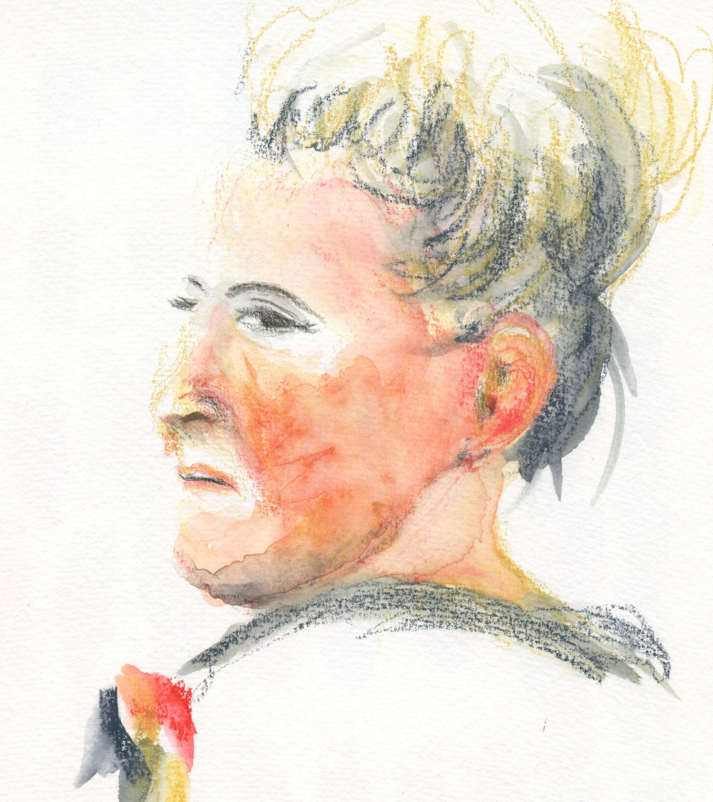
My first two tries were with Caran d’Ache Neocolor I wax pastels (the non-soluble kind) in a red Shizen Design journal. My thought here was that the red paper would serve as an “underpainting.” On the portrait of the blond man (top of post), I didn’t blend at all – I was just getting used to the palette by using black for shading, white for highlights and ochre for hair.
My portrait of the poor younger woman (below) turned into a mess. When I layered black and ochre on the red paper, the result was a ghoulish green! And yet I could see that the red “underpainting” gave a warm glow to her forehead, so maybe my concept was sound.
 |
| 11/19/22 Neocolor I in Shizen Design journal |
Next I used Neocolor II water-soluble wax pastels in my white Hahnemühle watercolor sketchbook so that I could try my hand at wet-mixing of the pigments. (This is the same young woman I abused with ballpoint ink during InkTober; I figured I couldn’t do any worse damage.) Although I gave her a bad case of acne and blotchy skin, I clearly saw the potential for this palette in portraits. Ochre and cadmium red make the basic skin tones, and black would easily darken it.
 |
| 11/20/22 Neocolor II in Hahnemuhle sketchbook |
For the older woman’s portrait, I went back to the red notebook, which has very thin paper. I knew it wouldn’t hold up to much water blending with Neocolor II, but I did it anyway (mostly on the shady-side cheek). Instead of black, I used Payne’s Grey, which has a softer look while still following the basic principle of a cool “black.” Avoiding the ghoulish skin tone this time, I really like the way the red “underpainting” came through (and shows off the white highlights so well).
 |
| 11/22/22 Neocolor II in Shizen Design journal |
Finally, in the last portrait shown here, I used Caran d’Ache Museum Aquarelles in the same three hues as the previous portrait (with Payne’s Grey instead of black). In my Hahnemühle watercolor sketchbook, I had the option of using water if I wanted to, but after applying the color dry, I preferred the softer look of optical mixing. Maybe next time I’ll try water again and see if I can avoid the blotchy acne look.
 |
| 11/23/22 Museum Aquarelles in Hahnemuhle sketchbook |
Related introspection: Every now and then, someone will ask me when I’m going to start painting. The question assumes two things: That painting must be the end-all, be-all of any art-making endeavor; that all these 11 years of sketching must just be a lead-up to eventually making paintings. (I don’t count the first several years of my sketching life when I used watercolors; I don’t consider those efforts “painting,” as I was simply using watercolor as a coloring agent for ink-drawn sketches). I don’t believe that painting is always the ultimate end result of art-making or that it should be.
In the past couple of years, I’ve been actively studying principles and concepts that I have been learning from painters: composition; color temperature; underpainting; and now the Zorn palette. I think many beginning painters struggle because they are trying to grasp those painting principles while also learning to draw and apply paint – that’s a lot to take in all at once. No wonder so many give up after a few classes.
Although I don’t have much interest in pursuing painting at the moment, someday I might. If and when I do, I’ll be relieved to have practiced a few important painting principles before I ever dipped a brush into paint, and it will be easier to focus on painting techniques instead of principles.
(All reference photos were by Earthsworld.)

For drawing, you might want to look into the "trois crayons" technique as a similar concept to the Zorn palette. Both fascinate me.
ReplyDeleteOoh, I've never heard of that! Will look it up! Thanks for the tip!
DeleteHi Tina, this isn't Zorn related but I feel like you need to know about the Midori "decoration crayons" I found recently. The body is made up of super colorful wax dots and I think you might enjoy them. Sorry for being off topic but I feel like anything remotely rainbow-pencil related needs to be relayed to you!
ReplyDeleteWhaaat??? I've never heard of those! I'm on it now! Thank you! (And you're certainly correct that anything remotely rainbow-pencil-related needs to be relayed to me! ;-) )
DeleteI am very interested in what you are going to do with the trois crayons technique. Really enjoying your portraits. Thanks for posting details about your process, it’s really informative and inspiring!
ReplyDeleteCathy I
I just Googled trois crayons and realized I have used the technique in a traditional drawing class I took years ago! I still have those materials, but I've avoided them because they are in the "messy" category! ;-) But I love the look, and it's certainly worth exploring further!
DeleteYou are really learning a lot about color theory. As much as I like your portraits on the colored paper, I think the mixing of the colors shows better on the white paper...although the one of the older woman came out really good! The red as an underpainting really worked there.
ReplyDeleteThanks! I like the red paper too, but it's trickier to work with. I enjoy the challenge!
Delete