 |
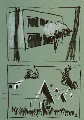
| 10/17/22 Maple Leaf and Green Lake. Now that I've discovered Uglybooks, I have a wide range of colors I can use as the midtone with black and white for shadows and highlights. |
Traditionally tan or gray, toned paper can be much more exciting when we consider other colors (basically, anything besides white). For years now, I’ve loved using red Field Notes Sweet Tooth books with black and white – the first time my eyes were opened to the potential of toned paper. Even better than pale tan or gray, which I’ve often felt do not make white pop as much as I want them to, red strikes just the right midtone balance between black shadows and white highlights. Now that I’ve discovered Uglybooks in a rainbow of colors, I am delighting in the midtone opportunities.
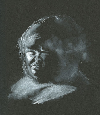
Black, the most extreme tone, has unique and exciting potential. When I use black paper, I forget about any midtones and head straight for the extreme notan look of black and white. Making nocturne sketches with white colored pencils and gel pens is so much fun – I’m looking forward to more this winter. I have also enjoyed doing video life drawing on black paper, especially when the model was lighted dramatically. When I was working on my daily hand series, I filled most of a black Stillman & Birn Nova sketchbook with hands drawn only with white.
 |
| 11/6/22 General's Primo Bianco white charcoal pencil in Shizen Design sketchbook. (Reference photo by Earthsworld) |
During InkTober when I was looking through all the intriguing portraits photographed by Earthsworld, I found many that would be ideal for sketching with white on black. Shown at right is my first attempt; I have plans for more.
Finally, the third way I have found to use a colored base is the way many oil and pastel painters and even some colored pencil artists use it – as an “underpainting.” Inspired by Uglybooks, I started thinking about this concept a couple of months ago, when I sketched some grapes and a Steller’s jay from life. Around the same time, I used a tan Uglybook to sketch a squirrel that was taking advantage of the peanuts we were feeding to the jays (below). Prepared with pencils in squirrely colors in the small sketch kit I had been bringing out to the deck, I was delighted that this guy stood there eating long enough for me to sketch him. In all of these color-on-color experiments, I covered most of the drawing with colored pencil, but the transparency of the pigments enabled the paper’s hue to show through subtly.
 |
| 9/25/22 Prismacolors in Uglybook |
 |
| 11/8/22 Prismacolors in Uglybook (photo reference) |
Now that winter seems to have arrived prematurely (it was 29 degrees when I woke on Wednesday morning), I’m taking advantage of photos I took during the summer to continue my experiments. In the one shown here, I used a mustard yellow Uglybook as the “underpainting” hue with the hope of capturing the Golden Hour light in this neighborhood photograph. Inspired by the works of painters who use a complementary underpainting, I used violet as the main shadow color.
I see lots of potential for more experiments! And I’m tickled that this lazy girl has found Uglybooks: No underpainting necessary. Color is the new white!
I love watching your experiments with the different colored papers. I think the yellow really has a lot of potential...and of course so does the black.
ReplyDeleteI have lots of other colors on deck to try! :-)
DeleteWonderful job with the yellow background!! I also really like the 10/17 one with the roofs. I keep meaning to order some of these books, the colors are so exciting.
ReplyDeleteThanks! These books are really fun to experiment with because the page size is small.
Delete