 |
| Caran d'Ache Colour Treasure Maxi graphite pencils |
When Caran d’Ache announced its Wonder Forest holiday
collection in 2021, of course the limited-edition Prismalo bicolor set
got my full attention, but none of the other products in the collection
interested me much. The two model-849 ballpoint pens were OK, and the lovely
forest green Sharpening Machine would have been nice if it didn’t leave bite
marks on pencil barrels. Fortunately for my purse, nothing tempted me.
This year, however, is a different story. Caran d’Ache’s
holiday Colour Treasure collection not only includes a new Prismalo bicolor pencil set; it also includes a set of Maxi graphite pencils. With ballpoint
pens usually dominating the Swiss company’s gift offerings, pencils are getting
equal billing this year. Until recently, I wasn’t enamored with Cd’A graphite, but
I’ve lately had better experiences, so I grabbed the Maxis.
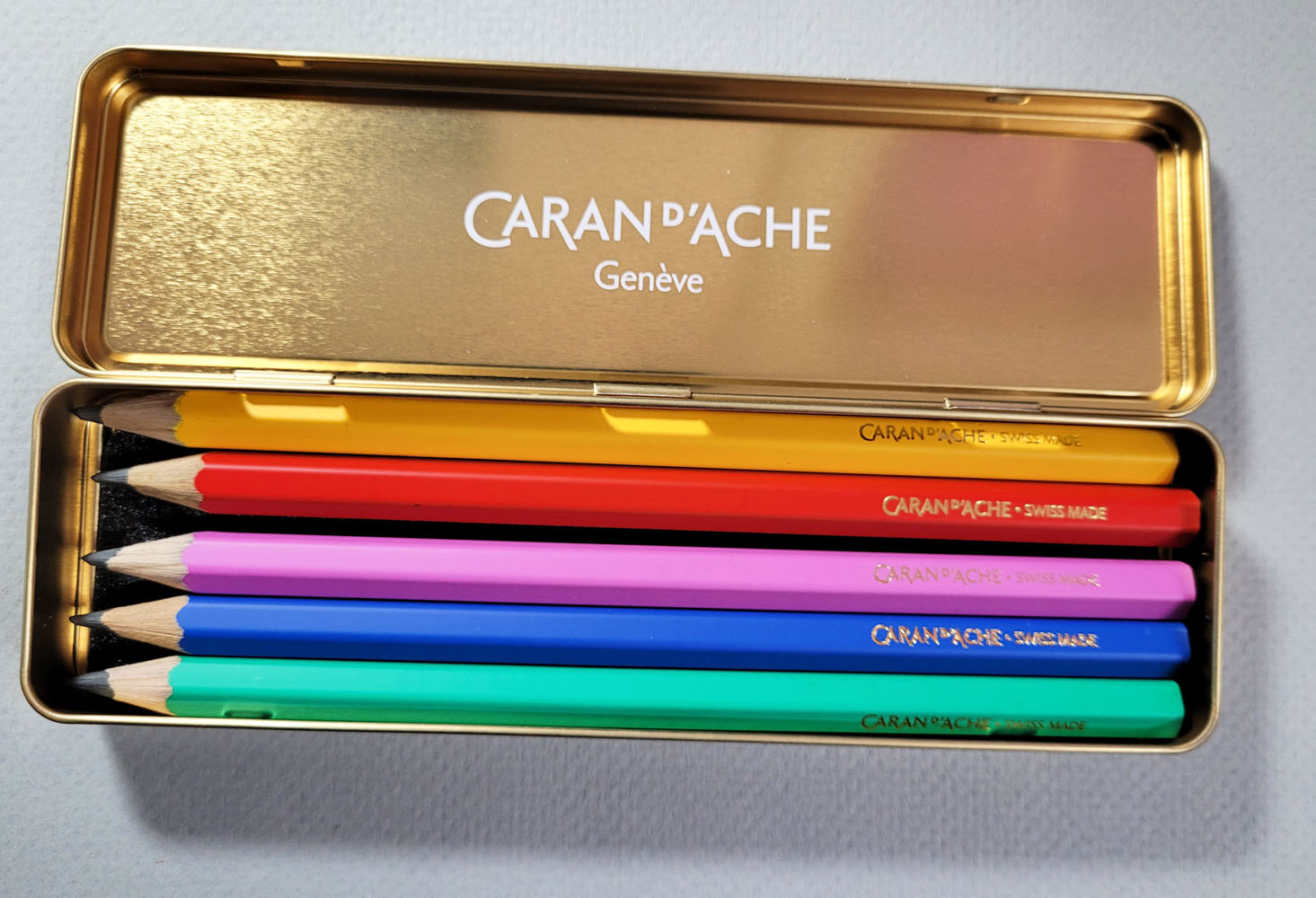
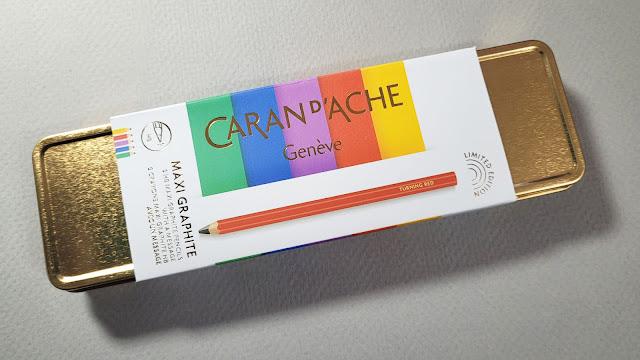
The shiny, metallic gold tin is identical to the one
containing the bicolors set.
The design of the five HB-grade graphite pencils is similar
to the Klein Blue graphite Maxi (which I reviewed last year at the Well-Appointed Desk). The jumbo-size barrel has the same lovely matte
finish and slightly convex, uncovered end. While the Caran d’Ache/Klein Blue
co-branding was printed in white, Colour Treasure Maxi pencils have a gold
embossed Cd’A logo befitting holiday cheer.
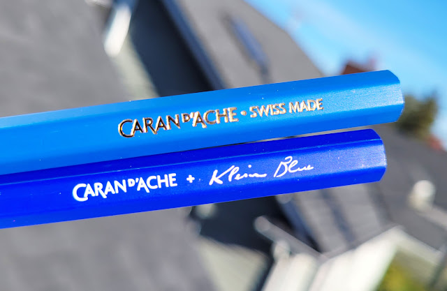 |
| Top: new Colour Treasure Maxi; bottom: Caran d'Ache/Klein Blue collaboration |
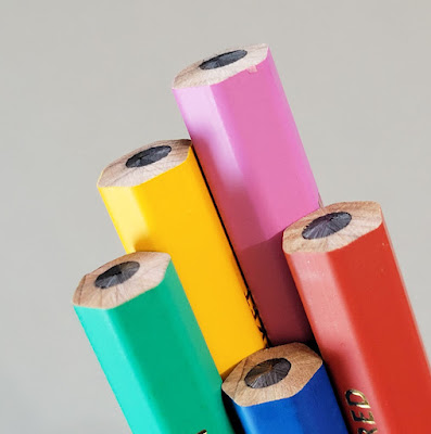 |
| A slightly convex, unfinished finish |
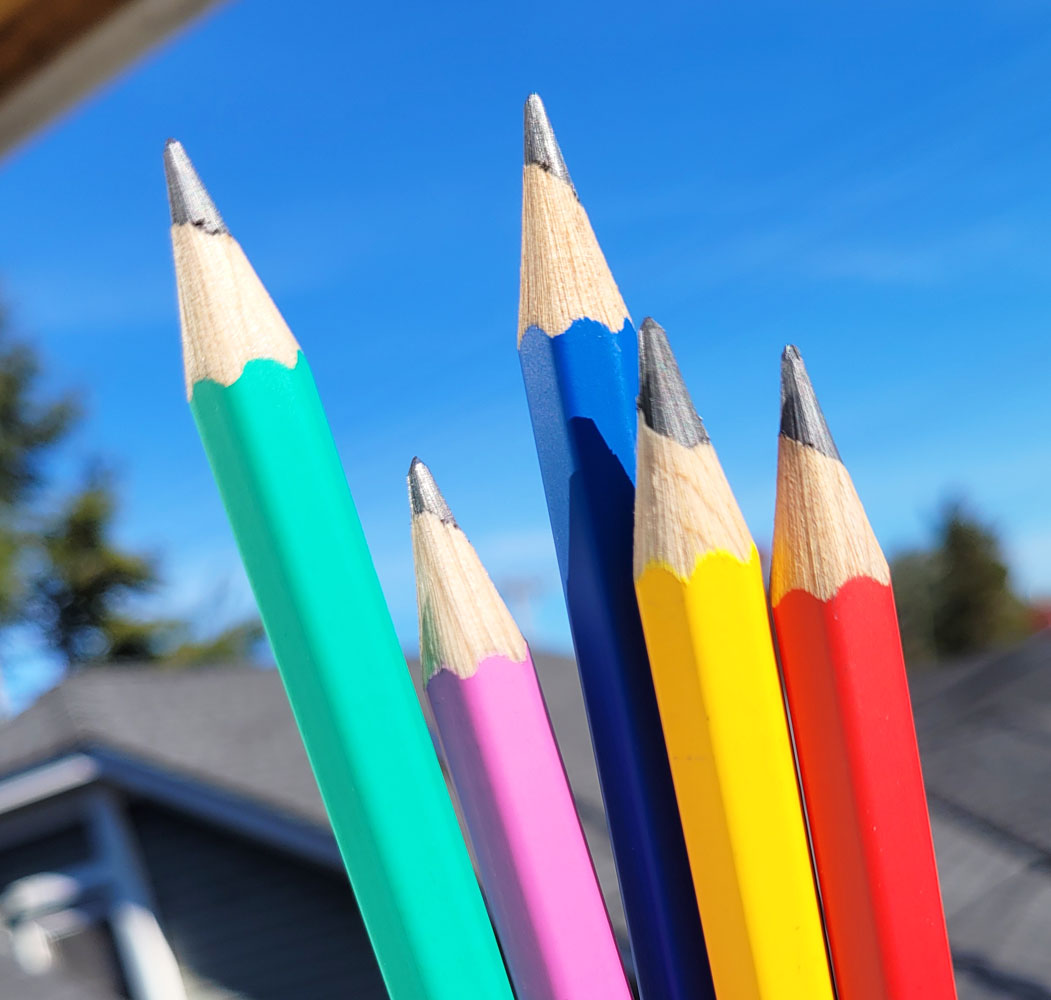
I was tickled to see that, coming from a company that gives
the impression of being somewhat formal (some would say stuffy), each Colour
Treasure Maxi pencil displays a whimsical expression.
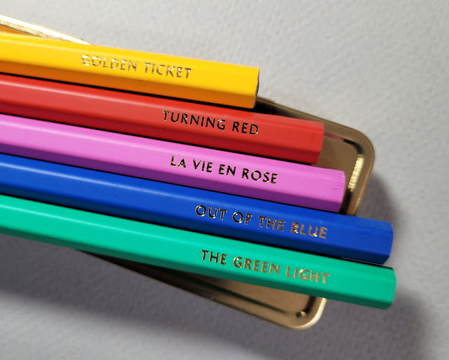 |
| Whimsy! |
Comparing each with the Klein Blue, I found the HB graphite
to be the same (see my review at the previous link to learn more about that).
It’s a thick 5mm core, and the chunky barrel is comfortable to write and draw
with. I love the feeling of the matte finish in my hand.
 |
| 11/15/22 Colour Treasure Maxi HB pencil in Stillman & Birn Alpha sketchbook |
Of course, I would have preferred something softer, but as I learned with Cd’A Grafwood pencils last summer, sometimes a pencil just
needs to be paired with the right paper. Grafwood, which is too “slippery” for
my taste on smooth paper that I would normally prefer with graphite, feels
beautiful on velvety Stonehenge Lenox Cotton. With the Maxi, I
tried Stillman & Birn Alpha, which has a slightly coarser tooth than
Lenox Cotton. I think I prefer Lenox, but I’m on the right track to stay with toothy
paper. I prefer Caran d’Ache graphite when it has something to grab.
These fun, colorful Maxis are good drawing pencils – but the
bad news comes from the back end. I initially noticed that the factory
sharpening revealed slanted collar tops (where the graphite meets the wood) – usually
a sign of off-center cores. The bare ends tell the full story.
 |
| Slanted collar tops |
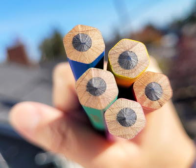 |
| Three of five cores are clearly off-center, and one is a bit off-center. |
I have never seen any off-center cores on Cd’A’s high-end colored or graphite pencils. Maybe these holiday Maxis are considered novelty and not high end, but at this price (five for €24 at Penworld), it’s disappointing
to find anything but perfectly centered cores.
OK, I’ll forgive you this time, Caran d’Ache, but only because
the Maxis are lovely and also fun.