|
| 5/14/22 Green Lake |
In one of the first videos I viewed in Ian Roberts’ enormous collection of tutorials, he explains the difference between a thumbnail and a sketch. A thumbnail is a small, rough “roadmap” to quickly crop the composition’s shape and identify the value masses in preparation for a painting, especially when working plein air. If one has time in the studio, a thumbnail could be further developed into a more refined sketch to understand more about how elements overlap, develop tonal subtleties and otherwise hone the composition (Roberts has posted 30 days’ worth of these types of sketches on Instagram). By resolving potential issues with a thumbnail or sketch before putting brush to canvas, the painting is more likely to be successful.
Although I’m enjoying exploring small studies (my generic
term for scribbles in my sketchbook that aren’t “real” sketches) according to
Roberts’ composition principles, my “studies” often morph into “real” sketches.
I forget that I’m supposed to be learning from the study and not just having
fun making a sketch. This might be partly because I know that my final outcome
will not be an oil painting, so my range from rough to finished is not as wide
as it would be for a painter. But maybe it’s mostly the element of intention: I
start to have fun and forget the intention to study.
 |
| 5/25/22 Roosevelt neighborhood |
It happened one morning on my way home from errands. With
frozen foods in the car, I didn’t have much time, but I knew I could easily
make a thumbnail or two. I saw some interesting shadows next to a
construction-area fence (at left). Somewhere along the way, I got interested in the
details, and it was no longer a study. I had fun, so it’s not a problem, but
its purpose was lost. (I was still quick – my frozen foods didn’t thaw!)
There’s also the element of expectation. A sketcher I follow
was complaining that, compared to sketches she consciously plans to
make, she often prefers the casual, spontaneous sketches she dashes off while
waiting for something to happen. I related to her comment immediately, though
in a slightly different way: I often prefer my studies to whatever “real”
sketches that the studies were supposed to prepare me for. I have no
expectations for the studies, and they often come off as simple, direct and
fresh – which is all I want from a “real” sketch!
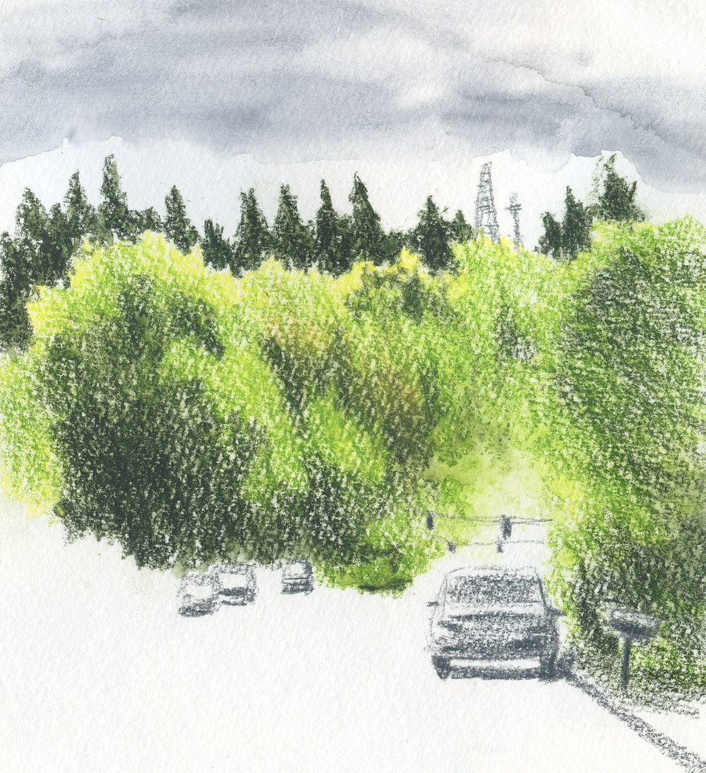
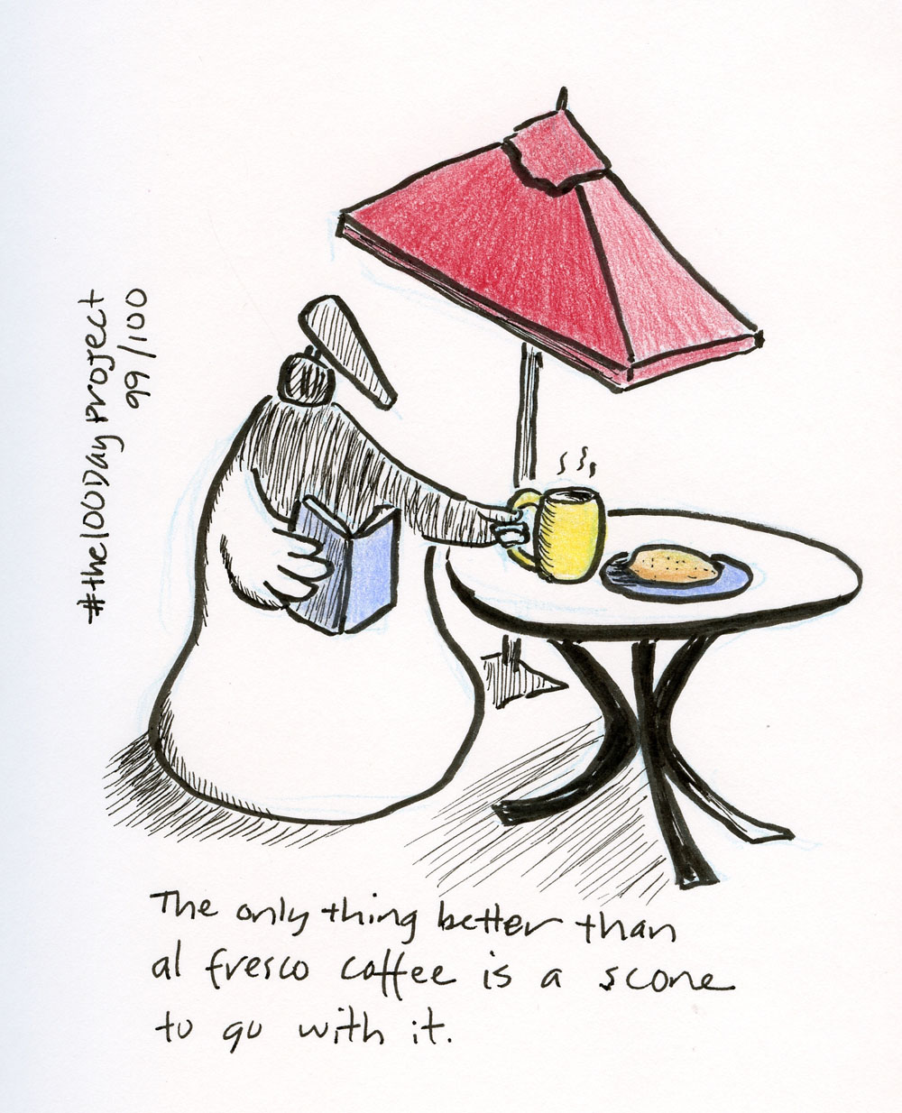
A good example happened at Green Lake recently (top of post). Enjoying al
fresco coffee with Greg, I spotted a scene down the street that I wanted to
sketch, but I didn’t want to take a half hour to make it. I promised I would
take no more than five minutes (he knows I’m good for it). It was an ideal
situation for a thumbnail (by Roberts’ definition): I saw an interesting
composition that I could explore quickly by noting the values (I used yellow
and blue, but they were more for values than color). If I wanted to, I could
come back later to make a larger sketch in full color. When I finished in the
promised five minutes, I liked this little study dashed off in my Field Notes
as much as any “real” sketch I might have made of the same scene. It captured
the moment, and it feels complete. Is it a study? Or is it a sketch?
Not that I care about the labels used, but I do care about
my intention. If I intend to practice deliberately and learn from it, I
don’t want to go on autopilot and just do my usual thing. In this case, it was
the best of all worlds: I made a quick notation of values that ended up being a
fresh, complete sketch – and I like the results.
 |
| 5/25/22 Maple Leaf neighborhood |
And sometimes this happens: I was out walking in the ‘hood one
beautiful day, making compositional studies. Early afternoon, the sun nearly
directly overhead, I spotted a traffic circle tree with a fringe of
backlighting. I thought about making a study, but I love that type of lighting
too much, and I didn’t want to kill the freshness by making a study first. I
went straight in with a “real” sketch (at right). When I was done, I drew a box around it
– a retroactive study! 😉
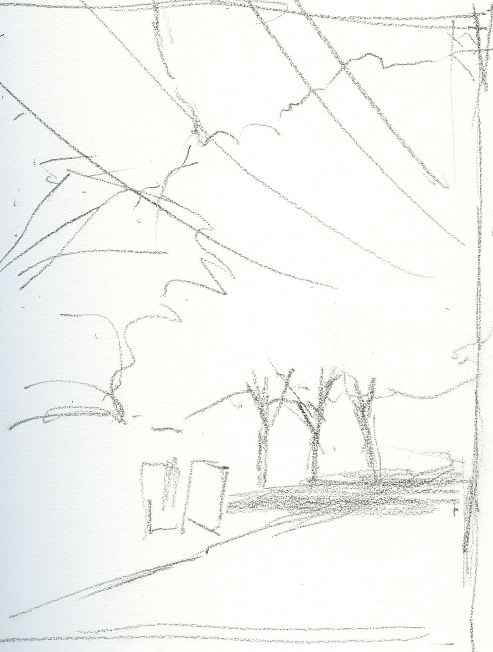
But as soon as I did, I realized I had put the tree smack-dab in the
center – an issue I would have spotted if I’d made a thumbnail first! I cropped
it digitally later (below) to show what that thumbnail should have taught me.
 |
| Cropped to improve the composition |