 |
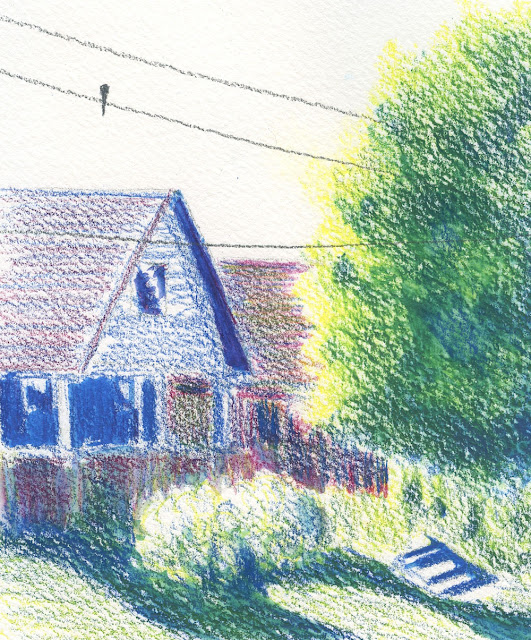
| 5/27/22 Green Lake neighborhood |
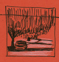 |
No. 1
|
On a cool and gusty morning, I drove around the Green Lake neighborhood to make more compositional studies, but this time I was determined to do it “right”: Stay focused on the “study” aspect (thumbnails made with the purpose of guiding a final piece) and eventually make a “real” sketch with color from a study. My intention was to approach this exercise as if I were an actual Ian Roberts workshop student (except that my final piece would not be an oil painting, of course).
To give myself an additional kick, I took a cue from Sue Heston, who likes to make multiple thumbnails of the same scene cropped in
different ways. She says it pushes her to think
beyond a first impression, and I thought that was an excellent approach. So
often I start sketching the first composition that occurs to me, but as soon as
I do, I see better options.
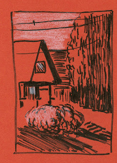 |
| No. 2 |
The first one I made (No. 1) is my typical street
composition: a car, a tree and street shadows. For No. 2, I included the sunlit
side of the same tree and expanded the composition to the left to include part of a house. The last one, No. 3, includes everything in the first two. For all
three, I paid attention to values, the path of the eye and the overall “design.”
(However, as a true urban sketcher, I didn’t add anything that wasn’t actually
there – not even the bird that showed up conveniently in No. 2!)
The tightest crop and the least like a “typical” composition
for me, No. 2 seemed like the best choice for a larger, more finished sketch in
color (top of page). Initially, I was going to use “reality” colors, but
strangely, it felt like less thinking would be required if I used my favorite primary
triad instead. (Using a primary triad used to be a challenge! Now it’s more
comfortable than reality colors!? Whaaaat?? When did that happen?!) Even with
the primary triad, I had enough color challenges to work out that the final
sketch still felt fun and fresh – not just a re-do of one of the thumbnails.
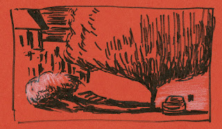 |
| No. 3 |
As you can see, I resisted straying from the thumbnail. In fact, I referred to the thumbnail several times to check the values! Score! As you can also see from the photo below, I had plenty of space available on the sketchbook page, but I still stuck with the thumbnail. It made me realize that I often keep on drawing just because I have space, but the added stuff may not improve the composition (and usually doesn’t).
There – I think I finally followed all the rules! Not bad
for a 30-minute “oil painting,” which I’m very pleased with. Someone, please
tell Ian to give me an “A.”
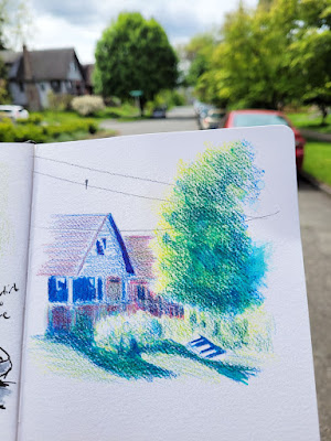 |
I resisted the temptation to add more stuff just because
space is available on the page. |


Really wonderful sketch!
ReplyDeleteThank you!
DeleteThe idea of doing multiple composition studies as a way to think beyond first impression is a good one. I should do that more often too.
ReplyDeleteIt's definitely worth doing!
DeleteThis final "oil painting" really came together. I'm glad to see you pushed yourself to do several compositions to see what would work best. Well done!
ReplyDeleteThanks, Joan!
Delete