 |
| 5/6/22 Composition and color temperature study, Maple Leaf neighborhood |
After getting hooked on Ian Roberts’ YouTube channel,
I wanted a more comprehensive view of his principles. Although his short videos
are nice nuggets that are easily chewed and digested a bite at a time, they
left me hungry for the full meal. As a reader more than a viewer, I also find
that I learn better when I can read concepts as well as see them being demo’d.
I bought his book, Mastering Composition: Techniques and Principles to Dramatically Improve Your Painting. (Originally published in 2007, it is
out of print, but my public library has it, and used copies are available on
Amazon. I got mine on eBay for the same price as originally published. I heard
that a new edition is in the works and will be available soon.)
The full meal I had wanted is a lot to digest, so I’m trying not to stuff myself too quickly. Learning about composition, values, color and other basic keys to developing a strong painting has made me start to think like a painter: Big shapes of color instead of details. Composition and “design” instead of subject matter. Controlling the “edges” between one “color mass” and another. It’s all painterspeak. It seems like it might not apply to urban sketching, and yet it all does. (The only section that doesn’t apply is a short one related to brush strokes using oil paints.)
To be clear, I have no current interest in becoming an oil painter (or any kind of painter, for that matter). But I have enough understanding about the way he teaches to realize that his principles are much larger than specific media or approaches. Whether on a 40-by-30-inch canvas or in an A5 sketchbook, whether using oil paints or colored pencils, the principles of solid composition (and what he calls “design”) are the same. I want to understand these principles to make my usual urban sketches better.
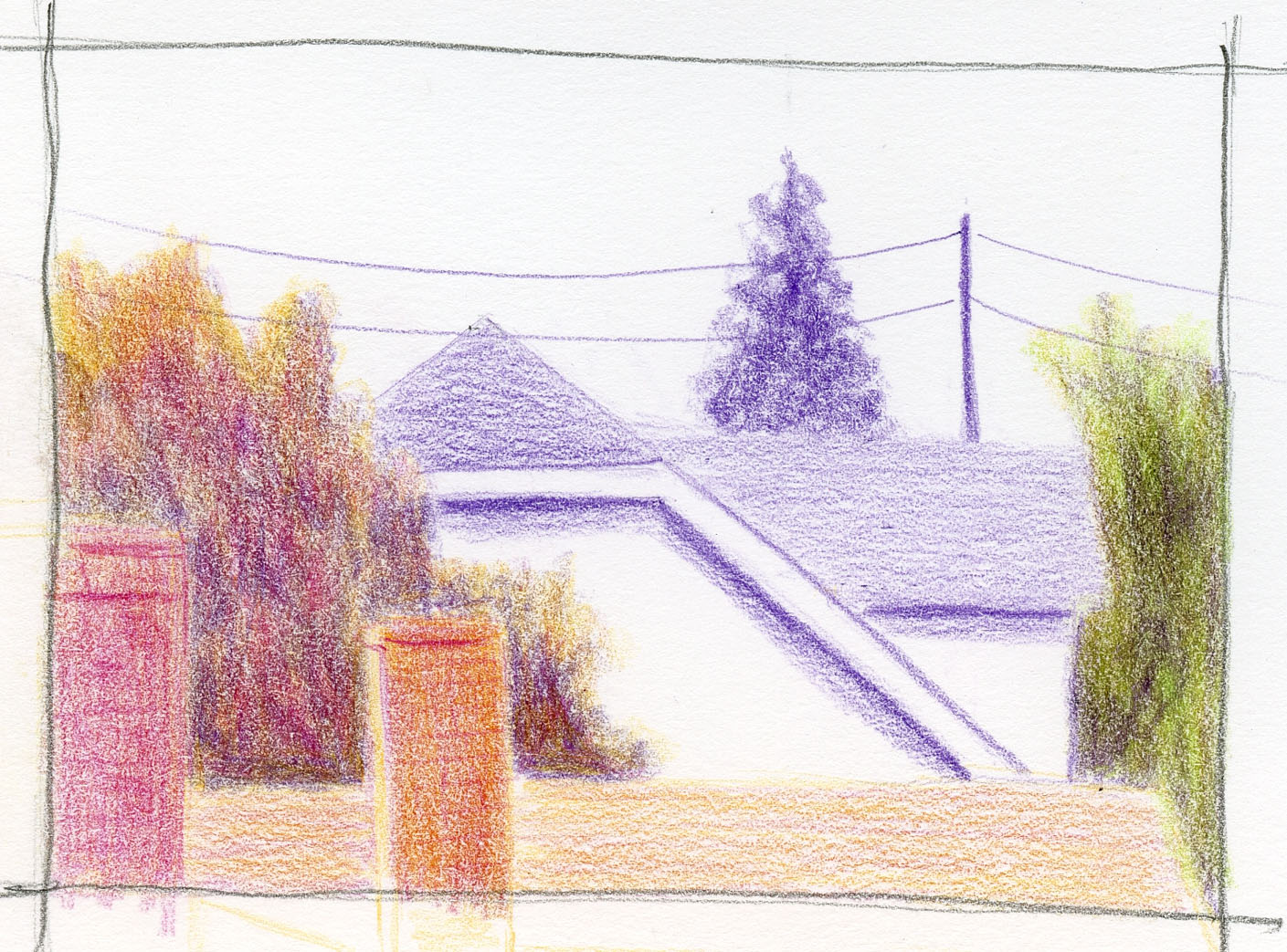
The study above was made through the same west window through which I usually sketch the three houses you’ve seen many times. Although these rooftops and chimneys are just as easy to see, I tend to sketch them in monochrome (here’s one I made a couple of winters ago when the Japanese maple was bare). As a compositional study, though, I think it’s more interesting than the three houses.
 |
| Value study thumbnail |
Because I’m trying to be a Roberts student, I had to make a small value study thumbnail first. (He says his students usually hate making thumbnails and value studies because they want to hit the paint as soon as possible. I know how they feel, but this part also felt more like an urban sketch to me because it was fresh – a scene I hadn’t sketched in a while.)
Then I used a secondary triad with the addition of magenta (I needed something between the warm orange and the cool violet) for the color temperature study. I admit, it was easier to think about color values with my monochrome value study as reference. (Yes, yes – I know almost every art instructor or author says to make a thumbnail first, but I only do it when I’m in class. Admit it – you’re the same!)
Composition: I think if Roberts were here looking over my shoulder, he would first say that my tight cropping was a good idea. He might say that I have some strong vertical, horizontal and diagonal lines to keep the eye moving, but I should get rid of that distracting tree in the upper right (he likes utility poles, though, so I don’t think he would tell me to get rid of that!). He would probably also say that the green foliage I added on the right side, even though it wasn’t in my thumbnail, should have been a lower contrast because it drags the eye out of the picture plane. I think this view has more compositional potential, so I’ll try it again sometime. (Fair warning: You may see these rooftops again.)
Color: It was raining off and on all day, so I didn’t have any shadows to help out except the narrow strips under the eaves. I kind of winged it, relying mostly on the dull local colors. (Roberts would have told me to skip it and come back on a sunny day when I could clearly see the color temperature “shifts.” To which I would reply, “But if it’s sunny, I’m going to be sketching outside, not here in my studio.”)
If you’re thinking that I’ve chug-a-lugged a full glass of the Ian Roberts’ Kool-Aid and now my sketches will be too thoroughly “designed” to be urban sketches, well, you know me better than that. Although I did make both the value study and color sketch from life, I’m not even calling them urban sketches because I moved the utility pole to make a better composition, which means I’m not being truthful to the scenes I witness. 😉


I had to laugh because I do hate doing thumbnails, but if I do them before I do an actual painting (not a sketch) I'm usually very happy that I did. I like hearing your thinking as you are analyzing the composition.
ReplyDeleteLOL! :-) We all hate doing them even if they are helpful! ;-)
DeleteReally enjoying your direction and sketch here. I need to check out Ian Roberts! I actually like your right-side tree--the contrast of its shadow guides my eye back to the white of the house.
ReplyDeleteGood feedback! Thank you! And do check out Roberts... he will really shake up your perspective about composition and design!
DeleteI will, thank you! Your notes on his work remind me of James Gurney's "Color and Light: A Guide for the Realist Painter". Despite the title I think of it almost every time I sketch, even with line-only work. The sections on "light and form" and "atmospheric effects" have been invaluable for my urban sketching observations!
DeleteMy library has the James Gurney you referenced... now in my hold queue! Thank you!
Delete