 |
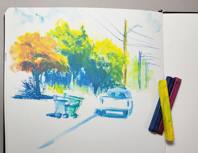
| 11/12/23 Derwent Inktense Blocks in Hahnemuhle 100% cotton watercolor sketchbook (photo reference) |
I went back and forth about whether to write a full review
of Derwent Inktense Blocks or simply write another “messing around” post
as a follow-up to the first one I wrote last spring. I finally settled
on the latter because I haven’t been using them very long. More critically, I
have no other product to compare them with to give a review context. For
example, every time I review a colored pencil, I am consciously (or
unconsciously) comparing it to every other colored pencil I’ve ever used
(whether that’s fair or not). Quite a bit more messing around is required
before I will feel qualified to review this truly unique animal.
 |
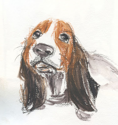
| 11/10/23 Hahnemuhle Akademie Aquarell sketchbook (unattributed reference photo used in France Van Stone's course) |
When I wrote my previous post, I deliberately compared the blocks to Caran d’Ache Neocolor II water-soluble wax pastels, which I thought they would be similar to. I found out quickly that they are completely different. Neocolors are very waxy, almost like traditional kids’ crayons, while Inktense Blocks feel closer to . . . nothing. They are drier and harder than wax pastels and oil pastels (and therefore leave less of a mess on the hands). They’re even different from Inktense pencils or Inktense paint pans. However, they all share the attribute of being “permanent” (Derwent’s term): Once they have dried, they do not reactivate as much as most water-soluble products – but they will move a bit.
Once I got over trying to figure out what they were similar to, it was easier to jump in and find out what they do well. In that previous post, I used them with techniques I typically use with watercolor pencils, but I missed one that I now use regularly (mainly since I started using a Hahnemühle 100 percent cotton watercolor sketchbook, which makes the technique possible): Applying dry color aggressively to a wet page. Most of the sketches shown here put that technique to the test – and Inktense Blocks passed with intensely flying colors!
 |
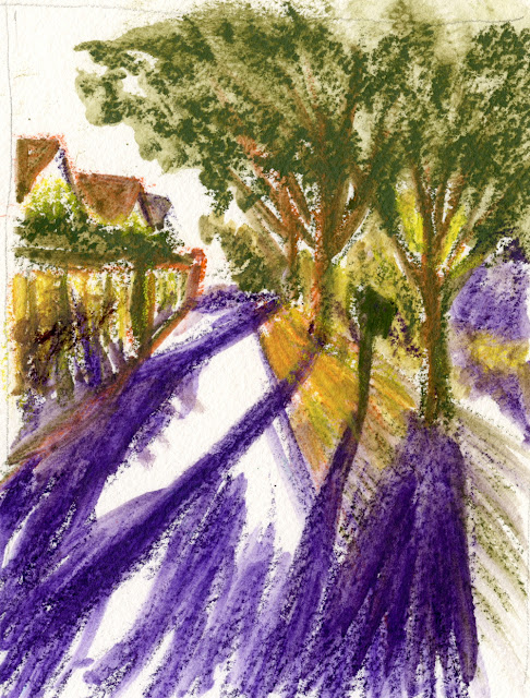
| 11/14/23 Hahnemuhle 100% cotton watercolor sketchbook (photo reference) |
More opaque than watercolor paints or watercolor pencils, Inktense Blocks dry with a matte finish that looks like gouache. When applied directly to wet paper, their intensity has only one setting – bold. If you tend to be shy with color, these blocks will help you get over that quickly.
Speaking of things I need to get over, what I find most helpful about Inktense Blocks is that their chunky size and shape will not allow me to fuss with details. In addition, some of these sketches feel more painterly – broad strokes of color filling the page – than most of my recent watercolor paintings. For a “drawsy” person like me, they are serving as an ideal transition toward being more painterly.
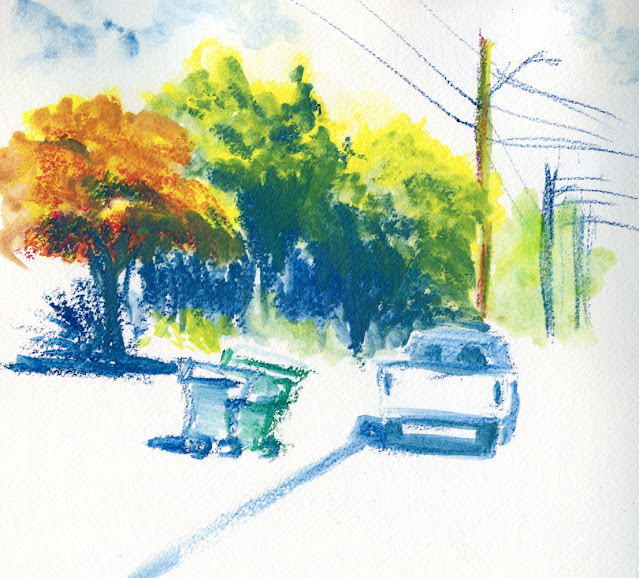
After experimenting with several sketches from photos, I finally took my set of 12 Inktense Blocks out for some urban sketching in my mobile studio (below). Because of their size, I can’t use my usual A6 size book, so I brought along the 7.7-inch square Hahnemühle sketchbook that I’d been using in my watercolor class. Making the sketch below, I think I said, “Whoa!” aloud in my car when I saw that explosion of color!
 |
| 11/15/23 Hahnemuhle 100% cotton watercolor sketchbook (on location, Crown Hill neighborhood) |
I was unhappy, though, by the streaky result of the “licking” technique I used for the sky, which is a standby for me when using watercolor pencils. That’s when I apply water to the page, then pick up a bit of color with the waterbrush and swipe it on the wet paper. I remember having the same disappointing result last spring during my first mess-about. I did a comparison below of that technique using an Inktense Block, an Inktense pencil, a Caran d’Ache Museum Aquarelle pencil and Inktense pan paint. I think the Museum Aquarelle made the smoothest, most watercolor-like wash, but all of them look better than the Inktense Block. Like their pan paint counterpart, the blocks don’t seem to move or flow much once they hit the paper – the opposite of watercolor.
 |
| "Licked" sky technique comparison in Hahnemuhle Akademie Aquarell sketchbook |
I was going to refer to those attributes as flaws, but that’s because I was comparing them to watercolor pencils and paints again. Inktense Blocks are something else, and I’m having fun finding out what other unique qualities they might have.
I’m not thrilled with the 12 colors in the basic set, especially the primary triad, so I bought “a few” (ahem) additional colors open stock at Blick (no, no – I did not get the entire set of 72 colors! No no no – down girl, down!). As you saw in my post about Derwent Graphitint XL Blocks, I am also mixing them with those muted colors, which together make an interesting, broad range of saturation.
Needing a large book means that I’m limited to using the blocks either in my car or where I have a table that I can put the book and supplies on. Since I tend to sketch in my car and in coffee shops most of the winter anyway, it’s not a bad time to bring them out more often. These have exciting potential, and I’m looking forward to exploring them further.
To see a demo of a Derwent artist using the XL version of Inktense Blocks, check out CultPens’ video.
 |
| Exciting potential! |
You are getting some amazing effects with this. Looks like I may have to try them. The red one is really eye popping!
ReplyDeleteI like the boldness of the marks!
ReplyDeleteYeah -- no shyness here! ;-)
DeleteI think you are right; the Inktense blocks are a different thing than any other medium I've seen out there. Derwent sent Katie Moody (mixed media artist) a variety of their products, and she did a few different, interesting techniques with them on her Youtube channel. I can't remember now what she did with which mark making tool, but it may be worth scanning that episode for a few ideas. I only bought five or six, open stock, but I find them so fun to use. ---Julana ys
ReplyDeleteThanks for the tip -- I'll look for her YouTube!
DeleteWow - impressive "messing around"! Smart to quit comparing these to other things and just enjoy them for their own unique characteristics. Apples and oranges you know.
ReplyDeleteIt's great to have a unique product instead of more of the same!
Delete