 |
| Uninformed opinions about Inktense Blocks (the spritzer was not included; you'll be hearing more about that soon). |
In my “messing around” series (three or more of anything is
a “series”), I use a product new to me that I know nothing about and have done
little research on how it is intended to be used – and then show the evidence
of my mess with a few uninformed opinions. It’s kind of the opposite of a product
review: No experience or knowledge necessary!
Having recently acquired two such products in that category, first up is Derwent Inktense Blocks. Familiar with the Blocks for a long time, I had ignored them because my historically shaky relationship withInktense pencils gave me no confidence about using its Block version. But now that the pencils and I have reached détente and are even feeling friendly, I thought I’d try the Blocks as a show of goodwill.
Before seeing the product in hand, my first thought was that the Blocks would be similar to Caran d’Ache Neocolor II water-soluble wax pastels. Just making the color swatches, however, convinced me that they are a whole different animal. While soft and waxy Neocolor IIs feel (and look) closer to kids’ crayons than anything else, Blocks are harder, drier and dustier. The square-cut Blocks are entirely unwrapped, so they also leave a messy residue on the hands. For those inclined, the chunky shape encourages using big paper and making broad, expressive marks.

As you can see from the swatches below, deliberately rubbing a thumb across the dry swatches will cause them to smudge slightly. But I will say one thing for the Blocks: Their water-activated colors live up to their “Inktense” name and heritage!
 |
| Inktense Blocks swatches in Hahnemuhle sketchbook |
On the first day of our recent heatwave, I took the Blocks out on our shady back deck for my first mess-about. And since it’s only natural that a Caran d’Ache fangirl like me would end up mentally comparing the Blocks with Neocolor IIs anyway, I brought out a few of those, too. What the heck – I’d do a showdown!
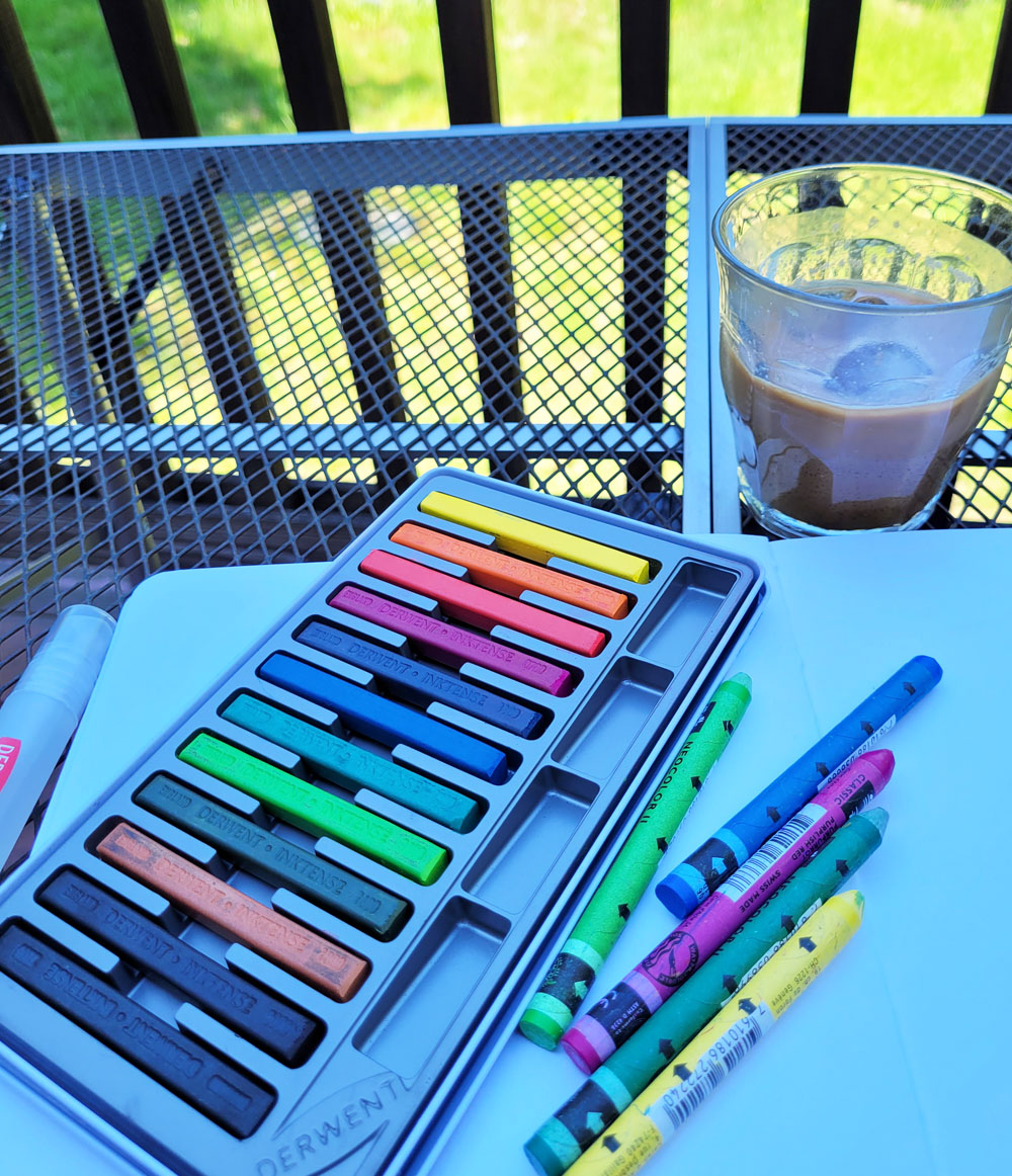 |
| Fueled by an iced latte, the showdown commences on our shady back deck. |
Using my typical urban sketching techniques, I loosely drew our neighbors’ house and their sour cherry tree with a primary triad available in my set of 12 Blocks. I activated the house with a waterbrush and the tree with a spritzer. Finally, I used my “licking” method to paint the sky.
 |
| 5/14/23 Inktense Blocks in Stillman & Birn Beta sketchbook |
Beyond frowning at the muddy triad mix (which I didn’t test before sketching), I was disappointed by the spritzing action on the tree – the color didn’t activate even as well as Inktense pencils (which don’t activate with spritzing as well as I’d like them to, either). The “licked” sky looks splotchy, but that might have been my messy water application. (I’ll give them the benefit of the doubt.)
Picking out a similar triad, I then sketched the same scene again using all the same techniques, this time with Neocolor IIs. The result of spritzing is much more vibrant and fully dissolved, and the “licked” sky looks better, too.
 |
| 5/14/23 Caran d'Ache Neocolor IIs in S&B Beta |
In demos I’ve seen on Derwent’s Instagram promotions, a popular way to use the Blocks is as watercolor pan paints. The slotted tray that the Blocks come in serves as a palette, making it easy to simply swipe a wet brush across the bars. As concentrated as Inktense pigments are, you don’t need much to get a rich dip of color.
I don’t know what got into me, but I decided to try a direct-to-watercolor portrait with the Blocks, combining a challenging method with a challenging subject! Using an Earthsworld reference photo, I swiped a waterbrush onto a few colors lightly and mixed directly on the paper without using a mixing tray. In retrospect, I realized I was using watercolors almost as if they were colored pencils: Apply a tentative layer, then apply more paint over it without waiting for the previous layer to dry – just applying more and more and moving paint around. If I were faster and more confident, this method would probably be called “charging in.” I call it an overworked mess, but it was a good way to test the Blocks as watercolor pans. I discovered that it is possible to mix subtle skin tones with Inktense’s verging-on-garish palette.
 |
| 5/15/23 Inktense Blocks in Hahnemuhle Akademie Aquarell sketchbook (Earthsworld reference photo) |
Although I’ve used a blue Neocolor II for the “licked” sky method, I don’t generally use them as watercolor pan paints. I suppose if I really enjoyed using these bars in the same way that I use watercolor pencils (not holding my breath on that one), this set could be a versatile, compact set for both drawing and painting.
Another discovery was that Inktense’s feature of being “permanent” after drying has a weird effect on my hesitant “charging-in” method. Where some parts did dry completely before I applied more paint on top, hard lines stayed visible, even after scrubbing, but other parts were damp enough to move a bit, so there’s a weird mix of hard and soft lines, all of which were unintentional (but looking at the portrait now, those unintentional results aren’t always bad, but none were conscious choices).
I must say that what impresses me more than the Blocks in this portrait is how well the Hahnemühle paper held up to my abuse. I was putting wet onto damp onto puddles, sometimes scrubbing fairly hard to blend colors, and the paper took it all – without so much as a buckle afterwards, and certainly no pilling or other surface damage. This wasn’t even the 100-percent cotton paper – just the “Akademie Aquarell” watercolor sketchbook. The more I use Hahnemühle, the more impressed I am!
My overall reaction toward Blocks so far is lukewarm at best, but it took me more than a decade to warm up to Inktense pencils – maybe I’ll eventually warm up to the Blocks, too. I do think they are worth exploring more on larger sheets of paper. Blick’s product description offers these ideas:
“Use them dry to apply fine lines or broad strokes directly to the paper. Wet, they can be used like pans of paint, dipped in water to apply color directly to the paper, or applied to wet paper for instant, intense color. Inktense Blocks are ideal for loose, expressive landscapes and colorful still life paintings. They can also be used for rubber stamping, decoupage, or on fabric to create stunning silk paintings and quilts.” (I’d be hesitant to use them with any kind of fiber art, given Inktense’s reputation for being fugitive. Imagine spending hundreds of hours on a hand-stitched quilt and having colors fade!)
One benefit of using the Blocks was discovering the unusual Leaf Green (1600) color. In a basic set of 12, it’s a surprising inclusion. On my swatch chart, it’s third from the right in the second row. (Sorry that the swatches aren’t labeled – the color numbers are debossed nearly illegibly on the bars. Hmmm, I’m having déjà vu of unhelpful Inktense pencil end caps.) Dry, the hue looks like mossy mud, but activated, it looks like no other green I’ve seen among my pencils.
Looking for Leaf Green in my Inktense pencil collection, I wondered what kind of secondary triads I could mix with it. After auditioning several oranges and violets in my color journal, I picked Nightshade (770) and Orange Sorbet (255). (Ignore the Supracolor pink 582 on the right, which is part of another audition. As you can see, I’m none too careful about keeping my color journal entries in tidy grids.) I’m looking forward to giving it a go.
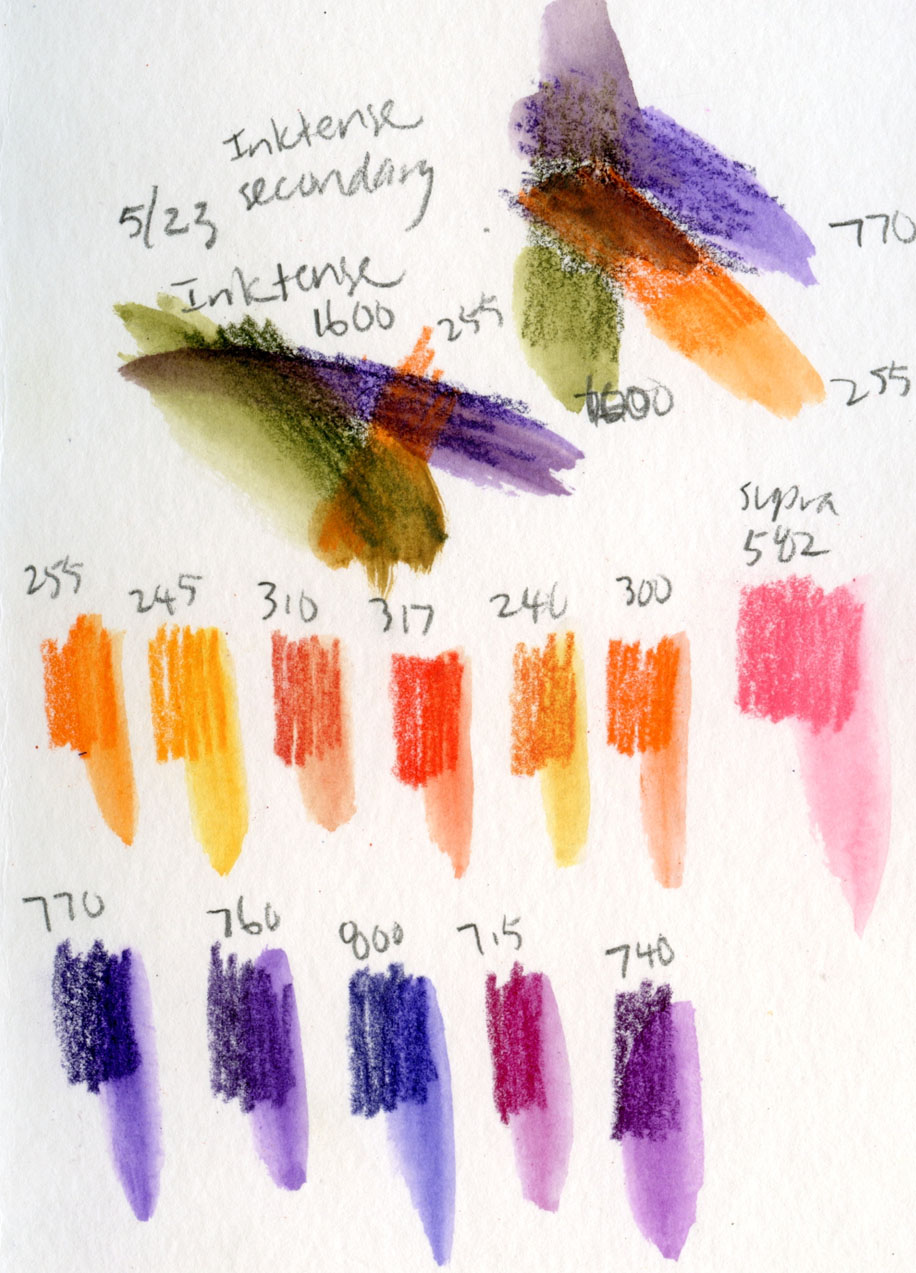 |
| Trying out some purples and oranges to use with Leaf Green (1600) |
See posts about two other products I’ve recently messed around with: Caran d’Ache Pastel Pencils and Faber-Castell Albrecht Durer Watercolor Markers.


No comments:
Post a Comment