 |
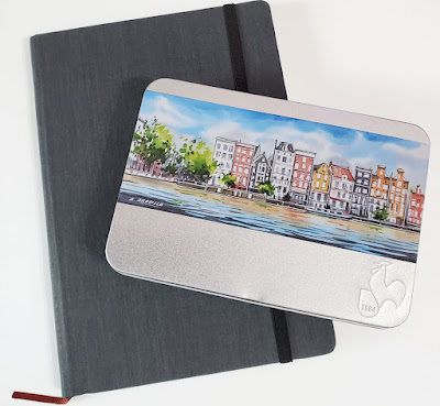
| Hahnemühle A5 sketchbook and postcard set |
A few weeks ago when I shopped at Daniel Smith for
the last time, one thing I had really hoped to stock up on was my daily-carry Stillman
& Birn Beta sketchbook. Alas, by Day 2 of the sale when I made it there,
the Beta edition books were all gone. The Beta I’m filling now is the last of
my stash, but before shopping for more Betas elsewhere, I thought it would be a
good opportunity to try something new.
Whaaat??! If you keep up with my blog, you know that no art
supply sends me into a tizzy as much as choosing a sketchbook does.
Paper is all-important, and if you use a variety of media as I do, then the
choice is always a compromise in one way or another, making the decision even
more difficult. Once I find an urban sketching sketchbook that works for me
most of the time with most materials, I tend to stick with it. I don’t change
sketchbooks impulsively or without plenty of hand-wringing and naval-gazing.
You will be shocked, then, to hear that I will be trying something
new – and somewhat impulsively! I was shocked, too, as I found myself viewing a
Hahnemühle A5 watercolor sketchbook and clicking “add to cart.” I
know that Hahnemühle has a lot of fans among wet media urban sketchers, and I
had been curious for a while, so maybe the choice wasn’t so impulsive after
all.
As I continued searching for Hahnemühle products, I
remembered that the German company also makes watercolor postcards. I haven’t
been making as many postcard sketches to give away as I’d like to, and one
reason is that I don’t like the strong tooth of the Strathmore postcard
pad I have been using. I thought I’d try a tin of Hahnemühle’s cold press postcards, too.
I still have a way to go before my current Beta is full, so
it will be a while before I start using the Hahnemühle sketchbook, but I made a
couple of important preliminary tests right away.
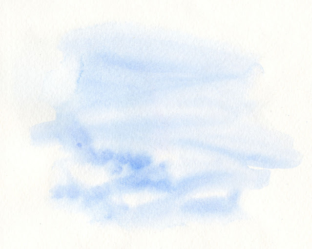
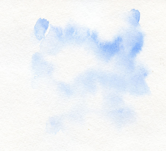
First, I spritzed a page and a postcard heavily, spread the
water, “licked” pigment from a watercolor pencil with a waterbrush, and
applied it to the wet papers. After those dried, on the reverse side of each, I
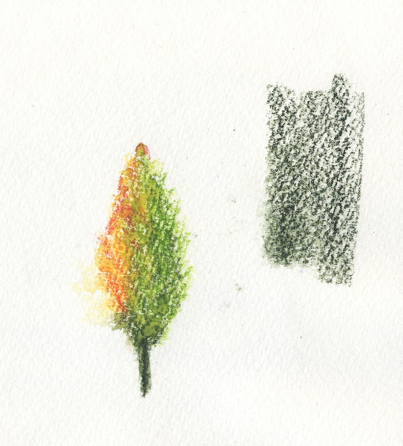
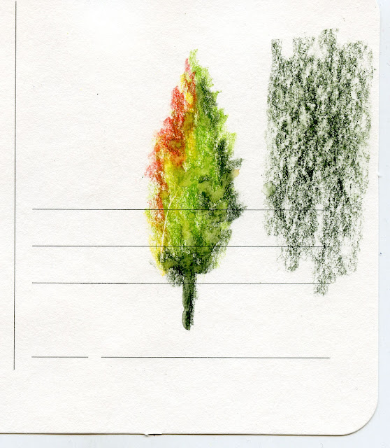
doodled a tree and spritzed it lightly. I also made a patch of watercolor
pencil and left it dry. Although I’m not as fussy as watercolor painters are
about how long paint floats on the sizing, these tests enable me to see how long
I have before wet-in-wet pigment sinks in. I also like to see how well paper
holds up to spritzing and what the surface texture looks like under dry pencil.
Finally, it’s important to me to be able to sketch on both sides of the page.
 |
| Sketchbook |
 |
| Sketchbook |
 |
| Postcard |
 |
| Postcard |
Both the sketchbook and the postcard performed well in these
tests, which are typically my heaviest uses of water. Although the 200 g/m2
(sketchbook) and 230 g/m2 (postcard) papers are significantly lighter than
S&B Beta (270 gsm), they warped less. I thought both papers’ cold-press
textures would be the same, but the sketchbook is a bit coarser, and both are slightly
coarser than Beta’s texture.
Based on these tests, I’m optimistic about Hahnemühle. I
especially like the sketchbook’s true A5 size, which I’ve always preferred to
S&B’s 5 ½-by-8 ½-inch size.
It’ll be a month or two before I can give the sketchbook a full
road test and review, so this is just a preview of my wild and crazy impulse. (What’s next – take up skydiving?) Stay tuned.


