|
| 9/27/23 Optical color-mixing: Luminance and Lightfast colored pencils in Field Notes Streetscapes sketchbook (photo reference) |
There must be something about autumn that puts me in an optical
color-mixing mood. Maybe it’s because it was in the fall two years ago that I
took Sarah Bixler’s color temperature workshop, which reignited my fascination
with the concept. Or maybe it’s because I often use secondary triads in the
fall, and they can be especially beautiful when mixed optically. In any case,
I’m back in the mood.
For my most thorough discussion of optical color mixing, see this post from last year. In a nutshell, optical mixing occurs when
transparent colors are applied in a way that allows individual hues to be visible
if you look closely enough (like Pointillism or pixels). The eye does the work
of mixing the colors together. Alternatively, when liquid paints are mixed
first on a tray or palette, the pigments are physically blended together.
As further discussion of optical mixing, I thought I’d show
examples of the opposite – colors that were
not optically mixed. Since water-soluble colored pencils are, by nature,
mostly transparent pigments, some examples are not clear cut, but I dug through
my files to see what I could find.
Interestingly, I found very few examples of fully blended
colors using activated watercolor pencils, and that’s because I tend to favor
the optically mixed look, even when more thorough blending is easily possible. In
the case of the still life below (full sketch in this post), I used activated
watercolor pencils, blending them more thoroughly than I usually do. (Compare
the water-activated produce with their cast shadow, which I left dry – purple
and green optically mixed.)
 |
| 9/26/22 still life detail; Museum Aquarelle watercolor pencils on Canson XL 140 lb. watercolor paper |
 |
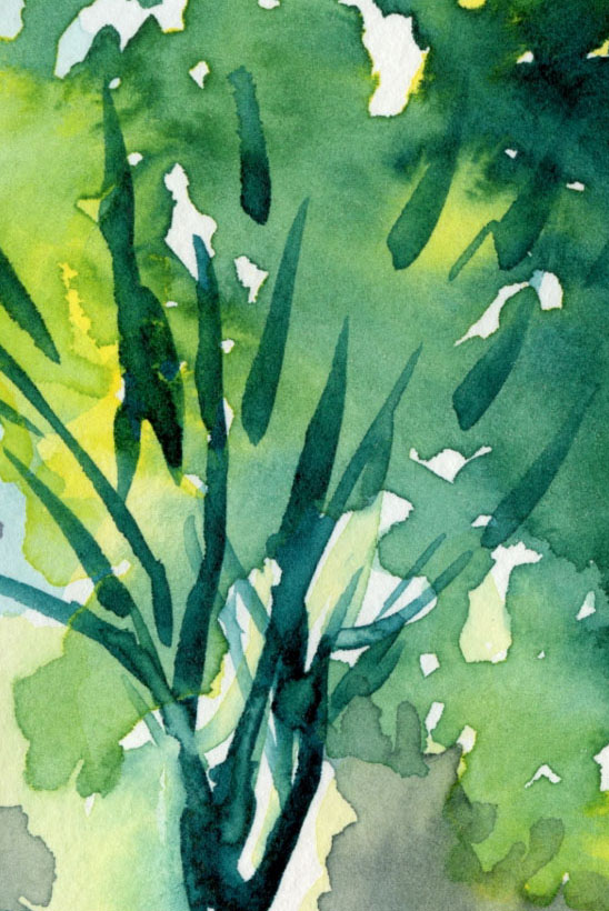
6/11/23 Kuretake Gansai watercolors in
Hahnemuhle sketchbook (photo reference) |
I also found a few examples of watercolor sketches made
during the 30 x 30 Direct Watercolor challenge, when I pushed myself to
mix colors directly on the paper instead of on the tray as much as possible. For
the foliage at left, I applied a good wet wash of yellow, then charged in the
blue, which blended almost completely as if I had mixed the green in the tray.
In dry colored pencils, I found this recent example of a portrait of my grand-niece (below). For her skin, I applied many colors in multiple, light layers.
My goal in this case was to blend all the pencils as smoothly as possible so
that the individual hues would not be apparent.
 |
| 8/19/23 Detail (Polychromos pencils on Derwent Lightfast paper; photo reference) |
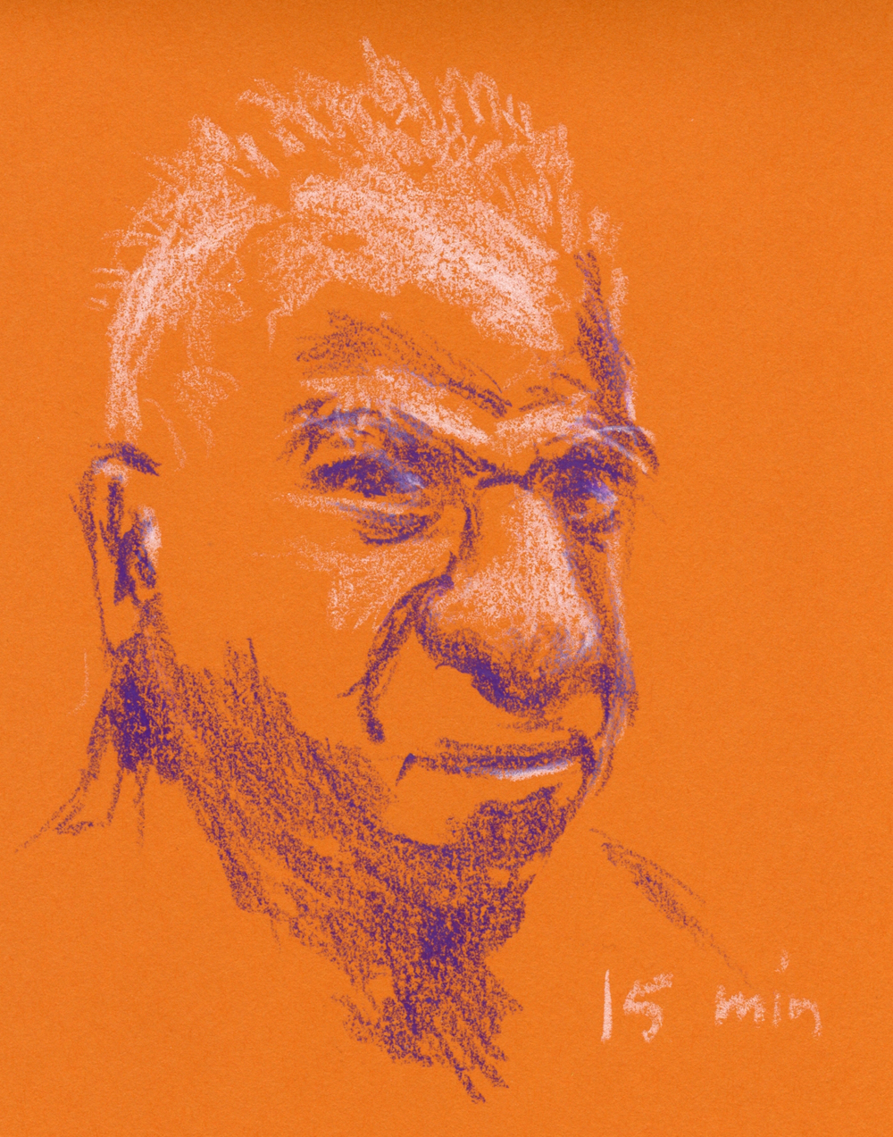
Finally, I have an example of what might be the most
opposite of optical mixing: This small sketch was made with Haiya oil pastels on purple construction paper (below). Granted, I don’t know what I’m doing
with oil pastels, but I find them to be so opaque that whatever colors are
underneath do not show through successive layers at all – perhaps similar to
gouache or oil paints. They do blend when pushed and smudged together, but then
they are acting more like a liquid medium than dry. (What a weird medium oil
pastels are! They are not liquid, but they are so greasy that it’s hard to
think of them as dry! You’ll notice I didn’t scan the image – I couldn’t bear
to get my scan bed greasy!)
 |
| 9/24/23 Haiya oil pastels on construction paper (photo reference) |
As for optical mixing, the topic of this post, I was all set up to experiment on location from my
mobile studio, but last week it rained so much that I knew my windshield wipers
wouldn’t be able to keep up. Instead, I spent some rainy time indoors with
photo references. Using the same primary triad in both sketches (Derwent Lightfast Yellow and Mid-Blue and Caran d’Ache Luminance Purplish
Red), my goal was to allow individual colors to show through so that the
viewer’s eyes would do the work of mixing (top of post and below). These were simple experiments using
only three basic colors as a warm-up, but I plan to eventually try more complex
mixes, too.
 |
| 9/27/23 Optical color-mixing: Luminance and Lightfast colored pencils in Field Notes Streetscapes sketchbook (photo reference). Enlarged like this, it's easier to see the "pixels" of individual colors, but at actual size, your vision does the work of blending them together. |
Both about A6 in size, these two sketches each took about 20
to 30 minutes, which is also the range of time I typically spend on A6-size
sketches in the field. I’m tickled about that, because it means it is possible
to achieve the look I want (the degree of color intensity and contrast) with
dry pencils without taking more time.
(By the way, as I like to do in the field, I am deliberately
using a cross-denominational mix of Caran d’Ache and Derwent pencils with these
non-soluble experiments. Why? Unlike my full loyalty to Caran d’Ache when it
comes to watercolor pencils, I’m not as enamored with Luminance. In fact, I’m
almost ready to declare Lightfast my favorite. Not yet, though.)
What do you think about this optical color mixing concept? If
you’ve tried it, what media did you use?