 |
| 9/4/22 Maple Leaf neighborhood |
Some trees are definitely turning. Others have made half-hearted
gestures in that direction but seem reluctant to let summer go. I know that
feeling.
The sketch above shows two varieties of Japanese maples.
From a distance, they look like a haze of color, the near one with more green, the
one in back with more orange, but both show a full range of hues if you look
closely. Some individual leaves display a gradient of hues, while others show
only one color per leaf. Thinking about optical color mixing, I realized
that these trees are nature’s examples of this concept.
After a couple of blog readers mentioned optical mixing in
their comments, I realized that I hadn’t actively talked about this color
concept in a while, but my long-time fascination with it continues. I’ve
probably been intrigued with optical mixing almost as long as I’ve been using
colored pencils, but I always feel like I’m still just learning about how to
use it. I know when I’ve done it well, but I might not understand it well
enough to explain how I achieved it (or maybe I’m prone to happy accidents). I’m
going to try to articulate some thoughts today to see if they make sense.
Here’s a definition of optical mixing that I found in a quick search:
Optical mixing, also known as partitive color, is the
perception of color resulting from the combination of adjacent colors. In other
words, when color is mixed optically, the blending occurs perceptually, and
takes place between our eyes and our brain. The perceived blending of color
increases with distance.
A common example that’s often given for optical mixing is
how TV and comic book images are made up of tiny colored dots. In art history, Pointillists and Impressionists are known for their use of optical mixing.
I think reading a how-to book on watercolor years ago was my
first introduction to the concept in regard to art making. With watercolor
glazing, multiple transparent colors are layered, allowing each layer to dry
completely before the next one is applied, so that the color blending occurs
only by the viewer’s eye, not by mixing liquid paints. I didn’t get far enough
in using watercolors to practice this technique beyond the book exercises, but
it helped me to understand the concept.
When I started using colored pencils and especially when I
began studying with Suzanne Brooker, my full fascination with optical
mixing began. In her first course we used only dry colored pencils, and that’s
when I realized how similar they are to watercolor glazing – except easier
because all that uncontrollable water stuff wasn’t involved!
 |
| 2/3/17 Optical mixing was a major component of the large grassy area in this study from Suzanne Brooker's class. The individual colors are lightly applied so that layers underneath stay visible. |
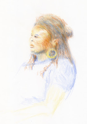 |
11/6/21 In this portrait exercise from Sarah Bixler's
workshop, the facial skin tones and hair are optical mixes
of many pencil colors. |
In Sarah Bixler’s color temperature workshops last
year, my intrigue was reignited. Again, using dry colored pencils only, we
explored the subtle shifts of color temperature that can be made with multiple
colored pencil layers. Because most colored pencil hues are transparent and, by
their physical nature, pencil pigments cover only some parts of the paper,
whatever is underneath shows through. Even if a pencil pigment is on the opaque
side, the marks can be made finely so that the effect remains transparent. The
dry pigments don’t blend together the way wet paints do; the eye does the work
of mixing and blending.
When other sketchers realize I use watercolor pencils, they
sometimes ask why I am so selective in my use of water. Since water activation
makes all watercolor pencil hues more vibrant, why not apply water everywhere?
One compositional reason is that I want to use different
degrees of intensity to show depth or to direct the eye. But another reason is
that dry pencils can show optical mixing more vibrantly – but only if they
remain dry. I’ve made the mistake of drawing an area of pleasing optical
mixing, and in my enthusiasm for the achieved mix, I activated it with water to
make it more intense. The individual colors are lost, and the result is intense
mud.
I still make this mistake occasionally, but here’s an
example in which I didn’t: Shown below is a detail from a recent sketch at Green Lake (the one that prompted the reader comments about optical
mixing). In those background trees, I used four of my chakra palette
pencils in varying degrees. To demonstrate what can happen when water is
applied, I tried to replicate the mix in the swatch. I swiped my waterbrush
through half of it so that you can see the dark mud that results. When left
dry, the individual colors show through subtly, making a complex blend that’s
more interesting (and hopefully more visually pleasing) than fully blended mud.
In addition, activating with water would have intensified the colors and likely
would have brought those distant trees forward. (By contrast, the sunny
foreground trees were fully activated.)
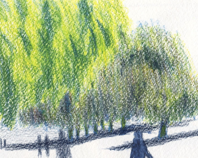 |
| Detail of background trees. See below for activated swatch of replicated colors. |
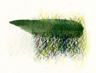 |
When water is applied, the optically mixed colors used
in the trees turn to mud. |
In the sketch of the maples at the top of the post, I activated
only the closer tree to bring it forward compared to the one just behind it. (The
difference is subtle, but they were not far apart.) I used all five pencils in
my chakra palette (ahh, all seven chakras were in balance that day!) for each
tree, but in varying amounts and degrees of intensity. I used enough colors
that a heavy-handed application of water with a brush could have turned the
front tree muddy, but I kept the spritzing minimal. The Hahnemühle sketchbook’s cold-press texture did the work of giving my sketch a bit of
the Pointillist effect even on the tree that I activated with water. Often that
texture gets obliterated when a brush is used, which is why I favor spritzing
when I want to retain some texture.
In the secondary triad sketch I made last spring (below), I
used non-soluble pencils, so I couldn’t have made wet mud even if I’d wanted
to. I know that it’s still possible to make dry mud, especially with a
secondary triad, but I hope that optical mixing allows the individual colors to
shine through while avoiding mud.
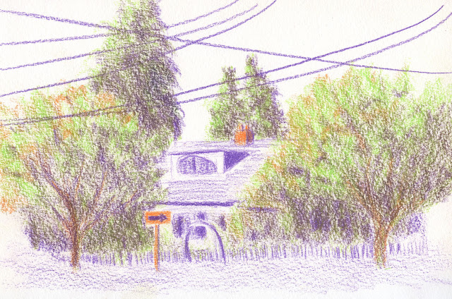 |
| 4/28/22 Optically mixed secondary triad colors |
Other examples shown in this post are explained in the
cutlines.
I hope I’ve been articulate, but even if I haven’t, trying
to talk about all this has excited me about optical mixing all over again! I’m
looking forward to giving these concepts and techniques a solid workout this
fall with a secondary triad palette.
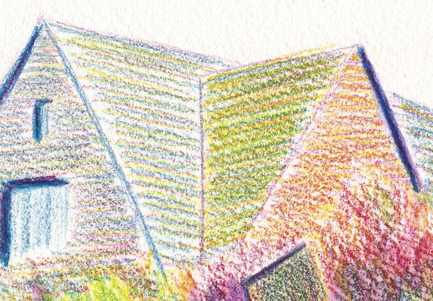 |
| 6/14/22 In this rooftop detail of a sketch I posted on June 18, I used color temperature to subtly indicate the side that had more light and optical mixing of pencils left dry. |
12/4/21 This still life, which was a color temperature
exercise, was made with the CMYK primary triad shown in the upper-right corner.
The avocado shows an interesting example of optical mixing of only the three
hues. Although the Stillman & Birn Zeta paper I used is relatively smooth,
it has enough texture to bring out the pixelated or Pointillist effect that
enhances optical mixing.


