 |
| 9/12/22 Secondary triad season is just getting started! |
Bittersweet but without regrets, I’ve let summer go. I’m
ready to embrace the coming fall in my favorite way: with secondary triads!
Last spring when I was trying to wrap my head around color temperature, a secondary palette was helpful, but autumn is the best time of year to focus
on orange, green and purple.
 |
| My chakras were mostly balanced, but this palette otherwise didn't do much for me. |
Before I get to my new palette, though, I want to close off the chakra palette I’d been using the past few weeks. It was fun using colors chosen for their spiritual associations rather than by esthetics or color wheel formulas, but ultimately, the palette didn’t hang together for me. As a seven-color rainbow, it seems like it should have been basic, and yet somehow it lacked coherence. Maybe it was just that I was conscious of trying to use as many of the seven colors as possible in each sketch (to balance my chakras). Interestingly, that part wasn’t as hard to achieve as I had expected. I thought purple might be difficult to work into urban sketches, but it reminded me that it’s an excellent shadow hue, which gave me more confidence about my secondary triad plans for fall. Although the chakra palette wasn’t a keeper, I’m glad I gave it a shot. And now – onward to my secondary triad palette.
To choose the specific pencils, I used the traditional “split” formula that painters use to create primary palettes: one warm and one cool of each of the three secondary hues. From my Caran d’Ache Museum Aquarelles, I auditioned the likely candidates. Good purples and violets are the hardest to find (since all colors in the Museum Aquarelle collection are supposed to be lightfast, notoriously fugitive purples must be difficult to formulate). For a wider range, I brought in a couple of Cd’A Supracolors, including the Violet (120) that I had just used in my chakra palette. Shown below are the trials:
 |
| These are the Caran d'Ache colors I auditioned for my secondary palette. Most are Museum Aquarelles; a few are Supracolors. |
Initially I selected the six Museum Aquarelles in the triadic mixes shown at the bottom. But MA Periwinkle Blue (131) lacked intensity for the way I like to use purples as dark shadows. I decided to swap out MA Periwinkle Blue for Supracolor Violet (120) as the warm violet. But what am I using for the cool violet? It’s Museum Aquarelle Violet (120)! Whaaat?! I’m sure I’ve mentioned it before, but these two Caran d’Ache violets (at left) with the same number are several shades apart! I can only assume that the brighter Supracolor 120 has fugitive properties that had to be changed in the Museum Aquarelle version. But why give them the same number when they are so different? (Notice also that Periwinkle Blue 131 is the name and number given to two different hues in the Supracolor and Museum Aquarelle lines, though the difference isn’t quite as dramatic as with 120.) My final palette is shown below:
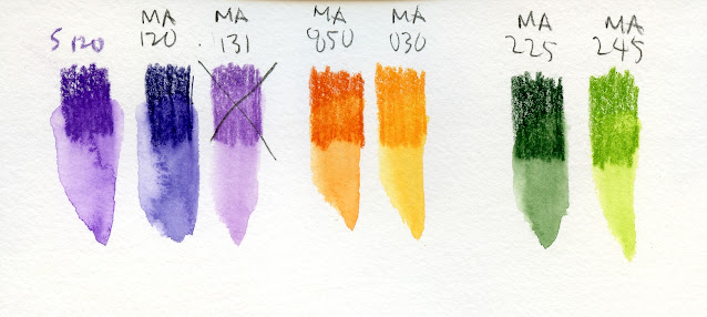 |
| My final palette |
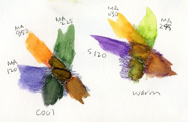 |
| Cool and warm mixes |
In the traditional split primary triad scheme, the theory is that if you mix warms only with warms and cools only with cools, you avoid mud. Should I stick with that theory with my split secondary scheme? Or does it even apply? With secondaries, I am always dancing dangerously close to the edge of mud, even if I keep to the warms-only or cools-only theory, so it probably doesn’t matter much. The greater risk might be in using too many pencils, even if they’re all secondaries, and spoiling the cohesiveness of a nicely limited triad.
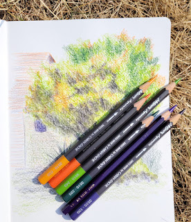 |
| All 6 colors used... maybe too many. |
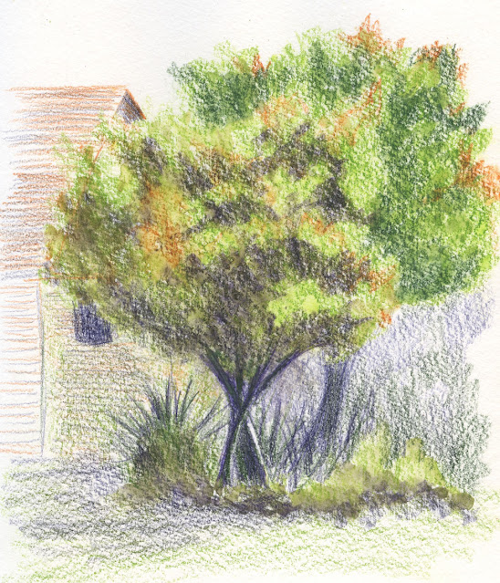
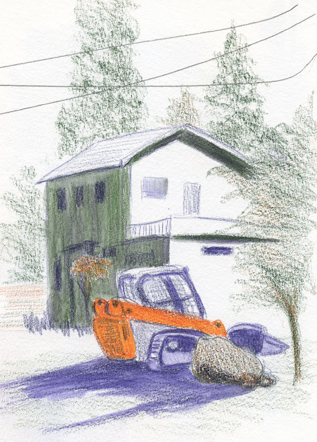
In the sketch at the top of the page, I did just that – used all six of my selected split secondary colors, especially in the trees. The result isn’t bad, so maybe I got away with it (this time).
In the sketch below, I used only the cool triad, and I think it looks more cohesive. I like the way the purple and green came together on the shaded side of the house – an interesting cool neutral. The only spots where I used all three hues are the foreground stones and the little Japanese maple in full shade next to the door. Muddy? Maybe – but in a good way. (I guess you have to like near-muddy neutrals to use a secondary triad palette at all.)
Here’s to a secondary autumn!
Incidentally, James Gurney has a great video demo in which he paints on location using a secondary triad palette – but he’s thinking in terms of a primary triad. Whaaat?! Another brain blowout for Tina! (While making the video, a spontaneous conversation occurs between Gurney and a man who used to live in the old house that Gurney is painting. He could have edited out the dialog, but he didn’t. Gurney is an urban sketcher after my own heart.)
 |
| 9/13/22 Maple Leaf neighborhood |
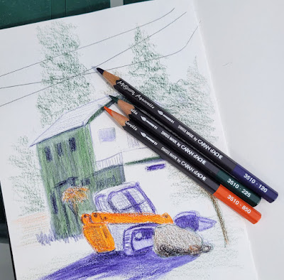 |
| Only the cool secondaries used |
This was great opening up your blog post this morning. Your use of secondaries in a sketch just really helped me use color in a more cohesive way. Plus using a limited palette too!
ReplyDeleteCathy I
Glad to hear my palette inspired you!
DeleteLooks like this will be a great secondary triad. I really like the way you used it in the top sketch.
ReplyDeleteThanks! I'm really enjoying using this triad!
DeleteI'm excited to see your work with secondary triads this season, that cool palette makes nice shadows. Happy sketching and nice work!
ReplyDeleteThanks, Lee! I'm looking forward to pushing this triad this season!
DeleteI really like these trees
ReplyDeleteThank you, Brenoit!
Delete