 |
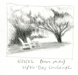
| 6/22/22 Green Lake Park |
During my first couple of years of sketching, I often opened
up my sketchbook and sketched across the full spread. That wasn’t a choice
based on the composition or subject matter; I did it because I had difficulty
scaling down to a small page, so I thought it would be easier if I gave myself
as much space as possible. It took me a long time to realize I was approaching
the solution backwards: I know now that small pages are much easier to
compose (not to mention fill in less time).
For years now, I’ve rarely gone larger than an A5-size page. It’s usually only in workshops when the instructor recommends or requires it that I ever go larger. (Since it’s something I avoid, it probably means I need to give myself a 30-day challenge to make myself sketch larger! Did I say that out loud??)
One of many things I’m learning (or reinforcing) during my current 30-day composition challenge is that my typical thumbnail size – usually around 2 ½ or 3 inches – is a wonderful size for finished sketches as well as studies. They are fast to complete, but more important, they are much easier to compose.
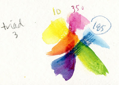
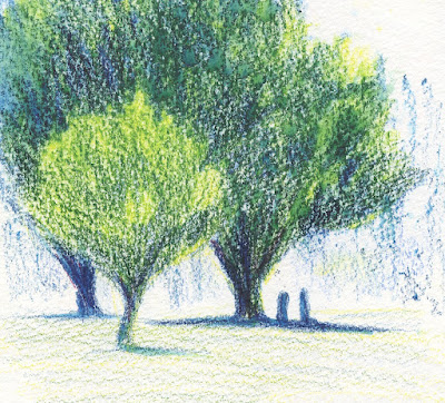
Several examples came up last week. With less than 10 minutes to kill while waiting for a friend at Green Lake, I made a thumbnail study from my parking space with a blue pencil (below, left). That was all I was planning to do, but I still had time left. I added magenta and yellow from primary triad 3 to the study (below right), and a few minutes later, my 2 ½-inch sketch was done. Even though it was tiny, it felt like a “real” sketch since I had made the thumbnail first (and the thumbnail had done its job of identifying values and composition)!
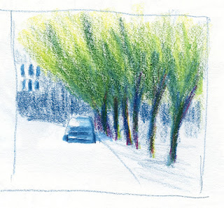
Voila -- the study is now a sketch! 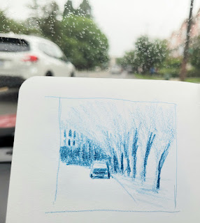
6/22/22 study for sketch at right.
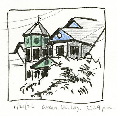
Later at Green Lake when I had more time, I decided to walk to a house I have admired and have thought about sketching for years, but its complexity is daunting. Painted blue, green and beige and with a hexagonal turret, round windows and other unusual architectural details, the unique house turns heads on Green Lake Way. (If you follow Steve Reddy, he made a beautiful drawing of it several years ago.)
I first made a thumbnail from a near-elevation view (below), not so much as a composition study but just to learn more about it. I didn’t like that view, so I walked a few yards south, where I found an angle I liked better. Since color is an important part of this house, I added a little. My intention was to make a larger sketch eventually, but by the time I finished these thumbnails, which took a lot of concentration, I was too tired! I think I’ll be ready the next time I go back, though, because it was informative to study the house on a small scale.
 |
| Thumbnail 1 |
 |
| Thumbnail 2 |
Size matters, and small is easier.
