![]() |
| 4/17/13 Platinum Sepia ink, watercolor, Stillman & Birn Alpha sketchbook |
Wednesday, April 17, 2013
Lenin in Fremont
Monday, May 25, 2026
This Time, Lenin and the Bridge
![]() |
| 5/23/26 Fremont Bridge and Lake Washington Ship Canal, Fremont neighborhood |
Sketching in the Fremont neighborhood is always a game of “choose
your icon.” The Troll, JP Patches & Gertrude, Lenin, Saturn,
the Rocket (bonus points if you can get both Saturn and the Rocket in the same composition), the Fremont Bridge, the topiary dinosaurs
– did I miss any? USk Seattle hit them all last Saturday on a cloudy afternoon.
Although I’ve sketched all of them multiple times, I picked an icon that I may not have sketched as often. It was breezy and chilly by the Lake Washington Ship Canal, but I wanted to start with a peek-a-boo view of the brilliantly blue Fremont Bridge.
After walking around Fremont for a while to warm up, I ended up at the statue of Lenin, where several other sketchers were already settled in at the former Soviet Union leader’s feet. Always a bit daunted by the formidable monument, I walked across the street for a more distant view. I chose a purple and green palette that would contrast strongly with Lenin’s red hand.
In fact, the red hand was just what I needed to fill the short time remaining until our throwdown, when the sun finally came out.
Monday, June 27, 2022
Iconic in Fremont
![]() |
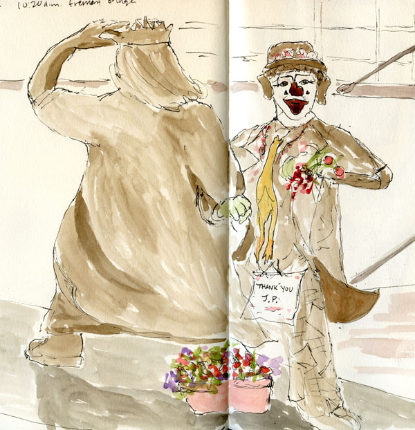
| 6/24/22 J.P. Patches and Gertrude (sculptor: Kevin Pettelle), Fremont neighborhood |
As many times as I have sketched in the Fremont neighborhood, I’m still always torn when I visit. On the one hand, Fremont is full of so many beloved icons (the Troll, the Fremont Bridge, the topiary dinosaurs, to name just a few favorites that I’ve sketched multiple times) that I never tire of sketching. But I also feel like I should branch out once in a while and sketch something less iconic or at least previously unsketched. Last Friday with USk Seattle, I couldn’t resist three icons, but at least I attempted one new subject.
![]() |
| The Saturn Building |
![]() |
| A water tower I hadn't sketched before |
As we both sketched the sculpture, I discovered that Paul is also a Seattle native, so we chatted about all the local children’s TV shows we had grown up with. He went to high school with Stan Boreson’s son! I have had no such brush with fame, although my Brownies troop did appear on J.P.’s show once.
Feeling happy and nostalgic, I made a couple of quick thumbnail studies for my 30-day challenge: the Saturn Building, which I had sketched only last month, and a water tower visible from the J.P. sculpture, which I had not sketched before. There – something previously unsketched and less iconic!
![]() |
| 6/24/22 Statue of Lenin |
The meetup location was the statue of Lenin, which I have sketched several times. Although I wasn’t planning to sketch him again, I had about 15 minutes to kill before the throwdown – just enough time for a small portrait.
So the icons won again. It’s a losing battle in Fremont.
Just for fun, I’ve included below my first sketches of J.P. (from 2012) and Lenin (from 2013).
![]() |
| 4/17/13 My first sketch of Lenin |
![]() |
| 8/9/12 My first sketch of J.P. and Gertrude |
![]() |
| My childhood hero, J.P. |
Thursday, May 28, 2026
Bob Blast’s Painterly Tips
![]() |
| 5/21/26 photo reference |
Bob Blast’s YouTube channel recently came to my
attention. Scanning through his titles, I can see that he is a painter, not a
sketcher, but as I always do with painting instruction videos, I try to apply
his approach to any medium I might use. That’s how I use oil painter Ian Roberts’ extremely informative videos about composition. It’s usually a
little more difficult to use pencils, crayons or markers in place of paint, but
I enjoy the challenge of attempting it anyway. And almost always, the exercise
reconfirms that basic art and design principles apply to any medium.
In the video I viewed recently, Blast (Bob’s real last name is Burridge, but I like that he uses “Blast”) shows how he designs paintings around figures by putting the highest contrast around the area of the focal point. He also uses negative space to clarify and design shapes. Finally, he stresses the importance of showing the direction of light. His style is more abstract than I would typically use for urban sketching, but its visual appeal made me want to try it.
Using a reference photo I had snapped on a walk, I picked out some primary colors in water-soluble markers and crayons. My color choices were based on values, not the photo, and I grabbed basic hues so that I wouldn’t get distracted by trying to “match” what I saw.
Although this approach is very different from the way I usually think, I like the result. I’m especially pleased with how the dark negative space defines the left figure’s lighted side. (I would have liked the way the high-contrast negative space defines the dog’s lighted side if I hadn’t inadvertently drawn the ground shadows through its body!)
![]() |
| 5/23/26 Statue of Lenin, Fremont |
Could I ever do it on location? It’s often difficult to find a high-contrast scene with ideal lighting that would make this exercise easier, but now that I’m aware of what to look for, I see more potential. Last week in Fremont, I was thinking about Blast’s tips as I sketched the statue of Lenin. Several dense trees are behind Lenin’s head. I made the tree on the left (the lit side of the statue) darker to have higher contrast against the focal point. On that overcast afternoon, I also exaggerated the contrast between light and shadow on the whole statue and made the direction of light more obvious -- something I became more aware of because of Blast’s videos.
Tuesday, August 18, 2026
Rear Views of the Center of the Universe
![]() |
| 8/15/26 Lake Washington Ship Canal path, Fremont neighborhood |
![]() |
| Lenin from the rear |
Fremont, AKA the Center of the Universe, is one of my favorite sketching neighborhoods, and I was happy to be back there with USk Seattle. Although I’ve sketched the (in)famous statue of Lenin many times (and I’m sure other long-time sketchers have, too), I never seem to tire of his strong angles and challenging lighting from all the trees around him. This time I tried a fresh perspective – from the rear (at right).
After that, I took a long walk around Fremont to look for my next sketch and to soak in the happy Saturday-afternoon summer vibe. I found myself on the Lake Washington Ship Canal walking/biking path, where I stopped to see how the topiary dinosaurs (which I’ve sketched several times) were doing. Some years, they have looked shaggy or somewhat bald, but they were looking good last weekend. With temps in the mid-70s by then, I walked all around them to find a view that I could sketch in shade (top of post). Coincidentally, the only shady view was again from the rear. Unrecognizable in my sketch, the mama dinosaur’s rear end is on the far left.
![]() |
| Thumbnail to try out the square composition |
The more inviting view was of the shadow pattern crossing the Ship Canal path, a power tower and the Aurora Bridge in the distance.
Material note: Lacking a fine-tip marker, I used a Pentel Sign brush pen to draw the relatively fine lines of the power tower in the color sketch – as well as the people, the dry-brushed border and to write the caption. The more I use it, the more I love this brush pen’s wide tip range and versatility (though I do curse its nonrefillable, disposable form factor).
Monday, June 26, 2017
Back to the Center of the Universe
![]() |
| 6/25/17 water-soluble colored pencils, Tombow marker |
Friday, May 27, 2016
Rocket, But No Saturn
![]() |
| 5/27/16 brush pen, inks, colored pencils, watercolor |
![]() |
| 5/27/16 ink, watercolor |
Friday, May 10, 2013
Sketching in the Center of the Universe
![]() |
| 5/10/13 Platinum Carbon ink, watercolor, Stillman & Birn Beta sketchbook |
![]() |
| 5/10/13 Platinum Carbon, watercolor, Zig marker, S&B sketchbook |
![]() |
| 5/10/13 Platinum Carbon, watercolor, Zig markers, Stillman & Birn sketchbook |
Monday, July 21, 2025
Touring Gas Works and Fremont

7/18/25 Gas Works Park
Gas Works Park is always my top choice for bringing visitors
new to Seattle because you can see so much of the city in one fell swoop. The
downtown skyline, Lake Union, Space Needle, seaplanes, towering steampunk-era
gas works – what more could you want? We had Sketcher Fest visitors in mind when
USk Seattle planned this outing for the day before Sketcher Fest got under way.
I was pleased that our great turnout included visitors from Berkeley,
Cincinnati and New York City!
![]() |
| 7/18/25 Fremont |
After the outing, I took Cathy (from Berkeley) to nearby Fremont for lunch and a leisurely sketchwalk around the neighborhood. As a resident, it’s always fun to see familiar icons through the fresh eyes of visitors (and their sketchbooks). Although our morning at Gas Works had been overcast and a little chilly, the sun came out for us in Fremont because, after all, it’s the Center of the Universe.
![]() |
| Obligatory selfie with Lenin in Fremont |
Sunday, May 19, 2013
A Tour of Seattle, Urban Sketcher Style
![]() |
| 5/18/13 Platinum Carbon ink, watercolor, Stillman & Birn Beta sketchbook |
The highlight of our Friday evening meet-and-greet over Ballard Pizza Company pizza was hearing guest and MC Gabi Campanario talk about the birth of the Urban Sketchers movement and how local workshops like “Line to Color” have become an ongoing adjunct to the annual international Urban Sketchers symposia.
![]() |
| 5/18/13 Pilot Iroshizuku Take-Sumi ink, S & B sketchbook |
In Ballard on Friday and Fremont Saturday morning, workshop participants practiced perspective and composition under Frank and Gail’s watchful eyes and thoughtful critique. As one participant kiddingly said, “I thought I was my own worst critic until I met Frank.” I worked hard practicing the exercises they recommended, but when they weren’t looking, I snuck in another sketch of Lenin (actually, my third, although he’s barely visible in the second).
By the time we got to Gas Works Park on Saturday afternoon, we were adding color to our lines. I finally got to practice wet-on-wet clouds over the Seattle skyline using the technique I’ve long admired in Gail’s sketches.
Sunday morning’s class at the Market was combined with the regular monthly Seattle Urban Sketchers meet-up, which brought out a record number of sketchers! (As far as social urban sketching goes, this sketchcrawl was an anniversary for me: A year ago this weekend I went to my very first.) I did one class exercise, a value study with selective color of the iconic Public Market Center sign. But after that, I decided class was over, and I spent the rest of the meet-up sketching my favorite farmer’s market subject: street performers (see next blog post).
![]() |
| 5/19/13 Platinum Carbon ink, watercolor, Stillman & Birn Alpha sketchbook |
By the end of the workshop, I came to the same conclusion I always come to: Learning from the masters helps; hearing their critiques of my sketches helps the most. But the only way to become a better sketcher is to practice, practice, practice.
Thanks, Gail and Frank, for another great workshop!
Monday, March 27, 2023
Advice I Would Give to My Newbie Self
![]() |
| 3/23/23 Le Pen Flex brush pen, Moleskine sketchbook (all reference photos by Earthsworld) |
Back when my primary drawing tools were fountain pens, one
of my techniques of choice was the ink-line wash. For years, I made line
drawings with water-soluble inks, then washed the lines for shading. It was a low-maintenance
technique on location – all I needed was a fountain pen and a waterbrush.
Using that technique with Marvy Uchida Le Pen Flex brush pens reminded me how much fun it is. It also made me realize that it may be a simple technique in terms of tools, but it is not necessarily easy. In fact, it’s quite challenging to make subtle modulations in tone, and controlling water flow is finicky with a waterbrush. In addition, paper sizing and texture affect the results significantly. All of that explains why I spent a lot of time and research back then trying to find the best combinations of inks and papers.
Perhaps most important from my then-newbie-self’s perspective is that it’s almost impossible to get a good range of values using nothing but a washed ink line. My darkest values were always relatively wimpy. (I recall vividly a sketch I had made of Fremont’s statue of Lenin during my first urban sketching workshop nearly a decade ago. I had washed the lines made with a gray fountain pen ink, and I thought I had done a decent job of bringing out tones and shadows. Squinting at the sketch, workshop instructor Frank Ching had remarked on the absence of darks. I recall thinking, “Oh – those pale gray marks aren’t dark enough?”)
In retrospect, I think it was a simple technique for a newbie to use – but not necessarily a good one to learn with.
![]() |
| 3/24/23 Le Pen Flex, Hahnemuhle Akademie sketchbook |
I thought a lot about this conflict – ease of use vs. ease of learning – during the weeks that I was taking Kathleen Moore’s Winter Sketchbook + Watercolor class (I have some comments on it in my summary of the last session). When I first began sketching, I looked around at all the other urban sketchers (online and in person) and saw that the vast majority used watercolor, so I thought I should, too. Easily cleaned and mostly non-toxic, watercolors seemed friendly – even kids use them.
Watercolors give the impression of being an easy-to-use medium. In fact, they are: All you have to do is wet your brush and stick it into the paints. But as anyone who has ever used them knows, they take a lot of practice to get good results and many years to master.
Thinking about everything beginning urban sketchers have to learn, all at once – how to draw, what to sketch, how to compose, where to stand or sit, what to bring – no wonder learning to sketch with watercolors was challenging, and my results were often disappointing.
![]() |
| 3/23/23 Le Pen Flex, Hahnemuhle 100% cotton sketchbook |
Sometimes I wish I could go back in time and tell my newbie self to skip the watercolors and maybe skip ink-line washes, too. My newbie self would hate me, but I would recommend something that would aid my learning instead of impeding it: How about a single soft graphite pencil? It’s easy to carry, and I can use any paper. With it, I can learn form and values while studying composition, and I can still sketch any subject matter I want. Gain a little confidence and skills with that before I add color.
A single graphite pencil??! Boooring! Noooo way!
Well, I tried.
Friday, June 14, 2024
North Fremont
![]() |
| 6/9/24 North Fremont |
When most people think of Fremont, the troll, Lenin, and the monument to JP and Gertrude probably come to mind. That’s
what I think of, anyway, and that southern end of Fremont is the only part I’ve
spent any time sketching. On Fremont’s northern edge, though, where the
neighborhood butts up against Phinney Ridge, it’s a little less “Center of the Universe-y” and more working class or maybe just more neighborhood-y.
To celebrate a friend’s birthday, we decided to meet at Uneeda Burger, which is housed in a building that must have been a garage at some point. The sunny deck in front was an ideal spot to devour messy, drippy burgers (both animal- and plant-based and taller than they were wide) on a lovely Sunday.
Arriving a little early to make time to sketch (and finished after lunch and a fun visit to the Fremont Sunday Market), I captured a few other buildings visible from the intersection of North 44th and Fremont Avenue North. The oldest was probably the Fremont Abbey Arts Center, a 1914 brick building that was originally St. Paul’s Lutheran Church.
Process notes: Like my old apartment building, none of these buildings struck me as particularly sketchworthy. The lighting wasn’t great on any of them, and let’s face it, I’m generally not a fan of sketching buildings just for the sake of sketching buildings (unless I’m in Amsterdam, Coimbra or Kyoto, of course). I’ve noticed, though, an interesting change in my attitude about architecture since I began making on-location comics. Because each sketch tends to be no more than thumbnail size to fit several on a comic-style spread, it’s much easier and faster to draw any building, even if it doesn’t interest me much. I look at each as simply a part of the larger story – in this case, an intersection in north Fremont – and it has become much more enjoyable to sketch these sometimes ho-hum structures. I don’t worry about getting angles or perspective right; I just choose a building’s corner and simplify it enough to fit into 2 or 3 inches. And I end up liking these small sketches much more than building portraits that I might fuss over for much longer. That’s a huge, unexpected benefit of embracing comics!
Thursday, April 4, 2019
Fremont’s Ship Canal (and Zeta Disappointment)
![]() |
| 3/30/19 Path along the Ship Canal |