 |
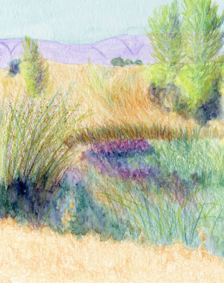
| 4/20/17 water-soluble colored pencils (photo reference) |
This week’s lessons in my colored-pencil class are depicting distance and using the secondary
triad. I’m not too pleased with my result in terms of showing distance, and I
wasn’t at all inspired by my photo reference of a marshy field – something I
would probably never choose as subject matter on my own. On the other hand, I
love the secondary triad palette I used and the process for mixing those hues!
During most of the previous lessons, we’ve used a primary
triad palette (red, yellow, blue) with a warm and a cool of each hue – a classic
paint-mixing structure. When I used watercolors, my tiny paint box allowed only
eight half pans, so I generally carried some variation of a primary triad with a couple of secondary or other “convenience”
colors. I’ve also experimented with colored pencil primary triads on my own, so I’ve gotten used to mixing
primaries.
This week when Suzanne introduced the concept of using a secondary
triad, I was very excited! Orange, green and violet is my favorite color
combination for almost everything (someday I might show you my dishware,
towels and downstairs bathroom), and I’m always attracted to it when
I see it in the work of others. (One of my favorite urban sketchers who uses
the secondary palette beautifully is Richard Sheppard.) But I’ve never consciously used it as a painting palette myself.
It was high time for me to use it with pencils!
While picking out warms and cools of the primaries is
easy, it took a little more thinking to choose the secondaries, mainly because
I don’t do it often. Finding the right purples and greens was relatively
straightforward, but the oranges were more challenging – it’s strange to think
of any orange as being cool. With Suzanne’s help, and keeping in mind the
marshy subject matter of the photo reference, I chose a dark reddish orange for
the cool and a yellower one for the warm.
Mixing the cool green and cool violet for the darkest
shadows was fun and surprisingly rich (instead of garish, which I feared).
 |
| My uninspiring photo reference. |
I’m going to be using this palette again . . . in fact, I
think it will be ideal for Italy next month!
Updated 4/27/17: Here are the specific colors in the secondary triad above:
Caran d'Ache Supracolor - Russet (065)
Faber-Castell Albrecht Durer - Terracotta (186)
Caran d'Ache Museum - 245
Faber-Castell Albrecht Durer - Deep Cobalt Green (158)
Faber-Castell Albrecht Durer - Delft Blue (141)
Caran d'Ache Supracolor - Purple Violet (100)

I really love the color combinations in this sketch! What are the names of your secondary palette for your water soluable pencils? I didn't realize that you could base a sketch on a secondary palette! Beautiful results!
ReplyDeleteGreat question -- I wish I'd thought of that earlier! I've updated the post with the specific color names/brands.
Delete