Showing posts sorted by relevance for query cmyk. Sort by date Show all posts

Thursday, October 27, 2022

Bic CMYK Colors (and Cristal UP Comments)


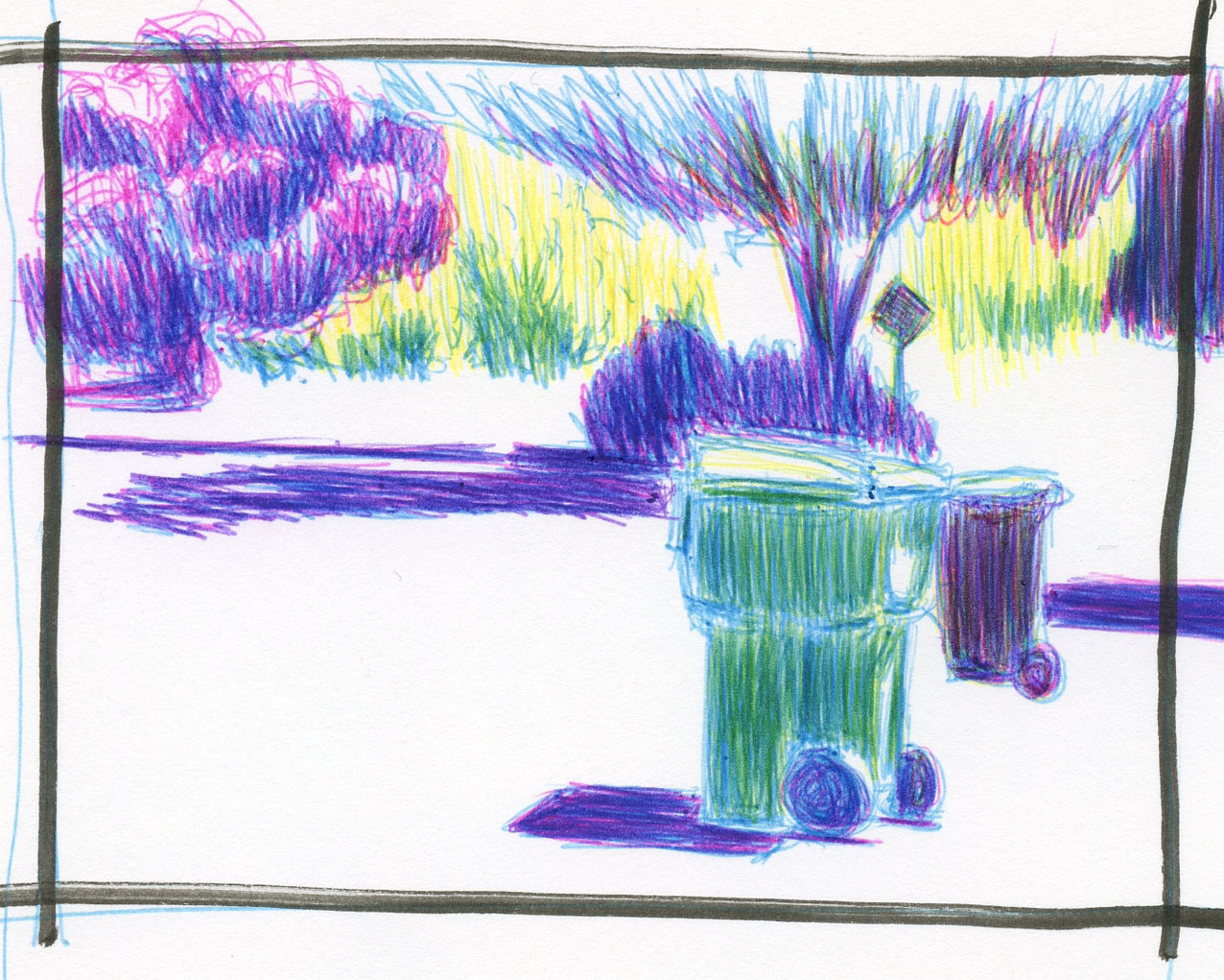
10/19/22 Bic 4-Color pens in Stillman & Birn Epsilon sketchbook
 (photo reference)

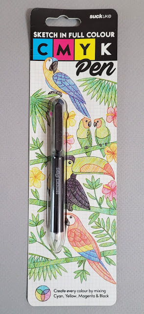
Does anyone remember my SuckUK incident? Early this year, I learned that a company with the unfortunate (and ultimately appropriate) name of SuckUK makes a ballpoint multi-pen containing the four CMYK colors: cyan, magenta, yellow and black. With my ongoing interest in CMYK primary triad mixing, I couldn’t resist giving the pen a try. While I applauded the company’s unique, innovative concept, my applause ended abruptly – as soon as I used it. After I wrote the review, I put the pen aside and dismissed it as another good idea poorly executed.

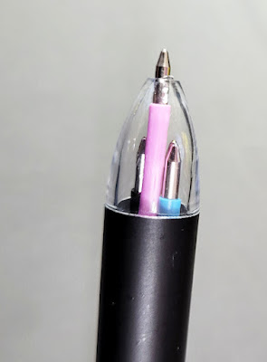
Fast-forward to a couple of weeks ago when a thoughtful blog reader brought this tip to my attention: The turquoise, pink, yellow and black inks contained in special editions of Bic 4-Color pens are, in fact, CMYK hues! Cue the exploding brain emoji! I could make my own CMYK multi-pen by putting the four ink refills into the same body – the SuckUK concept but with my beloved Bic inks!

The cutest way to get the two necessary 4-Colors

Black is available in all standard Bic 4-Colors, but the other three colors are not. I immediately went to my collection of Bic 4-Colors for the inks I needed. If you want them, the one containing turquoise and pink (along with purple and lime) is the “fashion” edition. The one that includes yellow (with orange, purple and pink) is called the “Sun” edition. The easiest (and most adorable) way to get both is to spring for the Bic 4-Color pen holder collection that looks just like a giant 4-Color pen (the holder is as cheesy as the pens in material and construction; remember, we buy Bics for their inks, not for their bodies or cases). I just happen to have that holder assortment, so I was golden.

First, I made a mixing swatch and immediately liked the secondaries that the C, M and Y could make (below). But what impressed me was the black that came together with the three primaries – I didn’t even need the black refill!

Mixed Bic CMYK hues


Trapped in the house during our seemingly endless days of hazardous smoke, I made this sketch on a trash day – what an ironic heartbreaker to have to resort to using a reference photo! But I was instantly cheered up when I saw the brilliant mixes I could get from Bic’s version of cyan, magenta and yellow.

Just for fun, I also mixed the three secondary colors that
are included in the two 4-Color assortments shown above.

As much as I enjoy drawing with Bics, I use them mostly for layered tones and, just lately, crosshatching. It’s unlikely that I would use Bics much as a coloring medium. Still, it’s good to know I could use Bics for full color if I wanted to (like on my trips to Gilligan’s Island). And color geek that I am, I was tickled to learn of this potential of Bics that had not occurred to me, despite owning all the colors. (Thank you, Dee, for bringing this to my attention!)
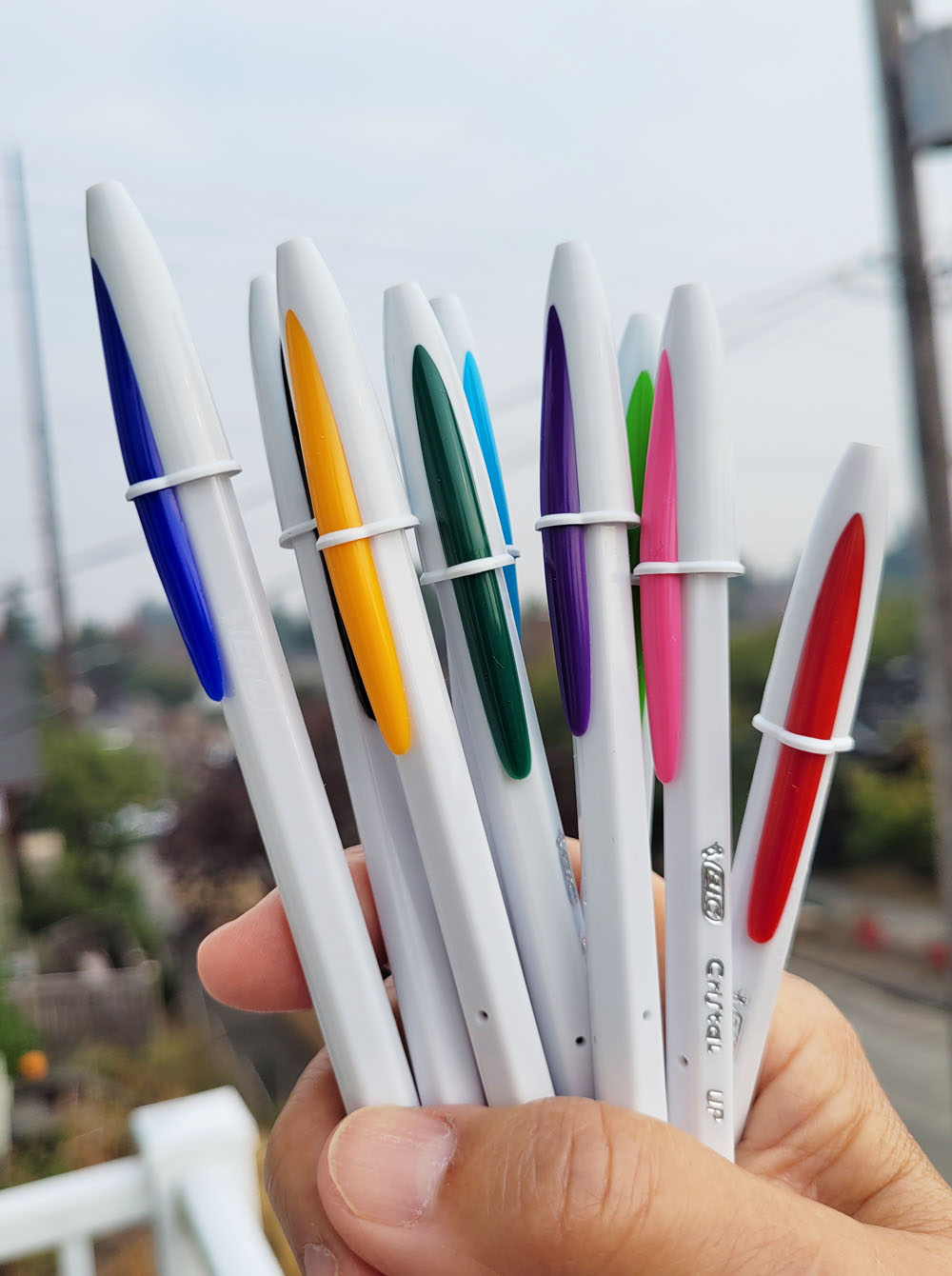


Bic Cristal UPs


Since Bics are on my mind during InkTober, I’ll also briefly mention one that I learned about from members of the Bic Cristal Facebook group (yes, of course, there’s a Facebook group for that). Because France Van Stone favors “extra bold” 1.6mm Bic Cristals, I had used mine for several exercises in her crosshatching course. I appreciate the bold point that makes crosshatching faster, but the drooly, blobby ink is messy. I eventually switched to my favorite 4-Colors, which have 1mm “medium” points. That’s when I learned about the Bic Cristal UP, which is a separate line of Cristals with a 1.2mm point – just slightly larger than a standard 1mm Cristal and Bic 4-Colors.

I bought a pack, thinking that the Cristal UP might be a nice middle ground between the 1mm and 1.6mm. It is that; and the Cristal UP comes in nine colors (unfortunately, not yellow, or it would be another way to get the CMYK hues). However, its barrel is cheesier than a regular Cristal with a slightly rough texture. The feature I appreciate most about the 4-Color (other than being a multi-pen) is its thicker, more comfortable barrel. I’ll keep using the UPs for InkTober, but I’m not sure the cheesy barrel tradeoff is worth the slightly larger point size. It’s too bad the UP ink cartridges won’t fit into the 4-Color barrels.

Bic Cristal UP: Good point size; cheesy barrel

Thursday, January 13, 2022

Review: SuckUK CMYK Ballpoint Pen

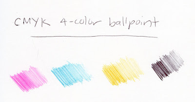
CMYK 4-color ballpoint
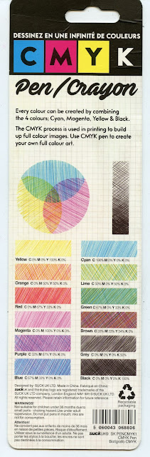
Color-mixing chart


A unique, unusual multi-pen crossed my radar recently. You already know how much
I love multi-pens as well as experimenting with CMYK color mixing. It will come to no surprise, then, to learn that when Nina Johansson showed it, it took me about three seconds to go get one: a CMYK four-color ballpoint pen!

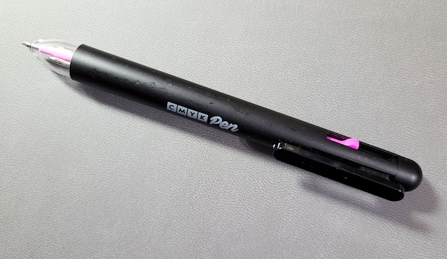
Lightweight plastic body

An unfortunate name.

Made in China for a company with the unfortunate name of SuckUK, the pen came in packaging with a useful color mixing chart.

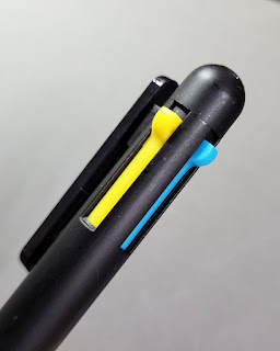
The very lightweight plastic barrel has three color selectors, and the clip selects black. The ballpoints are equivalent to a Bic medium point. I’ve used quite a few multi-pens, and I must say that the CMYK’s selection mechanism is one of the worst ever. The clip lever feels wobbly. Sometimes it takes multiple tries to get the selectors to engage, and sometimes they get stuck. When changing colors quickly in the middle of a sketch, clumsy mechanisms are annoying. Granted, Bic 4-colors are cheesy, too (one of the best multis mechanically is the Uni Jetstream 4 & 1), but a Bic typically costs a few bucks – not 16.


Clumsy color selectors


I’d forgive a clumsy body, however, if the inks were good (as is the case with Bics). Cyan and magenta are reasonably close to C and M process colors, but the yellow is a bit too cool – or maybe just muddy. Occasional orange or brown streaks appear. Although I expect ballpoint ink to be somewhat blobby (and my favorite oily Bic ink definitely is), the yellow is especially blobby.

Test swatches in Stillman & Birn Epsilon sketchbook

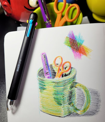
1/7/22 CMYK ballpoint in Stillman & Birn Zeta sketchbook

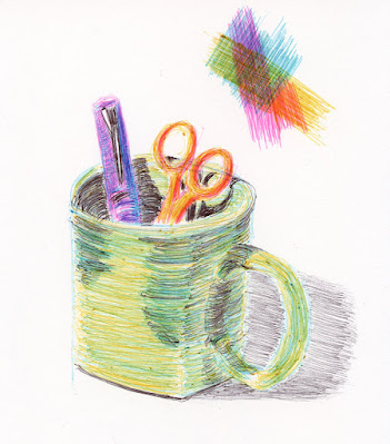
In my mixing test swatch, the purple, red and red-orange mixes aren’t too bad, but the green is off, and I blame the faulty yellow. Wanting to mix the secondary triad in a test sketch, I quickly gathered a bright green mug, orange scissors and a purple Nemosine fountain pen. The purple was easiest to mix; the green the most difficult. The biggest challenge, though, was the ink quality, which flows unevenly with lots of blobby bits. It also doesn’t have the pencil-like, pressure-sensitive quality that makes it enjoyable to build layers with Bic ink. So it turns out that the company name is appropriate.

Too bad – such a cool, innovative concept! If only Bic would steal it and put its fabulous, unique ink formula into its cheesy but reliably cheap body.

Sunday, November 7, 2021

Cherry Leaf – Loose and Optical


11/4/21 Caran d'Ache Museum Aquarelle on Stonehenge hot press 
Before my cherry leaf crumbled, I wanted to try a couple more things. The first was simply to get out my Caran d’Ache Museum Aquarelles and make a fast, loose sketch (at left). As I’ve mentioned before, “loose” doesn’t come naturally to me, but something about making a tight botanical drawing prompts a need to swing in the opposite direction (I recall feeling the same way after I drew a beet in Kathleen McKeehen’s class last year).

Next, I wanted to think more about the “optical mixing” concept that Crystal Shin talked about in her workshop. Although her own style is to blend colors seamlessly, she showed us the work of other artists and students that were good examples of optical mixing. Instead of blending completely, individual strokes from various colored pencils could be discerned when examined closely, but their cumulative effect from a distance is a solid color. Pointillists and Impressionists are known for their use of optical color mixing effects.

In my own sketches, I’ve seen the results of optical mixing most obviously when I use a CMYK-based primary triad. The three bold hues seem to visually vibrate, and a bit of cyan or magenta when it’s not expected can be a delightful surprise.

11/4/21 Derwent Lightfast and Prismacolor on Stonehenge hot press

For the sketch at right, I wanted to try a CMYK triad in the Derwent Lightfast line, but strangely, the set doesn’t include Cyan or anything close to it. A Prismacolor True Blue (903) stepped in. The Lightfast colors used were Magenta (which is darker than I like in a CMYK triad, but it worked well on this leaf) and Banana Yellow.

I try to make pencil strokes in the direction of the form as a matter of course (a basic technique I learned from Suzanne Brooker in my first class with her), even when I intend to blend them fully. But when the pencil strokes are intended to be visible, I get more bang for the buck from this technique in defining the form.

Thursday, September 9, 2021

Yellow: Warm or Cool?


9/6/21 Triadic study 1: cooler yellow

When I was studying many different primary triads (mostly at random and definitely not with the guidance of the CMYK principle) a while back, I felt that yellow usually played well with others. As long as the blue and red were in harmony, any chosen yellow probably wouldn’t ruin the song. Red and blue can be aggressive, while yellow is an easy-going player. My test sketches, though, were almost always mostly-red apples or tomatoes, so the influence of yellow was mostly on the red and rarely on blue.

Now that I’m making my triadic studies in the field, I’m learning different things. Now the influence of yellow on blue is all-important because trees and foliage usually play a key part in my compositions. And now that trees are turning, the yellow/red combo will become more important.

Prismacolor CMYK model

With all of that in mind, I started thinking more about yellow, especially its temperature. Using the Prismacolor CMYK model – Process Red (994), Canary Yellow (916), True Blue (903) – as a guide, I started out with Caran d’Ache Museum Aquarelle’s Yellow (010) because it looked closest to Prismacolor’s Canary. Fairly quickly, however, I switched to the cooler Lemon Yellow (240), which I preferred when mixed with the very warm, intense Phthalocyanine Blue (162), resulting in a cooler green. In the previous sketch that I made of the row of Japanese maples, though, I didn’t think the mix with red was warm enough.

I thought it would be both fun and informative to make an empirical study with only one variable: yellow. I went out looking for a scene in which I could put both green foliage and a turning maple in the same composition. I rarely sketch exactly the same scene twice, one right after the other, but in this case, I wanted to eliminate other variables.

In both sketches, the blue is Caran d’Ache Supracolor Gentian Blue (370), and the red is Museum Aquarelle Purplish Red (350). In the first sketch, the yellow is the one I have been using most lately, Museum Aquarelle Lemon (240). In the second sketch, the yellow is the warmer Museum Aquarelle Yellow (10).

Now that the trees are turning, I prefer the warmer yellow, although I still prefer the cooler one if the foliage is green. More experiments are needed, of course, and I’m happy to make them if September continues to be as beautiful as it has been.

I’m sure painters have written entire dissertations on this topic, and I could understand why: It’s endlessly fascinating. Although I still believe that yellow plays well with others, I think it has a lot more influence on the result than I was giving it credit for. Anyone else experimenting with triads and have thoughts on yellow?

9/6/21 Triadic study 2: warmer yellow

Thursday, August 12, 2021

Low-Tech CMYK


8/8/21 the view from our upstairs deck

When I want to print photos to share with friends or to put in my journal, I use a Canon Selphy printer. Unlike my color inkjet printer, which sprays the paper with ink, the Selphy’s dye-sublimation process uses heat to transfer the ink onto special paper. The paper passes through the printer four times, once for each of the CMYK (cyan, magenta, yellow, black) ink colors, and the paper is visible with each pass. I can see the image developing in a fascinating way, each layer of ink applied over the previous ones.

I think of this printing process whenever I sketch with the CMYK primary triad that I have been obsessed with lately. Using colored pencils instead of dye or paint, I don’t blend the colors completely, so my sketches seem to shimmer with a strange vibrancy. The transparent hues are glazed, and the individual colors are visible. It reminds me of promotional brochures and advertisements back in the day when an image’s printing plates were poorly registered, and you could see the ink colors showing around the blurry edges.

(Incidentally, Field Notes Brand tried to emulate this type of blurry, off-register printing to give their America the Beautiful notebooks an authentic, old-school look. Their printer with modern equipment had conniptions trying to accomplish this with modern technology that eliminates such messiness!)

This sketch was made with Staedtler Karat Aquarell water-soluble pencils, which I hadn’t used in a while. With a thin and hard core, it is useful for details and fine work, but not my favorite for my usual urban sketching methods. One thing I do like about them, though, is that the hues stay true to their dry state after water is applied. Some watercolor pencils change significantly in hue or intensity after activating with water.

Friday, June 17, 2022

Summer Palette Refresh, Triad 1

6/13/22 Green Lake neighborhood (new primary triad 1)
A recent sketch at Green Lake made me realize that I’m tired of the reliable colored pencil palette I’ve been using for years. I also realized that I lean too much on “normal” greens and neutrals for the typical urban landscape that I find myself sketching 99 percent of the time. By “normal,” I mean too realistic. Whenever I experiment with a primary or secondary triad, I’m usually pleased with the vibrancy, but unless I push myself that way, I just fall back into my lazy realism. And yet, seemingly paradoxically, I also recently surprised myself when I acknowledged that using a primary triad actually requires less thinking than using “realistic” colors! All of this led me to the same conclusion: I’m long overdue for a palette refresh.

I decided that the easiest way to give myself a swift kick in the palette pants is to keep the palette limited and try some new primary triads. I love the CMYK-based triad I’ve been using for a while (Caran d’Ache Phthalocyanine Blue [162], Lemon Yellow [240] and Purplish Red [350], shown at bottom of post and which I last used in the sketch in yesterday’s post), but it’s on the cool side. Since summer is just a few days away (though you’d never know it from our thermometer), I went through my Caran d’Ache Museum Aquarelle palette and looked for colors to warm up the basic CMYK.

Caran d'Ache Museum Aquarelle primary triad 1

New triad -- a bit too cool?
I picked out two variations. The one I’m showing you today includes the same Purplish Red (350), but I’ve swapped in a warmer Yellow (10) balanced by a cooler Permanent Blue (670). My first sketch with this trio, made near Green Lake, makes me think it may be cooler than I want, but I’ll try it a few more times.

Tomorrow I’ll show you the second primary triad I’m trying. It didn’t make sense to carry two primary triads when I’m trying to simplify and limit my palette, so I’m keeping one triad in my everyday-carry bag and the second in my tiny walking bag (which has no other colors except “heavy equipment yellow”). I haven’t jettisoned my “realistic” palette from the everyday-carry bag, but if I find myself getting lazy and using convenience greens and neutrals again, I might have to take stricter measures. But if the triad excites me, it will be incentive enough to keep using it! 

By the way, I had to chuckle at the conversation I overheard as I was sketching at Green Lake. A small party that had been dining outdoors nearby walked past me. “Is it always this cold here?” the visitor asked. “Oh, no – we usually get summer by July or August,” her friend reassured her.

My previous CMYK-based primary triad

Saturday, May 7, 2022

Museum Aquarelle Leads: the Saga

The elusive Museum Aquarelle lead set!

 Sometime in 2020 when I was in the depths of pandemic anxiety/restlessness/boredom (a dangerous retail therapy combo), I first heard about Caran d’Ache Museum Aquarelle leads. The predecessor product to the woodcased pencils, these 3.8mm leads were discontinued in 2013 when Caran d’Ache introduced the Museum Aquarelle colored pencils that I know well and love.

It was right around the time I was experimenting with Koh-i-Noor Mondeluz watercolor pencil leads, which just happen to be the same size. I had already decided that leads weren’t as practical as woodcased pencils, especially in the field. With a limited number of clutches, I’d have to constantly swap out leads. But I couldn’t stop thinking about them: Museum Aquarelle leads – a different form factor for my favorite watercolor pencils (this is where the animated twinkle appears in my eyes)! Down the deep rabbit hole I went.

Koh-i-Noor Mondeluz lead set
Much Googling and many inquiries later, I realized that the leads were elusive, even on auction sites. I would have settled for a used set or even some open stock single leads to try, but they were not to be found, either.

Once I start digging, though, you know I don’t back out of a rabbit hole easily (especially during a pre-vaccine pandemic when there’s little else to do). More than six months later, I learned that the one remaining set of Museum Aquarelle leads on planet Earth was still available at the Sennelier art supply shop in Paris! That’s the very same Sennelier store where I had shopped in 2015! If I’d known then what I knew in 2021, I could have purchased the set there and carried it back home with me!

Alas, I did not; instead, I paid a sweat-inducing cost to have the set – the very last on Earth, mind you – shipped from Paris!

The Caran d'Ache Museum Aquarelle lead set

Interesting how similar the set looks to the Koh-i-Noor set – coincidence? The Caran d’Ache set comes with some different accessories, however. In addition to a brush, water-soluble graphite leads and clutches, which are also included in the Mondeluz set, the Museum Aquarelle set comes with an eraser, a water dish, a tube of white gouache and an empty glass tube to carry leads in the field. (The store included a couple of extra leads of a color that had been found broken in the set. That was a nice customer service gesture toward the crazy American who was having the set shipped all the way to Seattle. Amazingly, the other leads arrived unbroken.)

Even the lead holders look similar. Unfortunately, just like the Koh-i-Noor, the Caran d’Ache is heavy, unbalanced, even longer than the Koh-i-Noor and uncomfortable to use.

Top: Koh-i-Noor lead holder; bottom: Museum Aquarelle lead holder

The set comes with 18 colors, which are apparently all that had ever been made in this form factor. The first thing I did was to compare the lead colors with their woodcased counterparts. I was very pleased to find that both the pigments and their softness are identical. I don’t have proper calipers to measure, but visually and using a ruler, they appear to be the same thickness also.

The 18 lead colors are identical to their woodcased pencil counterparts.


I was eager to try the Museum Aquarelle leads in the field – but there was one problem. The Caran d’Ache 3.8mm clutches are just as clumsy to use as the Koh-i-Noor. I had been on a quest ever since I got the Koh-i-Noor set to find lead holders that would make the leads appealing to use. Unfortunately, 3.8mm lead holders are not easy to find. I like the ergonomic shape of the Pilot Croquis, which I used for a while with the Koh-i-Noor leads, but it’s awkward to fill. In addition, its “twist action” to extend and retract the lead is not intuitive to me in a mechanical pencil. I kept looking.

The Pilot Croquis lead holder has a comfortable body, but I don't like the way it fills or operates.

Recently I discovered the Kutsuwa Neonpitsu Knock highlighter pencil, which comes with a 3.8mm highlighter lead. Lightweight and easy to fill, it has a knock that extends and retracts the lead, which is how I like my mechanical pencils to operate.

Comfortable Kutsuwa Neonpitsu Knock lead holders fit the Museum Aquarelle leads perfectly.

Washi tape on the ends helps me identify the colors.

Then I learned that the Tombow Mono Knock eraser, which also fits 3.8mm leads, has a similar body style – and costs less than the Kutsuwa highlighter. (Incidentally, the Tombow Knock eraser is excellent with graphite and good with colored pencils, too.) Identifying the lead colors in the neon- and pastel-colored clutches was resolved with washi tape.

The Tombow Knock eraser holder works well, too, and costs less.

Next was the sharpening issue. The Koh-i-Noor set came with sandpaper, which is the ideal way to sharpen these soft leads, but it’s messy. The heavy clutches have attached lead pointers, which are also messy, but I’m not using those clutches anyway. The first few times I used the leads, I realized that it’s not difficult to maintain a point if I just keep turning it as I draw. I don’t need to sharpen them much in the field. At home, I use sandpaper over a wastebasket.

Now that I finally have several comfortable lead holders, I’ve been putting the Museum leads to use. In March when our forsythia was in full bloom, I gave the leads a workout with a primary triad. It made me realize that using a limited palette is an ideal choice for the leads. I had already decided that changing out the leads in the field would be cumbersome and impractical. Though not weighing more, carrying a large quantity of plastic lead holders would be bulky and similarly impractical. But a carefully selected three or four would be ideal.


In fact, three or four colors is what I try to stick with in my tiny fitness-walking/pandemic bag. I’ve been carrying Museum Aquarelle leads in CMYK colors on my walks, and I like that they always remain a comfortable length without having to use extenders when they get too short.


The downside is that I find it difficult to lay down large areas of color aggressively, as is my habit with Museum Aquarelle pencils. Although the cores are the same, the lead holder’s collar gets in my way when I lay the lead down at an angle.

The leads also feel different in other ways – similar to the difference between writing with a mechanical pencil and a woodcased pencil. I feel a little less connected to the point; the feedback from the paper’s surface is less direct.

The big question remains: Why? Why use Museum Aquarelle leads when convenient, woodcased Museum Aquarelle pencils have replaced them – in 76 colors instead of only 18 – and which I already love? If I had been sketching with watercolor pencils before 2013 when the leads were still readily available, I’m sure I would have fallen in love with their rich pigment and softness. Eventually, though, I would have complained that they came in only 18 colors. You would have heard me rant here on this blog, “Who needs these clumsy lead holders? Come on, Caran d’Ache – why not put these fabulous leads into wood pencils? And while you’re at it, give us more colors!”

Luckily for me, I don’t have to wait for Caran d’Ache to respond to my retroactive rant; I’ve been happily using the much-improved form factor for years. But I’m not sad or disappointed that I can’t rave about Museum Aquarelle leads; it would be horrible to fall in love with a product that has been out of production for nearly a decade. Besides, the quest for, the triumphant discovery of and the eventual thrill of receiving the set from Paris were just what I needed to distract me from 2020. I’m grateful for anything that did that.

Meanwhile, the CMYK primary triad leads make a nice compact walking kit.

My fitness-walking/pandemic bag currently contains four leads in CMYK colors, a heavy-equipment yellow pencil, water-soluble graphite pencil, white Gelly Roll, Uni Pin brush pen, waterbrush, spritzer (not my favorite, but the most compact) and 5.5" square Hahnemuhle sketchbook.


3/20/22 the forsythia in our backyard

4/12/22 Maple Leaf neighborhood

4/27/22 Maple Leaf neighborhood

Saturday, June 25, 2022

Squared Crown Hill Trees (and Triad 3)


6/20/22 Crown Hill neighborhood

Eighth Avenue Northwest in Crown Hill is one of my favorite streets to sketch. A center divide between the two directions of traffic is lined with dense Zelkova trees. I thought that they had been trimmed in a weird, squared-off way to accommodate large trucks and buses, but a friend told me that the trimming has happened naturally as vehicles have hit the lower branches! I tend to sketch there in the fall to catch the color. Here’s a sketch I made in November when the backlighting was lovely. Several years earlier, there was more color by November, and another year the color was just starting in October.

On the day before the solstice, an overcast morning appointment brought me to Ballard, so I drove home by way of Eighth Northwest to see what the trees would be like to sketch in June. Lighting conditions weren’t the best that day, but I liked how each tree showed a fringe of soft light. It was a good test for primary triad 3.

After a few sketches, I had decided that primary triad 2, although slightly warmer than triad 1, was not doing it for me. I’ve swapped out the Caran d’Ache Turquoise Blue (171) for Caran d’Ache Ice Blue (185), which sounds cooler, but it’s closer to the Phthalocyanine Blue (162) that I was using in my original CMYK-based triad. Purplish Red (350) and Yellow (10) remain the same.

Primary triad 3

My choice may sound reasoned, but it’s probably more random than reasoned. I simply pulled out several blues I thought would work, made triad swatches, and picked the combo I liked best. It’s always interesting to make swatches because mixed triad hues never quite look the way I expect them to, which is part of the fun and excitement of using them. But the proof is always in the sketches – not the swatches. The hues in the sketch above might be cooler than I had intended, but ironically, it seems about right for our cooler-than-average June.

Traditionally, primary triads are made by mixing warms with warms or cools with cools. By mixing warms with cools, undesirable mud can sometimes result. That’s the basic concept, anyway, that I learned in a beginning watercolor class during my first year or two of sketching. Color mixing is more complex than that, however, and when I first learned about the primary triad based on CMYK hues, my head exploded: The three hues I think of as primaries are not necessarily red, yellow and blue at all!

Triad 1 is still in the running, but I haven’t used it often enough to decide whether it’s “right.” Ultimately, whether a triad is “right” is just a feeling and not a formula.

Monday, January 24, 2022

My $25 Sketch Kit

Is it possible to build a high-quality sketch kit for $25?

 The Art Supply Posse podcast took on a fun challenge: Build a beginner sketch kit for $25 or less! Although I’ve built myself many types of sketch kits for various purposes – minimalism, wet weather, life drawing, physically tiniest, nocturnes – I’ve never put one together with an eye on whether it could be purchased for $25. Game on!

The important factors would be versatility and value – a kit that could serve as many of my sketching needs as possible for the lowest cost. For me, that would mean the kit would have to meet my urban sketching needs, which might eliminate some specialized needs like sketching at night or life drawing. If you’re considering building your own, it would be key to consider how you would use your kit the majority of the time.

If cost were the only factor, it would be easy enough to assemble a watercolor pencil sketch kit inexpensively. Cheap colored pencils are a dime a dozen. But of course, I’d want it to be a good sketch kit that I would be satisfied using on a daily basis – that’s a bit more challenging, but certainly possible.

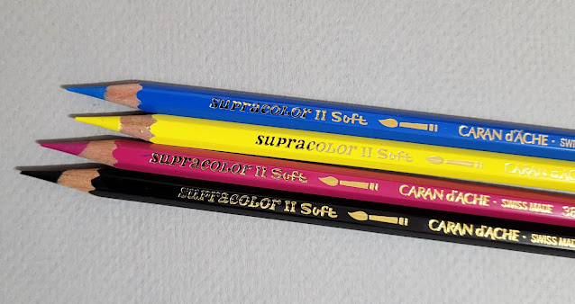
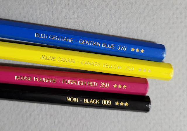
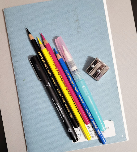
Let’s do the fun part first: the watercolor pencils! Regular readers of this blog know that I’m a luxury user in this department since I was spoiled early on by Caran d’Ache Museum Aquarelles: Unfortunately, I don’t think they’re going to make it into this kit. But Caran d’Ache Supracolors would be only a minor compromise (after all, they would be my choice if I absolutely had to choose only one colored pencil – it’s that versatile). The key is to carefully select a basic, open-stock palette ($2.69 each at Blick) instead of buying a pre-packaged set. And that palette would be four CMYK-based hues: Gentian Blue (370), Purplish Red (350), Canary Yellow (250) and Black (009). Yes, it’s challenging to use only these four colors, but my experiments have been lively, informative and fun.

Open-stock Caran d'Ache Supracolors... 

... in a CMYK palette.


An essential partner for watercolor pencils is a waterbrush. My choice would be a Kuretake in the compact, versatile medium size ($5.75 at JetPens). There are cheaper brands, but they lack the plug between the brush and reservoir, which I find important for controlling water flow.

With watercolor pencils as the color medium, a pen is optional. I use one so often, though, for line drawings without color that I consider it an essential sketch kit item. Any of my favorite fountain pens and inks would blow my kit budget big-time, so my choice is a Uni Pin brush pen ($2.45 at JetPens), which is currently the pen I use most for sketching anyway. Containing waterproof, pigment-based black ink, the tip lasts longer than most firm-tipped brush pens under my heavy hand – at least as long as the ink – so it’s a good value.

The clincher is the sketchbook: I’m picky about paper quality, and I don’t think compromising on paper is ever a good idea. My long-time favorite Stillman & Birn Beta softcover or my current Hahnemühle watercolor book would put me way over budget. I have an easy solution, though: Go back to hand binding sketchbooks, which I did for many years (and if I ever travel again, I intend to make a book for each trip as I always used to). My favorite paper for that is Canson XL 140-pound watercolor paper in the 9-by-12-inch size (30 sheets for $8.84 at Blick) which folds nicely into 6-by-9-inch signatures. With the same 52-page count as a 5 ½-by-8 ½-inch Stillman & Birn, I could make a book for about $4, including bookbinding thread and cardboard covers.

The final essential piece in this urban sketching kit would be a portable pencil sharpener. Here’s where I am saved by putting Supracolors into the kit instead of slightly girthier Museum Aquarelles: The barrel is a standard size, so any sharpener will fit. (The few handheld sharpeners I own that fit Museum Aquarelles would put me over budget.) The Kum wedge is not the best handheld sharpener in the world, but it gets the job done sufficiently, and for only $1.95 at Blick.

Here’s my tally:  

Supracolors: 4 x $2.69 = 10.76
Waterbrush: 5.75
Brush pen: 2.45
Handbound sketchbook: 4.00
Sharpener: 1.95
            Total: $24.91

High quality, compact and essential for $24.91!

1/22/22 Central District (Caran d'Ache Supracolor pencils 
on Canson XL 140 lb. watercolor paper)
You’ll note that I haven’t used the term “beginner” for this starter kit as the Posse did; it’s an idiosyncratic kit for myself. But if I were recommending one for a beginning urban sketcher, would it be any different? Not much. I might take out the brush pen and suggest replacing it with any pen or pencil of choice. The best way to start sketching is to use a drawing instrument that is already familiar and comfortable. Everything else, though, is a perfectly good, basic watercolor-pencil-based urban sketching kit – and very compact and portable, too!

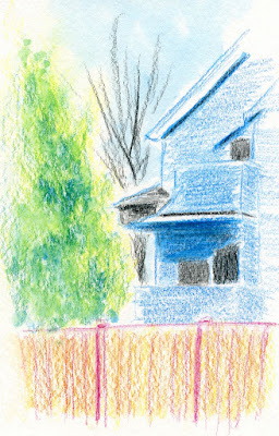
It’s easy enough to add up some supplies to equal $25, but I thought it was only right to put my money where my mouth is. I brought the budget kit with me the next time I went out and made the sketch at right. (Part of the house really was cyan blue and so was the sky!) I inadvertently cheated when I grabbed the spritzer from my bag without thinking, but since the spritzer is a reused bottle of hand sanitizer, technically it adds zero cost to the kit. My budget is intact. Indeed, it’s a perfectly good kit that I am happy to use. (Maybe not indefinitely, but I consider it a starter kit.)

(Whew! It’s been a while since Ive had to use a calculator to write a blog post! I need a nap.)

Related Posts Plugin for WordPress, Blogger...