Wednesday, December 20, 2023

Less is More


12/18/23 Maple Leaf neighborhood

Like their neighbors to the east, this family turns on a lot more colored lights in the evening, but the only lights they leave on overnight are the two trees visible through windows. I prefer it this way. At 6 a.m., I still had plenty of time before dawn would dull the illumination.

Tuesday, December 19, 2023

Tina’s Top 10 Memorable Sketches of 2023


2/5/23 Comforting soup in isolation
One of my favorite year-end posts is the one in which I look back on all the sketches I made during the calendar year and pick out my 10 most memorable. According to my own criteria, “memorable” does not necessarily mean my “best” sketches; these simply stand out in my memory as special sketching moments in 2023.

Even if you don’t share them publicly, I recommend going back through your sketchbooks from the past year. It’s a fun and illuminating way to review your year and perhaps observe how your style or skills have changed. If you are new to sketching and have been sketching regularly, I guarantee that any retrospective will astound you when you see how much your skills have improved.

I don’t look through my sketchbooks often, but when I do, I’m always surprised by some events I had sketched that I had almost forgotten about – and seeing them on the page brings them right back. Other events I clearly remember, and the top 10 show up here in this post. (To see retrospective posts of previous years, use the year-end review search label.)

Feb. 5, Orzo garbanzo soup (top of post): I rarely sketch my food, least of all anything I eat at home. Isolated in our TV room while recovering from COVID, however, I had to sketch this bowl of soup made by a dear friend because it was nourishing in many ways.

April 11, cherry blossoms, Sunset Hill neighborhood: Only minutes before I had sketched these not-quite-peak trees, I had learned the terrible news of Chandler O’Leary’s sudden and very unexpected death. Looking at this sketch now, I recall the sadness I felt for this young woman’s life cut short, for her husband, and especially for their young son who would barely remember her. It’s what I call the super power of urban sketching: Feelings and other associations get permanently embedded in the sketch, just like pigments or ink absorbed into paper.

4/11/23 Cherry blossoms for Chandler

6/17/23 Direct watercolor on location

June 17, Columbia City PCC (right): Though quite blah in content, this sketch in the PCC outdoor seating area was made during the 30x30 direct watercolor challenge, and it is memorable for being the first that felt like a “real” urban sketch – not just painting this way as an exercise. That meant that I was getting more comfortable with using watercolors on location.

July 16, SketcherFest (below): Last July’s SketcherFest weekend in Edmonds was the most fun sketching event since pre-COVID times and certainly the largest ever in Seattle.

7/16/23 SketcherFest in Edmonds


July 16, sketching with Momoko: Although this sketching opportunity occurred during SketcherFest, I have pulled out the sketch as a separate memorable occasion for a different reason. It’s always special to finally meet someone I have known for a long time but only online – and then to sketch with her is even more special.

7/16/23 Sketching with Momoko

July 26,
7/26/23 One of five sketches I made for On the Spot.

Luma the cedar (right):
 My sketch reportage for On the Spot about how Seattle citizens helped to save a 200-year-old cedar tree is certainly my most memorable sketching of the year. The experience left me with a lasting impression of the potential for sketching as a storytelling medium.

Aug. 19, portrait of Kaila (below): By the time it was complete, I was happy with the drawing of my grand niece, but it was one of the most high-pressure drawings I’ve ever done!


8/19/23 High stakes!

Oct. 12, squirrel exclusion (below left): This sketch of Sean, a pest wildlife removal expert, installing exclusion work on our roof marked the end of a nine-month ordeal.

10/12/23 No more squirrels

10/15/23 Frankie Feetsplinters in Ballard

Oct. 15, troll at National Nordic Museum (above right): Although ultimately a very wet day, the USk Seattle outing to Ballard to sketch the newly installed troll had a festive atmosphere. The outing’s focus on Frankie Feetsplinters kept most sketchers concentrated around the museum, which made it an especially fun social occasion as well as a memorable subject.

Nov. 16, pastry and Medicare: I hadn’t planned to sketch my freshly acquired Medicare card along with my chocolate tart, but I got the idea spontaneously as I celebrated a milestone birthday with friends.

11/16/23 A milestone birthday celebration

Monday, December 18, 2023

Homage to Museum Aquarelle


12/14/23 Museum Aquarelles on Strathmore 100% cotton postcard. Only a few select spots were activated to retain the soft, fluffy texture of this mostly white pup (reference photo by Jeff Chin).

I thought for sure this would be the year: finally an expansion of the Museum Aquarelle line. In the 10 years that I have been using Caran d’Ache’s premium watercolor pencils, it has only ever had 76 colors, which is certainly a respectable range – yet it has some significant holes that should be filled. When the Swiss company expanded the color range of Luminance, its artist quality, non-water-soluble line, from 76 to 100 colors in 2020, it seemed only a matter of time before Museum’s turn would come.

12/14/23 Museum Aquarelles in Hahnemuhle Akademie 
sketchbook. Although I used my usual hard-slamming, urban sketching
technique in this sketch, ironically, it was done from a photo that I
took on one of our golden hour walks last fall. I would have liked to
have done it from life, but that low sun was dropping fast, and
I knew I'd soon lose the lovely gold light on those buildings. With this
approach, I get all the color down dry as heavily as I need for the final result,
then activate, with no additional layers applied.


Its 10th anniversary was the ideal occasion for the big release! I waited patiently all year . . . but Caran d’Ache’s fairly low-key birthday announcement in October didn’t bode well. And then came the “celebration”: partnering with artist Sophia Clara “to guide you through a step-by-step tutorial and learn how to create a fall-inspired collage using autumnal colors, all beautifully enhanced by the watercolor Museum Aquarelle pencils.”

That’s it? You call that a “celebration” of your premier product’s 10th birthday? We want more colors, and we want them now!

Sigh.

12/14/23 Museum Aqurelles in Hahnemuhle 100% cotton sketchbook. This poinsettia still life feels a bit overworked and heavy-handed, I'm afraid. Waffling between a tighter, realistic approach and a looser, painterly style, I achieved neither. This was probably made with the most traditional watercolor pencil method -- multiple layers, each activated and fully dried before the next layer is applied.

In lieu of an ecstatic reveal of the non-existent new colors, this post is an homage to Museum Aquarelle in observance (not “celebration” – I need new colors for that) of this milestone year. I decided to make a sketch in each of the ways I typically use these versatile pencils: with minimal activation in the portrait of Niko; with my slam-it-down-hard, on-location method; with a multi-layer, full-activation still life; with spot color in a “coloring book” style line drawing (more technique commentary in the cutlines).

12/15/23 Uni Pin brush pen and Museum Aquarelles in Hahnemuhle
100% cotton sketchbook. This is what I call my "coloring book" method of
making a line drawing and then applying color selectively. Nothing is as fast and 
simple as colored pencils for this hasty method, which serves me so well in 
fast-acting situations, like this urban sketch in Maple Leaf.

Since this is an anniversary homage, I also took a retrospective angle by digging up one of my earliest urban sketches that includes Museum Aquarelles (of Café Bambino in 2014), below.


6/10/14 Various media including Museum Aquarelles on Canson XL 140-pound watercolor paper. Ten years ago, I was using as many mixed media as I could carry in my bag. I think the only use of Museum here is in the background tree, and it doesn't look like I activated it much. I still had much to learn about making use of these amazing pencils.

Happy 10th birthday, Museum Aquarelles! You remain my favorite watercolor pencils, even if Caran d’Ache never expands your color range. But that does not stop the whining.

Ten years young and standing tall!

Sunday, December 17, 2023

Messing Around with Viarco ArtGraf Water-Soluble Graphite (Tin)


ArtGraf in pan form -- another Viarco surprise (Earthsworld reference photo)

In my “messing around” series, I use a product new to me that I know little about and then show the evidence of my mess accompanied by a few uninformed opinions. I don’t consider this a product review.

Viarco, the small Portuguese pencil manufacturer, sure is full of surprises. I’ve known and loved for years the ArtGraf pencil, still my favorite water-soluble graphite pencil. After owning some for years, I finally started messing around recently with the “tailor shape” blocks of water-soluble color, which have exciting potential that I haven’t fully explored yet. And now I’m messing around with another item that I had put into my Viarco order without knowing much about it: ArtGraf water-soluble graphite that comes in a small tin (I have the 20-gram tin; a 60-gram tin is also available). Somehow, though, I had a hunch it might be fun.

Once again, I think this is a unique product that is different from any other water-soluble graphite or graphite-like product. It wets easily like watercolor, but it doesn’t flow like watercolor. Instead of glazing, it layers more like, well, like a graphite pencil – but in a wet way! It’s hard to describe and nothing like anything else I’ve used. It also takes some getting used to, and I’m still learning.

I first mentioned this product briefly in my post about the “drawing with paint” technique that I had learned from Steve Mitchell’s The Mind of Watercolor videos. ArtGraf in this tinned form is an ideal material for this technique because of its ability to build in tone, just like graphite. This Earthsworld portrait is another attempt at the “drawing” technique.

11/28/23 ArtGraf in Hahnemuhle Akademie sketchbook

At Drawing Jam a couple weeks ago, I brought the usual supplies I bring everywhere, but on a whim, I brought along the tin of ArtGraf. It turned out to be the material I used most because of its simplicity. Using the tin lid as my “mixing” palette to dilute the graphite as needed, all I needed was a waterbrush to “paint” quick life-drawing gestures (rusty as they were). Sometimes I paired it with an ArtGraf pencil to help define shapes.

12/2/23 Drawing Jam: Ideal for quick life-drawing gestures

One evening I dared to challenge myself by sketching a white animal on a mostly white background: I found a lovely image of an Arctic fox (reference photo by Jonatan Pie on Unsplash) irresistibly backlit. I ended up overworking it a bit trying to increase the contrast so that the backlighting fringing the fox would show, but I still enjoyed using ArtGraf for it (I also used a Blackwing pencil to define the fur’s texture a little). You can see where I had trouble getting a smooth background on the right side of the fox, but I think I just need more practice getting used to the way it flows (or doesn’t).

12/11/23 ArtGraf and graphite pencil in Hahnemuhle sketchbook (Jonatan Pie reference photo)

Finally, the sketch I had the most fun with was the kitty named Tucker that I drew on the cover of a Field Notes notebook (photo by Tucker’s human Grant Klein). I hadn’t tested ArtGraf on this cover stock, so I had my doubts about whether it would hold up, but surprise, surprise – it not only held up, I was able to tone the kitty wet-in-wet! Maybe because it’s a small area, the ArtGraf flowed beautifully and easily on the background behind Tucker with a nice granulated finish.

12/11/23 ArtGraf, Polychromos colored pencils on Field Notes cover

Once again, I’m thrilled by the potential of this product – which I’ve only barely touched.

Saturday, December 16, 2023

School Bus


12/11/23 Northgate
The color I’m seeing these days is mostly on the streets and sidewalks, not in the trees. Walking home from an errand at Northgate a few days ago, I spotted a yellow school bus parked near a mostly bare yellow tree, plus all the leaves the tree had recently shed, stuck to the wet pavement. Such is December in Seattle.

My Heavy Equipment Yellow pencil (AKA Caran d’Ache Gold Cadmium Yellow 530) comes in handy for many things.

Friday, December 15, 2023

Simple Lights


12/12/23 Maple Leaf neighborhood

As far as I can remember, this neighbor on the corner has never decorated for the holidays – until this year. Maybe the lights next door or other houses on the block put her in the mood (or she felt pressured to be in the mood). In any case, I like these simple strings of lights on her bushes and plants. The background lights from the fence across the street add a little more color, too.

Sparkly!

Material note: I’m diggin’ the glittery Posca paint markers. They are slightly more sparkly than the Kuretake Fudebiyori metallic brush pens I used last year. We don’t put up lights anymore, so the Poscas are as sparkly as we get on the north side of Northeast 81st.

Thursday, December 14, 2023

Messing Around With Derwent Graphitint Pan Paints


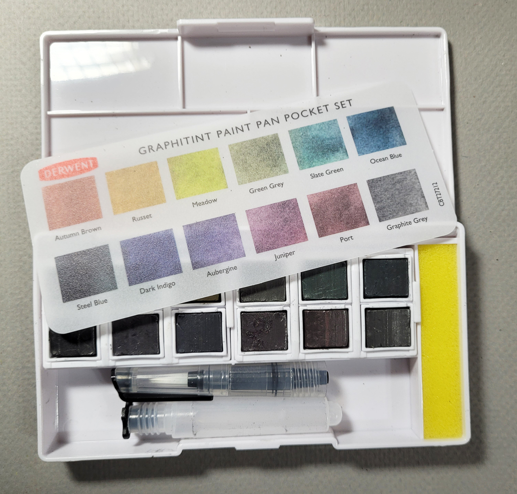
Derwent Graphitint Paint Pan Set

I thought I was done showing my mess-arounds with watercolor wannabes (for lack of a better shorthand term), but I almost forgot about this one – the Derwent Graphitint Paint Pan Set. Perhaps it’s because I am least excited about the set, which is the pan version of Graphitint pencils. I see a lot more potential with the XL Block version of the Graphitint series, which has strong pigment, an innovative shape and can also be used like pan paints. The pan set, however, while being more portable than blocks, is a lot less fun to use. I’ve been messing around with the set sporadically since October, but I can’t seem to get into it.

Like the Inktense and the tinted charcoal paint pan sets, the Graphitint set comes in an identical plastic palette with a waterbrush.

Like the corresponding water-soluble pencils and XL Blocks, the pan palette is muted and earthy, which I wouldn’t object to if the colors were richer.

Swatches made in Hahnemuhle Akademie Aquarell sketchbook

Initially, I made several sketches using only the colors in the Graphitint set. They match both the pencils and the blocks in terms of drying with a matte, slightly granulated finish. I do like the granulation that brings out its graphite base (the background on the left of the portrait, below). In addition, the pan paints seem more forgiving than traditional watercolors in that they can be overworked without showing as much evidence of overworking (though that also means they don’t move much once they hit the paper).

10/22/23 Graphitint pan paints in Hahnemuhle sketchbook (Earthworld reference photo)

My favorite is the crow; I used the color Steel Blue (lower left in the swatches), which looks black to me.

10/31/23 Rick Clark reference photo

This tonal street scene shows weird dots and splotches where the “paint” stopped moving when I lifted the brush. I like the granulating effect, but not much else.

11/5/23 photo reference

My most recent attempt was to use some of the grayish tones in the set as sort of a grisaille for regular watercolors. Well, that was my intention, anyway, but once I got out the colors, I forgot about the grisaille and just painted. Based on a rainy-day reference photo, the muted palette came out OK, but using watercolors alone would have been more exciting.

12/5/23 Graphitint pan paints and Kuretake watercolors in Hahnemuhle 100% cotton sketchbook (photo reference)

I’ve been looking at YouTubes for ideas on how others are using this set, but so far, nothing is grabbing me. If you see someone doing something interesting, let me know.

Related Posts Plugin for WordPress, Blogger...